/*
    Base styles
    Non-code-outputting stylesheets required in every SCSS partial
*/
/*
    Color Palette

    This section is the only place where color codes should live;
    All other stylesheets should reference the color variables below.
    If you need to use a new color in the v1 namespace, submit it as
    an addition to v1.

 */
/*

    Color-related Functions

 */
/*

    Generate Colors

    For the purpose of generating tinted and shaded versions of base colors.

    Tint & Shade from Compass:
*/
/*
  tint: Mix a color with white.

  @access public
  @param {Color} $color - color to tint
  @param {Number} $percentage - percentage of `$color` in returned color
  @return {Color}
*/
/*
  shade: Mix a color with black

  @access public
  @param {Color} $color - color to shade
  @param {Number} $percentage - percentage of `$color` in returned color
  @return {Color}
*/
/*

  Improved versions of tint & shade:

*/
/*
  Slightly lighten a color - more accurate version of tint()
  Example: tint("#a20101", 90) --> #C12828

  @access public
  @param {Color} $color - color to tint
  @param {Number} $percentage - percentage by which to tint the given color.
  @return {Color}
 */
/*
  Slightly darken a color - more accurate version of shade()
  Example: shade("#a20101", 10) --> #830000

  @access public
  @param {Color} $color - color to shade
  @param {Number} $percentage - percentage by which to shade the given color.
  @return {Color}
 */
/*

  Length functions
  
 */
/*
    Relative pixels: express pixel-level measurements, automatically converted to rems. 
        Usage: `border-width: rpx(5)` => results in a 5px border if 1 rem = 16px. 
        Generated style will read: `border-width: 0.3125rem`.
  */
/*
     Abstract colors

     These colors are building blocks, assigned to more
     semantically-named color variables.

     NOTE: Sass likes to be loosey-goosey and not require you to
     quote strings. This never ends well; quote them anyway.

 */
/* ------- NO COLOR LITERALS beyond this point! ------ */
/* Deprecated */
/* Neutrals */
/* Colloquial grey aliases */
/* use instead of black generally */
/*
    Interface palette

    Specific color roles, used throughout components. Components may
    also name their own color variables, based on role or usage but
    they should all be aliases of colors in this file.
 */
/* Text colors */
/* Graphical element colors */
/* State and status colors */
/* Links */
/* Focus */
/* Shadows */
/* Calculate a transparent black from an opacity value: */
/* Animation shadows */
/* ======================================================================= *
    Units & Measures

    $mod is the basic unit of measurement for most things.
    Define measures using the mod() function and a multiplier.

    Examples:
      margin-right: mod(0.5);
      padding-bottom: mod(4);
    ...but evangelize the use of a small number of standard measures

    * Variables, placeholders and mixins only
    * Always favor @include [mixin] over @extend [class or placeholder].
    * The basic unit of measure, the mod (module), is based on 1rem, which
      is almost universally defined in browsers as 16px.
 * ======================================================================= */
/*

  Mod: return a multiple of the base unit $mod

*/
/*
  Relative pixels: express pixel-level measurements, automatically converted to rems.
      Usage: `border-width: rpx(5)` => results in a 5px border if 1 rem = 16px.
      Generated style will read: `border-width: 0.3125rem`.
*/
/* stylelint-disable unit-disallowed-list */
/* Use pixels for media queries. */
/* stylelint-enable unit-disallowed-list */
/* ======================================================================= *

    Typography

 * ======================================================================= */
/*
    Font-size scale: although the `$font-size-x` variables (below) cannot be generated from
    a list with Sass, this scale IS used to generate type utility classes.
 */
/*
    Font-size variables
    Number is pixel equivalent (assume `html {font-size: 16px}`)
*/
/* TODO: line-height should be set on body as (14 / 22) unitless.
   There are some feature styles that are using this 22px variable... */
/*
    List decoration styles:
 */
/*

  Layers

  Defines a named, fixed vocabulary of z-index values. Use `z` function to access.

  Usage: `.bingo:focus { z-index: z(focus); }`

  NOTE: only use a z-index if you absolutely need to!

 */
/* ======================================================================= *

    Effects

 * ======================================================================= */
/* =======================================================================

      Functions: Media Queries

      viewport-min() and viewport-max(). Use viewport-min() unless max is necessary.

*  ======================================================================= */
/**
 * viewport-min generates a media query applying to the given named breakpoint and all lower breakpoints.
 *
 * For example, `viewport-min(sm)` would apply to viewports 500px wide (the small breakpoint) and up. 
 *
 * Usage:
 * @include viewport-min('md') {
 *   -- styles for the medium breakpoint go here --
 * }
 *
 * @param  {String} $bp-name         The two-letter t-shirt size abbreviation of the breakpoint
 * @param  {Map} $breakpoint-set:    The set of breakpoints to use (default is the standard set
                                     defined in _units.scss)
 * @return {Sass}                    The media query, with the enclosed block of Sass included
 */
/**
 * viewport-max generates a media query applying to the given named breakpoint and all higher breakpoints.
 *
 * For example, `viewport-max(md)` would apply to viewports 700px wide (the medium breakpoint) and down. 
 * 
 * IMPORTANT: It is advised to take a "mobile-first" approach, and therefore to
 *            define styles at the minimum width first, then work your way up the breakpoints.
 *            Prefer **viewport-min()** over viewport-max(), unless it is absolutely needed.
 * 
 * Usage:
 * @include viewport-max('sm') {
 *   -- styles for the small breakpoint go here --
 * }
 *
 * @param  {String} $bp-name         The two-letter t-shirt size abbreviation of the breakpoint
 * @param  {Map} $breakpoint-set:    The set of breakpoints to use (default is the standard set
                                     defined in _units.scss)
 * @return {Sass}                    The media query, with the enclosed block of Sass included
 */
/*

    Color-related Functions

 */
/*

    Generate Colors

    For the purpose of generating tinted and shaded versions of base colors.

    Tint & Shade from Compass:
*/
/*
  tint: Mix a color with white.

  @access public
  @param {Color} $color - color to tint
  @param {Number} $percentage - percentage of `$color` in returned color
  @return {Color}
*/
/*
  shade: Mix a color with black

  @access public
  @param {Color} $color - color to shade
  @param {Number} $percentage - percentage of `$color` in returned color
  @return {Color}
*/
/*

  Improved versions of tint & shade:

*/
/*
  Slightly lighten a color - more accurate version of tint()
  Example: tint("#a20101", 90) --> #C12828

  @access public
  @param {Color} $color - color to tint
  @param {Number} $percentage - percentage by which to tint the given color.
  @return {Color}
 */
/*
  Slightly darken a color - more accurate version of shade()
  Example: shade("#a20101", 10) --> #830000

  @access public
  @param {Color} $color - color to shade
  @param {Number} $percentage - percentage by which to shade the given color.
  @return {Color}
 */
/*

  Length functions
  
 */
/*
    Relative pixels: express pixel-level measurements, automatically converted to rems. 
        Usage: `border-width: rpx(5)` => results in a 5px border if 1 rem = 16px. 
        Generated style will read: `border-width: 0.3125rem`.
  */
/*

  Layer functions

 */
/**
 * Given a layer name, return the corresponding z-index value.
 *
 * Usage:  `.bingo:focus { z-index: z(focus); }`
 *
 * @param  {String} $layer  A named z-layer on which to place an element.
 * @return {String}         A z-index value (numeric or 'auto').
 */
/* ---- Supply several property values based on icon size ---- */
/* ---- Legacy icon object: DEPRECATED ---- */
/* ---- Base icon object (embedded svg style) ---- */
/* =======================================================================

      Objects: Groups

*  ======================================================================= */
/* Deprecated: use line-layout() instead. */
/* =======================================================================

      Objects: Lists

*  ======================================================================= */
/*
    List-specific defaults:
*/
/*
    List-specific mixins:

    plain-list: Lists without bullets or left-padding.
    Indenting is added back for nested lists.
*/
/*
    bullet-list: Remove browser bullet style, add back via
    generated content. Allows for easy coloring/restyling of bullets,
    and flexible spacing of bullets and text.

    Note: offsets are relative to the left edge of the parent's content box.
*/
/* stylelint-disable no-empty-source */
/* =======================================================================

      Objects: Plain Button

*  ======================================================================= */
/*
  Between the default element styles and this mixin, all visual decoration
  is removed from the button, so you can use it to wrap arbitrary objects
  without affecting their appearance.
 */
/* =======================================================================

      Objects: Shapes

*  ======================================================================= */
/*
    Circle
*/
/*
    Square
*/
/* ========================================================== *

    Tools: Properties

    Mixins that lend characteristics to objects and components.

 * ========================================================== */
/*
    Standard block spacing
*/
/*
  fluid-img() - Responsive image sizing

  Applies to an image, svg, or other element with inherent height & width.

  The element will scale to the full width of its parent  (unless the inherent
  size of the element is smaller than that). Height will automatically scale to
  maintain the inherent aspect ratio of the image.
*/
/*

  Make an element horizontally flush with its container.
  Applied to a child element to overcomes its parent's
  horizontal padding.

  Standard padding is usually 16px. Specify a length to
  override the default.

 */
/*

  Extend an item's left & right edges a given amount out into
  its parent via negative marging, while adding an equal amount
  of padding to offset the difference.

 */
/*

  Make content invisible to the eye, but accessible by
  screen readers and other assistive tech.

  Uses several methods to make sure this happens in a
  performant way (i.e., don't create huge render areas, etc.)

  `!important` because it's used primarily as a utility class.

 */
/* stylelint-disable declaration-no-important */
/*
  Disable clickable things.
  */
/*
  Focus
*/
/*
  Apply `appearance` vendor prefixes

  Not a standard CSS property, so Autoprefixer doesn't apply.
 */
/*
  Theme Mixins

  -prepend-selector-chain - abstract base for "namespace"-type mixins.

  Breaks out of the current selector chain and prepends a selector.

  Don't use directly in component stylesheets; instead, use a special-purpose wrapper
  like `theme()`, below.

  @private
  @param $selector {String} - the selector to prepend onto the current selector chain.
      
  Usage:

  $selector is almost always a single class. This can be used to further qualify the selector chain by adding a class      
  to the _beginning_ of the chain. By default it will be bound to the current first item in the chain.
*/
/*doc
--- 
title: theme-mixin
name: theme-mixin
category: Mixins
---

Prepends a selector to the current selector chain. Any feature 
namespace, other body classes, or media queries will be preserved.

Helps keep a single source of truth for a key selector by
allowing theme styles to be nested _in context_ in the same block
as the base compoent or modifier.

Example, without the mixin:

To add a themed variant in this example, we have to break out of the nesting, 
then manually assert the theme class, feature namespace, component class, 
and pseudoclass, essentially duplicating the whole selector chain by hand,
which is prone to error.

```
.ns-flashcards { // topmost selector; could be on body or some page section.
  ...
  .c-gallery__image {
    border: rpx(4) solid $gray-e;

    &:hover {
      border-color: $gray-d;
    }
  }

  @at-root {
    .t-high-contrast.ns-flashcards .c-gallery__image:hover { // Ew.
      border-color: $dark-blue;
    }
  }
  ...
}
```

Now WITH the theme() mixin, we don't have to repeat selectors, and all the styles for 
.c-gallery__image are in one block (single source of truth). It's easier to understand
 the code, and the specificity is still as low as possible:

```
.ns-flashcards {
  ...
  .c-gallery__image {
    border: rpx(4) solid $gray-e;
    
    &:hover {
      border-color: $gray-d;

      @include theme('high-contrast') {
        border-color: $dark-blue;
      }
    }
  }
  ...
}

Resulting selector chain: 
.t-high-contrast.ns-flashcards .c-gallery-image:hover {...}
```

Note that the theme class is chained to the previously first element
in the chain, indicating that those two classes MUST be on the same element in order
for the styles to apply.

Use to include styles for a given theme class (e.g., 'vol', 'supersites', 'high-contrast').
The `.t-` prefix is added automatically.

This works only if we follow the convention of repeating the theme class on any library or
feature namespace element inside the body.

Usage example: 

```
.ns-flashcards {
  .c-card {
    display: inline-block;

    @include theme('supersites-jr') {
      background-color: $gray-9;
    }
  }
}
```

This code will be compiled to:

```
.ns-flashcards .c-card { display: inline-block; }

.t-supersites-jr.ns-flashcards .c-card { background-color: #999; }
```

And thus only affect the feature class when the selector chain is qualified by the theme class. The
benefit is that in the source file, all styles related to a component can be kept _with_ the component,
usually within a single block.
*/
/*doc
--- 
title: theme-opt-in
name: theme-opt-in-mixin
categerory: Mixins
--- 

Use for opting in a page fragment to a theme (rather than the entire page).

The theme-opt-in mixin is subtly different in that it puts a space between the theme
class and the rest of the selector:

```
.ns-open-ended-questions {
  .c-textarea {
    font-size: 1rem;

    @include theme-opt-in('supersites-jr') {
      font-size: var(--font-7);
    }
  }
}
```

This example generates the following CSS selector:

```
.t-supersites-jr .ns-open-ended-questions .c-textarea {...}
                ^ this space is the difference.
```

Now the theme class can stay on the body. This allows us to opt-in a subset
of the page without repeating the theme class.
*/
/*
    Base styles
    Non-code-outputting stylesheets required in every SCSS partial
*/
/*
    Color Palette

    This section is the only place where color codes should live;
    All other stylesheets should reference the color variables below.
    If you need to use a new color in the v1 namespace, submit it as
    an addition to v1.

 */
/*

    Color-related Functions

 */
/*

    Generate Colors

    For the purpose of generating tinted and shaded versions of base colors.

    Tint & Shade from Compass:
*/
/*
  tint: Mix a color with white.

  @access public
  @param {Color} $color - color to tint
  @param {Number} $percentage - percentage of `$color` in returned color
  @return {Color}
*/
/*
  shade: Mix a color with black

  @access public
  @param {Color} $color - color to shade
  @param {Number} $percentage - percentage of `$color` in returned color
  @return {Color}
*/
/*

  Improved versions of tint & shade:

*/
/*
  Slightly lighten a color - more accurate version of tint()
  Example: tint("#a20101", 90) --> #C12828

  @access public
  @param {Color} $color - color to tint
  @param {Number} $percentage - percentage by which to tint the given color.
  @return {Color}
 */
/*
  Slightly darken a color - more accurate version of shade()
  Example: shade("#a20101", 10) --> #830000

  @access public
  @param {Color} $color - color to shade
  @param {Number} $percentage - percentage by which to shade the given color.
  @return {Color}
 */
/*

  Length functions
  
 */
/*
    Relative pixels: express pixel-level measurements, automatically converted to rems. 
        Usage: `border-width: rpx(5)` => results in a 5px border if 1 rem = 16px. 
        Generated style will read: `border-width: 0.3125rem`.
  */
/*
     Abstract colors

     These colors are building blocks, assigned to more
     semantically-named color variables.

     NOTE: Sass likes to be loosey-goosey and not require you to
     quote strings. This never ends well; quote them anyway.

 */
/* ------- NO COLOR LITERALS beyond this point! ------ */
/* Deprecated */
/* Neutrals */
/* Colloquial grey aliases */
/* use instead of black generally */
/*
    Interface palette

    Specific color roles, used throughout components. Components may
    also name their own color variables, based on role or usage but
    they should all be aliases of colors in this file.
 */
/* Text colors */
/* Graphical element colors */
/* State and status colors */
/* Links */
/* Focus */
/* Shadows */
/* Calculate a transparent black from an opacity value: */
/* Animation shadows */
/* ======================================================================= *
    Units & Measures

    $mod is the basic unit of measurement for most things.
    Define measures using the mod() function and a multiplier.

    Examples:
      margin-right: mod(0.5);
      padding-bottom: mod(4);
    ...but evangelize the use of a small number of standard measures

    * Variables, placeholders and mixins only
    * Always favor @include [mixin] over @extend [class or placeholder].
    * The basic unit of measure, the mod (module), is based on 1rem, which
      is almost universally defined in browsers as 16px.
 * ======================================================================= */
/*

  Mod: return a multiple of the base unit $mod

*/
/*
  Relative pixels: express pixel-level measurements, automatically converted to rems.
      Usage: `border-width: rpx(5)` => results in a 5px border if 1 rem = 16px.
      Generated style will read: `border-width: 0.3125rem`.
*/
/* stylelint-disable unit-disallowed-list */
/* Use pixels for media queries. */
/* stylelint-enable unit-disallowed-list */
/* ======================================================================= *

    Typography

 * ======================================================================= */
/*
    Font-size scale: although the `$font-size-x` variables (below) cannot be generated from
    a list with Sass, this scale IS used to generate type utility classes.
 */
/*
    Font-size variables
    Number is pixel equivalent (assume `html {font-size: 16px}`)
*/
/* TODO: line-height should be set on body as (14 / 22) unitless.
   There are some feature styles that are using this 22px variable... */
/*
    List decoration styles:
 */
/*

  Layers

  Defines a named, fixed vocabulary of z-index values. Use `z` function to access.

  Usage: `.bingo:focus { z-index: z(focus); }`

  NOTE: only use a z-index if you absolutely need to!

 */
/* ======================================================================= *

    Effects

 * ======================================================================= */
/* =======================================================================

      Functions: Media Queries

      viewport-min() and viewport-max(). Use viewport-min() unless max is necessary.

*  ======================================================================= */
/**
 * viewport-min generates a media query applying to the given named breakpoint and all lower breakpoints.
 *
 * For example, `viewport-min(sm)` would apply to viewports 500px wide (the small breakpoint) and up. 
 *
 * Usage:
 * @include viewport-min('md') {
 *   -- styles for the medium breakpoint go here --
 * }
 *
 * @param  {String} $bp-name         The two-letter t-shirt size abbreviation of the breakpoint
 * @param  {Map} $breakpoint-set:    The set of breakpoints to use (default is the standard set
                                     defined in _units.scss)
 * @return {Sass}                    The media query, with the enclosed block of Sass included
 */
/**
 * viewport-max generates a media query applying to the given named breakpoint and all higher breakpoints.
 *
 * For example, `viewport-max(md)` would apply to viewports 700px wide (the medium breakpoint) and down. 
 * 
 * IMPORTANT: It is advised to take a "mobile-first" approach, and therefore to
 *            define styles at the minimum width first, then work your way up the breakpoints.
 *            Prefer **viewport-min()** over viewport-max(), unless it is absolutely needed.
 * 
 * Usage:
 * @include viewport-max('sm') {
 *   -- styles for the small breakpoint go here --
 * }
 *
 * @param  {String} $bp-name         The two-letter t-shirt size abbreviation of the breakpoint
 * @param  {Map} $breakpoint-set:    The set of breakpoints to use (default is the standard set
                                     defined in _units.scss)
 * @return {Sass}                    The media query, with the enclosed block of Sass included
 */
/*

    Color-related Functions

 */
/*

    Generate Colors

    For the purpose of generating tinted and shaded versions of base colors.

    Tint & Shade from Compass:
*/
/*
  tint: Mix a color with white.

  @access public
  @param {Color} $color - color to tint
  @param {Number} $percentage - percentage of `$color` in returned color
  @return {Color}
*/
/*
  shade: Mix a color with black

  @access public
  @param {Color} $color - color to shade
  @param {Number} $percentage - percentage of `$color` in returned color
  @return {Color}
*/
/*

  Improved versions of tint & shade:

*/
/*
  Slightly lighten a color - more accurate version of tint()
  Example: tint("#a20101", 90) --> #C12828

  @access public
  @param {Color} $color - color to tint
  @param {Number} $percentage - percentage by which to tint the given color.
  @return {Color}
 */
/*
  Slightly darken a color - more accurate version of shade()
  Example: shade("#a20101", 10) --> #830000

  @access public
  @param {Color} $color - color to shade
  @param {Number} $percentage - percentage by which to shade the given color.
  @return {Color}
 */
/*

  Length functions
  
 */
/*
    Relative pixels: express pixel-level measurements, automatically converted to rems. 
        Usage: `border-width: rpx(5)` => results in a 5px border if 1 rem = 16px. 
        Generated style will read: `border-width: 0.3125rem`.
  */
/*

  Layer functions

 */
/**
 * Given a layer name, return the corresponding z-index value.
 *
 * Usage:  `.bingo:focus { z-index: z(focus); }`
 *
 * @param  {String} $layer  A named z-layer on which to place an element.
 * @return {String}         A z-index value (numeric or 'auto').
 */
/* ---- Supply several property values based on icon size ---- */
/* ---- Legacy icon object: DEPRECATED ---- */
/* ---- Base icon object (embedded svg style) ---- */
/* =======================================================================

      Objects: Groups

*  ======================================================================= */
/* Deprecated: use line-layout() instead. */
/* =======================================================================

      Objects: Lists

*  ======================================================================= */
/*
    List-specific defaults:
*/
/*
    List-specific mixins:

    plain-list: Lists without bullets or left-padding.
    Indenting is added back for nested lists.
*/
/*
    bullet-list: Remove browser bullet style, add back via
    generated content. Allows for easy coloring/restyling of bullets,
    and flexible spacing of bullets and text.

    Note: offsets are relative to the left edge of the parent's content box.
*/
/* stylelint-disable no-empty-source */
/* =======================================================================

      Objects: Plain Button

*  ======================================================================= */
/*
  Between the default element styles and this mixin, all visual decoration
  is removed from the button, so you can use it to wrap arbitrary objects
  without affecting their appearance.
 */
/* =======================================================================

      Objects: Shapes

*  ======================================================================= */
/*
    Circle
*/
/*
    Square
*/
/* ========================================================== *

    Tools: Properties

    Mixins that lend characteristics to objects and components.

 * ========================================================== */
/*
    Standard block spacing
*/
/*
  fluid-img() - Responsive image sizing

  Applies to an image, svg, or other element with inherent height & width.

  The element will scale to the full width of its parent  (unless the inherent
  size of the element is smaller than that). Height will automatically scale to
  maintain the inherent aspect ratio of the image.
*/
/*

  Make an element horizontally flush with its container.
  Applied to a child element to overcomes its parent's
  horizontal padding.

  Standard padding is usually 16px. Specify a length to
  override the default.

 */
/*

  Extend an item's left & right edges a given amount out into
  its parent via negative marging, while adding an equal amount
  of padding to offset the difference.

 */
/*

  Make content invisible to the eye, but accessible by
  screen readers and other assistive tech.

  Uses several methods to make sure this happens in a
  performant way (i.e., don't create huge render areas, etc.)

  `!important` because it's used primarily as a utility class.

 */
/* stylelint-disable declaration-no-important */
/*
  Disable clickable things.
  */
/*
  Focus
*/
/*
  Apply `appearance` vendor prefixes

  Not a standard CSS property, so Autoprefixer doesn't apply.
 */
/*
  Theme Mixins

  -prepend-selector-chain - abstract base for "namespace"-type mixins.

  Breaks out of the current selector chain and prepends a selector.

  Don't use directly in component stylesheets; instead, use a special-purpose wrapper
  like `theme()`, below.

  @private
  @param $selector {String} - the selector to prepend onto the current selector chain.
      
  Usage:

  $selector is almost always a single class. This can be used to further qualify the selector chain by adding a class      
  to the _beginning_ of the chain. By default it will be bound to the current first item in the chain.
*/
/*doc
--- 
title: theme-mixin
name: theme-mixin
category: Mixins
---

Prepends a selector to the current selector chain. Any feature 
namespace, other body classes, or media queries will be preserved.

Helps keep a single source of truth for a key selector by
allowing theme styles to be nested _in context_ in the same block
as the base compoent or modifier.

Example, without the mixin:

To add a themed variant in this example, we have to break out of the nesting, 
then manually assert the theme class, feature namespace, component class, 
and pseudoclass, essentially duplicating the whole selector chain by hand,
which is prone to error.

```
.ns-flashcards { // topmost selector; could be on body or some page section.
  ...
  .c-gallery__image {
    border: rpx(4) solid $gray-e;

    &:hover {
      border-color: $gray-d;
    }
  }

  @at-root {
    .t-high-contrast.ns-flashcards .c-gallery__image:hover { // Ew.
      border-color: $dark-blue;
    }
  }
  ...
}
```

Now WITH the theme() mixin, we don't have to repeat selectors, and all the styles for 
.c-gallery__image are in one block (single source of truth). It's easier to understand
 the code, and the specificity is still as low as possible:

```
.ns-flashcards {
  ...
  .c-gallery__image {
    border: rpx(4) solid $gray-e;
    
    &:hover {
      border-color: $gray-d;

      @include theme('high-contrast') {
        border-color: $dark-blue;
      }
    }
  }
  ...
}

Resulting selector chain: 
.t-high-contrast.ns-flashcards .c-gallery-image:hover {...}
```

Note that the theme class is chained to the previously first element
in the chain, indicating that those two classes MUST be on the same element in order
for the styles to apply.

Use to include styles for a given theme class (e.g., 'vol', 'supersites', 'high-contrast').
The `.t-` prefix is added automatically.

This works only if we follow the convention of repeating the theme class on any library or
feature namespace element inside the body.

Usage example: 

```
.ns-flashcards {
  .c-card {
    display: inline-block;

    @include theme('supersites-jr') {
      background-color: $gray-9;
    }
  }
}
```

This code will be compiled to:

```
.ns-flashcards .c-card { display: inline-block; }

.t-supersites-jr.ns-flashcards .c-card { background-color: #999; }
```

And thus only affect the feature class when the selector chain is qualified by the theme class. The
benefit is that in the source file, all styles related to a component can be kept _with_ the component,
usually within a single block.
*/
/*doc
--- 
title: theme-opt-in
name: theme-opt-in-mixin
categerory: Mixins
--- 

Use for opting in a page fragment to a theme (rather than the entire page).

The theme-opt-in mixin is subtly different in that it puts a space between the theme
class and the rest of the selector:

```
.ns-open-ended-questions {
  .c-textarea {
    font-size: 1rem;

    @include theme-opt-in('supersites-jr') {
      font-size: var(--font-7);
    }
  }
}
```

This example generates the following CSS selector:

```
.t-supersites-jr .ns-open-ended-questions .c-textarea {...}
                ^ this space is the difference.
```

Now the theme class can stay on the body. This allows us to opt-in a subset
of the page without repeating the theme class.
*/
/* ========================================================================= *

    Box Model

    Get everything on the same (sensible) box model.

 * ========================================================================= */
/* line 12, ../../../../usr/share/rvm/gems/ruby-3.3.8@ua/bundler/gems/music-c8c0015300a7/app/assets/stylesheets/music/library/v1/defaults/_box_model.scss */
.ns-music-v1, .ns-music-v1::before, .ns-music-v1::after,
.ns-music-v1 *,
.ns-music-v1 *::before,
.ns-music-v1 *::after {
  box-sizing: border-box;
}

/*doc
---
title: Border-Box Model
name: 02-border-box
category: Defaults
---

`box-model: border-box` is set on all elements by default. This means that
border & padding don't affect the overal width of an element; rather, they
subtract from the content width. This makes things easier to wrap your head
around, e.g., when trying to fit two 50% width boxes side by side.

## Example:

<p>
  The two inner floated boxes have padding, borders, 50% width, float: left,
  and use the <strong>content-box</strong> model. The padding and borders
  causes the calculated width to increase 50%, and the boxes cannot fit
  in the same row.
</p>

<div class="sg-container">
  <div class="sg-simple-box  sg-content-box">A</div>
  <div class="sg-simple-box  sg-content-box">B</div>
</div>

<hr>

<p>
  These two inner boxes are identical to the ones above, but use the
  <strong>border-box</strong> model. Since the padding & border is *subtracted*
  from the inner content width, they retain their 50% width and fit snugly
  in the same row.
</p>

<div class="sg-container">
  <div class="sg-simple-box  sg-border-box">C</div>
  <div class="sg-simple-box  sg-border-box">D</div>
</div>

*/
@charset "UTF-8";
/*
    Base styles
    Non-code-outputting stylesheets required in every SCSS partial
*/
/*
    Color Palette

    This section is the only place where color codes should live;
    All other stylesheets should reference the color variables below.
    If you need to use a new color in the v1 namespace, submit it as
    an addition to v1.

 */
/*

    Color-related Functions

 */
/*

    Generate Colors

    For the purpose of generating tinted and shaded versions of base colors.

    Tint & Shade from Compass:
*/
/*
  tint: Mix a color with white.

  @access public
  @param {Color} $color - color to tint
  @param {Number} $percentage - percentage of `$color` in returned color
  @return {Color}
*/
/*
  shade: Mix a color with black

  @access public
  @param {Color} $color - color to shade
  @param {Number} $percentage - percentage of `$color` in returned color
  @return {Color}
*/
/*

  Improved versions of tint & shade:

*/
/*
  Slightly lighten a color - more accurate version of tint()
  Example: tint("#a20101", 90) --> #C12828

  @access public
  @param {Color} $color - color to tint
  @param {Number} $percentage - percentage by which to tint the given color.
  @return {Color}
 */
/*
  Slightly darken a color - more accurate version of shade()
  Example: shade("#a20101", 10) --> #830000

  @access public
  @param {Color} $color - color to shade
  @param {Number} $percentage - percentage by which to shade the given color.
  @return {Color}
 */
/*

  Length functions
  
 */
/*
    Relative pixels: express pixel-level measurements, automatically converted to rems. 
        Usage: `border-width: rpx(5)` => results in a 5px border if 1 rem = 16px. 
        Generated style will read: `border-width: 0.3125rem`.
  */
/*
     Abstract colors

     These colors are building blocks, assigned to more
     semantically-named color variables.

     NOTE: Sass likes to be loosey-goosey and not require you to
     quote strings. This never ends well; quote them anyway.

 */
/* ------- NO COLOR LITERALS beyond this point! ------ */
/* Deprecated */
/* Neutrals */
/* Colloquial grey aliases */
/* use instead of black generally */
/*
    Interface palette

    Specific color roles, used throughout components. Components may
    also name their own color variables, based on role or usage but
    they should all be aliases of colors in this file.
 */
/* Text colors */
/* Graphical element colors */
/* State and status colors */
/* Links */
/* Focus */
/* Shadows */
/* Calculate a transparent black from an opacity value: */
/* Animation shadows */
/* ======================================================================= *
    Units & Measures

    $mod is the basic unit of measurement for most things.
    Define measures using the mod() function and a multiplier.

    Examples:
      margin-right: mod(0.5);
      padding-bottom: mod(4);
    ...but evangelize the use of a small number of standard measures

    * Variables, placeholders and mixins only
    * Always favor @include [mixin] over @extend [class or placeholder].
    * The basic unit of measure, the mod (module), is based on 1rem, which
      is almost universally defined in browsers as 16px.
 * ======================================================================= */
/*

  Mod: return a multiple of the base unit $mod

*/
/*
  Relative pixels: express pixel-level measurements, automatically converted to rems.
      Usage: `border-width: rpx(5)` => results in a 5px border if 1 rem = 16px.
      Generated style will read: `border-width: 0.3125rem`.
*/
/* stylelint-disable unit-disallowed-list */
/* Use pixels for media queries. */
/* stylelint-enable unit-disallowed-list */
/* ======================================================================= *

    Typography

 * ======================================================================= */
/*
    Font-size scale: although the `$font-size-x` variables (below) cannot be generated from
    a list with Sass, this scale IS used to generate type utility classes.
 */
/*
    Font-size variables
    Number is pixel equivalent (assume `html {font-size: 16px}`)
*/
/* TODO: line-height should be set on body as (14 / 22) unitless.
   There are some feature styles that are using this 22px variable... */
/*
    List decoration styles:
 */
/*

  Layers

  Defines a named, fixed vocabulary of z-index values. Use `z` function to access.

  Usage: `.bingo:focus { z-index: z(focus); }`

  NOTE: only use a z-index if you absolutely need to!

 */
/* ======================================================================= *

    Effects

 * ======================================================================= */
/* =======================================================================

      Functions: Media Queries

      viewport-min() and viewport-max(). Use viewport-min() unless max is necessary.

*  ======================================================================= */
/**
 * viewport-min generates a media query applying to the given named breakpoint and all lower breakpoints.
 *
 * For example, `viewport-min(sm)` would apply to viewports 500px wide (the small breakpoint) and up. 
 *
 * Usage:
 * @include viewport-min('md') {
 *   -- styles for the medium breakpoint go here --
 * }
 *
 * @param  {String} $bp-name         The two-letter t-shirt size abbreviation of the breakpoint
 * @param  {Map} $breakpoint-set:    The set of breakpoints to use (default is the standard set
                                     defined in _units.scss)
 * @return {Sass}                    The media query, with the enclosed block of Sass included
 */
/**
 * viewport-max generates a media query applying to the given named breakpoint and all higher breakpoints.
 *
 * For example, `viewport-max(md)` would apply to viewports 700px wide (the medium breakpoint) and down. 
 * 
 * IMPORTANT: It is advised to take a "mobile-first" approach, and therefore to
 *            define styles at the minimum width first, then work your way up the breakpoints.
 *            Prefer **viewport-min()** over viewport-max(), unless it is absolutely needed.
 * 
 * Usage:
 * @include viewport-max('sm') {
 *   -- styles for the small breakpoint go here --
 * }
 *
 * @param  {String} $bp-name         The two-letter t-shirt size abbreviation of the breakpoint
 * @param  {Map} $breakpoint-set:    The set of breakpoints to use (default is the standard set
                                     defined in _units.scss)
 * @return {Sass}                    The media query, with the enclosed block of Sass included
 */
/*

    Color-related Functions

 */
/*

    Generate Colors

    For the purpose of generating tinted and shaded versions of base colors.

    Tint & Shade from Compass:
*/
/*
  tint: Mix a color with white.

  @access public
  @param {Color} $color - color to tint
  @param {Number} $percentage - percentage of `$color` in returned color
  @return {Color}
*/
/*
  shade: Mix a color with black

  @access public
  @param {Color} $color - color to shade
  @param {Number} $percentage - percentage of `$color` in returned color
  @return {Color}
*/
/*

  Improved versions of tint & shade:

*/
/*
  Slightly lighten a color - more accurate version of tint()
  Example: tint("#a20101", 90) --> #C12828

  @access public
  @param {Color} $color - color to tint
  @param {Number} $percentage - percentage by which to tint the given color.
  @return {Color}
 */
/*
  Slightly darken a color - more accurate version of shade()
  Example: shade("#a20101", 10) --> #830000

  @access public
  @param {Color} $color - color to shade
  @param {Number} $percentage - percentage by which to shade the given color.
  @return {Color}
 */
/*

  Length functions
  
 */
/*
    Relative pixels: express pixel-level measurements, automatically converted to rems. 
        Usage: `border-width: rpx(5)` => results in a 5px border if 1 rem = 16px. 
        Generated style will read: `border-width: 0.3125rem`.
  */
/*

  Layer functions

 */
/**
 * Given a layer name, return the corresponding z-index value.
 *
 * Usage:  `.bingo:focus { z-index: z(focus); }`
 *
 * @param  {String} $layer  A named z-layer on which to place an element.
 * @return {String}         A z-index value (numeric or 'auto').
 */
/* ---- Supply several property values based on icon size ---- */
/* ---- Legacy icon object: DEPRECATED ---- */
/* ---- Base icon object (embedded svg style) ---- */
/* =======================================================================

      Objects: Groups

*  ======================================================================= */
/* Deprecated: use line-layout() instead. */
/* =======================================================================

      Objects: Lists

*  ======================================================================= */
/*
    List-specific defaults:
*/
/*
    List-specific mixins:

    plain-list: Lists without bullets or left-padding.
    Indenting is added back for nested lists.
*/
/*
    bullet-list: Remove browser bullet style, add back via
    generated content. Allows for easy coloring/restyling of bullets,
    and flexible spacing of bullets and text.

    Note: offsets are relative to the left edge of the parent's content box.
*/
/* stylelint-disable no-empty-source */
/* =======================================================================

      Objects: Plain Button

*  ======================================================================= */
/*
  Between the default element styles and this mixin, all visual decoration
  is removed from the button, so you can use it to wrap arbitrary objects
  without affecting their appearance.
 */
/* =======================================================================

      Objects: Shapes

*  ======================================================================= */
/*
    Circle
*/
/*
    Square
*/
/* ========================================================== *

    Tools: Properties

    Mixins that lend characteristics to objects and components.

 * ========================================================== */
/*
    Standard block spacing
*/
/*
  fluid-img() - Responsive image sizing

  Applies to an image, svg, or other element with inherent height & width.

  The element will scale to the full width of its parent  (unless the inherent
  size of the element is smaller than that). Height will automatically scale to
  maintain the inherent aspect ratio of the image.
*/
/*

  Make an element horizontally flush with its container.
  Applied to a child element to overcomes its parent's
  horizontal padding.

  Standard padding is usually 16px. Specify a length to
  override the default.

 */
/*

  Extend an item's left & right edges a given amount out into
  its parent via negative marging, while adding an equal amount
  of padding to offset the difference.

 */
/*

  Make content invisible to the eye, but accessible by
  screen readers and other assistive tech.

  Uses several methods to make sure this happens in a
  performant way (i.e., don't create huge render areas, etc.)

  `!important` because it's used primarily as a utility class.

 */
/* stylelint-disable declaration-no-important */
/*
  Disable clickable things.
  */
/*
  Focus
*/
/*
  Apply `appearance` vendor prefixes

  Not a standard CSS property, so Autoprefixer doesn't apply.
 */
/*
  Theme Mixins

  -prepend-selector-chain - abstract base for "namespace"-type mixins.

  Breaks out of the current selector chain and prepends a selector.

  Don't use directly in component stylesheets; instead, use a special-purpose wrapper
  like `theme()`, below.

  @private
  @param $selector {String} - the selector to prepend onto the current selector chain.
      
  Usage:

  $selector is almost always a single class. This can be used to further qualify the selector chain by adding a class      
  to the _beginning_ of the chain. By default it will be bound to the current first item in the chain.
*/
/*doc
--- 
title: theme-mixin
name: theme-mixin
category: Mixins
---

Prepends a selector to the current selector chain. Any feature 
namespace, other body classes, or media queries will be preserved.

Helps keep a single source of truth for a key selector by
allowing theme styles to be nested _in context_ in the same block
as the base compoent or modifier.

Example, without the mixin:

To add a themed variant in this example, we have to break out of the nesting, 
then manually assert the theme class, feature namespace, component class, 
and pseudoclass, essentially duplicating the whole selector chain by hand,
which is prone to error.

```
.ns-flashcards { // topmost selector; could be on body or some page section.
  ...
  .c-gallery__image {
    border: rpx(4) solid $gray-e;

    &:hover {
      border-color: $gray-d;
    }
  }

  @at-root {
    .t-high-contrast.ns-flashcards .c-gallery__image:hover { // Ew.
      border-color: $dark-blue;
    }
  }
  ...
}
```

Now WITH the theme() mixin, we don't have to repeat selectors, and all the styles for 
.c-gallery__image are in one block (single source of truth). It's easier to understand
 the code, and the specificity is still as low as possible:

```
.ns-flashcards {
  ...
  .c-gallery__image {
    border: rpx(4) solid $gray-e;
    
    &:hover {
      border-color: $gray-d;

      @include theme('high-contrast') {
        border-color: $dark-blue;
      }
    }
  }
  ...
}

Resulting selector chain: 
.t-high-contrast.ns-flashcards .c-gallery-image:hover {...}
```

Note that the theme class is chained to the previously first element
in the chain, indicating that those two classes MUST be on the same element in order
for the styles to apply.

Use to include styles for a given theme class (e.g., 'vol', 'supersites', 'high-contrast').
The `.t-` prefix is added automatically.

This works only if we follow the convention of repeating the theme class on any library or
feature namespace element inside the body.

Usage example: 

```
.ns-flashcards {
  .c-card {
    display: inline-block;

    @include theme('supersites-jr') {
      background-color: $gray-9;
    }
  }
}
```

This code will be compiled to:

```
.ns-flashcards .c-card { display: inline-block; }

.t-supersites-jr.ns-flashcards .c-card { background-color: #999; }
```

And thus only affect the feature class when the selector chain is qualified by the theme class. The
benefit is that in the source file, all styles related to a component can be kept _with_ the component,
usually within a single block.
*/
/*doc
--- 
title: theme-opt-in
name: theme-opt-in-mixin
categerory: Mixins
--- 

Use for opting in a page fragment to a theme (rather than the entire page).

The theme-opt-in mixin is subtly different in that it puts a space between the theme
class and the rest of the selector:

```
.ns-open-ended-questions {
  .c-textarea {
    font-size: 1rem;

    @include theme-opt-in('supersites-jr') {
      font-size: var(--font-7);
    }
  }
}
```

This example generates the following CSS selector:

```
.t-supersites-jr .ns-open-ended-questions .c-textarea {...}
                ^ this space is the difference.
```

Now the theme class can stay on the body. This allows us to opt-in a subset
of the page without repeating the theme class.
*/
/* ======================================================================= *

    Elements

    Basic styles on elements, general typographic styles

    This page demonstrates the styles that are bound to plain HTML elements
    -- the selectors contain no classes or ids. Not that you should be styling
    using IDs anyway. Always use classes except in default styles, such
    as these right here.

 * ======================================================================= */
/* ======================================================================= *

    Basic Typographical styles

 * ======================================================================= */
/* line 23, ../../../../usr/share/rvm/gems/ruby-3.3.8@ua/bundler/gems/music-c8c0015300a7/app/assets/stylesheets/music/library/v1/defaults/_elements.scss */
html {
  font-family: Open Sans, Helvetica Neue, Helvetica, Arial, AdobeKaitiRegular, KaiTi, Sans-serif;
  /*
      All font sizes should be specified in rems. Only use ems in low-level phrasing
      elements where there is little chance of parent-relative sizes cascading.
  */
  --font-default: 1rem;
  font-size: var(--font-default);
  /* 
      Force scrollbar on page to prevent horizontal jank when changing content
      makes the page short & taller than the viewport and toggles the scrollbar. 
  */
  overflow-y: scroll;
  min-height: 100%;
}

/* Top-level v1-namespaced element. For full music-v1 pages, this would be the body. */
/* stylelint-disable-next-line selector-no-qualifying-type */
/* line 43, ../../../../usr/share/rvm/gems/ruby-3.3.8@ua/bundler/gems/music-c8c0015300a7/app/assets/stylesheets/music/library/v1/defaults/_elements.scss */
body.ns-music-v1 {
  background-color: #fff;
  margin: 0;
}

/* line 48, ../../../../usr/share/rvm/gems/ruby-3.3.8@ua/bundler/gems/music-c8c0015300a7/app/assets/stylesheets/music/library/v1/defaults/_elements.scss */
.ns-music-v1 {
  color: #333;
  font-size: 0.875rem;
  /* Unitless line-height gets inherited as a proportion: */
  line-height: 1.571428571;
  /* (22/ 14) */
  /* ======================================================================= *

      Headings

      All heading levels have an identical baseline style. Specialized heading
      variants are to be found in components/headings.

      https://csswizardry.com/2016/02/managing-typography-on-large-apps/

   * ======================================================================= */
  /* See specialized heading styles in components/headings. */
  /* ======================================================================= *

      Document structure

   * ======================================================================= */
  /* ======================================================================= *

      Links

   * ======================================================================= */
  /* ======================================================================= *

      Images & Figures

   * ======================================================================= */
  /* ======================================================================= *

      Lists

   * ======================================================================= */
  /* Unordered & Ordered lists */
  /* Definition lists */
  /* ======================================================================= *

      Tables

   * ======================================================================= */
  /* ======================================================================= *

      Phrasing elements

   * ======================================================================= */
  /* ======================================================================= *

      Miscellaneous

   * ======================================================================= */
}

/* line 66, ../../../../usr/share/rvm/gems/ruby-3.3.8@ua/bundler/gems/music-c8c0015300a7/app/assets/stylesheets/music/library/v1/defaults/_elements.scss */
.ns-music-v1 h1,
.ns-music-v1 h2,
.ns-music-v1 h3,
.ns-music-v1 h4,
.ns-music-v1 h5,
.ns-music-v1 h6 {
  color: #333;
  font-size: 1rem;
  font-weight: bold;
  margin: 0 0 1rem;
}

/* line 87, ../../../../usr/share/rvm/gems/ruby-3.3.8@ua/bundler/gems/music-c8c0015300a7/app/assets/stylesheets/music/library/v1/defaults/_elements.scss */
.ns-music-v1 p {
  margin: 0 0 1rem;
}

/* line 98, ../../../../usr/share/rvm/gems/ruby-3.3.8@ua/bundler/gems/music-c8c0015300a7/app/assets/stylesheets/music/library/v1/defaults/_elements.scss */
.ns-music-v1 a {
  color: #006bae;
  text-decoration: none;
  transition: color 0.3s;
  /* stylelint-disable-next-line selector-no-qualifying-type */
}

/* line 103, ../../../../usr/share/rvm/gems/ruby-3.3.8@ua/bundler/gems/music-c8c0015300a7/app/assets/stylesheets/music/library/v1/defaults/_elements.scss */
.ns-music-v1 a:hover {
  color: #004b7a;
  text-decoration: underline;
}

/* line 109, ../../../../usr/share/rvm/gems/ruby-3.3.8@ua/bundler/gems/music-c8c0015300a7/app/assets/stylesheets/music/library/v1/defaults/_elements.scss */
.ns-music-v1 a[disabled], .ns-music-v1 a[disabled]:hover, .ns-music-v1 a[disabled]:active, .ns-music-v1 a.is-disabled, .ns-music-v1 a.is-disabled:hover, .ns-music-v1 a.is-disabled:active {
  color: #ccc;
  cursor: not-allowed;
  text-decoration: none;
}

/* line 128, ../../../../usr/share/rvm/gems/ruby-3.3.8@ua/bundler/gems/music-c8c0015300a7/app/assets/stylesheets/music/library/v1/defaults/_elements.scss */
.ns-music-v1 figure {
  display: table;
  /* shrink-wrap */
  margin: 0 0 1rem;
}

/* line 141, ../../../../usr/share/rvm/gems/ruby-3.3.8@ua/bundler/gems/music-c8c0015300a7/app/assets/stylesheets/music/library/v1/defaults/_elements.scss */
.ns-music-v1 ul,
.ns-music-v1 ol {
  padding-left: 1rem;
  margin: 0 0 1rem;
}

/* line 148, ../../../../usr/share/rvm/gems/ruby-3.3.8@ua/bundler/gems/music-c8c0015300a7/app/assets/stylesheets/music/library/v1/defaults/_elements.scss */
.ns-music-v1 dl {
  margin: 0 0 1rem;
}

/* line 152, ../../../../usr/share/rvm/gems/ruby-3.3.8@ua/bundler/gems/music-c8c0015300a7/app/assets/stylesheets/music/library/v1/defaults/_elements.scss */
.ns-music-v1 dt {
  font-weight: bold;
}

/* line 154, ../../../../usr/share/rvm/gems/ruby-3.3.8@ua/bundler/gems/music-c8c0015300a7/app/assets/stylesheets/music/library/v1/defaults/_elements.scss */
.ns-music-v1 dd {
  margin-left: 0;
}

/* line 156, ../../../../usr/share/rvm/gems/ruby-3.3.8@ua/bundler/gems/music-c8c0015300a7/app/assets/stylesheets/music/library/v1/defaults/_elements.scss */
.ns-music-v1 dd + dt {
  margin-top: 0.5rem;
}

/* line 164, ../../../../usr/share/rvm/gems/ruby-3.3.8@ua/bundler/gems/music-c8c0015300a7/app/assets/stylesheets/music/library/v1/defaults/_elements.scss */
.ns-music-v1 table {
  border-collapse: collapse;
  padding: 0;
  margin: 0 0 1rem;
}

/* line 170, ../../../../usr/share/rvm/gems/ruby-3.3.8@ua/bundler/gems/music-c8c0015300a7/app/assets/stylesheets/music/library/v1/defaults/_elements.scss */
.ns-music-v1 th,
.ns-music-v1 td {
  text-align: left;
}

/* line 182, ../../../../usr/share/rvm/gems/ruby-3.3.8@ua/bundler/gems/music-c8c0015300a7/app/assets/stylesheets/music/library/v1/defaults/_elements.scss */
.ns-music-v1 cite {
  font-style: normal;
}

/* line 184, ../../../../usr/share/rvm/gems/ruby-3.3.8@ua/bundler/gems/music-c8c0015300a7/app/assets/stylesheets/music/library/v1/defaults/_elements.scss */
.ns-music-v1 dfn {
  font-weight: bold;
  font-style: normal;
}

/* line 197, ../../../../usr/share/rvm/gems/ruby-3.3.8@ua/bundler/gems/music-c8c0015300a7/app/assets/stylesheets/music/library/v1/defaults/_elements.scss */
.ns-music-v1 blockquote {
  border-left: 0.25rem solid #999;
  padding-left: 0.75rem;
  font-style: italic;
  margin: 0 0 1rem;
}

/* line 204, ../../../../usr/share/rvm/gems/ruby-3.3.8@ua/bundler/gems/music-c8c0015300a7/app/assets/stylesheets/music/library/v1/defaults/_elements.scss */
.ns-music-v1 pre {
  margin: 0 0 1rem;
}

/* line 208, ../../../../usr/share/rvm/gems/ruby-3.3.8@ua/bundler/gems/music-c8c0015300a7/app/assets/stylesheets/music/library/v1/defaults/_elements.scss */
.ns-music-v1 hr {
  border: 0;
  /* Remove inset style */
  border-top: 0.0625rem solid #ddd;
  margin: 2rem 0;
}

/* line 214, ../../../../usr/share/rvm/gems/ruby-3.3.8@ua/bundler/gems/music-c8c0015300a7/app/assets/stylesheets/music/library/v1/defaults/_elements.scss */
.ns-music-v1 label {
  font-size: inherit;
}

/* line 216, ../../../../usr/share/rvm/gems/ruby-3.3.8@ua/bundler/gems/music-c8c0015300a7/app/assets/stylesheets/music/library/v1/defaults/_elements.scss */
.ns-music-v1 button,
.ns-music-v1 [type="button"],
.ns-music-v1 [type="submit"],
.ns-music-v1 [type="reset"] {
  font-size: inherit;
  font-family: inherit;
}

/* ======================================================================= *

  Select

* ======================================================================= */
/* line 231, ../../../../usr/share/rvm/gems/ruby-3.3.8@ua/bundler/gems/music-c8c0015300a7/app/assets/stylesheets/music/library/v1/defaults/_elements.scss */
select {
  background-color: white;
}

/*doc
---
title: Element Defaults
name: 01-elements
category: Defaults
---


This is a test page filled with common HTML elements to be used to provide visual
feedback whilst building CSS systems and frameworks. Styles are bound to plain HTML elements — the selectors contain no classes or ids.

Modified from <a href="https://twitter.com/cbracco">@cbracco</a>. Original code on
<a href="https://github.com/cbracco/html5-test-page">GitHub</a>.

Note: All plain (unclassed) heading levels have an identical baseline style.
Specialized heading variants can be found in [Typography:Headings][headings].


<nav role="navigation">
  <ul class="sg-flex-list">
    <li>
      <a href="#text">Text</a>
      <ul>
        <li><a href="#text__headings">Headings</a></li>
        <li><a href="#text__paragraphs">Paragraphs</a></li>
        <li><a href="#text__blockquotes">Blockquotes</a></li>
        <li><a href="#text__lists">Lists</a></li>
        <li><a href="#text__hr">Horizontal rules</a></li>
        <li><a href="#text__tables">Tabular data</a></li>
        <li><a href="#text__code">Code</a></li>
        <li><a href="#text__inline">Inline elements</a></li>
      </ul>
    </li>
    <li>
      <a href="#embedded">Embedded content</a>
      <ul>
        <li><a href="#embedded__images">Images</a></li>
        <li><a href="#embedded__audio">Audio</a></li>
        <li><a href="#embedded__video">Video</a></li>
        <li><a href="#embedded__canvas">Canvas</a></li>
        <li><a href="#embedded__meter">Meter</a></li>
        <li><a href="#embedded__progress">Progress</a></li>
        <li><a href="#embedded__svg">Inline SVG</a></li>
        <li><a href="#embedded__iframe">IFrames</a></li>
      </ul>
    </li>
    <li>
      <a href="#forms">Form elements</a>
      <ul>
        <li><a href="#forms__input">Input fields</a></li>
        <li><a href="#forms__select">Select menus</a></li>
        <li><a href="#forms__checkbox">Checkboxes</a></li>
        <li><a href="#forms__radio">Radio buttons</a></li>
        <li><a href="#forms__textareas">Textareas</a></li>
        <li><a href="#forms__html5">HTML5 inputs</a></li>
        <li><a href="#forms__action">Action buttons</a></li>
      </ul>
    </li>
  </ul>
</nav>

<section id="text">
  <header><h1>Text</h1></header>
  <article id="text__headings">
    <header>
      <h1>Headings</h1>
    </header>
    <div>
      <h1><code>h1</code> Heading 1</h1>
      <h2><code>h2</code> Heading 2</h2>
      <h3><code>h3</code> Heading 3</h3>
      <h4><code>h4</code> Heading 4</h4>
      <h5><code>h5</code> Heading 5</h5>
      <h6><code>h6</code> Heading 6</h6>
    </div>
    <footer><p><a href="#top" class="sg-top-link">[Top]</a></p></footer>
  </article>
  <article id="text__paragraphs">
    <header><h1>Paragraphs</h1></header>
    <div>
      <p><code>p</code> A paragraph (from the Greek paragraphos, “to write beside” or “written beside”) is a self-contained unit of a discourse in writing dealing with a particular point or idea. A paragraph consists of one or more sentences. Though not required by the syntax of any language, paragraphs are usually an expected part of formal writing, used to organize longer prose.</p>
    </div>
    <footer><p><a href="#top" class="sg-top-link">[Top]</a></p></footer>
  </article>
  <article id="text__blockquotes">
    <header><h1>Blockquotes</h1></header>
    <div>
      <blockquote>
        <p><code>blockquote</code> A block quotation (also known as a long quotation or extract) is a quotation in a written document, that is set off from the main text as a paragraph, or block of text.</p>
        <p>It is typically distinguished visually using indentation and a different typeface or smaller size quotation. It may or may not include a citation, usually placed at the bottom.</p>
        <cite><a href="#!">Said no one, ever.</a></cite>
      </blockquote>
    </div>
    <footer><p><a href="#top" class="sg-top-link">[Top]</a></p></footer>
  </article>
  <article id="text__lists">
    <header><h1>Lists</h1></header>
    <div>
      <h3><code>dl</code> Definition list</h3>
      <dl>
        <dt><code>dt</code> Definition List Term</dt>
        <dd><code>dd</code> Definition List Definition</dd>
        <dd><code>dd</code> (There can be multiple dd's per dt)
      </dl>
      <h3><code>ol</code> Ordered List</h3>
      <ol>
        <li><code>li</code> List Item 1</li>
        <li><code>li</code> List Item 2</li>
        <li><code>li</code> List Item 3</li>
      </ol>
      <h3><code>ul</code> Unordered List</h3>
      <ul>
        <li><code>li</code> List Item 1</li>
        <li><code>li</code> List Item 2</li>
        <li><code>li</code> List Item 3</li>
      </ul>
    </div>
    <footer><p><a href="#top" class="sg-top-link">[Top]</a></p></footer>
  </article>
  <article id="text__hr">
    <header><h1><code>hr</code> Horizontal rules</h1></header>
    <div>
      <hr>
    </div>
    <footer><p><a href="#top" class="sg-top-link">[Top]</a></p></footer>
  </article>
  <article id="text__tables">

    <div class="l-grid">
      <div class="l-col-4">

        <header><h1>Tabular data</h1></header>

        <table style="width: 100%">
          <caption>Table Caption</caption>
          <thead>
            <tr>
              <th>Color</th>
              <th>Shape</th>
              <th>Material</th>
            </tr>
          </thead>
          <tfoot>
            <tr>
              <th>11</th>
              <th>6</th>
              <th>7</th>
            </tr>
          </tfoot>
          <tbody>
            <tr>
              <td>Red</td>
              <td>Square</td>
              <td>Metal</td>
            </tr>
            <tr>
              <td>Blue</td>
              <td>Circle</td>
              <td>Wood</td>
            </tr>
          </tbody>
        </table>

      </div> <!-- /l-col-4 -->


      <div class="l-col-8">

        <pre class="sg-pre  u-mar-lt-32">&lt;table&gt;
&lt;caption&gt;Table Caption&lt;/caption&gt;
&lt;thead&gt;
&lt;tr&gt;
  &lt;th&gt;Color&lt;/th&gt;
  &lt;th&gt;Shape&lt;/th&gt;
  &lt;th&gt;Material&lt;/th&gt;
&lt;/tr&gt;
&lt;/thead&gt;
&lt;tfoot&gt;
&lt;tr&gt;
  &lt;th&gt;11&lt;/th&gt;
  &lt;th&gt;6&lt;/th&gt;
  &lt;th&gt;7&lt;/th&gt;
&lt;/tr&gt;
&lt;/tfoot&gt;
&lt;tbody&gt;
&lt;tr&gt;
  &lt;td&gt;Red&lt;/td&gt;
  &lt;td&gt;Square&lt;/td&gt;
  &lt;td&gt;Metal&lt;/td&gt;
&lt;/tr&gt;
&lt;tr&gt;
  &lt;td&gt;Blue&lt;/td&gt;
  &lt;td&gt;Circle&lt;/td&gt;
  &lt;td&gt;Wood&lt;/td&gt;
&lt;/tr&gt;
&lt;/tbody&gt;
&lt;/table&gt;
        </pre>

      </div> <!-- / l-col-8 -->
    </div> <!-- / l-grid -->

    <footer><p><a href="#top" class="sg-top-link">[Top]</a></p></footer>
  </article>
  <article id="text__code">
    <header><h1>Code</h1></header>
    <div>
      <p><code>kbd</code> <strong>Keyboard input:</strong> <kbd>Cmd</kbd></p>
      <p><code>code</code> <strong>Inline code:</strong> <code>myFunction();</code></p>
      <p><code>samp</code> <strong>Sample output:</strong> <samp>This is sample output from a computer program.</samp></p>
      <h2><code>pre</code> Pre-formatted text</h2>
      <pre>P R E F O R M A T T E D T E X T
! " # $ % &amp; ' ( ) * + , - . /
0 1 2 3 4 5 6 7 8 9 : ; &lt; = &gt; ?
@ A B C D E F G H I J K L M N O
P Q R S T U V W X Y Z [ \ ] ^ _
` a b c d e f g h i j k l m n o
p q r s t u v w x y z { | } ~ </pre>
    </div>
    <footer><p><a href="#top" class="sg-top-link">[Top]</a></p></footer>
  </article>
  <article id="text__inline">
    <header><h1>Inline elements</h1></header>
    <div>
      <p><code>a href="..."</code> <a href="#!">This is a text link</a>.</p>
      <p><code>strong</code> <strong>Strong is used to indicate strong importance.</strong></p>
      <p><code>em</code> <em>This text has added emphasis.</em></p>
      <p><code>b</code> The <b>b element</b> is stylistically different text from normal text, without any special importance.</p>
      <p><code>i</code> The <i>i element</i> is text that is offset from the normal text.</p>
      <p><code>u</code> The <u>u element</u> is text with an unarticulated, though explicitly rendered, non-textual annotation.</p>
      <p><code>del</code> <del>This text is deleted</del> and <ins>This text is inserted</ins>.</p>
      <p><code>s</code> <s>This text has a strikethrough</s>.</p>
      <p><code>sup</code> Superscript<sup>®</sup>.</p>
      <p><code>sub</code> Subscript for things like H<sub>2</sub>O.</p>
      <p><code>small</code> <small>This small text is small for for fine print, etc.</small></p>
      <p><code>abbr title="..."</code> Abbreviation: <abbr title="HyperText Markup Language">HTML</abbr></p>
      <p><code>q</code> <q cite="https://developer.mozilla.org/en-US/docs/HTML/Element/q">This text is a short inline quotation.</q></p>
      <p><code>cite</code> <cite>This is a citation.</cite></p>
      <p><code>dfn</code> The <dfn>dfn element</dfn> indicates a definition.</p>
      <p><code>mark</code> The <mark>mark element</mark> indicates a highlight.</p>
      <p><code>var</code> The <var>variable element</var>, such as <var>x</var> = <var>y</var>.</p>
      <p><code>time</code> The time element: <time datetime="2013-04-06T12:32+00:00">2 weeks ago</time></p>
    </div>
    <footer><p><a href="#top" class="sg-top-link">[Top]</a></p></footer>
  </article>
</section>

<section id="embedded">
  <header><h1>Embedded content</h1></header>
  <article id="embedded__images">
    <header><h2><code>img</code> Images</h2></header>
    <div>
      <h3>No <code>&lt;figure&gt;</code> element</h3>
      <p><img src="https://placekitten.com/480/480" alt="Image alt text"></p>
      <h3>Wrapped in a <code>figure</code> element, no <code>figcaption</code></h3>
      <figure><img src="https://placekitten.com/420/420" alt="Image alt text"></figure>
      <h3>Wrapped in a <code>figure</code> element, with a <code>figcaption</code></h3>
      <figure>
        <img src="https://placekitten.com/420/420" alt="Image alt text">
        <figcaption>Here is a caption for this image.</figcaption>
      </figure>
    </div>
    <footer><p><a href="#top" class="sg-top-link">[Top]</a></p></footer>
  </article>
  <article id="embedded__audio">
    <header><h2><code>audio</code> Audio</h2></header>
    <div><audio controls="">audio</audio></div>
    <footer><p><a href="#top" class="sg-top-link">[Top]</a></p></footer>
  </article>
  <article id="embedded__video">
    <header><h2><code>video</code> Video</h2></header>
    <div><video controls="">video</video></div>
    <footer><p><a href="#top" class="sg-top-link">[Top]</a></p></footer>
  </article>
  <article id="embedded__canvas">
    <header><h2><code>canvas</code> Canvas</h2></header>
    <div><canvas>canvas</canvas></div>
    <footer><p><a href="#top" class="sg-top-link">[Top]</a></p></footer>
  </article>
  <article id="embedded__meter">
    <header><h2><code>meter</code> Meter</h2></header>
    <div><meter value="2" min="0" max="10">2 out of 10</meter></div>
    <footer><p><a href="#top" class="sg-top-link">[Top]</a></p></footer>
  </article>
  <article id="embedded__progress">
    <header><h2><code>progress</code> Progress</h2></header>
    <div><progress>progress</progress></div>
    <footer><p><a href="#top" class="sg-top-link">[Top]</a></p></footer>
  </article>
  <article id="embedded__svg">
    <header><h2><code>svg</code> Inline SVG</h2></header>
    <div><svg width="100px" height="100px"><circle cx="100" cy="100" r="100" fill="#1fa3ec"></circle></svg></div>
    <footer><p><a href="#top" class="sg-top-link">[Top]</a></p></footer>
  </article>
  <article id="embedded__iframe">
    <header><h2><code>iframe</code> IFrame</h2></header>
    <div><iframe src="index.html" height="300"></iframe></div>
    <footer><p><a href="#top" class="sg-top-link">[Top]</a></p></footer>
  </article>
</section>

<header><h1 id="forms">Form elements</h1></header>


NOTE: These examples just show how the raw elements look. For proper form markup, see [Form Elements][forms-30-inputs].

<form>
  <fieldset id="forms__input">
    <legend>Input fields</legend>
    <p>
      <label for="input__text">Text Input</label>
      <code>label</code>
      <input id="input__text" type="text" placeholder="Text Input">
      <code>input type="text"</code>
    </p>
    <p>
      <label for="input__password">Password</label>
      <input id="input__password" type="password" placeholder="Type your Password">
      <code>input type="password"</code>
    </p>
    <p>
      <label for="input__webaddress">Web Address</label>
      <input id="input__webaddress" type="url" placeholder="https://yoursite.com">
      <code>input type="url"</code>
    </p>
    <p>
      <label for="input__emailaddress">Email Address</label>
      <input id="input__emailaddress" type="email" placeholder="name@email.com">
      <code>input type="email"</code>
    </p>
    <p>
      <label for="input__phone">Phone Number</label>
      <input id="input__phone" type="tel" placeholder="(999) 999-9999">
      <code>input type="tel"</code>
    </p>
    <p>
      <label for="input__search">Search</label>
      <input id="input__search" type="search" placeholder="Enter Search Term">
      <code>input type="search"</code>
    </p>
    <p>
      <label for="input__text2">Number Input</label>
      <input id="input__text2" type="number" placeholder="Enter a Number">
      <code>input type="number"</code>
    </p>
  </fieldset>
  <p><a href="#top" class="sg-top-link">[Top]</a></p>
  <fieldset id="forms__select">
    <legend>Select menus</legend>
    <p>
      <label for="select">Select</label>
      <select id="select">
        <option>Option One</option>
        <option>Option Two</option>
        <option>Option Three</option>
      </select>
    </p>
    <pre class="sg-pre">&lt;select id=&quot;select&quot;&gt;
&lt;option&gt;Option One&lt;/option&gt;
&lt;option&gt;Option Two&lt;/option&gt;
&lt;option&gt;Option Three&lt;/option&gt;
&lt;/select&gt;</pre>

  </fieldset>
  <p><a href="#top" class="sg-top-link">[Top]</a></p>
  <fieldset id="forms__checkbox">
    <legend>Checkboxes</legend>
    <ul class="list list--bare">
      <li><label for="checkbox1"><input id="checkbox1" name="checkbox" type="checkbox" checked> Choice A</label> <code>input type="checkbox" checked"</code></li>
      <li><label for="checkbox2"><input id="checkbox2" name="checkbox" type="checkbox"> Choice B</label> <code>input type="checkbox"</code></li>
      <li><label for="checkbox3"><input id="checkbox3" name="checkbox" type="checkbox"> Choice C</label></li>
    </ul>
  </fieldset>
  <p><a href="#top" class="sg-top-link">[Top]</a></p>
  <fieldset id="forms__radio">
    <legend>Radio buttons</legend>
    <ul class="list list--bare">
      <li><label for="radio1"><input id="radio1" name="radio" type="radio" class="radio" checked="checked"> Option 1</label> <code>input type="radio" checked"</code></li>
      <li><label for="radio2"><input id="radio2" name="radio" type="radio" class="radio"> Option 2</label> <code>input type="radio"</code></li>
      <li><label for="radio3"><input id="radio3" name="radio" type="radio" class="radio"> Option 3</label></li>
    </ul>
  </fieldset>
  <p><a href="#top" class="sg-top-link">[Top]</a></p>
  <fieldset id="forms__textareas">
    <legend>Textareas</legend>
    <p>
      <label for="textarea">Textarea</label>
      <textarea id="textarea" rows="8" cols="48" placeholder="Enter your message here"></textarea>
          <code>&lt;textarea&gt;(content)&lt;/textarea&gt;</code>
    </p>
  </fieldset>
  <p><a href="#top" class="sg-top-link">[Top]</a></p>
  <fieldset id="forms__html5">
    <legend>HTML5 inputs</legend>
    <p>
      <label for="ic">Color input</label>
      <input type="color" id="ic" value="#000000">
      <code>input type="color" value="#000000"</code>
    </p>
    <p>
      <label for="in">Number input</label>
      <input type="number" id="in" min="0" max="10" value="5">
      <code>input type="number" min="0" max="10" value="5"</code>
    </p>
    <p>
      <label for="ir">Range input</label>
      <input type="range" id="ir" min="0" max="10" value="5">
      <code>input type="range" min="0" max="10" value="5"</code>
    </p>
    <p>
      <label for="idd">Date input</label>
      <input type="date" id="idd" value="1970-01-01">
      <code>input type="date" value="1970-01-01"</code>
    </p>
    <p>
      <label for="idm">Month input</label>
      <input type="month" id="idm" value="1970-01">
      <code>input type="month" value="1970-01"</code>
    </p>
    <p>
      <label for="idw">Week input</label>
      <input type="week" id="idw" value="1970-W01">
      <code>input type="week" value="1970-W01"</code>
    </p>
    <p>
      <label for="idt">Datetime input</label>
      <input type="datetime" id="idt" value="1970-01-01T00:00:00Z">
      <code>input type="datetime" value="1970-01-01T00:00:00Z"</code>
    </p>
    <p>
      <label for="idtl">Datetime-local input</label>
      <input type="datetime-local" id="idtl" value="1970-01-01T00:00">
      <code>input type="datetime-local" value="1970-01-01T00:00"</code>
    </p>
  </fieldset>
  <p><a href="#top" class="sg-top-link">[Top]</a></p>
  <fieldset id="forms__action">
    <legend>Action buttons</legend>
    <p>
      <input type="submit" value="<input type=submit>">
      <input type="button" value="<input type=button>">
      <input type="reset" value="<input type=reset>">
      <input type="submit" value="<input disabled>" disabled>
    </p>
    <p>
      <button type="submit">&lt;button type=submit&gt;</button>
      <button type="button">&lt;button type=button&gt;</button>
      <button type="reset">&lt;button type=reset&gt;</button>
      <button type="button" disabled>&lt;button disabled&gt;</button>
    </p>
  </fieldset>
  <p><a href="#top" class="sg-top-link">[Top]</a></p>
</form>

<footer role="contentinfo">
  <p>Modifed from <a href="https://twitter.com/cbracco">@cbracco</a>. Original code on <a href="https://github.com/cbracco/html5-test-page">GitHub</a>.</p>
</footer>

  */
/*
    Base styles
    Non-code-outputting stylesheets required in every SCSS partial
*/
/*
    Color Palette

    This section is the only place where color codes should live;
    All other stylesheets should reference the color variables below.
    If you need to use a new color in the v1 namespace, submit it as
    an addition to v1.

 */
/*

    Color-related Functions

 */
/*

    Generate Colors

    For the purpose of generating tinted and shaded versions of base colors.

    Tint & Shade from Compass:
*/
/*
  tint: Mix a color with white.

  @access public
  @param {Color} $color - color to tint
  @param {Number} $percentage - percentage of `$color` in returned color
  @return {Color}
*/
/*
  shade: Mix a color with black

  @access public
  @param {Color} $color - color to shade
  @param {Number} $percentage - percentage of `$color` in returned color
  @return {Color}
*/
/*

  Improved versions of tint & shade:

*/
/*
  Slightly lighten a color - more accurate version of tint()
  Example: tint("#a20101", 90) --> #C12828

  @access public
  @param {Color} $color - color to tint
  @param {Number} $percentage - percentage by which to tint the given color.
  @return {Color}
 */
/*
  Slightly darken a color - more accurate version of shade()
  Example: shade("#a20101", 10) --> #830000

  @access public
  @param {Color} $color - color to shade
  @param {Number} $percentage - percentage by which to shade the given color.
  @return {Color}
 */
/*

  Length functions
  
 */
/*
    Relative pixels: express pixel-level measurements, automatically converted to rems. 
        Usage: `border-width: rpx(5)` => results in a 5px border if 1 rem = 16px. 
        Generated style will read: `border-width: 0.3125rem`.
  */
/*
     Abstract colors

     These colors are building blocks, assigned to more
     semantically-named color variables.

     NOTE: Sass likes to be loosey-goosey and not require you to
     quote strings. This never ends well; quote them anyway.

 */
/* ------- NO COLOR LITERALS beyond this point! ------ */
/* Deprecated */
/* Neutrals */
/* Colloquial grey aliases */
/* use instead of black generally */
/*
    Interface palette

    Specific color roles, used throughout components. Components may
    also name their own color variables, based on role or usage but
    they should all be aliases of colors in this file.
 */
/* Text colors */
/* Graphical element colors */
/* State and status colors */
/* Links */
/* Focus */
/* Shadows */
/* Calculate a transparent black from an opacity value: */
/* Animation shadows */
/* ======================================================================= *
    Units & Measures

    $mod is the basic unit of measurement for most things.
    Define measures using the mod() function and a multiplier.

    Examples:
      margin-right: mod(0.5);
      padding-bottom: mod(4);
    ...but evangelize the use of a small number of standard measures

    * Variables, placeholders and mixins only
    * Always favor @include [mixin] over @extend [class or placeholder].
    * The basic unit of measure, the mod (module), is based on 1rem, which
      is almost universally defined in browsers as 16px.
 * ======================================================================= */
/*

  Mod: return a multiple of the base unit $mod

*/
/*
  Relative pixels: express pixel-level measurements, automatically converted to rems.
      Usage: `border-width: rpx(5)` => results in a 5px border if 1 rem = 16px.
      Generated style will read: `border-width: 0.3125rem`.
*/
/* stylelint-disable unit-disallowed-list */
/* Use pixels for media queries. */
/* stylelint-enable unit-disallowed-list */
/* ======================================================================= *

    Typography

 * ======================================================================= */
/*
    Font-size scale: although the `$font-size-x` variables (below) cannot be generated from
    a list with Sass, this scale IS used to generate type utility classes.
 */
/*
    Font-size variables
    Number is pixel equivalent (assume `html {font-size: 16px}`)
*/
/* TODO: line-height should be set on body as (14 / 22) unitless.
   There are some feature styles that are using this 22px variable... */
/*
    List decoration styles:
 */
/*

  Layers

  Defines a named, fixed vocabulary of z-index values. Use `z` function to access.

  Usage: `.bingo:focus { z-index: z(focus); }`

  NOTE: only use a z-index if you absolutely need to!

 */
/* ======================================================================= *

    Effects

 * ======================================================================= */
/* =======================================================================

      Functions: Media Queries

      viewport-min() and viewport-max(). Use viewport-min() unless max is necessary.

*  ======================================================================= */
/**
 * viewport-min generates a media query applying to the given named breakpoint and all lower breakpoints.
 *
 * For example, `viewport-min(sm)` would apply to viewports 500px wide (the small breakpoint) and up. 
 *
 * Usage:
 * @include viewport-min('md') {
 *   -- styles for the medium breakpoint go here --
 * }
 *
 * @param  {String} $bp-name         The two-letter t-shirt size abbreviation of the breakpoint
 * @param  {Map} $breakpoint-set:    The set of breakpoints to use (default is the standard set
                                     defined in _units.scss)
 * @return {Sass}                    The media query, with the enclosed block of Sass included
 */
/**
 * viewport-max generates a media query applying to the given named breakpoint and all higher breakpoints.
 *
 * For example, `viewport-max(md)` would apply to viewports 700px wide (the medium breakpoint) and down. 
 * 
 * IMPORTANT: It is advised to take a "mobile-first" approach, and therefore to
 *            define styles at the minimum width first, then work your way up the breakpoints.
 *            Prefer **viewport-min()** over viewport-max(), unless it is absolutely needed.
 * 
 * Usage:
 * @include viewport-max('sm') {
 *   -- styles for the small breakpoint go here --
 * }
 *
 * @param  {String} $bp-name         The two-letter t-shirt size abbreviation of the breakpoint
 * @param  {Map} $breakpoint-set:    The set of breakpoints to use (default is the standard set
                                     defined in _units.scss)
 * @return {Sass}                    The media query, with the enclosed block of Sass included
 */
/*

    Color-related Functions

 */
/*

    Generate Colors

    For the purpose of generating tinted and shaded versions of base colors.

    Tint & Shade from Compass:
*/
/*
  tint: Mix a color with white.

  @access public
  @param {Color} $color - color to tint
  @param {Number} $percentage - percentage of `$color` in returned color
  @return {Color}
*/
/*
  shade: Mix a color with black

  @access public
  @param {Color} $color - color to shade
  @param {Number} $percentage - percentage of `$color` in returned color
  @return {Color}
*/
/*

  Improved versions of tint & shade:

*/
/*
  Slightly lighten a color - more accurate version of tint()
  Example: tint("#a20101", 90) --> #C12828

  @access public
  @param {Color} $color - color to tint
  @param {Number} $percentage - percentage by which to tint the given color.
  @return {Color}
 */
/*
  Slightly darken a color - more accurate version of shade()
  Example: shade("#a20101", 10) --> #830000

  @access public
  @param {Color} $color - color to shade
  @param {Number} $percentage - percentage by which to shade the given color.
  @return {Color}
 */
/*

  Length functions
  
 */
/*
    Relative pixels: express pixel-level measurements, automatically converted to rems. 
        Usage: `border-width: rpx(5)` => results in a 5px border if 1 rem = 16px. 
        Generated style will read: `border-width: 0.3125rem`.
  */
/*

  Layer functions

 */
/**
 * Given a layer name, return the corresponding z-index value.
 *
 * Usage:  `.bingo:focus { z-index: z(focus); }`
 *
 * @param  {String} $layer  A named z-layer on which to place an element.
 * @return {String}         A z-index value (numeric or 'auto').
 */
/* ---- Supply several property values based on icon size ---- */
/* ---- Legacy icon object: DEPRECATED ---- */
/* ---- Base icon object (embedded svg style) ---- */
/* =======================================================================

      Objects: Groups

*  ======================================================================= */
/* Deprecated: use line-layout() instead. */
/* =======================================================================

      Objects: Lists

*  ======================================================================= */
/*
    List-specific defaults:
*/
/*
    List-specific mixins:

    plain-list: Lists without bullets or left-padding.
    Indenting is added back for nested lists.
*/
/*
    bullet-list: Remove browser bullet style, add back via
    generated content. Allows for easy coloring/restyling of bullets,
    and flexible spacing of bullets and text.

    Note: offsets are relative to the left edge of the parent's content box.
*/
/* stylelint-disable no-empty-source */
/* =======================================================================

      Objects: Plain Button

*  ======================================================================= */
/*
  Between the default element styles and this mixin, all visual decoration
  is removed from the button, so you can use it to wrap arbitrary objects
  without affecting their appearance.
 */
/* =======================================================================

      Objects: Shapes

*  ======================================================================= */
/*
    Circle
*/
/*
    Square
*/
/* ========================================================== *

    Tools: Properties

    Mixins that lend characteristics to objects and components.

 * ========================================================== */
/*
    Standard block spacing
*/
/*
  fluid-img() - Responsive image sizing

  Applies to an image, svg, or other element with inherent height & width.

  The element will scale to the full width of its parent  (unless the inherent
  size of the element is smaller than that). Height will automatically scale to
  maintain the inherent aspect ratio of the image.
*/
/*

  Make an element horizontally flush with its container.
  Applied to a child element to overcomes its parent's
  horizontal padding.

  Standard padding is usually 16px. Specify a length to
  override the default.

 */
/*

  Extend an item's left & right edges a given amount out into
  its parent via negative marging, while adding an equal amount
  of padding to offset the difference.

 */
/*

  Make content invisible to the eye, but accessible by
  screen readers and other assistive tech.

  Uses several methods to make sure this happens in a
  performant way (i.e., don't create huge render areas, etc.)

  `!important` because it's used primarily as a utility class.

 */
/* stylelint-disable declaration-no-important */
/*
  Disable clickable things.
  */
/*
  Focus
*/
/*
  Apply `appearance` vendor prefixes

  Not a standard CSS property, so Autoprefixer doesn't apply.
 */
/*
  Theme Mixins

  -prepend-selector-chain - abstract base for "namespace"-type mixins.

  Breaks out of the current selector chain and prepends a selector.

  Don't use directly in component stylesheets; instead, use a special-purpose wrapper
  like `theme()`, below.

  @private
  @param $selector {String} - the selector to prepend onto the current selector chain.
      
  Usage:

  $selector is almost always a single class. This can be used to further qualify the selector chain by adding a class      
  to the _beginning_ of the chain. By default it will be bound to the current first item in the chain.
*/
/*doc
--- 
title: theme-mixin
name: theme-mixin
category: Mixins
---

Prepends a selector to the current selector chain. Any feature 
namespace, other body classes, or media queries will be preserved.

Helps keep a single source of truth for a key selector by
allowing theme styles to be nested _in context_ in the same block
as the base compoent or modifier.

Example, without the mixin:

To add a themed variant in this example, we have to break out of the nesting, 
then manually assert the theme class, feature namespace, component class, 
and pseudoclass, essentially duplicating the whole selector chain by hand,
which is prone to error.

```
.ns-flashcards { // topmost selector; could be on body or some page section.
  ...
  .c-gallery__image {
    border: rpx(4) solid $gray-e;

    &:hover {
      border-color: $gray-d;
    }
  }

  @at-root {
    .t-high-contrast.ns-flashcards .c-gallery__image:hover { // Ew.
      border-color: $dark-blue;
    }
  }
  ...
}
```

Now WITH the theme() mixin, we don't have to repeat selectors, and all the styles for 
.c-gallery__image are in one block (single source of truth). It's easier to understand
 the code, and the specificity is still as low as possible:

```
.ns-flashcards {
  ...
  .c-gallery__image {
    border: rpx(4) solid $gray-e;
    
    &:hover {
      border-color: $gray-d;

      @include theme('high-contrast') {
        border-color: $dark-blue;
      }
    }
  }
  ...
}

Resulting selector chain: 
.t-high-contrast.ns-flashcards .c-gallery-image:hover {...}
```

Note that the theme class is chained to the previously first element
in the chain, indicating that those two classes MUST be on the same element in order
for the styles to apply.

Use to include styles for a given theme class (e.g., 'vol', 'supersites', 'high-contrast').
The `.t-` prefix is added automatically.

This works only if we follow the convention of repeating the theme class on any library or
feature namespace element inside the body.

Usage example: 

```
.ns-flashcards {
  .c-card {
    display: inline-block;

    @include theme('supersites-jr') {
      background-color: $gray-9;
    }
  }
}
```

This code will be compiled to:

```
.ns-flashcards .c-card { display: inline-block; }

.t-supersites-jr.ns-flashcards .c-card { background-color: #999; }
```

And thus only affect the feature class when the selector chain is qualified by the theme class. The
benefit is that in the source file, all styles related to a component can be kept _with_ the component,
usually within a single block.
*/
/*doc
--- 
title: theme-opt-in
name: theme-opt-in-mixin
categerory: Mixins
--- 

Use for opting in a page fragment to a theme (rather than the entire page).

The theme-opt-in mixin is subtly different in that it puts a space between the theme
class and the rest of the selector:

```
.ns-open-ended-questions {
  .c-textarea {
    font-size: 1rem;

    @include theme-opt-in('supersites-jr') {
      font-size: var(--font-7);
    }
  }
}
```

This example generates the following CSS selector:

```
.t-supersites-jr .ns-open-ended-questions .c-textarea {...}
                ^ this space is the difference.
```

Now the theme class can stay on the body. This allows us to opt-in a subset
of the page without repeating the theme class.
*/
/* ======================================================================= *

    Layout containers

 * ======================================================================= */
/* line 9, ../../../../usr/share/rvm/gems/ruby-3.3.8@ua/bundler/gems/music-c8c0015300a7/app/assets/stylesheets/music/library/v1/layout/_containers.scss */
.ns-music-v1 {
  /*doc
  ---
  title: Fluid Container
  name: container-fluid
  category: Layout
  ---

  `.l-container fluid` is required to be present to establish a consistent
  page gutter, and to ensure that contant in grids aligns with content not in grids.
  The layouts should all have this built in, so you shouldn't have to explicitly add it.

  */
}

/* line 23, ../../../../usr/share/rvm/gems/ruby-3.3.8@ua/bundler/gems/music-c8c0015300a7/app/assets/stylesheets/music/library/v1/layout/_containers.scss */
.ns-music-v1 .l-container-fluid {
  max-width: 60rem;
  margin: 0 auto;
  padding: 0 1rem;
}

/* end ns-music-v1 */
@charset "UTF-8";
/*
    Base styles
    Non-code-outputting stylesheets required in every SCSS partial
*/
/*
    Color Palette

    This section is the only place where color codes should live;
    All other stylesheets should reference the color variables below.
    If you need to use a new color in the v1 namespace, submit it as
    an addition to v1.

 */
/*

    Color-related Functions

 */
/*

    Generate Colors

    For the purpose of generating tinted and shaded versions of base colors.

    Tint & Shade from Compass:
*/
/*
  tint: Mix a color with white.

  @access public
  @param {Color} $color - color to tint
  @param {Number} $percentage - percentage of `$color` in returned color
  @return {Color}
*/
/*
  shade: Mix a color with black

  @access public
  @param {Color} $color - color to shade
  @param {Number} $percentage - percentage of `$color` in returned color
  @return {Color}
*/
/*

  Improved versions of tint & shade:

*/
/*
  Slightly lighten a color - more accurate version of tint()
  Example: tint("#a20101", 90) --> #C12828

  @access public
  @param {Color} $color - color to tint
  @param {Number} $percentage - percentage by which to tint the given color.
  @return {Color}
 */
/*
  Slightly darken a color - more accurate version of shade()
  Example: shade("#a20101", 10) --> #830000

  @access public
  @param {Color} $color - color to shade
  @param {Number} $percentage - percentage by which to shade the given color.
  @return {Color}
 */
/*

  Length functions
  
 */
/*
    Relative pixels: express pixel-level measurements, automatically converted to rems. 
        Usage: `border-width: rpx(5)` => results in a 5px border if 1 rem = 16px. 
        Generated style will read: `border-width: 0.3125rem`.
  */
/*
     Abstract colors

     These colors are building blocks, assigned to more
     semantically-named color variables.

     NOTE: Sass likes to be loosey-goosey and not require you to
     quote strings. This never ends well; quote them anyway.

 */
/* ------- NO COLOR LITERALS beyond this point! ------ */
/* Deprecated */
/* Neutrals */
/* Colloquial grey aliases */
/* use instead of black generally */
/*
    Interface palette

    Specific color roles, used throughout components. Components may
    also name their own color variables, based on role or usage but
    they should all be aliases of colors in this file.
 */
/* Text colors */
/* Graphical element colors */
/* State and status colors */
/* Links */
/* Focus */
/* Shadows */
/* Calculate a transparent black from an opacity value: */
/* Animation shadows */
/* ======================================================================= *
    Units & Measures

    $mod is the basic unit of measurement for most things.
    Define measures using the mod() function and a multiplier.

    Examples:
      margin-right: mod(0.5);
      padding-bottom: mod(4);
    ...but evangelize the use of a small number of standard measures

    * Variables, placeholders and mixins only
    * Always favor @include [mixin] over @extend [class or placeholder].
    * The basic unit of measure, the mod (module), is based on 1rem, which
      is almost universally defined in browsers as 16px.
 * ======================================================================= */
/*

  Mod: return a multiple of the base unit $mod

*/
/*
  Relative pixels: express pixel-level measurements, automatically converted to rems.
      Usage: `border-width: rpx(5)` => results in a 5px border if 1 rem = 16px.
      Generated style will read: `border-width: 0.3125rem`.
*/
/* stylelint-disable unit-disallowed-list */
/* Use pixels for media queries. */
/* stylelint-enable unit-disallowed-list */
/* ======================================================================= *

    Typography

 * ======================================================================= */
/*
    Font-size scale: although the `$font-size-x` variables (below) cannot be generated from
    a list with Sass, this scale IS used to generate type utility classes.
 */
/*
    Font-size variables
    Number is pixel equivalent (assume `html {font-size: 16px}`)
*/
/* TODO: line-height should be set on body as (14 / 22) unitless.
   There are some feature styles that are using this 22px variable... */
/*
    List decoration styles:
 */
/*

  Layers

  Defines a named, fixed vocabulary of z-index values. Use `z` function to access.

  Usage: `.bingo:focus { z-index: z(focus); }`

  NOTE: only use a z-index if you absolutely need to!

 */
/* ======================================================================= *

    Effects

 * ======================================================================= */
/* =======================================================================

      Functions: Media Queries

      viewport-min() and viewport-max(). Use viewport-min() unless max is necessary.

*  ======================================================================= */
/**
 * viewport-min generates a media query applying to the given named breakpoint and all lower breakpoints.
 *
 * For example, `viewport-min(sm)` would apply to viewports 500px wide (the small breakpoint) and up. 
 *
 * Usage:
 * @include viewport-min('md') {
 *   -- styles for the medium breakpoint go here --
 * }
 *
 * @param  {String} $bp-name         The two-letter t-shirt size abbreviation of the breakpoint
 * @param  {Map} $breakpoint-set:    The set of breakpoints to use (default is the standard set
                                     defined in _units.scss)
 * @return {Sass}                    The media query, with the enclosed block of Sass included
 */
/**
 * viewport-max generates a media query applying to the given named breakpoint and all higher breakpoints.
 *
 * For example, `viewport-max(md)` would apply to viewports 700px wide (the medium breakpoint) and down. 
 * 
 * IMPORTANT: It is advised to take a "mobile-first" approach, and therefore to
 *            define styles at the minimum width first, then work your way up the breakpoints.
 *            Prefer **viewport-min()** over viewport-max(), unless it is absolutely needed.
 * 
 * Usage:
 * @include viewport-max('sm') {
 *   -- styles for the small breakpoint go here --
 * }
 *
 * @param  {String} $bp-name         The two-letter t-shirt size abbreviation of the breakpoint
 * @param  {Map} $breakpoint-set:    The set of breakpoints to use (default is the standard set
                                     defined in _units.scss)
 * @return {Sass}                    The media query, with the enclosed block of Sass included
 */
/*

    Color-related Functions

 */
/*

    Generate Colors

    For the purpose of generating tinted and shaded versions of base colors.

    Tint & Shade from Compass:
*/
/*
  tint: Mix a color with white.

  @access public
  @param {Color} $color - color to tint
  @param {Number} $percentage - percentage of `$color` in returned color
  @return {Color}
*/
/*
  shade: Mix a color with black

  @access public
  @param {Color} $color - color to shade
  @param {Number} $percentage - percentage of `$color` in returned color
  @return {Color}
*/
/*

  Improved versions of tint & shade:

*/
/*
  Slightly lighten a color - more accurate version of tint()
  Example: tint("#a20101", 90) --> #C12828

  @access public
  @param {Color} $color - color to tint
  @param {Number} $percentage - percentage by which to tint the given color.
  @return {Color}
 */
/*
  Slightly darken a color - more accurate version of shade()
  Example: shade("#a20101", 10) --> #830000

  @access public
  @param {Color} $color - color to shade
  @param {Number} $percentage - percentage by which to shade the given color.
  @return {Color}
 */
/*

  Length functions
  
 */
/*
    Relative pixels: express pixel-level measurements, automatically converted to rems. 
        Usage: `border-width: rpx(5)` => results in a 5px border if 1 rem = 16px. 
        Generated style will read: `border-width: 0.3125rem`.
  */
/*

  Layer functions

 */
/**
 * Given a layer name, return the corresponding z-index value.
 *
 * Usage:  `.bingo:focus { z-index: z(focus); }`
 *
 * @param  {String} $layer  A named z-layer on which to place an element.
 * @return {String}         A z-index value (numeric or 'auto').
 */
/* ---- Supply several property values based on icon size ---- */
/* ---- Legacy icon object: DEPRECATED ---- */
/* ---- Base icon object (embedded svg style) ---- */
/* =======================================================================

      Objects: Groups

*  ======================================================================= */
/* Deprecated: use line-layout() instead. */
/* =======================================================================

      Objects: Lists

*  ======================================================================= */
/*
    List-specific defaults:
*/
/*
    List-specific mixins:

    plain-list: Lists without bullets or left-padding.
    Indenting is added back for nested lists.
*/
/*
    bullet-list: Remove browser bullet style, add back via
    generated content. Allows for easy coloring/restyling of bullets,
    and flexible spacing of bullets and text.

    Note: offsets are relative to the left edge of the parent's content box.
*/
/* stylelint-disable no-empty-source */
/* =======================================================================

      Objects: Plain Button

*  ======================================================================= */
/*
  Between the default element styles and this mixin, all visual decoration
  is removed from the button, so you can use it to wrap arbitrary objects
  without affecting their appearance.
 */
/* =======================================================================

      Objects: Shapes

*  ======================================================================= */
/*
    Circle
*/
/*
    Square
*/
/* ========================================================== *

    Tools: Properties

    Mixins that lend characteristics to objects and components.

 * ========================================================== */
/*
    Standard block spacing
*/
/*
  fluid-img() - Responsive image sizing

  Applies to an image, svg, or other element with inherent height & width.

  The element will scale to the full width of its parent  (unless the inherent
  size of the element is smaller than that). Height will automatically scale to
  maintain the inherent aspect ratio of the image.
*/
/*

  Make an element horizontally flush with its container.
  Applied to a child element to overcomes its parent's
  horizontal padding.

  Standard padding is usually 16px. Specify a length to
  override the default.

 */
/*

  Extend an item's left & right edges a given amount out into
  its parent via negative marging, while adding an equal amount
  of padding to offset the difference.

 */
/*

  Make content invisible to the eye, but accessible by
  screen readers and other assistive tech.

  Uses several methods to make sure this happens in a
  performant way (i.e., don't create huge render areas, etc.)

  `!important` because it's used primarily as a utility class.

 */
/* stylelint-disable declaration-no-important */
/*
  Disable clickable things.
  */
/*
  Focus
*/
/*
  Apply `appearance` vendor prefixes

  Not a standard CSS property, so Autoprefixer doesn't apply.
 */
/*
  Theme Mixins

  -prepend-selector-chain - abstract base for "namespace"-type mixins.

  Breaks out of the current selector chain and prepends a selector.

  Don't use directly in component stylesheets; instead, use a special-purpose wrapper
  like `theme()`, below.

  @private
  @param $selector {String} - the selector to prepend onto the current selector chain.
      
  Usage:

  $selector is almost always a single class. This can be used to further qualify the selector chain by adding a class      
  to the _beginning_ of the chain. By default it will be bound to the current first item in the chain.
*/
/*doc
--- 
title: theme-mixin
name: theme-mixin
category: Mixins
---

Prepends a selector to the current selector chain. Any feature 
namespace, other body classes, or media queries will be preserved.

Helps keep a single source of truth for a key selector by
allowing theme styles to be nested _in context_ in the same block
as the base compoent or modifier.

Example, without the mixin:

To add a themed variant in this example, we have to break out of the nesting, 
then manually assert the theme class, feature namespace, component class, 
and pseudoclass, essentially duplicating the whole selector chain by hand,
which is prone to error.

```
.ns-flashcards { // topmost selector; could be on body or some page section.
  ...
  .c-gallery__image {
    border: rpx(4) solid $gray-e;

    &:hover {
      border-color: $gray-d;
    }
  }

  @at-root {
    .t-high-contrast.ns-flashcards .c-gallery__image:hover { // Ew.
      border-color: $dark-blue;
    }
  }
  ...
}
```

Now WITH the theme() mixin, we don't have to repeat selectors, and all the styles for 
.c-gallery__image are in one block (single source of truth). It's easier to understand
 the code, and the specificity is still as low as possible:

```
.ns-flashcards {
  ...
  .c-gallery__image {
    border: rpx(4) solid $gray-e;
    
    &:hover {
      border-color: $gray-d;

      @include theme('high-contrast') {
        border-color: $dark-blue;
      }
    }
  }
  ...
}

Resulting selector chain: 
.t-high-contrast.ns-flashcards .c-gallery-image:hover {...}
```

Note that the theme class is chained to the previously first element
in the chain, indicating that those two classes MUST be on the same element in order
for the styles to apply.

Use to include styles for a given theme class (e.g., 'vol', 'supersites', 'high-contrast').
The `.t-` prefix is added automatically.

This works only if we follow the convention of repeating the theme class on any library or
feature namespace element inside the body.

Usage example: 

```
.ns-flashcards {
  .c-card {
    display: inline-block;

    @include theme('supersites-jr') {
      background-color: $gray-9;
    }
  }
}
```

This code will be compiled to:

```
.ns-flashcards .c-card { display: inline-block; }

.t-supersites-jr.ns-flashcards .c-card { background-color: #999; }
```

And thus only affect the feature class when the selector chain is qualified by the theme class. The
benefit is that in the source file, all styles related to a component can be kept _with_ the component,
usually within a single block.
*/
/*doc
--- 
title: theme-opt-in
name: theme-opt-in-mixin
categerory: Mixins
--- 

Use for opting in a page fragment to a theme (rather than the entire page).

The theme-opt-in mixin is subtly different in that it puts a space between the theme
class and the rest of the selector:

```
.ns-open-ended-questions {
  .c-textarea {
    font-size: 1rem;

    @include theme-opt-in('supersites-jr') {
      font-size: var(--font-7);
    }
  }
}
```

This example generates the following CSS selector:

```
.t-supersites-jr .ns-open-ended-questions .c-textarea {...}
                ^ this space is the difference.
```

Now the theme class can stay on the body. This allows us to opt-in a subset
of the page without repeating the theme class.
*/
/* ======================================================================= *

    Grids

    Fluid, Flexbox-based. Column boxes take up full height.

    * $max-page-size, $grid-basis are set in base/settings/units

    Columns:

    l-col-{n}:        grid columns.
    l-col-offset-{n}: Add to column elements to shift them to the right by n columns.
    l-span-{n}:     Reusable width units based on column widths.
                    These are absolute, where columns are relative.
                    (they are consistent regardless of container width)

 * ======================================================================= */
/* line 46, ../../../../usr/share/rvm/gems/ruby-3.3.8@ua/bundler/gems/music-c8c0015300a7/app/assets/stylesheets/music/library/v1/layout/_grids.scss */
.ns-music-v1 {
  /*doc
  ---
  title: Grid
  name: 2-grid
  category: Layout
  ---

  Extends: `<div>`.

  Flexbox-based 12-column layout grid.

  * Must be inside `l-container-fluid'. This establishes the standard page gutter.
  * Each row of columns is wrapped in `l-grid`.
  * Subdivisions: Use `l-col-6` for half page width (6/12),
    `l-col-3` for quarter page width (3/12), etc.
  * Bump subdivisions to the right with, e.g., `l-col-offset-2`.
  * Under viewport width of 600px, grids collapse to stacked, full-width containers.

  ```html_example
<div class="l-container-fluid">

  <h4>Two-column grid:</h4>

  <div class="l-grid">
    <div class="l-col-6">
      <p>
        <q>Always design a thing by considering it in its next larger context – a chair in a room, a room in a house, a house in an environment, an environment in a city plan.</q>
        <br>&mdash; Eliel Saarinen
      </p>
    </div>
    <div class="l-col-6">
      <p>
        "As a rule," said Holmes, "the more bizarre a thing is the less mysterious it proves to be. It is your commonplace, featureless crimes which are really puzzling, just as a commonplace face is the most difficult to identify."
      </p>
    </div>
  </div>
</div>
  ```

  ```html_example
<div class="l-container-fluid">

  <h4>Three-column grid:</h4>

  <div class="l-grid">
    <div class="l-col-4">
      <p>
        <q>It is far better to grasp the Universe as it really is than to persist in delusion, however satisfying and reassuring.</q><br>
        &mdash; Carl Sagan
      </p>
    </div>
    <div class="l-col-4">
      <p>
        <q>I've had to deal with a lot of people who think that bad usability is something that the user interface fairy can fix by flying in at the end of the project and sprinkle UI-fairy dust on the application.</q><br>
        &mdash; Nicklas Andersson
      </p>
    </div>
    <div class="l-col-4">
      <p>
        <q>Felicitations, malefactors! I am endeavoring to misappropriate the formulary for the preparation of affordable comestibles! WHO WILL JOIN ME!?</q><br>
        &mdash; Plankton
      </p>
    </div>
  </div>
</div>
  ```

  ```html_example
<div class="l-container-fluid">
  <h4>Reference 12-column grid:</h4>

  <div class="l-grid  u-mar-bot-16">
    <div class="l-col-1">1</div><div class="l-col-1">2</div><div class="l-col-1">3</div>
    <div class="l-col-1">4</div><div class="l-col-1">5</div><div class="l-col-1">6</div>
    <div class="l-col-1">7</div><div class="l-col-1">8</div><div class="l-col-1">9</div>
    <div class="l-col-1">10</div><div class="l-col-1">11</div><div class="l-col-1">12</div>
  </div>

  <h4>Nested grid with offsets:</h4>

  <div class="l-grid">
    <div class="l-col-3">
      <p>
        <em style="color: #900;">&rarr; Note that the nested reference grid is not on the same scale as the full-width reference grid. There is work in progress on a solution for nested subdivisions that align with the master grid.</em>
      </p>
    </div>
    <div class="l-col-9">

      <div class="l-grid  u-mar-bot-16">
        <div class="l-col-1">1</div><div class="l-col-1">2</div><div class="l-col-1">3</div>
        <div class="l-col-1">4</div><div class="l-col-1">5</div><div class="l-col-1">6</div>
        <div class="l-col-1">7</div><div class="l-col-1">8</div><div class="l-col-1">9</div>
        <div class="l-col-1">10</div><div class="l-col-1">11</div><div class="l-col-1">12</div>
      </div>

      <div class="l-grid">
        <div class="l-col-7  l-col-offset-1">
          <p>
            "As a rule," said Holmes, "the more bizarre a thing is the less mysterious it proves to be. It is your commonplace, featureless crimes which are really puzzling, just as a commonplace face is the most difficult to identify."
          </p>
        </div>
        <div class="l-col-4">
          <p>
            <q>Always remember, that I have taken more out of alcohol than alcohol has taken out of me.</q> <br>&mdash; Winston Churchill
          </p>
        </div>
      </div>
      <div class="l-grid">
        <div class="l-col-6">
          <p>
            <q>The makers of the good are less worried about abstract perceptions of how novel they are. Instead, they focus on results, caring less about whether the ideas involved are new, old, or recycled.</q><br/>&mdash; Scott Berkun
          </p>

        </div>
        <div class="l-col-5">
          <p>
            <q>I see plenty of banner waving for collaborative working. Co-designing, pair programming, brainstorming, collaborative workshops... sometimes these activities can rush the process too much. They allow no time for me to think...a lot of the time, I’d rather listen to what you have to say and go and have a good think. </q>
            <br/>&mdash; Mark Boulton
          </p>
        </div>
      </div>
    </div>
  </div>

</div>
  ```
 */
  /*doc
  ---
  title: Span
  name: 3-span
  category: Layout
  ---

  Width classes for arbitrary elements, outside of a grid context but matching
  grid column widths. The width of a span is 5rems * the column width.

  ```html_example_table
<div class="c-box  l-span-2">
  I'm 10rems wide!
</div>
  ```
  */
  /*doc
  ---
  title: Responsive Grid
  name: 2-resp-grid
  category: Layout
  ---

  There are responsive grid classes so that you may specify the width of a column for multiple
  different breakpoints.

  A breakpoint is a viewport width, under or over which a given set of styles can be set to change.
  Breakpoints are defined as:

  Breakpoint  | Abbr.  | Applies at
  ------------|--------|---------------------
  Default     | (omit) | All undeclared sizes
  Extra Small | `xs`   | 375-499px
  Small       | `sm`   | 500-699px
  Medium      | `md`   | 700-899px
  Large       | `lg`   | 900-1099px
  Extra Large | `xl`   | 1100px and above

  When a column size is declared without abbreviation (`l-col-5`), it applied at all viewport
  sizes, up to whatever other size is declared on the same element (if at all).

  ![Illustration of responsive class scope](/music/style_guide/guide_images/resp-grid.png)

  For example, the following code:

  ```html_example
<div class="l-container-fluid">
  <div class="l-grid">
    <div class="l-col-9  l-col-lg-6">First column</div>
    <div class="l-col-3  l-col-lg-6">Second column</div>
  </div>
</div>
  ```

  Will cause columns to be 75% and 25% width (9/12 and 3/12) at medium viewport and below,
  and change to 50% / 50% (6/12) at large viewport and above (900+).


  **Default Responsiveness**

  At a viewport of under 500px wide, all columns will switch to full-width and stack,
  as seen in this second example:

  ```html_example
<div class="l-container-fluid">
  <div class="l-grid">
    <div class="l-col-md-4">First column</div>
    <div class="l-col-md-7">Second column</div>
    <div class="l-col-md-1">Third column</div>
  </div>
</div>
  ```

  which will render the column widths as 4/12. 7/12 and 1/12 (4+7+1 = 12) at the medium breakpoint and
  above, but stack them each vertically as full-width containers at small or below.

  **Auto-width columns**

  Any column sized `l-col-auto` will take up any unclaimed space in the row.
  Avoid adding more than one auto column: they will split the leftover space evenly, and this may throw multiple
  columns out of alignment with the base grid.

  ```html_example
<div class="l-container-fluid">
  <div class="l-grid">
    <div class="l-span-4">Fixed 4/12 column</div>
    <div class="l-col-auto">Auto-width column</div>
  </div>
</div>
  ```
  */
  /*
    At below 500px viewport width, columns stack:
   */
  /*
    Auto-width column:

    Takes up the remaining space after all fixed-width columns have been accounted for.
  */
}

/* line 175, ../../../../usr/share/rvm/gems/ruby-3.3.8@ua/bundler/gems/music-c8c0015300a7/app/assets/stylesheets/music/library/v1/layout/_grids.scss */
.ns-music-v1 .l-grid {
  display: flex;
  flex-wrap: wrap;
  /* Excess column padding on edges of grid "sinks" into container: */
  margin: 0 -1rem;
}

/* line 182, ../../../../usr/share/rvm/gems/ruby-3.3.8@ua/bundler/gems/music-c8c0015300a7/app/assets/stylesheets/music/library/v1/layout/_grids.scss */
.ns-music-v1 .l-grid > * {
  /* column padding left & right: */
  padding: 0 1rem;
}

/* line 27, ../../../../usr/share/rvm/gems/ruby-3.3.8@ua/bundler/gems/music-c8c0015300a7/app/assets/stylesheets/music/library/v1/layout/_grids.scss */
.ns-music-v1 .l-col-1 {
  width: 8.3333333333%;
}

/* line 31, ../../../../usr/share/rvm/gems/ruby-3.3.8@ua/bundler/gems/music-c8c0015300a7/app/assets/stylesheets/music/library/v1/layout/_grids.scss */
.ns-music-v1 .l-col-offset-1 {
  margin-left: 8.3333333333%;
}

/* line 35, ../../../../usr/share/rvm/gems/ruby-3.3.8@ua/bundler/gems/music-c8c0015300a7/app/assets/stylesheets/music/library/v1/layout/_grids.scss */
.ns-music-v1 .l-span-1 {
  width: 5rem;
}

/* line 27, ../../../../usr/share/rvm/gems/ruby-3.3.8@ua/bundler/gems/music-c8c0015300a7/app/assets/stylesheets/music/library/v1/layout/_grids.scss */
.ns-music-v1 .l-col-2 {
  width: 16.6666666667%;
}

/* line 31, ../../../../usr/share/rvm/gems/ruby-3.3.8@ua/bundler/gems/music-c8c0015300a7/app/assets/stylesheets/music/library/v1/layout/_grids.scss */
.ns-music-v1 .l-col-offset-2 {
  margin-left: 16.6666666667%;
}

/* line 35, ../../../../usr/share/rvm/gems/ruby-3.3.8@ua/bundler/gems/music-c8c0015300a7/app/assets/stylesheets/music/library/v1/layout/_grids.scss */
.ns-music-v1 .l-span-2 {
  width: 10rem;
}

/* line 27, ../../../../usr/share/rvm/gems/ruby-3.3.8@ua/bundler/gems/music-c8c0015300a7/app/assets/stylesheets/music/library/v1/layout/_grids.scss */
.ns-music-v1 .l-col-3 {
  width: 25%;
}

/* line 31, ../../../../usr/share/rvm/gems/ruby-3.3.8@ua/bundler/gems/music-c8c0015300a7/app/assets/stylesheets/music/library/v1/layout/_grids.scss */
.ns-music-v1 .l-col-offset-3 {
  margin-left: 25%;
}

/* line 35, ../../../../usr/share/rvm/gems/ruby-3.3.8@ua/bundler/gems/music-c8c0015300a7/app/assets/stylesheets/music/library/v1/layout/_grids.scss */
.ns-music-v1 .l-span-3 {
  width: 15rem;
}

/* line 27, ../../../../usr/share/rvm/gems/ruby-3.3.8@ua/bundler/gems/music-c8c0015300a7/app/assets/stylesheets/music/library/v1/layout/_grids.scss */
.ns-music-v1 .l-col-4 {
  width: 33.3333333333%;
}

/* line 31, ../../../../usr/share/rvm/gems/ruby-3.3.8@ua/bundler/gems/music-c8c0015300a7/app/assets/stylesheets/music/library/v1/layout/_grids.scss */
.ns-music-v1 .l-col-offset-4 {
  margin-left: 33.3333333333%;
}

/* line 35, ../../../../usr/share/rvm/gems/ruby-3.3.8@ua/bundler/gems/music-c8c0015300a7/app/assets/stylesheets/music/library/v1/layout/_grids.scss */
.ns-music-v1 .l-span-4 {
  width: 20rem;
}

/* line 27, ../../../../usr/share/rvm/gems/ruby-3.3.8@ua/bundler/gems/music-c8c0015300a7/app/assets/stylesheets/music/library/v1/layout/_grids.scss */
.ns-music-v1 .l-col-5 {
  width: 41.6666666667%;
}

/* line 31, ../../../../usr/share/rvm/gems/ruby-3.3.8@ua/bundler/gems/music-c8c0015300a7/app/assets/stylesheets/music/library/v1/layout/_grids.scss */
.ns-music-v1 .l-col-offset-5 {
  margin-left: 41.6666666667%;
}

/* line 35, ../../../../usr/share/rvm/gems/ruby-3.3.8@ua/bundler/gems/music-c8c0015300a7/app/assets/stylesheets/music/library/v1/layout/_grids.scss */
.ns-music-v1 .l-span-5 {
  width: 25rem;
}

/* line 27, ../../../../usr/share/rvm/gems/ruby-3.3.8@ua/bundler/gems/music-c8c0015300a7/app/assets/stylesheets/music/library/v1/layout/_grids.scss */
.ns-music-v1 .l-col-6 {
  width: 50%;
}

/* line 31, ../../../../usr/share/rvm/gems/ruby-3.3.8@ua/bundler/gems/music-c8c0015300a7/app/assets/stylesheets/music/library/v1/layout/_grids.scss */
.ns-music-v1 .l-col-offset-6 {
  margin-left: 50%;
}

/* line 35, ../../../../usr/share/rvm/gems/ruby-3.3.8@ua/bundler/gems/music-c8c0015300a7/app/assets/stylesheets/music/library/v1/layout/_grids.scss */
.ns-music-v1 .l-span-6 {
  width: 30rem;
}

/* line 27, ../../../../usr/share/rvm/gems/ruby-3.3.8@ua/bundler/gems/music-c8c0015300a7/app/assets/stylesheets/music/library/v1/layout/_grids.scss */
.ns-music-v1 .l-col-7 {
  width: 58.3333333333%;
}

/* line 31, ../../../../usr/share/rvm/gems/ruby-3.3.8@ua/bundler/gems/music-c8c0015300a7/app/assets/stylesheets/music/library/v1/layout/_grids.scss */
.ns-music-v1 .l-col-offset-7 {
  margin-left: 58.3333333333%;
}

/* line 35, ../../../../usr/share/rvm/gems/ruby-3.3.8@ua/bundler/gems/music-c8c0015300a7/app/assets/stylesheets/music/library/v1/layout/_grids.scss */
.ns-music-v1 .l-span-7 {
  width: 35rem;
}

/* line 27, ../../../../usr/share/rvm/gems/ruby-3.3.8@ua/bundler/gems/music-c8c0015300a7/app/assets/stylesheets/music/library/v1/layout/_grids.scss */
.ns-music-v1 .l-col-8 {
  width: 66.6666666667%;
}

/* line 31, ../../../../usr/share/rvm/gems/ruby-3.3.8@ua/bundler/gems/music-c8c0015300a7/app/assets/stylesheets/music/library/v1/layout/_grids.scss */
.ns-music-v1 .l-col-offset-8 {
  margin-left: 66.6666666667%;
}

/* line 35, ../../../../usr/share/rvm/gems/ruby-3.3.8@ua/bundler/gems/music-c8c0015300a7/app/assets/stylesheets/music/library/v1/layout/_grids.scss */
.ns-music-v1 .l-span-8 {
  width: 40rem;
}

/* line 27, ../../../../usr/share/rvm/gems/ruby-3.3.8@ua/bundler/gems/music-c8c0015300a7/app/assets/stylesheets/music/library/v1/layout/_grids.scss */
.ns-music-v1 .l-col-9 {
  width: 75%;
}

/* line 31, ../../../../usr/share/rvm/gems/ruby-3.3.8@ua/bundler/gems/music-c8c0015300a7/app/assets/stylesheets/music/library/v1/layout/_grids.scss */
.ns-music-v1 .l-col-offset-9 {
  margin-left: 75%;
}

/* line 35, ../../../../usr/share/rvm/gems/ruby-3.3.8@ua/bundler/gems/music-c8c0015300a7/app/assets/stylesheets/music/library/v1/layout/_grids.scss */
.ns-music-v1 .l-span-9 {
  width: 45rem;
}

/* line 27, ../../../../usr/share/rvm/gems/ruby-3.3.8@ua/bundler/gems/music-c8c0015300a7/app/assets/stylesheets/music/library/v1/layout/_grids.scss */
.ns-music-v1 .l-col-10 {
  width: 83.3333333333%;
}

/* line 31, ../../../../usr/share/rvm/gems/ruby-3.3.8@ua/bundler/gems/music-c8c0015300a7/app/assets/stylesheets/music/library/v1/layout/_grids.scss */
.ns-music-v1 .l-col-offset-10 {
  margin-left: 83.3333333333%;
}

/* line 35, ../../../../usr/share/rvm/gems/ruby-3.3.8@ua/bundler/gems/music-c8c0015300a7/app/assets/stylesheets/music/library/v1/layout/_grids.scss */
.ns-music-v1 .l-span-10 {
  width: 50rem;
}

/* line 27, ../../../../usr/share/rvm/gems/ruby-3.3.8@ua/bundler/gems/music-c8c0015300a7/app/assets/stylesheets/music/library/v1/layout/_grids.scss */
.ns-music-v1 .l-col-11 {
  width: 91.6666666667%;
}

/* line 31, ../../../../usr/share/rvm/gems/ruby-3.3.8@ua/bundler/gems/music-c8c0015300a7/app/assets/stylesheets/music/library/v1/layout/_grids.scss */
.ns-music-v1 .l-col-offset-11 {
  margin-left: 91.6666666667%;
}

/* line 35, ../../../../usr/share/rvm/gems/ruby-3.3.8@ua/bundler/gems/music-c8c0015300a7/app/assets/stylesheets/music/library/v1/layout/_grids.scss */
.ns-music-v1 .l-span-11 {
  width: 55rem;
}

/* line 27, ../../../../usr/share/rvm/gems/ruby-3.3.8@ua/bundler/gems/music-c8c0015300a7/app/assets/stylesheets/music/library/v1/layout/_grids.scss */
.ns-music-v1 .l-col-12 {
  width: 100%;
}

/* line 31, ../../../../usr/share/rvm/gems/ruby-3.3.8@ua/bundler/gems/music-c8c0015300a7/app/assets/stylesheets/music/library/v1/layout/_grids.scss */
.ns-music-v1 .l-col-offset-12 {
  margin-left: 100%;
}

/* line 35, ../../../../usr/share/rvm/gems/ruby-3.3.8@ua/bundler/gems/music-c8c0015300a7/app/assets/stylesheets/music/library/v1/layout/_grids.scss */
.ns-music-v1 .l-span-12 {
  width: 60rem;
}

@media (max-width: 499px) {
  /* line 286, ../../../../usr/share/rvm/gems/ruby-3.3.8@ua/bundler/gems/music-c8c0015300a7/app/assets/stylesheets/music/library/v1/layout/_grids.scss */
  .ns-music-v1 [class^="l-col-"] {
    width: 100%;
  }
}

/* line 296, ../../../../usr/share/rvm/gems/ruby-3.3.8@ua/bundler/gems/music-c8c0015300a7/app/assets/stylesheets/music/library/v1/layout/_grids.scss */
.ns-music-v1 .l-col-auto {
  flex: 1;
}

@media (min-width: 375px) {
  /* line 303, ../../../../usr/share/rvm/gems/ruby-3.3.8@ua/bundler/gems/music-c8c0015300a7/app/assets/stylesheets/music/library/v1/layout/_grids.scss */
  .ns-music-v1 .l-col-xs-1 {
    width: 8.3333333333%;
  }
  /* line 303, ../../../../usr/share/rvm/gems/ruby-3.3.8@ua/bundler/gems/music-c8c0015300a7/app/assets/stylesheets/music/library/v1/layout/_grids.scss */
  .ns-music-v1 .l-col-xs-2 {
    width: 16.6666666667%;
  }
  /* line 303, ../../../../usr/share/rvm/gems/ruby-3.3.8@ua/bundler/gems/music-c8c0015300a7/app/assets/stylesheets/music/library/v1/layout/_grids.scss */
  .ns-music-v1 .l-col-xs-3 {
    width: 25%;
  }
  /* line 303, ../../../../usr/share/rvm/gems/ruby-3.3.8@ua/bundler/gems/music-c8c0015300a7/app/assets/stylesheets/music/library/v1/layout/_grids.scss */
  .ns-music-v1 .l-col-xs-4 {
    width: 33.3333333333%;
  }
  /* line 303, ../../../../usr/share/rvm/gems/ruby-3.3.8@ua/bundler/gems/music-c8c0015300a7/app/assets/stylesheets/music/library/v1/layout/_grids.scss */
  .ns-music-v1 .l-col-xs-5 {
    width: 41.6666666667%;
  }
  /* line 303, ../../../../usr/share/rvm/gems/ruby-3.3.8@ua/bundler/gems/music-c8c0015300a7/app/assets/stylesheets/music/library/v1/layout/_grids.scss */
  .ns-music-v1 .l-col-xs-6 {
    width: 50%;
  }
  /* line 303, ../../../../usr/share/rvm/gems/ruby-3.3.8@ua/bundler/gems/music-c8c0015300a7/app/assets/stylesheets/music/library/v1/layout/_grids.scss */
  .ns-music-v1 .l-col-xs-7 {
    width: 58.3333333333%;
  }
  /* line 303, ../../../../usr/share/rvm/gems/ruby-3.3.8@ua/bundler/gems/music-c8c0015300a7/app/assets/stylesheets/music/library/v1/layout/_grids.scss */
  .ns-music-v1 .l-col-xs-8 {
    width: 66.6666666667%;
  }
  /* line 303, ../../../../usr/share/rvm/gems/ruby-3.3.8@ua/bundler/gems/music-c8c0015300a7/app/assets/stylesheets/music/library/v1/layout/_grids.scss */
  .ns-music-v1 .l-col-xs-9 {
    width: 75%;
  }
  /* line 303, ../../../../usr/share/rvm/gems/ruby-3.3.8@ua/bundler/gems/music-c8c0015300a7/app/assets/stylesheets/music/library/v1/layout/_grids.scss */
  .ns-music-v1 .l-col-xs-10 {
    width: 83.3333333333%;
  }
  /* line 303, ../../../../usr/share/rvm/gems/ruby-3.3.8@ua/bundler/gems/music-c8c0015300a7/app/assets/stylesheets/music/library/v1/layout/_grids.scss */
  .ns-music-v1 .l-col-xs-11 {
    width: 91.6666666667%;
  }
  /* line 303, ../../../../usr/share/rvm/gems/ruby-3.3.8@ua/bundler/gems/music-c8c0015300a7/app/assets/stylesheets/music/library/v1/layout/_grids.scss */
  .ns-music-v1 .l-col-xs-12 {
    width: 100%;
  }
}

@media (min-width: 500px) {
  /* line 303, ../../../../usr/share/rvm/gems/ruby-3.3.8@ua/bundler/gems/music-c8c0015300a7/app/assets/stylesheets/music/library/v1/layout/_grids.scss */
  .ns-music-v1 .l-col-sm-1 {
    width: 8.3333333333%;
  }
  /* line 303, ../../../../usr/share/rvm/gems/ruby-3.3.8@ua/bundler/gems/music-c8c0015300a7/app/assets/stylesheets/music/library/v1/layout/_grids.scss */
  .ns-music-v1 .l-col-sm-2 {
    width: 16.6666666667%;
  }
  /* line 303, ../../../../usr/share/rvm/gems/ruby-3.3.8@ua/bundler/gems/music-c8c0015300a7/app/assets/stylesheets/music/library/v1/layout/_grids.scss */
  .ns-music-v1 .l-col-sm-3 {
    width: 25%;
  }
  /* line 303, ../../../../usr/share/rvm/gems/ruby-3.3.8@ua/bundler/gems/music-c8c0015300a7/app/assets/stylesheets/music/library/v1/layout/_grids.scss */
  .ns-music-v1 .l-col-sm-4 {
    width: 33.3333333333%;
  }
  /* line 303, ../../../../usr/share/rvm/gems/ruby-3.3.8@ua/bundler/gems/music-c8c0015300a7/app/assets/stylesheets/music/library/v1/layout/_grids.scss */
  .ns-music-v1 .l-col-sm-5 {
    width: 41.6666666667%;
  }
  /* line 303, ../../../../usr/share/rvm/gems/ruby-3.3.8@ua/bundler/gems/music-c8c0015300a7/app/assets/stylesheets/music/library/v1/layout/_grids.scss */
  .ns-music-v1 .l-col-sm-6 {
    width: 50%;
  }
  /* line 303, ../../../../usr/share/rvm/gems/ruby-3.3.8@ua/bundler/gems/music-c8c0015300a7/app/assets/stylesheets/music/library/v1/layout/_grids.scss */
  .ns-music-v1 .l-col-sm-7 {
    width: 58.3333333333%;
  }
  /* line 303, ../../../../usr/share/rvm/gems/ruby-3.3.8@ua/bundler/gems/music-c8c0015300a7/app/assets/stylesheets/music/library/v1/layout/_grids.scss */
  .ns-music-v1 .l-col-sm-8 {
    width: 66.6666666667%;
  }
  /* line 303, ../../../../usr/share/rvm/gems/ruby-3.3.8@ua/bundler/gems/music-c8c0015300a7/app/assets/stylesheets/music/library/v1/layout/_grids.scss */
  .ns-music-v1 .l-col-sm-9 {
    width: 75%;
  }
  /* line 303, ../../../../usr/share/rvm/gems/ruby-3.3.8@ua/bundler/gems/music-c8c0015300a7/app/assets/stylesheets/music/library/v1/layout/_grids.scss */
  .ns-music-v1 .l-col-sm-10 {
    width: 83.3333333333%;
  }
  /* line 303, ../../../../usr/share/rvm/gems/ruby-3.3.8@ua/bundler/gems/music-c8c0015300a7/app/assets/stylesheets/music/library/v1/layout/_grids.scss */
  .ns-music-v1 .l-col-sm-11 {
    width: 91.6666666667%;
  }
  /* line 303, ../../../../usr/share/rvm/gems/ruby-3.3.8@ua/bundler/gems/music-c8c0015300a7/app/assets/stylesheets/music/library/v1/layout/_grids.scss */
  .ns-music-v1 .l-col-sm-12 {
    width: 100%;
  }
}

@media (min-width: 700px) {
  /* line 303, ../../../../usr/share/rvm/gems/ruby-3.3.8@ua/bundler/gems/music-c8c0015300a7/app/assets/stylesheets/music/library/v1/layout/_grids.scss */
  .ns-music-v1 .l-col-md-1 {
    width: 8.3333333333%;
  }
  /* line 303, ../../../../usr/share/rvm/gems/ruby-3.3.8@ua/bundler/gems/music-c8c0015300a7/app/assets/stylesheets/music/library/v1/layout/_grids.scss */
  .ns-music-v1 .l-col-md-2 {
    width: 16.6666666667%;
  }
  /* line 303, ../../../../usr/share/rvm/gems/ruby-3.3.8@ua/bundler/gems/music-c8c0015300a7/app/assets/stylesheets/music/library/v1/layout/_grids.scss */
  .ns-music-v1 .l-col-md-3 {
    width: 25%;
  }
  /* line 303, ../../../../usr/share/rvm/gems/ruby-3.3.8@ua/bundler/gems/music-c8c0015300a7/app/assets/stylesheets/music/library/v1/layout/_grids.scss */
  .ns-music-v1 .l-col-md-4 {
    width: 33.3333333333%;
  }
  /* line 303, ../../../../usr/share/rvm/gems/ruby-3.3.8@ua/bundler/gems/music-c8c0015300a7/app/assets/stylesheets/music/library/v1/layout/_grids.scss */
  .ns-music-v1 .l-col-md-5 {
    width: 41.6666666667%;
  }
  /* line 303, ../../../../usr/share/rvm/gems/ruby-3.3.8@ua/bundler/gems/music-c8c0015300a7/app/assets/stylesheets/music/library/v1/layout/_grids.scss */
  .ns-music-v1 .l-col-md-6 {
    width: 50%;
  }
  /* line 303, ../../../../usr/share/rvm/gems/ruby-3.3.8@ua/bundler/gems/music-c8c0015300a7/app/assets/stylesheets/music/library/v1/layout/_grids.scss */
  .ns-music-v1 .l-col-md-7 {
    width: 58.3333333333%;
  }
  /* line 303, ../../../../usr/share/rvm/gems/ruby-3.3.8@ua/bundler/gems/music-c8c0015300a7/app/assets/stylesheets/music/library/v1/layout/_grids.scss */
  .ns-music-v1 .l-col-md-8 {
    width: 66.6666666667%;
  }
  /* line 303, ../../../../usr/share/rvm/gems/ruby-3.3.8@ua/bundler/gems/music-c8c0015300a7/app/assets/stylesheets/music/library/v1/layout/_grids.scss */
  .ns-music-v1 .l-col-md-9 {
    width: 75%;
  }
  /* line 303, ../../../../usr/share/rvm/gems/ruby-3.3.8@ua/bundler/gems/music-c8c0015300a7/app/assets/stylesheets/music/library/v1/layout/_grids.scss */
  .ns-music-v1 .l-col-md-10 {
    width: 83.3333333333%;
  }
  /* line 303, ../../../../usr/share/rvm/gems/ruby-3.3.8@ua/bundler/gems/music-c8c0015300a7/app/assets/stylesheets/music/library/v1/layout/_grids.scss */
  .ns-music-v1 .l-col-md-11 {
    width: 91.6666666667%;
  }
  /* line 303, ../../../../usr/share/rvm/gems/ruby-3.3.8@ua/bundler/gems/music-c8c0015300a7/app/assets/stylesheets/music/library/v1/layout/_grids.scss */
  .ns-music-v1 .l-col-md-12 {
    width: 100%;
  }
}

@media (min-width: 900px) {
  /* line 303, ../../../../usr/share/rvm/gems/ruby-3.3.8@ua/bundler/gems/music-c8c0015300a7/app/assets/stylesheets/music/library/v1/layout/_grids.scss */
  .ns-music-v1 .l-col-lg-1 {
    width: 8.3333333333%;
  }
  /* line 303, ../../../../usr/share/rvm/gems/ruby-3.3.8@ua/bundler/gems/music-c8c0015300a7/app/assets/stylesheets/music/library/v1/layout/_grids.scss */
  .ns-music-v1 .l-col-lg-2 {
    width: 16.6666666667%;
  }
  /* line 303, ../../../../usr/share/rvm/gems/ruby-3.3.8@ua/bundler/gems/music-c8c0015300a7/app/assets/stylesheets/music/library/v1/layout/_grids.scss */
  .ns-music-v1 .l-col-lg-3 {
    width: 25%;
  }
  /* line 303, ../../../../usr/share/rvm/gems/ruby-3.3.8@ua/bundler/gems/music-c8c0015300a7/app/assets/stylesheets/music/library/v1/layout/_grids.scss */
  .ns-music-v1 .l-col-lg-4 {
    width: 33.3333333333%;
  }
  /* line 303, ../../../../usr/share/rvm/gems/ruby-3.3.8@ua/bundler/gems/music-c8c0015300a7/app/assets/stylesheets/music/library/v1/layout/_grids.scss */
  .ns-music-v1 .l-col-lg-5 {
    width: 41.6666666667%;
  }
  /* line 303, ../../../../usr/share/rvm/gems/ruby-3.3.8@ua/bundler/gems/music-c8c0015300a7/app/assets/stylesheets/music/library/v1/layout/_grids.scss */
  .ns-music-v1 .l-col-lg-6 {
    width: 50%;
  }
  /* line 303, ../../../../usr/share/rvm/gems/ruby-3.3.8@ua/bundler/gems/music-c8c0015300a7/app/assets/stylesheets/music/library/v1/layout/_grids.scss */
  .ns-music-v1 .l-col-lg-7 {
    width: 58.3333333333%;
  }
  /* line 303, ../../../../usr/share/rvm/gems/ruby-3.3.8@ua/bundler/gems/music-c8c0015300a7/app/assets/stylesheets/music/library/v1/layout/_grids.scss */
  .ns-music-v1 .l-col-lg-8 {
    width: 66.6666666667%;
  }
  /* line 303, ../../../../usr/share/rvm/gems/ruby-3.3.8@ua/bundler/gems/music-c8c0015300a7/app/assets/stylesheets/music/library/v1/layout/_grids.scss */
  .ns-music-v1 .l-col-lg-9 {
    width: 75%;
  }
  /* line 303, ../../../../usr/share/rvm/gems/ruby-3.3.8@ua/bundler/gems/music-c8c0015300a7/app/assets/stylesheets/music/library/v1/layout/_grids.scss */
  .ns-music-v1 .l-col-lg-10 {
    width: 83.3333333333%;
  }
  /* line 303, ../../../../usr/share/rvm/gems/ruby-3.3.8@ua/bundler/gems/music-c8c0015300a7/app/assets/stylesheets/music/library/v1/layout/_grids.scss */
  .ns-music-v1 .l-col-lg-11 {
    width: 91.6666666667%;
  }
  /* line 303, ../../../../usr/share/rvm/gems/ruby-3.3.8@ua/bundler/gems/music-c8c0015300a7/app/assets/stylesheets/music/library/v1/layout/_grids.scss */
  .ns-music-v1 .l-col-lg-12 {
    width: 100%;
  }
}

@media (min-width: 1100px) {
  /* line 303, ../../../../usr/share/rvm/gems/ruby-3.3.8@ua/bundler/gems/music-c8c0015300a7/app/assets/stylesheets/music/library/v1/layout/_grids.scss */
  .ns-music-v1 .l-col-xl-1 {
    width: 8.3333333333%;
  }
  /* line 303, ../../../../usr/share/rvm/gems/ruby-3.3.8@ua/bundler/gems/music-c8c0015300a7/app/assets/stylesheets/music/library/v1/layout/_grids.scss */
  .ns-music-v1 .l-col-xl-2 {
    width: 16.6666666667%;
  }
  /* line 303, ../../../../usr/share/rvm/gems/ruby-3.3.8@ua/bundler/gems/music-c8c0015300a7/app/assets/stylesheets/music/library/v1/layout/_grids.scss */
  .ns-music-v1 .l-col-xl-3 {
    width: 25%;
  }
  /* line 303, ../../../../usr/share/rvm/gems/ruby-3.3.8@ua/bundler/gems/music-c8c0015300a7/app/assets/stylesheets/music/library/v1/layout/_grids.scss */
  .ns-music-v1 .l-col-xl-4 {
    width: 33.3333333333%;
  }
  /* line 303, ../../../../usr/share/rvm/gems/ruby-3.3.8@ua/bundler/gems/music-c8c0015300a7/app/assets/stylesheets/music/library/v1/layout/_grids.scss */
  .ns-music-v1 .l-col-xl-5 {
    width: 41.6666666667%;
  }
  /* line 303, ../../../../usr/share/rvm/gems/ruby-3.3.8@ua/bundler/gems/music-c8c0015300a7/app/assets/stylesheets/music/library/v1/layout/_grids.scss */
  .ns-music-v1 .l-col-xl-6 {
    width: 50%;
  }
  /* line 303, ../../../../usr/share/rvm/gems/ruby-3.3.8@ua/bundler/gems/music-c8c0015300a7/app/assets/stylesheets/music/library/v1/layout/_grids.scss */
  .ns-music-v1 .l-col-xl-7 {
    width: 58.3333333333%;
  }
  /* line 303, ../../../../usr/share/rvm/gems/ruby-3.3.8@ua/bundler/gems/music-c8c0015300a7/app/assets/stylesheets/music/library/v1/layout/_grids.scss */
  .ns-music-v1 .l-col-xl-8 {
    width: 66.6666666667%;
  }
  /* line 303, ../../../../usr/share/rvm/gems/ruby-3.3.8@ua/bundler/gems/music-c8c0015300a7/app/assets/stylesheets/music/library/v1/layout/_grids.scss */
  .ns-music-v1 .l-col-xl-9 {
    width: 75%;
  }
  /* line 303, ../../../../usr/share/rvm/gems/ruby-3.3.8@ua/bundler/gems/music-c8c0015300a7/app/assets/stylesheets/music/library/v1/layout/_grids.scss */
  .ns-music-v1 .l-col-xl-10 {
    width: 83.3333333333%;
  }
  /* line 303, ../../../../usr/share/rvm/gems/ruby-3.3.8@ua/bundler/gems/music-c8c0015300a7/app/assets/stylesheets/music/library/v1/layout/_grids.scss */
  .ns-music-v1 .l-col-xl-11 {
    width: 91.6666666667%;
  }
  /* line 303, ../../../../usr/share/rvm/gems/ruby-3.3.8@ua/bundler/gems/music-c8c0015300a7/app/assets/stylesheets/music/library/v1/layout/_grids.scss */
  .ns-music-v1 .l-col-xl-12 {
    width: 100%;
  }
}

/* End of .ns-music-v1 namespace */
/*
    Base styles
    Non-code-outputting stylesheets required in every SCSS partial
*/
/*
    Color Palette

    This section is the only place where color codes should live;
    All other stylesheets should reference the color variables below.
    If you need to use a new color in the v1 namespace, submit it as
    an addition to v1.

 */
/*

    Color-related Functions

 */
/*

    Generate Colors

    For the purpose of generating tinted and shaded versions of base colors.

    Tint & Shade from Compass:
*/
/*
  tint: Mix a color with white.

  @access public
  @param {Color} $color - color to tint
  @param {Number} $percentage - percentage of `$color` in returned color
  @return {Color}
*/
/*
  shade: Mix a color with black

  @access public
  @param {Color} $color - color to shade
  @param {Number} $percentage - percentage of `$color` in returned color
  @return {Color}
*/
/*

  Improved versions of tint & shade:

*/
/*
  Slightly lighten a color - more accurate version of tint()
  Example: tint("#a20101", 90) --> #C12828

  @access public
  @param {Color} $color - color to tint
  @param {Number} $percentage - percentage by which to tint the given color.
  @return {Color}
 */
/*
  Slightly darken a color - more accurate version of shade()
  Example: shade("#a20101", 10) --> #830000

  @access public
  @param {Color} $color - color to shade
  @param {Number} $percentage - percentage by which to shade the given color.
  @return {Color}
 */
/*

  Length functions
  
 */
/*
    Relative pixels: express pixel-level measurements, automatically converted to rems. 
        Usage: `border-width: rpx(5)` => results in a 5px border if 1 rem = 16px. 
        Generated style will read: `border-width: 0.3125rem`.
  */
/*
     Abstract colors

     These colors are building blocks, assigned to more
     semantically-named color variables.

     NOTE: Sass likes to be loosey-goosey and not require you to
     quote strings. This never ends well; quote them anyway.

 */
/* ------- NO COLOR LITERALS beyond this point! ------ */
/* Deprecated */
/* Neutrals */
/* Colloquial grey aliases */
/* use instead of black generally */
/*
    Interface palette

    Specific color roles, used throughout components. Components may
    also name their own color variables, based on role or usage but
    they should all be aliases of colors in this file.
 */
/* Text colors */
/* Graphical element colors */
/* State and status colors */
/* Links */
/* Focus */
/* Shadows */
/* Calculate a transparent black from an opacity value: */
/* Animation shadows */
/* ======================================================================= *
    Units & Measures

    $mod is the basic unit of measurement for most things.
    Define measures using the mod() function and a multiplier.

    Examples:
      margin-right: mod(0.5);
      padding-bottom: mod(4);
    ...but evangelize the use of a small number of standard measures

    * Variables, placeholders and mixins only
    * Always favor @include [mixin] over @extend [class or placeholder].
    * The basic unit of measure, the mod (module), is based on 1rem, which
      is almost universally defined in browsers as 16px.
 * ======================================================================= */
/*

  Mod: return a multiple of the base unit $mod

*/
/*
  Relative pixels: express pixel-level measurements, automatically converted to rems.
      Usage: `border-width: rpx(5)` => results in a 5px border if 1 rem = 16px.
      Generated style will read: `border-width: 0.3125rem`.
*/
/* stylelint-disable unit-disallowed-list */
/* Use pixels for media queries. */
/* stylelint-enable unit-disallowed-list */
/* ======================================================================= *

    Typography

 * ======================================================================= */
/*
    Font-size scale: although the `$font-size-x` variables (below) cannot be generated from
    a list with Sass, this scale IS used to generate type utility classes.
 */
/*
    Font-size variables
    Number is pixel equivalent (assume `html {font-size: 16px}`)
*/
/* TODO: line-height should be set on body as (14 / 22) unitless.
   There are some feature styles that are using this 22px variable... */
/*
    List decoration styles:
 */
/*

  Layers

  Defines a named, fixed vocabulary of z-index values. Use `z` function to access.

  Usage: `.bingo:focus { z-index: z(focus); }`

  NOTE: only use a z-index if you absolutely need to!

 */
/* ======================================================================= *

    Effects

 * ======================================================================= */
/* =======================================================================

      Functions: Media Queries

      viewport-min() and viewport-max(). Use viewport-min() unless max is necessary.

*  ======================================================================= */
/**
 * viewport-min generates a media query applying to the given named breakpoint and all lower breakpoints.
 *
 * For example, `viewport-min(sm)` would apply to viewports 500px wide (the small breakpoint) and up. 
 *
 * Usage:
 * @include viewport-min('md') {
 *   -- styles for the medium breakpoint go here --
 * }
 *
 * @param  {String} $bp-name         The two-letter t-shirt size abbreviation of the breakpoint
 * @param  {Map} $breakpoint-set:    The set of breakpoints to use (default is the standard set
                                     defined in _units.scss)
 * @return {Sass}                    The media query, with the enclosed block of Sass included
 */
/**
 * viewport-max generates a media query applying to the given named breakpoint and all higher breakpoints.
 *
 * For example, `viewport-max(md)` would apply to viewports 700px wide (the medium breakpoint) and down. 
 * 
 * IMPORTANT: It is advised to take a "mobile-first" approach, and therefore to
 *            define styles at the minimum width first, then work your way up the breakpoints.
 *            Prefer **viewport-min()** over viewport-max(), unless it is absolutely needed.
 * 
 * Usage:
 * @include viewport-max('sm') {
 *   -- styles for the small breakpoint go here --
 * }
 *
 * @param  {String} $bp-name         The two-letter t-shirt size abbreviation of the breakpoint
 * @param  {Map} $breakpoint-set:    The set of breakpoints to use (default is the standard set
                                     defined in _units.scss)
 * @return {Sass}                    The media query, with the enclosed block of Sass included
 */
/*

    Color-related Functions

 */
/*

    Generate Colors

    For the purpose of generating tinted and shaded versions of base colors.

    Tint & Shade from Compass:
*/
/*
  tint: Mix a color with white.

  @access public
  @param {Color} $color - color to tint
  @param {Number} $percentage - percentage of `$color` in returned color
  @return {Color}
*/
/*
  shade: Mix a color with black

  @access public
  @param {Color} $color - color to shade
  @param {Number} $percentage - percentage of `$color` in returned color
  @return {Color}
*/
/*

  Improved versions of tint & shade:

*/
/*
  Slightly lighten a color - more accurate version of tint()
  Example: tint("#a20101", 90) --> #C12828

  @access public
  @param {Color} $color - color to tint
  @param {Number} $percentage - percentage by which to tint the given color.
  @return {Color}
 */
/*
  Slightly darken a color - more accurate version of shade()
  Example: shade("#a20101", 10) --> #830000

  @access public
  @param {Color} $color - color to shade
  @param {Number} $percentage - percentage by which to shade the given color.
  @return {Color}
 */
/*

  Length functions
  
 */
/*
    Relative pixels: express pixel-level measurements, automatically converted to rems. 
        Usage: `border-width: rpx(5)` => results in a 5px border if 1 rem = 16px. 
        Generated style will read: `border-width: 0.3125rem`.
  */
/*

  Layer functions

 */
/**
 * Given a layer name, return the corresponding z-index value.
 *
 * Usage:  `.bingo:focus { z-index: z(focus); }`
 *
 * @param  {String} $layer  A named z-layer on which to place an element.
 * @return {String}         A z-index value (numeric or 'auto').
 */
/* ---- Supply several property values based on icon size ---- */
/* ---- Legacy icon object: DEPRECATED ---- */
/* ---- Base icon object (embedded svg style) ---- */
/* =======================================================================

      Objects: Groups

*  ======================================================================= */
/* Deprecated: use line-layout() instead. */
/* =======================================================================

      Objects: Lists

*  ======================================================================= */
/*
    List-specific defaults:
*/
/*
    List-specific mixins:

    plain-list: Lists without bullets or left-padding.
    Indenting is added back for nested lists.
*/
/*
    bullet-list: Remove browser bullet style, add back via
    generated content. Allows for easy coloring/restyling of bullets,
    and flexible spacing of bullets and text.

    Note: offsets are relative to the left edge of the parent's content box.
*/
/* stylelint-disable no-empty-source */
/* =======================================================================

      Objects: Plain Button

*  ======================================================================= */
/*
  Between the default element styles and this mixin, all visual decoration
  is removed from the button, so you can use it to wrap arbitrary objects
  without affecting their appearance.
 */
/* =======================================================================

      Objects: Shapes

*  ======================================================================= */
/*
    Circle
*/
/*
    Square
*/
/* ========================================================== *

    Tools: Properties

    Mixins that lend characteristics to objects and components.

 * ========================================================== */
/*
    Standard block spacing
*/
/*
  fluid-img() - Responsive image sizing

  Applies to an image, svg, or other element with inherent height & width.

  The element will scale to the full width of its parent  (unless the inherent
  size of the element is smaller than that). Height will automatically scale to
  maintain the inherent aspect ratio of the image.
*/
/*

  Make an element horizontally flush with its container.
  Applied to a child element to overcomes its parent's
  horizontal padding.

  Standard padding is usually 16px. Specify a length to
  override the default.

 */
/*

  Extend an item's left & right edges a given amount out into
  its parent via negative marging, while adding an equal amount
  of padding to offset the difference.

 */
/*

  Make content invisible to the eye, but accessible by
  screen readers and other assistive tech.

  Uses several methods to make sure this happens in a
  performant way (i.e., don't create huge render areas, etc.)

  `!important` because it's used primarily as a utility class.

 */
/* stylelint-disable declaration-no-important */
/*
  Disable clickable things.
  */
/*
  Focus
*/
/*
  Apply `appearance` vendor prefixes

  Not a standard CSS property, so Autoprefixer doesn't apply.
 */
/*
  Theme Mixins

  -prepend-selector-chain - abstract base for "namespace"-type mixins.

  Breaks out of the current selector chain and prepends a selector.

  Don't use directly in component stylesheets; instead, use a special-purpose wrapper
  like `theme()`, below.

  @private
  @param $selector {String} - the selector to prepend onto the current selector chain.
      
  Usage:

  $selector is almost always a single class. This can be used to further qualify the selector chain by adding a class      
  to the _beginning_ of the chain. By default it will be bound to the current first item in the chain.
*/
/*doc
--- 
title: theme-mixin
name: theme-mixin
category: Mixins
---

Prepends a selector to the current selector chain. Any feature 
namespace, other body classes, or media queries will be preserved.

Helps keep a single source of truth for a key selector by
allowing theme styles to be nested _in context_ in the same block
as the base compoent or modifier.

Example, without the mixin:

To add a themed variant in this example, we have to break out of the nesting, 
then manually assert the theme class, feature namespace, component class, 
and pseudoclass, essentially duplicating the whole selector chain by hand,
which is prone to error.

```
.ns-flashcards { // topmost selector; could be on body or some page section.
  ...
  .c-gallery__image {
    border: rpx(4) solid $gray-e;

    &:hover {
      border-color: $gray-d;
    }
  }

  @at-root {
    .t-high-contrast.ns-flashcards .c-gallery__image:hover { // Ew.
      border-color: $dark-blue;
    }
  }
  ...
}
```

Now WITH the theme() mixin, we don't have to repeat selectors, and all the styles for 
.c-gallery__image are in one block (single source of truth). It's easier to understand
 the code, and the specificity is still as low as possible:

```
.ns-flashcards {
  ...
  .c-gallery__image {
    border: rpx(4) solid $gray-e;
    
    &:hover {
      border-color: $gray-d;

      @include theme('high-contrast') {
        border-color: $dark-blue;
      }
    }
  }
  ...
}

Resulting selector chain: 
.t-high-contrast.ns-flashcards .c-gallery-image:hover {...}
```

Note that the theme class is chained to the previously first element
in the chain, indicating that those two classes MUST be on the same element in order
for the styles to apply.

Use to include styles for a given theme class (e.g., 'vol', 'supersites', 'high-contrast').
The `.t-` prefix is added automatically.

This works only if we follow the convention of repeating the theme class on any library or
feature namespace element inside the body.

Usage example: 

```
.ns-flashcards {
  .c-card {
    display: inline-block;

    @include theme('supersites-jr') {
      background-color: $gray-9;
    }
  }
}
```

This code will be compiled to:

```
.ns-flashcards .c-card { display: inline-block; }

.t-supersites-jr.ns-flashcards .c-card { background-color: #999; }
```

And thus only affect the feature class when the selector chain is qualified by the theme class. The
benefit is that in the source file, all styles related to a component can be kept _with_ the component,
usually within a single block.
*/
/*doc
--- 
title: theme-opt-in
name: theme-opt-in-mixin
categerory: Mixins
--- 

Use for opting in a page fragment to a theme (rather than the entire page).

The theme-opt-in mixin is subtly different in that it puts a space between the theme
class and the rest of the selector:

```
.ns-open-ended-questions {
  .c-textarea {
    font-size: 1rem;

    @include theme-opt-in('supersites-jr') {
      font-size: var(--font-7);
    }
  }
}
```

This example generates the following CSS selector:

```
.t-supersites-jr .ns-open-ended-questions .c-textarea {...}
                ^ this space is the difference.
```

Now the theme class can stay on the body. This allows us to opt-in a subset
of the page without repeating the theme class.
*/
/* ======================================================================= *

    Groups

    Mini-layouts

 * ======================================================================= */
/* line 11, ../../../../usr/share/rvm/gems/ruby-3.3.8@ua/bundler/gems/music-c8c0015300a7/app/assets/stylesheets/music/library/v1/layout/_groups.scss */
.ns-music-v1 {
  /*doc
  ---
  title: Inline Group
  name: 999-inline-group-deprecated
  category: Layout
  ---

  DEPRECATED -- use [Line][02-line] instead. 
    
  Runs a set of elements horizontally. Often used for horizontal lists, menus,
  or inline forms.

  Vertical alignment variant classes:

  * `l-inline-group--start` (or synonym `--top`)
  * `l-inline-group--center`
  * `l-inline-group--baseline`
  * `l-inline-group--end` (or synonym `--bottom`)

  ```html_example_table
<ul class="l-inline-group  c-plain-list">
  <li>One</li>
  <li>Deux</li>
  <li>Drei</li>
  <li>Quatro</li>
</ul>

<p class="l-inline-group  u-flex-nowrap">
  <input type="text" value="Employer">
  <select class="c-dropdown--button  u-mar-rt-32">
    <option>Hair</option>
    <option>Dark</option>
    <option>Light</option>
  </select>
  <button class="c-button">Alright</button>
</p>
  ```
  */
}

/* line 51, ../../../../usr/share/rvm/gems/ruby-3.3.8@ua/bundler/gems/music-c8c0015300a7/app/assets/stylesheets/music/library/v1/layout/_groups.scss */
.ns-music-v1 .l-inline-group {
  display: flex;
  flex-wrap: wrap;
  justify-content: flex-start;
  align-items: flex-start;
  padding-left: 0;
}

/* line 23, ../../../../usr/share/rvm/gems/ruby-3.3.8@ua/bundler/gems/music-c8c0015300a7/app/assets/stylesheets/music/library/v1/layout/../base/tools/objects/_groups.scss */
.ns-music-v1 .l-inline-group > * {
  margin-right: 1rem;
  margin-bottom: 0;
}

/* line 27, ../../../../usr/share/rvm/gems/ruby-3.3.8@ua/bundler/gems/music-c8c0015300a7/app/assets/stylesheets/music/library/v1/layout/../base/tools/objects/_groups.scss */
.ns-music-v1 .l-inline-group > *:last-child {
  margin-right: 0;
}

/* line 56, ../../../../usr/share/rvm/gems/ruby-3.3.8@ua/bundler/gems/music-c8c0015300a7/app/assets/stylesheets/music/library/v1/layout/_groups.scss */
.ns-music-v1 .l-inline-group--start,
.ns-music-v1 .l-inline-group--top {
  align-items: flex-start;
}

/* line 61, ../../../../usr/share/rvm/gems/ruby-3.3.8@ua/bundler/gems/music-c8c0015300a7/app/assets/stylesheets/music/library/v1/layout/_groups.scss */
.ns-music-v1 .l-inline-group--center {
  align-items: center;
}

/* line 65, ../../../../usr/share/rvm/gems/ruby-3.3.8@ua/bundler/gems/music-c8c0015300a7/app/assets/stylesheets/music/library/v1/layout/_groups.scss */
.ns-music-v1 .l-inline-group--baseline {
  align-items: baseline;
}

/* line 69, ../../../../usr/share/rvm/gems/ruby-3.3.8@ua/bundler/gems/music-c8c0015300a7/app/assets/stylesheets/music/library/v1/layout/_groups.scss */
.ns-music-v1 .l-inline-group--end,
.ns-music-v1 .l-inline-group--bottom {
  align-items: flex-end;
}

/* line 73, ../../../../usr/share/rvm/gems/ruby-3.3.8@ua/bundler/gems/music-c8c0015300a7/app/assets/stylesheets/music/library/v1/layout/_groups.scss */
.ns-music-v1 .l-inline-group--end > *,
.ns-music-v1 .l-inline-group--bottom > * {
  margin-bottom: 0;
}

/* end ns-music-v1 scope */
/*
    Base styles
    Non-code-outputting stylesheets required in every SCSS partial
*/
/*
    Color Palette

    This section is the only place where color codes should live;
    All other stylesheets should reference the color variables below.
    If you need to use a new color in the v1 namespace, submit it as
    an addition to v1.

 */
/*

    Color-related Functions

 */
/*

    Generate Colors

    For the purpose of generating tinted and shaded versions of base colors.

    Tint & Shade from Compass:
*/
/*
  tint: Mix a color with white.

  @access public
  @param {Color} $color - color to tint
  @param {Number} $percentage - percentage of `$color` in returned color
  @return {Color}
*/
/*
  shade: Mix a color with black

  @access public
  @param {Color} $color - color to shade
  @param {Number} $percentage - percentage of `$color` in returned color
  @return {Color}
*/
/*

  Improved versions of tint & shade:

*/
/*
  Slightly lighten a color - more accurate version of tint()
  Example: tint("#a20101", 90) --> #C12828

  @access public
  @param {Color} $color - color to tint
  @param {Number} $percentage - percentage by which to tint the given color.
  @return {Color}
 */
/*
  Slightly darken a color - more accurate version of shade()
  Example: shade("#a20101", 10) --> #830000

  @access public
  @param {Color} $color - color to shade
  @param {Number} $percentage - percentage by which to shade the given color.
  @return {Color}
 */
/*

  Length functions
  
 */
/*
    Relative pixels: express pixel-level measurements, automatically converted to rems. 
        Usage: `border-width: rpx(5)` => results in a 5px border if 1 rem = 16px. 
        Generated style will read: `border-width: 0.3125rem`.
  */
/*
     Abstract colors

     These colors are building blocks, assigned to more
     semantically-named color variables.

     NOTE: Sass likes to be loosey-goosey and not require you to
     quote strings. This never ends well; quote them anyway.

 */
/* ------- NO COLOR LITERALS beyond this point! ------ */
/* Deprecated */
/* Neutrals */
/* Colloquial grey aliases */
/* use instead of black generally */
/*
    Interface palette

    Specific color roles, used throughout components. Components may
    also name their own color variables, based on role or usage but
    they should all be aliases of colors in this file.
 */
/* Text colors */
/* Graphical element colors */
/* State and status colors */
/* Links */
/* Focus */
/* Shadows */
/* Calculate a transparent black from an opacity value: */
/* Animation shadows */
/* ======================================================================= *
    Units & Measures

    $mod is the basic unit of measurement for most things.
    Define measures using the mod() function and a multiplier.

    Examples:
      margin-right: mod(0.5);
      padding-bottom: mod(4);
    ...but evangelize the use of a small number of standard measures

    * Variables, placeholders and mixins only
    * Always favor @include [mixin] over @extend [class or placeholder].
    * The basic unit of measure, the mod (module), is based on 1rem, which
      is almost universally defined in browsers as 16px.
 * ======================================================================= */
/*

  Mod: return a multiple of the base unit $mod

*/
/*
  Relative pixels: express pixel-level measurements, automatically converted to rems.
      Usage: `border-width: rpx(5)` => results in a 5px border if 1 rem = 16px.
      Generated style will read: `border-width: 0.3125rem`.
*/
/* stylelint-disable unit-disallowed-list */
/* Use pixels for media queries. */
/* stylelint-enable unit-disallowed-list */
/* ======================================================================= *

    Typography

 * ======================================================================= */
/*
    Font-size scale: although the `$font-size-x` variables (below) cannot be generated from
    a list with Sass, this scale IS used to generate type utility classes.
 */
/*
    Font-size variables
    Number is pixel equivalent (assume `html {font-size: 16px}`)
*/
/* TODO: line-height should be set on body as (14 / 22) unitless.
   There are some feature styles that are using this 22px variable... */
/*
    List decoration styles:
 */
/*

  Layers

  Defines a named, fixed vocabulary of z-index values. Use `z` function to access.

  Usage: `.bingo:focus { z-index: z(focus); }`

  NOTE: only use a z-index if you absolutely need to!

 */
/* ======================================================================= *

    Effects

 * ======================================================================= */
/* =======================================================================

      Functions: Media Queries

      viewport-min() and viewport-max(). Use viewport-min() unless max is necessary.

*  ======================================================================= */
/**
 * viewport-min generates a media query applying to the given named breakpoint and all lower breakpoints.
 *
 * For example, `viewport-min(sm)` would apply to viewports 500px wide (the small breakpoint) and up. 
 *
 * Usage:
 * @include viewport-min('md') {
 *   -- styles for the medium breakpoint go here --
 * }
 *
 * @param  {String} $bp-name         The two-letter t-shirt size abbreviation of the breakpoint
 * @param  {Map} $breakpoint-set:    The set of breakpoints to use (default is the standard set
                                     defined in _units.scss)
 * @return {Sass}                    The media query, with the enclosed block of Sass included
 */
/**
 * viewport-max generates a media query applying to the given named breakpoint and all higher breakpoints.
 *
 * For example, `viewport-max(md)` would apply to viewports 700px wide (the medium breakpoint) and down. 
 * 
 * IMPORTANT: It is advised to take a "mobile-first" approach, and therefore to
 *            define styles at the minimum width first, then work your way up the breakpoints.
 *            Prefer **viewport-min()** over viewport-max(), unless it is absolutely needed.
 * 
 * Usage:
 * @include viewport-max('sm') {
 *   -- styles for the small breakpoint go here --
 * }
 *
 * @param  {String} $bp-name         The two-letter t-shirt size abbreviation of the breakpoint
 * @param  {Map} $breakpoint-set:    The set of breakpoints to use (default is the standard set
                                     defined in _units.scss)
 * @return {Sass}                    The media query, with the enclosed block of Sass included
 */
/*

    Color-related Functions

 */
/*

    Generate Colors

    For the purpose of generating tinted and shaded versions of base colors.

    Tint & Shade from Compass:
*/
/*
  tint: Mix a color with white.

  @access public
  @param {Color} $color - color to tint
  @param {Number} $percentage - percentage of `$color` in returned color
  @return {Color}
*/
/*
  shade: Mix a color with black

  @access public
  @param {Color} $color - color to shade
  @param {Number} $percentage - percentage of `$color` in returned color
  @return {Color}
*/
/*

  Improved versions of tint & shade:

*/
/*
  Slightly lighten a color - more accurate version of tint()
  Example: tint("#a20101", 90) --> #C12828

  @access public
  @param {Color} $color - color to tint
  @param {Number} $percentage - percentage by which to tint the given color.
  @return {Color}
 */
/*
  Slightly darken a color - more accurate version of shade()
  Example: shade("#a20101", 10) --> #830000

  @access public
  @param {Color} $color - color to shade
  @param {Number} $percentage - percentage by which to shade the given color.
  @return {Color}
 */
/*

  Length functions
  
 */
/*
    Relative pixels: express pixel-level measurements, automatically converted to rems. 
        Usage: `border-width: rpx(5)` => results in a 5px border if 1 rem = 16px. 
        Generated style will read: `border-width: 0.3125rem`.
  */
/*

  Layer functions

 */
/**
 * Given a layer name, return the corresponding z-index value.
 *
 * Usage:  `.bingo:focus { z-index: z(focus); }`
 *
 * @param  {String} $layer  A named z-layer on which to place an element.
 * @return {String}         A z-index value (numeric or 'auto').
 */
/* ---- Supply several property values based on icon size ---- */
/* ---- Legacy icon object: DEPRECATED ---- */
/* ---- Base icon object (embedded svg style) ---- */
/* =======================================================================

      Objects: Groups

*  ======================================================================= */
/* Deprecated: use line-layout() instead. */
/* =======================================================================

      Objects: Lists

*  ======================================================================= */
/*
    List-specific defaults:
*/
/*
    List-specific mixins:

    plain-list: Lists without bullets or left-padding.
    Indenting is added back for nested lists.
*/
/*
    bullet-list: Remove browser bullet style, add back via
    generated content. Allows for easy coloring/restyling of bullets,
    and flexible spacing of bullets and text.

    Note: offsets are relative to the left edge of the parent's content box.
*/
/* stylelint-disable no-empty-source */
/* =======================================================================

      Objects: Plain Button

*  ======================================================================= */
/*
  Between the default element styles and this mixin, all visual decoration
  is removed from the button, so you can use it to wrap arbitrary objects
  without affecting their appearance.
 */
/* =======================================================================

      Objects: Shapes

*  ======================================================================= */
/*
    Circle
*/
/*
    Square
*/
/* ========================================================== *

    Tools: Properties

    Mixins that lend characteristics to objects and components.

 * ========================================================== */
/*
    Standard block spacing
*/
/*
  fluid-img() - Responsive image sizing

  Applies to an image, svg, or other element with inherent height & width.

  The element will scale to the full width of its parent  (unless the inherent
  size of the element is smaller than that). Height will automatically scale to
  maintain the inherent aspect ratio of the image.
*/
/*

  Make an element horizontally flush with its container.
  Applied to a child element to overcomes its parent's
  horizontal padding.

  Standard padding is usually 16px. Specify a length to
  override the default.

 */
/*

  Extend an item's left & right edges a given amount out into
  its parent via negative marging, while adding an equal amount
  of padding to offset the difference.

 */
/*

  Make content invisible to the eye, but accessible by
  screen readers and other assistive tech.

  Uses several methods to make sure this happens in a
  performant way (i.e., don't create huge render areas, etc.)

  `!important` because it's used primarily as a utility class.

 */
/* stylelint-disable declaration-no-important */
/*
  Disable clickable things.
  */
/*
  Focus
*/
/*
  Apply `appearance` vendor prefixes

  Not a standard CSS property, so Autoprefixer doesn't apply.
 */
/*
  Theme Mixins

  -prepend-selector-chain - abstract base for "namespace"-type mixins.

  Breaks out of the current selector chain and prepends a selector.

  Don't use directly in component stylesheets; instead, use a special-purpose wrapper
  like `theme()`, below.

  @private
  @param $selector {String} - the selector to prepend onto the current selector chain.
      
  Usage:

  $selector is almost always a single class. This can be used to further qualify the selector chain by adding a class      
  to the _beginning_ of the chain. By default it will be bound to the current first item in the chain.
*/
/*doc
--- 
title: theme-mixin
name: theme-mixin
category: Mixins
---

Prepends a selector to the current selector chain. Any feature 
namespace, other body classes, or media queries will be preserved.

Helps keep a single source of truth for a key selector by
allowing theme styles to be nested _in context_ in the same block
as the base compoent or modifier.

Example, without the mixin:

To add a themed variant in this example, we have to break out of the nesting, 
then manually assert the theme class, feature namespace, component class, 
and pseudoclass, essentially duplicating the whole selector chain by hand,
which is prone to error.

```
.ns-flashcards { // topmost selector; could be on body or some page section.
  ...
  .c-gallery__image {
    border: rpx(4) solid $gray-e;

    &:hover {
      border-color: $gray-d;
    }
  }

  @at-root {
    .t-high-contrast.ns-flashcards .c-gallery__image:hover { // Ew.
      border-color: $dark-blue;
    }
  }
  ...
}
```

Now WITH the theme() mixin, we don't have to repeat selectors, and all the styles for 
.c-gallery__image are in one block (single source of truth). It's easier to understand
 the code, and the specificity is still as low as possible:

```
.ns-flashcards {
  ...
  .c-gallery__image {
    border: rpx(4) solid $gray-e;
    
    &:hover {
      border-color: $gray-d;

      @include theme('high-contrast') {
        border-color: $dark-blue;
      }
    }
  }
  ...
}

Resulting selector chain: 
.t-high-contrast.ns-flashcards .c-gallery-image:hover {...}
```

Note that the theme class is chained to the previously first element
in the chain, indicating that those two classes MUST be on the same element in order
for the styles to apply.

Use to include styles for a given theme class (e.g., 'vol', 'supersites', 'high-contrast').
The `.t-` prefix is added automatically.

This works only if we follow the convention of repeating the theme class on any library or
feature namespace element inside the body.

Usage example: 

```
.ns-flashcards {
  .c-card {
    display: inline-block;

    @include theme('supersites-jr') {
      background-color: $gray-9;
    }
  }
}
```

This code will be compiled to:

```
.ns-flashcards .c-card { display: inline-block; }

.t-supersites-jr.ns-flashcards .c-card { background-color: #999; }
```

And thus only affect the feature class when the selector chain is qualified by the theme class. The
benefit is that in the source file, all styles related to a component can be kept _with_ the component,
usually within a single block.
*/
/*doc
--- 
title: theme-opt-in
name: theme-opt-in-mixin
categerory: Mixins
--- 

Use for opting in a page fragment to a theme (rather than the entire page).

The theme-opt-in mixin is subtly different in that it puts a space between the theme
class and the rest of the selector:

```
.ns-open-ended-questions {
  .c-textarea {
    font-size: 1rem;

    @include theme-opt-in('supersites-jr') {
      font-size: var(--font-7);
    }
  }
}
```

This example generates the following CSS selector:

```
.t-supersites-jr .ns-open-ended-questions .c-textarea {...}
                ^ this space is the difference.
```

Now the theme class can stay on the body. This allows us to opt-in a subset
of the page without repeating the theme class.
*/
/* ================================================= *

  Layout Primitives: Line

* ================================================= */
/* line 9, ../../../../usr/share/rvm/gems/ruby-3.3.8@ua/bundler/gems/music-c8c0015300a7/app/assets/stylesheets/music/library/v1/layout/_lines.scss */
.ns-music-v1 {
  /*doc
---
title: Line
name: 02-line
category: Layout
---

* Suited to horizontal layout only.
* Affect direct children only.
* Child elements:
  * Laid out horizontally.
  * Packed to the left by default-- each child gets the minimum width it needs.
  * Vertically aligned along the top by default.
  * Have customizable space between them (1rem by default)
* Use this in place of `l-inline-group`; note differences:
  * Optional wrapping of child blocks
  * Removes list styles by default -- no need to add `c-plain-list`
  * Has standardized modifier names

```html_examples
<ul class="l-line  l-line--mid  u-bg-red  u-txt-20  u-pad-8">
  <li><a class="c-reverse-link" href="/about">About</a></li>
  <li><a class="c-reverse-link" href="/products">Products</a></li>
  <li><a class="c-reverse-link" href="/solutions">Solutions</a></li>
  <li><a class="c-reverse-link" href="/team">Our<br> Team</a></li>
  <li class="l-line__splitter"></li>
  <li><a class="c-reverse-link" href="/contact">Contact</a></li>
  <li><a class="c-reverse-link" href="/sign-out">Sign out</a></li>
</ul>

<div class="l-line  l-line--wrap">
  <p>
    Lorem Ipsum is simply dummy text of the printing and typesetting industry. Lorem Ipsum has been the industry's standard dummy text ever since the 1500s, when an unknown printer took a galley of type and scrambled it to make a type specimen book.
  </p>
  <ul>
    <li>Bass</li>
    <li>Drums</li>
    <li>Trumpet</li>
    <li>Marimba</li>
  </ul>
  <form class="l-stack">
    <h2>A Stack</h2>
    <div class="c-form-item">
      <textarea class="c-form-item__textarea" rows="7">
        The contents of this form are not laid out horizontally b/c
        only the form itself is a direct child of the `l-line`.
      </textarea>
    </div>
    <p>
      <button type="button" class="c-button  c-button--primary">
        Submit
      </button>
    </p>
  </form>
  <ul>
    <li>Dog</li>
    <li>Cat</li>
    <li>Parakeet</li>
    <li>Turtle</li>
    <li>Komodo Dragon</li>
  </ul>
</div>
```

All modifier classes go on the parent element.

**Space modifiers** (space between children)

Control the amount of space between child elements.

* `l-line--xs`
* `l-line--sm`
* `l-line--md` (default)
* `l-line--lg`
* `l-line--xl`
* `l-line--xxl`

**Modifiers**

Control wrapping of child blocks (not their contents):

* `l-line--nowrap` (default)
* `l-line--wrap`

Control the vertical alignment of child elements:

* `l-line--top`
* `l-line--mid`
* `l-line--bot`
* `l-line--baseline` -- child blocks are aligned by font baselines.
* `l-line--full-height` -- default -- top-aligned, all children have the same height

> illustration: vertical alignment modifiers

Control the horizontal justification of the whole group of elements within the container:

* `line--lt` (default)
* `line--ctr`
* `line--rt`
* `line--justify` -- child blocks are spread evenly over the full width of the container.

> illustration: --horizontal alignment modifiers --

**Child elements**

Put this class on a child block to push all remaining blocks to the end (right) of the container:

`l-line__splitter`

> illustration: line splitter


*/
}

/* line 126, ../../../../usr/share/rvm/gems/ruby-3.3.8@ua/bundler/gems/music-c8c0015300a7/app/assets/stylesheets/music/library/v1/layout/_lines.scss */
.ns-music-v1 .l-line {
  display: flex;
  align-items: stretch;
  list-style-type: none;
  padding-left: 0;
  margin-left: 0;
  margin-right: 0;
  /* Space modifiers */
}

/* line 139, ../../../../usr/share/rvm/gems/ruby-3.3.8@ua/bundler/gems/music-c8c0015300a7/app/assets/stylesheets/music/library/v1/layout/_lines.scss */
.ns-music-v1 .l-line > * {
  margin-right: 1rem;
}

/* line 144, ../../../../usr/share/rvm/gems/ruby-3.3.8@ua/bundler/gems/music-c8c0015300a7/app/assets/stylesheets/music/library/v1/layout/_lines.scss */
.ns-music-v1 .l-line--nowrap {
  flex-wrap: nowrap;
}

/* line 145, ../../../../usr/share/rvm/gems/ruby-3.3.8@ua/bundler/gems/music-c8c0015300a7/app/assets/stylesheets/music/library/v1/layout/_lines.scss */
.ns-music-v1 .l-line--wrap {
  flex-wrap: wrap;
}

/* line 149, ../../../../usr/share/rvm/gems/ruby-3.3.8@ua/bundler/gems/music-c8c0015300a7/app/assets/stylesheets/music/library/v1/layout/_lines.scss */
.ns-music-v1 .l-line--flush > * {
  margin-right: 0;
}

/* line 150, ../../../../usr/share/rvm/gems/ruby-3.3.8@ua/bundler/gems/music-c8c0015300a7/app/assets/stylesheets/music/library/v1/layout/_lines.scss */
.ns-music-v1 .l-line--xs > * {
  margin-right: 0.25rem;
}

/* line 151, ../../../../usr/share/rvm/gems/ruby-3.3.8@ua/bundler/gems/music-c8c0015300a7/app/assets/stylesheets/music/library/v1/layout/_lines.scss */
.ns-music-v1 .l-line--sm > * {
  margin-right: 0.5rem;
}

/* line 152, ../../../../usr/share/rvm/gems/ruby-3.3.8@ua/bundler/gems/music-c8c0015300a7/app/assets/stylesheets/music/library/v1/layout/_lines.scss */
.ns-music-v1 .l-line--md > * {
  margin-right: 1rem;
}

/* line 153, ../../../../usr/share/rvm/gems/ruby-3.3.8@ua/bundler/gems/music-c8c0015300a7/app/assets/stylesheets/music/library/v1/layout/_lines.scss */
.ns-music-v1 .l-line--lg > * {
  margin-right: 2rem;
}

/* line 154, ../../../../usr/share/rvm/gems/ruby-3.3.8@ua/bundler/gems/music-c8c0015300a7/app/assets/stylesheets/music/library/v1/layout/_lines.scss */
.ns-music-v1 .l-line--xl > * {
  margin-right: 4rem;
}

/* line 155, ../../../../usr/share/rvm/gems/ruby-3.3.8@ua/bundler/gems/music-c8c0015300a7/app/assets/stylesheets/music/library/v1/layout/_lines.scss */
.ns-music-v1 .l-line--xxl > * {
  margin-right: 8rem;
}

/* line 156, ../../../../usr/share/rvm/gems/ruby-3.3.8@ua/bundler/gems/music-c8c0015300a7/app/assets/stylesheets/music/library/v1/layout/_lines.scss */
.ns-music-v1 .l-line--xxxl > * {
  margin-right: 16rem;
}

/* line 162, ../../../../usr/share/rvm/gems/ruby-3.3.8@ua/bundler/gems/music-c8c0015300a7/app/assets/stylesheets/music/library/v1/layout/_lines.scss */
.ns-music-v1 .l-line--lt {
  justify-content: flex-start;
}

/* line 163, ../../../../usr/share/rvm/gems/ruby-3.3.8@ua/bundler/gems/music-c8c0015300a7/app/assets/stylesheets/music/library/v1/layout/_lines.scss */
.ns-music-v1 .l-line--ctr {
  justify-content: center;
}

/* line 164, ../../../../usr/share/rvm/gems/ruby-3.3.8@ua/bundler/gems/music-c8c0015300a7/app/assets/stylesheets/music/library/v1/layout/_lines.scss */
.ns-music-v1 .l-line--rt {
  justify-content: flex-end;
}

/* line 165, ../../../../usr/share/rvm/gems/ruby-3.3.8@ua/bundler/gems/music-c8c0015300a7/app/assets/stylesheets/music/library/v1/layout/_lines.scss */
.ns-music-v1 .l-line--justify {
  justify-content: space-between;
}

/* line 169, ../../../../usr/share/rvm/gems/ruby-3.3.8@ua/bundler/gems/music-c8c0015300a7/app/assets/stylesheets/music/library/v1/layout/_lines.scss */
.ns-music-v1 .l-line--top {
  align-items: flex-start;
}

/* line 170, ../../../../usr/share/rvm/gems/ruby-3.3.8@ua/bundler/gems/music-c8c0015300a7/app/assets/stylesheets/music/library/v1/layout/_lines.scss */
.ns-music-v1 .l-line--mid {
  align-items: center;
}

/* line 171, ../../../../usr/share/rvm/gems/ruby-3.3.8@ua/bundler/gems/music-c8c0015300a7/app/assets/stylesheets/music/library/v1/layout/_lines.scss */
.ns-music-v1 .l-line--bot {
  align-items: flex-end;
}

/* line 172, ../../../../usr/share/rvm/gems/ruby-3.3.8@ua/bundler/gems/music-c8c0015300a7/app/assets/stylesheets/music/library/v1/layout/_lines.scss */
.ns-music-v1 .l-line--baseline {
  align-items: baseline;
}

/* line 173, ../../../../usr/share/rvm/gems/ruby-3.3.8@ua/bundler/gems/music-c8c0015300a7/app/assets/stylesheets/music/library/v1/layout/_lines.scss */
.ns-music-v1 .l-line--full-height {
  align-items: stretch;
}

/* line 177, ../../../../usr/share/rvm/gems/ruby-3.3.8@ua/bundler/gems/music-c8c0015300a7/app/assets/stylesheets/music/library/v1/layout/_lines.scss */
.ns-music-v1 .l-line__splitter {
  margin-right: auto;
}
/*
    Base styles
    Non-code-outputting stylesheets required in every SCSS partial
*/
/*
    Color Palette

    This section is the only place where color codes should live;
    All other stylesheets should reference the color variables below.
    If you need to use a new color in the v1 namespace, submit it as
    an addition to v1.

 */
/*

    Color-related Functions

 */
/*

    Generate Colors

    For the purpose of generating tinted and shaded versions of base colors.

    Tint & Shade from Compass:
*/
/*
  tint: Mix a color with white.

  @access public
  @param {Color} $color - color to tint
  @param {Number} $percentage - percentage of `$color` in returned color
  @return {Color}
*/
/*
  shade: Mix a color with black

  @access public
  @param {Color} $color - color to shade
  @param {Number} $percentage - percentage of `$color` in returned color
  @return {Color}
*/
/*

  Improved versions of tint & shade:

*/
/*
  Slightly lighten a color - more accurate version of tint()
  Example: tint("#a20101", 90) --> #C12828

  @access public
  @param {Color} $color - color to tint
  @param {Number} $percentage - percentage by which to tint the given color.
  @return {Color}
 */
/*
  Slightly darken a color - more accurate version of shade()
  Example: shade("#a20101", 10) --> #830000

  @access public
  @param {Color} $color - color to shade
  @param {Number} $percentage - percentage by which to shade the given color.
  @return {Color}
 */
/*

  Length functions
  
 */
/*
    Relative pixels: express pixel-level measurements, automatically converted to rems. 
        Usage: `border-width: rpx(5)` => results in a 5px border if 1 rem = 16px. 
        Generated style will read: `border-width: 0.3125rem`.
  */
/*
     Abstract colors

     These colors are building blocks, assigned to more
     semantically-named color variables.

     NOTE: Sass likes to be loosey-goosey and not require you to
     quote strings. This never ends well; quote them anyway.

 */
/* ------- NO COLOR LITERALS beyond this point! ------ */
/* Deprecated */
/* Neutrals */
/* Colloquial grey aliases */
/* use instead of black generally */
/*
    Interface palette

    Specific color roles, used throughout components. Components may
    also name their own color variables, based on role or usage but
    they should all be aliases of colors in this file.
 */
/* Text colors */
/* Graphical element colors */
/* State and status colors */
/* Links */
/* Focus */
/* Shadows */
/* Calculate a transparent black from an opacity value: */
/* Animation shadows */
/* ======================================================================= *
    Units & Measures

    $mod is the basic unit of measurement for most things.
    Define measures using the mod() function and a multiplier.

    Examples:
      margin-right: mod(0.5);
      padding-bottom: mod(4);
    ...but evangelize the use of a small number of standard measures

    * Variables, placeholders and mixins only
    * Always favor @include [mixin] over @extend [class or placeholder].
    * The basic unit of measure, the mod (module), is based on 1rem, which
      is almost universally defined in browsers as 16px.
 * ======================================================================= */
/*

  Mod: return a multiple of the base unit $mod

*/
/*
  Relative pixels: express pixel-level measurements, automatically converted to rems.
      Usage: `border-width: rpx(5)` => results in a 5px border if 1 rem = 16px.
      Generated style will read: `border-width: 0.3125rem`.
*/
/* stylelint-disable unit-disallowed-list */
/* Use pixels for media queries. */
/* stylelint-enable unit-disallowed-list */
/* ======================================================================= *

    Typography

 * ======================================================================= */
/*
    Font-size scale: although the `$font-size-x` variables (below) cannot be generated from
    a list with Sass, this scale IS used to generate type utility classes.
 */
/*
    Font-size variables
    Number is pixel equivalent (assume `html {font-size: 16px}`)
*/
/* TODO: line-height should be set on body as (14 / 22) unitless.
   There are some feature styles that are using this 22px variable... */
/*
    List decoration styles:
 */
/*

  Layers

  Defines a named, fixed vocabulary of z-index values. Use `z` function to access.

  Usage: `.bingo:focus { z-index: z(focus); }`

  NOTE: only use a z-index if you absolutely need to!

 */
/* ======================================================================= *

    Effects

 * ======================================================================= */
/* =======================================================================

      Functions: Media Queries

      viewport-min() and viewport-max(). Use viewport-min() unless max is necessary.

*  ======================================================================= */
/**
 * viewport-min generates a media query applying to the given named breakpoint and all lower breakpoints.
 *
 * For example, `viewport-min(sm)` would apply to viewports 500px wide (the small breakpoint) and up. 
 *
 * Usage:
 * @include viewport-min('md') {
 *   -- styles for the medium breakpoint go here --
 * }
 *
 * @param  {String} $bp-name         The two-letter t-shirt size abbreviation of the breakpoint
 * @param  {Map} $breakpoint-set:    The set of breakpoints to use (default is the standard set
                                     defined in _units.scss)
 * @return {Sass}                    The media query, with the enclosed block of Sass included
 */
/**
 * viewport-max generates a media query applying to the given named breakpoint and all higher breakpoints.
 *
 * For example, `viewport-max(md)` would apply to viewports 700px wide (the medium breakpoint) and down. 
 * 
 * IMPORTANT: It is advised to take a "mobile-first" approach, and therefore to
 *            define styles at the minimum width first, then work your way up the breakpoints.
 *            Prefer **viewport-min()** over viewport-max(), unless it is absolutely needed.
 * 
 * Usage:
 * @include viewport-max('sm') {
 *   -- styles for the small breakpoint go here --
 * }
 *
 * @param  {String} $bp-name         The two-letter t-shirt size abbreviation of the breakpoint
 * @param  {Map} $breakpoint-set:    The set of breakpoints to use (default is the standard set
                                     defined in _units.scss)
 * @return {Sass}                    The media query, with the enclosed block of Sass included
 */
/*

    Color-related Functions

 */
/*

    Generate Colors

    For the purpose of generating tinted and shaded versions of base colors.

    Tint & Shade from Compass:
*/
/*
  tint: Mix a color with white.

  @access public
  @param {Color} $color - color to tint
  @param {Number} $percentage - percentage of `$color` in returned color
  @return {Color}
*/
/*
  shade: Mix a color with black

  @access public
  @param {Color} $color - color to shade
  @param {Number} $percentage - percentage of `$color` in returned color
  @return {Color}
*/
/*

  Improved versions of tint & shade:

*/
/*
  Slightly lighten a color - more accurate version of tint()
  Example: tint("#a20101", 90) --> #C12828

  @access public
  @param {Color} $color - color to tint
  @param {Number} $percentage - percentage by which to tint the given color.
  @return {Color}
 */
/*
  Slightly darken a color - more accurate version of shade()
  Example: shade("#a20101", 10) --> #830000

  @access public
  @param {Color} $color - color to shade
  @param {Number} $percentage - percentage by which to shade the given color.
  @return {Color}
 */
/*

  Length functions
  
 */
/*
    Relative pixels: express pixel-level measurements, automatically converted to rems. 
        Usage: `border-width: rpx(5)` => results in a 5px border if 1 rem = 16px. 
        Generated style will read: `border-width: 0.3125rem`.
  */
/*

  Layer functions

 */
/**
 * Given a layer name, return the corresponding z-index value.
 *
 * Usage:  `.bingo:focus { z-index: z(focus); }`
 *
 * @param  {String} $layer  A named z-layer on which to place an element.
 * @return {String}         A z-index value (numeric or 'auto').
 */
/* ---- Supply several property values based on icon size ---- */
/* ---- Legacy icon object: DEPRECATED ---- */
/* ---- Base icon object (embedded svg style) ---- */
/* =======================================================================

      Objects: Groups

*  ======================================================================= */
/* Deprecated: use line-layout() instead. */
/* =======================================================================

      Objects: Lists

*  ======================================================================= */
/*
    List-specific defaults:
*/
/*
    List-specific mixins:

    plain-list: Lists without bullets or left-padding.
    Indenting is added back for nested lists.
*/
/*
    bullet-list: Remove browser bullet style, add back via
    generated content. Allows for easy coloring/restyling of bullets,
    and flexible spacing of bullets and text.

    Note: offsets are relative to the left edge of the parent's content box.
*/
/* stylelint-disable no-empty-source */
/* =======================================================================

      Objects: Plain Button

*  ======================================================================= */
/*
  Between the default element styles and this mixin, all visual decoration
  is removed from the button, so you can use it to wrap arbitrary objects
  without affecting their appearance.
 */
/* =======================================================================

      Objects: Shapes

*  ======================================================================= */
/*
    Circle
*/
/*
    Square
*/
/* ========================================================== *

    Tools: Properties

    Mixins that lend characteristics to objects and components.

 * ========================================================== */
/*
    Standard block spacing
*/
/*
  fluid-img() - Responsive image sizing

  Applies to an image, svg, or other element with inherent height & width.

  The element will scale to the full width of its parent  (unless the inherent
  size of the element is smaller than that). Height will automatically scale to
  maintain the inherent aspect ratio of the image.
*/
/*

  Make an element horizontally flush with its container.
  Applied to a child element to overcomes its parent's
  horizontal padding.

  Standard padding is usually 16px. Specify a length to
  override the default.

 */
/*

  Extend an item's left & right edges a given amount out into
  its parent via negative marging, while adding an equal amount
  of padding to offset the difference.

 */
/*

  Make content invisible to the eye, but accessible by
  screen readers and other assistive tech.

  Uses several methods to make sure this happens in a
  performant way (i.e., don't create huge render areas, etc.)

  `!important` because it's used primarily as a utility class.

 */
/* stylelint-disable declaration-no-important */
/*
  Disable clickable things.
  */
/*
  Focus
*/
/*
  Apply `appearance` vendor prefixes

  Not a standard CSS property, so Autoprefixer doesn't apply.
 */
/*
  Theme Mixins

  -prepend-selector-chain - abstract base for "namespace"-type mixins.

  Breaks out of the current selector chain and prepends a selector.

  Don't use directly in component stylesheets; instead, use a special-purpose wrapper
  like `theme()`, below.

  @private
  @param $selector {String} - the selector to prepend onto the current selector chain.
      
  Usage:

  $selector is almost always a single class. This can be used to further qualify the selector chain by adding a class      
  to the _beginning_ of the chain. By default it will be bound to the current first item in the chain.
*/
/*doc
--- 
title: theme-mixin
name: theme-mixin
category: Mixins
---

Prepends a selector to the current selector chain. Any feature 
namespace, other body classes, or media queries will be preserved.

Helps keep a single source of truth for a key selector by
allowing theme styles to be nested _in context_ in the same block
as the base compoent or modifier.

Example, without the mixin:

To add a themed variant in this example, we have to break out of the nesting, 
then manually assert the theme class, feature namespace, component class, 
and pseudoclass, essentially duplicating the whole selector chain by hand,
which is prone to error.

```
.ns-flashcards { // topmost selector; could be on body or some page section.
  ...
  .c-gallery__image {
    border: rpx(4) solid $gray-e;

    &:hover {
      border-color: $gray-d;
    }
  }

  @at-root {
    .t-high-contrast.ns-flashcards .c-gallery__image:hover { // Ew.
      border-color: $dark-blue;
    }
  }
  ...
}
```

Now WITH the theme() mixin, we don't have to repeat selectors, and all the styles for 
.c-gallery__image are in one block (single source of truth). It's easier to understand
 the code, and the specificity is still as low as possible:

```
.ns-flashcards {
  ...
  .c-gallery__image {
    border: rpx(4) solid $gray-e;
    
    &:hover {
      border-color: $gray-d;

      @include theme('high-contrast') {
        border-color: $dark-blue;
      }
    }
  }
  ...
}

Resulting selector chain: 
.t-high-contrast.ns-flashcards .c-gallery-image:hover {...}
```

Note that the theme class is chained to the previously first element
in the chain, indicating that those two classes MUST be on the same element in order
for the styles to apply.

Use to include styles for a given theme class (e.g., 'vol', 'supersites', 'high-contrast').
The `.t-` prefix is added automatically.

This works only if we follow the convention of repeating the theme class on any library or
feature namespace element inside the body.

Usage example: 

```
.ns-flashcards {
  .c-card {
    display: inline-block;

    @include theme('supersites-jr') {
      background-color: $gray-9;
    }
  }
}
```

This code will be compiled to:

```
.ns-flashcards .c-card { display: inline-block; }

.t-supersites-jr.ns-flashcards .c-card { background-color: #999; }
```

And thus only affect the feature class when the selector chain is qualified by the theme class. The
benefit is that in the source file, all styles related to a component can be kept _with_ the component,
usually within a single block.
*/
/*doc
--- 
title: theme-opt-in
name: theme-opt-in-mixin
categerory: Mixins
--- 

Use for opting in a page fragment to a theme (rather than the entire page).

The theme-opt-in mixin is subtly different in that it puts a space between the theme
class and the rest of the selector:

```
.ns-open-ended-questions {
  .c-textarea {
    font-size: 1rem;

    @include theme-opt-in('supersites-jr') {
      font-size: var(--font-7);
    }
  }
}
```

This example generates the following CSS selector:

```
.t-supersites-jr .ns-open-ended-questions .c-textarea {...}
                ^ this space is the difference.
```

Now the theme class can stay on the body. This allows us to opt-in a subset
of the page without repeating the theme class.
*/
/* =======================================================================

      Layout: Media object

*  ======================================================================= */
/*doc
---
title: Media Object
name: media-object
category: Layout
---

Layout class. Places a block of otherwise full-width content next to a media
item such as an image. Content does not wrap the media, but columns are
created. The media column is as wide as needs to be.


```html_example_table
<div class="l-media">
  <div class="l-media__img">
    <span class="c-icon  c-icon--md  c-icon--edit" title="Edit"></span>
  </div>
  <div class="l-media__body">
    This page only shows courses and sections that you have already created within VHLcentral.
    Create the courses and sections you need within your VHL program before initiating this process again.
  </div>
</div>

<div class="l-media  l-media--rev">
  <div class="l-media__img">
    <span class="c-icon  c-icon--xl  c-icon--save" title="Save"></span>
  </div>
  <div class="l-media__body">
    This page only shows courses and sections that you have already created within VHLcentral.
    Create the courses and sections you need within your VHL program before initiating this process again.
  </div>
</div>
```

*/
/* line 46, ../../../../usr/share/rvm/gems/ruby-3.3.8@ua/bundler/gems/music-c8c0015300a7/app/assets/stylesheets/music/library/v1/layout/_media_objects.scss */
.ns-music-v1 .l-media {
  display: flex;
  align-items: flex-start;
}

/* line 51, ../../../../usr/share/rvm/gems/ruby-3.3.8@ua/bundler/gems/music-c8c0015300a7/app/assets/stylesheets/music/library/v1/layout/_media_objects.scss */
.ns-music-v1 .l-media__img {
  margin-right: 1rem;
}

/* line 55, ../../../../usr/share/rvm/gems/ruby-3.3.8@ua/bundler/gems/music-c8c0015300a7/app/assets/stylesheets/music/library/v1/layout/_media_objects.scss */
.ns-music-v1 .l-media__body {
  flex: 1;
}

/* line 59, ../../../../usr/share/rvm/gems/ruby-3.3.8@ua/bundler/gems/music-c8c0015300a7/app/assets/stylesheets/music/library/v1/layout/_media_objects.scss */
.ns-music-v1 .l-media--rev > .l-media__img {
  order: 1;
  margin: 0 0 0 1rem;
}
/*
    Base styles
    Non-code-outputting stylesheets required in every SCSS partial
*/
/*
    Color Palette

    This section is the only place where color codes should live;
    All other stylesheets should reference the color variables below.
    If you need to use a new color in the v1 namespace, submit it as
    an addition to v1.

 */
/*

    Color-related Functions

 */
/*

    Generate Colors

    For the purpose of generating tinted and shaded versions of base colors.

    Tint & Shade from Compass:
*/
/*
  tint: Mix a color with white.

  @access public
  @param {Color} $color - color to tint
  @param {Number} $percentage - percentage of `$color` in returned color
  @return {Color}
*/
/*
  shade: Mix a color with black

  @access public
  @param {Color} $color - color to shade
  @param {Number} $percentage - percentage of `$color` in returned color
  @return {Color}
*/
/*

  Improved versions of tint & shade:

*/
/*
  Slightly lighten a color - more accurate version of tint()
  Example: tint("#a20101", 90) --> #C12828

  @access public
  @param {Color} $color - color to tint
  @param {Number} $percentage - percentage by which to tint the given color.
  @return {Color}
 */
/*
  Slightly darken a color - more accurate version of shade()
  Example: shade("#a20101", 10) --> #830000

  @access public
  @param {Color} $color - color to shade
  @param {Number} $percentage - percentage by which to shade the given color.
  @return {Color}
 */
/*

  Length functions
  
 */
/*
    Relative pixels: express pixel-level measurements, automatically converted to rems. 
        Usage: `border-width: rpx(5)` => results in a 5px border if 1 rem = 16px. 
        Generated style will read: `border-width: 0.3125rem`.
  */
/*
     Abstract colors

     These colors are building blocks, assigned to more
     semantically-named color variables.

     NOTE: Sass likes to be loosey-goosey and not require you to
     quote strings. This never ends well; quote them anyway.

 */
/* ------- NO COLOR LITERALS beyond this point! ------ */
/* Deprecated */
/* Neutrals */
/* Colloquial grey aliases */
/* use instead of black generally */
/*
    Interface palette

    Specific color roles, used throughout components. Components may
    also name their own color variables, based on role or usage but
    they should all be aliases of colors in this file.
 */
/* Text colors */
/* Graphical element colors */
/* State and status colors */
/* Links */
/* Focus */
/* Shadows */
/* Calculate a transparent black from an opacity value: */
/* Animation shadows */
/* ======================================================================= *
    Units & Measures

    $mod is the basic unit of measurement for most things.
    Define measures using the mod() function and a multiplier.

    Examples:
      margin-right: mod(0.5);
      padding-bottom: mod(4);
    ...but evangelize the use of a small number of standard measures

    * Variables, placeholders and mixins only
    * Always favor @include [mixin] over @extend [class or placeholder].
    * The basic unit of measure, the mod (module), is based on 1rem, which
      is almost universally defined in browsers as 16px.
 * ======================================================================= */
/*

  Mod: return a multiple of the base unit $mod

*/
/*
  Relative pixels: express pixel-level measurements, automatically converted to rems.
      Usage: `border-width: rpx(5)` => results in a 5px border if 1 rem = 16px.
      Generated style will read: `border-width: 0.3125rem`.
*/
/* stylelint-disable unit-disallowed-list */
/* Use pixels for media queries. */
/* stylelint-enable unit-disallowed-list */
/* ======================================================================= *

    Typography

 * ======================================================================= */
/*
    Font-size scale: although the `$font-size-x` variables (below) cannot be generated from
    a list with Sass, this scale IS used to generate type utility classes.
 */
/*
    Font-size variables
    Number is pixel equivalent (assume `html {font-size: 16px}`)
*/
/* TODO: line-height should be set on body as (14 / 22) unitless.
   There are some feature styles that are using this 22px variable... */
/*
    List decoration styles:
 */
/*

  Layers

  Defines a named, fixed vocabulary of z-index values. Use `z` function to access.

  Usage: `.bingo:focus { z-index: z(focus); }`

  NOTE: only use a z-index if you absolutely need to!

 */
/* ======================================================================= *

    Effects

 * ======================================================================= */
/* =======================================================================

      Functions: Media Queries

      viewport-min() and viewport-max(). Use viewport-min() unless max is necessary.

*  ======================================================================= */
/**
 * viewport-min generates a media query applying to the given named breakpoint and all lower breakpoints.
 *
 * For example, `viewport-min(sm)` would apply to viewports 500px wide (the small breakpoint) and up. 
 *
 * Usage:
 * @include viewport-min('md') {
 *   -- styles for the medium breakpoint go here --
 * }
 *
 * @param  {String} $bp-name         The two-letter t-shirt size abbreviation of the breakpoint
 * @param  {Map} $breakpoint-set:    The set of breakpoints to use (default is the standard set
                                     defined in _units.scss)
 * @return {Sass}                    The media query, with the enclosed block of Sass included
 */
/**
 * viewport-max generates a media query applying to the given named breakpoint and all higher breakpoints.
 *
 * For example, `viewport-max(md)` would apply to viewports 700px wide (the medium breakpoint) and down. 
 * 
 * IMPORTANT: It is advised to take a "mobile-first" approach, and therefore to
 *            define styles at the minimum width first, then work your way up the breakpoints.
 *            Prefer **viewport-min()** over viewport-max(), unless it is absolutely needed.
 * 
 * Usage:
 * @include viewport-max('sm') {
 *   -- styles for the small breakpoint go here --
 * }
 *
 * @param  {String} $bp-name         The two-letter t-shirt size abbreviation of the breakpoint
 * @param  {Map} $breakpoint-set:    The set of breakpoints to use (default is the standard set
                                     defined in _units.scss)
 * @return {Sass}                    The media query, with the enclosed block of Sass included
 */
/*

    Color-related Functions

 */
/*

    Generate Colors

    For the purpose of generating tinted and shaded versions of base colors.

    Tint & Shade from Compass:
*/
/*
  tint: Mix a color with white.

  @access public
  @param {Color} $color - color to tint
  @param {Number} $percentage - percentage of `$color` in returned color
  @return {Color}
*/
/*
  shade: Mix a color with black

  @access public
  @param {Color} $color - color to shade
  @param {Number} $percentage - percentage of `$color` in returned color
  @return {Color}
*/
/*

  Improved versions of tint & shade:

*/
/*
  Slightly lighten a color - more accurate version of tint()
  Example: tint("#a20101", 90) --> #C12828

  @access public
  @param {Color} $color - color to tint
  @param {Number} $percentage - percentage by which to tint the given color.
  @return {Color}
 */
/*
  Slightly darken a color - more accurate version of shade()
  Example: shade("#a20101", 10) --> #830000

  @access public
  @param {Color} $color - color to shade
  @param {Number} $percentage - percentage by which to shade the given color.
  @return {Color}
 */
/*

  Length functions
  
 */
/*
    Relative pixels: express pixel-level measurements, automatically converted to rems. 
        Usage: `border-width: rpx(5)` => results in a 5px border if 1 rem = 16px. 
        Generated style will read: `border-width: 0.3125rem`.
  */
/*

  Layer functions

 */
/**
 * Given a layer name, return the corresponding z-index value.
 *
 * Usage:  `.bingo:focus { z-index: z(focus); }`
 *
 * @param  {String} $layer  A named z-layer on which to place an element.
 * @return {String}         A z-index value (numeric or 'auto').
 */
/* ---- Supply several property values based on icon size ---- */
/* ---- Legacy icon object: DEPRECATED ---- */
/* ---- Base icon object (embedded svg style) ---- */
/* =======================================================================

      Objects: Groups

*  ======================================================================= */
/* Deprecated: use line-layout() instead. */
/* =======================================================================

      Objects: Lists

*  ======================================================================= */
/*
    List-specific defaults:
*/
/*
    List-specific mixins:

    plain-list: Lists without bullets or left-padding.
    Indenting is added back for nested lists.
*/
/*
    bullet-list: Remove browser bullet style, add back via
    generated content. Allows for easy coloring/restyling of bullets,
    and flexible spacing of bullets and text.

    Note: offsets are relative to the left edge of the parent's content box.
*/
/* stylelint-disable no-empty-source */
/* =======================================================================

      Objects: Plain Button

*  ======================================================================= */
/*
  Between the default element styles and this mixin, all visual decoration
  is removed from the button, so you can use it to wrap arbitrary objects
  without affecting their appearance.
 */
/* =======================================================================

      Objects: Shapes

*  ======================================================================= */
/*
    Circle
*/
/*
    Square
*/
/* ========================================================== *

    Tools: Properties

    Mixins that lend characteristics to objects and components.

 * ========================================================== */
/*
    Standard block spacing
*/
/*
  fluid-img() - Responsive image sizing

  Applies to an image, svg, or other element with inherent height & width.

  The element will scale to the full width of its parent  (unless the inherent
  size of the element is smaller than that). Height will automatically scale to
  maintain the inherent aspect ratio of the image.
*/
/*

  Make an element horizontally flush with its container.
  Applied to a child element to overcomes its parent's
  horizontal padding.

  Standard padding is usually 16px. Specify a length to
  override the default.

 */
/*

  Extend an item's left & right edges a given amount out into
  its parent via negative marging, while adding an equal amount
  of padding to offset the difference.

 */
/*

  Make content invisible to the eye, but accessible by
  screen readers and other assistive tech.

  Uses several methods to make sure this happens in a
  performant way (i.e., don't create huge render areas, etc.)

  `!important` because it's used primarily as a utility class.

 */
/* stylelint-disable declaration-no-important */
/*
  Disable clickable things.
  */
/*
  Focus
*/
/*
  Apply `appearance` vendor prefixes

  Not a standard CSS property, so Autoprefixer doesn't apply.
 */
/*
  Theme Mixins

  -prepend-selector-chain - abstract base for "namespace"-type mixins.

  Breaks out of the current selector chain and prepends a selector.

  Don't use directly in component stylesheets; instead, use a special-purpose wrapper
  like `theme()`, below.

  @private
  @param $selector {String} - the selector to prepend onto the current selector chain.
      
  Usage:

  $selector is almost always a single class. This can be used to further qualify the selector chain by adding a class      
  to the _beginning_ of the chain. By default it will be bound to the current first item in the chain.
*/
/*doc
--- 
title: theme-mixin
name: theme-mixin
category: Mixins
---

Prepends a selector to the current selector chain. Any feature 
namespace, other body classes, or media queries will be preserved.

Helps keep a single source of truth for a key selector by
allowing theme styles to be nested _in context_ in the same block
as the base compoent or modifier.

Example, without the mixin:

To add a themed variant in this example, we have to break out of the nesting, 
then manually assert the theme class, feature namespace, component class, 
and pseudoclass, essentially duplicating the whole selector chain by hand,
which is prone to error.

```
.ns-flashcards { // topmost selector; could be on body or some page section.
  ...
  .c-gallery__image {
    border: rpx(4) solid $gray-e;

    &:hover {
      border-color: $gray-d;
    }
  }

  @at-root {
    .t-high-contrast.ns-flashcards .c-gallery__image:hover { // Ew.
      border-color: $dark-blue;
    }
  }
  ...
}
```

Now WITH the theme() mixin, we don't have to repeat selectors, and all the styles for 
.c-gallery__image are in one block (single source of truth). It's easier to understand
 the code, and the specificity is still as low as possible:

```
.ns-flashcards {
  ...
  .c-gallery__image {
    border: rpx(4) solid $gray-e;
    
    &:hover {
      border-color: $gray-d;

      @include theme('high-contrast') {
        border-color: $dark-blue;
      }
    }
  }
  ...
}

Resulting selector chain: 
.t-high-contrast.ns-flashcards .c-gallery-image:hover {...}
```

Note that the theme class is chained to the previously first element
in the chain, indicating that those two classes MUST be on the same element in order
for the styles to apply.

Use to include styles for a given theme class (e.g., 'vol', 'supersites', 'high-contrast').
The `.t-` prefix is added automatically.

This works only if we follow the convention of repeating the theme class on any library or
feature namespace element inside the body.

Usage example: 

```
.ns-flashcards {
  .c-card {
    display: inline-block;

    @include theme('supersites-jr') {
      background-color: $gray-9;
    }
  }
}
```

This code will be compiled to:

```
.ns-flashcards .c-card { display: inline-block; }

.t-supersites-jr.ns-flashcards .c-card { background-color: #999; }
```

And thus only affect the feature class when the selector chain is qualified by the theme class. The
benefit is that in the source file, all styles related to a component can be kept _with_ the component,
usually within a single block.
*/
/*doc
--- 
title: theme-opt-in
name: theme-opt-in-mixin
categerory: Mixins
--- 

Use for opting in a page fragment to a theme (rather than the entire page).

The theme-opt-in mixin is subtly different in that it puts a space between the theme
class and the rest of the selector:

```
.ns-open-ended-questions {
  .c-textarea {
    font-size: 1rem;

    @include theme-opt-in('supersites-jr') {
      font-size: var(--font-7);
    }
  }
}
```

This example generates the following CSS selector:

```
.t-supersites-jr .ns-open-ended-questions .c-textarea {...}
                ^ this space is the difference.
```

Now the theme class can stay on the body. This allows us to opt-in a subset
of the page without repeating the theme class.
*/
/* ====================================================== *

    Layout Primitives: Stack

   ====================================================== */
/* line 9, ../../../../usr/share/rvm/gems/ruby-3.3.8@ua/bundler/gems/music-c8c0015300a7/app/assets/stylesheets/music/library/v1/layout/_stacks.scss */
.ns-music-v1 {
  /*doc
---
title: Stack
name: 01-stack
category: Layout
---

* Based on simple blocks (vertical) layout.
* Applies consistent spacing between children.
* Child elements:
  * Stack vertically.
  * Take up full width by default.
  * Have customizable space between them (1rem by default)

```html_example
<div class="l-stack  l-stack--lg">
  <h2>Hello Hello</h2>
  <p>Lorem Ipsum is simply dummy text of the printing and typesetting industry. Lorem Ipsum has been the industry's standard dummy text ever since the 1500s, when an unknown printer took a galley of type and scrambled it to make a type specimen book.</p>
  <p>It has survived not only five centuries, but also the leap into electronic typesetting, remaining essentially unchanged. It was popularised in the 1960s with the release of Letraset sheets containing Lorem Ipsum passages, and more recently with desktop publishing software like Aldus PageMaker including versions of Lorem Ipsum.</p>
  <div class="l-line  l-line--xl">
    <a href="/">Cancel</a>
    <a href="/">Mark as Read</a>
  </div>
</div>
```

**Space modifiers** (space between children)

Equal space between child elements.

* `.l-stack--flush` -- Zero space between children.
* `.l-stack--xs`
* `.l-stack--sm`
* `.l-stack--md` (default)
* `.l-stack--lg`
* `.l-stack--xl`
* `.l-stack--xxl`
* `.l-stack--xxxl`

**Child Elements**

Put this class on a child block to push all remaining blocks to the end (bottom) of the container:

`l-stack__splitter`

> illustration: stack splitter;

*/
}

/* line 60, ../../../../usr/share/rvm/gems/ruby-3.3.8@ua/bundler/gems/music-c8c0015300a7/app/assets/stylesheets/music/library/v1/layout/_stacks.scss */
.ns-music-v1 .l-stack {
  display: flex;
  flex-direction: column;
  /* Space modifiers -- between child elements: */
  /* Alignment modifiers */
}

/* line 66, ../../../../usr/share/rvm/gems/ruby-3.3.8@ua/bundler/gems/music-c8c0015300a7/app/assets/stylesheets/music/library/v1/layout/_stacks.scss */
.ns-music-v1 .l-stack > * {
  margin-bottom: 1rem;
}

/* line 70, ../../../../usr/share/rvm/gems/ruby-3.3.8@ua/bundler/gems/music-c8c0015300a7/app/assets/stylesheets/music/library/v1/layout/_stacks.scss */
.ns-music-v1 .l-stack:only-child {
  height: 100%;
}

/* line 75, ../../../../usr/share/rvm/gems/ruby-3.3.8@ua/bundler/gems/music-c8c0015300a7/app/assets/stylesheets/music/library/v1/layout/_stacks.scss */
.ns-music-v1 .l-stack--flush > * {
  margin-bottom: 0;
}

/* line 76, ../../../../usr/share/rvm/gems/ruby-3.3.8@ua/bundler/gems/music-c8c0015300a7/app/assets/stylesheets/music/library/v1/layout/_stacks.scss */
.ns-music-v1 .l-stack--xs > * {
  margin-bottom: 0.25rem;
}

/* line 77, ../../../../usr/share/rvm/gems/ruby-3.3.8@ua/bundler/gems/music-c8c0015300a7/app/assets/stylesheets/music/library/v1/layout/_stacks.scss */
.ns-music-v1 .l-stack--sm > * {
  margin-bottom: 0.5rem;
}

/* line 78, ../../../../usr/share/rvm/gems/ruby-3.3.8@ua/bundler/gems/music-c8c0015300a7/app/assets/stylesheets/music/library/v1/layout/_stacks.scss */
.ns-music-v1 .l-stack--md > * {
  margin-bottom: 1rem;
}

/* line 79, ../../../../usr/share/rvm/gems/ruby-3.3.8@ua/bundler/gems/music-c8c0015300a7/app/assets/stylesheets/music/library/v1/layout/_stacks.scss */
.ns-music-v1 .l-stack--lg > * {
  margin-bottom: 2rem;
}

/* line 80, ../../../../usr/share/rvm/gems/ruby-3.3.8@ua/bundler/gems/music-c8c0015300a7/app/assets/stylesheets/music/library/v1/layout/_stacks.scss */
.ns-music-v1 .l-stack--xl > * {
  margin-bottom: 4rem;
}

/* line 81, ../../../../usr/share/rvm/gems/ruby-3.3.8@ua/bundler/gems/music-c8c0015300a7/app/assets/stylesheets/music/library/v1/layout/_stacks.scss */
.ns-music-v1 .l-stack--xxl > * {
  margin-bottom: 8rem;
}

/* line 82, ../../../../usr/share/rvm/gems/ruby-3.3.8@ua/bundler/gems/music-c8c0015300a7/app/assets/stylesheets/music/library/v1/layout/_stacks.scss */
.ns-music-v1 .l-stack--xxxl > * {
  margin-bottom: 16rem;
}

/* line 85, ../../../../usr/share/rvm/gems/ruby-3.3.8@ua/bundler/gems/music-c8c0015300a7/app/assets/stylesheets/music/library/v1/layout/_stacks.scss */
.ns-music-v1 .l-stack--lt {
  align-items: left;
}

/* line 86, ../../../../usr/share/rvm/gems/ruby-3.3.8@ua/bundler/gems/music-c8c0015300a7/app/assets/stylesheets/music/library/v1/layout/_stacks.scss */
.ns-music-v1 .l-stack--ctr {
  align-items: center;
}

/* line 87, ../../../../usr/share/rvm/gems/ruby-3.3.8@ua/bundler/gems/music-c8c0015300a7/app/assets/stylesheets/music/library/v1/layout/_stacks.scss */
.ns-music-v1 .l-stack--rt {
  align-items: right;
}

/* line 99, ../../../../usr/share/rvm/gems/ruby-3.3.8@ua/bundler/gems/music-c8c0015300a7/app/assets/stylesheets/music/library/v1/layout/_stacks.scss */
.ns-music-v1 .l-stack__splitter {
  margin-bottom: auto;
}
/*
    Base styles
    Non-code-outputting stylesheets required in every SCSS partial
*/
/*
    Color Palette

    This section is the only place where color codes should live;
    All other stylesheets should reference the color variables below.
    If you need to use a new color in the v1 namespace, submit it as
    an addition to v1.

 */
/*

    Color-related Functions

 */
/*

    Generate Colors

    For the purpose of generating tinted and shaded versions of base colors.

    Tint & Shade from Compass:
*/
/*
  tint: Mix a color with white.

  @access public
  @param {Color} $color - color to tint
  @param {Number} $percentage - percentage of `$color` in returned color
  @return {Color}
*/
/*
  shade: Mix a color with black

  @access public
  @param {Color} $color - color to shade
  @param {Number} $percentage - percentage of `$color` in returned color
  @return {Color}
*/
/*

  Improved versions of tint & shade:

*/
/*
  Slightly lighten a color - more accurate version of tint()
  Example: tint("#a20101", 90) --> #C12828

  @access public
  @param {Color} $color - color to tint
  @param {Number} $percentage - percentage by which to tint the given color.
  @return {Color}
 */
/*
  Slightly darken a color - more accurate version of shade()
  Example: shade("#a20101", 10) --> #830000

  @access public
  @param {Color} $color - color to shade
  @param {Number} $percentage - percentage by which to shade the given color.
  @return {Color}
 */
/*

  Length functions
  
 */
/*
    Relative pixels: express pixel-level measurements, automatically converted to rems. 
        Usage: `border-width: rpx(5)` => results in a 5px border if 1 rem = 16px. 
        Generated style will read: `border-width: 0.3125rem`.
  */
/*
     Abstract colors

     These colors are building blocks, assigned to more
     semantically-named color variables.

     NOTE: Sass likes to be loosey-goosey and not require you to
     quote strings. This never ends well; quote them anyway.

 */
/* ------- NO COLOR LITERALS beyond this point! ------ */
/* Deprecated */
/* Neutrals */
/* Colloquial grey aliases */
/* use instead of black generally */
/*
    Interface palette

    Specific color roles, used throughout components. Components may
    also name their own color variables, based on role or usage but
    they should all be aliases of colors in this file.
 */
/* Text colors */
/* Graphical element colors */
/* State and status colors */
/* Links */
/* Focus */
/* Shadows */
/* Calculate a transparent black from an opacity value: */
/* Animation shadows */
/* ======================================================================= *
    Units & Measures

    $mod is the basic unit of measurement for most things.
    Define measures using the mod() function and a multiplier.

    Examples:
      margin-right: mod(0.5);
      padding-bottom: mod(4);
    ...but evangelize the use of a small number of standard measures

    * Variables, placeholders and mixins only
    * Always favor @include [mixin] over @extend [class or placeholder].
    * The basic unit of measure, the mod (module), is based on 1rem, which
      is almost universally defined in browsers as 16px.
 * ======================================================================= */
/*

  Mod: return a multiple of the base unit $mod

*/
/*
  Relative pixels: express pixel-level measurements, automatically converted to rems.
      Usage: `border-width: rpx(5)` => results in a 5px border if 1 rem = 16px.
      Generated style will read: `border-width: 0.3125rem`.
*/
/* stylelint-disable unit-disallowed-list */
/* Use pixels for media queries. */
/* stylelint-enable unit-disallowed-list */
/* ======================================================================= *

    Typography

 * ======================================================================= */
/*
    Font-size scale: although the `$font-size-x` variables (below) cannot be generated from
    a list with Sass, this scale IS used to generate type utility classes.
 */
/*
    Font-size variables
    Number is pixel equivalent (assume `html {font-size: 16px}`)
*/
/* TODO: line-height should be set on body as (14 / 22) unitless.
   There are some feature styles that are using this 22px variable... */
/*
    List decoration styles:
 */
/*

  Layers

  Defines a named, fixed vocabulary of z-index values. Use `z` function to access.

  Usage: `.bingo:focus { z-index: z(focus); }`

  NOTE: only use a z-index if you absolutely need to!

 */
/* ======================================================================= *

    Effects

 * ======================================================================= */
/* =======================================================================

      Functions: Media Queries

      viewport-min() and viewport-max(). Use viewport-min() unless max is necessary.

*  ======================================================================= */
/**
 * viewport-min generates a media query applying to the given named breakpoint and all lower breakpoints.
 *
 * For example, `viewport-min(sm)` would apply to viewports 500px wide (the small breakpoint) and up. 
 *
 * Usage:
 * @include viewport-min('md') {
 *   -- styles for the medium breakpoint go here --
 * }
 *
 * @param  {String} $bp-name         The two-letter t-shirt size abbreviation of the breakpoint
 * @param  {Map} $breakpoint-set:    The set of breakpoints to use (default is the standard set
                                     defined in _units.scss)
 * @return {Sass}                    The media query, with the enclosed block of Sass included
 */
/**
 * viewport-max generates a media query applying to the given named breakpoint and all higher breakpoints.
 *
 * For example, `viewport-max(md)` would apply to viewports 700px wide (the medium breakpoint) and down. 
 * 
 * IMPORTANT: It is advised to take a "mobile-first" approach, and therefore to
 *            define styles at the minimum width first, then work your way up the breakpoints.
 *            Prefer **viewport-min()** over viewport-max(), unless it is absolutely needed.
 * 
 * Usage:
 * @include viewport-max('sm') {
 *   -- styles for the small breakpoint go here --
 * }
 *
 * @param  {String} $bp-name         The two-letter t-shirt size abbreviation of the breakpoint
 * @param  {Map} $breakpoint-set:    The set of breakpoints to use (default is the standard set
                                     defined in _units.scss)
 * @return {Sass}                    The media query, with the enclosed block of Sass included
 */
/*

    Color-related Functions

 */
/*

    Generate Colors

    For the purpose of generating tinted and shaded versions of base colors.

    Tint & Shade from Compass:
*/
/*
  tint: Mix a color with white.

  @access public
  @param {Color} $color - color to tint
  @param {Number} $percentage - percentage of `$color` in returned color
  @return {Color}
*/
/*
  shade: Mix a color with black

  @access public
  @param {Color} $color - color to shade
  @param {Number} $percentage - percentage of `$color` in returned color
  @return {Color}
*/
/*

  Improved versions of tint & shade:

*/
/*
  Slightly lighten a color - more accurate version of tint()
  Example: tint("#a20101", 90) --> #C12828

  @access public
  @param {Color} $color - color to tint
  @param {Number} $percentage - percentage by which to tint the given color.
  @return {Color}
 */
/*
  Slightly darken a color - more accurate version of shade()
  Example: shade("#a20101", 10) --> #830000

  @access public
  @param {Color} $color - color to shade
  @param {Number} $percentage - percentage by which to shade the given color.
  @return {Color}
 */
/*

  Length functions
  
 */
/*
    Relative pixels: express pixel-level measurements, automatically converted to rems. 
        Usage: `border-width: rpx(5)` => results in a 5px border if 1 rem = 16px. 
        Generated style will read: `border-width: 0.3125rem`.
  */
/*

  Layer functions

 */
/**
 * Given a layer name, return the corresponding z-index value.
 *
 * Usage:  `.bingo:focus { z-index: z(focus); }`
 *
 * @param  {String} $layer  A named z-layer on which to place an element.
 * @return {String}         A z-index value (numeric or 'auto').
 */
/* ---- Supply several property values based on icon size ---- */
/* ---- Legacy icon object: DEPRECATED ---- */
/* ---- Base icon object (embedded svg style) ---- */
/* =======================================================================

      Objects: Groups

*  ======================================================================= */
/* Deprecated: use line-layout() instead. */
/* =======================================================================

      Objects: Lists

*  ======================================================================= */
/*
    List-specific defaults:
*/
/*
    List-specific mixins:

    plain-list: Lists without bullets or left-padding.
    Indenting is added back for nested lists.
*/
/*
    bullet-list: Remove browser bullet style, add back via
    generated content. Allows for easy coloring/restyling of bullets,
    and flexible spacing of bullets and text.

    Note: offsets are relative to the left edge of the parent's content box.
*/
/* stylelint-disable no-empty-source */
/* =======================================================================

      Objects: Plain Button

*  ======================================================================= */
/*
  Between the default element styles and this mixin, all visual decoration
  is removed from the button, so you can use it to wrap arbitrary objects
  without affecting their appearance.
 */
/* =======================================================================

      Objects: Shapes

*  ======================================================================= */
/*
    Circle
*/
/*
    Square
*/
/* ========================================================== *

    Tools: Properties

    Mixins that lend characteristics to objects and components.

 * ========================================================== */
/*
    Standard block spacing
*/
/*
  fluid-img() - Responsive image sizing

  Applies to an image, svg, or other element with inherent height & width.

  The element will scale to the full width of its parent  (unless the inherent
  size of the element is smaller than that). Height will automatically scale to
  maintain the inherent aspect ratio of the image.
*/
/*

  Make an element horizontally flush with its container.
  Applied to a child element to overcomes its parent's
  horizontal padding.

  Standard padding is usually 16px. Specify a length to
  override the default.

 */
/*

  Extend an item's left & right edges a given amount out into
  its parent via negative marging, while adding an equal amount
  of padding to offset the difference.

 */
/*

  Make content invisible to the eye, but accessible by
  screen readers and other assistive tech.

  Uses several methods to make sure this happens in a
  performant way (i.e., don't create huge render areas, etc.)

  `!important` because it's used primarily as a utility class.

 */
/* stylelint-disable declaration-no-important */
/*
  Disable clickable things.
  */
/*
  Focus
*/
/*
  Apply `appearance` vendor prefixes

  Not a standard CSS property, so Autoprefixer doesn't apply.
 */
/*
  Theme Mixins

  -prepend-selector-chain - abstract base for "namespace"-type mixins.

  Breaks out of the current selector chain and prepends a selector.

  Don't use directly in component stylesheets; instead, use a special-purpose wrapper
  like `theme()`, below.

  @private
  @param $selector {String} - the selector to prepend onto the current selector chain.
      
  Usage:

  $selector is almost always a single class. This can be used to further qualify the selector chain by adding a class      
  to the _beginning_ of the chain. By default it will be bound to the current first item in the chain.
*/
/*doc
--- 
title: theme-mixin
name: theme-mixin
category: Mixins
---

Prepends a selector to the current selector chain. Any feature 
namespace, other body classes, or media queries will be preserved.

Helps keep a single source of truth for a key selector by
allowing theme styles to be nested _in context_ in the same block
as the base compoent or modifier.

Example, without the mixin:

To add a themed variant in this example, we have to break out of the nesting, 
then manually assert the theme class, feature namespace, component class, 
and pseudoclass, essentially duplicating the whole selector chain by hand,
which is prone to error.

```
.ns-flashcards { // topmost selector; could be on body or some page section.
  ...
  .c-gallery__image {
    border: rpx(4) solid $gray-e;

    &:hover {
      border-color: $gray-d;
    }
  }

  @at-root {
    .t-high-contrast.ns-flashcards .c-gallery__image:hover { // Ew.
      border-color: $dark-blue;
    }
  }
  ...
}
```

Now WITH the theme() mixin, we don't have to repeat selectors, and all the styles for 
.c-gallery__image are in one block (single source of truth). It's easier to understand
 the code, and the specificity is still as low as possible:

```
.ns-flashcards {
  ...
  .c-gallery__image {
    border: rpx(4) solid $gray-e;
    
    &:hover {
      border-color: $gray-d;

      @include theme('high-contrast') {
        border-color: $dark-blue;
      }
    }
  }
  ...
}

Resulting selector chain: 
.t-high-contrast.ns-flashcards .c-gallery-image:hover {...}
```

Note that the theme class is chained to the previously first element
in the chain, indicating that those two classes MUST be on the same element in order
for the styles to apply.

Use to include styles for a given theme class (e.g., 'vol', 'supersites', 'high-contrast').
The `.t-` prefix is added automatically.

This works only if we follow the convention of repeating the theme class on any library or
feature namespace element inside the body.

Usage example: 

```
.ns-flashcards {
  .c-card {
    display: inline-block;

    @include theme('supersites-jr') {
      background-color: $gray-9;
    }
  }
}
```

This code will be compiled to:

```
.ns-flashcards .c-card { display: inline-block; }

.t-supersites-jr.ns-flashcards .c-card { background-color: #999; }
```

And thus only affect the feature class when the selector chain is qualified by the theme class. The
benefit is that in the source file, all styles related to a component can be kept _with_ the component,
usually within a single block.
*/
/*doc
--- 
title: theme-opt-in
name: theme-opt-in-mixin
categerory: Mixins
--- 

Use for opting in a page fragment to a theme (rather than the entire page).

The theme-opt-in mixin is subtly different in that it puts a space between the theme
class and the rest of the selector:

```
.ns-open-ended-questions {
  .c-textarea {
    font-size: 1rem;

    @include theme-opt-in('supersites-jr') {
      font-size: var(--font-7);
    }
  }
}
```

This example generates the following CSS selector:

```
.t-supersites-jr .ns-open-ended-questions .c-textarea {...}
                ^ this space is the difference.
```

Now the theme class can stay on the body. This allows us to opt-in a subset
of the page without repeating the theme class.
*/
/* =======================================================================

      Box

      A really basic component for simple block-level treatments.

*  ======================================================================= */
/* line 12, ../../../../usr/share/rvm/gems/ruby-3.3.8@ua/bundler/gems/music-c8c0015300a7/app/assets/stylesheets/music/library/v1/components/_boxes.scss */
.ns-music-v1 {
  /*doc
  ---
  title: Box
  name: box
  category: Boxes
  ---

  Simple block-level box with padding and background shading.

  BLOCK -- extends `div`, `ul`, etc.

  ```html_example_table
<div class="c-box">
  Just some text here.
</div>
  ```

  */
  /*doc
  ---
  title: Box with no decoration, only padding
  name: box-2-plain
  parent: box
  ---

  Simple block-level box with padding and a white background.

  Extends c-box.

  ```html_example_table
<div class="c-box  c-box--plain">
  Just some text here.
</div>
  ```

  */
  /*doc
  ---
  title: Box with outline
  name: box-3-outlined
  parent: box
  ---

  Simple block-level box with padding and background shading.

  BLOCK -- extends `div`, `ul`, etc.

  ```html_example_table
<div class="c-box  c-box--outlined">
  Just some text here.
</div>
  ```

  */
  /*doc
  ---
  title: Box with bubble wrap
  name: box-4-bubble
  parent: box
  ---

  Box with white background, padding, border, rounded corners.

  BLOCK -- extends `div`, `ul`, etc.

  ```html_example_table
<div class="c-box  c-box--bubble-wrap">
  <p class="u-bg-gray-e  u-pad-12  u-mar-0">Just some text here.</p>
</div>
  ```

  */
  /*doc
  ---
  title: Card
  name: card
  category: Boxes
  ---

  BLOCK -- extends `div`, `ul`, etc.

  ```html_example_table
<div class="c-card">
  This is a card.
</div>
  ```
  */
  /*doc
  ---
  title: Card Stack
  name: card-stack
  parent: card
  ---

  Modifier. Extends `.c-card` or any block element.

  Adds a dimensional "card stack" aspect to any block.
  Note:drop shadows will "spill" out of box and onto
  adjacent elements, so extra space around the stack
  may be called for.

  ```html_example_table
<div class="c-card  c-card--stack">
  This is a stack.
</div>
  ```
  */
}

/* line 32, ../../../../usr/share/rvm/gems/ruby-3.3.8@ua/bundler/gems/music-c8c0015300a7/app/assets/stylesheets/music/library/v1/components/_boxes.scss */
.ns-music-v1 .c-box {
  margin: 0 0 1rem;
  padding: 1rem;
  background-color: #f5f5f5;
}

/* line 56, ../../../../usr/share/rvm/gems/ruby-3.3.8@ua/bundler/gems/music-c8c0015300a7/app/assets/stylesheets/music/library/v1/components/_boxes.scss */
.ns-music-v1 .c-box--plain {
  background-color: #fff;
}

/* line 78, ../../../../usr/share/rvm/gems/ruby-3.3.8@ua/bundler/gems/music-c8c0015300a7/app/assets/stylesheets/music/library/v1/components/_boxes.scss */
.ns-music-v1 .c-box--outlined {
  background-color: #fff;
  border: 0.125rem solid #f5f5f5;
}

/* line 102, ../../../../usr/share/rvm/gems/ruby-3.3.8@ua/bundler/gems/music-c8c0015300a7/app/assets/stylesheets/music/library/v1/components/_boxes.scss */
.ns-music-v1 .c-box--bubble-wrap {
  background-color: #fff;
  margin: 0 0 1rem;
  padding: 0.5rem;
  border: 0.0625rem solid #ddd;
  border-radius: 0.375rem;
}

/* line 125, ../../../../usr/share/rvm/gems/ruby-3.3.8@ua/bundler/gems/music-c8c0015300a7/app/assets/stylesheets/music/library/v1/components/_boxes.scss */
.ns-music-v1 .c-card {
  margin: 0 0 1rem;
  background-color: #fff;
  padding: 1rem;
  border: 0.0625rem solid #999;
  border-radius: 0.1875rem;
}

/* line 154, ../../../../usr/share/rvm/gems/ruby-3.3.8@ua/bundler/gems/music-c8c0015300a7/app/assets/stylesheets/music/library/v1/components/_boxes.scss */
.ns-music-v1 .c-card--stack {
  box-shadow: -0.375rem 0.375rem 0 0 #f5f5f5, -0.375rem 0.375rem 0 0.0625rem #999, -0.8125rem 0.8125rem 0 0 #f5f5f5, -0.8125rem 0.8125rem 0 0.0625rem #999;
}

/* end .ns-music-v1 */
/*
    Base styles
    Non-code-outputting stylesheets required in every SCSS partial
*/
/*
    Color Palette

    This section is the only place where color codes should live;
    All other stylesheets should reference the color variables below.
    If you need to use a new color in the v1 namespace, submit it as
    an addition to v1.

 */
/*

    Color-related Functions

 */
/*

    Generate Colors

    For the purpose of generating tinted and shaded versions of base colors.

    Tint & Shade from Compass:
*/
/*
  tint: Mix a color with white.

  @access public
  @param {Color} $color - color to tint
  @param {Number} $percentage - percentage of `$color` in returned color
  @return {Color}
*/
/*
  shade: Mix a color with black

  @access public
  @param {Color} $color - color to shade
  @param {Number} $percentage - percentage of `$color` in returned color
  @return {Color}
*/
/*

  Improved versions of tint & shade:

*/
/*
  Slightly lighten a color - more accurate version of tint()
  Example: tint("#a20101", 90) --> #C12828

  @access public
  @param {Color} $color - color to tint
  @param {Number} $percentage - percentage by which to tint the given color.
  @return {Color}
 */
/*
  Slightly darken a color - more accurate version of shade()
  Example: shade("#a20101", 10) --> #830000

  @access public
  @param {Color} $color - color to shade
  @param {Number} $percentage - percentage by which to shade the given color.
  @return {Color}
 */
/*

  Length functions
  
 */
/*
    Relative pixels: express pixel-level measurements, automatically converted to rems. 
        Usage: `border-width: rpx(5)` => results in a 5px border if 1 rem = 16px. 
        Generated style will read: `border-width: 0.3125rem`.
  */
/*
     Abstract colors

     These colors are building blocks, assigned to more
     semantically-named color variables.

     NOTE: Sass likes to be loosey-goosey and not require you to
     quote strings. This never ends well; quote them anyway.

 */
/* ------- NO COLOR LITERALS beyond this point! ------ */
/* Deprecated */
/* Neutrals */
/* Colloquial grey aliases */
/* use instead of black generally */
/*
    Interface palette

    Specific color roles, used throughout components. Components may
    also name their own color variables, based on role or usage but
    they should all be aliases of colors in this file.
 */
/* Text colors */
/* Graphical element colors */
/* State and status colors */
/* Links */
/* Focus */
/* Shadows */
/* Calculate a transparent black from an opacity value: */
/* Animation shadows */
/* ======================================================================= *
    Units & Measures

    $mod is the basic unit of measurement for most things.
    Define measures using the mod() function and a multiplier.

    Examples:
      margin-right: mod(0.5);
      padding-bottom: mod(4);
    ...but evangelize the use of a small number of standard measures

    * Variables, placeholders and mixins only
    * Always favor @include [mixin] over @extend [class or placeholder].
    * The basic unit of measure, the mod (module), is based on 1rem, which
      is almost universally defined in browsers as 16px.
 * ======================================================================= */
/*

  Mod: return a multiple of the base unit $mod

*/
/*
  Relative pixels: express pixel-level measurements, automatically converted to rems.
      Usage: `border-width: rpx(5)` => results in a 5px border if 1 rem = 16px.
      Generated style will read: `border-width: 0.3125rem`.
*/
/* stylelint-disable unit-disallowed-list */
/* Use pixels for media queries. */
/* stylelint-enable unit-disallowed-list */
/* ======================================================================= *

    Typography

 * ======================================================================= */
/*
    Font-size scale: although the `$font-size-x` variables (below) cannot be generated from
    a list with Sass, this scale IS used to generate type utility classes.
 */
/*
    Font-size variables
    Number is pixel equivalent (assume `html {font-size: 16px}`)
*/
/* TODO: line-height should be set on body as (14 / 22) unitless.
   There are some feature styles that are using this 22px variable... */
/*
    List decoration styles:
 */
/*

  Layers

  Defines a named, fixed vocabulary of z-index values. Use `z` function to access.

  Usage: `.bingo:focus { z-index: z(focus); }`

  NOTE: only use a z-index if you absolutely need to!

 */
/* ======================================================================= *

    Effects

 * ======================================================================= */
/* =======================================================================

      Functions: Media Queries

      viewport-min() and viewport-max(). Use viewport-min() unless max is necessary.

*  ======================================================================= */
/**
 * viewport-min generates a media query applying to the given named breakpoint and all lower breakpoints.
 *
 * For example, `viewport-min(sm)` would apply to viewports 500px wide (the small breakpoint) and up. 
 *
 * Usage:
 * @include viewport-min('md') {
 *   -- styles for the medium breakpoint go here --
 * }
 *
 * @param  {String} $bp-name         The two-letter t-shirt size abbreviation of the breakpoint
 * @param  {Map} $breakpoint-set:    The set of breakpoints to use (default is the standard set
                                     defined in _units.scss)
 * @return {Sass}                    The media query, with the enclosed block of Sass included
 */
/**
 * viewport-max generates a media query applying to the given named breakpoint and all higher breakpoints.
 *
 * For example, `viewport-max(md)` would apply to viewports 700px wide (the medium breakpoint) and down. 
 * 
 * IMPORTANT: It is advised to take a "mobile-first" approach, and therefore to
 *            define styles at the minimum width first, then work your way up the breakpoints.
 *            Prefer **viewport-min()** over viewport-max(), unless it is absolutely needed.
 * 
 * Usage:
 * @include viewport-max('sm') {
 *   -- styles for the small breakpoint go here --
 * }
 *
 * @param  {String} $bp-name         The two-letter t-shirt size abbreviation of the breakpoint
 * @param  {Map} $breakpoint-set:    The set of breakpoints to use (default is the standard set
                                     defined in _units.scss)
 * @return {Sass}                    The media query, with the enclosed block of Sass included
 */
/*

    Color-related Functions

 */
/*

    Generate Colors

    For the purpose of generating tinted and shaded versions of base colors.

    Tint & Shade from Compass:
*/
/*
  tint: Mix a color with white.

  @access public
  @param {Color} $color - color to tint
  @param {Number} $percentage - percentage of `$color` in returned color
  @return {Color}
*/
/*
  shade: Mix a color with black

  @access public
  @param {Color} $color - color to shade
  @param {Number} $percentage - percentage of `$color` in returned color
  @return {Color}
*/
/*

  Improved versions of tint & shade:

*/
/*
  Slightly lighten a color - more accurate version of tint()
  Example: tint("#a20101", 90) --> #C12828

  @access public
  @param {Color} $color - color to tint
  @param {Number} $percentage - percentage by which to tint the given color.
  @return {Color}
 */
/*
  Slightly darken a color - more accurate version of shade()
  Example: shade("#a20101", 10) --> #830000

  @access public
  @param {Color} $color - color to shade
  @param {Number} $percentage - percentage by which to shade the given color.
  @return {Color}
 */
/*

  Length functions
  
 */
/*
    Relative pixels: express pixel-level measurements, automatically converted to rems. 
        Usage: `border-width: rpx(5)` => results in a 5px border if 1 rem = 16px. 
        Generated style will read: `border-width: 0.3125rem`.
  */
/*

  Layer functions

 */
/**
 * Given a layer name, return the corresponding z-index value.
 *
 * Usage:  `.bingo:focus { z-index: z(focus); }`
 *
 * @param  {String} $layer  A named z-layer on which to place an element.
 * @return {String}         A z-index value (numeric or 'auto').
 */
/* ---- Supply several property values based on icon size ---- */
/* ---- Legacy icon object: DEPRECATED ---- */
/* ---- Base icon object (embedded svg style) ---- */
/* =======================================================================

      Objects: Groups

*  ======================================================================= */
/* Deprecated: use line-layout() instead. */
/* =======================================================================

      Objects: Lists

*  ======================================================================= */
/*
    List-specific defaults:
*/
/*
    List-specific mixins:

    plain-list: Lists without bullets or left-padding.
    Indenting is added back for nested lists.
*/
/*
    bullet-list: Remove browser bullet style, add back via
    generated content. Allows for easy coloring/restyling of bullets,
    and flexible spacing of bullets and text.

    Note: offsets are relative to the left edge of the parent's content box.
*/
/* stylelint-disable no-empty-source */
/* =======================================================================

      Objects: Plain Button

*  ======================================================================= */
/*
  Between the default element styles and this mixin, all visual decoration
  is removed from the button, so you can use it to wrap arbitrary objects
  without affecting their appearance.
 */
/* =======================================================================

      Objects: Shapes

*  ======================================================================= */
/*
    Circle
*/
/*
    Square
*/
/* ========================================================== *

    Tools: Properties

    Mixins that lend characteristics to objects and components.

 * ========================================================== */
/*
    Standard block spacing
*/
/*
  fluid-img() - Responsive image sizing

  Applies to an image, svg, or other element with inherent height & width.

  The element will scale to the full width of its parent  (unless the inherent
  size of the element is smaller than that). Height will automatically scale to
  maintain the inherent aspect ratio of the image.
*/
/*

  Make an element horizontally flush with its container.
  Applied to a child element to overcomes its parent's
  horizontal padding.

  Standard padding is usually 16px. Specify a length to
  override the default.

 */
/*

  Extend an item's left & right edges a given amount out into
  its parent via negative marging, while adding an equal amount
  of padding to offset the difference.

 */
/*

  Make content invisible to the eye, but accessible by
  screen readers and other assistive tech.

  Uses several methods to make sure this happens in a
  performant way (i.e., don't create huge render areas, etc.)

  `!important` because it's used primarily as a utility class.

 */
/* stylelint-disable declaration-no-important */
/*
  Disable clickable things.
  */
/*
  Focus
*/
/*
  Apply `appearance` vendor prefixes

  Not a standard CSS property, so Autoprefixer doesn't apply.
 */
/*
  Theme Mixins

  -prepend-selector-chain - abstract base for "namespace"-type mixins.

  Breaks out of the current selector chain and prepends a selector.

  Don't use directly in component stylesheets; instead, use a special-purpose wrapper
  like `theme()`, below.

  @private
  @param $selector {String} - the selector to prepend onto the current selector chain.
      
  Usage:

  $selector is almost always a single class. This can be used to further qualify the selector chain by adding a class      
  to the _beginning_ of the chain. By default it will be bound to the current first item in the chain.
*/
/*doc
--- 
title: theme-mixin
name: theme-mixin
category: Mixins
---

Prepends a selector to the current selector chain. Any feature 
namespace, other body classes, or media queries will be preserved.

Helps keep a single source of truth for a key selector by
allowing theme styles to be nested _in context_ in the same block
as the base compoent or modifier.

Example, without the mixin:

To add a themed variant in this example, we have to break out of the nesting, 
then manually assert the theme class, feature namespace, component class, 
and pseudoclass, essentially duplicating the whole selector chain by hand,
which is prone to error.

```
.ns-flashcards { // topmost selector; could be on body or some page section.
  ...
  .c-gallery__image {
    border: rpx(4) solid $gray-e;

    &:hover {
      border-color: $gray-d;
    }
  }

  @at-root {
    .t-high-contrast.ns-flashcards .c-gallery__image:hover { // Ew.
      border-color: $dark-blue;
    }
  }
  ...
}
```

Now WITH the theme() mixin, we don't have to repeat selectors, and all the styles for 
.c-gallery__image are in one block (single source of truth). It's easier to understand
 the code, and the specificity is still as low as possible:

```
.ns-flashcards {
  ...
  .c-gallery__image {
    border: rpx(4) solid $gray-e;
    
    &:hover {
      border-color: $gray-d;

      @include theme('high-contrast') {
        border-color: $dark-blue;
      }
    }
  }
  ...
}

Resulting selector chain: 
.t-high-contrast.ns-flashcards .c-gallery-image:hover {...}
```

Note that the theme class is chained to the previously first element
in the chain, indicating that those two classes MUST be on the same element in order
for the styles to apply.

Use to include styles for a given theme class (e.g., 'vol', 'supersites', 'high-contrast').
The `.t-` prefix is added automatically.

This works only if we follow the convention of repeating the theme class on any library or
feature namespace element inside the body.

Usage example: 

```
.ns-flashcards {
  .c-card {
    display: inline-block;

    @include theme('supersites-jr') {
      background-color: $gray-9;
    }
  }
}
```

This code will be compiled to:

```
.ns-flashcards .c-card { display: inline-block; }

.t-supersites-jr.ns-flashcards .c-card { background-color: #999; }
```

And thus only affect the feature class when the selector chain is qualified by the theme class. The
benefit is that in the source file, all styles related to a component can be kept _with_ the component,
usually within a single block.
*/
/*doc
--- 
title: theme-opt-in
name: theme-opt-in-mixin
categerory: Mixins
--- 

Use for opting in a page fragment to a theme (rather than the entire page).

The theme-opt-in mixin is subtly different in that it puts a space between the theme
class and the rest of the selector:

```
.ns-open-ended-questions {
  .c-textarea {
    font-size: 1rem;

    @include theme-opt-in('supersites-jr') {
      font-size: var(--font-7);
    }
  }
}
```

This example generates the following CSS selector:

```
.t-supersites-jr .ns-open-ended-questions .c-textarea {...}
                ^ this space is the difference.
```

Now the theme class can stay on the body. This allows us to opt-in a subset
of the page without repeating the theme class.
*/
/* ======================================================================= *

    Buttons

 * ======================================================================= */
/* line 17, ../../../../usr/share/rvm/gems/ruby-3.3.8@ua/bundler/gems/music-c8c0015300a7/app/assets/stylesheets/music/library/v1/components/_buttons.scss */
.ns-music-v1 {
  /*doc
  ---
  title: Button
  name: 00-button
  category: Buttons
  ---

  
  There is a set of Vue Button Components you can use that cover all themes:
  Docs: <a href="/music/styles/components?name=vue_components">Vue Components</a>

  ```html
<ButtonDefault theme="supersite">Save</ButtonDefault>
<ButtonPrimary theme="supersite-jr">Submit</ButtonPrimary>
<ButtonSecondary theme="vol">Exit</ButtonSecondary>
<ButtonDanger theme="supersite">Self-Destruct!</ButtonDanger>
  ```
  <p>
    <img 
      src="/music/style_guide/guide_images/vue_buttons.png" 
      alt="Screenshot of the four types of Vue Buttons, in senior and junior themes." />
  </p>

  ```javascript
import ButtonPrimary from 'music/app/javascript/src/components/button_primary/v1.2/ButtonPrimary';
  ```

  <p>
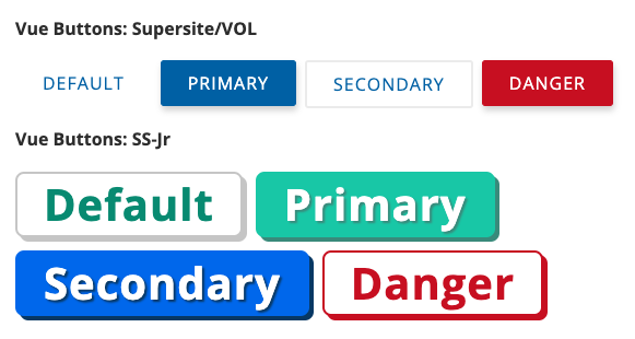
    There is also a Ruby snippet you can use, though it does not support the Junior theme, and the variant names are different. For more info, see
    [Button component helper](/music/styles/components?name=buttons).
  </p>
  */
  /*doc
  ---
  title: Media-Button
  name: 10-media-button
  category: Buttons
  ---

  <p>There is a Ruby snippet you can use that is recommended. For more info, see
  [Media Button helper](/music/styles/components?name=media_buttons).</p>

  */
  /*
      Default button

      Intentionally minimal: not intended for use without
      a theme.

  */
  /*doc
  ---
  title: No-Button
  name: 20-no-button
  category: Buttons
  ---

  `c-no-button` - BLOCK - Extends `<button>`

  Use this class instead of `c-button` to remove all styling from a `<button>`.

  ```html_example_table
<button type="button" class="c-no-button">Grok</button>
  ```
  */
  /*doc
  ---
  title: Button Group
  name: 30-button-group
  category: Buttons
  ---

  Groups a set of buttons. By default the group itself is inline.

  ```html_example

<div class="c-button-group  c-button-group--lt">
  <button class="c-button  c-button--primary" type="button">Save</button>
  <button class="c-button  c-button" type="button">Cancel</button>
</div>
```

**Multiple button groups:**

```html_example
<div class="u-bord-1  u-bord-dashed  u-bord-gray-c  u-pad-8  u-sp">
  <div class="c-button-group  c-button-group--lt">
    <button class="c-button  c-button--primary" type="button">Save</button>
    <button class="c-button  c-button" type="button">Cancel</button>
  </div>
</div>
<div class="u-bord-1  u-bord-dashed  u-bord-gray-c  u-pad-8  u-sp">
  <div class="c-button-group  c-button-group--lt">
    <button class="c-button  c-button--danger" type="button">Delete</button>
    <button class="c-button  c-button--danger" type="button">Pulverize</button>
  </div>
</div>
  ```
  
**Align buttons**

```html_example
<h4>Default (Right)</h4>

<div class="u-bord-1  u-bord-dashed  u-bord-gray-c  u-pad-8  u-sp">
  <div class="c-button-group  c-button-group--rt">
    <button class="c-button  c-button" type="button">Cancel</button>
    <button class="c-button  c-button--primary" type="button">Save</button>
  </div>
</div>

<h4>Left</h4>

<div class="u-bord-1  u-bord-dashed  u-bord-gray-c  u-pad-8  u-sp">
  <div class="c-button-group  c-button-group--lt">
    <button class="c-button  c-button--primary" type="button">Save</button>
    <button class="c-button  c-button" type="button">Cancel</button>
  </div>
</div>

<h4>Center</h4>

<div class="u-bord-1  u-bord-dashed  u-bord-gray-c  u-pad-8  u-sp">
  <div class="c-button-group  c-button-group--ctr">
    <button class="c-button  c-button--primary" type="button">Save</button>
    <button class="c-button  c-button" type="button">Cancel</button>
  </div>
</div>
  ```
  */
}

/* line 99, ../../../../usr/share/rvm/gems/ruby-3.3.8@ua/bundler/gems/music-c8c0015300a7/app/assets/stylesheets/music/library/v1/components/_buttons.scss */
.ns-music-v1 .c-button {
  color: #006bae;
  background: #fff;
  padding: 0.5rem 1.5rem;
  border: 0;
  border-radius: 0.1875rem;
  line-height: 1.5rem;
  cursor: pointer;
  text-transform: uppercase;
  letter-spacing: 0.0625rem;
  font-size: 0.875rem;
  transition: color 0.2s ease-in-out, border-color 0.2s ease-in-out, background-color 0.2s ease-in-out, box-shadow 0.2s ease-in-out;
  /* 
      In retrospect, this was a very bad idea;
      Let layout objects handle layout.
     */
  margin-right: 0.5rem;
}

/* line 80, ../../../../usr/share/rvm/gems/ruby-3.3.8@ua/bundler/gems/music-c8c0015300a7/app/assets/stylesheets/music/library/v1/components/_buttons.scss */
.ns-music-v1 .c-button[disabled], .ns-music-v1 .c-button.is-disabled {
  color: #ccc;
  cursor: not-allowed;
}

/* line 86, ../../../../usr/share/rvm/gems/ruby-3.3.8@ua/bundler/gems/music-c8c0015300a7/app/assets/stylesheets/music/library/v1/components/_buttons.scss */
.ns-music-v1 .c-button:hover {
  background: #f8f8f8;
}

/* line 108, ../../../../usr/share/rvm/gems/ruby-3.3.8@ua/bundler/gems/music-c8c0015300a7/app/assets/stylesheets/music/library/v1/components/_buttons.scss */
.ns-music-v1 .c-button[disabled] {
  background: transparent;
}

/* line 112, ../../../../usr/share/rvm/gems/ruby-3.3.8@ua/bundler/gems/music-c8c0015300a7/app/assets/stylesheets/music/library/v1/components/_buttons.scss */
.ns-music-v1 .c-button:last-child {
  margin-right: 0;
}

/* line 117, ../../../../usr/share/rvm/gems/ruby-3.3.8@ua/bundler/gems/music-c8c0015300a7/app/assets/stylesheets/music/library/v1/components/_buttons.scss */
.ns-music-v1 .c-button--primary {
  min-width: 8rem;
  color: #fff;
  background: #006bae;
  border: 0;
  box-shadow: 0.0625rem 0.25rem 0.375rem 0 rgba(0, 0, 0, 0.18);
}

/* line 124, ../../../../usr/share/rvm/gems/ruby-3.3.8@ua/bundler/gems/music-c8c0015300a7/app/assets/stylesheets/music/library/v1/components/_buttons.scss */
.ns-music-v1 .c-button--primary:hover {
  color: #fff;
  background: #004b7a;
  box-shadow: none;
}

/* line 130, ../../../../usr/share/rvm/gems/ruby-3.3.8@ua/bundler/gems/music-c8c0015300a7/app/assets/stylesheets/music/library/v1/components/_buttons.scss */
.ns-music-v1 .c-button--primary[disabled], .ns-music-v1 .c-button--primary.is-disabled {
  color: #fff;
  background: #ccc;
  box-shadow: none;
}

/* line 139, ../../../../usr/share/rvm/gems/ruby-3.3.8@ua/bundler/gems/music-c8c0015300a7/app/assets/stylesheets/music/library/v1/components/_buttons.scss */
.ns-music-v1 .c-button--danger {
  min-width: 8rem;
  color: #fff;
  background: #CE0C24;
  border: 0;
  box-shadow: 0.0625rem 0.25rem 0.375rem 0 rgba(0, 0, 0, 0.18);
}

/* line 146, ../../../../usr/share/rvm/gems/ruby-3.3.8@ua/bundler/gems/music-c8c0015300a7/app/assets/stylesheets/music/library/v1/components/_buttons.scss */
.ns-music-v1 .c-button--danger:hover {
  color: #fff;
  background: #9e091c;
  box-shadow: none;
}

/* line 152, ../../../../usr/share/rvm/gems/ruby-3.3.8@ua/bundler/gems/music-c8c0015300a7/app/assets/stylesheets/music/library/v1/components/_buttons.scss */
.ns-music-v1 .c-button--danger[disabled], .ns-music-v1 .c-button--danger.is-disabled {
  color: #fff;
  background: #ccc;
  box-shadow: none;
}

/* line 161, ../../../../usr/share/rvm/gems/ruby-3.3.8@ua/bundler/gems/music-c8c0015300a7/app/assets/stylesheets/music/library/v1/components/_buttons.scss */
.ns-music-v1 .c-button--border {
  min-width: 8rem;
  border: 0.0625rem solid #ddd;
}

/* line 183, ../../../../usr/share/rvm/gems/ruby-3.3.8@ua/bundler/gems/music-c8c0015300a7/app/assets/stylesheets/music/library/v1/components/_buttons.scss */
.ns-music-v1 .c-no-button {
  border: 0;
  background: transparent;
  border-radius: 0;
  padding: 0;
  cursor: pointer;
  color: #006bae;
  transition: color 0.2s ease-in-out, box-shadow 0.2s ease-in-out;
}

/* line 188, ../../../../usr/share/rvm/gems/ruby-3.3.8@ua/bundler/gems/music-c8c0015300a7/app/assets/stylesheets/music/library/v1/components/_buttons.scss */
.ns-music-v1 .c-no-button:hover:not([disabled]) {
  color: #004b7a;
  text-decoration: underline;
}

/* line 193, ../../../../usr/share/rvm/gems/ruby-3.3.8@ua/bundler/gems/music-c8c0015300a7/app/assets/stylesheets/music/library/v1/components/_buttons.scss */
.ns-music-v1 .c-no-button[disabled],
.ns-music-v1 .c-no-button .is-disabled, .ns-music-v1 .c-no-button[disabled] *, .ns-music-v1 .c-no-button.is-disabled * {
  color: #ccc;
  cursor: not-allowed;
}

/* line 200, ../../../../usr/share/rvm/gems/ruby-3.3.8@ua/bundler/gems/music-c8c0015300a7/app/assets/stylesheets/music/library/v1/components/_buttons.scss */
.ns-music-v1 .c-no-button[disabled]:hover,
.ns-music-v1 .c-no-button .is-disabled:hover, .ns-music-v1 .c-no-button[disabled] *:hover, .ns-music-v1 .c-no-button.is-disabled *:hover {
  outline: 0;
}

/* line 272, ../../../../usr/share/rvm/gems/ruby-3.3.8@ua/bundler/gems/music-c8c0015300a7/app/assets/stylesheets/music/library/v1/components/_buttons.scss */
.ns-music-v1 .c-button-group {
  display: flex;
  flex-direction: row;
  flex-wrap: wrap;
  gap: 0.5rem;
  justify-content: flex-start;
  align-items: flex-start;
  justify-content: flex-end;
  margin-bottom: 1rem;
}

/* line 277, ../../../../usr/share/rvm/gems/ruby-3.3.8@ua/bundler/gems/music-c8c0015300a7/app/assets/stylesheets/music/library/v1/components/_buttons.scss */
.ns-music-v1 .c-button-group > .c-button {
  /* Override a bad (old) rule on c-button: */
  margin-right: 0;
}

/* line 283, ../../../../usr/share/rvm/gems/ruby-3.3.8@ua/bundler/gems/music-c8c0015300a7/app/assets/stylesheets/music/library/v1/components/_buttons.scss */
.ns-music-v1 .c-button-group--rt {
  justify-content: flex-end;
}

/* line 287, ../../../../usr/share/rvm/gems/ruby-3.3.8@ua/bundler/gems/music-c8c0015300a7/app/assets/stylesheets/music/library/v1/components/_buttons.scss */
.ns-music-v1 .c-button-group--lt {
  justify-content: flex-start;
}

/* line 291, ../../../../usr/share/rvm/gems/ruby-3.3.8@ua/bundler/gems/music-c8c0015300a7/app/assets/stylesheets/music/library/v1/components/_buttons.scss */
.ns-music-v1 .c-button-group--ctr {
  justify-content: center;
}

/* line 295, ../../../../usr/share/rvm/gems/ruby-3.3.8@ua/bundler/gems/music-c8c0015300a7/app/assets/stylesheets/music/library/v1/components/_buttons.scss */
.ns-music-v1 .c-button-group--space-evenly {
  justify-content: space-evenly;
}

/* line 299, ../../../../usr/share/rvm/gems/ruby-3.3.8@ua/bundler/gems/music-c8c0015300a7/app/assets/stylesheets/music/library/v1/components/_buttons.scss */
.ns-music-v1 .c-button-group--space-between {
  justify-content: space-between;
}

/* end ns-music-v1 namespace */
/*
    Forms and Form Elements
*/
/*
    Base styles
    Non-code-outputting stylesheets required in every SCSS partial
*/
/*
    Color Palette

    This section is the only place where color codes should live;
    All other stylesheets should reference the color variables below.
    If you need to use a new color in the v1 namespace, submit it as
    an addition to v1.

 */
/*

    Color-related Functions

 */
/*

    Generate Colors

    For the purpose of generating tinted and shaded versions of base colors.

    Tint & Shade from Compass:
*/
/*
  tint: Mix a color with white.

  @access public
  @param {Color} $color - color to tint
  @param {Number} $percentage - percentage of `$color` in returned color
  @return {Color}
*/
/*
  shade: Mix a color with black

  @access public
  @param {Color} $color - color to shade
  @param {Number} $percentage - percentage of `$color` in returned color
  @return {Color}
*/
/*

  Improved versions of tint & shade:

*/
/*
  Slightly lighten a color - more accurate version of tint()
  Example: tint("#a20101", 90) --> #C12828

  @access public
  @param {Color} $color - color to tint
  @param {Number} $percentage - percentage by which to tint the given color.
  @return {Color}
 */
/*
  Slightly darken a color - more accurate version of shade()
  Example: shade("#a20101", 10) --> #830000

  @access public
  @param {Color} $color - color to shade
  @param {Number} $percentage - percentage by which to shade the given color.
  @return {Color}
 */
/*

  Length functions
  
 */
/*
    Relative pixels: express pixel-level measurements, automatically converted to rems. 
        Usage: `border-width: rpx(5)` => results in a 5px border if 1 rem = 16px. 
        Generated style will read: `border-width: 0.3125rem`.
  */
/*
     Abstract colors

     These colors are building blocks, assigned to more
     semantically-named color variables.

     NOTE: Sass likes to be loosey-goosey and not require you to
     quote strings. This never ends well; quote them anyway.

 */
/* ------- NO COLOR LITERALS beyond this point! ------ */
/* Deprecated */
/* Neutrals */
/* Colloquial grey aliases */
/* use instead of black generally */
/*
    Interface palette

    Specific color roles, used throughout components. Components may
    also name their own color variables, based on role or usage but
    they should all be aliases of colors in this file.
 */
/* Text colors */
/* Graphical element colors */
/* State and status colors */
/* Links */
/* Focus */
/* Shadows */
/* Calculate a transparent black from an opacity value: */
/* Animation shadows */
/* ======================================================================= *
    Units & Measures

    $mod is the basic unit of measurement for most things.
    Define measures using the mod() function and a multiplier.

    Examples:
      margin-right: mod(0.5);
      padding-bottom: mod(4);
    ...but evangelize the use of a small number of standard measures

    * Variables, placeholders and mixins only
    * Always favor @include [mixin] over @extend [class or placeholder].
    * The basic unit of measure, the mod (module), is based on 1rem, which
      is almost universally defined in browsers as 16px.
 * ======================================================================= */
/*

  Mod: return a multiple of the base unit $mod

*/
/*
  Relative pixels: express pixel-level measurements, automatically converted to rems.
      Usage: `border-width: rpx(5)` => results in a 5px border if 1 rem = 16px.
      Generated style will read: `border-width: 0.3125rem`.
*/
/* stylelint-disable unit-disallowed-list */
/* Use pixels for media queries. */
/* stylelint-enable unit-disallowed-list */
/* ======================================================================= *

    Typography

 * ======================================================================= */
/*
    Font-size scale: although the `$font-size-x` variables (below) cannot be generated from
    a list with Sass, this scale IS used to generate type utility classes.
 */
/*
    Font-size variables
    Number is pixel equivalent (assume `html {font-size: 16px}`)
*/
/* TODO: line-height should be set on body as (14 / 22) unitless.
   There are some feature styles that are using this 22px variable... */
/*
    List decoration styles:
 */
/*

  Layers

  Defines a named, fixed vocabulary of z-index values. Use `z` function to access.

  Usage: `.bingo:focus { z-index: z(focus); }`

  NOTE: only use a z-index if you absolutely need to!

 */
/* ======================================================================= *

    Effects

 * ======================================================================= */
/* =======================================================================

      Functions: Media Queries

      viewport-min() and viewport-max(). Use viewport-min() unless max is necessary.

*  ======================================================================= */
/**
 * viewport-min generates a media query applying to the given named breakpoint and all lower breakpoints.
 *
 * For example, `viewport-min(sm)` would apply to viewports 500px wide (the small breakpoint) and up. 
 *
 * Usage:
 * @include viewport-min('md') {
 *   -- styles for the medium breakpoint go here --
 * }
 *
 * @param  {String} $bp-name         The two-letter t-shirt size abbreviation of the breakpoint
 * @param  {Map} $breakpoint-set:    The set of breakpoints to use (default is the standard set
                                     defined in _units.scss)
 * @return {Sass}                    The media query, with the enclosed block of Sass included
 */
/**
 * viewport-max generates a media query applying to the given named breakpoint and all higher breakpoints.
 *
 * For example, `viewport-max(md)` would apply to viewports 700px wide (the medium breakpoint) and down. 
 * 
 * IMPORTANT: It is advised to take a "mobile-first" approach, and therefore to
 *            define styles at the minimum width first, then work your way up the breakpoints.
 *            Prefer **viewport-min()** over viewport-max(), unless it is absolutely needed.
 * 
 * Usage:
 * @include viewport-max('sm') {
 *   -- styles for the small breakpoint go here --
 * }
 *
 * @param  {String} $bp-name         The two-letter t-shirt size abbreviation of the breakpoint
 * @param  {Map} $breakpoint-set:    The set of breakpoints to use (default is the standard set
                                     defined in _units.scss)
 * @return {Sass}                    The media query, with the enclosed block of Sass included
 */
/*

    Color-related Functions

 */
/*

    Generate Colors

    For the purpose of generating tinted and shaded versions of base colors.

    Tint & Shade from Compass:
*/
/*
  tint: Mix a color with white.

  @access public
  @param {Color} $color - color to tint
  @param {Number} $percentage - percentage of `$color` in returned color
  @return {Color}
*/
/*
  shade: Mix a color with black

  @access public
  @param {Color} $color - color to shade
  @param {Number} $percentage - percentage of `$color` in returned color
  @return {Color}
*/
/*

  Improved versions of tint & shade:

*/
/*
  Slightly lighten a color - more accurate version of tint()
  Example: tint("#a20101", 90) --> #C12828

  @access public
  @param {Color} $color - color to tint
  @param {Number} $percentage - percentage by which to tint the given color.
  @return {Color}
 */
/*
  Slightly darken a color - more accurate version of shade()
  Example: shade("#a20101", 10) --> #830000

  @access public
  @param {Color} $color - color to shade
  @param {Number} $percentage - percentage by which to shade the given color.
  @return {Color}
 */
/*

  Length functions
  
 */
/*
    Relative pixels: express pixel-level measurements, automatically converted to rems. 
        Usage: `border-width: rpx(5)` => results in a 5px border if 1 rem = 16px. 
        Generated style will read: `border-width: 0.3125rem`.
  */
/*

  Layer functions

 */
/**
 * Given a layer name, return the corresponding z-index value.
 *
 * Usage:  `.bingo:focus { z-index: z(focus); }`
 *
 * @param  {String} $layer  A named z-layer on which to place an element.
 * @return {String}         A z-index value (numeric or 'auto').
 */
/* ---- Supply several property values based on icon size ---- */
/* ---- Legacy icon object: DEPRECATED ---- */
/* ---- Base icon object (embedded svg style) ---- */
/* =======================================================================

      Objects: Groups

*  ======================================================================= */
/* Deprecated: use line-layout() instead. */
/* =======================================================================

      Objects: Lists

*  ======================================================================= */
/*
    List-specific defaults:
*/
/*
    List-specific mixins:

    plain-list: Lists without bullets or left-padding.
    Indenting is added back for nested lists.
*/
/*
    bullet-list: Remove browser bullet style, add back via
    generated content. Allows for easy coloring/restyling of bullets,
    and flexible spacing of bullets and text.

    Note: offsets are relative to the left edge of the parent's content box.
*/
/* stylelint-disable no-empty-source */
/* =======================================================================

      Objects: Plain Button

*  ======================================================================= */
/*
  Between the default element styles and this mixin, all visual decoration
  is removed from the button, so you can use it to wrap arbitrary objects
  without affecting their appearance.
 */
/* =======================================================================

      Objects: Shapes

*  ======================================================================= */
/*
    Circle
*/
/*
    Square
*/
/* ========================================================== *

    Tools: Properties

    Mixins that lend characteristics to objects and components.

 * ========================================================== */
/*
    Standard block spacing
*/
/*
  fluid-img() - Responsive image sizing

  Applies to an image, svg, or other element with inherent height & width.

  The element will scale to the full width of its parent  (unless the inherent
  size of the element is smaller than that). Height will automatically scale to
  maintain the inherent aspect ratio of the image.
*/
/*

  Make an element horizontally flush with its container.
  Applied to a child element to overcomes its parent's
  horizontal padding.

  Standard padding is usually 16px. Specify a length to
  override the default.

 */
/*

  Extend an item's left & right edges a given amount out into
  its parent via negative marging, while adding an equal amount
  of padding to offset the difference.

 */
/*

  Make content invisible to the eye, but accessible by
  screen readers and other assistive tech.

  Uses several methods to make sure this happens in a
  performant way (i.e., don't create huge render areas, etc.)

  `!important` because it's used primarily as a utility class.

 */
/* stylelint-disable declaration-no-important */
/*
  Disable clickable things.
  */
/*
  Focus
*/
/*
  Apply `appearance` vendor prefixes

  Not a standard CSS property, so Autoprefixer doesn't apply.
 */
/*
  Theme Mixins

  -prepend-selector-chain - abstract base for "namespace"-type mixins.

  Breaks out of the current selector chain and prepends a selector.

  Don't use directly in component stylesheets; instead, use a special-purpose wrapper
  like `theme()`, below.

  @private
  @param $selector {String} - the selector to prepend onto the current selector chain.
      
  Usage:

  $selector is almost always a single class. This can be used to further qualify the selector chain by adding a class      
  to the _beginning_ of the chain. By default it will be bound to the current first item in the chain.
*/
/*doc
--- 
title: theme-mixin
name: theme-mixin
category: Mixins
---

Prepends a selector to the current selector chain. Any feature 
namespace, other body classes, or media queries will be preserved.

Helps keep a single source of truth for a key selector by
allowing theme styles to be nested _in context_ in the same block
as the base compoent or modifier.

Example, without the mixin:

To add a themed variant in this example, we have to break out of the nesting, 
then manually assert the theme class, feature namespace, component class, 
and pseudoclass, essentially duplicating the whole selector chain by hand,
which is prone to error.

```
.ns-flashcards { // topmost selector; could be on body or some page section.
  ...
  .c-gallery__image {
    border: rpx(4) solid $gray-e;

    &:hover {
      border-color: $gray-d;
    }
  }

  @at-root {
    .t-high-contrast.ns-flashcards .c-gallery__image:hover { // Ew.
      border-color: $dark-blue;
    }
  }
  ...
}
```

Now WITH the theme() mixin, we don't have to repeat selectors, and all the styles for 
.c-gallery__image are in one block (single source of truth). It's easier to understand
 the code, and the specificity is still as low as possible:

```
.ns-flashcards {
  ...
  .c-gallery__image {
    border: rpx(4) solid $gray-e;
    
    &:hover {
      border-color: $gray-d;

      @include theme('high-contrast') {
        border-color: $dark-blue;
      }
    }
  }
  ...
}

Resulting selector chain: 
.t-high-contrast.ns-flashcards .c-gallery-image:hover {...}
```

Note that the theme class is chained to the previously first element
in the chain, indicating that those two classes MUST be on the same element in order
for the styles to apply.

Use to include styles for a given theme class (e.g., 'vol', 'supersites', 'high-contrast').
The `.t-` prefix is added automatically.

This works only if we follow the convention of repeating the theme class on any library or
feature namespace element inside the body.

Usage example: 

```
.ns-flashcards {
  .c-card {
    display: inline-block;

    @include theme('supersites-jr') {
      background-color: $gray-9;
    }
  }
}
```

This code will be compiled to:

```
.ns-flashcards .c-card { display: inline-block; }

.t-supersites-jr.ns-flashcards .c-card { background-color: #999; }
```

And thus only affect the feature class when the selector chain is qualified by the theme class. The
benefit is that in the source file, all styles related to a component can be kept _with_ the component,
usually within a single block.
*/
/*doc
--- 
title: theme-opt-in
name: theme-opt-in-mixin
categerory: Mixins
--- 

Use for opting in a page fragment to a theme (rather than the entire page).

The theme-opt-in mixin is subtly different in that it puts a space between the theme
class and the rest of the selector:

```
.ns-open-ended-questions {
  .c-textarea {
    font-size: 1rem;

    @include theme-opt-in('supersites-jr') {
      font-size: var(--font-7);
    }
  }
}
```

This example generates the following CSS selector:

```
.t-supersites-jr .ns-open-ended-questions .c-textarea {...}
                ^ this space is the difference.
```

Now the theme class can stay on the body. This allows us to opt-in a subset
of the page without repeating the theme class.
*/
/*
    Base styles
    Non-code-outputting stylesheets required in every SCSS partial
*/
/*
    Color Palette

    This section is the only place where color codes should live;
    All other stylesheets should reference the color variables below.
    If you need to use a new color in the v1 namespace, submit it as
    an addition to v1.

 */
/*

    Color-related Functions

 */
/*

    Generate Colors

    For the purpose of generating tinted and shaded versions of base colors.

    Tint & Shade from Compass:
*/
/*
  tint: Mix a color with white.

  @access public
  @param {Color} $color - color to tint
  @param {Number} $percentage - percentage of `$color` in returned color
  @return {Color}
*/
/*
  shade: Mix a color with black

  @access public
  @param {Color} $color - color to shade
  @param {Number} $percentage - percentage of `$color` in returned color
  @return {Color}
*/
/*

  Improved versions of tint & shade:

*/
/*
  Slightly lighten a color - more accurate version of tint()
  Example: tint("#a20101", 90) --> #C12828

  @access public
  @param {Color} $color - color to tint
  @param {Number} $percentage - percentage by which to tint the given color.
  @return {Color}
 */
/*
  Slightly darken a color - more accurate version of shade()
  Example: shade("#a20101", 10) --> #830000

  @access public
  @param {Color} $color - color to shade
  @param {Number} $percentage - percentage by which to shade the given color.
  @return {Color}
 */
/*

  Length functions
  
 */
/*
    Relative pixels: express pixel-level measurements, automatically converted to rems. 
        Usage: `border-width: rpx(5)` => results in a 5px border if 1 rem = 16px. 
        Generated style will read: `border-width: 0.3125rem`.
  */
/*
     Abstract colors

     These colors are building blocks, assigned to more
     semantically-named color variables.

     NOTE: Sass likes to be loosey-goosey and not require you to
     quote strings. This never ends well; quote them anyway.

 */
/* ------- NO COLOR LITERALS beyond this point! ------ */
/* Deprecated */
/* Neutrals */
/* Colloquial grey aliases */
/* use instead of black generally */
/*
    Interface palette

    Specific color roles, used throughout components. Components may
    also name their own color variables, based on role or usage but
    they should all be aliases of colors in this file.
 */
/* Text colors */
/* Graphical element colors */
/* State and status colors */
/* Links */
/* Focus */
/* Shadows */
/* Calculate a transparent black from an opacity value: */
/* Animation shadows */
/* ======================================================================= *
    Units & Measures

    $mod is the basic unit of measurement for most things.
    Define measures using the mod() function and a multiplier.

    Examples:
      margin-right: mod(0.5);
      padding-bottom: mod(4);
    ...but evangelize the use of a small number of standard measures

    * Variables, placeholders and mixins only
    * Always favor @include [mixin] over @extend [class or placeholder].
    * The basic unit of measure, the mod (module), is based on 1rem, which
      is almost universally defined in browsers as 16px.
 * ======================================================================= */
/*

  Mod: return a multiple of the base unit $mod

*/
/*
  Relative pixels: express pixel-level measurements, automatically converted to rems.
      Usage: `border-width: rpx(5)` => results in a 5px border if 1 rem = 16px.
      Generated style will read: `border-width: 0.3125rem`.
*/
/* stylelint-disable unit-disallowed-list */
/* Use pixels for media queries. */
/* stylelint-enable unit-disallowed-list */
/* ======================================================================= *

    Typography

 * ======================================================================= */
/*
    Font-size scale: although the `$font-size-x` variables (below) cannot be generated from
    a list with Sass, this scale IS used to generate type utility classes.
 */
/*
    Font-size variables
    Number is pixel equivalent (assume `html {font-size: 16px}`)
*/
/* TODO: line-height should be set on body as (14 / 22) unitless.
   There are some feature styles that are using this 22px variable... */
/*
    List decoration styles:
 */
/*

  Layers

  Defines a named, fixed vocabulary of z-index values. Use `z` function to access.

  Usage: `.bingo:focus { z-index: z(focus); }`

  NOTE: only use a z-index if you absolutely need to!

 */
/* ======================================================================= *

    Effects

 * ======================================================================= */
/* =======================================================================

      Functions: Media Queries

      viewport-min() and viewport-max(). Use viewport-min() unless max is necessary.

*  ======================================================================= */
/**
 * viewport-min generates a media query applying to the given named breakpoint and all lower breakpoints.
 *
 * For example, `viewport-min(sm)` would apply to viewports 500px wide (the small breakpoint) and up. 
 *
 * Usage:
 * @include viewport-min('md') {
 *   -- styles for the medium breakpoint go here --
 * }
 *
 * @param  {String} $bp-name         The two-letter t-shirt size abbreviation of the breakpoint
 * @param  {Map} $breakpoint-set:    The set of breakpoints to use (default is the standard set
                                     defined in _units.scss)
 * @return {Sass}                    The media query, with the enclosed block of Sass included
 */
/**
 * viewport-max generates a media query applying to the given named breakpoint and all higher breakpoints.
 *
 * For example, `viewport-max(md)` would apply to viewports 700px wide (the medium breakpoint) and down. 
 * 
 * IMPORTANT: It is advised to take a "mobile-first" approach, and therefore to
 *            define styles at the minimum width first, then work your way up the breakpoints.
 *            Prefer **viewport-min()** over viewport-max(), unless it is absolutely needed.
 * 
 * Usage:
 * @include viewport-max('sm') {
 *   -- styles for the small breakpoint go here --
 * }
 *
 * @param  {String} $bp-name         The two-letter t-shirt size abbreviation of the breakpoint
 * @param  {Map} $breakpoint-set:    The set of breakpoints to use (default is the standard set
                                     defined in _units.scss)
 * @return {Sass}                    The media query, with the enclosed block of Sass included
 */
/*

    Color-related Functions

 */
/*

    Generate Colors

    For the purpose of generating tinted and shaded versions of base colors.

    Tint & Shade from Compass:
*/
/*
  tint: Mix a color with white.

  @access public
  @param {Color} $color - color to tint
  @param {Number} $percentage - percentage of `$color` in returned color
  @return {Color}
*/
/*
  shade: Mix a color with black

  @access public
  @param {Color} $color - color to shade
  @param {Number} $percentage - percentage of `$color` in returned color
  @return {Color}
*/
/*

  Improved versions of tint & shade:

*/
/*
  Slightly lighten a color - more accurate version of tint()
  Example: tint("#a20101", 90) --> #C12828

  @access public
  @param {Color} $color - color to tint
  @param {Number} $percentage - percentage by which to tint the given color.
  @return {Color}
 */
/*
  Slightly darken a color - more accurate version of shade()
  Example: shade("#a20101", 10) --> #830000

  @access public
  @param {Color} $color - color to shade
  @param {Number} $percentage - percentage by which to shade the given color.
  @return {Color}
 */
/*

  Length functions
  
 */
/*
    Relative pixels: express pixel-level measurements, automatically converted to rems. 
        Usage: `border-width: rpx(5)` => results in a 5px border if 1 rem = 16px. 
        Generated style will read: `border-width: 0.3125rem`.
  */
/*

  Layer functions

 */
/**
 * Given a layer name, return the corresponding z-index value.
 *
 * Usage:  `.bingo:focus { z-index: z(focus); }`
 *
 * @param  {String} $layer  A named z-layer on which to place an element.
 * @return {String}         A z-index value (numeric or 'auto').
 */
/* ---- Supply several property values based on icon size ---- */
/* ---- Legacy icon object: DEPRECATED ---- */
/* ---- Base icon object (embedded svg style) ---- */
/* =======================================================================

      Objects: Groups

*  ======================================================================= */
/* Deprecated: use line-layout() instead. */
/* =======================================================================

      Objects: Lists

*  ======================================================================= */
/*
    List-specific defaults:
*/
/*
    List-specific mixins:

    plain-list: Lists without bullets or left-padding.
    Indenting is added back for nested lists.
*/
/*
    bullet-list: Remove browser bullet style, add back via
    generated content. Allows for easy coloring/restyling of bullets,
    and flexible spacing of bullets and text.

    Note: offsets are relative to the left edge of the parent's content box.
*/
/* stylelint-disable no-empty-source */
/* =======================================================================

      Objects: Plain Button

*  ======================================================================= */
/*
  Between the default element styles and this mixin, all visual decoration
  is removed from the button, so you can use it to wrap arbitrary objects
  without affecting their appearance.
 */
/* =======================================================================

      Objects: Shapes

*  ======================================================================= */
/*
    Circle
*/
/*
    Square
*/
/* ========================================================== *

    Tools: Properties

    Mixins that lend characteristics to objects and components.

 * ========================================================== */
/*
    Standard block spacing
*/
/*
  fluid-img() - Responsive image sizing

  Applies to an image, svg, or other element with inherent height & width.

  The element will scale to the full width of its parent  (unless the inherent
  size of the element is smaller than that). Height will automatically scale to
  maintain the inherent aspect ratio of the image.
*/
/*

  Make an element horizontally flush with its container.
  Applied to a child element to overcomes its parent's
  horizontal padding.

  Standard padding is usually 16px. Specify a length to
  override the default.

 */
/*

  Extend an item's left & right edges a given amount out into
  its parent via negative marging, while adding an equal amount
  of padding to offset the difference.

 */
/*

  Make content invisible to the eye, but accessible by
  screen readers and other assistive tech.

  Uses several methods to make sure this happens in a
  performant way (i.e., don't create huge render areas, etc.)

  `!important` because it's used primarily as a utility class.

 */
/* stylelint-disable declaration-no-important */
/*
  Disable clickable things.
  */
/*
  Focus
*/
/*
  Apply `appearance` vendor prefixes

  Not a standard CSS property, so Autoprefixer doesn't apply.
 */
/*
  Theme Mixins

  -prepend-selector-chain - abstract base for "namespace"-type mixins.

  Breaks out of the current selector chain and prepends a selector.

  Don't use directly in component stylesheets; instead, use a special-purpose wrapper
  like `theme()`, below.

  @private
  @param $selector {String} - the selector to prepend onto the current selector chain.
      
  Usage:

  $selector is almost always a single class. This can be used to further qualify the selector chain by adding a class      
  to the _beginning_ of the chain. By default it will be bound to the current first item in the chain.
*/
/*doc
--- 
title: theme-mixin
name: theme-mixin
category: Mixins
---

Prepends a selector to the current selector chain. Any feature 
namespace, other body classes, or media queries will be preserved.

Helps keep a single source of truth for a key selector by
allowing theme styles to be nested _in context_ in the same block
as the base compoent or modifier.

Example, without the mixin:

To add a themed variant in this example, we have to break out of the nesting, 
then manually assert the theme class, feature namespace, component class, 
and pseudoclass, essentially duplicating the whole selector chain by hand,
which is prone to error.

```
.ns-flashcards { // topmost selector; could be on body or some page section.
  ...
  .c-gallery__image {
    border: rpx(4) solid $gray-e;

    &:hover {
      border-color: $gray-d;
    }
  }

  @at-root {
    .t-high-contrast.ns-flashcards .c-gallery__image:hover { // Ew.
      border-color: $dark-blue;
    }
  }
  ...
}
```

Now WITH the theme() mixin, we don't have to repeat selectors, and all the styles for 
.c-gallery__image are in one block (single source of truth). It's easier to understand
 the code, and the specificity is still as low as possible:

```
.ns-flashcards {
  ...
  .c-gallery__image {
    border: rpx(4) solid $gray-e;
    
    &:hover {
      border-color: $gray-d;

      @include theme('high-contrast') {
        border-color: $dark-blue;
      }
    }
  }
  ...
}

Resulting selector chain: 
.t-high-contrast.ns-flashcards .c-gallery-image:hover {...}
```

Note that the theme class is chained to the previously first element
in the chain, indicating that those two classes MUST be on the same element in order
for the styles to apply.

Use to include styles for a given theme class (e.g., 'vol', 'supersites', 'high-contrast').
The `.t-` prefix is added automatically.

This works only if we follow the convention of repeating the theme class on any library or
feature namespace element inside the body.

Usage example: 

```
.ns-flashcards {
  .c-card {
    display: inline-block;

    @include theme('supersites-jr') {
      background-color: $gray-9;
    }
  }
}
```

This code will be compiled to:

```
.ns-flashcards .c-card { display: inline-block; }

.t-supersites-jr.ns-flashcards .c-card { background-color: #999; }
```

And thus only affect the feature class when the selector chain is qualified by the theme class. The
benefit is that in the source file, all styles related to a component can be kept _with_ the component,
usually within a single block.
*/
/*doc
--- 
title: theme-opt-in
name: theme-opt-in-mixin
categerory: Mixins
--- 

Use for opting in a page fragment to a theme (rather than the entire page).

The theme-opt-in mixin is subtly different in that it puts a space between the theme
class and the rest of the selector:

```
.ns-open-ended-questions {
  .c-textarea {
    font-size: 1rem;

    @include theme-opt-in('supersites-jr') {
      font-size: var(--font-7);
    }
  }
}
```

This example generates the following CSS selector:

```
.t-supersites-jr .ns-open-ended-questions .c-textarea {...}
                ^ this space is the difference.
```

Now the theme class can stay on the body. This allows us to opt-in a subset
of the page without repeating the theme class.
*/
/* ======================================================================= *

    File Input

 * ======================================================================= */
/* ======================================================================= *

      Checkboxes & Radio Buttons

      Custom & accessible.

 * ======================================================================= */
/* line 12, ../../../../usr/share/rvm/gems/ruby-3.3.8@ua/bundler/gems/music-c8c0015300a7/app/assets/stylesheets/music/library/v1/components/forms/_checkboxes_radios.scss */
.ns-music-v1 {
  /*doc
  ---
  title: Checkboxes
  name: forms-10-checkbox
  category: Form Elements
  ---

  * Put the label __after__ the checkbox.
  * Associate the two with a unique id.
  * The label references the checkbox's id with the `for` attribute.

  ```html_example
  <h4>Choose Services</h4>
  <div class="c-form-item">
    <input class="c-form-item__checkbox" type="checkbox" id="demo1">
    <label class="c-form-item__label" for="demo1">
      Cut $30
    </label>
  </div>
  <div class="c-form-item">
    <input class="c-form-item__checkbox" type="checkbox" id="demo2" checked>
    <label class="c-form-item__label" for="demo2">
      Brush Shampoo Rinse Dry Shampoo again Rinse Dry Color Freeze-dry Rinse
      Shampoo Rinse Dry Muss Brush Cut (House Specialty) $500
    </label>
  </div>
  <div class="c-form-item">
    <input class="c-form-item__checkbox" type="checkbox" id="demo3" disabled>
    <label class="c-form-item__label" for="demo3">
      Perm $80
    </label>
  </div>
  <div class="c-form-item">
    <input class="c-form-item__checkbox" type="checkbox" id="demo4" checked disabled>
    <label class="c-form-item__label" for="demo4">
      Wash $0
    </label>
  </div>
  ```

  */
  /*doc
  ---
  title: Radio Buttons
  name: forms-20-radios
  category: Form Elements
  ---

  * Put the label __after__ the radio button.
  * Associate the two with a unique id.
  * The label references the radio's id with the `for` attribute.
  * Group radio button choices with the `name` attribute

  ```html_example
  <h3>Radio buttons</h3>
  <div class="c-form-item">
    <input class="c-form-item__radio" type="radio" name="color" id="color_blue">
    <label class="c-form-item__label" for="color_blue">Bluish-purplish, with a touch of seagreen, almost turqoise. Or brown, even. Pinkish? Nevermind, it's just gray!!</label>
  </div>
  <div class="c-form-item">
    <input class="c-form-item__radio" type="radio" name="color" id="color_red" checked>
    <label class="c-form-item__label" for="color_red">Red</label>
  </div>
  <div class="c-form-item">
    <input class="c-form-item__radio" type="radio" name="color" id="color_green" disabled>
    <label class="c-form-item__label" for="color_green">Green</label>
  </div>
  <div class="c-form-item">
    <input class="c-form-item__radio" type="radio" name="color" id="color_yellow" disabled>
    <label class="c-form-item__label" for="color_yellow">Yellow</label>
  </div>
  ```

  */
}

/* line 13, ../../../../usr/share/rvm/gems/ruby-3.3.8@ua/bundler/gems/music-c8c0015300a7/app/assets/stylesheets/music/library/v1/components/forms/_checkboxes_radios.scss */
.ns-music-v1 .c-form-item__label {
  font-size: 0.875rem;
}

/* line 17, ../../../../usr/share/rvm/gems/ruby-3.3.8@ua/bundler/gems/music-c8c0015300a7/app/assets/stylesheets/music/library/v1/components/forms/_checkboxes_radios.scss */
.ns-music-v1 .c-form-item__checkbox,
.ns-music-v1 .c-form-item__checkbox + .c-form-item__label,
.ns-music-v1 .c-form-item__radio,
.ns-music-v1 .c-form-item__radio + .c-form-item__label {
  font-weight: normal;
  line-height: 1.5rem;
  display: inline-block;
  vertical-align: middle;
  margin-bottom: 0.25rem;
}

/* line 71, ../../../../usr/share/rvm/gems/ruby-3.3.8@ua/bundler/gems/music-c8c0015300a7/app/assets/stylesheets/music/library/v1/components/forms/_checkboxes_radios.scss */
.ns-music-v1 .c-form-item__checkbox, .ns-music-v1 .c-form-item__radio {
  border: 0 !important;
  clip: rect(0 0 0 0) !important;
  height: 0.0625rem !important;
  margin: -0.0625rem !important;
  overflow: hidden !important;
  padding: 0 !important;
  position: absolute !important;
  width: 0.0625rem !important;
}

/* line 74, ../../../../usr/share/rvm/gems/ruby-3.3.8@ua/bundler/gems/music-c8c0015300a7/app/assets/stylesheets/music/library/v1/components/forms/_checkboxes_radios.scss */
.ns-music-v1 .c-form-item__checkbox + .c-form-item__label, .ns-music-v1 .c-form-item__radio + .c-form-item__label {
  position: relative;
  transition: color 0.3s;
  padding: 0.25rem 0.25rem 0.25rem 2.25rem;
}

/* line 80, ../../../../usr/share/rvm/gems/ruby-3.3.8@ua/bundler/gems/music-c8c0015300a7/app/assets/stylesheets/music/library/v1/components/forms/_checkboxes_radios.scss */
.ns-music-v1 .c-form-item__checkbox + .c-form-item__label::before, .ns-music-v1 .c-form-item__checkbox + .c-form-item__label::after, .ns-music-v1 .c-form-item__radio + .c-form-item__label::before, .ns-music-v1 .c-form-item__radio + .c-form-item__label::after {
  content: '';
  position: absolute;
  height: 1.5rem;
  width: 1.5rem;
}

/* line 88, ../../../../usr/share/rvm/gems/ruby-3.3.8@ua/bundler/gems/music-c8c0015300a7/app/assets/stylesheets/music/library/v1/components/forms/_checkboxes_radios.scss */
.ns-music-v1 .c-form-item__checkbox + .c-form-item__label::before, .ns-music-v1 .c-form-item__radio + .c-form-item__label::before {
  left: 0.25rem;
  display: inline-block;
  margin-right: 0.5rem;
  background: #fff;
  border: 0.0625rem solid #8e8e8e;
  transition: border 0.3s;
}

/* line 97, ../../../../usr/share/rvm/gems/ruby-3.3.8@ua/bundler/gems/music-c8c0015300a7/app/assets/stylesheets/music/library/v1/components/forms/_checkboxes_radios.scss */
.ns-music-v1 .c-form-item__checkbox + .c-form-item__label::after, .ns-music-v1 .c-form-item__radio + .c-form-item__label::after {
  top: 0.25rem;
  left: 0.25rem;
  display: block;
  background-image: url(/assets/music/icons/check-651aace7e9b5960145d405501c81bc26d4537c5b396b584957c41e3226b4e9bd.svg);
  background-size: 100% 100%;
  opacity: 0;
  transition: opacity 0.2s;
}

/* line 109, ../../../../usr/share/rvm/gems/ruby-3.3.8@ua/bundler/gems/music-c8c0015300a7/app/assets/stylesheets/music/library/v1/components/forms/_checkboxes_radios.scss */
.ns-music-v1 .c-form-item__checkbox:checked + .c-form-item__label::after, .ns-music-v1 .c-form-item__radio:checked + .c-form-item__label::after {
  opacity: 1;
}

/* line 114, ../../../../usr/share/rvm/gems/ruby-3.3.8@ua/bundler/gems/music-c8c0015300a7/app/assets/stylesheets/music/library/v1/components/forms/_checkboxes_radios.scss */
.ns-music-v1 .c-form-item__checkbox:disabled + .c-form-item__label, .ns-music-v1 .c-form-item__radio:disabled + .c-form-item__label {
  cursor: default;
  opacity: 0.4;
}

/* line 118, ../../../../usr/share/rvm/gems/ruby-3.3.8@ua/bundler/gems/music-c8c0015300a7/app/assets/stylesheets/music/library/v1/components/forms/_checkboxes_radios.scss */
.ns-music-v1 .c-form-item__checkbox:disabled + .c-form-item__label::before, .ns-music-v1 .c-form-item__radio:disabled + .c-form-item__label::before {
  border-color: #ccc;
}

/* line 122, ../../../../usr/share/rvm/gems/ruby-3.3.8@ua/bundler/gems/music-c8c0015300a7/app/assets/stylesheets/music/library/v1/components/forms/_checkboxes_radios.scss */
.ns-music-v1 .c-form-item__checkbox:disabled + .c-form-item__label:hover, .ns-music-v1 .c-form-item__radio:disabled + .c-form-item__label:hover {
  color: #333;
}

/* line 127, ../../../../usr/share/rvm/gems/ruby-3.3.8@ua/bundler/gems/music-c8c0015300a7/app/assets/stylesheets/music/library/v1/components/forms/_checkboxes_radios.scss */
.ns-music-v1 .c-form-item__checkbox:disabled:hover + .c-form-item__label::before, .ns-music-v1 .c-form-item__radio:disabled:hover + .c-form-item__label::before {
  border-color: #ccc;
}

/* line 133, ../../../../usr/share/rvm/gems/ruby-3.3.8@ua/bundler/gems/music-c8c0015300a7/app/assets/stylesheets/music/library/v1/components/forms/_checkboxes_radios.scss */
.ns-music-v1 .c-form-item__checkbox:hover + .c-form-item__label::before, .ns-music-v1 .c-form-item__radio:hover + .c-form-item__label::before {
  border-color: #333;
  outline: 0;
}

/* line 178, ../../../../usr/share/rvm/gems/ruby-3.3.8@ua/bundler/gems/music-c8c0015300a7/app/assets/stylesheets/music/library/v1/components/forms/_checkboxes_radios.scss */
.ns-music-v1 .c-form-item__radio + .c-form-item__label {
  padding: 0.25rem 0.25rem 0.25rem 2rem;
}

/* line 181, ../../../../usr/share/rvm/gems/ruby-3.3.8@ua/bundler/gems/music-c8c0015300a7/app/assets/stylesheets/music/library/v1/components/forms/_checkboxes_radios.scss */
.ns-music-v1 .c-form-item__radio + .c-form-item__label::before, .ns-music-v1 .c-form-item__radio + .c-form-item__label::after {
  border-radius: 50%;
  top: 0.375rem;
}

/* line 188, ../../../../usr/share/rvm/gems/ruby-3.3.8@ua/bundler/gems/music-c8c0015300a7/app/assets/stylesheets/music/library/v1/components/forms/_checkboxes_radios.scss */
.ns-music-v1 .c-form-item__radio + .c-form-item__label::before {
  width: 1.25rem;
  height: 1.25rem;
}

/* line 194, ../../../../usr/share/rvm/gems/ruby-3.3.8@ua/bundler/gems/music-c8c0015300a7/app/assets/stylesheets/music/library/v1/components/forms/_checkboxes_radios.scss */
.ns-music-v1 .c-form-item__radio + .c-form-item__label::after {
  top: 0.625rem;
  left: 0.5rem;
  width: 0.75rem;
  height: 0.75rem;
  background: #333 none;
  transition: opacity 0.2s;
  opacity: 0;
}

/* line 206, ../../../../usr/share/rvm/gems/ruby-3.3.8@ua/bundler/gems/music-c8c0015300a7/app/assets/stylesheets/music/library/v1/components/forms/_checkboxes_radios.scss */
.ns-music-v1 .c-form-item__radio:checked + .c-form-item__label::after {
  opacity: 1;
}

/*
    Base styles
    Non-code-outputting stylesheets required in every SCSS partial
*/
/*
    Color Palette

    This section is the only place where color codes should live;
    All other stylesheets should reference the color variables below.
    If you need to use a new color in the v1 namespace, submit it as
    an addition to v1.

 */
/*

    Color-related Functions

 */
/*

    Generate Colors

    For the purpose of generating tinted and shaded versions of base colors.

    Tint & Shade from Compass:
*/
/*
  tint: Mix a color with white.

  @access public
  @param {Color} $color - color to tint
  @param {Number} $percentage - percentage of `$color` in returned color
  @return {Color}
*/
/*
  shade: Mix a color with black

  @access public
  @param {Color} $color - color to shade
  @param {Number} $percentage - percentage of `$color` in returned color
  @return {Color}
*/
/*

  Improved versions of tint & shade:

*/
/*
  Slightly lighten a color - more accurate version of tint()
  Example: tint("#a20101", 90) --> #C12828

  @access public
  @param {Color} $color - color to tint
  @param {Number} $percentage - percentage by which to tint the given color.
  @return {Color}
 */
/*
  Slightly darken a color - more accurate version of shade()
  Example: shade("#a20101", 10) --> #830000

  @access public
  @param {Color} $color - color to shade
  @param {Number} $percentage - percentage by which to shade the given color.
  @return {Color}
 */
/*

  Length functions
  
 */
/*
    Relative pixels: express pixel-level measurements, automatically converted to rems. 
        Usage: `border-width: rpx(5)` => results in a 5px border if 1 rem = 16px. 
        Generated style will read: `border-width: 0.3125rem`.
  */
/*
     Abstract colors

     These colors are building blocks, assigned to more
     semantically-named color variables.

     NOTE: Sass likes to be loosey-goosey and not require you to
     quote strings. This never ends well; quote them anyway.

 */
/* ------- NO COLOR LITERALS beyond this point! ------ */
/* Deprecated */
/* Neutrals */
/* Colloquial grey aliases */
/* use instead of black generally */
/*
    Interface palette

    Specific color roles, used throughout components. Components may
    also name their own color variables, based on role or usage but
    they should all be aliases of colors in this file.
 */
/* Text colors */
/* Graphical element colors */
/* State and status colors */
/* Links */
/* Focus */
/* Shadows */
/* Calculate a transparent black from an opacity value: */
/* Animation shadows */
/* ======================================================================= *
    Units & Measures

    $mod is the basic unit of measurement for most things.
    Define measures using the mod() function and a multiplier.

    Examples:
      margin-right: mod(0.5);
      padding-bottom: mod(4);
    ...but evangelize the use of a small number of standard measures

    * Variables, placeholders and mixins only
    * Always favor @include [mixin] over @extend [class or placeholder].
    * The basic unit of measure, the mod (module), is based on 1rem, which
      is almost universally defined in browsers as 16px.
 * ======================================================================= */
/*

  Mod: return a multiple of the base unit $mod

*/
/*
  Relative pixels: express pixel-level measurements, automatically converted to rems.
      Usage: `border-width: rpx(5)` => results in a 5px border if 1 rem = 16px.
      Generated style will read: `border-width: 0.3125rem`.
*/
/* stylelint-disable unit-disallowed-list */
/* Use pixels for media queries. */
/* stylelint-enable unit-disallowed-list */
/* ======================================================================= *

    Typography

 * ======================================================================= */
/*
    Font-size scale: although the `$font-size-x` variables (below) cannot be generated from
    a list with Sass, this scale IS used to generate type utility classes.
 */
/*
    Font-size variables
    Number is pixel equivalent (assume `html {font-size: 16px}`)
*/
/* TODO: line-height should be set on body as (14 / 22) unitless.
   There are some feature styles that are using this 22px variable... */
/*
    List decoration styles:
 */
/*

  Layers

  Defines a named, fixed vocabulary of z-index values. Use `z` function to access.

  Usage: `.bingo:focus { z-index: z(focus); }`

  NOTE: only use a z-index if you absolutely need to!

 */
/* ======================================================================= *

    Effects

 * ======================================================================= */
/* =======================================================================

      Functions: Media Queries

      viewport-min() and viewport-max(). Use viewport-min() unless max is necessary.

*  ======================================================================= */
/**
 * viewport-min generates a media query applying to the given named breakpoint and all lower breakpoints.
 *
 * For example, `viewport-min(sm)` would apply to viewports 500px wide (the small breakpoint) and up. 
 *
 * Usage:
 * @include viewport-min('md') {
 *   -- styles for the medium breakpoint go here --
 * }
 *
 * @param  {String} $bp-name         The two-letter t-shirt size abbreviation of the breakpoint
 * @param  {Map} $breakpoint-set:    The set of breakpoints to use (default is the standard set
                                     defined in _units.scss)
 * @return {Sass}                    The media query, with the enclosed block of Sass included
 */
/**
 * viewport-max generates a media query applying to the given named breakpoint and all higher breakpoints.
 *
 * For example, `viewport-max(md)` would apply to viewports 700px wide (the medium breakpoint) and down. 
 * 
 * IMPORTANT: It is advised to take a "mobile-first" approach, and therefore to
 *            define styles at the minimum width first, then work your way up the breakpoints.
 *            Prefer **viewport-min()** over viewport-max(), unless it is absolutely needed.
 * 
 * Usage:
 * @include viewport-max('sm') {
 *   -- styles for the small breakpoint go here --
 * }
 *
 * @param  {String} $bp-name         The two-letter t-shirt size abbreviation of the breakpoint
 * @param  {Map} $breakpoint-set:    The set of breakpoints to use (default is the standard set
                                     defined in _units.scss)
 * @return {Sass}                    The media query, with the enclosed block of Sass included
 */
/*

    Color-related Functions

 */
/*

    Generate Colors

    For the purpose of generating tinted and shaded versions of base colors.

    Tint & Shade from Compass:
*/
/*
  tint: Mix a color with white.

  @access public
  @param {Color} $color - color to tint
  @param {Number} $percentage - percentage of `$color` in returned color
  @return {Color}
*/
/*
  shade: Mix a color with black

  @access public
  @param {Color} $color - color to shade
  @param {Number} $percentage - percentage of `$color` in returned color
  @return {Color}
*/
/*

  Improved versions of tint & shade:

*/
/*
  Slightly lighten a color - more accurate version of tint()
  Example: tint("#a20101", 90) --> #C12828

  @access public
  @param {Color} $color - color to tint
  @param {Number} $percentage - percentage by which to tint the given color.
  @return {Color}
 */
/*
  Slightly darken a color - more accurate version of shade()
  Example: shade("#a20101", 10) --> #830000

  @access public
  @param {Color} $color - color to shade
  @param {Number} $percentage - percentage by which to shade the given color.
  @return {Color}
 */
/*

  Length functions
  
 */
/*
    Relative pixels: express pixel-level measurements, automatically converted to rems. 
        Usage: `border-width: rpx(5)` => results in a 5px border if 1 rem = 16px. 
        Generated style will read: `border-width: 0.3125rem`.
  */
/*

  Layer functions

 */
/**
 * Given a layer name, return the corresponding z-index value.
 *
 * Usage:  `.bingo:focus { z-index: z(focus); }`
 *
 * @param  {String} $layer  A named z-layer on which to place an element.
 * @return {String}         A z-index value (numeric or 'auto').
 */
/* ---- Supply several property values based on icon size ---- */
/* ---- Legacy icon object: DEPRECATED ---- */
/* ---- Base icon object (embedded svg style) ---- */
/* =======================================================================

      Objects: Groups

*  ======================================================================= */
/* Deprecated: use line-layout() instead. */
/* =======================================================================

      Objects: Lists

*  ======================================================================= */
/*
    List-specific defaults:
*/
/*
    List-specific mixins:

    plain-list: Lists without bullets or left-padding.
    Indenting is added back for nested lists.
*/
/*
    bullet-list: Remove browser bullet style, add back via
    generated content. Allows for easy coloring/restyling of bullets,
    and flexible spacing of bullets and text.

    Note: offsets are relative to the left edge of the parent's content box.
*/
/* stylelint-disable no-empty-source */
/* =======================================================================

      Objects: Plain Button

*  ======================================================================= */
/*
  Between the default element styles and this mixin, all visual decoration
  is removed from the button, so you can use it to wrap arbitrary objects
  without affecting their appearance.
 */
/* =======================================================================

      Objects: Shapes

*  ======================================================================= */
/*
    Circle
*/
/*
    Square
*/
/* ========================================================== *

    Tools: Properties

    Mixins that lend characteristics to objects and components.

 * ========================================================== */
/*
    Standard block spacing
*/
/*
  fluid-img() - Responsive image sizing

  Applies to an image, svg, or other element with inherent height & width.

  The element will scale to the full width of its parent  (unless the inherent
  size of the element is smaller than that). Height will automatically scale to
  maintain the inherent aspect ratio of the image.
*/
/*

  Make an element horizontally flush with its container.
  Applied to a child element to overcomes its parent's
  horizontal padding.

  Standard padding is usually 16px. Specify a length to
  override the default.

 */
/*

  Extend an item's left & right edges a given amount out into
  its parent via negative marging, while adding an equal amount
  of padding to offset the difference.

 */
/*

  Make content invisible to the eye, but accessible by
  screen readers and other assistive tech.

  Uses several methods to make sure this happens in a
  performant way (i.e., don't create huge render areas, etc.)

  `!important` because it's used primarily as a utility class.

 */
/* stylelint-disable declaration-no-important */
/*
  Disable clickable things.
  */
/*
  Focus
*/
/*
  Apply `appearance` vendor prefixes

  Not a standard CSS property, so Autoprefixer doesn't apply.
 */
/*
  Theme Mixins

  -prepend-selector-chain - abstract base for "namespace"-type mixins.

  Breaks out of the current selector chain and prepends a selector.

  Don't use directly in component stylesheets; instead, use a special-purpose wrapper
  like `theme()`, below.

  @private
  @param $selector {String} - the selector to prepend onto the current selector chain.
      
  Usage:

  $selector is almost always a single class. This can be used to further qualify the selector chain by adding a class      
  to the _beginning_ of the chain. By default it will be bound to the current first item in the chain.
*/
/*doc
--- 
title: theme-mixin
name: theme-mixin
category: Mixins
---

Prepends a selector to the current selector chain. Any feature 
namespace, other body classes, or media queries will be preserved.

Helps keep a single source of truth for a key selector by
allowing theme styles to be nested _in context_ in the same block
as the base compoent or modifier.

Example, without the mixin:

To add a themed variant in this example, we have to break out of the nesting, 
then manually assert the theme class, feature namespace, component class, 
and pseudoclass, essentially duplicating the whole selector chain by hand,
which is prone to error.

```
.ns-flashcards { // topmost selector; could be on body or some page section.
  ...
  .c-gallery__image {
    border: rpx(4) solid $gray-e;

    &:hover {
      border-color: $gray-d;
    }
  }

  @at-root {
    .t-high-contrast.ns-flashcards .c-gallery__image:hover { // Ew.
      border-color: $dark-blue;
    }
  }
  ...
}
```

Now WITH the theme() mixin, we don't have to repeat selectors, and all the styles for 
.c-gallery__image are in one block (single source of truth). It's easier to understand
 the code, and the specificity is still as low as possible:

```
.ns-flashcards {
  ...
  .c-gallery__image {
    border: rpx(4) solid $gray-e;
    
    &:hover {
      border-color: $gray-d;

      @include theme('high-contrast') {
        border-color: $dark-blue;
      }
    }
  }
  ...
}

Resulting selector chain: 
.t-high-contrast.ns-flashcards .c-gallery-image:hover {...}
```

Note that the theme class is chained to the previously first element
in the chain, indicating that those two classes MUST be on the same element in order
for the styles to apply.

Use to include styles for a given theme class (e.g., 'vol', 'supersites', 'high-contrast').
The `.t-` prefix is added automatically.

This works only if we follow the convention of repeating the theme class on any library or
feature namespace element inside the body.

Usage example: 

```
.ns-flashcards {
  .c-card {
    display: inline-block;

    @include theme('supersites-jr') {
      background-color: $gray-9;
    }
  }
}
```

This code will be compiled to:

```
.ns-flashcards .c-card { display: inline-block; }

.t-supersites-jr.ns-flashcards .c-card { background-color: #999; }
```

And thus only affect the feature class when the selector chain is qualified by the theme class. The
benefit is that in the source file, all styles related to a component can be kept _with_ the component,
usually within a single block.
*/
/*doc
--- 
title: theme-opt-in
name: theme-opt-in-mixin
categerory: Mixins
--- 

Use for opting in a page fragment to a theme (rather than the entire page).

The theme-opt-in mixin is subtly different in that it puts a space between the theme
class and the rest of the selector:

```
.ns-open-ended-questions {
  .c-textarea {
    font-size: 1rem;

    @include theme-opt-in('supersites-jr') {
      font-size: var(--font-7);
    }
  }
}
```

This example generates the following CSS selector:

```
.t-supersites-jr .ns-open-ended-questions .c-textarea {...}
                ^ this space is the difference.
```

Now the theme class can stay on the body. This allows us to opt-in a subset
of the page without repeating the theme class.
*/
/*
    Base styles
    Non-code-outputting stylesheets required in every SCSS partial
*/
/*
    Color Palette

    This section is the only place where color codes should live;
    All other stylesheets should reference the color variables below.
    If you need to use a new color in the v1 namespace, submit it as
    an addition to v1.

 */
/*

    Color-related Functions

 */
/*

    Generate Colors

    For the purpose of generating tinted and shaded versions of base colors.

    Tint & Shade from Compass:
*/
/*
  tint: Mix a color with white.

  @access public
  @param {Color} $color - color to tint
  @param {Number} $percentage - percentage of `$color` in returned color
  @return {Color}
*/
/*
  shade: Mix a color with black

  @access public
  @param {Color} $color - color to shade
  @param {Number} $percentage - percentage of `$color` in returned color
  @return {Color}
*/
/*

  Improved versions of tint & shade:

*/
/*
  Slightly lighten a color - more accurate version of tint()
  Example: tint("#a20101", 90) --> #C12828

  @access public
  @param {Color} $color - color to tint
  @param {Number} $percentage - percentage by which to tint the given color.
  @return {Color}
 */
/*
  Slightly darken a color - more accurate version of shade()
  Example: shade("#a20101", 10) --> #830000

  @access public
  @param {Color} $color - color to shade
  @param {Number} $percentage - percentage by which to shade the given color.
  @return {Color}
 */
/*

  Length functions
  
 */
/*
    Relative pixels: express pixel-level measurements, automatically converted to rems. 
        Usage: `border-width: rpx(5)` => results in a 5px border if 1 rem = 16px. 
        Generated style will read: `border-width: 0.3125rem`.
  */
/*
     Abstract colors

     These colors are building blocks, assigned to more
     semantically-named color variables.

     NOTE: Sass likes to be loosey-goosey and not require you to
     quote strings. This never ends well; quote them anyway.

 */
/* ------- NO COLOR LITERALS beyond this point! ------ */
/* Deprecated */
/* Neutrals */
/* Colloquial grey aliases */
/* use instead of black generally */
/*
    Interface palette

    Specific color roles, used throughout components. Components may
    also name their own color variables, based on role or usage but
    they should all be aliases of colors in this file.
 */
/* Text colors */
/* Graphical element colors */
/* State and status colors */
/* Links */
/* Focus */
/* Shadows */
/* Calculate a transparent black from an opacity value: */
/* Animation shadows */
/* ======================================================================= *
    Units & Measures

    $mod is the basic unit of measurement for most things.
    Define measures using the mod() function and a multiplier.

    Examples:
      margin-right: mod(0.5);
      padding-bottom: mod(4);
    ...but evangelize the use of a small number of standard measures

    * Variables, placeholders and mixins only
    * Always favor @include [mixin] over @extend [class or placeholder].
    * The basic unit of measure, the mod (module), is based on 1rem, which
      is almost universally defined in browsers as 16px.
 * ======================================================================= */
/*

  Mod: return a multiple of the base unit $mod

*/
/*
  Relative pixels: express pixel-level measurements, automatically converted to rems.
      Usage: `border-width: rpx(5)` => results in a 5px border if 1 rem = 16px.
      Generated style will read: `border-width: 0.3125rem`.
*/
/* stylelint-disable unit-disallowed-list */
/* Use pixels for media queries. */
/* stylelint-enable unit-disallowed-list */
/* ======================================================================= *

    Typography

 * ======================================================================= */
/*
    Font-size scale: although the `$font-size-x` variables (below) cannot be generated from
    a list with Sass, this scale IS used to generate type utility classes.
 */
/*
    Font-size variables
    Number is pixel equivalent (assume `html {font-size: 16px}`)
*/
/* TODO: line-height should be set on body as (14 / 22) unitless.
   There are some feature styles that are using this 22px variable... */
/*
    List decoration styles:
 */
/*

  Layers

  Defines a named, fixed vocabulary of z-index values. Use `z` function to access.

  Usage: `.bingo:focus { z-index: z(focus); }`

  NOTE: only use a z-index if you absolutely need to!

 */
/* ======================================================================= *

    Effects

 * ======================================================================= */
/* =======================================================================

      Functions: Media Queries

      viewport-min() and viewport-max(). Use viewport-min() unless max is necessary.

*  ======================================================================= */
/**
 * viewport-min generates a media query applying to the given named breakpoint and all lower breakpoints.
 *
 * For example, `viewport-min(sm)` would apply to viewports 500px wide (the small breakpoint) and up. 
 *
 * Usage:
 * @include viewport-min('md') {
 *   -- styles for the medium breakpoint go here --
 * }
 *
 * @param  {String} $bp-name         The two-letter t-shirt size abbreviation of the breakpoint
 * @param  {Map} $breakpoint-set:    The set of breakpoints to use (default is the standard set
                                     defined in _units.scss)
 * @return {Sass}                    The media query, with the enclosed block of Sass included
 */
/**
 * viewport-max generates a media query applying to the given named breakpoint and all higher breakpoints.
 *
 * For example, `viewport-max(md)` would apply to viewports 700px wide (the medium breakpoint) and down. 
 * 
 * IMPORTANT: It is advised to take a "mobile-first" approach, and therefore to
 *            define styles at the minimum width first, then work your way up the breakpoints.
 *            Prefer **viewport-min()** over viewport-max(), unless it is absolutely needed.
 * 
 * Usage:
 * @include viewport-max('sm') {
 *   -- styles for the small breakpoint go here --
 * }
 *
 * @param  {String} $bp-name         The two-letter t-shirt size abbreviation of the breakpoint
 * @param  {Map} $breakpoint-set:    The set of breakpoints to use (default is the standard set
                                     defined in _units.scss)
 * @return {Sass}                    The media query, with the enclosed block of Sass included
 */
/*

    Color-related Functions

 */
/*

    Generate Colors

    For the purpose of generating tinted and shaded versions of base colors.

    Tint & Shade from Compass:
*/
/*
  tint: Mix a color with white.

  @access public
  @param {Color} $color - color to tint
  @param {Number} $percentage - percentage of `$color` in returned color
  @return {Color}
*/
/*
  shade: Mix a color with black

  @access public
  @param {Color} $color - color to shade
  @param {Number} $percentage - percentage of `$color` in returned color
  @return {Color}
*/
/*

  Improved versions of tint & shade:

*/
/*
  Slightly lighten a color - more accurate version of tint()
  Example: tint("#a20101", 90) --> #C12828

  @access public
  @param {Color} $color - color to tint
  @param {Number} $percentage - percentage by which to tint the given color.
  @return {Color}
 */
/*
  Slightly darken a color - more accurate version of shade()
  Example: shade("#a20101", 10) --> #830000

  @access public
  @param {Color} $color - color to shade
  @param {Number} $percentage - percentage by which to shade the given color.
  @return {Color}
 */
/*

  Length functions
  
 */
/*
    Relative pixels: express pixel-level measurements, automatically converted to rems. 
        Usage: `border-width: rpx(5)` => results in a 5px border if 1 rem = 16px. 
        Generated style will read: `border-width: 0.3125rem`.
  */
/*

  Layer functions

 */
/**
 * Given a layer name, return the corresponding z-index value.
 *
 * Usage:  `.bingo:focus { z-index: z(focus); }`
 *
 * @param  {String} $layer  A named z-layer on which to place an element.
 * @return {String}         A z-index value (numeric or 'auto').
 */
/* ---- Supply several property values based on icon size ---- */
/* ---- Legacy icon object: DEPRECATED ---- */
/* ---- Base icon object (embedded svg style) ---- */
/* =======================================================================

      Objects: Groups

*  ======================================================================= */
/* Deprecated: use line-layout() instead. */
/* =======================================================================

      Objects: Lists

*  ======================================================================= */
/*
    List-specific defaults:
*/
/*
    List-specific mixins:

    plain-list: Lists without bullets or left-padding.
    Indenting is added back for nested lists.
*/
/*
    bullet-list: Remove browser bullet style, add back via
    generated content. Allows for easy coloring/restyling of bullets,
    and flexible spacing of bullets and text.

    Note: offsets are relative to the left edge of the parent's content box.
*/
/* stylelint-disable no-empty-source */
/* =======================================================================

      Objects: Plain Button

*  ======================================================================= */
/*
  Between the default element styles and this mixin, all visual decoration
  is removed from the button, so you can use it to wrap arbitrary objects
  without affecting their appearance.
 */
/* =======================================================================

      Objects: Shapes

*  ======================================================================= */
/*
    Circle
*/
/*
    Square
*/
/* ========================================================== *

    Tools: Properties

    Mixins that lend characteristics to objects and components.

 * ========================================================== */
/*
    Standard block spacing
*/
/*
  fluid-img() - Responsive image sizing

  Applies to an image, svg, or other element with inherent height & width.

  The element will scale to the full width of its parent  (unless the inherent
  size of the element is smaller than that). Height will automatically scale to
  maintain the inherent aspect ratio of the image.
*/
/*

  Make an element horizontally flush with its container.
  Applied to a child element to overcomes its parent's
  horizontal padding.

  Standard padding is usually 16px. Specify a length to
  override the default.

 */
/*

  Extend an item's left & right edges a given amount out into
  its parent via negative marging, while adding an equal amount
  of padding to offset the difference.

 */
/*

  Make content invisible to the eye, but accessible by
  screen readers and other assistive tech.

  Uses several methods to make sure this happens in a
  performant way (i.e., don't create huge render areas, etc.)

  `!important` because it's used primarily as a utility class.

 */
/* stylelint-disable declaration-no-important */
/*
  Disable clickable things.
  */
/*
  Focus
*/
/*
  Apply `appearance` vendor prefixes

  Not a standard CSS property, so Autoprefixer doesn't apply.
 */
/*
  Theme Mixins

  -prepend-selector-chain - abstract base for "namespace"-type mixins.

  Breaks out of the current selector chain and prepends a selector.

  Don't use directly in component stylesheets; instead, use a special-purpose wrapper
  like `theme()`, below.

  @private
  @param $selector {String} - the selector to prepend onto the current selector chain.
      
  Usage:

  $selector is almost always a single class. This can be used to further qualify the selector chain by adding a class      
  to the _beginning_ of the chain. By default it will be bound to the current first item in the chain.
*/
/*doc
--- 
title: theme-mixin
name: theme-mixin
category: Mixins
---

Prepends a selector to the current selector chain. Any feature 
namespace, other body classes, or media queries will be preserved.

Helps keep a single source of truth for a key selector by
allowing theme styles to be nested _in context_ in the same block
as the base compoent or modifier.

Example, without the mixin:

To add a themed variant in this example, we have to break out of the nesting, 
then manually assert the theme class, feature namespace, component class, 
and pseudoclass, essentially duplicating the whole selector chain by hand,
which is prone to error.

```
.ns-flashcards { // topmost selector; could be on body or some page section.
  ...
  .c-gallery__image {
    border: rpx(4) solid $gray-e;

    &:hover {
      border-color: $gray-d;
    }
  }

  @at-root {
    .t-high-contrast.ns-flashcards .c-gallery__image:hover { // Ew.
      border-color: $dark-blue;
    }
  }
  ...
}
```

Now WITH the theme() mixin, we don't have to repeat selectors, and all the styles for 
.c-gallery__image are in one block (single source of truth). It's easier to understand
 the code, and the specificity is still as low as possible:

```
.ns-flashcards {
  ...
  .c-gallery__image {
    border: rpx(4) solid $gray-e;
    
    &:hover {
      border-color: $gray-d;

      @include theme('high-contrast') {
        border-color: $dark-blue;
      }
    }
  }
  ...
}

Resulting selector chain: 
.t-high-contrast.ns-flashcards .c-gallery-image:hover {...}
```

Note that the theme class is chained to the previously first element
in the chain, indicating that those two classes MUST be on the same element in order
for the styles to apply.

Use to include styles for a given theme class (e.g., 'vol', 'supersites', 'high-contrast').
The `.t-` prefix is added automatically.

This works only if we follow the convention of repeating the theme class on any library or
feature namespace element inside the body.

Usage example: 

```
.ns-flashcards {
  .c-card {
    display: inline-block;

    @include theme('supersites-jr') {
      background-color: $gray-9;
    }
  }
}
```

This code will be compiled to:

```
.ns-flashcards .c-card { display: inline-block; }

.t-supersites-jr.ns-flashcards .c-card { background-color: #999; }
```

And thus only affect the feature class when the selector chain is qualified by the theme class. The
benefit is that in the source file, all styles related to a component can be kept _with_ the component,
usually within a single block.
*/
/*doc
--- 
title: theme-opt-in
name: theme-opt-in-mixin
categerory: Mixins
--- 

Use for opting in a page fragment to a theme (rather than the entire page).

The theme-opt-in mixin is subtly different in that it puts a space between the theme
class and the rest of the selector:

```
.ns-open-ended-questions {
  .c-textarea {
    font-size: 1rem;

    @include theme-opt-in('supersites-jr') {
      font-size: var(--font-7);
    }
  }
}
```

This example generates the following CSS selector:

```
.t-supersites-jr .ns-open-ended-questions .c-textarea {...}
                ^ this space is the difference.
```

Now the theme class can stay on the body. This allows us to opt-in a subset
of the page without repeating the theme class.
*/
/* ======================================================================= *

    File Input

 * ======================================================================= */
/* line 4, ../../../../usr/share/rvm/gems/ruby-3.3.8@ua/bundler/gems/music-c8c0015300a7/app/assets/stylesheets/music/library/v1/components/forms/_inputs.scss */
.ns-music-v1 {
  /* ========================================================================= *

      Form Inputs

* ========================================================================= */
  /*doc
---
title: Inputs
name: forms-30-inputs
category: Form Elements
---

**c-form-item** is a wrapper for an input element and its attendant label, help text, error messages, etc.

```html_example
<div class="c-form-item">
  <label class="c-form-item__label" for="sample_input1">Category</label>
  <input class="c-form-item__input" type="text" id="sample_input1" placeholder="e.g. Homework">
  <div class="c-form-item__error">
    The category name should be between 2 and 100 characters.
  </div>
  <div class="c-form-item__help">
    Indicate the category to which this assignment belongs.
  </div>
</div>
```

```html_example
<div class="c-form-item-group">
  <div class="c-form-item">
    <label class="c-form-item__label" for="sample_input2">Item</label>
    <input class="c-form-item__input" type="text" id="sample_input2" placeholder="Cheese">
  </div>
  <div class="c-form-item">
    <label class="c-form-item__label" for="form-demo-sample_input_number">Qty</label>
    <input class="c-form-item__input  c-form-item__input--sm" type="number" id="form-demo-sample_input_number" value="5">
  </div>
  <div class="c-form-item">
    <input class="c-form-item__checkbox" type="checkbox" id="form-demo">
    <label class="c-form-item__label" for="form-demo">
      With Crackers
      <div class="c-form-item__hint">Includes a mix of styles.</div>
    </label>
  </div>
  <button class="c-button  c-button--primary">Add to Cart</button>
</div>

<div class="c-form-item-group">
  <div class="c-form-item">
    <label class="c-form-item__label" for="form-demo-text1">Username</label>
    <div class="c-form-item__hint">Your email address</div>
    <input class="c-form-item__input" type="text" id="form-demo-text1">
  </div>
  <div class="c-form-item">
    <label class="c-form-item__label" for="form-demo-sample_input_password">Password</label>
    <input class="c-form-item__input" type="password" id="form-demo-sample_input_password" value="password">
  </div>
  <button class="c-button  c-button--primary">Login</button>
</div>
```

Password:

```html_example
<div class="c-form-item">
  <label class="c-form-item__label" for="sample_input_password">Password</label>
  <input class="c-form-item__input" type="password" id="sample_input_password" value="password">
</div>
```

Short inputs (e.g. numbers):

```html_example
<div class="c-form-item">
  <label class="c-form-item__label" for="sample_input_number">Qty</label>
  <input class="c-form-item__input  c-form-item__input--sm" type="number" id="sample_input_number" value="5">
</div>
```

Text area:

```html_example
<div class="c-form-item">
  <label class="c-form-item__label" for="sample_input_textarea">Feedback</label>
  <textarea class="c-form-item__textarea" id="sample_input_textarea" placeholder="Your response here" cols="50" rows="5"></textarea>
</div>
```

States

Disabled:

```html_example
<div class="c-form-item">
  <label class="c-form-item__label" for="sample_input2">Category</label>
  <input class="c-form-item__input" type="text" id="sample_input2" placeholder="e.g. Homework" value="Tests" disabled>
</div>
```

Success:

```html_example
<div class="c-form-item  c-form-item--success">
  <label class="c-form-item__label" for="sample_input3">Name</label>
  <input class="c-form-item__input" type="text" id="sample_input3" placeholder="e.g. John Smith" value="Bob Smith">
  <span class="c-icon  c-icon--lg  c-icon--check"></span>
  <div class="c-form-item__success">
    Great name. Optional happy text.
  </div>
</div>
```

Error:

```html_example
<div class="c-form-item  c-form-item--error">
  <label class="c-form-item__label" for="sample_input4">Username</label>
  <input class="c-form-item__input" type="text" id="sample_input4" placeholder="Username" value="vhl_student">
  <span class="c-icon  c-icon--lg  c-icon--alert"></span>
  <div class="c-form-item__error">
    The username "vhl_student" is already taken.
  </div>
</div>
```

Input with an icon
Create specific variants for individual uses. Example below is for a datepicker input.
Though there is an input type="date", do not use it for this component, because
it is incompatible with the jQueryUI datepicker (in most browsers, you would
see both the native AND the jQuery datepickers). Use type="text".

```html_example
<div class="c-form-item">
  <label class="c-form-item__label" for="sample_input5">New Thing</label>
  <input class="c-form-item__input  c-form-item__input--datepicker  js-datepicker" type="text" id="sample_input5" placeholder="MM-DD-YYYY" data-widget-classes="c-datepicker">
</div>
```
*/
  /* .c-form-item {} */
  /* Text input variants */
  /* States */
  /* Error: style the container */
}

/* line 203, ../../../../usr/share/rvm/gems/ruby-3.3.8@ua/bundler/gems/music-c8c0015300a7/app/assets/stylesheets/music/library/v1/components/forms/_inputs.scss */
.ns-music-v1 .c-form-item__label {
  font-size: 0.875rem;
  color: #666;
  letter-spacing: 0.0625rem;
  text-transform: uppercase;
  display: block;
}

/* line 21, ../../../../usr/share/rvm/gems/ruby-3.3.8@ua/bundler/gems/music-c8c0015300a7/app/assets/stylesheets/music/library/v1/components/forms/../../base/tools/_theme_helpers.scss */
.t-supersites-jr .ns-music-v1 .c-form-item__label {
  font-size: var(--font-3);
}

/* line 215, ../../../../usr/share/rvm/gems/ruby-3.3.8@ua/bundler/gems/music-c8c0015300a7/app/assets/stylesheets/music/library/v1/components/forms/_inputs.scss */
.ns-music-v1 .c-form-item__label--radio {
  color: #333;
  letter-spacing: 0;
  text-transform: none;
  display: inline;
}

/* line 223, ../../../../usr/share/rvm/gems/ruby-3.3.8@ua/bundler/gems/music-c8c0015300a7/app/assets/stylesheets/music/library/v1/components/forms/_inputs.scss */
.ns-music-v1 .c-form-item__hint {
  font-size: 0.875rem;
  color: #999;
  line-height: 1;
}

/* line 21, ../../../../usr/share/rvm/gems/ruby-3.3.8@ua/bundler/gems/music-c8c0015300a7/app/assets/stylesheets/music/library/v1/components/forms/../../base/tools/_theme_helpers.scss */
.t-supersites-jr .ns-music-v1 .c-form-item__hint {
  font-size: var(--font-3);
}

/* line 236, ../../../../usr/share/rvm/gems/ruby-3.3.8@ua/bundler/gems/music-c8c0015300a7/app/assets/stylesheets/music/library/v1/components/forms/_inputs.scss */
.ns-music-v1 .c-form-item__checkbox + .c-form-item__label,
.ns-music-v1 .c-form-item__radio + .c-form-item__label {
  letter-spacing: 0;
  text-transform: none;
}

/* line 242, ../../../../usr/share/rvm/gems/ruby-3.3.8@ua/bundler/gems/music-c8c0015300a7/app/assets/stylesheets/music/library/v1/components/forms/_inputs.scss */
.ns-music-v1 .c-form-item__textarea {
  display: inline-block;
  width: auto;
  min-width: 8rem;
  background: #fff;
  padding: 0.5rem;
  margin: 0;
  border-radius: 0.1875rem;
  line-height: 1.5rem;
  box-sizing: border-box;
  border: 0.0625rem solid #ddd;
  box-shadow: inset 0 0.0625rem 0.1875rem 0 rgba(0, 0, 0, 0.1);
  font-size: 0.875rem;
  transition: color 0.2s ease-in-out, border-color 0.2s ease-in-out, background-color 0.2s ease-in-out, box-shadow 0.2s ease-in-out;
}

/* line 21, ../../../../usr/share/rvm/gems/ruby-3.3.8@ua/bundler/gems/music-c8c0015300a7/app/assets/stylesheets/music/library/v1/components/forms/../../base/tools/_theme_helpers.scss */
.t-supersites-jr .ns-music-v1 .c-form-item__textarea {
  font-size: var(--font-3);
}

/* line 169, ../../../../usr/share/rvm/gems/ruby-3.3.8@ua/bundler/gems/music-c8c0015300a7/app/assets/stylesheets/music/library/v1/components/forms/_inputs.scss */
.ns-music-v1 .c-form-item__textarea[disabled] {
  opacity: 0.5;
  box-shadow: none;
  border: 0.0625rem solid #ccc;
  background-color: #f5f5f5;
}

/* line 175, ../../../../usr/share/rvm/gems/ruby-3.3.8@ua/bundler/gems/music-c8c0015300a7/app/assets/stylesheets/music/library/v1/components/forms/_inputs.scss */
.ns-music-v1 .c-form-item__textarea[disabled]:hover {
  background-color: #f5f5f5;
  border-color: #ddd;
}

/* line 181, ../../../../usr/share/rvm/gems/ruby-3.3.8@ua/bundler/gems/music-c8c0015300a7/app/assets/stylesheets/music/library/v1/components/forms/_inputs.scss */
.ns-music-v1 .c-form-item__textarea:hover {
  background-color: #f8f8f8;
}

/* line 185, ../../../../usr/share/rvm/gems/ruby-3.3.8@ua/bundler/gems/music-c8c0015300a7/app/assets/stylesheets/music/library/v1/components/forms/_inputs.scss */
.ns-music-v1 .c-form-item__textarea:active {
  border-color: #FF6028;
  background-color: #fff;
  outline: none;
}

/* line 246, ../../../../usr/share/rvm/gems/ruby-3.3.8@ua/bundler/gems/music-c8c0015300a7/app/assets/stylesheets/music/library/v1/components/forms/_inputs.scss */
.ns-music-v1 .c-form-item__input {
  display: inline-block;
  width: auto;
  min-width: 8rem;
  background: #fff;
  padding: 0.5rem;
  margin: 0;
  border-radius: 0.1875rem;
  line-height: 1.5rem;
  box-sizing: border-box;
  border: 0.0625rem solid #ddd;
  box-shadow: inset 0 0.0625rem 0.1875rem 0 rgba(0, 0, 0, 0.1);
  font-size: 0.875rem;
  transition: color 0.2s ease-in-out, border-color 0.2s ease-in-out, background-color 0.2s ease-in-out, box-shadow 0.2s ease-in-out;
  height: 2.5rem;
}

/* line 21, ../../../../usr/share/rvm/gems/ruby-3.3.8@ua/bundler/gems/music-c8c0015300a7/app/assets/stylesheets/music/library/v1/components/forms/../../base/tools/_theme_helpers.scss */
.t-supersites-jr .ns-music-v1 .c-form-item__input {
  font-size: var(--font-3);
}

/* line 169, ../../../../usr/share/rvm/gems/ruby-3.3.8@ua/bundler/gems/music-c8c0015300a7/app/assets/stylesheets/music/library/v1/components/forms/_inputs.scss */
.ns-music-v1 .c-form-item__input[disabled] {
  opacity: 0.5;
  box-shadow: none;
  border: 0.0625rem solid #ccc;
  background-color: #f5f5f5;
}

/* line 175, ../../../../usr/share/rvm/gems/ruby-3.3.8@ua/bundler/gems/music-c8c0015300a7/app/assets/stylesheets/music/library/v1/components/forms/_inputs.scss */
.ns-music-v1 .c-form-item__input[disabled]:hover {
  background-color: #f5f5f5;
  border-color: #ddd;
}

/* line 181, ../../../../usr/share/rvm/gems/ruby-3.3.8@ua/bundler/gems/music-c8c0015300a7/app/assets/stylesheets/music/library/v1/components/forms/_inputs.scss */
.ns-music-v1 .c-form-item__input:hover {
  background-color: #f8f8f8;
}

/* line 185, ../../../../usr/share/rvm/gems/ruby-3.3.8@ua/bundler/gems/music-c8c0015300a7/app/assets/stylesheets/music/library/v1/components/forms/_inputs.scss */
.ns-music-v1 .c-form-item__input:active {
  border-color: #FF6028;
  background-color: #fff;
  outline: none;
}

/* line 253, ../../../../usr/share/rvm/gems/ruby-3.3.8@ua/bundler/gems/music-c8c0015300a7/app/assets/stylesheets/music/library/v1/components/forms/_inputs.scss */
.ns-music-v1 .c-form-item__input--datepicker {
  background-image: url(/assets/music/icons/calendar-ebc9c128550fa7d5599a9a8658fe5de3f6d75cc8fe5175f4503b3395765bbba1.svg);
  background-repeat: no-repeat;
  background-position: 0.625rem 0.5rem;
  background-size: 1.25rem;
  padding-left: 2.5rem;
  /* Force the input to be only wide enough for the icon and
      the place holder text (e.g. MM-DD-YYYY) */
  max-width: 9rem;
}

/* line 260, ../../../../usr/share/rvm/gems/ruby-3.3.8@ua/bundler/gems/music-c8c0015300a7/app/assets/stylesheets/music/library/v1/components/forms/_inputs.scss */
.ns-music-v1 .c-form-item__input--sm {
  min-width: 0;
  width: 4rem;
}

/* line 267, ../../../../usr/share/rvm/gems/ruby-3.3.8@ua/bundler/gems/music-c8c0015300a7/app/assets/stylesheets/music/library/v1/components/forms/_inputs.scss */
.ns-music-v1 .c-form-item__error {
  color: #CE0C24;
}

/* line 271, ../../../../usr/share/rvm/gems/ruby-3.3.8@ua/bundler/gems/music-c8c0015300a7/app/assets/stylesheets/music/library/v1/components/forms/_inputs.scss */
.ns-music-v1 .c-form-item__success {
  color: #1D873E;
}

/* line 276, ../../../../usr/share/rvm/gems/ruby-3.3.8@ua/bundler/gems/music-c8c0015300a7/app/assets/stylesheets/music/library/v1/components/forms/_inputs.scss */
.ns-music-v1 .c-form-item--success .c-form-item__input {
  padding-right: 2rem;
  border: 0.125rem solid #1D873E;
  background: url(/assets/music/icons/check-651aace7e9b5960145d405501c81bc26d4537c5b396b584957c41e3226b4e9bd.svg) right 0.25rem center no-repeat;
  background-size: 1.5rem 1.5rem;
}

/* line 286, ../../../../usr/share/rvm/gems/ruby-3.3.8@ua/bundler/gems/music-c8c0015300a7/app/assets/stylesheets/music/library/v1/components/forms/_inputs.scss */
.ns-music-v1 .c-form-item--error .c-form-item__input {
  padding-right: 2rem;
  border: 0.125rem solid #CE0C24;
  background: url(/assets/music/icons/circle-exclamation-8b0489f30e8d1cc085ff915acbef935066d4e956eb41c14348e4030440ad4203.svg) right 0.25rem center no-repeat;
  background-size: 1.5rem 1.5rem;
}

/* line 294, ../../../../usr/share/rvm/gems/ruby-3.3.8@ua/bundler/gems/music-c8c0015300a7/app/assets/stylesheets/music/library/v1/components/forms/_inputs.scss */
.ns-music-v1 .c-form-item-group {
  display: flex;
  flex-wrap: wrap;
  justify-content: flex-start;
  align-items: flex-start;
  margin: 0 0 1rem;
  align-items: flex-end;
}

/* line 23, ../../../../usr/share/rvm/gems/ruby-3.3.8@ua/bundler/gems/music-c8c0015300a7/app/assets/stylesheets/music/library/v1/components/forms/../../base/tools/objects/_groups.scss */
.ns-music-v1 .c-form-item-group > * {
  margin-right: 1rem;
  margin-bottom: 0;
}

/* line 27, ../../../../usr/share/rvm/gems/ruby-3.3.8@ua/bundler/gems/music-c8c0015300a7/app/assets/stylesheets/music/library/v1/components/forms/../../base/tools/objects/_groups.scss */
.ns-music-v1 .c-form-item-group > *:last-child {
  margin-right: 0;
}

/*
    Base styles
    Non-code-outputting stylesheets required in every SCSS partial
*/
/*
    Color Palette

    This section is the only place where color codes should live;
    All other stylesheets should reference the color variables below.
    If you need to use a new color in the v1 namespace, submit it as
    an addition to v1.

 */
/*

    Color-related Functions

 */
/*

    Generate Colors

    For the purpose of generating tinted and shaded versions of base colors.

    Tint & Shade from Compass:
*/
/*
  tint: Mix a color with white.

  @access public
  @param {Color} $color - color to tint
  @param {Number} $percentage - percentage of `$color` in returned color
  @return {Color}
*/
/*
  shade: Mix a color with black

  @access public
  @param {Color} $color - color to shade
  @param {Number} $percentage - percentage of `$color` in returned color
  @return {Color}
*/
/*

  Improved versions of tint & shade:

*/
/*
  Slightly lighten a color - more accurate version of tint()
  Example: tint("#a20101", 90) --> #C12828

  @access public
  @param {Color} $color - color to tint
  @param {Number} $percentage - percentage by which to tint the given color.
  @return {Color}
 */
/*
  Slightly darken a color - more accurate version of shade()
  Example: shade("#a20101", 10) --> #830000

  @access public
  @param {Color} $color - color to shade
  @param {Number} $percentage - percentage by which to shade the given color.
  @return {Color}
 */
/*

  Length functions
  
 */
/*
    Relative pixels: express pixel-level measurements, automatically converted to rems. 
        Usage: `border-width: rpx(5)` => results in a 5px border if 1 rem = 16px. 
        Generated style will read: `border-width: 0.3125rem`.
  */
/*
     Abstract colors

     These colors are building blocks, assigned to more
     semantically-named color variables.

     NOTE: Sass likes to be loosey-goosey and not require you to
     quote strings. This never ends well; quote them anyway.

 */
/* ------- NO COLOR LITERALS beyond this point! ------ */
/* Deprecated */
/* Neutrals */
/* Colloquial grey aliases */
/* use instead of black generally */
/*
    Interface palette

    Specific color roles, used throughout components. Components may
    also name their own color variables, based on role or usage but
    they should all be aliases of colors in this file.
 */
/* Text colors */
/* Graphical element colors */
/* State and status colors */
/* Links */
/* Focus */
/* Shadows */
/* Calculate a transparent black from an opacity value: */
/* Animation shadows */
/* ======================================================================= *
    Units & Measures

    $mod is the basic unit of measurement for most things.
    Define measures using the mod() function and a multiplier.

    Examples:
      margin-right: mod(0.5);
      padding-bottom: mod(4);
    ...but evangelize the use of a small number of standard measures

    * Variables, placeholders and mixins only
    * Always favor @include [mixin] over @extend [class or placeholder].
    * The basic unit of measure, the mod (module), is based on 1rem, which
      is almost universally defined in browsers as 16px.
 * ======================================================================= */
/*

  Mod: return a multiple of the base unit $mod

*/
/*
  Relative pixels: express pixel-level measurements, automatically converted to rems.
      Usage: `border-width: rpx(5)` => results in a 5px border if 1 rem = 16px.
      Generated style will read: `border-width: 0.3125rem`.
*/
/* stylelint-disable unit-disallowed-list */
/* Use pixels for media queries. */
/* stylelint-enable unit-disallowed-list */
/* ======================================================================= *

    Typography

 * ======================================================================= */
/*
    Font-size scale: although the `$font-size-x` variables (below) cannot be generated from
    a list with Sass, this scale IS used to generate type utility classes.
 */
/*
    Font-size variables
    Number is pixel equivalent (assume `html {font-size: 16px}`)
*/
/* TODO: line-height should be set on body as (14 / 22) unitless.
   There are some feature styles that are using this 22px variable... */
/*
    List decoration styles:
 */
/*

  Layers

  Defines a named, fixed vocabulary of z-index values. Use `z` function to access.

  Usage: `.bingo:focus { z-index: z(focus); }`

  NOTE: only use a z-index if you absolutely need to!

 */
/* ======================================================================= *

    Effects

 * ======================================================================= */
/* =======================================================================

      Functions: Media Queries

      viewport-min() and viewport-max(). Use viewport-min() unless max is necessary.

*  ======================================================================= */
/**
 * viewport-min generates a media query applying to the given named breakpoint and all lower breakpoints.
 *
 * For example, `viewport-min(sm)` would apply to viewports 500px wide (the small breakpoint) and up. 
 *
 * Usage:
 * @include viewport-min('md') {
 *   -- styles for the medium breakpoint go here --
 * }
 *
 * @param  {String} $bp-name         The two-letter t-shirt size abbreviation of the breakpoint
 * @param  {Map} $breakpoint-set:    The set of breakpoints to use (default is the standard set
                                     defined in _units.scss)
 * @return {Sass}                    The media query, with the enclosed block of Sass included
 */
/**
 * viewport-max generates a media query applying to the given named breakpoint and all higher breakpoints.
 *
 * For example, `viewport-max(md)` would apply to viewports 700px wide (the medium breakpoint) and down. 
 * 
 * IMPORTANT: It is advised to take a "mobile-first" approach, and therefore to
 *            define styles at the minimum width first, then work your way up the breakpoints.
 *            Prefer **viewport-min()** over viewport-max(), unless it is absolutely needed.
 * 
 * Usage:
 * @include viewport-max('sm') {
 *   -- styles for the small breakpoint go here --
 * }
 *
 * @param  {String} $bp-name         The two-letter t-shirt size abbreviation of the breakpoint
 * @param  {Map} $breakpoint-set:    The set of breakpoints to use (default is the standard set
                                     defined in _units.scss)
 * @return {Sass}                    The media query, with the enclosed block of Sass included
 */
/*

    Color-related Functions

 */
/*

    Generate Colors

    For the purpose of generating tinted and shaded versions of base colors.

    Tint & Shade from Compass:
*/
/*
  tint: Mix a color with white.

  @access public
  @param {Color} $color - color to tint
  @param {Number} $percentage - percentage of `$color` in returned color
  @return {Color}
*/
/*
  shade: Mix a color with black

  @access public
  @param {Color} $color - color to shade
  @param {Number} $percentage - percentage of `$color` in returned color
  @return {Color}
*/
/*

  Improved versions of tint & shade:

*/
/*
  Slightly lighten a color - more accurate version of tint()
  Example: tint("#a20101", 90) --> #C12828

  @access public
  @param {Color} $color - color to tint
  @param {Number} $percentage - percentage by which to tint the given color.
  @return {Color}
 */
/*
  Slightly darken a color - more accurate version of shade()
  Example: shade("#a20101", 10) --> #830000

  @access public
  @param {Color} $color - color to shade
  @param {Number} $percentage - percentage by which to shade the given color.
  @return {Color}
 */
/*

  Length functions
  
 */
/*
    Relative pixels: express pixel-level measurements, automatically converted to rems. 
        Usage: `border-width: rpx(5)` => results in a 5px border if 1 rem = 16px. 
        Generated style will read: `border-width: 0.3125rem`.
  */
/*

  Layer functions

 */
/**
 * Given a layer name, return the corresponding z-index value.
 *
 * Usage:  `.bingo:focus { z-index: z(focus); }`
 *
 * @param  {String} $layer  A named z-layer on which to place an element.
 * @return {String}         A z-index value (numeric or 'auto').
 */
/* ---- Supply several property values based on icon size ---- */
/* ---- Legacy icon object: DEPRECATED ---- */
/* ---- Base icon object (embedded svg style) ---- */
/* =======================================================================

      Objects: Groups

*  ======================================================================= */
/* Deprecated: use line-layout() instead. */
/* =======================================================================

      Objects: Lists

*  ======================================================================= */
/*
    List-specific defaults:
*/
/*
    List-specific mixins:

    plain-list: Lists without bullets or left-padding.
    Indenting is added back for nested lists.
*/
/*
    bullet-list: Remove browser bullet style, add back via
    generated content. Allows for easy coloring/restyling of bullets,
    and flexible spacing of bullets and text.

    Note: offsets are relative to the left edge of the parent's content box.
*/
/* stylelint-disable no-empty-source */
/* =======================================================================

      Objects: Plain Button

*  ======================================================================= */
/*
  Between the default element styles and this mixin, all visual decoration
  is removed from the button, so you can use it to wrap arbitrary objects
  without affecting their appearance.
 */
/* =======================================================================

      Objects: Shapes

*  ======================================================================= */
/*
    Circle
*/
/*
    Square
*/
/* ========================================================== *

    Tools: Properties

    Mixins that lend characteristics to objects and components.

 * ========================================================== */
/*
    Standard block spacing
*/
/*
  fluid-img() - Responsive image sizing

  Applies to an image, svg, or other element with inherent height & width.

  The element will scale to the full width of its parent  (unless the inherent
  size of the element is smaller than that). Height will automatically scale to
  maintain the inherent aspect ratio of the image.
*/
/*

  Make an element horizontally flush with its container.
  Applied to a child element to overcomes its parent's
  horizontal padding.

  Standard padding is usually 16px. Specify a length to
  override the default.

 */
/*

  Extend an item's left & right edges a given amount out into
  its parent via negative marging, while adding an equal amount
  of padding to offset the difference.

 */
/*

  Make content invisible to the eye, but accessible by
  screen readers and other assistive tech.

  Uses several methods to make sure this happens in a
  performant way (i.e., don't create huge render areas, etc.)

  `!important` because it's used primarily as a utility class.

 */
/* stylelint-disable declaration-no-important */
/*
  Disable clickable things.
  */
/*
  Focus
*/
/*
  Apply `appearance` vendor prefixes

  Not a standard CSS property, so Autoprefixer doesn't apply.
 */
/*
  Theme Mixins

  -prepend-selector-chain - abstract base for "namespace"-type mixins.

  Breaks out of the current selector chain and prepends a selector.

  Don't use directly in component stylesheets; instead, use a special-purpose wrapper
  like `theme()`, below.

  @private
  @param $selector {String} - the selector to prepend onto the current selector chain.
      
  Usage:

  $selector is almost always a single class. This can be used to further qualify the selector chain by adding a class      
  to the _beginning_ of the chain. By default it will be bound to the current first item in the chain.
*/
/*doc
--- 
title: theme-mixin
name: theme-mixin
category: Mixins
---

Prepends a selector to the current selector chain. Any feature 
namespace, other body classes, or media queries will be preserved.

Helps keep a single source of truth for a key selector by
allowing theme styles to be nested _in context_ in the same block
as the base compoent or modifier.

Example, without the mixin:

To add a themed variant in this example, we have to break out of the nesting, 
then manually assert the theme class, feature namespace, component class, 
and pseudoclass, essentially duplicating the whole selector chain by hand,
which is prone to error.

```
.ns-flashcards { // topmost selector; could be on body or some page section.
  ...
  .c-gallery__image {
    border: rpx(4) solid $gray-e;

    &:hover {
      border-color: $gray-d;
    }
  }

  @at-root {
    .t-high-contrast.ns-flashcards .c-gallery__image:hover { // Ew.
      border-color: $dark-blue;
    }
  }
  ...
}
```

Now WITH the theme() mixin, we don't have to repeat selectors, and all the styles for 
.c-gallery__image are in one block (single source of truth). It's easier to understand
 the code, and the specificity is still as low as possible:

```
.ns-flashcards {
  ...
  .c-gallery__image {
    border: rpx(4) solid $gray-e;
    
    &:hover {
      border-color: $gray-d;

      @include theme('high-contrast') {
        border-color: $dark-blue;
      }
    }
  }
  ...
}

Resulting selector chain: 
.t-high-contrast.ns-flashcards .c-gallery-image:hover {...}
```

Note that the theme class is chained to the previously first element
in the chain, indicating that those two classes MUST be on the same element in order
for the styles to apply.

Use to include styles for a given theme class (e.g., 'vol', 'supersites', 'high-contrast').
The `.t-` prefix is added automatically.

This works only if we follow the convention of repeating the theme class on any library or
feature namespace element inside the body.

Usage example: 

```
.ns-flashcards {
  .c-card {
    display: inline-block;

    @include theme('supersites-jr') {
      background-color: $gray-9;
    }
  }
}
```

This code will be compiled to:

```
.ns-flashcards .c-card { display: inline-block; }

.t-supersites-jr.ns-flashcards .c-card { background-color: #999; }
```

And thus only affect the feature class when the selector chain is qualified by the theme class. The
benefit is that in the source file, all styles related to a component can be kept _with_ the component,
usually within a single block.
*/
/*doc
--- 
title: theme-opt-in
name: theme-opt-in-mixin
categerory: Mixins
--- 

Use for opting in a page fragment to a theme (rather than the entire page).

The theme-opt-in mixin is subtly different in that it puts a space between the theme
class and the rest of the selector:

```
.ns-open-ended-questions {
  .c-textarea {
    font-size: 1rem;

    @include theme-opt-in('supersites-jr') {
      font-size: var(--font-7);
    }
  }
}
```

This example generates the following CSS selector:

```
.t-supersites-jr .ns-open-ended-questions .c-textarea {...}
                ^ this space is the difference.
```

Now the theme class can stay on the body. This allows us to opt-in a subset
of the page without repeating the theme class.
*/
/*
    Base styles
    Non-code-outputting stylesheets required in every SCSS partial
*/
/*
    Color Palette

    This section is the only place where color codes should live;
    All other stylesheets should reference the color variables below.
    If you need to use a new color in the v1 namespace, submit it as
    an addition to v1.

 */
/*

    Color-related Functions

 */
/*

    Generate Colors

    For the purpose of generating tinted and shaded versions of base colors.

    Tint & Shade from Compass:
*/
/*
  tint: Mix a color with white.

  @access public
  @param {Color} $color - color to tint
  @param {Number} $percentage - percentage of `$color` in returned color
  @return {Color}
*/
/*
  shade: Mix a color with black

  @access public
  @param {Color} $color - color to shade
  @param {Number} $percentage - percentage of `$color` in returned color
  @return {Color}
*/
/*

  Improved versions of tint & shade:

*/
/*
  Slightly lighten a color - more accurate version of tint()
  Example: tint("#a20101", 90) --> #C12828

  @access public
  @param {Color} $color - color to tint
  @param {Number} $percentage - percentage by which to tint the given color.
  @return {Color}
 */
/*
  Slightly darken a color - more accurate version of shade()
  Example: shade("#a20101", 10) --> #830000

  @access public
  @param {Color} $color - color to shade
  @param {Number} $percentage - percentage by which to shade the given color.
  @return {Color}
 */
/*

  Length functions
  
 */
/*
    Relative pixels: express pixel-level measurements, automatically converted to rems. 
        Usage: `border-width: rpx(5)` => results in a 5px border if 1 rem = 16px. 
        Generated style will read: `border-width: 0.3125rem`.
  */
/*
     Abstract colors

     These colors are building blocks, assigned to more
     semantically-named color variables.

     NOTE: Sass likes to be loosey-goosey and not require you to
     quote strings. This never ends well; quote them anyway.

 */
/* ------- NO COLOR LITERALS beyond this point! ------ */
/* Deprecated */
/* Neutrals */
/* Colloquial grey aliases */
/* use instead of black generally */
/*
    Interface palette

    Specific color roles, used throughout components. Components may
    also name their own color variables, based on role or usage but
    they should all be aliases of colors in this file.
 */
/* Text colors */
/* Graphical element colors */
/* State and status colors */
/* Links */
/* Focus */
/* Shadows */
/* Calculate a transparent black from an opacity value: */
/* Animation shadows */
/* ======================================================================= *
    Units & Measures

    $mod is the basic unit of measurement for most things.
    Define measures using the mod() function and a multiplier.

    Examples:
      margin-right: mod(0.5);
      padding-bottom: mod(4);
    ...but evangelize the use of a small number of standard measures

    * Variables, placeholders and mixins only
    * Always favor @include [mixin] over @extend [class or placeholder].
    * The basic unit of measure, the mod (module), is based on 1rem, which
      is almost universally defined in browsers as 16px.
 * ======================================================================= */
/*

  Mod: return a multiple of the base unit $mod

*/
/*
  Relative pixels: express pixel-level measurements, automatically converted to rems.
      Usage: `border-width: rpx(5)` => results in a 5px border if 1 rem = 16px.
      Generated style will read: `border-width: 0.3125rem`.
*/
/* stylelint-disable unit-disallowed-list */
/* Use pixels for media queries. */
/* stylelint-enable unit-disallowed-list */
/* ======================================================================= *

    Typography

 * ======================================================================= */
/*
    Font-size scale: although the `$font-size-x` variables (below) cannot be generated from
    a list with Sass, this scale IS used to generate type utility classes.
 */
/*
    Font-size variables
    Number is pixel equivalent (assume `html {font-size: 16px}`)
*/
/* TODO: line-height should be set on body as (14 / 22) unitless.
   There are some feature styles that are using this 22px variable... */
/*
    List decoration styles:
 */
/*

  Layers

  Defines a named, fixed vocabulary of z-index values. Use `z` function to access.

  Usage: `.bingo:focus { z-index: z(focus); }`

  NOTE: only use a z-index if you absolutely need to!

 */
/* ======================================================================= *

    Effects

 * ======================================================================= */
/* =======================================================================

      Functions: Media Queries

      viewport-min() and viewport-max(). Use viewport-min() unless max is necessary.

*  ======================================================================= */
/**
 * viewport-min generates a media query applying to the given named breakpoint and all lower breakpoints.
 *
 * For example, `viewport-min(sm)` would apply to viewports 500px wide (the small breakpoint) and up. 
 *
 * Usage:
 * @include viewport-min('md') {
 *   -- styles for the medium breakpoint go here --
 * }
 *
 * @param  {String} $bp-name         The two-letter t-shirt size abbreviation of the breakpoint
 * @param  {Map} $breakpoint-set:    The set of breakpoints to use (default is the standard set
                                     defined in _units.scss)
 * @return {Sass}                    The media query, with the enclosed block of Sass included
 */
/**
 * viewport-max generates a media query applying to the given named breakpoint and all higher breakpoints.
 *
 * For example, `viewport-max(md)` would apply to viewports 700px wide (the medium breakpoint) and down. 
 * 
 * IMPORTANT: It is advised to take a "mobile-first" approach, and therefore to
 *            define styles at the minimum width first, then work your way up the breakpoints.
 *            Prefer **viewport-min()** over viewport-max(), unless it is absolutely needed.
 * 
 * Usage:
 * @include viewport-max('sm') {
 *   -- styles for the small breakpoint go here --
 * }
 *
 * @param  {String} $bp-name         The two-letter t-shirt size abbreviation of the breakpoint
 * @param  {Map} $breakpoint-set:    The set of breakpoints to use (default is the standard set
                                     defined in _units.scss)
 * @return {Sass}                    The media query, with the enclosed block of Sass included
 */
/*

    Color-related Functions

 */
/*

    Generate Colors

    For the purpose of generating tinted and shaded versions of base colors.

    Tint & Shade from Compass:
*/
/*
  tint: Mix a color with white.

  @access public
  @param {Color} $color - color to tint
  @param {Number} $percentage - percentage of `$color` in returned color
  @return {Color}
*/
/*
  shade: Mix a color with black

  @access public
  @param {Color} $color - color to shade
  @param {Number} $percentage - percentage of `$color` in returned color
  @return {Color}
*/
/*

  Improved versions of tint & shade:

*/
/*
  Slightly lighten a color - more accurate version of tint()
  Example: tint("#a20101", 90) --> #C12828

  @access public
  @param {Color} $color - color to tint
  @param {Number} $percentage - percentage by which to tint the given color.
  @return {Color}
 */
/*
  Slightly darken a color - more accurate version of shade()
  Example: shade("#a20101", 10) --> #830000

  @access public
  @param {Color} $color - color to shade
  @param {Number} $percentage - percentage by which to shade the given color.
  @return {Color}
 */
/*

  Length functions
  
 */
/*
    Relative pixels: express pixel-level measurements, automatically converted to rems. 
        Usage: `border-width: rpx(5)` => results in a 5px border if 1 rem = 16px. 
        Generated style will read: `border-width: 0.3125rem`.
  */
/*

  Layer functions

 */
/**
 * Given a layer name, return the corresponding z-index value.
 *
 * Usage:  `.bingo:focus { z-index: z(focus); }`
 *
 * @param  {String} $layer  A named z-layer on which to place an element.
 * @return {String}         A z-index value (numeric or 'auto').
 */
/* ---- Supply several property values based on icon size ---- */
/* ---- Legacy icon object: DEPRECATED ---- */
/* ---- Base icon object (embedded svg style) ---- */
/* =======================================================================

      Objects: Groups

*  ======================================================================= */
/* Deprecated: use line-layout() instead. */
/* =======================================================================

      Objects: Lists

*  ======================================================================= */
/*
    List-specific defaults:
*/
/*
    List-specific mixins:

    plain-list: Lists without bullets or left-padding.
    Indenting is added back for nested lists.
*/
/*
    bullet-list: Remove browser bullet style, add back via
    generated content. Allows for easy coloring/restyling of bullets,
    and flexible spacing of bullets and text.

    Note: offsets are relative to the left edge of the parent's content box.
*/
/* stylelint-disable no-empty-source */
/* =======================================================================

      Objects: Plain Button

*  ======================================================================= */
/*
  Between the default element styles and this mixin, all visual decoration
  is removed from the button, so you can use it to wrap arbitrary objects
  without affecting their appearance.
 */
/* =======================================================================

      Objects: Shapes

*  ======================================================================= */
/*
    Circle
*/
/*
    Square
*/
/* ========================================================== *

    Tools: Properties

    Mixins that lend characteristics to objects and components.

 * ========================================================== */
/*
    Standard block spacing
*/
/*
  fluid-img() - Responsive image sizing

  Applies to an image, svg, or other element with inherent height & width.

  The element will scale to the full width of its parent  (unless the inherent
  size of the element is smaller than that). Height will automatically scale to
  maintain the inherent aspect ratio of the image.
*/
/*

  Make an element horizontally flush with its container.
  Applied to a child element to overcomes its parent's
  horizontal padding.

  Standard padding is usually 16px. Specify a length to
  override the default.

 */
/*

  Extend an item's left & right edges a given amount out into
  its parent via negative marging, while adding an equal amount
  of padding to offset the difference.

 */
/*

  Make content invisible to the eye, but accessible by
  screen readers and other assistive tech.

  Uses several methods to make sure this happens in a
  performant way (i.e., don't create huge render areas, etc.)

  `!important` because it's used primarily as a utility class.

 */
/* stylelint-disable declaration-no-important */
/*
  Disable clickable things.
  */
/*
  Focus
*/
/*
  Apply `appearance` vendor prefixes

  Not a standard CSS property, so Autoprefixer doesn't apply.
 */
/*
  Theme Mixins

  -prepend-selector-chain - abstract base for "namespace"-type mixins.

  Breaks out of the current selector chain and prepends a selector.

  Don't use directly in component stylesheets; instead, use a special-purpose wrapper
  like `theme()`, below.

  @private
  @param $selector {String} - the selector to prepend onto the current selector chain.
      
  Usage:

  $selector is almost always a single class. This can be used to further qualify the selector chain by adding a class      
  to the _beginning_ of the chain. By default it will be bound to the current first item in the chain.
*/
/*doc
--- 
title: theme-mixin
name: theme-mixin
category: Mixins
---

Prepends a selector to the current selector chain. Any feature 
namespace, other body classes, or media queries will be preserved.

Helps keep a single source of truth for a key selector by
allowing theme styles to be nested _in context_ in the same block
as the base compoent or modifier.

Example, without the mixin:

To add a themed variant in this example, we have to break out of the nesting, 
then manually assert the theme class, feature namespace, component class, 
and pseudoclass, essentially duplicating the whole selector chain by hand,
which is prone to error.

```
.ns-flashcards { // topmost selector; could be on body or some page section.
  ...
  .c-gallery__image {
    border: rpx(4) solid $gray-e;

    &:hover {
      border-color: $gray-d;
    }
  }

  @at-root {
    .t-high-contrast.ns-flashcards .c-gallery__image:hover { // Ew.
      border-color: $dark-blue;
    }
  }
  ...
}
```

Now WITH the theme() mixin, we don't have to repeat selectors, and all the styles for 
.c-gallery__image are in one block (single source of truth). It's easier to understand
 the code, and the specificity is still as low as possible:

```
.ns-flashcards {
  ...
  .c-gallery__image {
    border: rpx(4) solid $gray-e;
    
    &:hover {
      border-color: $gray-d;

      @include theme('high-contrast') {
        border-color: $dark-blue;
      }
    }
  }
  ...
}

Resulting selector chain: 
.t-high-contrast.ns-flashcards .c-gallery-image:hover {...}
```

Note that the theme class is chained to the previously first element
in the chain, indicating that those two classes MUST be on the same element in order
for the styles to apply.

Use to include styles for a given theme class (e.g., 'vol', 'supersites', 'high-contrast').
The `.t-` prefix is added automatically.

This works only if we follow the convention of repeating the theme class on any library or
feature namespace element inside the body.

Usage example: 

```
.ns-flashcards {
  .c-card {
    display: inline-block;

    @include theme('supersites-jr') {
      background-color: $gray-9;
    }
  }
}
```

This code will be compiled to:

```
.ns-flashcards .c-card { display: inline-block; }

.t-supersites-jr.ns-flashcards .c-card { background-color: #999; }
```

And thus only affect the feature class when the selector chain is qualified by the theme class. The
benefit is that in the source file, all styles related to a component can be kept _with_ the component,
usually within a single block.
*/
/*doc
--- 
title: theme-opt-in
name: theme-opt-in-mixin
categerory: Mixins
--- 

Use for opting in a page fragment to a theme (rather than the entire page).

The theme-opt-in mixin is subtly different in that it puts a space between the theme
class and the rest of the selector:

```
.ns-open-ended-questions {
  .c-textarea {
    font-size: 1rem;

    @include theme-opt-in('supersites-jr') {
      font-size: var(--font-7);
    }
  }
}
```

This example generates the following CSS selector:

```
.t-supersites-jr .ns-open-ended-questions .c-textarea {...}
                ^ this space is the difference.
```

Now the theme class can stay on the body. This allows us to opt-in a subset
of the page without repeating the theme class.
*/
/* ======================================================================= *

    File Input

 * ======================================================================= */
/* ======================================================================= *

    File Input

 * ======================================================================= */
/*doc
---
title: File Input
name: forms-40-file-input
category: Form Elements
---

```html_example
<div class="c-form-item">
  <input class="c-file-input  js-file-input" id="uploaded_file" name="uploaded_file" type="file">
  <label for="uploaded_file">
    Choose Your File
  </label>
  <span class="c-file-input-text  js-file-input-text"></span>
</div>
```
 */
/* line 35, ../../../../usr/share/rvm/gems/ruby-3.3.8@ua/bundler/gems/music-c8c0015300a7/app/assets/stylesheets/music/library/v1/components/forms/_file_input.scss */
.c-file-input {
  border: 0 !important;
  clip: rect(0 0 0 0) !important;
  height: 0.0625rem !important;
  margin: -0.0625rem !important;
  overflow: hidden !important;
  padding: 0 !important;
  position: absolute !important;
  width: 0.0625rem !important;
}

/* TODO: Render with existing classes or mixins */
/* line 41, ../../../../usr/share/rvm/gems/ruby-3.3.8@ua/bundler/gems/music-c8c0015300a7/app/assets/stylesheets/music/library/v1/components/forms/_file_input.scss */
.c-file-input + label {
  color: #006bae;
  background: #fff;
  padding: 0.5rem 1.5rem;
  border: 0;
  border-radius: 0.1875rem;
  line-height: 1.5rem;
  cursor: pointer;
  text-transform: uppercase;
  letter-spacing: 0.0625rem;
  font-size: 0.875rem;
  transition: color 0.2s ease-in-out, border-color 0.2s ease-in-out, background-color 0.2s ease-in-out, box-shadow 0.2s ease-in-out;
  /* styles that differ from buttons */
  text-align: center;
  font-weight: normal;
  /* Override m3 legacy for labels */
  /* end */
}

/* line 62, ../../../../usr/share/rvm/gems/ruby-3.3.8@ua/bundler/gems/music-c8c0015300a7/app/assets/stylesheets/music/library/v1/components/forms/_file_input.scss */
.c-file-input + label:hover, .c-file-input + label.has-focus {
  background: #f8f8f8;
}

/* line 67, ../../../../usr/share/rvm/gems/ruby-3.3.8@ua/bundler/gems/music-c8c0015300a7/app/assets/stylesheets/music/library/v1/components/forms/_file_input.scss */
.c-file-input + label.has-focus {
  outline: 0.125rem solid #006bae;
}

/* line 72, ../../../../usr/share/rvm/gems/ruby-3.3.8@ua/bundler/gems/music-c8c0015300a7/app/assets/stylesheets/music/library/v1/components/forms/_file_input.scss */
.c-file-input-text {
  padding-left: 1rem;
}

/* line 77, ../../../../usr/share/rvm/gems/ruby-3.3.8@ua/bundler/gems/music-c8c0015300a7/app/assets/stylesheets/music/library/v1/components/forms/_file_input.scss */
.file-input-wrapper:focus-within label {
  background: #f8f8f8;
  outline: 0.125rem solid #006bae;
}

/*
    Base styles
    Non-code-outputting stylesheets required in every SCSS partial
*/
/*
    Color Palette

    This section is the only place where color codes should live;
    All other stylesheets should reference the color variables below.
    If you need to use a new color in the v1 namespace, submit it as
    an addition to v1.

 */
/*

    Color-related Functions

 */
/*

    Generate Colors

    For the purpose of generating tinted and shaded versions of base colors.

    Tint & Shade from Compass:
*/
/*
  tint: Mix a color with white.

  @access public
  @param {Color} $color - color to tint
  @param {Number} $percentage - percentage of `$color` in returned color
  @return {Color}
*/
/*
  shade: Mix a color with black

  @access public
  @param {Color} $color - color to shade
  @param {Number} $percentage - percentage of `$color` in returned color
  @return {Color}
*/
/*

  Improved versions of tint & shade:

*/
/*
  Slightly lighten a color - more accurate version of tint()
  Example: tint("#a20101", 90) --> #C12828

  @access public
  @param {Color} $color - color to tint
  @param {Number} $percentage - percentage by which to tint the given color.
  @return {Color}
 */
/*
  Slightly darken a color - more accurate version of shade()
  Example: shade("#a20101", 10) --> #830000

  @access public
  @param {Color} $color - color to shade
  @param {Number} $percentage - percentage by which to shade the given color.
  @return {Color}
 */
/*

  Length functions
  
 */
/*
    Relative pixels: express pixel-level measurements, automatically converted to rems. 
        Usage: `border-width: rpx(5)` => results in a 5px border if 1 rem = 16px. 
        Generated style will read: `border-width: 0.3125rem`.
  */
/*
     Abstract colors

     These colors are building blocks, assigned to more
     semantically-named color variables.

     NOTE: Sass likes to be loosey-goosey and not require you to
     quote strings. This never ends well; quote them anyway.

 */
/* ------- NO COLOR LITERALS beyond this point! ------ */
/* Deprecated */
/* Neutrals */
/* Colloquial grey aliases */
/* use instead of black generally */
/*
    Interface palette

    Specific color roles, used throughout components. Components may
    also name their own color variables, based on role or usage but
    they should all be aliases of colors in this file.
 */
/* Text colors */
/* Graphical element colors */
/* State and status colors */
/* Links */
/* Focus */
/* Shadows */
/* Calculate a transparent black from an opacity value: */
/* Animation shadows */
/* ======================================================================= *
    Units & Measures

    $mod is the basic unit of measurement for most things.
    Define measures using the mod() function and a multiplier.

    Examples:
      margin-right: mod(0.5);
      padding-bottom: mod(4);
    ...but evangelize the use of a small number of standard measures

    * Variables, placeholders and mixins only
    * Always favor @include [mixin] over @extend [class or placeholder].
    * The basic unit of measure, the mod (module), is based on 1rem, which
      is almost universally defined in browsers as 16px.
 * ======================================================================= */
/*

  Mod: return a multiple of the base unit $mod

*/
/*
  Relative pixels: express pixel-level measurements, automatically converted to rems.
      Usage: `border-width: rpx(5)` => results in a 5px border if 1 rem = 16px.
      Generated style will read: `border-width: 0.3125rem`.
*/
/* stylelint-disable unit-disallowed-list */
/* Use pixels for media queries. */
/* stylelint-enable unit-disallowed-list */
/* ======================================================================= *

    Typography

 * ======================================================================= */
/*
    Font-size scale: although the `$font-size-x` variables (below) cannot be generated from
    a list with Sass, this scale IS used to generate type utility classes.
 */
/*
    Font-size variables
    Number is pixel equivalent (assume `html {font-size: 16px}`)
*/
/* TODO: line-height should be set on body as (14 / 22) unitless.
   There are some feature styles that are using this 22px variable... */
/*
    List decoration styles:
 */
/*

  Layers

  Defines a named, fixed vocabulary of z-index values. Use `z` function to access.

  Usage: `.bingo:focus { z-index: z(focus); }`

  NOTE: only use a z-index if you absolutely need to!

 */
/* ======================================================================= *

    Effects

 * ======================================================================= */
/* =======================================================================

      Functions: Media Queries

      viewport-min() and viewport-max(). Use viewport-min() unless max is necessary.

*  ======================================================================= */
/**
 * viewport-min generates a media query applying to the given named breakpoint and all lower breakpoints.
 *
 * For example, `viewport-min(sm)` would apply to viewports 500px wide (the small breakpoint) and up. 
 *
 * Usage:
 * @include viewport-min('md') {
 *   -- styles for the medium breakpoint go here --
 * }
 *
 * @param  {String} $bp-name         The two-letter t-shirt size abbreviation of the breakpoint
 * @param  {Map} $breakpoint-set:    The set of breakpoints to use (default is the standard set
                                     defined in _units.scss)
 * @return {Sass}                    The media query, with the enclosed block of Sass included
 */
/**
 * viewport-max generates a media query applying to the given named breakpoint and all higher breakpoints.
 *
 * For example, `viewport-max(md)` would apply to viewports 700px wide (the medium breakpoint) and down. 
 * 
 * IMPORTANT: It is advised to take a "mobile-first" approach, and therefore to
 *            define styles at the minimum width first, then work your way up the breakpoints.
 *            Prefer **viewport-min()** over viewport-max(), unless it is absolutely needed.
 * 
 * Usage:
 * @include viewport-max('sm') {
 *   -- styles for the small breakpoint go here --
 * }
 *
 * @param  {String} $bp-name         The two-letter t-shirt size abbreviation of the breakpoint
 * @param  {Map} $breakpoint-set:    The set of breakpoints to use (default is the standard set
                                     defined in _units.scss)
 * @return {Sass}                    The media query, with the enclosed block of Sass included
 */
/*

    Color-related Functions

 */
/*

    Generate Colors

    For the purpose of generating tinted and shaded versions of base colors.

    Tint & Shade from Compass:
*/
/*
  tint: Mix a color with white.

  @access public
  @param {Color} $color - color to tint
  @param {Number} $percentage - percentage of `$color` in returned color
  @return {Color}
*/
/*
  shade: Mix a color with black

  @access public
  @param {Color} $color - color to shade
  @param {Number} $percentage - percentage of `$color` in returned color
  @return {Color}
*/
/*

  Improved versions of tint & shade:

*/
/*
  Slightly lighten a color - more accurate version of tint()
  Example: tint("#a20101", 90) --> #C12828

  @access public
  @param {Color} $color - color to tint
  @param {Number} $percentage - percentage by which to tint the given color.
  @return {Color}
 */
/*
  Slightly darken a color - more accurate version of shade()
  Example: shade("#a20101", 10) --> #830000

  @access public
  @param {Color} $color - color to shade
  @param {Number} $percentage - percentage by which to shade the given color.
  @return {Color}
 */
/*

  Length functions
  
 */
/*
    Relative pixels: express pixel-level measurements, automatically converted to rems. 
        Usage: `border-width: rpx(5)` => results in a 5px border if 1 rem = 16px. 
        Generated style will read: `border-width: 0.3125rem`.
  */
/*

  Layer functions

 */
/**
 * Given a layer name, return the corresponding z-index value.
 *
 * Usage:  `.bingo:focus { z-index: z(focus); }`
 *
 * @param  {String} $layer  A named z-layer on which to place an element.
 * @return {String}         A z-index value (numeric or 'auto').
 */
/* ---- Supply several property values based on icon size ---- */
/* ---- Legacy icon object: DEPRECATED ---- */
/* ---- Base icon object (embedded svg style) ---- */
/* =======================================================================

      Objects: Groups

*  ======================================================================= */
/* Deprecated: use line-layout() instead. */
/* =======================================================================

      Objects: Lists

*  ======================================================================= */
/*
    List-specific defaults:
*/
/*
    List-specific mixins:

    plain-list: Lists without bullets or left-padding.
    Indenting is added back for nested lists.
*/
/*
    bullet-list: Remove browser bullet style, add back via
    generated content. Allows for easy coloring/restyling of bullets,
    and flexible spacing of bullets and text.

    Note: offsets are relative to the left edge of the parent's content box.
*/
/* stylelint-disable no-empty-source */
/* =======================================================================

      Objects: Plain Button

*  ======================================================================= */
/*
  Between the default element styles and this mixin, all visual decoration
  is removed from the button, so you can use it to wrap arbitrary objects
  without affecting their appearance.
 */
/* =======================================================================

      Objects: Shapes

*  ======================================================================= */
/*
    Circle
*/
/*
    Square
*/
/* ========================================================== *

    Tools: Properties

    Mixins that lend characteristics to objects and components.

 * ========================================================== */
/*
    Standard block spacing
*/
/*
  fluid-img() - Responsive image sizing

  Applies to an image, svg, or other element with inherent height & width.

  The element will scale to the full width of its parent  (unless the inherent
  size of the element is smaller than that). Height will automatically scale to
  maintain the inherent aspect ratio of the image.
*/
/*

  Make an element horizontally flush with its container.
  Applied to a child element to overcomes its parent's
  horizontal padding.

  Standard padding is usually 16px. Specify a length to
  override the default.

 */
/*

  Extend an item's left & right edges a given amount out into
  its parent via negative marging, while adding an equal amount
  of padding to offset the difference.

 */
/*

  Make content invisible to the eye, but accessible by
  screen readers and other assistive tech.

  Uses several methods to make sure this happens in a
  performant way (i.e., don't create huge render areas, etc.)

  `!important` because it's used primarily as a utility class.

 */
/* stylelint-disable declaration-no-important */
/*
  Disable clickable things.
  */
/*
  Focus
*/
/*
  Apply `appearance` vendor prefixes

  Not a standard CSS property, so Autoprefixer doesn't apply.
 */
/*
  Theme Mixins

  -prepend-selector-chain - abstract base for "namespace"-type mixins.

  Breaks out of the current selector chain and prepends a selector.

  Don't use directly in component stylesheets; instead, use a special-purpose wrapper
  like `theme()`, below.

  @private
  @param $selector {String} - the selector to prepend onto the current selector chain.
      
  Usage:

  $selector is almost always a single class. This can be used to further qualify the selector chain by adding a class      
  to the _beginning_ of the chain. By default it will be bound to the current first item in the chain.
*/
/*doc
--- 
title: theme-mixin
name: theme-mixin
category: Mixins
---

Prepends a selector to the current selector chain. Any feature 
namespace, other body classes, or media queries will be preserved.

Helps keep a single source of truth for a key selector by
allowing theme styles to be nested _in context_ in the same block
as the base compoent or modifier.

Example, without the mixin:

To add a themed variant in this example, we have to break out of the nesting, 
then manually assert the theme class, feature namespace, component class, 
and pseudoclass, essentially duplicating the whole selector chain by hand,
which is prone to error.

```
.ns-flashcards { // topmost selector; could be on body or some page section.
  ...
  .c-gallery__image {
    border: rpx(4) solid $gray-e;

    &:hover {
      border-color: $gray-d;
    }
  }

  @at-root {
    .t-high-contrast.ns-flashcards .c-gallery__image:hover { // Ew.
      border-color: $dark-blue;
    }
  }
  ...
}
```

Now WITH the theme() mixin, we don't have to repeat selectors, and all the styles for 
.c-gallery__image are in one block (single source of truth). It's easier to understand
 the code, and the specificity is still as low as possible:

```
.ns-flashcards {
  ...
  .c-gallery__image {
    border: rpx(4) solid $gray-e;
    
    &:hover {
      border-color: $gray-d;

      @include theme('high-contrast') {
        border-color: $dark-blue;
      }
    }
  }
  ...
}

Resulting selector chain: 
.t-high-contrast.ns-flashcards .c-gallery-image:hover {...}
```

Note that the theme class is chained to the previously first element
in the chain, indicating that those two classes MUST be on the same element in order
for the styles to apply.

Use to include styles for a given theme class (e.g., 'vol', 'supersites', 'high-contrast').
The `.t-` prefix is added automatically.

This works only if we follow the convention of repeating the theme class on any library or
feature namespace element inside the body.

Usage example: 

```
.ns-flashcards {
  .c-card {
    display: inline-block;

    @include theme('supersites-jr') {
      background-color: $gray-9;
    }
  }
}
```

This code will be compiled to:

```
.ns-flashcards .c-card { display: inline-block; }

.t-supersites-jr.ns-flashcards .c-card { background-color: #999; }
```

And thus only affect the feature class when the selector chain is qualified by the theme class. The
benefit is that in the source file, all styles related to a component can be kept _with_ the component,
usually within a single block.
*/
/*doc
--- 
title: theme-opt-in
name: theme-opt-in-mixin
categerory: Mixins
--- 

Use for opting in a page fragment to a theme (rather than the entire page).

The theme-opt-in mixin is subtly different in that it puts a space between the theme
class and the rest of the selector:

```
.ns-open-ended-questions {
  .c-textarea {
    font-size: 1rem;

    @include theme-opt-in('supersites-jr') {
      font-size: var(--font-7);
    }
  }
}
```

This example generates the following CSS selector:

```
.t-supersites-jr .ns-open-ended-questions .c-textarea {...}
                ^ this space is the difference.
```

Now the theme class can stay on the body. This allows us to opt-in a subset
of the page without repeating the theme class.
*/
/*
    Base styles
    Non-code-outputting stylesheets required in every SCSS partial
*/
/*
    Color Palette

    This section is the only place where color codes should live;
    All other stylesheets should reference the color variables below.
    If you need to use a new color in the v1 namespace, submit it as
    an addition to v1.

 */
/*

    Color-related Functions

 */
/*

    Generate Colors

    For the purpose of generating tinted and shaded versions of base colors.

    Tint & Shade from Compass:
*/
/*
  tint: Mix a color with white.

  @access public
  @param {Color} $color - color to tint
  @param {Number} $percentage - percentage of `$color` in returned color
  @return {Color}
*/
/*
  shade: Mix a color with black

  @access public
  @param {Color} $color - color to shade
  @param {Number} $percentage - percentage of `$color` in returned color
  @return {Color}
*/
/*

  Improved versions of tint & shade:

*/
/*
  Slightly lighten a color - more accurate version of tint()
  Example: tint("#a20101", 90) --> #C12828

  @access public
  @param {Color} $color - color to tint
  @param {Number} $percentage - percentage by which to tint the given color.
  @return {Color}
 */
/*
  Slightly darken a color - more accurate version of shade()
  Example: shade("#a20101", 10) --> #830000

  @access public
  @param {Color} $color - color to shade
  @param {Number} $percentage - percentage by which to shade the given color.
  @return {Color}
 */
/*

  Length functions
  
 */
/*
    Relative pixels: express pixel-level measurements, automatically converted to rems. 
        Usage: `border-width: rpx(5)` => results in a 5px border if 1 rem = 16px. 
        Generated style will read: `border-width: 0.3125rem`.
  */
/*
     Abstract colors

     These colors are building blocks, assigned to more
     semantically-named color variables.

     NOTE: Sass likes to be loosey-goosey and not require you to
     quote strings. This never ends well; quote them anyway.

 */
/* ------- NO COLOR LITERALS beyond this point! ------ */
/* Deprecated */
/* Neutrals */
/* Colloquial grey aliases */
/* use instead of black generally */
/*
    Interface palette

    Specific color roles, used throughout components. Components may
    also name their own color variables, based on role or usage but
    they should all be aliases of colors in this file.
 */
/* Text colors */
/* Graphical element colors */
/* State and status colors */
/* Links */
/* Focus */
/* Shadows */
/* Calculate a transparent black from an opacity value: */
/* Animation shadows */
/* ======================================================================= *
    Units & Measures

    $mod is the basic unit of measurement for most things.
    Define measures using the mod() function and a multiplier.

    Examples:
      margin-right: mod(0.5);
      padding-bottom: mod(4);
    ...but evangelize the use of a small number of standard measures

    * Variables, placeholders and mixins only
    * Always favor @include [mixin] over @extend [class or placeholder].
    * The basic unit of measure, the mod (module), is based on 1rem, which
      is almost universally defined in browsers as 16px.
 * ======================================================================= */
/*

  Mod: return a multiple of the base unit $mod

*/
/*
  Relative pixels: express pixel-level measurements, automatically converted to rems.
      Usage: `border-width: rpx(5)` => results in a 5px border if 1 rem = 16px.
      Generated style will read: `border-width: 0.3125rem`.
*/
/* stylelint-disable unit-disallowed-list */
/* Use pixels for media queries. */
/* stylelint-enable unit-disallowed-list */
/* ======================================================================= *

    Typography

 * ======================================================================= */
/*
    Font-size scale: although the `$font-size-x` variables (below) cannot be generated from
    a list with Sass, this scale IS used to generate type utility classes.
 */
/*
    Font-size variables
    Number is pixel equivalent (assume `html {font-size: 16px}`)
*/
/* TODO: line-height should be set on body as (14 / 22) unitless.
   There are some feature styles that are using this 22px variable... */
/*
    List decoration styles:
 */
/*

  Layers

  Defines a named, fixed vocabulary of z-index values. Use `z` function to access.

  Usage: `.bingo:focus { z-index: z(focus); }`

  NOTE: only use a z-index if you absolutely need to!

 */
/* ======================================================================= *

    Effects

 * ======================================================================= */
/* =======================================================================

      Functions: Media Queries

      viewport-min() and viewport-max(). Use viewport-min() unless max is necessary.

*  ======================================================================= */
/**
 * viewport-min generates a media query applying to the given named breakpoint and all lower breakpoints.
 *
 * For example, `viewport-min(sm)` would apply to viewports 500px wide (the small breakpoint) and up. 
 *
 * Usage:
 * @include viewport-min('md') {
 *   -- styles for the medium breakpoint go here --
 * }
 *
 * @param  {String} $bp-name         The two-letter t-shirt size abbreviation of the breakpoint
 * @param  {Map} $breakpoint-set:    The set of breakpoints to use (default is the standard set
                                     defined in _units.scss)
 * @return {Sass}                    The media query, with the enclosed block of Sass included
 */
/**
 * viewport-max generates a media query applying to the given named breakpoint and all higher breakpoints.
 *
 * For example, `viewport-max(md)` would apply to viewports 700px wide (the medium breakpoint) and down. 
 * 
 * IMPORTANT: It is advised to take a "mobile-first" approach, and therefore to
 *            define styles at the minimum width first, then work your way up the breakpoints.
 *            Prefer **viewport-min()** over viewport-max(), unless it is absolutely needed.
 * 
 * Usage:
 * @include viewport-max('sm') {
 *   -- styles for the small breakpoint go here --
 * }
 *
 * @param  {String} $bp-name         The two-letter t-shirt size abbreviation of the breakpoint
 * @param  {Map} $breakpoint-set:    The set of breakpoints to use (default is the standard set
                                     defined in _units.scss)
 * @return {Sass}                    The media query, with the enclosed block of Sass included
 */
/*

    Color-related Functions

 */
/*

    Generate Colors

    For the purpose of generating tinted and shaded versions of base colors.

    Tint & Shade from Compass:
*/
/*
  tint: Mix a color with white.

  @access public
  @param {Color} $color - color to tint
  @param {Number} $percentage - percentage of `$color` in returned color
  @return {Color}
*/
/*
  shade: Mix a color with black

  @access public
  @param {Color} $color - color to shade
  @param {Number} $percentage - percentage of `$color` in returned color
  @return {Color}
*/
/*

  Improved versions of tint & shade:

*/
/*
  Slightly lighten a color - more accurate version of tint()
  Example: tint("#a20101", 90) --> #C12828

  @access public
  @param {Color} $color - color to tint
  @param {Number} $percentage - percentage by which to tint the given color.
  @return {Color}
 */
/*
  Slightly darken a color - more accurate version of shade()
  Example: shade("#a20101", 10) --> #830000

  @access public
  @param {Color} $color - color to shade
  @param {Number} $percentage - percentage by which to shade the given color.
  @return {Color}
 */
/*

  Length functions
  
 */
/*
    Relative pixels: express pixel-level measurements, automatically converted to rems. 
        Usage: `border-width: rpx(5)` => results in a 5px border if 1 rem = 16px. 
        Generated style will read: `border-width: 0.3125rem`.
  */
/*

  Layer functions

 */
/**
 * Given a layer name, return the corresponding z-index value.
 *
 * Usage:  `.bingo:focus { z-index: z(focus); }`
 *
 * @param  {String} $layer  A named z-layer on which to place an element.
 * @return {String}         A z-index value (numeric or 'auto').
 */
/* ---- Supply several property values based on icon size ---- */
/* ---- Legacy icon object: DEPRECATED ---- */
/* ---- Base icon object (embedded svg style) ---- */
/* =======================================================================

      Objects: Groups

*  ======================================================================= */
/* Deprecated: use line-layout() instead. */
/* =======================================================================

      Objects: Lists

*  ======================================================================= */
/*
    List-specific defaults:
*/
/*
    List-specific mixins:

    plain-list: Lists without bullets or left-padding.
    Indenting is added back for nested lists.
*/
/*
    bullet-list: Remove browser bullet style, add back via
    generated content. Allows for easy coloring/restyling of bullets,
    and flexible spacing of bullets and text.

    Note: offsets are relative to the left edge of the parent's content box.
*/
/* stylelint-disable no-empty-source */
/* =======================================================================

      Objects: Plain Button

*  ======================================================================= */
/*
  Between the default element styles and this mixin, all visual decoration
  is removed from the button, so you can use it to wrap arbitrary objects
  without affecting their appearance.
 */
/* =======================================================================

      Objects: Shapes

*  ======================================================================= */
/*
    Circle
*/
/*
    Square
*/
/* ========================================================== *

    Tools: Properties

    Mixins that lend characteristics to objects and components.

 * ========================================================== */
/*
    Standard block spacing
*/
/*
  fluid-img() - Responsive image sizing

  Applies to an image, svg, or other element with inherent height & width.

  The element will scale to the full width of its parent  (unless the inherent
  size of the element is smaller than that). Height will automatically scale to
  maintain the inherent aspect ratio of the image.
*/
/*

  Make an element horizontally flush with its container.
  Applied to a child element to overcomes its parent's
  horizontal padding.

  Standard padding is usually 16px. Specify a length to
  override the default.

 */
/*

  Extend an item's left & right edges a given amount out into
  its parent via negative marging, while adding an equal amount
  of padding to offset the difference.

 */
/*

  Make content invisible to the eye, but accessible by
  screen readers and other assistive tech.

  Uses several methods to make sure this happens in a
  performant way (i.e., don't create huge render areas, etc.)

  `!important` because it's used primarily as a utility class.

 */
/* stylelint-disable declaration-no-important */
/*
  Disable clickable things.
  */
/*
  Focus
*/
/*
  Apply `appearance` vendor prefixes

  Not a standard CSS property, so Autoprefixer doesn't apply.
 */
/*
  Theme Mixins

  -prepend-selector-chain - abstract base for "namespace"-type mixins.

  Breaks out of the current selector chain and prepends a selector.

  Don't use directly in component stylesheets; instead, use a special-purpose wrapper
  like `theme()`, below.

  @private
  @param $selector {String} - the selector to prepend onto the current selector chain.
      
  Usage:

  $selector is almost always a single class. This can be used to further qualify the selector chain by adding a class      
  to the _beginning_ of the chain. By default it will be bound to the current first item in the chain.
*/
/*doc
--- 
title: theme-mixin
name: theme-mixin
category: Mixins
---

Prepends a selector to the current selector chain. Any feature 
namespace, other body classes, or media queries will be preserved.

Helps keep a single source of truth for a key selector by
allowing theme styles to be nested _in context_ in the same block
as the base compoent or modifier.

Example, without the mixin:

To add a themed variant in this example, we have to break out of the nesting, 
then manually assert the theme class, feature namespace, component class, 
and pseudoclass, essentially duplicating the whole selector chain by hand,
which is prone to error.

```
.ns-flashcards { // topmost selector; could be on body or some page section.
  ...
  .c-gallery__image {
    border: rpx(4) solid $gray-e;

    &:hover {
      border-color: $gray-d;
    }
  }

  @at-root {
    .t-high-contrast.ns-flashcards .c-gallery__image:hover { // Ew.
      border-color: $dark-blue;
    }
  }
  ...
}
```

Now WITH the theme() mixin, we don't have to repeat selectors, and all the styles for 
.c-gallery__image are in one block (single source of truth). It's easier to understand
 the code, and the specificity is still as low as possible:

```
.ns-flashcards {
  ...
  .c-gallery__image {
    border: rpx(4) solid $gray-e;
    
    &:hover {
      border-color: $gray-d;

      @include theme('high-contrast') {
        border-color: $dark-blue;
      }
    }
  }
  ...
}

Resulting selector chain: 
.t-high-contrast.ns-flashcards .c-gallery-image:hover {...}
```

Note that the theme class is chained to the previously first element
in the chain, indicating that those two classes MUST be on the same element in order
for the styles to apply.

Use to include styles for a given theme class (e.g., 'vol', 'supersites', 'high-contrast').
The `.t-` prefix is added automatically.

This works only if we follow the convention of repeating the theme class on any library or
feature namespace element inside the body.

Usage example: 

```
.ns-flashcards {
  .c-card {
    display: inline-block;

    @include theme('supersites-jr') {
      background-color: $gray-9;
    }
  }
}
```

This code will be compiled to:

```
.ns-flashcards .c-card { display: inline-block; }

.t-supersites-jr.ns-flashcards .c-card { background-color: #999; }
```

And thus only affect the feature class when the selector chain is qualified by the theme class. The
benefit is that in the source file, all styles related to a component can be kept _with_ the component,
usually within a single block.
*/
/*doc
--- 
title: theme-opt-in
name: theme-opt-in-mixin
categerory: Mixins
--- 

Use for opting in a page fragment to a theme (rather than the entire page).

The theme-opt-in mixin is subtly different in that it puts a space between the theme
class and the rest of the selector:

```
.ns-open-ended-questions {
  .c-textarea {
    font-size: 1rem;

    @include theme-opt-in('supersites-jr') {
      font-size: var(--font-7);
    }
  }
}
```

This example generates the following CSS selector:

```
.t-supersites-jr .ns-open-ended-questions .c-textarea {...}
                ^ this space is the difference.
```

Now the theme class can stay on the body. This allows us to opt-in a subset
of the page without repeating the theme class.
*/
/* ======================================================================= *

    File Input

 * ======================================================================= */
/* line 4, ../../../../usr/share/rvm/gems/ruby-3.3.8@ua/bundler/gems/music-c8c0015300a7/app/assets/stylesheets/music/library/v1/components/forms/_selects.scss */
.ns-music-v1 {
  /* ======================================================================= *

      Dropdowns

 * ======================================================================= */
  /*doc
  ---
  title: Selects
  name: forms-30-selects
  category: Form Elements
  ---

  To be used instead of `c-dropdown`. Does not require SelectBox-It,

  ```html_example
  <div class="c-form-item">
    <label class="c-form-item__label" for="select-example-1">Example</label>
    <select id="select-example-1" class="c-select">
      <option value="1">One</option>
      <option value="1">Two</option>
      <option value="1">Three</option>
    </select>
  </div>

  <div class="c-form-item  u-pad-top-16">
    <label class="c-form-item__label" for="select-example-1">Long Example</label>
    <select id="select-example-1" class="c-select">
      <option value="1">Pride & Prejudice by Jane Austen</option>
      <option value="1">Dracula by Bram Stoker</option>
      <option value="1">Nostromo by Joseph Conrad</option>
    </select>
  </div>

  <div class="c-form-item  u-pad-top-16">
    <label class="c-form-item__label" for="select-example-2">Disabled Example</label>
    <select id="select-example-1" class="c-select" disabled>
      <option value="1">One</option>
      <option value="1">Two</option>
      <option value="1">Three</option>
    </select>
  </div>
  ```

  */
}

/* line 53, ../../../../usr/share/rvm/gems/ruby-3.3.8@ua/bundler/gems/music-c8c0015300a7/app/assets/stylesheets/music/library/v1/components/forms/_selects.scss */
.ns-music-v1 .c-select {
  -webkit-appearance: none;
  -moz-appearance: none;
  appearance: none;
  position: relative;
  height: 2.5rem;
  max-width: 100%;
  font-family: inherit;
  font-size: 0.75rem;
  background: #fff url(/assets/music/v1/forms/caret-99d74f757eca60c8688f9f2d1aa1e10a71a55b32c5a2476a1aea971fff0189ca.svg) no-repeat;
  background-position: center right 0.375rem;
  background-size: 1rem;
  border-radius: 0.1875rem;
  border: 0.0625rem #ddd solid;
  padding: 0 1.5rem 0 0.75rem;
  transition: color 0.2s ease-in-out, border-color 0.2s ease-in-out;
}

/* line 21, ../../../../usr/share/rvm/gems/ruby-3.3.8@ua/bundler/gems/music-c8c0015300a7/app/assets/stylesheets/music/library/v1/components/forms/../../base/tools/_theme_helpers.scss */
.t-supersites-jr .ns-music-v1 .c-select {
  font-size: var(--font-2);
}

/* line 74, ../../../../usr/share/rvm/gems/ruby-3.3.8@ua/bundler/gems/music-c8c0015300a7/app/assets/stylesheets/music/library/v1/components/forms/_selects.scss */
.ns-music-v1 .c-select:hover, .ns-music-v1 .c-select:focus, .ns-music-v1 .c-select:active {
  background-color: #f8f8f8;
}

/* line 80, ../../../../usr/share/rvm/gems/ruby-3.3.8@ua/bundler/gems/music-c8c0015300a7/app/assets/stylesheets/music/library/v1/components/forms/_selects.scss */
.ns-music-v1 .c-select:focus {
  outline: 0.125rem auto #FF6028;
}

/* line 84, ../../../../usr/share/rvm/gems/ruby-3.3.8@ua/bundler/gems/music-c8c0015300a7/app/assets/stylesheets/music/library/v1/components/forms/_selects.scss */
.ns-music-v1 .c-select:disabled {
  border: 0.0625rem solid #ccc;
  color: #ccc;
  background-image: url(/assets/music/v1/forms/caret-disabled-8bc27fc1621a0b8887d992318f474082c4c7eed01fef7e32c77052ec65bbb470.svg);
  box-shadow: none;
}

/*
    Base styles
    Non-code-outputting stylesheets required in every SCSS partial
*/
/*
    Color Palette

    This section is the only place where color codes should live;
    All other stylesheets should reference the color variables below.
    If you need to use a new color in the v1 namespace, submit it as
    an addition to v1.

 */
/*

    Color-related Functions

 */
/*

    Generate Colors

    For the purpose of generating tinted and shaded versions of base colors.

    Tint & Shade from Compass:
*/
/*
  tint: Mix a color with white.

  @access public
  @param {Color} $color - color to tint
  @param {Number} $percentage - percentage of `$color` in returned color
  @return {Color}
*/
/*
  shade: Mix a color with black

  @access public
  @param {Color} $color - color to shade
  @param {Number} $percentage - percentage of `$color` in returned color
  @return {Color}
*/
/*

  Improved versions of tint & shade:

*/
/*
  Slightly lighten a color - more accurate version of tint()
  Example: tint("#a20101", 90) --> #C12828

  @access public
  @param {Color} $color - color to tint
  @param {Number} $percentage - percentage by which to tint the given color.
  @return {Color}
 */
/*
  Slightly darken a color - more accurate version of shade()
  Example: shade("#a20101", 10) --> #830000

  @access public
  @param {Color} $color - color to shade
  @param {Number} $percentage - percentage by which to shade the given color.
  @return {Color}
 */
/*

  Length functions
  
 */
/*
    Relative pixels: express pixel-level measurements, automatically converted to rems. 
        Usage: `border-width: rpx(5)` => results in a 5px border if 1 rem = 16px. 
        Generated style will read: `border-width: 0.3125rem`.
  */
/*
     Abstract colors

     These colors are building blocks, assigned to more
     semantically-named color variables.

     NOTE: Sass likes to be loosey-goosey and not require you to
     quote strings. This never ends well; quote them anyway.

 */
/* ------- NO COLOR LITERALS beyond this point! ------ */
/* Deprecated */
/* Neutrals */
/* Colloquial grey aliases */
/* use instead of black generally */
/*
    Interface palette

    Specific color roles, used throughout components. Components may
    also name their own color variables, based on role or usage but
    they should all be aliases of colors in this file.
 */
/* Text colors */
/* Graphical element colors */
/* State and status colors */
/* Links */
/* Focus */
/* Shadows */
/* Calculate a transparent black from an opacity value: */
/* Animation shadows */
/* ======================================================================= *
    Units & Measures

    $mod is the basic unit of measurement for most things.
    Define measures using the mod() function and a multiplier.

    Examples:
      margin-right: mod(0.5);
      padding-bottom: mod(4);
    ...but evangelize the use of a small number of standard measures

    * Variables, placeholders and mixins only
    * Always favor @include [mixin] over @extend [class or placeholder].
    * The basic unit of measure, the mod (module), is based on 1rem, which
      is almost universally defined in browsers as 16px.
 * ======================================================================= */
/*

  Mod: return a multiple of the base unit $mod

*/
/*
  Relative pixels: express pixel-level measurements, automatically converted to rems.
      Usage: `border-width: rpx(5)` => results in a 5px border if 1 rem = 16px.
      Generated style will read: `border-width: 0.3125rem`.
*/
/* stylelint-disable unit-disallowed-list */
/* Use pixels for media queries. */
/* stylelint-enable unit-disallowed-list */
/* ======================================================================= *

    Typography

 * ======================================================================= */
/*
    Font-size scale: although the `$font-size-x` variables (below) cannot be generated from
    a list with Sass, this scale IS used to generate type utility classes.
 */
/*
    Font-size variables
    Number is pixel equivalent (assume `html {font-size: 16px}`)
*/
/* TODO: line-height should be set on body as (14 / 22) unitless.
   There are some feature styles that are using this 22px variable... */
/*
    List decoration styles:
 */
/*

  Layers

  Defines a named, fixed vocabulary of z-index values. Use `z` function to access.

  Usage: `.bingo:focus { z-index: z(focus); }`

  NOTE: only use a z-index if you absolutely need to!

 */
/* ======================================================================= *

    Effects

 * ======================================================================= */
/* =======================================================================

      Functions: Media Queries

      viewport-min() and viewport-max(). Use viewport-min() unless max is necessary.

*  ======================================================================= */
/**
 * viewport-min generates a media query applying to the given named breakpoint and all lower breakpoints.
 *
 * For example, `viewport-min(sm)` would apply to viewports 500px wide (the small breakpoint) and up. 
 *
 * Usage:
 * @include viewport-min('md') {
 *   -- styles for the medium breakpoint go here --
 * }
 *
 * @param  {String} $bp-name         The two-letter t-shirt size abbreviation of the breakpoint
 * @param  {Map} $breakpoint-set:    The set of breakpoints to use (default is the standard set
                                     defined in _units.scss)
 * @return {Sass}                    The media query, with the enclosed block of Sass included
 */
/**
 * viewport-max generates a media query applying to the given named breakpoint and all higher breakpoints.
 *
 * For example, `viewport-max(md)` would apply to viewports 700px wide (the medium breakpoint) and down. 
 * 
 * IMPORTANT: It is advised to take a "mobile-first" approach, and therefore to
 *            define styles at the minimum width first, then work your way up the breakpoints.
 *            Prefer **viewport-min()** over viewport-max(), unless it is absolutely needed.
 * 
 * Usage:
 * @include viewport-max('sm') {
 *   -- styles for the small breakpoint go here --
 * }
 *
 * @param  {String} $bp-name         The two-letter t-shirt size abbreviation of the breakpoint
 * @param  {Map} $breakpoint-set:    The set of breakpoints to use (default is the standard set
                                     defined in _units.scss)
 * @return {Sass}                    The media query, with the enclosed block of Sass included
 */
/*

    Color-related Functions

 */
/*

    Generate Colors

    For the purpose of generating tinted and shaded versions of base colors.

    Tint & Shade from Compass:
*/
/*
  tint: Mix a color with white.

  @access public
  @param {Color} $color - color to tint
  @param {Number} $percentage - percentage of `$color` in returned color
  @return {Color}
*/
/*
  shade: Mix a color with black

  @access public
  @param {Color} $color - color to shade
  @param {Number} $percentage - percentage of `$color` in returned color
  @return {Color}
*/
/*

  Improved versions of tint & shade:

*/
/*
  Slightly lighten a color - more accurate version of tint()
  Example: tint("#a20101", 90) --> #C12828

  @access public
  @param {Color} $color - color to tint
  @param {Number} $percentage - percentage by which to tint the given color.
  @return {Color}
 */
/*
  Slightly darken a color - more accurate version of shade()
  Example: shade("#a20101", 10) --> #830000

  @access public
  @param {Color} $color - color to shade
  @param {Number} $percentage - percentage by which to shade the given color.
  @return {Color}
 */
/*

  Length functions
  
 */
/*
    Relative pixels: express pixel-level measurements, automatically converted to rems. 
        Usage: `border-width: rpx(5)` => results in a 5px border if 1 rem = 16px. 
        Generated style will read: `border-width: 0.3125rem`.
  */
/*

  Layer functions

 */
/**
 * Given a layer name, return the corresponding z-index value.
 *
 * Usage:  `.bingo:focus { z-index: z(focus); }`
 *
 * @param  {String} $layer  A named z-layer on which to place an element.
 * @return {String}         A z-index value (numeric or 'auto').
 */
/* ---- Supply several property values based on icon size ---- */
/* ---- Legacy icon object: DEPRECATED ---- */
/* ---- Base icon object (embedded svg style) ---- */
/* =======================================================================

      Objects: Groups

*  ======================================================================= */
/* Deprecated: use line-layout() instead. */
/* =======================================================================

      Objects: Lists

*  ======================================================================= */
/*
    List-specific defaults:
*/
/*
    List-specific mixins:

    plain-list: Lists without bullets or left-padding.
    Indenting is added back for nested lists.
*/
/*
    bullet-list: Remove browser bullet style, add back via
    generated content. Allows for easy coloring/restyling of bullets,
    and flexible spacing of bullets and text.

    Note: offsets are relative to the left edge of the parent's content box.
*/
/* stylelint-disable no-empty-source */
/* =======================================================================

      Objects: Plain Button

*  ======================================================================= */
/*
  Between the default element styles and this mixin, all visual decoration
  is removed from the button, so you can use it to wrap arbitrary objects
  without affecting their appearance.
 */
/* =======================================================================

      Objects: Shapes

*  ======================================================================= */
/*
    Circle
*/
/*
    Square
*/
/* ========================================================== *

    Tools: Properties

    Mixins that lend characteristics to objects and components.

 * ========================================================== */
/*
    Standard block spacing
*/
/*
  fluid-img() - Responsive image sizing

  Applies to an image, svg, or other element with inherent height & width.

  The element will scale to the full width of its parent  (unless the inherent
  size of the element is smaller than that). Height will automatically scale to
  maintain the inherent aspect ratio of the image.
*/
/*

  Make an element horizontally flush with its container.
  Applied to a child element to overcomes its parent's
  horizontal padding.

  Standard padding is usually 16px. Specify a length to
  override the default.

 */
/*

  Extend an item's left & right edges a given amount out into
  its parent via negative marging, while adding an equal amount
  of padding to offset the difference.

 */
/*

  Make content invisible to the eye, but accessible by
  screen readers and other assistive tech.

  Uses several methods to make sure this happens in a
  performant way (i.e., don't create huge render areas, etc.)

  `!important` because it's used primarily as a utility class.

 */
/* stylelint-disable declaration-no-important */
/*
  Disable clickable things.
  */
/*
  Focus
*/
/*
  Apply `appearance` vendor prefixes

  Not a standard CSS property, so Autoprefixer doesn't apply.
 */
/*
  Theme Mixins

  -prepend-selector-chain - abstract base for "namespace"-type mixins.

  Breaks out of the current selector chain and prepends a selector.

  Don't use directly in component stylesheets; instead, use a special-purpose wrapper
  like `theme()`, below.

  @private
  @param $selector {String} - the selector to prepend onto the current selector chain.
      
  Usage:

  $selector is almost always a single class. This can be used to further qualify the selector chain by adding a class      
  to the _beginning_ of the chain. By default it will be bound to the current first item in the chain.
*/
/*doc
--- 
title: theme-mixin
name: theme-mixin
category: Mixins
---

Prepends a selector to the current selector chain. Any feature 
namespace, other body classes, or media queries will be preserved.

Helps keep a single source of truth for a key selector by
allowing theme styles to be nested _in context_ in the same block
as the base compoent or modifier.

Example, without the mixin:

To add a themed variant in this example, we have to break out of the nesting, 
then manually assert the theme class, feature namespace, component class, 
and pseudoclass, essentially duplicating the whole selector chain by hand,
which is prone to error.

```
.ns-flashcards { // topmost selector; could be on body or some page section.
  ...
  .c-gallery__image {
    border: rpx(4) solid $gray-e;

    &:hover {
      border-color: $gray-d;
    }
  }

  @at-root {
    .t-high-contrast.ns-flashcards .c-gallery__image:hover { // Ew.
      border-color: $dark-blue;
    }
  }
  ...
}
```

Now WITH the theme() mixin, we don't have to repeat selectors, and all the styles for 
.c-gallery__image are in one block (single source of truth). It's easier to understand
 the code, and the specificity is still as low as possible:

```
.ns-flashcards {
  ...
  .c-gallery__image {
    border: rpx(4) solid $gray-e;
    
    &:hover {
      border-color: $gray-d;

      @include theme('high-contrast') {
        border-color: $dark-blue;
      }
    }
  }
  ...
}

Resulting selector chain: 
.t-high-contrast.ns-flashcards .c-gallery-image:hover {...}
```

Note that the theme class is chained to the previously first element
in the chain, indicating that those two classes MUST be on the same element in order
for the styles to apply.

Use to include styles for a given theme class (e.g., 'vol', 'supersites', 'high-contrast').
The `.t-` prefix is added automatically.

This works only if we follow the convention of repeating the theme class on any library or
feature namespace element inside the body.

Usage example: 

```
.ns-flashcards {
  .c-card {
    display: inline-block;

    @include theme('supersites-jr') {
      background-color: $gray-9;
    }
  }
}
```

This code will be compiled to:

```
.ns-flashcards .c-card { display: inline-block; }

.t-supersites-jr.ns-flashcards .c-card { background-color: #999; }
```

And thus only affect the feature class when the selector chain is qualified by the theme class. The
benefit is that in the source file, all styles related to a component can be kept _with_ the component,
usually within a single block.
*/
/*doc
--- 
title: theme-opt-in
name: theme-opt-in-mixin
categerory: Mixins
--- 

Use for opting in a page fragment to a theme (rather than the entire page).

The theme-opt-in mixin is subtly different in that it puts a space between the theme
class and the rest of the selector:

```
.ns-open-ended-questions {
  .c-textarea {
    font-size: 1rem;

    @include theme-opt-in('supersites-jr') {
      font-size: var(--font-7);
    }
  }
}
```

This example generates the following CSS selector:

```
.t-supersites-jr .ns-open-ended-questions .c-textarea {...}
                ^ this space is the difference.
```

Now the theme class can stay on the body. This allows us to opt-in a subset
of the page without repeating the theme class.
*/
/*
    Base styles
    Non-code-outputting stylesheets required in every SCSS partial
*/
/*
    Color Palette

    This section is the only place where color codes should live;
    All other stylesheets should reference the color variables below.
    If you need to use a new color in the v1 namespace, submit it as
    an addition to v1.

 */
/*

    Color-related Functions

 */
/*

    Generate Colors

    For the purpose of generating tinted and shaded versions of base colors.

    Tint & Shade from Compass:
*/
/*
  tint: Mix a color with white.

  @access public
  @param {Color} $color - color to tint
  @param {Number} $percentage - percentage of `$color` in returned color
  @return {Color}
*/
/*
  shade: Mix a color with black

  @access public
  @param {Color} $color - color to shade
  @param {Number} $percentage - percentage of `$color` in returned color
  @return {Color}
*/
/*

  Improved versions of tint & shade:

*/
/*
  Slightly lighten a color - more accurate version of tint()
  Example: tint("#a20101", 90) --> #C12828

  @access public
  @param {Color} $color - color to tint
  @param {Number} $percentage - percentage by which to tint the given color.
  @return {Color}
 */
/*
  Slightly darken a color - more accurate version of shade()
  Example: shade("#a20101", 10) --> #830000

  @access public
  @param {Color} $color - color to shade
  @param {Number} $percentage - percentage by which to shade the given color.
  @return {Color}
 */
/*

  Length functions
  
 */
/*
    Relative pixels: express pixel-level measurements, automatically converted to rems. 
        Usage: `border-width: rpx(5)` => results in a 5px border if 1 rem = 16px. 
        Generated style will read: `border-width: 0.3125rem`.
  */
/*
     Abstract colors

     These colors are building blocks, assigned to more
     semantically-named color variables.

     NOTE: Sass likes to be loosey-goosey and not require you to
     quote strings. This never ends well; quote them anyway.

 */
/* ------- NO COLOR LITERALS beyond this point! ------ */
/* Deprecated */
/* Neutrals */
/* Colloquial grey aliases */
/* use instead of black generally */
/*
    Interface palette

    Specific color roles, used throughout components. Components may
    also name their own color variables, based on role or usage but
    they should all be aliases of colors in this file.
 */
/* Text colors */
/* Graphical element colors */
/* State and status colors */
/* Links */
/* Focus */
/* Shadows */
/* Calculate a transparent black from an opacity value: */
/* Animation shadows */
/* ======================================================================= *
    Units & Measures

    $mod is the basic unit of measurement for most things.
    Define measures using the mod() function and a multiplier.

    Examples:
      margin-right: mod(0.5);
      padding-bottom: mod(4);
    ...but evangelize the use of a small number of standard measures

    * Variables, placeholders and mixins only
    * Always favor @include [mixin] over @extend [class or placeholder].
    * The basic unit of measure, the mod (module), is based on 1rem, which
      is almost universally defined in browsers as 16px.
 * ======================================================================= */
/*

  Mod: return a multiple of the base unit $mod

*/
/*
  Relative pixels: express pixel-level measurements, automatically converted to rems.
      Usage: `border-width: rpx(5)` => results in a 5px border if 1 rem = 16px.
      Generated style will read: `border-width: 0.3125rem`.
*/
/* stylelint-disable unit-disallowed-list */
/* Use pixels for media queries. */
/* stylelint-enable unit-disallowed-list */
/* ======================================================================= *

    Typography

 * ======================================================================= */
/*
    Font-size scale: although the `$font-size-x` variables (below) cannot be generated from
    a list with Sass, this scale IS used to generate type utility classes.
 */
/*
    Font-size variables
    Number is pixel equivalent (assume `html {font-size: 16px}`)
*/
/* TODO: line-height should be set on body as (14 / 22) unitless.
   There are some feature styles that are using this 22px variable... */
/*
    List decoration styles:
 */
/*

  Layers

  Defines a named, fixed vocabulary of z-index values. Use `z` function to access.

  Usage: `.bingo:focus { z-index: z(focus); }`

  NOTE: only use a z-index if you absolutely need to!

 */
/* ======================================================================= *

    Effects

 * ======================================================================= */
/* =======================================================================

      Functions: Media Queries

      viewport-min() and viewport-max(). Use viewport-min() unless max is necessary.

*  ======================================================================= */
/**
 * viewport-min generates a media query applying to the given named breakpoint and all lower breakpoints.
 *
 * For example, `viewport-min(sm)` would apply to viewports 500px wide (the small breakpoint) and up. 
 *
 * Usage:
 * @include viewport-min('md') {
 *   -- styles for the medium breakpoint go here --
 * }
 *
 * @param  {String} $bp-name         The two-letter t-shirt size abbreviation of the breakpoint
 * @param  {Map} $breakpoint-set:    The set of breakpoints to use (default is the standard set
                                     defined in _units.scss)
 * @return {Sass}                    The media query, with the enclosed block of Sass included
 */
/**
 * viewport-max generates a media query applying to the given named breakpoint and all higher breakpoints.
 *
 * For example, `viewport-max(md)` would apply to viewports 700px wide (the medium breakpoint) and down. 
 * 
 * IMPORTANT: It is advised to take a "mobile-first" approach, and therefore to
 *            define styles at the minimum width first, then work your way up the breakpoints.
 *            Prefer **viewport-min()** over viewport-max(), unless it is absolutely needed.
 * 
 * Usage:
 * @include viewport-max('sm') {
 *   -- styles for the small breakpoint go here --
 * }
 *
 * @param  {String} $bp-name         The two-letter t-shirt size abbreviation of the breakpoint
 * @param  {Map} $breakpoint-set:    The set of breakpoints to use (default is the standard set
                                     defined in _units.scss)
 * @return {Sass}                    The media query, with the enclosed block of Sass included
 */
/*

    Color-related Functions

 */
/*

    Generate Colors

    For the purpose of generating tinted and shaded versions of base colors.

    Tint & Shade from Compass:
*/
/*
  tint: Mix a color with white.

  @access public
  @param {Color} $color - color to tint
  @param {Number} $percentage - percentage of `$color` in returned color
  @return {Color}
*/
/*
  shade: Mix a color with black

  @access public
  @param {Color} $color - color to shade
  @param {Number} $percentage - percentage of `$color` in returned color
  @return {Color}
*/
/*

  Improved versions of tint & shade:

*/
/*
  Slightly lighten a color - more accurate version of tint()
  Example: tint("#a20101", 90) --> #C12828

  @access public
  @param {Color} $color - color to tint
  @param {Number} $percentage - percentage by which to tint the given color.
  @return {Color}
 */
/*
  Slightly darken a color - more accurate version of shade()
  Example: shade("#a20101", 10) --> #830000

  @access public
  @param {Color} $color - color to shade
  @param {Number} $percentage - percentage by which to shade the given color.
  @return {Color}
 */
/*

  Length functions
  
 */
/*
    Relative pixels: express pixel-level measurements, automatically converted to rems. 
        Usage: `border-width: rpx(5)` => results in a 5px border if 1 rem = 16px. 
        Generated style will read: `border-width: 0.3125rem`.
  */
/*

  Layer functions

 */
/**
 * Given a layer name, return the corresponding z-index value.
 *
 * Usage:  `.bingo:focus { z-index: z(focus); }`
 *
 * @param  {String} $layer  A named z-layer on which to place an element.
 * @return {String}         A z-index value (numeric or 'auto').
 */
/* ---- Supply several property values based on icon size ---- */
/* ---- Legacy icon object: DEPRECATED ---- */
/* ---- Base icon object (embedded svg style) ---- */
/* =======================================================================

      Objects: Groups

*  ======================================================================= */
/* Deprecated: use line-layout() instead. */
/* =======================================================================

      Objects: Lists

*  ======================================================================= */
/*
    List-specific defaults:
*/
/*
    List-specific mixins:

    plain-list: Lists without bullets or left-padding.
    Indenting is added back for nested lists.
*/
/*
    bullet-list: Remove browser bullet style, add back via
    generated content. Allows for easy coloring/restyling of bullets,
    and flexible spacing of bullets and text.

    Note: offsets are relative to the left edge of the parent's content box.
*/
/* stylelint-disable no-empty-source */
/* =======================================================================

      Objects: Plain Button

*  ======================================================================= */
/*
  Between the default element styles and this mixin, all visual decoration
  is removed from the button, so you can use it to wrap arbitrary objects
  without affecting their appearance.
 */
/* =======================================================================

      Objects: Shapes

*  ======================================================================= */
/*
    Circle
*/
/*
    Square
*/
/* ========================================================== *

    Tools: Properties

    Mixins that lend characteristics to objects and components.

 * ========================================================== */
/*
    Standard block spacing
*/
/*
  fluid-img() - Responsive image sizing

  Applies to an image, svg, or other element with inherent height & width.

  The element will scale to the full width of its parent  (unless the inherent
  size of the element is smaller than that). Height will automatically scale to
  maintain the inherent aspect ratio of the image.
*/
/*

  Make an element horizontally flush with its container.
  Applied to a child element to overcomes its parent's
  horizontal padding.

  Standard padding is usually 16px. Specify a length to
  override the default.

 */
/*

  Extend an item's left & right edges a given amount out into
  its parent via negative marging, while adding an equal amount
  of padding to offset the difference.

 */
/*

  Make content invisible to the eye, but accessible by
  screen readers and other assistive tech.

  Uses several methods to make sure this happens in a
  performant way (i.e., don't create huge render areas, etc.)

  `!important` because it's used primarily as a utility class.

 */
/* stylelint-disable declaration-no-important */
/*
  Disable clickable things.
  */
/*
  Focus
*/
/*
  Apply `appearance` vendor prefixes

  Not a standard CSS property, so Autoprefixer doesn't apply.
 */
/*
  Theme Mixins

  -prepend-selector-chain - abstract base for "namespace"-type mixins.

  Breaks out of the current selector chain and prepends a selector.

  Don't use directly in component stylesheets; instead, use a special-purpose wrapper
  like `theme()`, below.

  @private
  @param $selector {String} - the selector to prepend onto the current selector chain.
      
  Usage:

  $selector is almost always a single class. This can be used to further qualify the selector chain by adding a class      
  to the _beginning_ of the chain. By default it will be bound to the current first item in the chain.
*/
/*doc
--- 
title: theme-mixin
name: theme-mixin
category: Mixins
---

Prepends a selector to the current selector chain. Any feature 
namespace, other body classes, or media queries will be preserved.

Helps keep a single source of truth for a key selector by
allowing theme styles to be nested _in context_ in the same block
as the base compoent or modifier.

Example, without the mixin:

To add a themed variant in this example, we have to break out of the nesting, 
then manually assert the theme class, feature namespace, component class, 
and pseudoclass, essentially duplicating the whole selector chain by hand,
which is prone to error.

```
.ns-flashcards { // topmost selector; could be on body or some page section.
  ...
  .c-gallery__image {
    border: rpx(4) solid $gray-e;

    &:hover {
      border-color: $gray-d;
    }
  }

  @at-root {
    .t-high-contrast.ns-flashcards .c-gallery__image:hover { // Ew.
      border-color: $dark-blue;
    }
  }
  ...
}
```

Now WITH the theme() mixin, we don't have to repeat selectors, and all the styles for 
.c-gallery__image are in one block (single source of truth). It's easier to understand
 the code, and the specificity is still as low as possible:

```
.ns-flashcards {
  ...
  .c-gallery__image {
    border: rpx(4) solid $gray-e;
    
    &:hover {
      border-color: $gray-d;

      @include theme('high-contrast') {
        border-color: $dark-blue;
      }
    }
  }
  ...
}

Resulting selector chain: 
.t-high-contrast.ns-flashcards .c-gallery-image:hover {...}
```

Note that the theme class is chained to the previously first element
in the chain, indicating that those two classes MUST be on the same element in order
for the styles to apply.

Use to include styles for a given theme class (e.g., 'vol', 'supersites', 'high-contrast').
The `.t-` prefix is added automatically.

This works only if we follow the convention of repeating the theme class on any library or
feature namespace element inside the body.

Usage example: 

```
.ns-flashcards {
  .c-card {
    display: inline-block;

    @include theme('supersites-jr') {
      background-color: $gray-9;
    }
  }
}
```

This code will be compiled to:

```
.ns-flashcards .c-card { display: inline-block; }

.t-supersites-jr.ns-flashcards .c-card { background-color: #999; }
```

And thus only affect the feature class when the selector chain is qualified by the theme class. The
benefit is that in the source file, all styles related to a component can be kept _with_ the component,
usually within a single block.
*/
/*doc
--- 
title: theme-opt-in
name: theme-opt-in-mixin
categerory: Mixins
--- 

Use for opting in a page fragment to a theme (rather than the entire page).

The theme-opt-in mixin is subtly different in that it puts a space between the theme
class and the rest of the selector:

```
.ns-open-ended-questions {
  .c-textarea {
    font-size: 1rem;

    @include theme-opt-in('supersites-jr') {
      font-size: var(--font-7);
    }
  }
}
```

This example generates the following CSS selector:

```
.t-supersites-jr .ns-open-ended-questions .c-textarea {...}
                ^ this space is the difference.
```

Now the theme class can stay on the body. This allows us to opt-in a subset
of the page without repeating the theme class.
*/
/* ======================================================================= *

    File Input

 * ======================================================================= */
/* line 4, ../../../../usr/share/rvm/gems/ruby-3.3.8@ua/bundler/gems/music-c8c0015300a7/app/assets/stylesheets/music/library/v1/components/forms/_toggles.scss */
.ns-music-v1 {
  /* ======================================================================= *

    Toggle

    Moving toggle switch skin for a checkbox:

 * ======================================================================= */
  /*doc
  ---
  title: Toggles
  name: forms-40-toggles
  category: Form Elements
  ---

  Extends `<input type="checkbox"/>`.

  Can be used with a single static label, or one label for each state (marked up with classes as in this example):

  Transition and label-switching is handled purely by CSS.

  ```html_example
  <div class="c-form-item">
    <input type="checkbox" class="c-toggle" id="unique-id-99"/>
    <label class="c-label" for="unique-id-99">
      <span class="c-toggle__on-label">Available to chat</span>
      <span class="c-toggle__off-label">Unavailable to chat</span>
    </label>
  </div>

  <div class="c-form-item">
    <input type="checkbox" class="c-toggle" id="unique-id-98" disabled/>
    <label class="c-label" for="unique-id-98">
      All systems go (disabled)
    </label>
  </div>
  ```
  */
}

/* line 48, ../../../../usr/share/rvm/gems/ruby-3.3.8@ua/bundler/gems/music-c8c0015300a7/app/assets/stylesheets/music/library/v1/components/forms/_toggles.scss */
.ns-music-v1 .c-toggle,
.ns-music-v1 .c-toggle + .c-label {
  font-weight: normal;
  line-height: 1.5rem;
  vertical-align: middle;
}

/* line 56, ../../../../usr/share/rvm/gems/ruby-3.3.8@ua/bundler/gems/music-c8c0015300a7/app/assets/stylesheets/music/library/v1/components/forms/_toggles.scss */
.ns-music-v1 .c-toggle {
  border: 0 !important;
  clip: rect(0 0 0 0) !important;
  height: 0.0625rem !important;
  margin: -0.0625rem !important;
  overflow: hidden !important;
  padding: 0 !important;
  position: absolute !important;
  width: 0.0625rem !important;
  display: block;
}

/* line 60, ../../../../usr/share/rvm/gems/ruby-3.3.8@ua/bundler/gems/music-c8c0015300a7/app/assets/stylesheets/music/library/v1/components/forms/_toggles.scss */
.ns-music-v1 .c-toggle + .c-label {
  color: #666;
  font-weight: normal;
  text-transform: uppercase;
  position: relative;
  display: inline-block;
  padding: 1rem;
  border: 0.125rem solid transparent;
  cursor: pointer;
  margin-right: 0;
  transition: color 0.2s ease-in-out;
}

/* line 72, ../../../../usr/share/rvm/gems/ruby-3.3.8@ua/bundler/gems/music-c8c0015300a7/app/assets/stylesheets/music/library/v1/components/forms/_toggles.scss */
.ns-music-v1 .c-toggle + .c-label::before {
  content: '';
  left: 0;
  top: 0;
  display: inline-block;
  vertical-align: -0.125rem;
  margin-right: 0.75rem;
  height: 0.975rem;
  width: 2.625rem;
  background-color: #aaa;
  border-radius: 0.625rem;
  transition: background-color 0.2s ease-in-out;
  box-shadow: inset 0 0.0625rem 0.1875rem 0 rgba(0, 0, 0, 0.24);
}

/* line 87, ../../../../usr/share/rvm/gems/ruby-3.3.8@ua/bundler/gems/music-c8c0015300a7/app/assets/stylesheets/music/library/v1/components/forms/_toggles.scss */
.ns-music-v1 .c-toggle + .c-label::after {
  content: '';
  position: absolute;
  top: 1rem;
  left: 1rem;
  display: block;
  width: 1.5rem;
  height: 1.5rem;
  background-color: #f5f5f5;
  transition: box-shadow 0.2s ease-in-out, background-color 0.2s ease-in-out, left 0.2s ease-in-out;
  border-radius: 50%;
  border: 0.0625rem solid rgba(0, 0, 0, 0.1);
  box-shadow: 0.0625rem 0.25rem 0.375rem 0 rgba(0, 0, 0, 0.18);
  border: 0.0625rem solid #8e8e8e;
}

/* line 103, ../../../../usr/share/rvm/gems/ruby-3.3.8@ua/bundler/gems/music-c8c0015300a7/app/assets/stylesheets/music/library/v1/components/forms/_toggles.scss */
.ns-music-v1 .c-toggle + .c-label .c-toggle__on-label,
.ns-music-v1 .c-toggle + .c-label .c-toggle__off-label {
  position: absolute;
  transition: opacity 0.2s ease-in-out;
  display: inline;
  white-space: nowrap;
}

/* line 111, ../../../../usr/share/rvm/gems/ruby-3.3.8@ua/bundler/gems/music-c8c0015300a7/app/assets/stylesheets/music/library/v1/components/forms/_toggles.scss */
.ns-music-v1 .c-toggle + .c-label .c-toggle__on-label {
  opacity: 0;
}

/* line 112, ../../../../usr/share/rvm/gems/ruby-3.3.8@ua/bundler/gems/music-c8c0015300a7/app/assets/stylesheets/music/library/v1/components/forms/_toggles.scss */
.ns-music-v1 .c-toggle + .c-label .c-toggle__off-label {
  opacity: 1;
}

/* line 115, ../../../../usr/share/rvm/gems/ruby-3.3.8@ua/bundler/gems/music-c8c0015300a7/app/assets/stylesheets/music/library/v1/components/forms/_toggles.scss */
.ns-music-v1 .c-toggle:checked + .c-label {
  color: #333;
}

/* line 118, ../../../../usr/share/rvm/gems/ruby-3.3.8@ua/bundler/gems/music-c8c0015300a7/app/assets/stylesheets/music/library/v1/components/forms/_toggles.scss */
.ns-music-v1 .c-toggle:checked + .c-label::before {
  background-color: #52abe2;
}

/* line 122, ../../../../usr/share/rvm/gems/ruby-3.3.8@ua/bundler/gems/music-c8c0015300a7/app/assets/stylesheets/music/library/v1/components/forms/_toggles.scss */
.ns-music-v1 .c-toggle:checked + .c-label::after {
  left: 2.25rem;
}

/* line 126, ../../../../usr/share/rvm/gems/ruby-3.3.8@ua/bundler/gems/music-c8c0015300a7/app/assets/stylesheets/music/library/v1/components/forms/_toggles.scss */
.ns-music-v1 .c-toggle:checked + .c-label .c-toggle__on-label {
  opacity: 1;
}

/* line 127, ../../../../usr/share/rvm/gems/ruby-3.3.8@ua/bundler/gems/music-c8c0015300a7/app/assets/stylesheets/music/library/v1/components/forms/_toggles.scss */
.ns-music-v1 .c-toggle:checked + .c-label .c-toggle__off-label {
  opacity: 0;
}

/* line 131, ../../../../usr/share/rvm/gems/ruby-3.3.8@ua/bundler/gems/music-c8c0015300a7/app/assets/stylesheets/music/library/v1/components/forms/_toggles.scss */
.ns-music-v1 .c-toggle:hover:enabled + .c-label::after {
  background-color: #fff;
}

/* line 137, ../../../../usr/share/rvm/gems/ruby-3.3.8@ua/bundler/gems/music-c8c0015300a7/app/assets/stylesheets/music/library/v1/components/forms/_toggles.scss */
.ns-music-v1 .c-toggle:disabled + .c-label {
  cursor: not-allowed;
  opacity: 0.5;
}

/* line 141, ../../../../usr/share/rvm/gems/ruby-3.3.8@ua/bundler/gems/music-c8c0015300a7/app/assets/stylesheets/music/library/v1/components/forms/_toggles.scss */
.ns-music-v1 .c-toggle:disabled + .c-label::before {
  box-shadow: none;
  background-color: #ccc;
}

/* line 146, ../../../../usr/share/rvm/gems/ruby-3.3.8@ua/bundler/gems/music-c8c0015300a7/app/assets/stylesheets/music/library/v1/components/forms/_toggles.scss */
.ns-music-v1 .c-toggle:disabled + .c-label::after {
  box-shadow: none;
}
/*
    Base styles
    Non-code-outputting stylesheets required in every SCSS partial
*/
/*
    Color Palette

    This section is the only place where color codes should live;
    All other stylesheets should reference the color variables below.
    If you need to use a new color in the v1 namespace, submit it as
    an addition to v1.

 */
/*

    Color-related Functions

 */
/*

    Generate Colors

    For the purpose of generating tinted and shaded versions of base colors.

    Tint & Shade from Compass:
*/
/*
  tint: Mix a color with white.

  @access public
  @param {Color} $color - color to tint
  @param {Number} $percentage - percentage of `$color` in returned color
  @return {Color}
*/
/*
  shade: Mix a color with black

  @access public
  @param {Color} $color - color to shade
  @param {Number} $percentage - percentage of `$color` in returned color
  @return {Color}
*/
/*

  Improved versions of tint & shade:

*/
/*
  Slightly lighten a color - more accurate version of tint()
  Example: tint("#a20101", 90) --> #C12828

  @access public
  @param {Color} $color - color to tint
  @param {Number} $percentage - percentage by which to tint the given color.
  @return {Color}
 */
/*
  Slightly darken a color - more accurate version of shade()
  Example: shade("#a20101", 10) --> #830000

  @access public
  @param {Color} $color - color to shade
  @param {Number} $percentage - percentage by which to shade the given color.
  @return {Color}
 */
/*

  Length functions
  
 */
/*
    Relative pixels: express pixel-level measurements, automatically converted to rems. 
        Usage: `border-width: rpx(5)` => results in a 5px border if 1 rem = 16px. 
        Generated style will read: `border-width: 0.3125rem`.
  */
/*
     Abstract colors

     These colors are building blocks, assigned to more
     semantically-named color variables.

     NOTE: Sass likes to be loosey-goosey and not require you to
     quote strings. This never ends well; quote them anyway.

 */
/* ------- NO COLOR LITERALS beyond this point! ------ */
/* Deprecated */
/* Neutrals */
/* Colloquial grey aliases */
/* use instead of black generally */
/*
    Interface palette

    Specific color roles, used throughout components. Components may
    also name their own color variables, based on role or usage but
    they should all be aliases of colors in this file.
 */
/* Text colors */
/* Graphical element colors */
/* State and status colors */
/* Links */
/* Focus */
/* Shadows */
/* Calculate a transparent black from an opacity value: */
/* Animation shadows */
/* ======================================================================= *
    Units & Measures

    $mod is the basic unit of measurement for most things.
    Define measures using the mod() function and a multiplier.

    Examples:
      margin-right: mod(0.5);
      padding-bottom: mod(4);
    ...but evangelize the use of a small number of standard measures

    * Variables, placeholders and mixins only
    * Always favor @include [mixin] over @extend [class or placeholder].
    * The basic unit of measure, the mod (module), is based on 1rem, which
      is almost universally defined in browsers as 16px.
 * ======================================================================= */
/*

  Mod: return a multiple of the base unit $mod

*/
/*
  Relative pixels: express pixel-level measurements, automatically converted to rems.
      Usage: `border-width: rpx(5)` => results in a 5px border if 1 rem = 16px.
      Generated style will read: `border-width: 0.3125rem`.
*/
/* stylelint-disable unit-disallowed-list */
/* Use pixels for media queries. */
/* stylelint-enable unit-disallowed-list */
/* ======================================================================= *

    Typography

 * ======================================================================= */
/*
    Font-size scale: although the `$font-size-x` variables (below) cannot be generated from
    a list with Sass, this scale IS used to generate type utility classes.
 */
/*
    Font-size variables
    Number is pixel equivalent (assume `html {font-size: 16px}`)
*/
/* TODO: line-height should be set on body as (14 / 22) unitless.
   There are some feature styles that are using this 22px variable... */
/*
    List decoration styles:
 */
/*

  Layers

  Defines a named, fixed vocabulary of z-index values. Use `z` function to access.

  Usage: `.bingo:focus { z-index: z(focus); }`

  NOTE: only use a z-index if you absolutely need to!

 */
/* ======================================================================= *

    Effects

 * ======================================================================= */
/* =======================================================================

      Functions: Media Queries

      viewport-min() and viewport-max(). Use viewport-min() unless max is necessary.

*  ======================================================================= */
/**
 * viewport-min generates a media query applying to the given named breakpoint and all lower breakpoints.
 *
 * For example, `viewport-min(sm)` would apply to viewports 500px wide (the small breakpoint) and up. 
 *
 * Usage:
 * @include viewport-min('md') {
 *   -- styles for the medium breakpoint go here --
 * }
 *
 * @param  {String} $bp-name         The two-letter t-shirt size abbreviation of the breakpoint
 * @param  {Map} $breakpoint-set:    The set of breakpoints to use (default is the standard set
                                     defined in _units.scss)
 * @return {Sass}                    The media query, with the enclosed block of Sass included
 */
/**
 * viewport-max generates a media query applying to the given named breakpoint and all higher breakpoints.
 *
 * For example, `viewport-max(md)` would apply to viewports 700px wide (the medium breakpoint) and down. 
 * 
 * IMPORTANT: It is advised to take a "mobile-first" approach, and therefore to
 *            define styles at the minimum width first, then work your way up the breakpoints.
 *            Prefer **viewport-min()** over viewport-max(), unless it is absolutely needed.
 * 
 * Usage:
 * @include viewport-max('sm') {
 *   -- styles for the small breakpoint go here --
 * }
 *
 * @param  {String} $bp-name         The two-letter t-shirt size abbreviation of the breakpoint
 * @param  {Map} $breakpoint-set:    The set of breakpoints to use (default is the standard set
                                     defined in _units.scss)
 * @return {Sass}                    The media query, with the enclosed block of Sass included
 */
/*

    Color-related Functions

 */
/*

    Generate Colors

    For the purpose of generating tinted and shaded versions of base colors.

    Tint & Shade from Compass:
*/
/*
  tint: Mix a color with white.

  @access public
  @param {Color} $color - color to tint
  @param {Number} $percentage - percentage of `$color` in returned color
  @return {Color}
*/
/*
  shade: Mix a color with black

  @access public
  @param {Color} $color - color to shade
  @param {Number} $percentage - percentage of `$color` in returned color
  @return {Color}
*/
/*

  Improved versions of tint & shade:

*/
/*
  Slightly lighten a color - more accurate version of tint()
  Example: tint("#a20101", 90) --> #C12828

  @access public
  @param {Color} $color - color to tint
  @param {Number} $percentage - percentage by which to tint the given color.
  @return {Color}
 */
/*
  Slightly darken a color - more accurate version of shade()
  Example: shade("#a20101", 10) --> #830000

  @access public
  @param {Color} $color - color to shade
  @param {Number} $percentage - percentage by which to shade the given color.
  @return {Color}
 */
/*

  Length functions
  
 */
/*
    Relative pixels: express pixel-level measurements, automatically converted to rems. 
        Usage: `border-width: rpx(5)` => results in a 5px border if 1 rem = 16px. 
        Generated style will read: `border-width: 0.3125rem`.
  */
/*

  Layer functions

 */
/**
 * Given a layer name, return the corresponding z-index value.
 *
 * Usage:  `.bingo:focus { z-index: z(focus); }`
 *
 * @param  {String} $layer  A named z-layer on which to place an element.
 * @return {String}         A z-index value (numeric or 'auto').
 */
/* ---- Supply several property values based on icon size ---- */
/* ---- Legacy icon object: DEPRECATED ---- */
/* ---- Base icon object (embedded svg style) ---- */
/* =======================================================================

      Objects: Groups

*  ======================================================================= */
/* Deprecated: use line-layout() instead. */
/* =======================================================================

      Objects: Lists

*  ======================================================================= */
/*
    List-specific defaults:
*/
/*
    List-specific mixins:

    plain-list: Lists without bullets or left-padding.
    Indenting is added back for nested lists.
*/
/*
    bullet-list: Remove browser bullet style, add back via
    generated content. Allows for easy coloring/restyling of bullets,
    and flexible spacing of bullets and text.

    Note: offsets are relative to the left edge of the parent's content box.
*/
/* stylelint-disable no-empty-source */
/* =======================================================================

      Objects: Plain Button

*  ======================================================================= */
/*
  Between the default element styles and this mixin, all visual decoration
  is removed from the button, so you can use it to wrap arbitrary objects
  without affecting their appearance.
 */
/* =======================================================================

      Objects: Shapes

*  ======================================================================= */
/*
    Circle
*/
/*
    Square
*/
/* ========================================================== *

    Tools: Properties

    Mixins that lend characteristics to objects and components.

 * ========================================================== */
/*
    Standard block spacing
*/
/*
  fluid-img() - Responsive image sizing

  Applies to an image, svg, or other element with inherent height & width.

  The element will scale to the full width of its parent  (unless the inherent
  size of the element is smaller than that). Height will automatically scale to
  maintain the inherent aspect ratio of the image.
*/
/*

  Make an element horizontally flush with its container.
  Applied to a child element to overcomes its parent's
  horizontal padding.

  Standard padding is usually 16px. Specify a length to
  override the default.

 */
/*

  Extend an item's left & right edges a given amount out into
  its parent via negative marging, while adding an equal amount
  of padding to offset the difference.

 */
/*

  Make content invisible to the eye, but accessible by
  screen readers and other assistive tech.

  Uses several methods to make sure this happens in a
  performant way (i.e., don't create huge render areas, etc.)

  `!important` because it's used primarily as a utility class.

 */
/* stylelint-disable declaration-no-important */
/*
  Disable clickable things.
  */
/*
  Focus
*/
/*
  Apply `appearance` vendor prefixes

  Not a standard CSS property, so Autoprefixer doesn't apply.
 */
/*
  Theme Mixins

  -prepend-selector-chain - abstract base for "namespace"-type mixins.

  Breaks out of the current selector chain and prepends a selector.

  Don't use directly in component stylesheets; instead, use a special-purpose wrapper
  like `theme()`, below.

  @private
  @param $selector {String} - the selector to prepend onto the current selector chain.
      
  Usage:

  $selector is almost always a single class. This can be used to further qualify the selector chain by adding a class      
  to the _beginning_ of the chain. By default it will be bound to the current first item in the chain.
*/
/*doc
--- 
title: theme-mixin
name: theme-mixin
category: Mixins
---

Prepends a selector to the current selector chain. Any feature 
namespace, other body classes, or media queries will be preserved.

Helps keep a single source of truth for a key selector by
allowing theme styles to be nested _in context_ in the same block
as the base compoent or modifier.

Example, without the mixin:

To add a themed variant in this example, we have to break out of the nesting, 
then manually assert the theme class, feature namespace, component class, 
and pseudoclass, essentially duplicating the whole selector chain by hand,
which is prone to error.

```
.ns-flashcards { // topmost selector; could be on body or some page section.
  ...
  .c-gallery__image {
    border: rpx(4) solid $gray-e;

    &:hover {
      border-color: $gray-d;
    }
  }

  @at-root {
    .t-high-contrast.ns-flashcards .c-gallery__image:hover { // Ew.
      border-color: $dark-blue;
    }
  }
  ...
}
```

Now WITH the theme() mixin, we don't have to repeat selectors, and all the styles for 
.c-gallery__image are in one block (single source of truth). It's easier to understand
 the code, and the specificity is still as low as possible:

```
.ns-flashcards {
  ...
  .c-gallery__image {
    border: rpx(4) solid $gray-e;
    
    &:hover {
      border-color: $gray-d;

      @include theme('high-contrast') {
        border-color: $dark-blue;
      }
    }
  }
  ...
}

Resulting selector chain: 
.t-high-contrast.ns-flashcards .c-gallery-image:hover {...}
```

Note that the theme class is chained to the previously first element
in the chain, indicating that those two classes MUST be on the same element in order
for the styles to apply.

Use to include styles for a given theme class (e.g., 'vol', 'supersites', 'high-contrast').
The `.t-` prefix is added automatically.

This works only if we follow the convention of repeating the theme class on any library or
feature namespace element inside the body.

Usage example: 

```
.ns-flashcards {
  .c-card {
    display: inline-block;

    @include theme('supersites-jr') {
      background-color: $gray-9;
    }
  }
}
```

This code will be compiled to:

```
.ns-flashcards .c-card { display: inline-block; }

.t-supersites-jr.ns-flashcards .c-card { background-color: #999; }
```

And thus only affect the feature class when the selector chain is qualified by the theme class. The
benefit is that in the source file, all styles related to a component can be kept _with_ the component,
usually within a single block.
*/
/*doc
--- 
title: theme-opt-in
name: theme-opt-in-mixin
categerory: Mixins
--- 

Use for opting in a page fragment to a theme (rather than the entire page).

The theme-opt-in mixin is subtly different in that it puts a space between the theme
class and the rest of the selector:

```
.ns-open-ended-questions {
  .c-textarea {
    font-size: 1rem;

    @include theme-opt-in('supersites-jr') {
      font-size: var(--font-7);
    }
  }
}
```

This example generates the following CSS selector:

```
.t-supersites-jr .ns-open-ended-questions .c-textarea {...}
                ^ this space is the difference.
```

Now the theme class can stay on the body. This allows us to opt-in a subset
of the page without repeating the theme class.
*/
/* =======================================================================

      Datepickers

      Styles for the jQueryUI datepicker.

*  ======================================================================= */
/* line 12, ../../../../usr/share/rvm/gems/ruby-3.3.8@ua/bundler/gems/music-c8c0015300a7/app/assets/stylesheets/music/library/v1/components/_datepickers.scss */
.ns-music-v1 {
  /*doc
  ---
  title: Datepicker
  name: datepicker
  category: Form Elements
  ---

  Skin for the jQueryUI datepicker.

  The datepicker markup is a block-level element generated by jQueryUI.
  Using a class of 'js-datepicker' on an input element will automatically trigger
  instantiation (the style class for the widget is copied form the input's
  `data-widget-classes` attribute, via JS).

  NOTE: do not use `type="date"` for the input -- there will be conflicts between the datepicker and
  those browsers that support a native date picker.

  ```html_example_table
<input type="text" class="js-datepicker" data-widget-classes="c-datepicker">
  ```

  */
}

/* line 36, ../../../../usr/share/rvm/gems/ruby-3.3.8@ua/bundler/gems/music-c8c0015300a7/app/assets/stylesheets/music/library/v1/components/_datepickers.scss */
.ns-music-v1 .c-datepicker {
  font-size: 1rem;
  box-shadow: 0.0625rem 0.25rem 0.375rem 0 rgba(0, 0, 0, 0.18);
  background-color: #fff;
  /** Replace prev/next images with pure CSS-style triangles: */
}

/* line 41, ../../../../usr/share/rvm/gems/ruby-3.3.8@ua/bundler/gems/music-c8c0015300a7/app/assets/stylesheets/music/library/v1/components/_datepickers.scss */
.ns-music-v1 .c-datepicker .ui-datepicker-title,
.ns-music-v1 .c-datepicker .ui-datepicker-header,
.ns-music-v1 .c-datepicker .ui-state-default {
  font-weight: normal;
  background: none;
  border: 0;
  color: #666;
}

/* line 51, ../../../../usr/share/rvm/gems/ruby-3.3.8@ua/bundler/gems/music-c8c0015300a7/app/assets/stylesheets/music/library/v1/components/_datepickers.scss */
.ns-music-v1 .c-datepicker .ui-datepicker-prev,
.ns-music-v1 .c-datepicker .ui-datepicker-next {
  text-align: center;
  top: 0.375rem;
}

/* line 56, ../../../../usr/share/rvm/gems/ruby-3.3.8@ua/bundler/gems/music-c8c0015300a7/app/assets/stylesheets/music/library/v1/components/_datepickers.scss */
.ns-music-v1 .c-datepicker .ui-datepicker-prev span,
.ns-music-v1 .c-datepicker .ui-datepicker-next span {
  display: none;
}

/* line 58, ../../../../usr/share/rvm/gems/ruby-3.3.8@ua/bundler/gems/music-c8c0015300a7/app/assets/stylesheets/music/library/v1/components/_datepickers.scss */
.ns-music-v1 .c-datepicker .ui-datepicker-prev::after,
.ns-music-v1 .c-datepicker .ui-datepicker-next::after {
  content: '';
  display: inline-block;
  border: 0.5rem solid transparent;
}

/* line 64, ../../../../usr/share/rvm/gems/ruby-3.3.8@ua/bundler/gems/music-c8c0015300a7/app/assets/stylesheets/music/library/v1/components/_datepickers.scss */
.ns-music-v1 .c-datepicker .ui-datepicker-prev:hover,
.ns-music-v1 .c-datepicker .ui-datepicker-next:hover {
  border: 0;
  background: none;
  top: 0.375rem;
}

/* line 71, ../../../../usr/share/rvm/gems/ruby-3.3.8@ua/bundler/gems/music-c8c0015300a7/app/assets/stylesheets/music/library/v1/components/_datepickers.scss */
.ns-music-v1 .c-datepicker .ui-datepicker-prev::after {
  border-right: 0.5rem solid #006bae;
  border-left: 0;
}

/* line 76, ../../../../usr/share/rvm/gems/ruby-3.3.8@ua/bundler/gems/music-c8c0015300a7/app/assets/stylesheets/music/library/v1/components/_datepickers.scss */
.ns-music-v1 .c-datepicker .ui-datepicker-prev-hover {
  border-right-color: #52abe2;
  left: 0.125rem;
}

/* line 81, ../../../../usr/share/rvm/gems/ruby-3.3.8@ua/bundler/gems/music-c8c0015300a7/app/assets/stylesheets/music/library/v1/components/_datepickers.scss */
.ns-music-v1 .c-datepicker .ui-datepicker-next::after {
  border-left: 0.5rem solid #006bae;
  border-right: 0;
}

/* line 86, ../../../../usr/share/rvm/gems/ruby-3.3.8@ua/bundler/gems/music-c8c0015300a7/app/assets/stylesheets/music/library/v1/components/_datepickers.scss */
.ns-music-v1 .c-datepicker .ui-datepicker-next-hover {
  border-left-color: #52abe2;
  right: 0.125rem;
}

/* line 93, ../../../../usr/share/rvm/gems/ruby-3.3.8@ua/bundler/gems/music-c8c0015300a7/app/assets/stylesheets/music/library/v1/components/_datepickers.scss */
.ns-music-v1 .c-datepicker .ui-datepicker-week-end span {
  color: #FF6028;
}

/* line 98, ../../../../usr/share/rvm/gems/ruby-3.3.8@ua/bundler/gems/music-c8c0015300a7/app/assets/stylesheets/music/library/v1/components/_datepickers.scss */
.ns-music-v1 .c-datepicker .ui-datepicker-calendar {
  margin-left: -0.25rem;
  margin-bottom: 0.5rem;
}

/* line 104, ../../../../usr/share/rvm/gems/ruby-3.3.8@ua/bundler/gems/music-c8c0015300a7/app/assets/stylesheets/music/library/v1/components/_datepickers.scss */
.ns-music-v1 .c-datepicker thead th {
  font-weight: normal;
  text-align: right;
}

/* line 110, ../../../../usr/share/rvm/gems/ruby-3.3.8@ua/bundler/gems/music-c8c0015300a7/app/assets/stylesheets/music/library/v1/components/_datepickers.scss */
.ns-music-v1 .c-datepicker .ui-state-active,
.ns-music-v1 .c-datepicker .ui-state-active:active {
  font-weight: normal;
  background-color: #52abe2;
  color: #fff;
}

/* line 117, ../../../../usr/share/rvm/gems/ruby-3.3.8@ua/bundler/gems/music-c8c0015300a7/app/assets/stylesheets/music/library/v1/components/_datepickers.scss */
.ns-music-v1 .c-datepicker .ui-datepicker-today > a {
  font-weight: bold;
  color: #000;
}

/* line 122, ../../../../usr/share/rvm/gems/ruby-3.3.8@ua/bundler/gems/music-c8c0015300a7/app/assets/stylesheets/music/library/v1/components/_datepickers.scss */
.ns-music-v1 .c-datepicker .ui-state-hover {
  background-color: #ddd;
  color: #333;
}

/* line 128, ../../../../usr/share/rvm/gems/ruby-3.3.8@ua/bundler/gems/music-c8c0015300a7/app/assets/stylesheets/music/library/v1/components/_datepickers.scss */
.ns-music-v1 .c-datepicker .ui-state-active.ui-state-hover {
  background-color: #999;
}

/* end .ns-music-v1 */
/*
    Base styles
    Non-code-outputting stylesheets required in every SCSS partial
*/
/*
    Color Palette

    This section is the only place where color codes should live;
    All other stylesheets should reference the color variables below.
    If you need to use a new color in the v1 namespace, submit it as
    an addition to v1.

 */
/*

    Color-related Functions

 */
/*

    Generate Colors

    For the purpose of generating tinted and shaded versions of base colors.

    Tint & Shade from Compass:
*/
/*
  tint: Mix a color with white.

  @access public
  @param {Color} $color - color to tint
  @param {Number} $percentage - percentage of `$color` in returned color
  @return {Color}
*/
/*
  shade: Mix a color with black

  @access public
  @param {Color} $color - color to shade
  @param {Number} $percentage - percentage of `$color` in returned color
  @return {Color}
*/
/*

  Improved versions of tint & shade:

*/
/*
  Slightly lighten a color - more accurate version of tint()
  Example: tint("#a20101", 90) --> #C12828

  @access public
  @param {Color} $color - color to tint
  @param {Number} $percentage - percentage by which to tint the given color.
  @return {Color}
 */
/*
  Slightly darken a color - more accurate version of shade()
  Example: shade("#a20101", 10) --> #830000

  @access public
  @param {Color} $color - color to shade
  @param {Number} $percentage - percentage by which to shade the given color.
  @return {Color}
 */
/*

  Length functions
  
 */
/*
    Relative pixels: express pixel-level measurements, automatically converted to rems. 
        Usage: `border-width: rpx(5)` => results in a 5px border if 1 rem = 16px. 
        Generated style will read: `border-width: 0.3125rem`.
  */
/*
     Abstract colors

     These colors are building blocks, assigned to more
     semantically-named color variables.

     NOTE: Sass likes to be loosey-goosey and not require you to
     quote strings. This never ends well; quote them anyway.

 */
/* ------- NO COLOR LITERALS beyond this point! ------ */
/* Deprecated */
/* Neutrals */
/* Colloquial grey aliases */
/* use instead of black generally */
/*
    Interface palette

    Specific color roles, used throughout components. Components may
    also name their own color variables, based on role or usage but
    they should all be aliases of colors in this file.
 */
/* Text colors */
/* Graphical element colors */
/* State and status colors */
/* Links */
/* Focus */
/* Shadows */
/* Calculate a transparent black from an opacity value: */
/* Animation shadows */
/* ======================================================================= *
    Units & Measures

    $mod is the basic unit of measurement for most things.
    Define measures using the mod() function and a multiplier.

    Examples:
      margin-right: mod(0.5);
      padding-bottom: mod(4);
    ...but evangelize the use of a small number of standard measures

    * Variables, placeholders and mixins only
    * Always favor @include [mixin] over @extend [class or placeholder].
    * The basic unit of measure, the mod (module), is based on 1rem, which
      is almost universally defined in browsers as 16px.
 * ======================================================================= */
/*

  Mod: return a multiple of the base unit $mod

*/
/*
  Relative pixels: express pixel-level measurements, automatically converted to rems.
      Usage: `border-width: rpx(5)` => results in a 5px border if 1 rem = 16px.
      Generated style will read: `border-width: 0.3125rem`.
*/
/* stylelint-disable unit-disallowed-list */
/* Use pixels for media queries. */
/* stylelint-enable unit-disallowed-list */
/* ======================================================================= *

    Typography

 * ======================================================================= */
/*
    Font-size scale: although the `$font-size-x` variables (below) cannot be generated from
    a list with Sass, this scale IS used to generate type utility classes.
 */
/*
    Font-size variables
    Number is pixel equivalent (assume `html {font-size: 16px}`)
*/
/* TODO: line-height should be set on body as (14 / 22) unitless.
   There are some feature styles that are using this 22px variable... */
/*
    List decoration styles:
 */
/*

  Layers

  Defines a named, fixed vocabulary of z-index values. Use `z` function to access.

  Usage: `.bingo:focus { z-index: z(focus); }`

  NOTE: only use a z-index if you absolutely need to!

 */
/* ======================================================================= *

    Effects

 * ======================================================================= */
/* =======================================================================

      Functions: Media Queries

      viewport-min() and viewport-max(). Use viewport-min() unless max is necessary.

*  ======================================================================= */
/**
 * viewport-min generates a media query applying to the given named breakpoint and all lower breakpoints.
 *
 * For example, `viewport-min(sm)` would apply to viewports 500px wide (the small breakpoint) and up. 
 *
 * Usage:
 * @include viewport-min('md') {
 *   -- styles for the medium breakpoint go here --
 * }
 *
 * @param  {String} $bp-name         The two-letter t-shirt size abbreviation of the breakpoint
 * @param  {Map} $breakpoint-set:    The set of breakpoints to use (default is the standard set
                                     defined in _units.scss)
 * @return {Sass}                    The media query, with the enclosed block of Sass included
 */
/**
 * viewport-max generates a media query applying to the given named breakpoint and all higher breakpoints.
 *
 * For example, `viewport-max(md)` would apply to viewports 700px wide (the medium breakpoint) and down. 
 * 
 * IMPORTANT: It is advised to take a "mobile-first" approach, and therefore to
 *            define styles at the minimum width first, then work your way up the breakpoints.
 *            Prefer **viewport-min()** over viewport-max(), unless it is absolutely needed.
 * 
 * Usage:
 * @include viewport-max('sm') {
 *   -- styles for the small breakpoint go here --
 * }
 *
 * @param  {String} $bp-name         The two-letter t-shirt size abbreviation of the breakpoint
 * @param  {Map} $breakpoint-set:    The set of breakpoints to use (default is the standard set
                                     defined in _units.scss)
 * @return {Sass}                    The media query, with the enclosed block of Sass included
 */
/*

    Color-related Functions

 */
/*

    Generate Colors

    For the purpose of generating tinted and shaded versions of base colors.

    Tint & Shade from Compass:
*/
/*
  tint: Mix a color with white.

  @access public
  @param {Color} $color - color to tint
  @param {Number} $percentage - percentage of `$color` in returned color
  @return {Color}
*/
/*
  shade: Mix a color with black

  @access public
  @param {Color} $color - color to shade
  @param {Number} $percentage - percentage of `$color` in returned color
  @return {Color}
*/
/*

  Improved versions of tint & shade:

*/
/*
  Slightly lighten a color - more accurate version of tint()
  Example: tint("#a20101", 90) --> #C12828

  @access public
  @param {Color} $color - color to tint
  @param {Number} $percentage - percentage by which to tint the given color.
  @return {Color}
 */
/*
  Slightly darken a color - more accurate version of shade()
  Example: shade("#a20101", 10) --> #830000

  @access public
  @param {Color} $color - color to shade
  @param {Number} $percentage - percentage by which to shade the given color.
  @return {Color}
 */
/*

  Length functions
  
 */
/*
    Relative pixels: express pixel-level measurements, automatically converted to rems. 
        Usage: `border-width: rpx(5)` => results in a 5px border if 1 rem = 16px. 
        Generated style will read: `border-width: 0.3125rem`.
  */
/*

  Layer functions

 */
/**
 * Given a layer name, return the corresponding z-index value.
 *
 * Usage:  `.bingo:focus { z-index: z(focus); }`
 *
 * @param  {String} $layer  A named z-layer on which to place an element.
 * @return {String}         A z-index value (numeric or 'auto').
 */
/* ---- Supply several property values based on icon size ---- */
/* ---- Legacy icon object: DEPRECATED ---- */
/* ---- Base icon object (embedded svg style) ---- */
/* =======================================================================

      Objects: Groups

*  ======================================================================= */
/* Deprecated: use line-layout() instead. */
/* =======================================================================

      Objects: Lists

*  ======================================================================= */
/*
    List-specific defaults:
*/
/*
    List-specific mixins:

    plain-list: Lists without bullets or left-padding.
    Indenting is added back for nested lists.
*/
/*
    bullet-list: Remove browser bullet style, add back via
    generated content. Allows for easy coloring/restyling of bullets,
    and flexible spacing of bullets and text.

    Note: offsets are relative to the left edge of the parent's content box.
*/
/* stylelint-disable no-empty-source */
/* =======================================================================

      Objects: Plain Button

*  ======================================================================= */
/*
  Between the default element styles and this mixin, all visual decoration
  is removed from the button, so you can use it to wrap arbitrary objects
  without affecting their appearance.
 */
/* =======================================================================

      Objects: Shapes

*  ======================================================================= */
/*
    Circle
*/
/*
    Square
*/
/* ========================================================== *

    Tools: Properties

    Mixins that lend characteristics to objects and components.

 * ========================================================== */
/*
    Standard block spacing
*/
/*
  fluid-img() - Responsive image sizing

  Applies to an image, svg, or other element with inherent height & width.

  The element will scale to the full width of its parent  (unless the inherent
  size of the element is smaller than that). Height will automatically scale to
  maintain the inherent aspect ratio of the image.
*/
/*

  Make an element horizontally flush with its container.
  Applied to a child element to overcomes its parent's
  horizontal padding.

  Standard padding is usually 16px. Specify a length to
  override the default.

 */
/*

  Extend an item's left & right edges a given amount out into
  its parent via negative marging, while adding an equal amount
  of padding to offset the difference.

 */
/*

  Make content invisible to the eye, but accessible by
  screen readers and other assistive tech.

  Uses several methods to make sure this happens in a
  performant way (i.e., don't create huge render areas, etc.)

  `!important` because it's used primarily as a utility class.

 */
/* stylelint-disable declaration-no-important */
/*
  Disable clickable things.
  */
/*
  Focus
*/
/*
  Apply `appearance` vendor prefixes

  Not a standard CSS property, so Autoprefixer doesn't apply.
 */
/*
  Theme Mixins

  -prepend-selector-chain - abstract base for "namespace"-type mixins.

  Breaks out of the current selector chain and prepends a selector.

  Don't use directly in component stylesheets; instead, use a special-purpose wrapper
  like `theme()`, below.

  @private
  @param $selector {String} - the selector to prepend onto the current selector chain.
      
  Usage:

  $selector is almost always a single class. This can be used to further qualify the selector chain by adding a class      
  to the _beginning_ of the chain. By default it will be bound to the current first item in the chain.
*/
/*doc
--- 
title: theme-mixin
name: theme-mixin
category: Mixins
---

Prepends a selector to the current selector chain. Any feature 
namespace, other body classes, or media queries will be preserved.

Helps keep a single source of truth for a key selector by
allowing theme styles to be nested _in context_ in the same block
as the base compoent or modifier.

Example, without the mixin:

To add a themed variant in this example, we have to break out of the nesting, 
then manually assert the theme class, feature namespace, component class, 
and pseudoclass, essentially duplicating the whole selector chain by hand,
which is prone to error.

```
.ns-flashcards { // topmost selector; could be on body or some page section.
  ...
  .c-gallery__image {
    border: rpx(4) solid $gray-e;

    &:hover {
      border-color: $gray-d;
    }
  }

  @at-root {
    .t-high-contrast.ns-flashcards .c-gallery__image:hover { // Ew.
      border-color: $dark-blue;
    }
  }
  ...
}
```

Now WITH the theme() mixin, we don't have to repeat selectors, and all the styles for 
.c-gallery__image are in one block (single source of truth). It's easier to understand
 the code, and the specificity is still as low as possible:

```
.ns-flashcards {
  ...
  .c-gallery__image {
    border: rpx(4) solid $gray-e;
    
    &:hover {
      border-color: $gray-d;

      @include theme('high-contrast') {
        border-color: $dark-blue;
      }
    }
  }
  ...
}

Resulting selector chain: 
.t-high-contrast.ns-flashcards .c-gallery-image:hover {...}
```

Note that the theme class is chained to the previously first element
in the chain, indicating that those two classes MUST be on the same element in order
for the styles to apply.

Use to include styles for a given theme class (e.g., 'vol', 'supersites', 'high-contrast').
The `.t-` prefix is added automatically.

This works only if we follow the convention of repeating the theme class on any library or
feature namespace element inside the body.

Usage example: 

```
.ns-flashcards {
  .c-card {
    display: inline-block;

    @include theme('supersites-jr') {
      background-color: $gray-9;
    }
  }
}
```

This code will be compiled to:

```
.ns-flashcards .c-card { display: inline-block; }

.t-supersites-jr.ns-flashcards .c-card { background-color: #999; }
```

And thus only affect the feature class when the selector chain is qualified by the theme class. The
benefit is that in the source file, all styles related to a component can be kept _with_ the component,
usually within a single block.
*/
/*doc
--- 
title: theme-opt-in
name: theme-opt-in-mixin
categerory: Mixins
--- 

Use for opting in a page fragment to a theme (rather than the entire page).

The theme-opt-in mixin is subtly different in that it puts a space between the theme
class and the rest of the selector:

```
.ns-open-ended-questions {
  .c-textarea {
    font-size: 1rem;

    @include theme-opt-in('supersites-jr') {
      font-size: var(--font-7);
    }
  }
}
```

This example generates the following CSS selector:

```
.t-supersites-jr .ns-open-ended-questions .c-textarea {...}
                ^ this space is the difference.
```

Now the theme class can stay on the body. This allows us to opt-in a subset
of the page without repeating the theme class.
*/
/*
    Base styles
    Non-code-outputting stylesheets required in every SCSS partial
*/
/*
    Color Palette

    This section is the only place where color codes should live;
    All other stylesheets should reference the color variables below.
    If you need to use a new color in the v1 namespace, submit it as
    an addition to v1.

 */
/*

    Color-related Functions

 */
/*

    Generate Colors

    For the purpose of generating tinted and shaded versions of base colors.

    Tint & Shade from Compass:
*/
/*
  tint: Mix a color with white.

  @access public
  @param {Color} $color - color to tint
  @param {Number} $percentage - percentage of `$color` in returned color
  @return {Color}
*/
/*
  shade: Mix a color with black

  @access public
  @param {Color} $color - color to shade
  @param {Number} $percentage - percentage of `$color` in returned color
  @return {Color}
*/
/*

  Improved versions of tint & shade:

*/
/*
  Slightly lighten a color - more accurate version of tint()
  Example: tint("#a20101", 90) --> #C12828

  @access public
  @param {Color} $color - color to tint
  @param {Number} $percentage - percentage by which to tint the given color.
  @return {Color}
 */
/*
  Slightly darken a color - more accurate version of shade()
  Example: shade("#a20101", 10) --> #830000

  @access public
  @param {Color} $color - color to shade
  @param {Number} $percentage - percentage by which to shade the given color.
  @return {Color}
 */
/*

  Length functions
  
 */
/*
    Relative pixels: express pixel-level measurements, automatically converted to rems. 
        Usage: `border-width: rpx(5)` => results in a 5px border if 1 rem = 16px. 
        Generated style will read: `border-width: 0.3125rem`.
  */
/*
     Abstract colors

     These colors are building blocks, assigned to more
     semantically-named color variables.

     NOTE: Sass likes to be loosey-goosey and not require you to
     quote strings. This never ends well; quote them anyway.

 */
/* ------- NO COLOR LITERALS beyond this point! ------ */
/* Deprecated */
/* Neutrals */
/* Colloquial grey aliases */
/* use instead of black generally */
/*
    Interface palette

    Specific color roles, used throughout components. Components may
    also name their own color variables, based on role or usage but
    they should all be aliases of colors in this file.
 */
/* Text colors */
/* Graphical element colors */
/* State and status colors */
/* Links */
/* Focus */
/* Shadows */
/* Calculate a transparent black from an opacity value: */
/* Animation shadows */
/* ======================================================================= *
    Units & Measures

    $mod is the basic unit of measurement for most things.
    Define measures using the mod() function and a multiplier.

    Examples:
      margin-right: mod(0.5);
      padding-bottom: mod(4);
    ...but evangelize the use of a small number of standard measures

    * Variables, placeholders and mixins only
    * Always favor @include [mixin] over @extend [class or placeholder].
    * The basic unit of measure, the mod (module), is based on 1rem, which
      is almost universally defined in browsers as 16px.
 * ======================================================================= */
/*

  Mod: return a multiple of the base unit $mod

*/
/*
  Relative pixels: express pixel-level measurements, automatically converted to rems.
      Usage: `border-width: rpx(5)` => results in a 5px border if 1 rem = 16px.
      Generated style will read: `border-width: 0.3125rem`.
*/
/* stylelint-disable unit-disallowed-list */
/* Use pixels for media queries. */
/* stylelint-enable unit-disallowed-list */
/* ======================================================================= *

    Typography

 * ======================================================================= */
/*
    Font-size scale: although the `$font-size-x` variables (below) cannot be generated from
    a list with Sass, this scale IS used to generate type utility classes.
 */
/*
    Font-size variables
    Number is pixel equivalent (assume `html {font-size: 16px}`)
*/
/* TODO: line-height should be set on body as (14 / 22) unitless.
   There are some feature styles that are using this 22px variable... */
/*
    List decoration styles:
 */
/*

  Layers

  Defines a named, fixed vocabulary of z-index values. Use `z` function to access.

  Usage: `.bingo:focus { z-index: z(focus); }`

  NOTE: only use a z-index if you absolutely need to!

 */
/* ======================================================================= *

    Effects

 * ======================================================================= */
/* =======================================================================

      Functions: Media Queries

      viewport-min() and viewport-max(). Use viewport-min() unless max is necessary.

*  ======================================================================= */
/**
 * viewport-min generates a media query applying to the given named breakpoint and all lower breakpoints.
 *
 * For example, `viewport-min(sm)` would apply to viewports 500px wide (the small breakpoint) and up. 
 *
 * Usage:
 * @include viewport-min('md') {
 *   -- styles for the medium breakpoint go here --
 * }
 *
 * @param  {String} $bp-name         The two-letter t-shirt size abbreviation of the breakpoint
 * @param  {Map} $breakpoint-set:    The set of breakpoints to use (default is the standard set
                                     defined in _units.scss)
 * @return {Sass}                    The media query, with the enclosed block of Sass included
 */
/**
 * viewport-max generates a media query applying to the given named breakpoint and all higher breakpoints.
 *
 * For example, `viewport-max(md)` would apply to viewports 700px wide (the medium breakpoint) and down. 
 * 
 * IMPORTANT: It is advised to take a "mobile-first" approach, and therefore to
 *            define styles at the minimum width first, then work your way up the breakpoints.
 *            Prefer **viewport-min()** over viewport-max(), unless it is absolutely needed.
 * 
 * Usage:
 * @include viewport-max('sm') {
 *   -- styles for the small breakpoint go here --
 * }
 *
 * @param  {String} $bp-name         The two-letter t-shirt size abbreviation of the breakpoint
 * @param  {Map} $breakpoint-set:    The set of breakpoints to use (default is the standard set
                                     defined in _units.scss)
 * @return {Sass}                    The media query, with the enclosed block of Sass included
 */
/*

    Color-related Functions

 */
/*

    Generate Colors

    For the purpose of generating tinted and shaded versions of base colors.

    Tint & Shade from Compass:
*/
/*
  tint: Mix a color with white.

  @access public
  @param {Color} $color - color to tint
  @param {Number} $percentage - percentage of `$color` in returned color
  @return {Color}
*/
/*
  shade: Mix a color with black

  @access public
  @param {Color} $color - color to shade
  @param {Number} $percentage - percentage of `$color` in returned color
  @return {Color}
*/
/*

  Improved versions of tint & shade:

*/
/*
  Slightly lighten a color - more accurate version of tint()
  Example: tint("#a20101", 90) --> #C12828

  @access public
  @param {Color} $color - color to tint
  @param {Number} $percentage - percentage by which to tint the given color.
  @return {Color}
 */
/*
  Slightly darken a color - more accurate version of shade()
  Example: shade("#a20101", 10) --> #830000

  @access public
  @param {Color} $color - color to shade
  @param {Number} $percentage - percentage by which to shade the given color.
  @return {Color}
 */
/*

  Length functions
  
 */
/*
    Relative pixels: express pixel-level measurements, automatically converted to rems. 
        Usage: `border-width: rpx(5)` => results in a 5px border if 1 rem = 16px. 
        Generated style will read: `border-width: 0.3125rem`.
  */
/*

  Layer functions

 */
/**
 * Given a layer name, return the corresponding z-index value.
 *
 * Usage:  `.bingo:focus { z-index: z(focus); }`
 *
 * @param  {String} $layer  A named z-layer on which to place an element.
 * @return {String}         A z-index value (numeric or 'auto').
 */
/* ---- Supply several property values based on icon size ---- */
/* ---- Legacy icon object: DEPRECATED ---- */
/* ---- Base icon object (embedded svg style) ---- */
/* =======================================================================

      Objects: Groups

*  ======================================================================= */
/* Deprecated: use line-layout() instead. */
/* =======================================================================

      Objects: Lists

*  ======================================================================= */
/*
    List-specific defaults:
*/
/*
    List-specific mixins:

    plain-list: Lists without bullets or left-padding.
    Indenting is added back for nested lists.
*/
/*
    bullet-list: Remove browser bullet style, add back via
    generated content. Allows for easy coloring/restyling of bullets,
    and flexible spacing of bullets and text.

    Note: offsets are relative to the left edge of the parent's content box.
*/
/* stylelint-disable no-empty-source */
/* =======================================================================

      Objects: Plain Button

*  ======================================================================= */
/*
  Between the default element styles and this mixin, all visual decoration
  is removed from the button, so you can use it to wrap arbitrary objects
  without affecting their appearance.
 */
/* =======================================================================

      Objects: Shapes

*  ======================================================================= */
/*
    Circle
*/
/*
    Square
*/
/* ========================================================== *

    Tools: Properties

    Mixins that lend characteristics to objects and components.

 * ========================================================== */
/*
    Standard block spacing
*/
/*
  fluid-img() - Responsive image sizing

  Applies to an image, svg, or other element with inherent height & width.

  The element will scale to the full width of its parent  (unless the inherent
  size of the element is smaller than that). Height will automatically scale to
  maintain the inherent aspect ratio of the image.
*/
/*

  Make an element horizontally flush with its container.
  Applied to a child element to overcomes its parent's
  horizontal padding.

  Standard padding is usually 16px. Specify a length to
  override the default.

 */
/*

  Extend an item's left & right edges a given amount out into
  its parent via negative marging, while adding an equal amount
  of padding to offset the difference.

 */
/*

  Make content invisible to the eye, but accessible by
  screen readers and other assistive tech.

  Uses several methods to make sure this happens in a
  performant way (i.e., don't create huge render areas, etc.)

  `!important` because it's used primarily as a utility class.

 */
/* stylelint-disable declaration-no-important */
/*
  Disable clickable things.
  */
/*
  Focus
*/
/*
  Apply `appearance` vendor prefixes

  Not a standard CSS property, so Autoprefixer doesn't apply.
 */
/*
  Theme Mixins

  -prepend-selector-chain - abstract base for "namespace"-type mixins.

  Breaks out of the current selector chain and prepends a selector.

  Don't use directly in component stylesheets; instead, use a special-purpose wrapper
  like `theme()`, below.

  @private
  @param $selector {String} - the selector to prepend onto the current selector chain.
      
  Usage:

  $selector is almost always a single class. This can be used to further qualify the selector chain by adding a class      
  to the _beginning_ of the chain. By default it will be bound to the current first item in the chain.
*/
/*doc
--- 
title: theme-mixin
name: theme-mixin
category: Mixins
---

Prepends a selector to the current selector chain. Any feature 
namespace, other body classes, or media queries will be preserved.

Helps keep a single source of truth for a key selector by
allowing theme styles to be nested _in context_ in the same block
as the base compoent or modifier.

Example, without the mixin:

To add a themed variant in this example, we have to break out of the nesting, 
then manually assert the theme class, feature namespace, component class, 
and pseudoclass, essentially duplicating the whole selector chain by hand,
which is prone to error.

```
.ns-flashcards { // topmost selector; could be on body or some page section.
  ...
  .c-gallery__image {
    border: rpx(4) solid $gray-e;

    &:hover {
      border-color: $gray-d;
    }
  }

  @at-root {
    .t-high-contrast.ns-flashcards .c-gallery__image:hover { // Ew.
      border-color: $dark-blue;
    }
  }
  ...
}
```

Now WITH the theme() mixin, we don't have to repeat selectors, and all the styles for 
.c-gallery__image are in one block (single source of truth). It's easier to understand
 the code, and the specificity is still as low as possible:

```
.ns-flashcards {
  ...
  .c-gallery__image {
    border: rpx(4) solid $gray-e;
    
    &:hover {
      border-color: $gray-d;

      @include theme('high-contrast') {
        border-color: $dark-blue;
      }
    }
  }
  ...
}

Resulting selector chain: 
.t-high-contrast.ns-flashcards .c-gallery-image:hover {...}
```

Note that the theme class is chained to the previously first element
in the chain, indicating that those two classes MUST be on the same element in order
for the styles to apply.

Use to include styles for a given theme class (e.g., 'vol', 'supersites', 'high-contrast').
The `.t-` prefix is added automatically.

This works only if we follow the convention of repeating the theme class on any library or
feature namespace element inside the body.

Usage example: 

```
.ns-flashcards {
  .c-card {
    display: inline-block;

    @include theme('supersites-jr') {
      background-color: $gray-9;
    }
  }
}
```

This code will be compiled to:

```
.ns-flashcards .c-card { display: inline-block; }

.t-supersites-jr.ns-flashcards .c-card { background-color: #999; }
```

And thus only affect the feature class when the selector chain is qualified by the theme class. The
benefit is that in the source file, all styles related to a component can be kept _with_ the component,
usually within a single block.
*/
/*doc
--- 
title: theme-opt-in
name: theme-opt-in-mixin
categerory: Mixins
--- 

Use for opting in a page fragment to a theme (rather than the entire page).

The theme-opt-in mixin is subtly different in that it puts a space between the theme
class and the rest of the selector:

```
.ns-open-ended-questions {
  .c-textarea {
    font-size: 1rem;

    @include theme-opt-in('supersites-jr') {
      font-size: var(--font-7);
    }
  }
}
```

This example generates the following CSS selector:

```
.t-supersites-jr .ns-open-ended-questions .c-textarea {...}
                ^ this space is the difference.
```

Now the theme class can stay on the body. This allows us to opt-in a subset
of the page without repeating the theme class.
*/
/* ======================================================================= *

      Icons

      Contents:
      * Icon imports

      Base objects for icon can be found in music/library/v1/base/settings/tools.

*  ======================================================================= */
/* line 14, ../../../../usr/share/rvm/gems/ruby-3.3.8@ua/bundler/gems/music-c8c0015300a7/app/assets/stylesheets/music/library/v1/components/_icons.scss */
.ns-music-v1 {
  /*
      One-offs: These are the older-style icons which use background-image. These are mostly
      oddball icons that don't have the full complement of states. This style is deprecated
      and these will be converted to the embedded style eventually.
  */
  /*
    Base styles
    Non-code-outputting stylesheets required in every SCSS partial
*/
  /*
    Color Palette

    This section is the only place where color codes should live;
    All other stylesheets should reference the color variables below.
    If you need to use a new color in the v1 namespace, submit it as
    an addition to v1.

 */
  /*

    Color-related Functions

 */
  /*

    Generate Colors

    For the purpose of generating tinted and shaded versions of base colors.

    Tint & Shade from Compass:
*/
  /*
  tint: Mix a color with white.

  @access public
  @param {Color} $color - color to tint
  @param {Number} $percentage - percentage of `$color` in returned color
  @return {Color}
*/
  /*
  shade: Mix a color with black

  @access public
  @param {Color} $color - color to shade
  @param {Number} $percentage - percentage of `$color` in returned color
  @return {Color}
*/
  /*

  Improved versions of tint & shade:

*/
  /*
  Slightly lighten a color - more accurate version of tint()
  Example: tint("#a20101", 90) --> #C12828

  @access public
  @param {Color} $color - color to tint
  @param {Number} $percentage - percentage by which to tint the given color.
  @return {Color}
 */
  /*
  Slightly darken a color - more accurate version of shade()
  Example: shade("#a20101", 10) --> #830000

  @access public
  @param {Color} $color - color to shade
  @param {Number} $percentage - percentage by which to shade the given color.
  @return {Color}
 */
  /*

  Length functions
  
 */
  /*
    Relative pixels: express pixel-level measurements, automatically converted to rems. 
        Usage: `border-width: rpx(5)` => results in a 5px border if 1 rem = 16px. 
        Generated style will read: `border-width: 0.3125rem`.
  */
  /*
     Abstract colors

     These colors are building blocks, assigned to more
     semantically-named color variables.

     NOTE: Sass likes to be loosey-goosey and not require you to
     quote strings. This never ends well; quote them anyway.

 */
  /* ------- NO COLOR LITERALS beyond this point! ------ */
  /* Deprecated */
  /* Neutrals */
  /* Colloquial grey aliases */
  /* use instead of black generally */
  /*
    Interface palette

    Specific color roles, used throughout components. Components may
    also name their own color variables, based on role or usage but
    they should all be aliases of colors in this file.
 */
  /* Text colors */
  /* Graphical element colors */
  /* State and status colors */
  /* Links */
  /* Focus */
  /* Shadows */
  /* Calculate a transparent black from an opacity value: */
  /* Animation shadows */
  /* ======================================================================= *
    Units & Measures

    $mod is the basic unit of measurement for most things.
    Define measures using the mod() function and a multiplier.

    Examples:
      margin-right: mod(0.5);
      padding-bottom: mod(4);
    ...but evangelize the use of a small number of standard measures

    * Variables, placeholders and mixins only
    * Always favor @include [mixin] over @extend [class or placeholder].
    * The basic unit of measure, the mod (module), is based on 1rem, which
      is almost universally defined in browsers as 16px.
 * ======================================================================= */
  /*

  Mod: return a multiple of the base unit $mod

*/
  /*
  Relative pixels: express pixel-level measurements, automatically converted to rems.
      Usage: `border-width: rpx(5)` => results in a 5px border if 1 rem = 16px.
      Generated style will read: `border-width: 0.3125rem`.
*/
  /* stylelint-disable unit-disallowed-list */
  /* Use pixels for media queries. */
  /* stylelint-enable unit-disallowed-list */
  /* ======================================================================= *

    Typography

 * ======================================================================= */
  /*
    Font-size scale: although the `$font-size-x` variables (below) cannot be generated from
    a list with Sass, this scale IS used to generate type utility classes.
 */
  /*
    Font-size variables
    Number is pixel equivalent (assume `html {font-size: 16px}`)
*/
  /* TODO: line-height should be set on body as (14 / 22) unitless.
   There are some feature styles that are using this 22px variable... */
  /*
    List decoration styles:
 */
  /*

  Layers

  Defines a named, fixed vocabulary of z-index values. Use `z` function to access.

  Usage: `.bingo:focus { z-index: z(focus); }`

  NOTE: only use a z-index if you absolutely need to!

 */
  /* ======================================================================= *

    Effects

 * ======================================================================= */
  /* =======================================================================

      Functions: Media Queries

      viewport-min() and viewport-max(). Use viewport-min() unless max is necessary.

*  ======================================================================= */
  /**
 * viewport-min generates a media query applying to the given named breakpoint and all lower breakpoints.
 *
 * For example, `viewport-min(sm)` would apply to viewports 500px wide (the small breakpoint) and up. 
 *
 * Usage:
 * @include viewport-min('md') {
 *   -- styles for the medium breakpoint go here --
 * }
 *
 * @param  {String} $bp-name         The two-letter t-shirt size abbreviation of the breakpoint
 * @param  {Map} $breakpoint-set:    The set of breakpoints to use (default is the standard set
                                     defined in _units.scss)
 * @return {Sass}                    The media query, with the enclosed block of Sass included
 */
  /**
 * viewport-max generates a media query applying to the given named breakpoint and all higher breakpoints.
 *
 * For example, `viewport-max(md)` would apply to viewports 700px wide (the medium breakpoint) and down. 
 * 
 * IMPORTANT: It is advised to take a "mobile-first" approach, and therefore to
 *            define styles at the minimum width first, then work your way up the breakpoints.
 *            Prefer **viewport-min()** over viewport-max(), unless it is absolutely needed.
 * 
 * Usage:
 * @include viewport-max('sm') {
 *   -- styles for the small breakpoint go here --
 * }
 *
 * @param  {String} $bp-name         The two-letter t-shirt size abbreviation of the breakpoint
 * @param  {Map} $breakpoint-set:    The set of breakpoints to use (default is the standard set
                                     defined in _units.scss)
 * @return {Sass}                    The media query, with the enclosed block of Sass included
 */
  /*

    Color-related Functions

 */
  /*

    Generate Colors

    For the purpose of generating tinted and shaded versions of base colors.

    Tint & Shade from Compass:
*/
  /*
  tint: Mix a color with white.

  @access public
  @param {Color} $color - color to tint
  @param {Number} $percentage - percentage of `$color` in returned color
  @return {Color}
*/
  /*
  shade: Mix a color with black

  @access public
  @param {Color} $color - color to shade
  @param {Number} $percentage - percentage of `$color` in returned color
  @return {Color}
*/
  /*

  Improved versions of tint & shade:

*/
  /*
  Slightly lighten a color - more accurate version of tint()
  Example: tint("#a20101", 90) --> #C12828

  @access public
  @param {Color} $color - color to tint
  @param {Number} $percentage - percentage by which to tint the given color.
  @return {Color}
 */
  /*
  Slightly darken a color - more accurate version of shade()
  Example: shade("#a20101", 10) --> #830000

  @access public
  @param {Color} $color - color to shade
  @param {Number} $percentage - percentage by which to shade the given color.
  @return {Color}
 */
  /*

  Length functions
  
 */
  /*
    Relative pixels: express pixel-level measurements, automatically converted to rems. 
        Usage: `border-width: rpx(5)` => results in a 5px border if 1 rem = 16px. 
        Generated style will read: `border-width: 0.3125rem`.
  */
  /*

  Layer functions

 */
  /**
 * Given a layer name, return the corresponding z-index value.
 *
 * Usage:  `.bingo:focus { z-index: z(focus); }`
 *
 * @param  {String} $layer  A named z-layer on which to place an element.
 * @return {String}         A z-index value (numeric or 'auto').
 */
  /* ---- Supply several property values based on icon size ---- */
  /* ---- Legacy icon object: DEPRECATED ---- */
  /* ---- Base icon object (embedded svg style) ---- */
  /* =======================================================================

      Objects: Groups

*  ======================================================================= */
  /* Deprecated: use line-layout() instead. */
  /* =======================================================================

      Objects: Lists

*  ======================================================================= */
  /*
    List-specific defaults:
*/
  /*
    List-specific mixins:

    plain-list: Lists without bullets or left-padding.
    Indenting is added back for nested lists.
*/
  /*
    bullet-list: Remove browser bullet style, add back via
    generated content. Allows for easy coloring/restyling of bullets,
    and flexible spacing of bullets and text.

    Note: offsets are relative to the left edge of the parent's content box.
*/
  /* stylelint-disable no-empty-source */
  /* =======================================================================

      Objects: Plain Button

*  ======================================================================= */
  /*
  Between the default element styles and this mixin, all visual decoration
  is removed from the button, so you can use it to wrap arbitrary objects
  without affecting their appearance.
 */
  /* =======================================================================

      Objects: Shapes

*  ======================================================================= */
  /*
    Circle
*/
  /*
    Square
*/
  /* ========================================================== *

    Tools: Properties

    Mixins that lend characteristics to objects and components.

 * ========================================================== */
  /*
    Standard block spacing
*/
  /*
  fluid-img() - Responsive image sizing

  Applies to an image, svg, or other element with inherent height & width.

  The element will scale to the full width of its parent  (unless the inherent
  size of the element is smaller than that). Height will automatically scale to
  maintain the inherent aspect ratio of the image.
*/
  /*

  Make an element horizontally flush with its container.
  Applied to a child element to overcomes its parent's
  horizontal padding.

  Standard padding is usually 16px. Specify a length to
  override the default.

 */
  /*

  Extend an item's left & right edges a given amount out into
  its parent via negative marging, while adding an equal amount
  of padding to offset the difference.

 */
  /*

  Make content invisible to the eye, but accessible by
  screen readers and other assistive tech.

  Uses several methods to make sure this happens in a
  performant way (i.e., don't create huge render areas, etc.)

  `!important` because it's used primarily as a utility class.

 */
  /* stylelint-disable declaration-no-important */
  /*
  Disable clickable things.
  */
  /*
  Focus
*/
  /*
  Apply `appearance` vendor prefixes

  Not a standard CSS property, so Autoprefixer doesn't apply.
 */
  /*
  Theme Mixins

  -prepend-selector-chain - abstract base for "namespace"-type mixins.

  Breaks out of the current selector chain and prepends a selector.

  Don't use directly in component stylesheets; instead, use a special-purpose wrapper
  like `theme()`, below.

  @private
  @param $selector {String} - the selector to prepend onto the current selector chain.
      
  Usage:

  $selector is almost always a single class. This can be used to further qualify the selector chain by adding a class      
  to the _beginning_ of the chain. By default it will be bound to the current first item in the chain.
*/
  /*doc
--- 
title: theme-mixin
name: theme-mixin
category: Mixins
---

Prepends a selector to the current selector chain. Any feature 
namespace, other body classes, or media queries will be preserved.

Helps keep a single source of truth for a key selector by
allowing theme styles to be nested _in context_ in the same block
as the base compoent or modifier.

Example, without the mixin:

To add a themed variant in this example, we have to break out of the nesting, 
then manually assert the theme class, feature namespace, component class, 
and pseudoclass, essentially duplicating the whole selector chain by hand,
which is prone to error.

```
.ns-flashcards { // topmost selector; could be on body or some page section.
  ...
  .c-gallery__image {
    border: rpx(4) solid $gray-e;

    &:hover {
      border-color: $gray-d;
    }
  }

  @at-root {
    .t-high-contrast.ns-flashcards .c-gallery__image:hover { // Ew.
      border-color: $dark-blue;
    }
  }
  ...
}
```

Now WITH the theme() mixin, we don't have to repeat selectors, and all the styles for 
.c-gallery__image are in one block (single source of truth). It's easier to understand
 the code, and the specificity is still as low as possible:

```
.ns-flashcards {
  ...
  .c-gallery__image {
    border: rpx(4) solid $gray-e;
    
    &:hover {
      border-color: $gray-d;

      @include theme('high-contrast') {
        border-color: $dark-blue;
      }
    }
  }
  ...
}

Resulting selector chain: 
.t-high-contrast.ns-flashcards .c-gallery-image:hover {...}
```

Note that the theme class is chained to the previously first element
in the chain, indicating that those two classes MUST be on the same element in order
for the styles to apply.

Use to include styles for a given theme class (e.g., 'vol', 'supersites', 'high-contrast').
The `.t-` prefix is added automatically.

This works only if we follow the convention of repeating the theme class on any library or
feature namespace element inside the body.

Usage example: 

```
.ns-flashcards {
  .c-card {
    display: inline-block;

    @include theme('supersites-jr') {
      background-color: $gray-9;
    }
  }
}
```

This code will be compiled to:

```
.ns-flashcards .c-card { display: inline-block; }

.t-supersites-jr.ns-flashcards .c-card { background-color: #999; }
```

And thus only affect the feature class when the selector chain is qualified by the theme class. The
benefit is that in the source file, all styles related to a component can be kept _with_ the component,
usually within a single block.
*/
  /*doc
--- 
title: theme-opt-in
name: theme-opt-in-mixin
categerory: Mixins
--- 

Use for opting in a page fragment to a theme (rather than the entire page).

The theme-opt-in mixin is subtly different in that it puts a space between the theme
class and the rest of the selector:

```
.ns-open-ended-questions {
  .c-textarea {
    font-size: 1rem;

    @include theme-opt-in('supersites-jr') {
      font-size: var(--font-7);
    }
  }
}
```

This example generates the following CSS selector:

```
.t-supersites-jr .ns-open-ended-questions .c-textarea {...}
                ^ this space is the difference.
```

Now the theme class can stay on the body. This allows us to opt-in a subset
of the page without repeating the theme class.
*/
  /* ======================================================================= *

      Icons - One-offs.

      Does not include `c-icon-btn`.

      Contents:

      * Variants
        * Size
        * Type
          * Multi-state
          * Single state
      * One-offs
      * Container events

*  ======================================================================= */
  /* ================================================================

      Icon usage

     ================================================================


  ```html_example_table
<!-- Icon with invisible but accessible label -->
<span class="c-icon  c-icon--edit" title="Edit"></span><span class="u-screen-reader-only">Edit</span>

<!-- If you want it clickable, wrap it in a link: -->
<a href="javascript://" title="Edit">
  <span class="c-icon  c-icon--edit"></span><span>Edit</span>
</a>

<!-- In a button: -->
<button class="c-button  c-button--default">
  <span class="c-icon  c-icon--delete"></span><span>Delete</span>
</button>

<!-- In a primary button: -->
<button class="c-button  c-button--primary">
  <span class="c-icon  c-icon--save  c-icon--light"></span><span>Save</span>
</button>

<!-- In a disabled element: -->
<a href="javascript" class="is-disabled">
  <span class="c-icon  c-icon--save"></span><span>Save</span>
</a>
  ```
  */
  /* ================================================================

       Icon sizes

     ================================================================


  ```html_example_table
<span class="c-icon  c-icon--sm  c-icon--ok"></span>

<span class="c-icon  c-icon--ok"></span>

<span class="c-icon  c-icon--lg  c-icon--ok"></span>

<span class="c-icon  c-icon--xl  c-icon--ok"></span>
  ```
  */
  /* ================================================================

     Icon variants

   ================================================================
*/
  /* ---- Single-state variants ---- */
  /*
---
title: One-offs
name: icons-one-offs
category: icons
---

Oddball icons that don't have the full complement of variants & states:

```html_example_table
<span class="c-icon  c-icon--lg  c-icon--ok"></span><span class="u-screen-reader-only">OK</span>

<span class="c-icon  c-icon--lg  c-icon--ok  is-disabled"></span><span class="u-screen-reader-only">OK - dim</span>

<span class="c-icon  c-icon--lg  c-icon--cognate"></span><span class="u-screen-reader-only">Cognate</span>

<span class="c-icon  c-icon--lg  c-icon--cognate-false"></span><span class="u-screen-reader-only">Cognate - false</span>

<span class="c-icon  c-icon--lg  c-icon--up-arrow"></span><span class="u-screen-reader-only">up-arrow</span>

<span class="c-icon  c-icon--lg  c-icon--right-arrow"></span><span class="u-screen-reader-only">right-arrow</span>

<span class="c-icon  c-icon--lg  c-icon--down-arrow"></span><span class="u-screen-reader-only">down-arrow</span>

<span class="c-icon  c-icon--lg  c-icon--left-arrow"></span><span class="u-screen-reader-only">left-arrow</span>

```
*/
  /* stylelint-disable selector-type-no-unknown */
  /* stylelint-enable selector-type-no-unknown */
  /* stylelint-disable selector-type-no-unknown, at-rule-disallowed-list */
  /* This XML element comes through untransformed */
  /* stylelint-disable  */
  /* stylelint-enable selector-type-no-unknown, at-rule-disallowed-list */
  /* Forced icon states for demo purposes: */
  /* DEPRECATED */
  /*
      Core (embedded) icons: These icons work with the Music Component Snippets, and are
      embedded as SVGs within the HTML document. This style is preferred for new icons.
   */
  /*
    Base styles
    Non-code-outputting stylesheets required in every SCSS partial
*/
  /*
    Color Palette

    This section is the only place where color codes should live;
    All other stylesheets should reference the color variables below.
    If you need to use a new color in the v1 namespace, submit it as
    an addition to v1.

 */
  /*

    Color-related Functions

 */
  /*

    Generate Colors

    For the purpose of generating tinted and shaded versions of base colors.

    Tint & Shade from Compass:
*/
  /*
  tint: Mix a color with white.

  @access public
  @param {Color} $color - color to tint
  @param {Number} $percentage - percentage of `$color` in returned color
  @return {Color}
*/
  /*
  shade: Mix a color with black

  @access public
  @param {Color} $color - color to shade
  @param {Number} $percentage - percentage of `$color` in returned color
  @return {Color}
*/
  /*

  Improved versions of tint & shade:

*/
  /*
  Slightly lighten a color - more accurate version of tint()
  Example: tint("#a20101", 90) --> #C12828

  @access public
  @param {Color} $color - color to tint
  @param {Number} $percentage - percentage by which to tint the given color.
  @return {Color}
 */
  /*
  Slightly darken a color - more accurate version of shade()
  Example: shade("#a20101", 10) --> #830000

  @access public
  @param {Color} $color - color to shade
  @param {Number} $percentage - percentage by which to shade the given color.
  @return {Color}
 */
  /*

  Length functions
  
 */
  /*
    Relative pixels: express pixel-level measurements, automatically converted to rems. 
        Usage: `border-width: rpx(5)` => results in a 5px border if 1 rem = 16px. 
        Generated style will read: `border-width: 0.3125rem`.
  */
  /*
     Abstract colors

     These colors are building blocks, assigned to more
     semantically-named color variables.

     NOTE: Sass likes to be loosey-goosey and not require you to
     quote strings. This never ends well; quote them anyway.

 */
  /* ------- NO COLOR LITERALS beyond this point! ------ */
  /* Deprecated */
  /* Neutrals */
  /* Colloquial grey aliases */
  /* use instead of black generally */
  /*
    Interface palette

    Specific color roles, used throughout components. Components may
    also name their own color variables, based on role or usage but
    they should all be aliases of colors in this file.
 */
  /* Text colors */
  /* Graphical element colors */
  /* State and status colors */
  /* Links */
  /* Focus */
  /* Shadows */
  /* Calculate a transparent black from an opacity value: */
  /* Animation shadows */
  /* ======================================================================= *
    Units & Measures

    $mod is the basic unit of measurement for most things.
    Define measures using the mod() function and a multiplier.

    Examples:
      margin-right: mod(0.5);
      padding-bottom: mod(4);
    ...but evangelize the use of a small number of standard measures

    * Variables, placeholders and mixins only
    * Always favor @include [mixin] over @extend [class or placeholder].
    * The basic unit of measure, the mod (module), is based on 1rem, which
      is almost universally defined in browsers as 16px.
 * ======================================================================= */
  /*

  Mod: return a multiple of the base unit $mod

*/
  /*
  Relative pixels: express pixel-level measurements, automatically converted to rems.
      Usage: `border-width: rpx(5)` => results in a 5px border if 1 rem = 16px.
      Generated style will read: `border-width: 0.3125rem`.
*/
  /* stylelint-disable unit-disallowed-list */
  /* Use pixels for media queries. */
  /* stylelint-enable unit-disallowed-list */
  /* ======================================================================= *

    Typography

 * ======================================================================= */
  /*
    Font-size scale: although the `$font-size-x` variables (below) cannot be generated from
    a list with Sass, this scale IS used to generate type utility classes.
 */
  /*
    Font-size variables
    Number is pixel equivalent (assume `html {font-size: 16px}`)
*/
  /* TODO: line-height should be set on body as (14 / 22) unitless.
   There are some feature styles that are using this 22px variable... */
  /*
    List decoration styles:
 */
  /*

  Layers

  Defines a named, fixed vocabulary of z-index values. Use `z` function to access.

  Usage: `.bingo:focus { z-index: z(focus); }`

  NOTE: only use a z-index if you absolutely need to!

 */
  /* ======================================================================= *

    Effects

 * ======================================================================= */
  /* =======================================================================

      Functions: Media Queries

      viewport-min() and viewport-max(). Use viewport-min() unless max is necessary.

*  ======================================================================= */
  /**
 * viewport-min generates a media query applying to the given named breakpoint and all lower breakpoints.
 *
 * For example, `viewport-min(sm)` would apply to viewports 500px wide (the small breakpoint) and up. 
 *
 * Usage:
 * @include viewport-min('md') {
 *   -- styles for the medium breakpoint go here --
 * }
 *
 * @param  {String} $bp-name         The two-letter t-shirt size abbreviation of the breakpoint
 * @param  {Map} $breakpoint-set:    The set of breakpoints to use (default is the standard set
                                     defined in _units.scss)
 * @return {Sass}                    The media query, with the enclosed block of Sass included
 */
  /**
 * viewport-max generates a media query applying to the given named breakpoint and all higher breakpoints.
 *
 * For example, `viewport-max(md)` would apply to viewports 700px wide (the medium breakpoint) and down. 
 * 
 * IMPORTANT: It is advised to take a "mobile-first" approach, and therefore to
 *            define styles at the minimum width first, then work your way up the breakpoints.
 *            Prefer **viewport-min()** over viewport-max(), unless it is absolutely needed.
 * 
 * Usage:
 * @include viewport-max('sm') {
 *   -- styles for the small breakpoint go here --
 * }
 *
 * @param  {String} $bp-name         The two-letter t-shirt size abbreviation of the breakpoint
 * @param  {Map} $breakpoint-set:    The set of breakpoints to use (default is the standard set
                                     defined in _units.scss)
 * @return {Sass}                    The media query, with the enclosed block of Sass included
 */
  /*

    Color-related Functions

 */
  /*

    Generate Colors

    For the purpose of generating tinted and shaded versions of base colors.

    Tint & Shade from Compass:
*/
  /*
  tint: Mix a color with white.

  @access public
  @param {Color} $color - color to tint
  @param {Number} $percentage - percentage of `$color` in returned color
  @return {Color}
*/
  /*
  shade: Mix a color with black

  @access public
  @param {Color} $color - color to shade
  @param {Number} $percentage - percentage of `$color` in returned color
  @return {Color}
*/
  /*

  Improved versions of tint & shade:

*/
  /*
  Slightly lighten a color - more accurate version of tint()
  Example: tint("#a20101", 90) --> #C12828

  @access public
  @param {Color} $color - color to tint
  @param {Number} $percentage - percentage by which to tint the given color.
  @return {Color}
 */
  /*
  Slightly darken a color - more accurate version of shade()
  Example: shade("#a20101", 10) --> #830000

  @access public
  @param {Color} $color - color to shade
  @param {Number} $percentage - percentage by which to shade the given color.
  @return {Color}
 */
  /*

  Length functions
  
 */
  /*
    Relative pixels: express pixel-level measurements, automatically converted to rems. 
        Usage: `border-width: rpx(5)` => results in a 5px border if 1 rem = 16px. 
        Generated style will read: `border-width: 0.3125rem`.
  */
  /*

  Layer functions

 */
  /**
 * Given a layer name, return the corresponding z-index value.
 *
 * Usage:  `.bingo:focus { z-index: z(focus); }`
 *
 * @param  {String} $layer  A named z-layer on which to place an element.
 * @return {String}         A z-index value (numeric or 'auto').
 */
  /* ---- Supply several property values based on icon size ---- */
  /* ---- Legacy icon object: DEPRECATED ---- */
  /* ---- Base icon object (embedded svg style) ---- */
  /* =======================================================================

      Objects: Groups

*  ======================================================================= */
  /* Deprecated: use line-layout() instead. */
  /* =======================================================================

      Objects: Lists

*  ======================================================================= */
  /*
    List-specific defaults:
*/
  /*
    List-specific mixins:

    plain-list: Lists without bullets or left-padding.
    Indenting is added back for nested lists.
*/
  /*
    bullet-list: Remove browser bullet style, add back via
    generated content. Allows for easy coloring/restyling of bullets,
    and flexible spacing of bullets and text.

    Note: offsets are relative to the left edge of the parent's content box.
*/
  /* stylelint-disable no-empty-source */
  /* =======================================================================

      Objects: Plain Button

*  ======================================================================= */
  /*
  Between the default element styles and this mixin, all visual decoration
  is removed from the button, so you can use it to wrap arbitrary objects
  without affecting their appearance.
 */
  /* =======================================================================

      Objects: Shapes

*  ======================================================================= */
  /*
    Circle
*/
  /*
    Square
*/
  /* ========================================================== *

    Tools: Properties

    Mixins that lend characteristics to objects and components.

 * ========================================================== */
  /*
    Standard block spacing
*/
  /*
  fluid-img() - Responsive image sizing

  Applies to an image, svg, or other element with inherent height & width.

  The element will scale to the full width of its parent  (unless the inherent
  size of the element is smaller than that). Height will automatically scale to
  maintain the inherent aspect ratio of the image.
*/
  /*

  Make an element horizontally flush with its container.
  Applied to a child element to overcomes its parent's
  horizontal padding.

  Standard padding is usually 16px. Specify a length to
  override the default.

 */
  /*

  Extend an item's left & right edges a given amount out into
  its parent via negative marging, while adding an equal amount
  of padding to offset the difference.

 */
  /*

  Make content invisible to the eye, but accessible by
  screen readers and other assistive tech.

  Uses several methods to make sure this happens in a
  performant way (i.e., don't create huge render areas, etc.)

  `!important` because it's used primarily as a utility class.

 */
  /* stylelint-disable declaration-no-important */
  /*
  Disable clickable things.
  */
  /*
  Focus
*/
  /*
  Apply `appearance` vendor prefixes

  Not a standard CSS property, so Autoprefixer doesn't apply.
 */
  /*
  Theme Mixins

  -prepend-selector-chain - abstract base for "namespace"-type mixins.

  Breaks out of the current selector chain and prepends a selector.

  Don't use directly in component stylesheets; instead, use a special-purpose wrapper
  like `theme()`, below.

  @private
  @param $selector {String} - the selector to prepend onto the current selector chain.
      
  Usage:

  $selector is almost always a single class. This can be used to further qualify the selector chain by adding a class      
  to the _beginning_ of the chain. By default it will be bound to the current first item in the chain.
*/
  /*doc
--- 
title: theme-mixin
name: theme-mixin
category: Mixins
---

Prepends a selector to the current selector chain. Any feature 
namespace, other body classes, or media queries will be preserved.

Helps keep a single source of truth for a key selector by
allowing theme styles to be nested _in context_ in the same block
as the base compoent or modifier.

Example, without the mixin:

To add a themed variant in this example, we have to break out of the nesting, 
then manually assert the theme class, feature namespace, component class, 
and pseudoclass, essentially duplicating the whole selector chain by hand,
which is prone to error.

```
.ns-flashcards { // topmost selector; could be on body or some page section.
  ...
  .c-gallery__image {
    border: rpx(4) solid $gray-e;

    &:hover {
      border-color: $gray-d;
    }
  }

  @at-root {
    .t-high-contrast.ns-flashcards .c-gallery__image:hover { // Ew.
      border-color: $dark-blue;
    }
  }
  ...
}
```

Now WITH the theme() mixin, we don't have to repeat selectors, and all the styles for 
.c-gallery__image are in one block (single source of truth). It's easier to understand
 the code, and the specificity is still as low as possible:

```
.ns-flashcards {
  ...
  .c-gallery__image {
    border: rpx(4) solid $gray-e;
    
    &:hover {
      border-color: $gray-d;

      @include theme('high-contrast') {
        border-color: $dark-blue;
      }
    }
  }
  ...
}

Resulting selector chain: 
.t-high-contrast.ns-flashcards .c-gallery-image:hover {...}
```

Note that the theme class is chained to the previously first element
in the chain, indicating that those two classes MUST be on the same element in order
for the styles to apply.

Use to include styles for a given theme class (e.g., 'vol', 'supersites', 'high-contrast').
The `.t-` prefix is added automatically.

This works only if we follow the convention of repeating the theme class on any library or
feature namespace element inside the body.

Usage example: 

```
.ns-flashcards {
  .c-card {
    display: inline-block;

    @include theme('supersites-jr') {
      background-color: $gray-9;
    }
  }
}
```

This code will be compiled to:

```
.ns-flashcards .c-card { display: inline-block; }

.t-supersites-jr.ns-flashcards .c-card { background-color: #999; }
```

And thus only affect the feature class when the selector chain is qualified by the theme class. The
benefit is that in the source file, all styles related to a component can be kept _with_ the component,
usually within a single block.
*/
  /*doc
--- 
title: theme-opt-in
name: theme-opt-in-mixin
categerory: Mixins
--- 

Use for opting in a page fragment to a theme (rather than the entire page).

The theme-opt-in mixin is subtly different in that it puts a space between the theme
class and the rest of the selector:

```
.ns-open-ended-questions {
  .c-textarea {
    font-size: 1rem;

    @include theme-opt-in('supersites-jr') {
      font-size: var(--font-7);
    }
  }
}
```

This example generates the following CSS selector:

```
.t-supersites-jr .ns-open-ended-questions .c-textarea {...}
                ^ this space is the difference.
```

Now the theme class can stay on the body. This allows us to opt-in a subset
of the page without repeating the theme class.
*/
  /* ======================================================================= *

      Icons (Embedded)

      Contents:

      * Variables & Mixins
      * Base styles
      * Size variants

      Snippet

      <%= Music::Components.icon(variant: 'edit', size: 'md', text: 'Edit') %>

      Markup generated by snippet:

      ```
      <span class="c-embedded-icon  c-embedded-icon--edit  c-embedded-icon--lg"> <-- all icon classes go here
        <svg>
          (shape elements, with `fill="inherit`")
        </svg>
        <span class="c-embedded-icon__label">Edit</span>
      </span>
      ```

      * For a clickable icon, wrap with an `<a>` (_with href!_) or `<button>`.
        * States (`:hover`, `is-disabled`, etc.) go on this element.

      Main docs for icons: https://www.vhlcentral.com/music/styles/components?name=icons

*  ======================================================================= */
  /*doc
  ---
  title: Icon (Embedded)
  name: icon
  category: Icon 
  ---

  For ERB-based icons, see: [Helpers/Icon](https://www.vhlcentral.com/music/styles/components?name=icons)

  For arbitrary feature icons, use:

  ```
<%= feature_icon('music/path/to/image/filename', ['c-embedded-icon--lg'] ) %>

  ```

  This results in:

  ```
<span class="c-embedded-icon  c-embedded-icon--lg">
  <svg ... >
    ...path data...
  </svg>
</span>
  ```

*/
}

/* line 54, ../../../../usr/share/rvm/gems/ruby-3.3.8@ua/bundler/gems/music-c8c0015300a7/app/assets/stylesheets/music/library/v1/components/_icons_one_offs.scss */
.ns-music-v1 .c-icon {
  display: inline-block;
  vertical-align: middle;
  text-decoration: none;
  background-repeat: no-repeat;
  background-position: 50% 50%;
  width: 1rem;
  height: 1rem;
  line-height: 1rem;
  background-size: 1rem 1rem;
  /* ---- Icon Labels ---- */
}

/* line 60, ../../../../usr/share/rvm/gems/ruby-3.3.8@ua/bundler/gems/music-c8c0015300a7/app/assets/stylesheets/music/library/v1/components/_icons_one_offs.scss */
.ns-music-v1 .c-icon + span {
  text-decoration: none;
  white-space: nowrap;
}

/* line 85, ../../../../usr/share/rvm/gems/ruby-3.3.8@ua/bundler/gems/music-c8c0015300a7/app/assets/stylesheets/music/library/v1/components/_icons_one_offs.scss */
.ns-music-v1 .c-icon--sm {
  width: 0.75rem;
  height: 0.75rem;
  line-height: 0.75rem;
  background-size: 0.75rem 0.75rem;
}

/* line 85, ../../../../usr/share/rvm/gems/ruby-3.3.8@ua/bundler/gems/music-c8c0015300a7/app/assets/stylesheets/music/library/v1/components/_icons_one_offs.scss */
.ns-music-v1 .c-icon--md {
  width: 1rem;
  height: 1rem;
  line-height: 1rem;
  background-size: 1rem 1rem;
}

/* line 85, ../../../../usr/share/rvm/gems/ruby-3.3.8@ua/bundler/gems/music-c8c0015300a7/app/assets/stylesheets/music/library/v1/components/_icons_one_offs.scss */
.ns-music-v1 .c-icon--md-lg {
  width: 1.25rem;
  height: 1.25rem;
  line-height: 1.25rem;
  background-size: 1.25rem 1.25rem;
}

/* line 85, ../../../../usr/share/rvm/gems/ruby-3.3.8@ua/bundler/gems/music-c8c0015300a7/app/assets/stylesheets/music/library/v1/components/_icons_one_offs.scss */
.ns-music-v1 .c-icon--lg {
  width: 1.5rem;
  height: 1.5rem;
  line-height: 1.5rem;
  background-size: 1.5rem 1.5rem;
}

/* line 85, ../../../../usr/share/rvm/gems/ruby-3.3.8@ua/bundler/gems/music-c8c0015300a7/app/assets/stylesheets/music/library/v1/components/_icons_one_offs.scss */
.ns-music-v1 .c-icon--xl {
  width: 2rem;
  height: 2rem;
  line-height: 2rem;
  background-size: 2rem 2rem;
}

/* line 103, ../../../../usr/share/rvm/gems/ruby-3.3.8@ua/bundler/gems/music-c8c0015300a7/app/assets/stylesheets/music/library/v1/components/_icons_one_offs.scss */
.ns-music-v1 .c-icon--complete {
  background-image: url(/assets/music/icons/complete-a84f04366390c6985803474acf25e6105c41cd3e542026ec6c4c5e8216e31422.svg);
}

/* line 103, ../../../../usr/share/rvm/gems/ruby-3.3.8@ua/bundler/gems/music-c8c0015300a7/app/assets/stylesheets/music/library/v1/components/_icons_one_offs.scss */
.ns-music-v1 .c-icon--error-circle {
  background-image: url(/assets/music/icons/error-circle-2c4df6b266844dadbc36ca24edeff0d9ca56ccf88439319cc2bc22981eda03e2.svg);
}

/* line 103, ../../../../usr/share/rvm/gems/ruby-3.3.8@ua/bundler/gems/music-c8c0015300a7/app/assets/stylesheets/music/library/v1/components/_icons_one_offs.scss */
.ns-music-v1 .c-icon--thumbs-up {
  background-image: url(/assets/music/icons/thumbs-up-87608d3b37c01da2bd4b23c3b8fffc46c7f54e5b8daa0a77d8986801747d8e56.svg);
}

/* line 103, ../../../../usr/share/rvm/gems/ruby-3.3.8@ua/bundler/gems/music-c8c0015300a7/app/assets/stylesheets/music/library/v1/components/_icons_one_offs.scss */
.ns-music-v1 .c-icon--thumbs-down {
  background-image: url(/assets/music/icons/thumbs-down-fb4b4055da350257d79fa94874546d6e8950a82c45faa14c512aabed25d82b29.svg);
}

/* line 109, ../../../../usr/share/rvm/gems/ruby-3.3.8@ua/bundler/gems/music-c8c0015300a7/app/assets/stylesheets/music/library/v1/components/_icons_one_offs.scss */
.ns-music-v1 .c-icon--file-type-document {
  background-image: url(/assets/music/icons/file-type/file-type-document-3dd4c04371107cb407263af28adfdd20e0e2683022b5660b76c5c40f876295af.svg);
}

/* line 109, ../../../../usr/share/rvm/gems/ruby-3.3.8@ua/bundler/gems/music-c8c0015300a7/app/assets/stylesheets/music/library/v1/components/_icons_one_offs.scss */
.ns-music-v1 .c-icon--file-type-audio {
  background-image: url(/assets/music/icons/file-type/file-type-audio-164f0d13e17566d0543faefeb0fad52812ab87eaa6d418ef82e1473581bdfc5a.svg);
}

/* line 109, ../../../../usr/share/rvm/gems/ruby-3.3.8@ua/bundler/gems/music-c8c0015300a7/app/assets/stylesheets/music/library/v1/components/_icons_one_offs.scss */
.ns-music-v1 .c-icon--file-type-presentation {
  background-image: url(/assets/music/icons/file-type/file-type-presentation-b0ea943d3850295125a7c6e0e11cf8bc94903a2977dbb609e75421626329205f.svg);
}

/* line 109, ../../../../usr/share/rvm/gems/ruby-3.3.8@ua/bundler/gems/music-c8c0015300a7/app/assets/stylesheets/music/library/v1/components/_icons_one_offs.scss */
.ns-music-v1 .c-icon--file-type-image {
  background-image: url(/assets/music/icons/file-type/file-type-image-c965acfc274c80fe87a3e9af7340d4a66f1f1780db3810fb5279d65be354afe7.svg);
}

/* line 109, ../../../../usr/share/rvm/gems/ruby-3.3.8@ua/bundler/gems/music-c8c0015300a7/app/assets/stylesheets/music/library/v1/components/_icons_one_offs.scss */
.ns-music-v1 .c-icon--file-type-pdf {
  background-image: url(/assets/music/icons/file-type/file-type-pdf-f51afac9e0b13ab3ff0be4ddf5c82fabcfe21c0e49be9c9ea66bf97a230d030e.svg);
}

/* line 144, ../../../../usr/share/rvm/gems/ruby-3.3.8@ua/bundler/gems/music-c8c0015300a7/app/assets/stylesheets/music/library/v1/components/_icons_one_offs.scss */
.ns-music-v1 .c-icon--ok {
  background-image: url(/assets/music/icons/checkmark-green-c25a40554decd41e38351eb612a0d8388e3607d8e12b74bc6d686e317a704441.svg);
}

/* line 147, ../../../../usr/share/rvm/gems/ruby-3.3.8@ua/bundler/gems/music-c8c0015300a7/app/assets/stylesheets/music/library/v1/components/_icons_one_offs.scss */
.ns-music-v1 .c-icon--ok.is-disabled {
  background-image: url(/assets/music/icons/checkmark-black-ac045451cab1003cad130453155e890f665cf810a9e72d5860147e7e3feba987.svg);
  opacity: 0.15;
}

/* line 153, ../../../../usr/share/rvm/gems/ruby-3.3.8@ua/bundler/gems/music-c8c0015300a7/app/assets/stylesheets/music/library/v1/components/_icons_one_offs.scss */
.ns-music-v1 .c-icon--close {
  background-image: url(/assets/music/icons/close-b1ce797faab01b3482e90f2e58ad6575c1bbcbeff903f90df7ddc0335e9584d1.svg);
}

/* line 156, ../../../../usr/share/rvm/gems/ruby-3.3.8@ua/bundler/gems/music-c8c0015300a7/app/assets/stylesheets/music/library/v1/components/_icons_one_offs.scss */
.ns-music-v1 .c-icon--close:hover {
  background-image: url(/assets/music/icons/close-hover-4cabd06091b3691380ae9b4a71a3cacd6e98011717b40a904a5553748b6a308b.svg);
}

/* line 161, ../../../../usr/share/rvm/gems/ruby-3.3.8@ua/bundler/gems/music-c8c0015300a7/app/assets/stylesheets/music/library/v1/components/_icons_one_offs.scss */
.ns-music-v1 .c-icon--up-arrow,
.ns-music-v1 .c-icon--right-arrow,
.ns-music-v1 .c-icon--down-arrow,
.ns-music-v1 .c-icon--left-arrow,
.ns-music-v1 .c-icon--back-arrow {
  background-image: url(/assets/music/icons/navigation-arrows/icon-nav-arrow-4d9210ace4fae027f7071d07f7cf0c49e1396f6a2928cd8d97db1edc77cba375.svg);
  margin-top: -0.0625rem;
}

/* line 169, ../../../../usr/share/rvm/gems/ruby-3.3.8@ua/bundler/gems/music-c8c0015300a7/app/assets/stylesheets/music/library/v1/components/_icons_one_offs.scss */
.ns-music-v1 .c-icon--up-arrow.c-icon--light,
.ns-music-v1 .c-icon--right-arrow.c-icon--light,
.ns-music-v1 .c-icon--down-arrow.c-icon--light,
.ns-music-v1 .c-icon--left-arrow.c-icon--light,
.ns-music-v1 .c-icon--back-arrow.c-icon--light {
  background-image: url(/assets/music/icons/navigation-arrows/icon-nav-arrow-light-a2a7ecaab609a0571ce153bd225772a457fe7d8db9c80d1d2ff1929ef737a382.svg);
}

/* line 173, ../../../../usr/share/rvm/gems/ruby-3.3.8@ua/bundler/gems/music-c8c0015300a7/app/assets/stylesheets/music/library/v1/components/_icons_one_offs.scss */
.ns-music-v1 .c-icon--up-arrow.is-disabled,
.ns-music-v1 .c-icon--right-arrow.is-disabled,
.ns-music-v1 .c-icon--down-arrow.is-disabled,
.ns-music-v1 .c-icon--left-arrow.is-disabled,
.ns-music-v1 .c-icon--back-arrow.is-disabled {
  background-image: url(/assets/music/icons/navigation-arrows/icon-nav-arrow-disabled-848264389da202e9cd6a64c4621162074c26fa0671a70c68a29b0be4381e6a1d.svg);
}

/* line 178, ../../../../usr/share/rvm/gems/ruby-3.3.8@ua/bundler/gems/music-c8c0015300a7/app/assets/stylesheets/music/library/v1/components/_icons_one_offs.scss */
.ns-music-v1 .c-icon--up-arrow {
  transform: rotate(0deg);
}

/* line 179, ../../../../usr/share/rvm/gems/ruby-3.3.8@ua/bundler/gems/music-c8c0015300a7/app/assets/stylesheets/music/library/v1/components/_icons_one_offs.scss */
.ns-music-v1 .c-icon--right-arrow {
  transform: rotate(90deg);
}

/* line 180, ../../../../usr/share/rvm/gems/ruby-3.3.8@ua/bundler/gems/music-c8c0015300a7/app/assets/stylesheets/music/library/v1/components/_icons_one_offs.scss */
.ns-music-v1 .c-icon--down-arrow {
  transform: rotate(180deg);
}

/* line 182, ../../../../usr/share/rvm/gems/ruby-3.3.8@ua/bundler/gems/music-c8c0015300a7/app/assets/stylesheets/music/library/v1/components/_icons_one_offs.scss */
.ns-music-v1 .c-icon--left-arrow,
.ns-music-v1 .c-icon--back-arrow {
  transform: rotate(-90deg);
}

/* line 186, ../../../../usr/share/rvm/gems/ruby-3.3.8@ua/bundler/gems/music-c8c0015300a7/app/assets/stylesheets/music/library/v1/components/_icons_one_offs.scss */
.ns-music-v1 a:hover .c-icon--up-arrow,
.ns-music-v1 a:hover .c-icon--right-arrow,
.ns-music-v1 a:hover .c-icon--down-arrow,
.ns-music-v1 a:hover .c-icon--left-arrow,
.ns-music-v1 a:hover .c-icon--back-arrow, .ns-music-v1 button:hover .c-icon--up-arrow,
.ns-music-v1 button:hover .c-icon--right-arrow,
.ns-music-v1 button:hover .c-icon--down-arrow,
.ns-music-v1 button:hover .c-icon--left-arrow,
.ns-music-v1 button:hover .c-icon--back-arrow {
  background-image: url(/assets/music/icons/navigation-arrows/icon-nav-arrow-hover-42000500ae1e63dbef8b0742e10f9aa059f7f9cca8526ba293be1dac90911ffb.svg);
}

/* line 193, ../../../../usr/share/rvm/gems/ruby-3.3.8@ua/bundler/gems/music-c8c0015300a7/app/assets/stylesheets/music/library/v1/components/_icons_one_offs.scss */
.ns-music-v1 a:hover .c-icon--up-arrow.c-icon--light,
.ns-music-v1 a:hover .c-icon--right-arrow.c-icon--light,
.ns-music-v1 a:hover .c-icon--down-arrow.c-icon--light,
.ns-music-v1 a:hover .c-icon--left-arrow.c-icon--light,
.ns-music-v1 a:hover .c-icon--back-arrow.c-icon--light, .ns-music-v1 button:hover .c-icon--up-arrow.c-icon--light,
.ns-music-v1 button:hover .c-icon--right-arrow.c-icon--light,
.ns-music-v1 button:hover .c-icon--down-arrow.c-icon--light,
.ns-music-v1 button:hover .c-icon--left-arrow.c-icon--light,
.ns-music-v1 button:hover .c-icon--back-arrow.c-icon--light {
  background-image: url(/assets/music/icons/navigation-arrows/icon-nav-arrow-light-a2a7ecaab609a0571ce153bd225772a457fe7d8db9c80d1d2ff1929ef737a382.svg);
}

/* line 201, ../../../../usr/share/rvm/gems/ruby-3.3.8@ua/bundler/gems/music-c8c0015300a7/app/assets/stylesheets/music/library/v1/components/_icons_one_offs.scss */
.ns-music-v1 .c-icon--cognate,
.ns-music-v1 .c-icon--cognate-false,
.ns-music-v1 false_cognate {
  width: 1.5rem;
  height: 1.5rem;
  background-size: 1.5rem 1.5rem;
  background-repeat: no-repeat;
}

/* line 212, ../../../../usr/share/rvm/gems/ruby-3.3.8@ua/bundler/gems/music-c8c0015300a7/app/assets/stylesheets/music/library/v1/components/_icons_one_offs.scss */
.ns-music-v1 .c-icon--cognate {
  background-image: url(/assets/music/learning_engines/cognate-8424fe3f45d33eec8640e2fae3257ad5b3cf1731fac833b176fb5cd882bade9f.svg);
}

/* line 216, ../../../../usr/share/rvm/gems/ruby-3.3.8@ua/bundler/gems/music-c8c0015300a7/app/assets/stylesheets/music/library/v1/components/_icons_one_offs.scss */
.ns-music-v1 .c-icon--cognate-false, .ns-music-v1 false_cognate {
  background-image: url(/assets/music/learning_engines/cognate-false-c60e2811746ff13632a6a7e8ebcc1500f3b00b91ce35a43cbff43bc214085b5d.svg);
}

/* line 223, ../../../../usr/share/rvm/gems/ruby-3.3.8@ua/bundler/gems/music-c8c0015300a7/app/assets/stylesheets/music/library/v1/components/_icons_one_offs.scss */
.ns-music-v1 false_cognate {
  padding-right: 1.75rem;
  background-position: 100% 0%;
}

/* line 231, ../../../../usr/share/rvm/gems/ruby-3.3.8@ua/bundler/gems/music-c8c0015300a7/app/assets/stylesheets/music/library/v1/components/_icons_one_offs.scss */
.ns-music-v1 .sg-icon-hover {
  background-image: url(/assets/music/icons/cards-hover-b0c1d6860d97ff74ad5314c1cdf836ad78e858662930e40c85c1ab3836bec879.svg);
}

/* line 232, ../../../../usr/share/rvm/gems/ruby-3.3.8@ua/bundler/gems/music-c8c0015300a7/app/assets/stylesheets/music/library/v1/components/_icons_one_offs.scss */
.ns-music-v1 .sg-icon-active {
  background-image: url(/assets/music/icons/cards-hover-b0c1d6860d97ff74ad5314c1cdf836ad78e858662930e40c85c1ab3836bec879.svg);
}

/* line 233, ../../../../usr/share/rvm/gems/ruby-3.3.8@ua/bundler/gems/music-c8c0015300a7/app/assets/stylesheets/music/library/v1/components/_icons_one_offs.scss */
.ns-music-v1 .sg-icon-light {
  background-color: #666;
  outline: 0.125rem solid #666;
}

/* line 77, ../../../../usr/share/rvm/gems/ruby-3.3.8@ua/bundler/gems/music-c8c0015300a7/app/assets/stylesheets/music/library/v1/components/_icons_embedded.scss */
.ns-music-v1 .c-embedded-icon {
  display: inline-block;
  text-decoration: none;
  white-space: nowrap;
}

/* line 80, ../../../../usr/share/rvm/gems/ruby-3.3.8@ua/bundler/gems/music-c8c0015300a7/app/assets/stylesheets/music/library/v1/components/_icons_embedded.scss */
.ns-music-v1 .c-embedded-icon svg {
  width: 1rem;
  height: 1rem;
  line-height: 1rem;
  background-size: 1rem 1rem;
  display: inline-block;
  vertical-align: middle;
  fill: #444;
}

/* line 89, ../../../../usr/share/rvm/gems/ruby-3.3.8@ua/bundler/gems/music-c8c0015300a7/app/assets/stylesheets/music/library/v1/components/_icons_embedded.scss */
.ns-music-v1 .c-embedded-icon__label {
  margin-left: 0.125rem;
}

/* line 94, ../../../../usr/share/rvm/gems/ruby-3.3.8@ua/bundler/gems/music-c8c0015300a7/app/assets/stylesheets/music/library/v1/components/_icons_embedded.scss */
.ns-music-v1 .c-embedded-icon--inverted svg {
  fill: #fff;
}

/* line 97, ../../../../usr/share/rvm/gems/ruby-3.3.8@ua/bundler/gems/music-c8c0015300a7/app/assets/stylesheets/music/library/v1/components/_icons_embedded.scss */
.ns-music-v1 [href] .c-embedded-icon svg, .ns-music-v1 [class*="button"] .c-embedded-icon svg, .ns-music-v1 .c-details__summary .c-embedded-icon svg {
  fill: #006bae;
}

/* line 99, ../../../../usr/share/rvm/gems/ruby-3.3.8@ua/bundler/gems/music-c8c0015300a7/app/assets/stylesheets/music/library/v1/components/_icons_embedded.scss */
.ns-music-v1 [href] .c-embedded-icon--inverted svg, .ns-music-v1 [class*="button"] .c-embedded-icon--inverted svg, .ns-music-v1 .c-details__summary .c-embedded-icon--inverted svg {
  fill: #fff;
}

/* line 101, ../../../../usr/share/rvm/gems/ruby-3.3.8@ua/bundler/gems/music-c8c0015300a7/app/assets/stylesheets/music/library/v1/components/_icons_embedded.scss */
.ns-music-v1 [href]:hover .c-embedded-icon:not(.c-embedded-icon--inverted) svg, .ns-music-v1 [class*="button"]:hover .c-embedded-icon:not(.c-embedded-icon--inverted) svg, .ns-music-v1 .c-details__summary:hover .c-embedded-icon:not(.c-embedded-icon--inverted) svg {
  fill: #004b7a;
}

/* line 105, ../../../../usr/share/rvm/gems/ruby-3.3.8@ua/bundler/gems/music-c8c0015300a7/app/assets/stylesheets/music/library/v1/components/_icons_embedded.scss */
.ns-music-v1 [href]:focus .c-embedded-icon:not(.c-embedded-icon--inverted) svg, .ns-music-v1 [class*="button"]:focus .c-embedded-icon:not(.c-embedded-icon--inverted) svg, .ns-music-v1 .c-details__summary:focus .c-embedded-icon:not(.c-embedded-icon--inverted) svg {
  fill: #004b7a;
}

/* line 109, ../../../../usr/share/rvm/gems/ruby-3.3.8@ua/bundler/gems/music-c8c0015300a7/app/assets/stylesheets/music/library/v1/components/_icons_embedded.scss */
.ns-music-v1 [href]:active .c-embedded-icon:not(.c-embedded-icon--inverted) svg, .ns-music-v1 [class*="button"]:active .c-embedded-icon:not(.c-embedded-icon--inverted) svg, .ns-music-v1 .c-details__summary:active .c-embedded-icon:not(.c-embedded-icon--inverted) svg {
  fill: #000;
}

/* line 113, ../../../../usr/share/rvm/gems/ruby-3.3.8@ua/bundler/gems/music-c8c0015300a7/app/assets/stylesheets/music/library/v1/components/_icons_embedded.scss */
.ns-music-v1 .is-active[href] .c-embedded-icon:not(.c-embedded-icon--inverted) svg, .ns-music-v1 .is-active[class*="button"] .c-embedded-icon:not(.c-embedded-icon--inverted) svg, .ns-music-v1 .c-details__summary.is-active .c-embedded-icon:not(.c-embedded-icon--inverted) svg {
  fill: #FF6028;
}

/* line 119, ../../../../usr/share/rvm/gems/ruby-3.3.8@ua/bundler/gems/music-c8c0015300a7/app/assets/stylesheets/music/library/v1/components/_icons_embedded.scss */
.ns-music-v1 [href]:disabled .c-embedded-icon svg, .ns-music-v1 .is-disabled[href] .c-embedded-icon svg, .ns-music-v1 [class*="button"]:disabled .c-embedded-icon svg, .ns-music-v1 .is-disabled[class*="button"] .c-embedded-icon svg, .ns-music-v1 .c-details__summary:disabled .c-embedded-icon svg, .ns-music-v1 .c-details__summary.is-disabled .c-embedded-icon svg {
  fill: #ccc;
}

/* line 128, ../../../../usr/share/rvm/gems/ruby-3.3.8@ua/bundler/gems/music-c8c0015300a7/app/assets/stylesheets/music/library/v1/components/_icons_embedded.scss */
.ns-music-v1 .is-disabled .c-embedded-icon svg,
.ns-music-v1 :disabled .c-embedded-icon svg {
  /* stylelint-disable declaration-no-important */
  fill: #ccc !important;
  /* stylelint-enable declaration-no-important */
}

/* line 138, ../../../../usr/share/rvm/gems/ruby-3.3.8@ua/bundler/gems/music-c8c0015300a7/app/assets/stylesheets/music/library/v1/components/_icons_embedded.scss */
.ns-music-v1 .c-embedded-icon--sm svg {
  width: 0.75rem;
  height: 0.75rem;
  line-height: 0.75rem;
  background-size: 0.75rem 0.75rem;
}

/* line 138, ../../../../usr/share/rvm/gems/ruby-3.3.8@ua/bundler/gems/music-c8c0015300a7/app/assets/stylesheets/music/library/v1/components/_icons_embedded.scss */
.ns-music-v1 .c-embedded-icon--md svg {
  width: 1rem;
  height: 1rem;
  line-height: 1rem;
  background-size: 1rem 1rem;
}

/* line 138, ../../../../usr/share/rvm/gems/ruby-3.3.8@ua/bundler/gems/music-c8c0015300a7/app/assets/stylesheets/music/library/v1/components/_icons_embedded.scss */
.ns-music-v1 .c-embedded-icon--md-lg svg {
  width: 1.25rem;
  height: 1.25rem;
  line-height: 1.25rem;
  background-size: 1.25rem 1.25rem;
}

/* line 138, ../../../../usr/share/rvm/gems/ruby-3.3.8@ua/bundler/gems/music-c8c0015300a7/app/assets/stylesheets/music/library/v1/components/_icons_embedded.scss */
.ns-music-v1 .c-embedded-icon--lg svg {
  width: 1.5rem;
  height: 1.5rem;
  line-height: 1.5rem;
  background-size: 1.5rem 1.5rem;
}

/* line 138, ../../../../usr/share/rvm/gems/ruby-3.3.8@ua/bundler/gems/music-c8c0015300a7/app/assets/stylesheets/music/library/v1/components/_icons_embedded.scss */
.ns-music-v1 .c-embedded-icon--xl svg {
  width: 2rem;
  height: 2rem;
  line-height: 2rem;
  background-size: 2rem 2rem;
}

/* ======================================================================= *

      Disclosure

      A basic component used to hide or show more information on click.

 * ======================================================================= */
/* line 12, ../../../../usr/share/rvm/gems/ruby-3.3.8@ua/bundler/gems/music-c8c0015300a7/app/assets/stylesheets/music/library/v1/components/_disclosure.scss */
.ns-music-v1 {
  /*doc
  ---
  title: Native Disclosure
  name: 00-native-disclosure
  category: Disclosures
  ---

  ```html_example
  <details>
    <summary>This is the summary, you click it to toggle the hidden contents.</summary>
    <div class="c-box  c-box--plain">
      <h2>Details</h2>

      <p>This is the content of the details element. You can put anything in here.</p>

      <p>The box style is not required, just an example.</p>

      <p>
        No JavaScript is required for the toggling. But if you need to change the state
        using JS, just add/remove the `open` attribute on the `<details>` element.
      </p>
    </div>
  </details>
  ```

  */
  /*doc
  ---
  title: Disclosure
  name: 10-disclosure-deprecated
  category: Disclosures
  ---

  Disclosure: hide/show more detail, with an always-visible header.

  NOTE: It is recommended to use native HTML `<details> & <summary>` elements for discosures,
  as they are now supported by all the browsers we support. See 
  [Native Disclosure][00-native-disclosure].

  This component requires `role`, `aria-expanded`, and `aria-controls`
  attributes on the `c-disclosure__header`. The `id` on `c-disclosure__body`
  is the same name as the value of `aria-controls`.
  
  Make sure to initialize the disclosure in a JS file.

  ```js_example 
  $(() => {
    let disclosure = new VHL.Music.V1.Disclosure('.js-disclosure');
  }); 
  ```

  ```html_example
  <div class="c-disclosure  c-disclosure--end  js-disclosure">
    <button aria-expanded="true" 
            aria-controls="disclosure-body"
            class="c-no-button  c-disclosure__header"
            type="button">
      <div class="c-disclosure__marker"></div>
        This is the clickable text.
    </button>
    <p id="disclosure-body" class="c-disclosure__body">
      This is the stuff that is revealed.
    </p>
  </div>
  ```
  */
}

/* line 83, ../../../../usr/share/rvm/gems/ruby-3.3.8@ua/bundler/gems/music-c8c0015300a7/app/assets/stylesheets/music/library/v1/components/_disclosure.scss */
.ns-music-v1 .c-disclosure {
  display: flex;
  flex-flow: row wrap;
}

/* line 88, ../../../../usr/share/rvm/gems/ruby-3.3.8@ua/bundler/gems/music-c8c0015300a7/app/assets/stylesheets/music/library/v1/components/_disclosure.scss */
.ns-music-v1 .c-disclosure__header {
  cursor: pointer;
}

/* line 90, ../../../../usr/share/rvm/gems/ruby-3.3.8@ua/bundler/gems/music-c8c0015300a7/app/assets/stylesheets/music/library/v1/components/_disclosure.scss */
.ns-music-v1 .c-disclosure__marker {
  display: inline-block;
  vertical-align: middle;
  text-decoration: none;
  background-repeat: no-repeat;
  background-position: 50% 50%;
}

/* line 94, ../../../../usr/share/rvm/gems/ruby-3.3.8@ua/bundler/gems/music-c8c0015300a7/app/assets/stylesheets/music/library/v1/components/_disclosure.scss */
.ns-music-v1 .c-disclosure__body {
  flex: 1 100%;
  order: 3;
}

/* line 100, ../../../../usr/share/rvm/gems/ruby-3.3.8@ua/bundler/gems/music-c8c0015300a7/app/assets/stylesheets/music/library/v1/components/_disclosure.scss */
.ns-music-v1 .c-disclosure--start .c-disclosure__header {
  order: 2;
  margin-left: 0.5rem;
}

/* line 105, ../../../../usr/share/rvm/gems/ruby-3.3.8@ua/bundler/gems/music-c8c0015300a7/app/assets/stylesheets/music/library/v1/components/_disclosure.scss */
.ns-music-v1 .c-disclosure--start .c-disclosure__marker {
  width: 1.5rem;
  height: 1.5rem;
  line-height: 1.5rem;
  background-size: 1.5rem 1.5rem;
  order: 1;
  background-image: url(/assets/music/icons/disclosure-42a59825e6eb75ea4f198a976adfaf112558be30ba0bc20df6e1d327783236d4.svg);
  transform: rotate(90deg);
}

/* line 111, ../../../../usr/share/rvm/gems/ruby-3.3.8@ua/bundler/gems/music-c8c0015300a7/app/assets/stylesheets/music/library/v1/components/_disclosure.scss */
.ns-music-v1 .c-disclosure--start .c-disclosure__marker.is-expanded {
  transform: rotate(180deg);
}

/* line 115, ../../../../usr/share/rvm/gems/ruby-3.3.8@ua/bundler/gems/music-c8c0015300a7/app/assets/stylesheets/music/library/v1/components/_disclosure.scss */
.ns-music-v1 .c-disclosure--start .c-disclosure__marker[disabled], .ns-music-v1 .c-disclosure--start .c-disclosure__marker.is-disabled {
  background-image: url(/assets/music/icons/disclosure-light-c875a33d0bd4f3f81dc15dc70137a5c920c5c0ca99b523d1dd32812e1d7c6ed7.svg);
}

/* line 121, ../../../../usr/share/rvm/gems/ruby-3.3.8@ua/bundler/gems/music-c8c0015300a7/app/assets/stylesheets/music/library/v1/components/_disclosure.scss */
.ns-music-v1 .c-disclosure--start .c-disclosure__marker--reverse {
  background-image: url(/assets/music/icons/disclosure-light-c875a33d0bd4f3f81dc15dc70137a5c920c5c0ca99b523d1dd32812e1d7c6ed7.svg);
}

/* line 126, ../../../../usr/share/rvm/gems/ruby-3.3.8@ua/bundler/gems/music-c8c0015300a7/app/assets/stylesheets/music/library/v1/components/_disclosure.scss */
.ns-music-v1 .c-disclosure--end {
  align-items: baseline;
}

/* line 129, ../../../../usr/share/rvm/gems/ruby-3.3.8@ua/bundler/gems/music-c8c0015300a7/app/assets/stylesheets/music/library/v1/components/_disclosure.scss */
.ns-music-v1 .c-disclosure--end .c-disclosure__header {
  order: 1;
  margin-right: 0.5rem;
}

/* line 134, ../../../../usr/share/rvm/gems/ruby-3.3.8@ua/bundler/gems/music-c8c0015300a7/app/assets/stylesheets/music/library/v1/components/_disclosure.scss */
.ns-music-v1 .c-disclosure--end .c-disclosure__marker {
  width: 1rem;
  height: 1rem;
  line-height: 1rem;
  background-size: 1rem 1rem;
  order: 2;
  background-image: url(/assets/music/icons/caret-f0a0d68c9d225116712fb411568354198972cf4839d279a216e761d0e2a47226.svg);
  transform: rotate(90deg);
}

/* line 141, ../../../../usr/share/rvm/gems/ruby-3.3.8@ua/bundler/gems/music-c8c0015300a7/app/assets/stylesheets/music/library/v1/components/_disclosure.scss */
.ns-music-v1 .c-disclosure--end .c-disclosure__marker.is-expanded {
  transform: rotate(-90deg);
}

/* line 145, ../../../../usr/share/rvm/gems/ruby-3.3.8@ua/bundler/gems/music-c8c0015300a7/app/assets/stylesheets/music/library/v1/components/_disclosure.scss */
.ns-music-v1 .c-disclosure--end .c-disclosure__marker[disabled], .ns-music-v1 .c-disclosure--end .c-disclosure__marker.is-disabled {
  background-image: url(/assets/music/icons/caret-light-6434995b09730853cf13d4446cf9c9fd7657f92c17d0b6d96ace28e6ebe58956.svg);
}

/* line 151, ../../../../usr/share/rvm/gems/ruby-3.3.8@ua/bundler/gems/music-c8c0015300a7/app/assets/stylesheets/music/library/v1/components/_disclosure.scss */
.ns-music-v1 .c-disclosure--end .c-disclosure__marker--reverse {
  background-image: url(/assets/music/icons/caret-light-6434995b09730853cf13d4446cf9c9fd7657f92c17d0b6d96ace28e6ebe58956.svg);
}

/* line 157, ../../../../usr/share/rvm/gems/ruby-3.3.8@ua/bundler/gems/music-c8c0015300a7/app/assets/stylesheets/music/library/v1/components/_disclosure.scss */
.ns-music-v1 .c-disclosure__header.c-panel__header {
  margin-right: 0;
  width: 100%;
}
/*
    Base styles
    Non-code-outputting stylesheets required in every SCSS partial
*/
/*
    Color Palette

    This section is the only place where color codes should live;
    All other stylesheets should reference the color variables below.
    If you need to use a new color in the v1 namespace, submit it as
    an addition to v1.

 */
/*

    Color-related Functions

 */
/*

    Generate Colors

    For the purpose of generating tinted and shaded versions of base colors.

    Tint & Shade from Compass:
*/
/*
  tint: Mix a color with white.

  @access public
  @param {Color} $color - color to tint
  @param {Number} $percentage - percentage of `$color` in returned color
  @return {Color}
*/
/*
  shade: Mix a color with black

  @access public
  @param {Color} $color - color to shade
  @param {Number} $percentage - percentage of `$color` in returned color
  @return {Color}
*/
/*

  Improved versions of tint & shade:

*/
/*
  Slightly lighten a color - more accurate version of tint()
  Example: tint("#a20101", 90) --> #C12828

  @access public
  @param {Color} $color - color to tint
  @param {Number} $percentage - percentage by which to tint the given color.
  @return {Color}
 */
/*
  Slightly darken a color - more accurate version of shade()
  Example: shade("#a20101", 10) --> #830000

  @access public
  @param {Color} $color - color to shade
  @param {Number} $percentage - percentage by which to shade the given color.
  @return {Color}
 */
/*

  Length functions
  
 */
/*
    Relative pixels: express pixel-level measurements, automatically converted to rems. 
        Usage: `border-width: rpx(5)` => results in a 5px border if 1 rem = 16px. 
        Generated style will read: `border-width: 0.3125rem`.
  */
/*
     Abstract colors

     These colors are building blocks, assigned to more
     semantically-named color variables.

     NOTE: Sass likes to be loosey-goosey and not require you to
     quote strings. This never ends well; quote them anyway.

 */
/* ------- NO COLOR LITERALS beyond this point! ------ */
/* Deprecated */
/* Neutrals */
/* Colloquial grey aliases */
/* use instead of black generally */
/*
    Interface palette

    Specific color roles, used throughout components. Components may
    also name their own color variables, based on role or usage but
    they should all be aliases of colors in this file.
 */
/* Text colors */
/* Graphical element colors */
/* State and status colors */
/* Links */
/* Focus */
/* Shadows */
/* Calculate a transparent black from an opacity value: */
/* Animation shadows */
/* ======================================================================= *
    Units & Measures

    $mod is the basic unit of measurement for most things.
    Define measures using the mod() function and a multiplier.

    Examples:
      margin-right: mod(0.5);
      padding-bottom: mod(4);
    ...but evangelize the use of a small number of standard measures

    * Variables, placeholders and mixins only
    * Always favor @include [mixin] over @extend [class or placeholder].
    * The basic unit of measure, the mod (module), is based on 1rem, which
      is almost universally defined in browsers as 16px.
 * ======================================================================= */
/*

  Mod: return a multiple of the base unit $mod

*/
/*
  Relative pixels: express pixel-level measurements, automatically converted to rems.
      Usage: `border-width: rpx(5)` => results in a 5px border if 1 rem = 16px.
      Generated style will read: `border-width: 0.3125rem`.
*/
/* stylelint-disable unit-disallowed-list */
/* Use pixels for media queries. */
/* stylelint-enable unit-disallowed-list */
/* ======================================================================= *

    Typography

 * ======================================================================= */
/*
    Font-size scale: although the `$font-size-x` variables (below) cannot be generated from
    a list with Sass, this scale IS used to generate type utility classes.
 */
/*
    Font-size variables
    Number is pixel equivalent (assume `html {font-size: 16px}`)
*/
/* TODO: line-height should be set on body as (14 / 22) unitless.
   There are some feature styles that are using this 22px variable... */
/*
    List decoration styles:
 */
/*

  Layers

  Defines a named, fixed vocabulary of z-index values. Use `z` function to access.

  Usage: `.bingo:focus { z-index: z(focus); }`

  NOTE: only use a z-index if you absolutely need to!

 */
/* ======================================================================= *

    Effects

 * ======================================================================= */
/* =======================================================================

      Functions: Media Queries

      viewport-min() and viewport-max(). Use viewport-min() unless max is necessary.

*  ======================================================================= */
/**
 * viewport-min generates a media query applying to the given named breakpoint and all lower breakpoints.
 *
 * For example, `viewport-min(sm)` would apply to viewports 500px wide (the small breakpoint) and up. 
 *
 * Usage:
 * @include viewport-min('md') {
 *   -- styles for the medium breakpoint go here --
 * }
 *
 * @param  {String} $bp-name         The two-letter t-shirt size abbreviation of the breakpoint
 * @param  {Map} $breakpoint-set:    The set of breakpoints to use (default is the standard set
                                     defined in _units.scss)
 * @return {Sass}                    The media query, with the enclosed block of Sass included
 */
/**
 * viewport-max generates a media query applying to the given named breakpoint and all higher breakpoints.
 *
 * For example, `viewport-max(md)` would apply to viewports 700px wide (the medium breakpoint) and down. 
 * 
 * IMPORTANT: It is advised to take a "mobile-first" approach, and therefore to
 *            define styles at the minimum width first, then work your way up the breakpoints.
 *            Prefer **viewport-min()** over viewport-max(), unless it is absolutely needed.
 * 
 * Usage:
 * @include viewport-max('sm') {
 *   -- styles for the small breakpoint go here --
 * }
 *
 * @param  {String} $bp-name         The two-letter t-shirt size abbreviation of the breakpoint
 * @param  {Map} $breakpoint-set:    The set of breakpoints to use (default is the standard set
                                     defined in _units.scss)
 * @return {Sass}                    The media query, with the enclosed block of Sass included
 */
/*

    Color-related Functions

 */
/*

    Generate Colors

    For the purpose of generating tinted and shaded versions of base colors.

    Tint & Shade from Compass:
*/
/*
  tint: Mix a color with white.

  @access public
  @param {Color} $color - color to tint
  @param {Number} $percentage - percentage of `$color` in returned color
  @return {Color}
*/
/*
  shade: Mix a color with black

  @access public
  @param {Color} $color - color to shade
  @param {Number} $percentage - percentage of `$color` in returned color
  @return {Color}
*/
/*

  Improved versions of tint & shade:

*/
/*
  Slightly lighten a color - more accurate version of tint()
  Example: tint("#a20101", 90) --> #C12828

  @access public
  @param {Color} $color - color to tint
  @param {Number} $percentage - percentage by which to tint the given color.
  @return {Color}
 */
/*
  Slightly darken a color - more accurate version of shade()
  Example: shade("#a20101", 10) --> #830000

  @access public
  @param {Color} $color - color to shade
  @param {Number} $percentage - percentage by which to shade the given color.
  @return {Color}
 */
/*

  Length functions
  
 */
/*
    Relative pixels: express pixel-level measurements, automatically converted to rems. 
        Usage: `border-width: rpx(5)` => results in a 5px border if 1 rem = 16px. 
        Generated style will read: `border-width: 0.3125rem`.
  */
/*

  Layer functions

 */
/**
 * Given a layer name, return the corresponding z-index value.
 *
 * Usage:  `.bingo:focus { z-index: z(focus); }`
 *
 * @param  {String} $layer  A named z-layer on which to place an element.
 * @return {String}         A z-index value (numeric or 'auto').
 */
/* ---- Supply several property values based on icon size ---- */
/* ---- Legacy icon object: DEPRECATED ---- */
/* ---- Base icon object (embedded svg style) ---- */
/* =======================================================================

      Objects: Groups

*  ======================================================================= */
/* Deprecated: use line-layout() instead. */
/* =======================================================================

      Objects: Lists

*  ======================================================================= */
/*
    List-specific defaults:
*/
/*
    List-specific mixins:

    plain-list: Lists without bullets or left-padding.
    Indenting is added back for nested lists.
*/
/*
    bullet-list: Remove browser bullet style, add back via
    generated content. Allows for easy coloring/restyling of bullets,
    and flexible spacing of bullets and text.

    Note: offsets are relative to the left edge of the parent's content box.
*/
/* stylelint-disable no-empty-source */
/* =======================================================================

      Objects: Plain Button

*  ======================================================================= */
/*
  Between the default element styles and this mixin, all visual decoration
  is removed from the button, so you can use it to wrap arbitrary objects
  without affecting their appearance.
 */
/* =======================================================================

      Objects: Shapes

*  ======================================================================= */
/*
    Circle
*/
/*
    Square
*/
/* ========================================================== *

    Tools: Properties

    Mixins that lend characteristics to objects and components.

 * ========================================================== */
/*
    Standard block spacing
*/
/*
  fluid-img() - Responsive image sizing

  Applies to an image, svg, or other element with inherent height & width.

  The element will scale to the full width of its parent  (unless the inherent
  size of the element is smaller than that). Height will automatically scale to
  maintain the inherent aspect ratio of the image.
*/
/*

  Make an element horizontally flush with its container.
  Applied to a child element to overcomes its parent's
  horizontal padding.

  Standard padding is usually 16px. Specify a length to
  override the default.

 */
/*

  Extend an item's left & right edges a given amount out into
  its parent via negative marging, while adding an equal amount
  of padding to offset the difference.

 */
/*

  Make content invisible to the eye, but accessible by
  screen readers and other assistive tech.

  Uses several methods to make sure this happens in a
  performant way (i.e., don't create huge render areas, etc.)

  `!important` because it's used primarily as a utility class.

 */
/* stylelint-disable declaration-no-important */
/*
  Disable clickable things.
  */
/*
  Focus
*/
/*
  Apply `appearance` vendor prefixes

  Not a standard CSS property, so Autoprefixer doesn't apply.
 */
/*
  Theme Mixins

  -prepend-selector-chain - abstract base for "namespace"-type mixins.

  Breaks out of the current selector chain and prepends a selector.

  Don't use directly in component stylesheets; instead, use a special-purpose wrapper
  like `theme()`, below.

  @private
  @param $selector {String} - the selector to prepend onto the current selector chain.
      
  Usage:

  $selector is almost always a single class. This can be used to further qualify the selector chain by adding a class      
  to the _beginning_ of the chain. By default it will be bound to the current first item in the chain.
*/
/*doc
--- 
title: theme-mixin
name: theme-mixin
category: Mixins
---

Prepends a selector to the current selector chain. Any feature 
namespace, other body classes, or media queries will be preserved.

Helps keep a single source of truth for a key selector by
allowing theme styles to be nested _in context_ in the same block
as the base compoent or modifier.

Example, without the mixin:

To add a themed variant in this example, we have to break out of the nesting, 
then manually assert the theme class, feature namespace, component class, 
and pseudoclass, essentially duplicating the whole selector chain by hand,
which is prone to error.

```
.ns-flashcards { // topmost selector; could be on body or some page section.
  ...
  .c-gallery__image {
    border: rpx(4) solid $gray-e;

    &:hover {
      border-color: $gray-d;
    }
  }

  @at-root {
    .t-high-contrast.ns-flashcards .c-gallery__image:hover { // Ew.
      border-color: $dark-blue;
    }
  }
  ...
}
```

Now WITH the theme() mixin, we don't have to repeat selectors, and all the styles for 
.c-gallery__image are in one block (single source of truth). It's easier to understand
 the code, and the specificity is still as low as possible:

```
.ns-flashcards {
  ...
  .c-gallery__image {
    border: rpx(4) solid $gray-e;
    
    &:hover {
      border-color: $gray-d;

      @include theme('high-contrast') {
        border-color: $dark-blue;
      }
    }
  }
  ...
}

Resulting selector chain: 
.t-high-contrast.ns-flashcards .c-gallery-image:hover {...}
```

Note that the theme class is chained to the previously first element
in the chain, indicating that those two classes MUST be on the same element in order
for the styles to apply.

Use to include styles for a given theme class (e.g., 'vol', 'supersites', 'high-contrast').
The `.t-` prefix is added automatically.

This works only if we follow the convention of repeating the theme class on any library or
feature namespace element inside the body.

Usage example: 

```
.ns-flashcards {
  .c-card {
    display: inline-block;

    @include theme('supersites-jr') {
      background-color: $gray-9;
    }
  }
}
```

This code will be compiled to:

```
.ns-flashcards .c-card { display: inline-block; }

.t-supersites-jr.ns-flashcards .c-card { background-color: #999; }
```

And thus only affect the feature class when the selector chain is qualified by the theme class. The
benefit is that in the source file, all styles related to a component can be kept _with_ the component,
usually within a single block.
*/
/*doc
--- 
title: theme-opt-in
name: theme-opt-in-mixin
categerory: Mixins
--- 

Use for opting in a page fragment to a theme (rather than the entire page).

The theme-opt-in mixin is subtly different in that it puts a space between the theme
class and the rest of the selector:

```
.ns-open-ended-questions {
  .c-textarea {
    font-size: 1rem;

    @include theme-opt-in('supersites-jr') {
      font-size: var(--font-7);
    }
  }
}
```

This example generates the following CSS selector:

```
.t-supersites-jr .ns-open-ended-questions .c-textarea {...}
                ^ this space is the difference.
```

Now the theme class can stay on the body. This allows us to opt-in a subset
of the page without repeating the theme class.
*/
/* ======================================================================= *

    Flash Banners

 * ======================================================================= */
/* line 9, ../../../../usr/share/rvm/gems/ruby-3.3.8@ua/bundler/gems/music-c8c0015300a7/app/assets/stylesheets/music/library/v1/components/_flash_banners.scss */
.ns-music-v1 {
  /* Group the banners in a positioned container so they flow down the page: */
  /*doc
  ---
  title: Embedded Flash Banner
  name: flash-banner-group-embedded
  category: Alerts
  ---

  The Flash Banner is a static banner that is embedded within the pages to show success,
  warning or error messages.
  
  `.c-flash-banner-group` It is a class to group the banners in a fixed position.
  
  `.c-flash-banner-group--embedded` This class extends from `.c-flash-banner-group` to group the
  banners in a static position at the top right of the page, it pushes down the page content.


  The flash banner can be success using `c-flash-banner--success` and `c-flash-banner__icon--success`

  ```html_example
    <div class="c-flash-banner-group--embedded">
      <div class="c-flash-banner  c-flash-banner--success" role="alert">
        <div class="l-media">
          <div class="l-media__img">
            <span class="c-flash-banner__icon  c-flash-banner__icon--success"></span>
            <span class="u-screen-reader-only">success</span>
          </div>
          <div class="l-media__body  test-flash-message">
            The success message that needs to be shown inside flash message goes here.!
          </div>
        </div>
      </div>
    </div>
  ```
  The flash banner can be warning using `c-flash-banner--warning` and `c-flash-banner__icon--warning`
  
  ```html_example
    <div class="c-flash-banner-group">
      <div class="c-flash-banner  c-flash-banner--warning" role="alert">
        <div class="l-media">
          <div class="l-media__img">
            <span class="c-flash-banner__icon  c-flash-banner__icon--warning"></span>
            <span class="u-screen-reader-only">warning</span>
          </div>
          <div class="l-media__body  test-flash-message">
            The warning message that needs to be shown inside flash message goes here.!
          </div>
        </div>
      </div>
    </div>
  ```
  The flash banner can be error using `c-flash-banner--error` and `c-flash-banner__icon--error` 

  ```html_example
      <div class="c-flash-banner  c-flash-banner--error" role="alert">
        <div class="l-media">
          <div class="l-media__img">
            <span class="c-flash-banner__icon  c-flash-banner__icon--error"></span>
            <span class="u-screen-reader-only">error</span>
          </div>
          <div class="l-media__body  test-flash-message">
            The error message that needs to be shown inside flash message goes here.!
          </div>
        </div>
      </div>
  ```
  */
  /* For "live" flash banners in course/section wizard */
}

/* line 10, ../../../../usr/share/rvm/gems/ruby-3.3.8@ua/bundler/gems/music-c8c0015300a7/app/assets/stylesheets/music/library/v1/components/_flash_banners.scss */
.ns-music-v1 .c-flash-banner {
  background: #fff;
  box-shadow: 0.0625rem 0.25rem 0.375rem 0 rgba(0, 0, 0, 0.18);
  border-radius: 0.1875rem;
  border-top: 0.25rem solid currentColor;
  padding: 1rem 3rem 1rem 1rem;
  position: relative;
  text-align: left;
  max-width: 32rem;
}

/* line 20, ../../../../usr/share/rvm/gems/ruby-3.3.8@ua/bundler/gems/music-c8c0015300a7/app/assets/stylesheets/music/library/v1/components/_flash_banners.scss */
.ns-music-v1 .c-flash-banner p:last-child {
  margin-bottom: 0;
}

@media (max-width: 699px) {
  /* line 10, ../../../../usr/share/rvm/gems/ruby-3.3.8@ua/bundler/gems/music-c8c0015300a7/app/assets/stylesheets/music/library/v1/components/_flash_banners.scss */
  .ns-music-v1 .c-flash-banner {
    max-width: none;
    border-radius: 0;
  }
}

/* line 28, ../../../../usr/share/rvm/gems/ruby-3.3.8@ua/bundler/gems/music-c8c0015300a7/app/assets/stylesheets/music/library/v1/components/_flash_banners.scss */
.ns-music-v1 .c-flash-banner__icon {
  display: inline-block;
  vertical-align: middle;
  text-decoration: none;
  background-repeat: no-repeat;
  background-position: 50% 50%;
  width: 1.5rem;
  height: 1.5rem;
  line-height: 1.5rem;
  background-size: 1.5rem 1.5rem;
}

/* line 33, ../../../../usr/share/rvm/gems/ruby-3.3.8@ua/bundler/gems/music-c8c0015300a7/app/assets/stylesheets/music/library/v1/components/_flash_banners.scss */
.ns-music-v1 .c-flash-banner__close-link {
  display: inline-block;
  font-size: 1.5rem;
  text-decoration: none;
  border: 0;
  padding: 0.5rem;
  position: absolute;
  right: 0;
  top: -0.75rem;
}

/* line 43, ../../../../usr/share/rvm/gems/ruby-3.3.8@ua/bundler/gems/music-c8c0015300a7/app/assets/stylesheets/music/library/v1/components/_flash_banners.scss */
.ns-music-v1 .c-flash-banner__close-link:hover {
  text-decoration: none;
}

/* line 48, ../../../../usr/share/rvm/gems/ruby-3.3.8@ua/bundler/gems/music-c8c0015300a7/app/assets/stylesheets/music/library/v1/components/_flash_banners.scss */
.ns-music-v1 .c-flash-banner--success,
.ns-music-v1 .c-flash-banner--notice {
  color: #1D873E;
}

/* line 53, ../../../../usr/share/rvm/gems/ruby-3.3.8@ua/bundler/gems/music-c8c0015300a7/app/assets/stylesheets/music/library/v1/components/_flash_banners.scss */
.ns-music-v1 .c-flash-banner__icon--success,
.ns-music-v1 .c-flash-banner__icon--notice {
  background-image: url(/assets/music/icons/flash-banners/icon-success-9ec82c0262150398eb508164be24cc4aaaf9846fca4add0ba924d8011221fc98.svg);
}

/* line 58, ../../../../usr/share/rvm/gems/ruby-3.3.8@ua/bundler/gems/music-c8c0015300a7/app/assets/stylesheets/music/library/v1/components/_flash_banners.scss */
.ns-music-v1 .c-flash-banner--error {
  color: #CE0C24;
}

/* line 62, ../../../../usr/share/rvm/gems/ruby-3.3.8@ua/bundler/gems/music-c8c0015300a7/app/assets/stylesheets/music/library/v1/components/_flash_banners.scss */
.ns-music-v1 .c-flash-banner__icon--error {
  background-image: url(/assets/music/icons/flash-banners/icon-error-304f0c07786b538e45dd3d89df396a10ac9bad722df8514abe8f8c523507d2cb.svg);
}

/* line 66, ../../../../usr/share/rvm/gems/ruby-3.3.8@ua/bundler/gems/music-c8c0015300a7/app/assets/stylesheets/music/library/v1/components/_flash_banners.scss */
.ns-music-v1 .c-flash-banner--warning {
  color: #FF6028;
}

/* line 70, ../../../../usr/share/rvm/gems/ruby-3.3.8@ua/bundler/gems/music-c8c0015300a7/app/assets/stylesheets/music/library/v1/components/_flash_banners.scss */
.ns-music-v1 .c-flash-banner--warning .l-media__body {
  color: #333;
}

/* line 74, ../../../../usr/share/rvm/gems/ruby-3.3.8@ua/bundler/gems/music-c8c0015300a7/app/assets/stylesheets/music/library/v1/components/_flash_banners.scss */
.ns-music-v1 .c-flash-banner__icon--warning {
  background-image: url(/assets/music/icons/flash-banners/icon-warning-6cd7c5709fb353b98480327987f57dd2f335e848fdfb5066b9ecbad15870b8f7.svg);
}

/* line 80, ../../../../usr/share/rvm/gems/ruby-3.3.8@ua/bundler/gems/music-c8c0015300a7/app/assets/stylesheets/music/library/v1/components/_flash_banners.scss */
.ns-music-v1 .c-flash-banner-group {
  position: absolute;
  top: calc(100% + 0.5rem);
  right: 1rem;
  z-index: 5;
}

@media (max-width: 699px) {
  /* line 80, ../../../../usr/share/rvm/gems/ruby-3.3.8@ua/bundler/gems/music-c8c0015300a7/app/assets/stylesheets/music/library/v1/components/_flash_banners.scss */
  .ns-music-v1 .c-flash-banner-group {
    position: relative;
    margin-left: -1rem;
    margin-right: -1rem;
    left: 0;
    right: 0;
  }
}

/* line 165, ../../../../usr/share/rvm/gems/ruby-3.3.8@ua/bundler/gems/music-c8c0015300a7/app/assets/stylesheets/music/library/v1/components/_flash_banners.scss */
.ns-music-v1 .c-flash-banner-group--embedded {
  position: static;
  margin-top: -1.5625rem;
  max-width: 75%;
}

@media (max-width: 699px) {
  /* line 165, ../../../../usr/share/rvm/gems/ruby-3.3.8@ua/bundler/gems/music-c8c0015300a7/app/assets/stylesheets/music/library/v1/components/_flash_banners.scss */
  .ns-music-v1 .c-flash-banner-group--embedded {
    max-width: none;
    margin-right: auto;
    margin-left: auto;
  }
}

/* line 177, ../../../../usr/share/rvm/gems/ruby-3.3.8@ua/bundler/gems/music-c8c0015300a7/app/assets/stylesheets/music/library/v1/components/_flash_banners.scss */
.ns-music-v1 .c-flash-banner--embedded {
  color: #333;
  width: 100%;
  max-width: none;
  padding: 1rem 1rem 1rem 1rem;
}

/* line 184, ../../../../usr/share/rvm/gems/ruby-3.3.8@ua/bundler/gems/music-c8c0015300a7/app/assets/stylesheets/music/library/v1/components/_flash_banners.scss */
.ns-music-v1 .c-flash-banner--embedded--warning {
  border-top: 0.25rem solid #EBA719;
}

/* line 188, ../../../../usr/share/rvm/gems/ruby-3.3.8@ua/bundler/gems/music-c8c0015300a7/app/assets/stylesheets/music/library/v1/components/_flash_banners.scss */
.ns-music-v1 .c-flash-banner--embedded--error {
  border-top: 0.25rem solid #CE0C24;
}

/* line 192, ../../../../usr/share/rvm/gems/ruby-3.3.8@ua/bundler/gems/music-c8c0015300a7/app/assets/stylesheets/music/library/v1/components/_flash_banners.scss */
.ns-music-v1 .c-flash-banner--embedded--success,
.ns-music-v1 .c-flash-banner--embedded--notice {
  border-top: 0.25rem solid #1D873E;
}

/* line 198, ../../../../usr/share/rvm/gems/ruby-3.3.8@ua/bundler/gems/music-c8c0015300a7/app/assets/stylesheets/music/library/v1/components/_flash_banners.scss */
.ns-music-v1 .c-live-flash-container {
  display: flex;
  flex-direction: column;
  align-items: flex-end;
  position: absolute;
  right: 0.5rem;
  top: 0.5rem;
  width: 20rem;
}

/* end ns-music-v1 */
/*
    Base styles
    Non-code-outputting stylesheets required in every SCSS partial
*/
/*
    Color Palette

    This section is the only place where color codes should live;
    All other stylesheets should reference the color variables below.
    If you need to use a new color in the v1 namespace, submit it as
    an addition to v1.

 */
/*

    Color-related Functions

 */
/*

    Generate Colors

    For the purpose of generating tinted and shaded versions of base colors.

    Tint & Shade from Compass:
*/
/*
  tint: Mix a color with white.

  @access public
  @param {Color} $color - color to tint
  @param {Number} $percentage - percentage of `$color` in returned color
  @return {Color}
*/
/*
  shade: Mix a color with black

  @access public
  @param {Color} $color - color to shade
  @param {Number} $percentage - percentage of `$color` in returned color
  @return {Color}
*/
/*

  Improved versions of tint & shade:

*/
/*
  Slightly lighten a color - more accurate version of tint()
  Example: tint("#a20101", 90) --> #C12828

  @access public
  @param {Color} $color - color to tint
  @param {Number} $percentage - percentage by which to tint the given color.
  @return {Color}
 */
/*
  Slightly darken a color - more accurate version of shade()
  Example: shade("#a20101", 10) --> #830000

  @access public
  @param {Color} $color - color to shade
  @param {Number} $percentage - percentage by which to shade the given color.
  @return {Color}
 */
/*

  Length functions
  
 */
/*
    Relative pixels: express pixel-level measurements, automatically converted to rems. 
        Usage: `border-width: rpx(5)` => results in a 5px border if 1 rem = 16px. 
        Generated style will read: `border-width: 0.3125rem`.
  */
/*
     Abstract colors

     These colors are building blocks, assigned to more
     semantically-named color variables.

     NOTE: Sass likes to be loosey-goosey and not require you to
     quote strings. This never ends well; quote them anyway.

 */
/* ------- NO COLOR LITERALS beyond this point! ------ */
/* Deprecated */
/* Neutrals */
/* Colloquial grey aliases */
/* use instead of black generally */
/*
    Interface palette

    Specific color roles, used throughout components. Components may
    also name their own color variables, based on role or usage but
    they should all be aliases of colors in this file.
 */
/* Text colors */
/* Graphical element colors */
/* State and status colors */
/* Links */
/* Focus */
/* Shadows */
/* Calculate a transparent black from an opacity value: */
/* Animation shadows */
/* ======================================================================= *
    Units & Measures

    $mod is the basic unit of measurement for most things.
    Define measures using the mod() function and a multiplier.

    Examples:
      margin-right: mod(0.5);
      padding-bottom: mod(4);
    ...but evangelize the use of a small number of standard measures

    * Variables, placeholders and mixins only
    * Always favor @include [mixin] over @extend [class or placeholder].
    * The basic unit of measure, the mod (module), is based on 1rem, which
      is almost universally defined in browsers as 16px.
 * ======================================================================= */
/*

  Mod: return a multiple of the base unit $mod

*/
/*
  Relative pixels: express pixel-level measurements, automatically converted to rems.
      Usage: `border-width: rpx(5)` => results in a 5px border if 1 rem = 16px.
      Generated style will read: `border-width: 0.3125rem`.
*/
/* stylelint-disable unit-disallowed-list */
/* Use pixels for media queries. */
/* stylelint-enable unit-disallowed-list */
/* ======================================================================= *

    Typography

 * ======================================================================= */
/*
    Font-size scale: although the `$font-size-x` variables (below) cannot be generated from
    a list with Sass, this scale IS used to generate type utility classes.
 */
/*
    Font-size variables
    Number is pixel equivalent (assume `html {font-size: 16px}`)
*/
/* TODO: line-height should be set on body as (14 / 22) unitless.
   There are some feature styles that are using this 22px variable... */
/*
    List decoration styles:
 */
/*

  Layers

  Defines a named, fixed vocabulary of z-index values. Use `z` function to access.

  Usage: `.bingo:focus { z-index: z(focus); }`

  NOTE: only use a z-index if you absolutely need to!

 */
/* ======================================================================= *

    Effects

 * ======================================================================= */
/* =======================================================================

      Functions: Media Queries

      viewport-min() and viewport-max(). Use viewport-min() unless max is necessary.

*  ======================================================================= */
/**
 * viewport-min generates a media query applying to the given named breakpoint and all lower breakpoints.
 *
 * For example, `viewport-min(sm)` would apply to viewports 500px wide (the small breakpoint) and up. 
 *
 * Usage:
 * @include viewport-min('md') {
 *   -- styles for the medium breakpoint go here --
 * }
 *
 * @param  {String} $bp-name         The two-letter t-shirt size abbreviation of the breakpoint
 * @param  {Map} $breakpoint-set:    The set of breakpoints to use (default is the standard set
                                     defined in _units.scss)
 * @return {Sass}                    The media query, with the enclosed block of Sass included
 */
/**
 * viewport-max generates a media query applying to the given named breakpoint and all higher breakpoints.
 *
 * For example, `viewport-max(md)` would apply to viewports 700px wide (the medium breakpoint) and down. 
 * 
 * IMPORTANT: It is advised to take a "mobile-first" approach, and therefore to
 *            define styles at the minimum width first, then work your way up the breakpoints.
 *            Prefer **viewport-min()** over viewport-max(), unless it is absolutely needed.
 * 
 * Usage:
 * @include viewport-max('sm') {
 *   -- styles for the small breakpoint go here --
 * }
 *
 * @param  {String} $bp-name         The two-letter t-shirt size abbreviation of the breakpoint
 * @param  {Map} $breakpoint-set:    The set of breakpoints to use (default is the standard set
                                     defined in _units.scss)
 * @return {Sass}                    The media query, with the enclosed block of Sass included
 */
/*

    Color-related Functions

 */
/*

    Generate Colors

    For the purpose of generating tinted and shaded versions of base colors.

    Tint & Shade from Compass:
*/
/*
  tint: Mix a color with white.

  @access public
  @param {Color} $color - color to tint
  @param {Number} $percentage - percentage of `$color` in returned color
  @return {Color}
*/
/*
  shade: Mix a color with black

  @access public
  @param {Color} $color - color to shade
  @param {Number} $percentage - percentage of `$color` in returned color
  @return {Color}
*/
/*

  Improved versions of tint & shade:

*/
/*
  Slightly lighten a color - more accurate version of tint()
  Example: tint("#a20101", 90) --> #C12828

  @access public
  @param {Color} $color - color to tint
  @param {Number} $percentage - percentage by which to tint the given color.
  @return {Color}
 */
/*
  Slightly darken a color - more accurate version of shade()
  Example: shade("#a20101", 10) --> #830000

  @access public
  @param {Color} $color - color to shade
  @param {Number} $percentage - percentage by which to shade the given color.
  @return {Color}
 */
/*

  Length functions
  
 */
/*
    Relative pixels: express pixel-level measurements, automatically converted to rems. 
        Usage: `border-width: rpx(5)` => results in a 5px border if 1 rem = 16px. 
        Generated style will read: `border-width: 0.3125rem`.
  */
/*

  Layer functions

 */
/**
 * Given a layer name, return the corresponding z-index value.
 *
 * Usage:  `.bingo:focus { z-index: z(focus); }`
 *
 * @param  {String} $layer  A named z-layer on which to place an element.
 * @return {String}         A z-index value (numeric or 'auto').
 */
/* ---- Supply several property values based on icon size ---- */
/* ---- Legacy icon object: DEPRECATED ---- */
/* ---- Base icon object (embedded svg style) ---- */
/* =======================================================================

      Objects: Groups

*  ======================================================================= */
/* Deprecated: use line-layout() instead. */
/* =======================================================================

      Objects: Lists

*  ======================================================================= */
/*
    List-specific defaults:
*/
/*
    List-specific mixins:

    plain-list: Lists without bullets or left-padding.
    Indenting is added back for nested lists.
*/
/*
    bullet-list: Remove browser bullet style, add back via
    generated content. Allows for easy coloring/restyling of bullets,
    and flexible spacing of bullets and text.

    Note: offsets are relative to the left edge of the parent's content box.
*/
/* stylelint-disable no-empty-source */
/* =======================================================================

      Objects: Plain Button

*  ======================================================================= */
/*
  Between the default element styles and this mixin, all visual decoration
  is removed from the button, so you can use it to wrap arbitrary objects
  without affecting their appearance.
 */
/* =======================================================================

      Objects: Shapes

*  ======================================================================= */
/*
    Circle
*/
/*
    Square
*/
/* ========================================================== *

    Tools: Properties

    Mixins that lend characteristics to objects and components.

 * ========================================================== */
/*
    Standard block spacing
*/
/*
  fluid-img() - Responsive image sizing

  Applies to an image, svg, or other element with inherent height & width.

  The element will scale to the full width of its parent  (unless the inherent
  size of the element is smaller than that). Height will automatically scale to
  maintain the inherent aspect ratio of the image.
*/
/*

  Make an element horizontally flush with its container.
  Applied to a child element to overcomes its parent's
  horizontal padding.

  Standard padding is usually 16px. Specify a length to
  override the default.

 */
/*

  Extend an item's left & right edges a given amount out into
  its parent via negative marging, while adding an equal amount
  of padding to offset the difference.

 */
/*

  Make content invisible to the eye, but accessible by
  screen readers and other assistive tech.

  Uses several methods to make sure this happens in a
  performant way (i.e., don't create huge render areas, etc.)

  `!important` because it's used primarily as a utility class.

 */
/* stylelint-disable declaration-no-important */
/*
  Disable clickable things.
  */
/*
  Focus
*/
/*
  Apply `appearance` vendor prefixes

  Not a standard CSS property, so Autoprefixer doesn't apply.
 */
/*
  Theme Mixins

  -prepend-selector-chain - abstract base for "namespace"-type mixins.

  Breaks out of the current selector chain and prepends a selector.

  Don't use directly in component stylesheets; instead, use a special-purpose wrapper
  like `theme()`, below.

  @private
  @param $selector {String} - the selector to prepend onto the current selector chain.
      
  Usage:

  $selector is almost always a single class. This can be used to further qualify the selector chain by adding a class      
  to the _beginning_ of the chain. By default it will be bound to the current first item in the chain.
*/
/*doc
--- 
title: theme-mixin
name: theme-mixin
category: Mixins
---

Prepends a selector to the current selector chain. Any feature 
namespace, other body classes, or media queries will be preserved.

Helps keep a single source of truth for a key selector by
allowing theme styles to be nested _in context_ in the same block
as the base compoent or modifier.

Example, without the mixin:

To add a themed variant in this example, we have to break out of the nesting, 
then manually assert the theme class, feature namespace, component class, 
and pseudoclass, essentially duplicating the whole selector chain by hand,
which is prone to error.

```
.ns-flashcards { // topmost selector; could be on body or some page section.
  ...
  .c-gallery__image {
    border: rpx(4) solid $gray-e;

    &:hover {
      border-color: $gray-d;
    }
  }

  @at-root {
    .t-high-contrast.ns-flashcards .c-gallery__image:hover { // Ew.
      border-color: $dark-blue;
    }
  }
  ...
}
```

Now WITH the theme() mixin, we don't have to repeat selectors, and all the styles for 
.c-gallery__image are in one block (single source of truth). It's easier to understand
 the code, and the specificity is still as low as possible:

```
.ns-flashcards {
  ...
  .c-gallery__image {
    border: rpx(4) solid $gray-e;
    
    &:hover {
      border-color: $gray-d;

      @include theme('high-contrast') {
        border-color: $dark-blue;
      }
    }
  }
  ...
}

Resulting selector chain: 
.t-high-contrast.ns-flashcards .c-gallery-image:hover {...}
```

Note that the theme class is chained to the previously first element
in the chain, indicating that those two classes MUST be on the same element in order
for the styles to apply.

Use to include styles for a given theme class (e.g., 'vol', 'supersites', 'high-contrast').
The `.t-` prefix is added automatically.

This works only if we follow the convention of repeating the theme class on any library or
feature namespace element inside the body.

Usage example: 

```
.ns-flashcards {
  .c-card {
    display: inline-block;

    @include theme('supersites-jr') {
      background-color: $gray-9;
    }
  }
}
```

This code will be compiled to:

```
.ns-flashcards .c-card { display: inline-block; }

.t-supersites-jr.ns-flashcards .c-card { background-color: #999; }
```

And thus only affect the feature class when the selector chain is qualified by the theme class. The
benefit is that in the source file, all styles related to a component can be kept _with_ the component,
usually within a single block.
*/
/*doc
--- 
title: theme-opt-in
name: theme-opt-in-mixin
categerory: Mixins
--- 

Use for opting in a page fragment to a theme (rather than the entire page).

The theme-opt-in mixin is subtly different in that it puts a space between the theme
class and the rest of the selector:

```
.ns-open-ended-questions {
  .c-textarea {
    font-size: 1rem;

    @include theme-opt-in('supersites-jr') {
      font-size: var(--font-7);
    }
  }
}
```

This example generates the following CSS selector:

```
.t-supersites-jr .ns-open-ended-questions .c-textarea {...}
                ^ this space is the difference.
```

Now the theme class can stay on the body. This allows us to opt-in a subset
of the page without repeating the theme class.
*/
/* ======================================================================= *

    Headings

 * ======================================================================= */
/* line 21, ../../../../usr/share/rvm/gems/ruby-3.3.8@ua/bundler/gems/music-c8c0015300a7/app/assets/stylesheets/music/library/v1/components/_headings.scss */
.ns-music-v1 {
  /*doc
---
title: Headings
name: headings
category: Typography
---

* Use appropriate heading element level `h1`-`h6` for correct document semantics.
* Optionally, add one of these heading classes for appearance.


```html_example_table

<h1 class="c-heading--xl">Heading (xl)</h1>

<h1 class="c-heading--lg">Heading (lg)</h1>

<h1 class="c-heading--md">Heading (md)</h1>

<h1 class="c-heading--sm">Heading (sm)</h1>

<h1 class="c-heading--xs">Heading (xs)</h1>

<h1 class="c-heading">Generic Heading</h1>

<h1 class="c-heading--page-title">Page Title</h1>

<h1 class="c-heading--modal">Modal Heading</h1>
    
<h1 class="c-heading--caps">All-caps Heading</h1>
```

*/
  /* Define basic set of headings: */
  /*

      Semantic, artisanal heading classes for particular roles

  */
  /* Generic heading */
}

/* line 60, ../../../../usr/share/rvm/gems/ruby-3.3.8@ua/bundler/gems/music-c8c0015300a7/app/assets/stylesheets/music/library/v1/components/_headings.scss */
.ns-music-v1 .c-heading--xs {
  font-size: 0.875rem;
  color: #333;
}

/* line 60, ../../../../usr/share/rvm/gems/ruby-3.3.8@ua/bundler/gems/music-c8c0015300a7/app/assets/stylesheets/music/library/v1/components/_headings.scss */
.ns-music-v1 .c-heading--sm {
  font-size: 1rem;
  color: #333;
}

/* line 60, ../../../../usr/share/rvm/gems/ruby-3.3.8@ua/bundler/gems/music-c8c0015300a7/app/assets/stylesheets/music/library/v1/components/_headings.scss */
.ns-music-v1 .c-heading--md {
  font-size: 1.25rem;
  color: #333;
}

/* line 60, ../../../../usr/share/rvm/gems/ruby-3.3.8@ua/bundler/gems/music-c8c0015300a7/app/assets/stylesheets/music/library/v1/components/_headings.scss */
.ns-music-v1 .c-heading--lg {
  font-size: 2rem;
  color: #333;
}

/* line 60, ../../../../usr/share/rvm/gems/ruby-3.3.8@ua/bundler/gems/music-c8c0015300a7/app/assets/stylesheets/music/library/v1/components/_headings.scss */
.ns-music-v1 .c-heading--xl {
  font-size: 3rem;
  color: #333;
}

/* line 77, ../../../../usr/share/rvm/gems/ruby-3.3.8@ua/bundler/gems/music-c8c0015300a7/app/assets/stylesheets/music/library/v1/components/_headings.scss */
.ns-music-v1 .c-heading {
  color: #333;
  font-size: 1rem;
}

/* line 82, ../../../../usr/share/rvm/gems/ruby-3.3.8@ua/bundler/gems/music-c8c0015300a7/app/assets/stylesheets/music/library/v1/components/_headings.scss */
.ns-music-v1 .c-heading--page-title {
  color: #666;
  font-size: 1.25rem;
  font-weight: normal;
}

/* line 88, ../../../../usr/share/rvm/gems/ruby-3.3.8@ua/bundler/gems/music-c8c0015300a7/app/assets/stylesheets/music/library/v1/components/_headings.scss */
.ns-music-v1 .c-heading--modal {
  font-size: 2rem;
  font-weight: normal;
}

/* line 93, ../../../../usr/share/rvm/gems/ruby-3.3.8@ua/bundler/gems/music-c8c0015300a7/app/assets/stylesheets/music/library/v1/components/_headings.scss */
.ns-music-v1 .c-heading--caps {
  font-size: 0.875rem;
  color: #666;
  letter-spacing: 0.0625rem;
  text-transform: uppercase;
}

/* line 100, ../../../../usr/share/rvm/gems/ruby-3.3.8@ua/bundler/gems/music-c8c0015300a7/app/assets/stylesheets/music/library/v1/components/_headings.scss */
.ns-music-v1 .c-heading--reference {
  color: #666;
  font-size: 1rem;
}

/* end .ns-music-v1 scope */
/*
    Base styles
    Non-code-outputting stylesheets required in every SCSS partial
*/
/*
    Color Palette

    This section is the only place where color codes should live;
    All other stylesheets should reference the color variables below.
    If you need to use a new color in the v1 namespace, submit it as
    an addition to v1.

 */
/*

    Color-related Functions

 */
/*

    Generate Colors

    For the purpose of generating tinted and shaded versions of base colors.

    Tint & Shade from Compass:
*/
/*
  tint: Mix a color with white.

  @access public
  @param {Color} $color - color to tint
  @param {Number} $percentage - percentage of `$color` in returned color
  @return {Color}
*/
/*
  shade: Mix a color with black

  @access public
  @param {Color} $color - color to shade
  @param {Number} $percentage - percentage of `$color` in returned color
  @return {Color}
*/
/*

  Improved versions of tint & shade:

*/
/*
  Slightly lighten a color - more accurate version of tint()
  Example: tint("#a20101", 90) --> #C12828

  @access public
  @param {Color} $color - color to tint
  @param {Number} $percentage - percentage by which to tint the given color.
  @return {Color}
 */
/*
  Slightly darken a color - more accurate version of shade()
  Example: shade("#a20101", 10) --> #830000

  @access public
  @param {Color} $color - color to shade
  @param {Number} $percentage - percentage by which to shade the given color.
  @return {Color}
 */
/*

  Length functions
  
 */
/*
    Relative pixels: express pixel-level measurements, automatically converted to rems. 
        Usage: `border-width: rpx(5)` => results in a 5px border if 1 rem = 16px. 
        Generated style will read: `border-width: 0.3125rem`.
  */
/*
     Abstract colors

     These colors are building blocks, assigned to more
     semantically-named color variables.

     NOTE: Sass likes to be loosey-goosey and not require you to
     quote strings. This never ends well; quote them anyway.

 */
/* ------- NO COLOR LITERALS beyond this point! ------ */
/* Deprecated */
/* Neutrals */
/* Colloquial grey aliases */
/* use instead of black generally */
/*
    Interface palette

    Specific color roles, used throughout components. Components may
    also name their own color variables, based on role or usage but
    they should all be aliases of colors in this file.
 */
/* Text colors */
/* Graphical element colors */
/* State and status colors */
/* Links */
/* Focus */
/* Shadows */
/* Calculate a transparent black from an opacity value: */
/* Animation shadows */
/* ======================================================================= *
    Units & Measures

    $mod is the basic unit of measurement for most things.
    Define measures using the mod() function and a multiplier.

    Examples:
      margin-right: mod(0.5);
      padding-bottom: mod(4);
    ...but evangelize the use of a small number of standard measures

    * Variables, placeholders and mixins only
    * Always favor @include [mixin] over @extend [class or placeholder].
    * The basic unit of measure, the mod (module), is based on 1rem, which
      is almost universally defined in browsers as 16px.
 * ======================================================================= */
/*

  Mod: return a multiple of the base unit $mod

*/
/*
  Relative pixels: express pixel-level measurements, automatically converted to rems.
      Usage: `border-width: rpx(5)` => results in a 5px border if 1 rem = 16px.
      Generated style will read: `border-width: 0.3125rem`.
*/
/* stylelint-disable unit-disallowed-list */
/* Use pixels for media queries. */
/* stylelint-enable unit-disallowed-list */
/* ======================================================================= *

    Typography

 * ======================================================================= */
/*
    Font-size scale: although the `$font-size-x` variables (below) cannot be generated from
    a list with Sass, this scale IS used to generate type utility classes.
 */
/*
    Font-size variables
    Number is pixel equivalent (assume `html {font-size: 16px}`)
*/
/* TODO: line-height should be set on body as (14 / 22) unitless.
   There are some feature styles that are using this 22px variable... */
/*
    List decoration styles:
 */
/*

  Layers

  Defines a named, fixed vocabulary of z-index values. Use `z` function to access.

  Usage: `.bingo:focus { z-index: z(focus); }`

  NOTE: only use a z-index if you absolutely need to!

 */
/* ======================================================================= *

    Effects

 * ======================================================================= */
/* =======================================================================

      Functions: Media Queries

      viewport-min() and viewport-max(). Use viewport-min() unless max is necessary.

*  ======================================================================= */
/**
 * viewport-min generates a media query applying to the given named breakpoint and all lower breakpoints.
 *
 * For example, `viewport-min(sm)` would apply to viewports 500px wide (the small breakpoint) and up. 
 *
 * Usage:
 * @include viewport-min('md') {
 *   -- styles for the medium breakpoint go here --
 * }
 *
 * @param  {String} $bp-name         The two-letter t-shirt size abbreviation of the breakpoint
 * @param  {Map} $breakpoint-set:    The set of breakpoints to use (default is the standard set
                                     defined in _units.scss)
 * @return {Sass}                    The media query, with the enclosed block of Sass included
 */
/**
 * viewport-max generates a media query applying to the given named breakpoint and all higher breakpoints.
 *
 * For example, `viewport-max(md)` would apply to viewports 700px wide (the medium breakpoint) and down. 
 * 
 * IMPORTANT: It is advised to take a "mobile-first" approach, and therefore to
 *            define styles at the minimum width first, then work your way up the breakpoints.
 *            Prefer **viewport-min()** over viewport-max(), unless it is absolutely needed.
 * 
 * Usage:
 * @include viewport-max('sm') {
 *   -- styles for the small breakpoint go here --
 * }
 *
 * @param  {String} $bp-name         The two-letter t-shirt size abbreviation of the breakpoint
 * @param  {Map} $breakpoint-set:    The set of breakpoints to use (default is the standard set
                                     defined in _units.scss)
 * @return {Sass}                    The media query, with the enclosed block of Sass included
 */
/*

    Color-related Functions

 */
/*

    Generate Colors

    For the purpose of generating tinted and shaded versions of base colors.

    Tint & Shade from Compass:
*/
/*
  tint: Mix a color with white.

  @access public
  @param {Color} $color - color to tint
  @param {Number} $percentage - percentage of `$color` in returned color
  @return {Color}
*/
/*
  shade: Mix a color with black

  @access public
  @param {Color} $color - color to shade
  @param {Number} $percentage - percentage of `$color` in returned color
  @return {Color}
*/
/*

  Improved versions of tint & shade:

*/
/*
  Slightly lighten a color - more accurate version of tint()
  Example: tint("#a20101", 90) --> #C12828

  @access public
  @param {Color} $color - color to tint
  @param {Number} $percentage - percentage by which to tint the given color.
  @return {Color}
 */
/*
  Slightly darken a color - more accurate version of shade()
  Example: shade("#a20101", 10) --> #830000

  @access public
  @param {Color} $color - color to shade
  @param {Number} $percentage - percentage by which to shade the given color.
  @return {Color}
 */
/*

  Length functions
  
 */
/*
    Relative pixels: express pixel-level measurements, automatically converted to rems. 
        Usage: `border-width: rpx(5)` => results in a 5px border if 1 rem = 16px. 
        Generated style will read: `border-width: 0.3125rem`.
  */
/*

  Layer functions

 */
/**
 * Given a layer name, return the corresponding z-index value.
 *
 * Usage:  `.bingo:focus { z-index: z(focus); }`
 *
 * @param  {String} $layer  A named z-layer on which to place an element.
 * @return {String}         A z-index value (numeric or 'auto').
 */
/* ---- Supply several property values based on icon size ---- */
/* ---- Legacy icon object: DEPRECATED ---- */
/* ---- Base icon object (embedded svg style) ---- */
/* =======================================================================

      Objects: Groups

*  ======================================================================= */
/* Deprecated: use line-layout() instead. */
/* =======================================================================

      Objects: Lists

*  ======================================================================= */
/*
    List-specific defaults:
*/
/*
    List-specific mixins:

    plain-list: Lists without bullets or left-padding.
    Indenting is added back for nested lists.
*/
/*
    bullet-list: Remove browser bullet style, add back via
    generated content. Allows for easy coloring/restyling of bullets,
    and flexible spacing of bullets and text.

    Note: offsets are relative to the left edge of the parent's content box.
*/
/* stylelint-disable no-empty-source */
/* =======================================================================

      Objects: Plain Button

*  ======================================================================= */
/*
  Between the default element styles and this mixin, all visual decoration
  is removed from the button, so you can use it to wrap arbitrary objects
  without affecting their appearance.
 */
/* =======================================================================

      Objects: Shapes

*  ======================================================================= */
/*
    Circle
*/
/*
    Square
*/
/* ========================================================== *

    Tools: Properties

    Mixins that lend characteristics to objects and components.

 * ========================================================== */
/*
    Standard block spacing
*/
/*
  fluid-img() - Responsive image sizing

  Applies to an image, svg, or other element with inherent height & width.

  The element will scale to the full width of its parent  (unless the inherent
  size of the element is smaller than that). Height will automatically scale to
  maintain the inherent aspect ratio of the image.
*/
/*

  Make an element horizontally flush with its container.
  Applied to a child element to overcomes its parent's
  horizontal padding.

  Standard padding is usually 16px. Specify a length to
  override the default.

 */
/*

  Extend an item's left & right edges a given amount out into
  its parent via negative marging, while adding an equal amount
  of padding to offset the difference.

 */
/*

  Make content invisible to the eye, but accessible by
  screen readers and other assistive tech.

  Uses several methods to make sure this happens in a
  performant way (i.e., don't create huge render areas, etc.)

  `!important` because it's used primarily as a utility class.

 */
/* stylelint-disable declaration-no-important */
/*
  Disable clickable things.
  */
/*
  Focus
*/
/*
  Apply `appearance` vendor prefixes

  Not a standard CSS property, so Autoprefixer doesn't apply.
 */
/*
  Theme Mixins

  -prepend-selector-chain - abstract base for "namespace"-type mixins.

  Breaks out of the current selector chain and prepends a selector.

  Don't use directly in component stylesheets; instead, use a special-purpose wrapper
  like `theme()`, below.

  @private
  @param $selector {String} - the selector to prepend onto the current selector chain.
      
  Usage:

  $selector is almost always a single class. This can be used to further qualify the selector chain by adding a class      
  to the _beginning_ of the chain. By default it will be bound to the current first item in the chain.
*/
/*doc
--- 
title: theme-mixin
name: theme-mixin
category: Mixins
---

Prepends a selector to the current selector chain. Any feature 
namespace, other body classes, or media queries will be preserved.

Helps keep a single source of truth for a key selector by
allowing theme styles to be nested _in context_ in the same block
as the base compoent or modifier.

Example, without the mixin:

To add a themed variant in this example, we have to break out of the nesting, 
then manually assert the theme class, feature namespace, component class, 
and pseudoclass, essentially duplicating the whole selector chain by hand,
which is prone to error.

```
.ns-flashcards { // topmost selector; could be on body or some page section.
  ...
  .c-gallery__image {
    border: rpx(4) solid $gray-e;

    &:hover {
      border-color: $gray-d;
    }
  }

  @at-root {
    .t-high-contrast.ns-flashcards .c-gallery__image:hover { // Ew.
      border-color: $dark-blue;
    }
  }
  ...
}
```

Now WITH the theme() mixin, we don't have to repeat selectors, and all the styles for 
.c-gallery__image are in one block (single source of truth). It's easier to understand
 the code, and the specificity is still as low as possible:

```
.ns-flashcards {
  ...
  .c-gallery__image {
    border: rpx(4) solid $gray-e;
    
    &:hover {
      border-color: $gray-d;

      @include theme('high-contrast') {
        border-color: $dark-blue;
      }
    }
  }
  ...
}

Resulting selector chain: 
.t-high-contrast.ns-flashcards .c-gallery-image:hover {...}
```

Note that the theme class is chained to the previously first element
in the chain, indicating that those two classes MUST be on the same element in order
for the styles to apply.

Use to include styles for a given theme class (e.g., 'vol', 'supersites', 'high-contrast').
The `.t-` prefix is added automatically.

This works only if we follow the convention of repeating the theme class on any library or
feature namespace element inside the body.

Usage example: 

```
.ns-flashcards {
  .c-card {
    display: inline-block;

    @include theme('supersites-jr') {
      background-color: $gray-9;
    }
  }
}
```

This code will be compiled to:

```
.ns-flashcards .c-card { display: inline-block; }

.t-supersites-jr.ns-flashcards .c-card { background-color: #999; }
```

And thus only affect the feature class when the selector chain is qualified by the theme class. The
benefit is that in the source file, all styles related to a component can be kept _with_ the component,
usually within a single block.
*/
/*doc
--- 
title: theme-opt-in
name: theme-opt-in-mixin
categerory: Mixins
--- 

Use for opting in a page fragment to a theme (rather than the entire page).

The theme-opt-in mixin is subtly different in that it puts a space between the theme
class and the rest of the selector:

```
.ns-open-ended-questions {
  .c-textarea {
    font-size: 1rem;

    @include theme-opt-in('supersites-jr') {
      font-size: var(--font-7);
    }
  }
}
```

This example generates the following CSS selector:

```
.t-supersites-jr .ns-open-ended-questions .c-textarea {...}
                ^ this space is the difference.
```

Now the theme class can stay on the body. This allows us to opt-in a subset
of the page without repeating the theme class.
*/
/* ======================================================================= *

      Icons

      Contents:
      * Icon imports

      Base objects for icon can be found in music/library/v1/base/settings/tools.

*  ======================================================================= */
/* line 14, ../../../../usr/share/rvm/gems/ruby-3.3.8@ua/bundler/gems/music-c8c0015300a7/app/assets/stylesheets/music/library/v1/components/_icons.scss */
.ns-music-v1 {
  /*
      One-offs: These are the older-style icons which use background-image. These are mostly
      oddball icons that don't have the full complement of states. This style is deprecated
      and these will be converted to the embedded style eventually.
  */
  /*
    Base styles
    Non-code-outputting stylesheets required in every SCSS partial
*/
  /*
    Color Palette

    This section is the only place where color codes should live;
    All other stylesheets should reference the color variables below.
    If you need to use a new color in the v1 namespace, submit it as
    an addition to v1.

 */
  /*

    Color-related Functions

 */
  /*

    Generate Colors

    For the purpose of generating tinted and shaded versions of base colors.

    Tint & Shade from Compass:
*/
  /*
  tint: Mix a color with white.

  @access public
  @param {Color} $color - color to tint
  @param {Number} $percentage - percentage of `$color` in returned color
  @return {Color}
*/
  /*
  shade: Mix a color with black

  @access public
  @param {Color} $color - color to shade
  @param {Number} $percentage - percentage of `$color` in returned color
  @return {Color}
*/
  /*

  Improved versions of tint & shade:

*/
  /*
  Slightly lighten a color - more accurate version of tint()
  Example: tint("#a20101", 90) --> #C12828

  @access public
  @param {Color} $color - color to tint
  @param {Number} $percentage - percentage by which to tint the given color.
  @return {Color}
 */
  /*
  Slightly darken a color - more accurate version of shade()
  Example: shade("#a20101", 10) --> #830000

  @access public
  @param {Color} $color - color to shade
  @param {Number} $percentage - percentage by which to shade the given color.
  @return {Color}
 */
  /*

  Length functions
  
 */
  /*
    Relative pixels: express pixel-level measurements, automatically converted to rems. 
        Usage: `border-width: rpx(5)` => results in a 5px border if 1 rem = 16px. 
        Generated style will read: `border-width: 0.3125rem`.
  */
  /*
     Abstract colors

     These colors are building blocks, assigned to more
     semantically-named color variables.

     NOTE: Sass likes to be loosey-goosey and not require you to
     quote strings. This never ends well; quote them anyway.

 */
  /* ------- NO COLOR LITERALS beyond this point! ------ */
  /* Deprecated */
  /* Neutrals */
  /* Colloquial grey aliases */
  /* use instead of black generally */
  /*
    Interface palette

    Specific color roles, used throughout components. Components may
    also name their own color variables, based on role or usage but
    they should all be aliases of colors in this file.
 */
  /* Text colors */
  /* Graphical element colors */
  /* State and status colors */
  /* Links */
  /* Focus */
  /* Shadows */
  /* Calculate a transparent black from an opacity value: */
  /* Animation shadows */
  /* ======================================================================= *
    Units & Measures

    $mod is the basic unit of measurement for most things.
    Define measures using the mod() function and a multiplier.

    Examples:
      margin-right: mod(0.5);
      padding-bottom: mod(4);
    ...but evangelize the use of a small number of standard measures

    * Variables, placeholders and mixins only
    * Always favor @include [mixin] over @extend [class or placeholder].
    * The basic unit of measure, the mod (module), is based on 1rem, which
      is almost universally defined in browsers as 16px.
 * ======================================================================= */
  /*

  Mod: return a multiple of the base unit $mod

*/
  /*
  Relative pixels: express pixel-level measurements, automatically converted to rems.
      Usage: `border-width: rpx(5)` => results in a 5px border if 1 rem = 16px.
      Generated style will read: `border-width: 0.3125rem`.
*/
  /* stylelint-disable unit-disallowed-list */
  /* Use pixels for media queries. */
  /* stylelint-enable unit-disallowed-list */
  /* ======================================================================= *

    Typography

 * ======================================================================= */
  /*
    Font-size scale: although the `$font-size-x` variables (below) cannot be generated from
    a list with Sass, this scale IS used to generate type utility classes.
 */
  /*
    Font-size variables
    Number is pixel equivalent (assume `html {font-size: 16px}`)
*/
  /* TODO: line-height should be set on body as (14 / 22) unitless.
   There are some feature styles that are using this 22px variable... */
  /*
    List decoration styles:
 */
  /*

  Layers

  Defines a named, fixed vocabulary of z-index values. Use `z` function to access.

  Usage: `.bingo:focus { z-index: z(focus); }`

  NOTE: only use a z-index if you absolutely need to!

 */
  /* ======================================================================= *

    Effects

 * ======================================================================= */
  /* =======================================================================

      Functions: Media Queries

      viewport-min() and viewport-max(). Use viewport-min() unless max is necessary.

*  ======================================================================= */
  /**
 * viewport-min generates a media query applying to the given named breakpoint and all lower breakpoints.
 *
 * For example, `viewport-min(sm)` would apply to viewports 500px wide (the small breakpoint) and up. 
 *
 * Usage:
 * @include viewport-min('md') {
 *   -- styles for the medium breakpoint go here --
 * }
 *
 * @param  {String} $bp-name         The two-letter t-shirt size abbreviation of the breakpoint
 * @param  {Map} $breakpoint-set:    The set of breakpoints to use (default is the standard set
                                     defined in _units.scss)
 * @return {Sass}                    The media query, with the enclosed block of Sass included
 */
  /**
 * viewport-max generates a media query applying to the given named breakpoint and all higher breakpoints.
 *
 * For example, `viewport-max(md)` would apply to viewports 700px wide (the medium breakpoint) and down. 
 * 
 * IMPORTANT: It is advised to take a "mobile-first" approach, and therefore to
 *            define styles at the minimum width first, then work your way up the breakpoints.
 *            Prefer **viewport-min()** over viewport-max(), unless it is absolutely needed.
 * 
 * Usage:
 * @include viewport-max('sm') {
 *   -- styles for the small breakpoint go here --
 * }
 *
 * @param  {String} $bp-name         The two-letter t-shirt size abbreviation of the breakpoint
 * @param  {Map} $breakpoint-set:    The set of breakpoints to use (default is the standard set
                                     defined in _units.scss)
 * @return {Sass}                    The media query, with the enclosed block of Sass included
 */
  /*

    Color-related Functions

 */
  /*

    Generate Colors

    For the purpose of generating tinted and shaded versions of base colors.

    Tint & Shade from Compass:
*/
  /*
  tint: Mix a color with white.

  @access public
  @param {Color} $color - color to tint
  @param {Number} $percentage - percentage of `$color` in returned color
  @return {Color}
*/
  /*
  shade: Mix a color with black

  @access public
  @param {Color} $color - color to shade
  @param {Number} $percentage - percentage of `$color` in returned color
  @return {Color}
*/
  /*

  Improved versions of tint & shade:

*/
  /*
  Slightly lighten a color - more accurate version of tint()
  Example: tint("#a20101", 90) --> #C12828

  @access public
  @param {Color} $color - color to tint
  @param {Number} $percentage - percentage by which to tint the given color.
  @return {Color}
 */
  /*
  Slightly darken a color - more accurate version of shade()
  Example: shade("#a20101", 10) --> #830000

  @access public
  @param {Color} $color - color to shade
  @param {Number} $percentage - percentage by which to shade the given color.
  @return {Color}
 */
  /*

  Length functions
  
 */
  /*
    Relative pixels: express pixel-level measurements, automatically converted to rems. 
        Usage: `border-width: rpx(5)` => results in a 5px border if 1 rem = 16px. 
        Generated style will read: `border-width: 0.3125rem`.
  */
  /*

  Layer functions

 */
  /**
 * Given a layer name, return the corresponding z-index value.
 *
 * Usage:  `.bingo:focus { z-index: z(focus); }`
 *
 * @param  {String} $layer  A named z-layer on which to place an element.
 * @return {String}         A z-index value (numeric or 'auto').
 */
  /* ---- Supply several property values based on icon size ---- */
  /* ---- Legacy icon object: DEPRECATED ---- */
  /* ---- Base icon object (embedded svg style) ---- */
  /* =======================================================================

      Objects: Groups

*  ======================================================================= */
  /* Deprecated: use line-layout() instead. */
  /* =======================================================================

      Objects: Lists

*  ======================================================================= */
  /*
    List-specific defaults:
*/
  /*
    List-specific mixins:

    plain-list: Lists without bullets or left-padding.
    Indenting is added back for nested lists.
*/
  /*
    bullet-list: Remove browser bullet style, add back via
    generated content. Allows for easy coloring/restyling of bullets,
    and flexible spacing of bullets and text.

    Note: offsets are relative to the left edge of the parent's content box.
*/
  /* stylelint-disable no-empty-source */
  /* =======================================================================

      Objects: Plain Button

*  ======================================================================= */
  /*
  Between the default element styles and this mixin, all visual decoration
  is removed from the button, so you can use it to wrap arbitrary objects
  without affecting their appearance.
 */
  /* =======================================================================

      Objects: Shapes

*  ======================================================================= */
  /*
    Circle
*/
  /*
    Square
*/
  /* ========================================================== *

    Tools: Properties

    Mixins that lend characteristics to objects and components.

 * ========================================================== */
  /*
    Standard block spacing
*/
  /*
  fluid-img() - Responsive image sizing

  Applies to an image, svg, or other element with inherent height & width.

  The element will scale to the full width of its parent  (unless the inherent
  size of the element is smaller than that). Height will automatically scale to
  maintain the inherent aspect ratio of the image.
*/
  /*

  Make an element horizontally flush with its container.
  Applied to a child element to overcomes its parent's
  horizontal padding.

  Standard padding is usually 16px. Specify a length to
  override the default.

 */
  /*

  Extend an item's left & right edges a given amount out into
  its parent via negative marging, while adding an equal amount
  of padding to offset the difference.

 */
  /*

  Make content invisible to the eye, but accessible by
  screen readers and other assistive tech.

  Uses several methods to make sure this happens in a
  performant way (i.e., don't create huge render areas, etc.)

  `!important` because it's used primarily as a utility class.

 */
  /* stylelint-disable declaration-no-important */
  /*
  Disable clickable things.
  */
  /*
  Focus
*/
  /*
  Apply `appearance` vendor prefixes

  Not a standard CSS property, so Autoprefixer doesn't apply.
 */
  /*
  Theme Mixins

  -prepend-selector-chain - abstract base for "namespace"-type mixins.

  Breaks out of the current selector chain and prepends a selector.

  Don't use directly in component stylesheets; instead, use a special-purpose wrapper
  like `theme()`, below.

  @private
  @param $selector {String} - the selector to prepend onto the current selector chain.
      
  Usage:

  $selector is almost always a single class. This can be used to further qualify the selector chain by adding a class      
  to the _beginning_ of the chain. By default it will be bound to the current first item in the chain.
*/
  /*doc
--- 
title: theme-mixin
name: theme-mixin
category: Mixins
---

Prepends a selector to the current selector chain. Any feature 
namespace, other body classes, or media queries will be preserved.

Helps keep a single source of truth for a key selector by
allowing theme styles to be nested _in context_ in the same block
as the base compoent or modifier.

Example, without the mixin:

To add a themed variant in this example, we have to break out of the nesting, 
then manually assert the theme class, feature namespace, component class, 
and pseudoclass, essentially duplicating the whole selector chain by hand,
which is prone to error.

```
.ns-flashcards { // topmost selector; could be on body or some page section.
  ...
  .c-gallery__image {
    border: rpx(4) solid $gray-e;

    &:hover {
      border-color: $gray-d;
    }
  }

  @at-root {
    .t-high-contrast.ns-flashcards .c-gallery__image:hover { // Ew.
      border-color: $dark-blue;
    }
  }
  ...
}
```

Now WITH the theme() mixin, we don't have to repeat selectors, and all the styles for 
.c-gallery__image are in one block (single source of truth). It's easier to understand
 the code, and the specificity is still as low as possible:

```
.ns-flashcards {
  ...
  .c-gallery__image {
    border: rpx(4) solid $gray-e;
    
    &:hover {
      border-color: $gray-d;

      @include theme('high-contrast') {
        border-color: $dark-blue;
      }
    }
  }
  ...
}

Resulting selector chain: 
.t-high-contrast.ns-flashcards .c-gallery-image:hover {...}
```

Note that the theme class is chained to the previously first element
in the chain, indicating that those two classes MUST be on the same element in order
for the styles to apply.

Use to include styles for a given theme class (e.g., 'vol', 'supersites', 'high-contrast').
The `.t-` prefix is added automatically.

This works only if we follow the convention of repeating the theme class on any library or
feature namespace element inside the body.

Usage example: 

```
.ns-flashcards {
  .c-card {
    display: inline-block;

    @include theme('supersites-jr') {
      background-color: $gray-9;
    }
  }
}
```

This code will be compiled to:

```
.ns-flashcards .c-card { display: inline-block; }

.t-supersites-jr.ns-flashcards .c-card { background-color: #999; }
```

And thus only affect the feature class when the selector chain is qualified by the theme class. The
benefit is that in the source file, all styles related to a component can be kept _with_ the component,
usually within a single block.
*/
  /*doc
--- 
title: theme-opt-in
name: theme-opt-in-mixin
categerory: Mixins
--- 

Use for opting in a page fragment to a theme (rather than the entire page).

The theme-opt-in mixin is subtly different in that it puts a space between the theme
class and the rest of the selector:

```
.ns-open-ended-questions {
  .c-textarea {
    font-size: 1rem;

    @include theme-opt-in('supersites-jr') {
      font-size: var(--font-7);
    }
  }
}
```

This example generates the following CSS selector:

```
.t-supersites-jr .ns-open-ended-questions .c-textarea {...}
                ^ this space is the difference.
```

Now the theme class can stay on the body. This allows us to opt-in a subset
of the page without repeating the theme class.
*/
  /* ======================================================================= *

      Icons - One-offs.

      Does not include `c-icon-btn`.

      Contents:

      * Variants
        * Size
        * Type
          * Multi-state
          * Single state
      * One-offs
      * Container events

*  ======================================================================= */
  /* ================================================================

      Icon usage

     ================================================================


  ```html_example_table
<!-- Icon with invisible but accessible label -->
<span class="c-icon  c-icon--edit" title="Edit"></span><span class="u-screen-reader-only">Edit</span>

<!-- If you want it clickable, wrap it in a link: -->
<a href="javascript://" title="Edit">
  <span class="c-icon  c-icon--edit"></span><span>Edit</span>
</a>

<!-- In a button: -->
<button class="c-button  c-button--default">
  <span class="c-icon  c-icon--delete"></span><span>Delete</span>
</button>

<!-- In a primary button: -->
<button class="c-button  c-button--primary">
  <span class="c-icon  c-icon--save  c-icon--light"></span><span>Save</span>
</button>

<!-- In a disabled element: -->
<a href="javascript" class="is-disabled">
  <span class="c-icon  c-icon--save"></span><span>Save</span>
</a>
  ```
  */
  /* ================================================================

       Icon sizes

     ================================================================


  ```html_example_table
<span class="c-icon  c-icon--sm  c-icon--ok"></span>

<span class="c-icon  c-icon--ok"></span>

<span class="c-icon  c-icon--lg  c-icon--ok"></span>

<span class="c-icon  c-icon--xl  c-icon--ok"></span>
  ```
  */
  /* ================================================================

     Icon variants

   ================================================================
*/
  /* ---- Single-state variants ---- */
  /*
---
title: One-offs
name: icons-one-offs
category: icons
---

Oddball icons that don't have the full complement of variants & states:

```html_example_table
<span class="c-icon  c-icon--lg  c-icon--ok"></span><span class="u-screen-reader-only">OK</span>

<span class="c-icon  c-icon--lg  c-icon--ok  is-disabled"></span><span class="u-screen-reader-only">OK - dim</span>

<span class="c-icon  c-icon--lg  c-icon--cognate"></span><span class="u-screen-reader-only">Cognate</span>

<span class="c-icon  c-icon--lg  c-icon--cognate-false"></span><span class="u-screen-reader-only">Cognate - false</span>

<span class="c-icon  c-icon--lg  c-icon--up-arrow"></span><span class="u-screen-reader-only">up-arrow</span>

<span class="c-icon  c-icon--lg  c-icon--right-arrow"></span><span class="u-screen-reader-only">right-arrow</span>

<span class="c-icon  c-icon--lg  c-icon--down-arrow"></span><span class="u-screen-reader-only">down-arrow</span>

<span class="c-icon  c-icon--lg  c-icon--left-arrow"></span><span class="u-screen-reader-only">left-arrow</span>

```
*/
  /* stylelint-disable selector-type-no-unknown */
  /* stylelint-enable selector-type-no-unknown */
  /* stylelint-disable selector-type-no-unknown, at-rule-disallowed-list */
  /* This XML element comes through untransformed */
  /* stylelint-disable  */
  /* stylelint-enable selector-type-no-unknown, at-rule-disallowed-list */
  /* Forced icon states for demo purposes: */
  /* DEPRECATED */
  /*
      Core (embedded) icons: These icons work with the Music Component Snippets, and are
      embedded as SVGs within the HTML document. This style is preferred for new icons.
   */
  /*
    Base styles
    Non-code-outputting stylesheets required in every SCSS partial
*/
  /*
    Color Palette

    This section is the only place where color codes should live;
    All other stylesheets should reference the color variables below.
    If you need to use a new color in the v1 namespace, submit it as
    an addition to v1.

 */
  /*

    Color-related Functions

 */
  /*

    Generate Colors

    For the purpose of generating tinted and shaded versions of base colors.

    Tint & Shade from Compass:
*/
  /*
  tint: Mix a color with white.

  @access public
  @param {Color} $color - color to tint
  @param {Number} $percentage - percentage of `$color` in returned color
  @return {Color}
*/
  /*
  shade: Mix a color with black

  @access public
  @param {Color} $color - color to shade
  @param {Number} $percentage - percentage of `$color` in returned color
  @return {Color}
*/
  /*

  Improved versions of tint & shade:

*/
  /*
  Slightly lighten a color - more accurate version of tint()
  Example: tint("#a20101", 90) --> #C12828

  @access public
  @param {Color} $color - color to tint
  @param {Number} $percentage - percentage by which to tint the given color.
  @return {Color}
 */
  /*
  Slightly darken a color - more accurate version of shade()
  Example: shade("#a20101", 10) --> #830000

  @access public
  @param {Color} $color - color to shade
  @param {Number} $percentage - percentage by which to shade the given color.
  @return {Color}
 */
  /*

  Length functions
  
 */
  /*
    Relative pixels: express pixel-level measurements, automatically converted to rems. 
        Usage: `border-width: rpx(5)` => results in a 5px border if 1 rem = 16px. 
        Generated style will read: `border-width: 0.3125rem`.
  */
  /*
     Abstract colors

     These colors are building blocks, assigned to more
     semantically-named color variables.

     NOTE: Sass likes to be loosey-goosey and not require you to
     quote strings. This never ends well; quote them anyway.

 */
  /* ------- NO COLOR LITERALS beyond this point! ------ */
  /* Deprecated */
  /* Neutrals */
  /* Colloquial grey aliases */
  /* use instead of black generally */
  /*
    Interface palette

    Specific color roles, used throughout components. Components may
    also name their own color variables, based on role or usage but
    they should all be aliases of colors in this file.
 */
  /* Text colors */
  /* Graphical element colors */
  /* State and status colors */
  /* Links */
  /* Focus */
  /* Shadows */
  /* Calculate a transparent black from an opacity value: */
  /* Animation shadows */
  /* ======================================================================= *
    Units & Measures

    $mod is the basic unit of measurement for most things.
    Define measures using the mod() function and a multiplier.

    Examples:
      margin-right: mod(0.5);
      padding-bottom: mod(4);
    ...but evangelize the use of a small number of standard measures

    * Variables, placeholders and mixins only
    * Always favor @include [mixin] over @extend [class or placeholder].
    * The basic unit of measure, the mod (module), is based on 1rem, which
      is almost universally defined in browsers as 16px.
 * ======================================================================= */
  /*

  Mod: return a multiple of the base unit $mod

*/
  /*
  Relative pixels: express pixel-level measurements, automatically converted to rems.
      Usage: `border-width: rpx(5)` => results in a 5px border if 1 rem = 16px.
      Generated style will read: `border-width: 0.3125rem`.
*/
  /* stylelint-disable unit-disallowed-list */
  /* Use pixels for media queries. */
  /* stylelint-enable unit-disallowed-list */
  /* ======================================================================= *

    Typography

 * ======================================================================= */
  /*
    Font-size scale: although the `$font-size-x` variables (below) cannot be generated from
    a list with Sass, this scale IS used to generate type utility classes.
 */
  /*
    Font-size variables
    Number is pixel equivalent (assume `html {font-size: 16px}`)
*/
  /* TODO: line-height should be set on body as (14 / 22) unitless.
   There are some feature styles that are using this 22px variable... */
  /*
    List decoration styles:
 */
  /*

  Layers

  Defines a named, fixed vocabulary of z-index values. Use `z` function to access.

  Usage: `.bingo:focus { z-index: z(focus); }`

  NOTE: only use a z-index if you absolutely need to!

 */
  /* ======================================================================= *

    Effects

 * ======================================================================= */
  /* =======================================================================

      Functions: Media Queries

      viewport-min() and viewport-max(). Use viewport-min() unless max is necessary.

*  ======================================================================= */
  /**
 * viewport-min generates a media query applying to the given named breakpoint and all lower breakpoints.
 *
 * For example, `viewport-min(sm)` would apply to viewports 500px wide (the small breakpoint) and up. 
 *
 * Usage:
 * @include viewport-min('md') {
 *   -- styles for the medium breakpoint go here --
 * }
 *
 * @param  {String} $bp-name         The two-letter t-shirt size abbreviation of the breakpoint
 * @param  {Map} $breakpoint-set:    The set of breakpoints to use (default is the standard set
                                     defined in _units.scss)
 * @return {Sass}                    The media query, with the enclosed block of Sass included
 */
  /**
 * viewport-max generates a media query applying to the given named breakpoint and all higher breakpoints.
 *
 * For example, `viewport-max(md)` would apply to viewports 700px wide (the medium breakpoint) and down. 
 * 
 * IMPORTANT: It is advised to take a "mobile-first" approach, and therefore to
 *            define styles at the minimum width first, then work your way up the breakpoints.
 *            Prefer **viewport-min()** over viewport-max(), unless it is absolutely needed.
 * 
 * Usage:
 * @include viewport-max('sm') {
 *   -- styles for the small breakpoint go here --
 * }
 *
 * @param  {String} $bp-name         The two-letter t-shirt size abbreviation of the breakpoint
 * @param  {Map} $breakpoint-set:    The set of breakpoints to use (default is the standard set
                                     defined in _units.scss)
 * @return {Sass}                    The media query, with the enclosed block of Sass included
 */
  /*

    Color-related Functions

 */
  /*

    Generate Colors

    For the purpose of generating tinted and shaded versions of base colors.

    Tint & Shade from Compass:
*/
  /*
  tint: Mix a color with white.

  @access public
  @param {Color} $color - color to tint
  @param {Number} $percentage - percentage of `$color` in returned color
  @return {Color}
*/
  /*
  shade: Mix a color with black

  @access public
  @param {Color} $color - color to shade
  @param {Number} $percentage - percentage of `$color` in returned color
  @return {Color}
*/
  /*

  Improved versions of tint & shade:

*/
  /*
  Slightly lighten a color - more accurate version of tint()
  Example: tint("#a20101", 90) --> #C12828

  @access public
  @param {Color} $color - color to tint
  @param {Number} $percentage - percentage by which to tint the given color.
  @return {Color}
 */
  /*
  Slightly darken a color - more accurate version of shade()
  Example: shade("#a20101", 10) --> #830000

  @access public
  @param {Color} $color - color to shade
  @param {Number} $percentage - percentage by which to shade the given color.
  @return {Color}
 */
  /*

  Length functions
  
 */
  /*
    Relative pixels: express pixel-level measurements, automatically converted to rems. 
        Usage: `border-width: rpx(5)` => results in a 5px border if 1 rem = 16px. 
        Generated style will read: `border-width: 0.3125rem`.
  */
  /*

  Layer functions

 */
  /**
 * Given a layer name, return the corresponding z-index value.
 *
 * Usage:  `.bingo:focus { z-index: z(focus); }`
 *
 * @param  {String} $layer  A named z-layer on which to place an element.
 * @return {String}         A z-index value (numeric or 'auto').
 */
  /* ---- Supply several property values based on icon size ---- */
  /* ---- Legacy icon object: DEPRECATED ---- */
  /* ---- Base icon object (embedded svg style) ---- */
  /* =======================================================================

      Objects: Groups

*  ======================================================================= */
  /* Deprecated: use line-layout() instead. */
  /* =======================================================================

      Objects: Lists

*  ======================================================================= */
  /*
    List-specific defaults:
*/
  /*
    List-specific mixins:

    plain-list: Lists without bullets or left-padding.
    Indenting is added back for nested lists.
*/
  /*
    bullet-list: Remove browser bullet style, add back via
    generated content. Allows for easy coloring/restyling of bullets,
    and flexible spacing of bullets and text.

    Note: offsets are relative to the left edge of the parent's content box.
*/
  /* stylelint-disable no-empty-source */
  /* =======================================================================

      Objects: Plain Button

*  ======================================================================= */
  /*
  Between the default element styles and this mixin, all visual decoration
  is removed from the button, so you can use it to wrap arbitrary objects
  without affecting their appearance.
 */
  /* =======================================================================

      Objects: Shapes

*  ======================================================================= */
  /*
    Circle
*/
  /*
    Square
*/
  /* ========================================================== *

    Tools: Properties

    Mixins that lend characteristics to objects and components.

 * ========================================================== */
  /*
    Standard block spacing
*/
  /*
  fluid-img() - Responsive image sizing

  Applies to an image, svg, or other element with inherent height & width.

  The element will scale to the full width of its parent  (unless the inherent
  size of the element is smaller than that). Height will automatically scale to
  maintain the inherent aspect ratio of the image.
*/
  /*

  Make an element horizontally flush with its container.
  Applied to a child element to overcomes its parent's
  horizontal padding.

  Standard padding is usually 16px. Specify a length to
  override the default.

 */
  /*

  Extend an item's left & right edges a given amount out into
  its parent via negative marging, while adding an equal amount
  of padding to offset the difference.

 */
  /*

  Make content invisible to the eye, but accessible by
  screen readers and other assistive tech.

  Uses several methods to make sure this happens in a
  performant way (i.e., don't create huge render areas, etc.)

  `!important` because it's used primarily as a utility class.

 */
  /* stylelint-disable declaration-no-important */
  /*
  Disable clickable things.
  */
  /*
  Focus
*/
  /*
  Apply `appearance` vendor prefixes

  Not a standard CSS property, so Autoprefixer doesn't apply.
 */
  /*
  Theme Mixins

  -prepend-selector-chain - abstract base for "namespace"-type mixins.

  Breaks out of the current selector chain and prepends a selector.

  Don't use directly in component stylesheets; instead, use a special-purpose wrapper
  like `theme()`, below.

  @private
  @param $selector {String} - the selector to prepend onto the current selector chain.
      
  Usage:

  $selector is almost always a single class. This can be used to further qualify the selector chain by adding a class      
  to the _beginning_ of the chain. By default it will be bound to the current first item in the chain.
*/
  /*doc
--- 
title: theme-mixin
name: theme-mixin
category: Mixins
---

Prepends a selector to the current selector chain. Any feature 
namespace, other body classes, or media queries will be preserved.

Helps keep a single source of truth for a key selector by
allowing theme styles to be nested _in context_ in the same block
as the base compoent or modifier.

Example, without the mixin:

To add a themed variant in this example, we have to break out of the nesting, 
then manually assert the theme class, feature namespace, component class, 
and pseudoclass, essentially duplicating the whole selector chain by hand,
which is prone to error.

```
.ns-flashcards { // topmost selector; could be on body or some page section.
  ...
  .c-gallery__image {
    border: rpx(4) solid $gray-e;

    &:hover {
      border-color: $gray-d;
    }
  }

  @at-root {
    .t-high-contrast.ns-flashcards .c-gallery__image:hover { // Ew.
      border-color: $dark-blue;
    }
  }
  ...
}
```

Now WITH the theme() mixin, we don't have to repeat selectors, and all the styles for 
.c-gallery__image are in one block (single source of truth). It's easier to understand
 the code, and the specificity is still as low as possible:

```
.ns-flashcards {
  ...
  .c-gallery__image {
    border: rpx(4) solid $gray-e;
    
    &:hover {
      border-color: $gray-d;

      @include theme('high-contrast') {
        border-color: $dark-blue;
      }
    }
  }
  ...
}

Resulting selector chain: 
.t-high-contrast.ns-flashcards .c-gallery-image:hover {...}
```

Note that the theme class is chained to the previously first element
in the chain, indicating that those two classes MUST be on the same element in order
for the styles to apply.

Use to include styles for a given theme class (e.g., 'vol', 'supersites', 'high-contrast').
The `.t-` prefix is added automatically.

This works only if we follow the convention of repeating the theme class on any library or
feature namespace element inside the body.

Usage example: 

```
.ns-flashcards {
  .c-card {
    display: inline-block;

    @include theme('supersites-jr') {
      background-color: $gray-9;
    }
  }
}
```

This code will be compiled to:

```
.ns-flashcards .c-card { display: inline-block; }

.t-supersites-jr.ns-flashcards .c-card { background-color: #999; }
```

And thus only affect the feature class when the selector chain is qualified by the theme class. The
benefit is that in the source file, all styles related to a component can be kept _with_ the component,
usually within a single block.
*/
  /*doc
--- 
title: theme-opt-in
name: theme-opt-in-mixin
categerory: Mixins
--- 

Use for opting in a page fragment to a theme (rather than the entire page).

The theme-opt-in mixin is subtly different in that it puts a space between the theme
class and the rest of the selector:

```
.ns-open-ended-questions {
  .c-textarea {
    font-size: 1rem;

    @include theme-opt-in('supersites-jr') {
      font-size: var(--font-7);
    }
  }
}
```

This example generates the following CSS selector:

```
.t-supersites-jr .ns-open-ended-questions .c-textarea {...}
                ^ this space is the difference.
```

Now the theme class can stay on the body. This allows us to opt-in a subset
of the page without repeating the theme class.
*/
  /* ======================================================================= *

      Icons (Embedded)

      Contents:

      * Variables & Mixins
      * Base styles
      * Size variants

      Snippet

      <%= Music::Components.icon(variant: 'edit', size: 'md', text: 'Edit') %>

      Markup generated by snippet:

      ```
      <span class="c-embedded-icon  c-embedded-icon--edit  c-embedded-icon--lg"> <-- all icon classes go here
        <svg>
          (shape elements, with `fill="inherit`")
        </svg>
        <span class="c-embedded-icon__label">Edit</span>
      </span>
      ```

      * For a clickable icon, wrap with an `<a>` (_with href!_) or `<button>`.
        * States (`:hover`, `is-disabled`, etc.) go on this element.

      Main docs for icons: https://www.vhlcentral.com/music/styles/components?name=icons

*  ======================================================================= */
  /*doc
  ---
  title: Icon (Embedded)
  name: icon
  category: Icon 
  ---

  For ERB-based icons, see: [Helpers/Icon](https://www.vhlcentral.com/music/styles/components?name=icons)

  For arbitrary feature icons, use:

  ```
<%= feature_icon('music/path/to/image/filename', ['c-embedded-icon--lg'] ) %>

  ```

  This results in:

  ```
<span class="c-embedded-icon  c-embedded-icon--lg">
  <svg ... >
    ...path data...
  </svg>
</span>
  ```

*/
}

/* line 54, ../../../../usr/share/rvm/gems/ruby-3.3.8@ua/bundler/gems/music-c8c0015300a7/app/assets/stylesheets/music/library/v1/components/_icons_one_offs.scss */
.ns-music-v1 .c-icon {
  display: inline-block;
  vertical-align: middle;
  text-decoration: none;
  background-repeat: no-repeat;
  background-position: 50% 50%;
  width: 1rem;
  height: 1rem;
  line-height: 1rem;
  background-size: 1rem 1rem;
  /* ---- Icon Labels ---- */
}

/* line 60, ../../../../usr/share/rvm/gems/ruby-3.3.8@ua/bundler/gems/music-c8c0015300a7/app/assets/stylesheets/music/library/v1/components/_icons_one_offs.scss */
.ns-music-v1 .c-icon + span {
  text-decoration: none;
  white-space: nowrap;
}

/* line 85, ../../../../usr/share/rvm/gems/ruby-3.3.8@ua/bundler/gems/music-c8c0015300a7/app/assets/stylesheets/music/library/v1/components/_icons_one_offs.scss */
.ns-music-v1 .c-icon--sm {
  width: 0.75rem;
  height: 0.75rem;
  line-height: 0.75rem;
  background-size: 0.75rem 0.75rem;
}

/* line 85, ../../../../usr/share/rvm/gems/ruby-3.3.8@ua/bundler/gems/music-c8c0015300a7/app/assets/stylesheets/music/library/v1/components/_icons_one_offs.scss */
.ns-music-v1 .c-icon--md {
  width: 1rem;
  height: 1rem;
  line-height: 1rem;
  background-size: 1rem 1rem;
}

/* line 85, ../../../../usr/share/rvm/gems/ruby-3.3.8@ua/bundler/gems/music-c8c0015300a7/app/assets/stylesheets/music/library/v1/components/_icons_one_offs.scss */
.ns-music-v1 .c-icon--md-lg {
  width: 1.25rem;
  height: 1.25rem;
  line-height: 1.25rem;
  background-size: 1.25rem 1.25rem;
}

/* line 85, ../../../../usr/share/rvm/gems/ruby-3.3.8@ua/bundler/gems/music-c8c0015300a7/app/assets/stylesheets/music/library/v1/components/_icons_one_offs.scss */
.ns-music-v1 .c-icon--lg {
  width: 1.5rem;
  height: 1.5rem;
  line-height: 1.5rem;
  background-size: 1.5rem 1.5rem;
}

/* line 85, ../../../../usr/share/rvm/gems/ruby-3.3.8@ua/bundler/gems/music-c8c0015300a7/app/assets/stylesheets/music/library/v1/components/_icons_one_offs.scss */
.ns-music-v1 .c-icon--xl {
  width: 2rem;
  height: 2rem;
  line-height: 2rem;
  background-size: 2rem 2rem;
}

/* line 103, ../../../../usr/share/rvm/gems/ruby-3.3.8@ua/bundler/gems/music-c8c0015300a7/app/assets/stylesheets/music/library/v1/components/_icons_one_offs.scss */
.ns-music-v1 .c-icon--complete {
  background-image: url(/assets/music/icons/complete-a84f04366390c6985803474acf25e6105c41cd3e542026ec6c4c5e8216e31422.svg);
}

/* line 103, ../../../../usr/share/rvm/gems/ruby-3.3.8@ua/bundler/gems/music-c8c0015300a7/app/assets/stylesheets/music/library/v1/components/_icons_one_offs.scss */
.ns-music-v1 .c-icon--error-circle {
  background-image: url(/assets/music/icons/error-circle-2c4df6b266844dadbc36ca24edeff0d9ca56ccf88439319cc2bc22981eda03e2.svg);
}

/* line 103, ../../../../usr/share/rvm/gems/ruby-3.3.8@ua/bundler/gems/music-c8c0015300a7/app/assets/stylesheets/music/library/v1/components/_icons_one_offs.scss */
.ns-music-v1 .c-icon--thumbs-up {
  background-image: url(/assets/music/icons/thumbs-up-87608d3b37c01da2bd4b23c3b8fffc46c7f54e5b8daa0a77d8986801747d8e56.svg);
}

/* line 103, ../../../../usr/share/rvm/gems/ruby-3.3.8@ua/bundler/gems/music-c8c0015300a7/app/assets/stylesheets/music/library/v1/components/_icons_one_offs.scss */
.ns-music-v1 .c-icon--thumbs-down {
  background-image: url(/assets/music/icons/thumbs-down-fb4b4055da350257d79fa94874546d6e8950a82c45faa14c512aabed25d82b29.svg);
}

/* line 109, ../../../../usr/share/rvm/gems/ruby-3.3.8@ua/bundler/gems/music-c8c0015300a7/app/assets/stylesheets/music/library/v1/components/_icons_one_offs.scss */
.ns-music-v1 .c-icon--file-type-document {
  background-image: url(/assets/music/icons/file-type/file-type-document-3dd4c04371107cb407263af28adfdd20e0e2683022b5660b76c5c40f876295af.svg);
}

/* line 109, ../../../../usr/share/rvm/gems/ruby-3.3.8@ua/bundler/gems/music-c8c0015300a7/app/assets/stylesheets/music/library/v1/components/_icons_one_offs.scss */
.ns-music-v1 .c-icon--file-type-audio {
  background-image: url(/assets/music/icons/file-type/file-type-audio-164f0d13e17566d0543faefeb0fad52812ab87eaa6d418ef82e1473581bdfc5a.svg);
}

/* line 109, ../../../../usr/share/rvm/gems/ruby-3.3.8@ua/bundler/gems/music-c8c0015300a7/app/assets/stylesheets/music/library/v1/components/_icons_one_offs.scss */
.ns-music-v1 .c-icon--file-type-presentation {
  background-image: url(/assets/music/icons/file-type/file-type-presentation-b0ea943d3850295125a7c6e0e11cf8bc94903a2977dbb609e75421626329205f.svg);
}

/* line 109, ../../../../usr/share/rvm/gems/ruby-3.3.8@ua/bundler/gems/music-c8c0015300a7/app/assets/stylesheets/music/library/v1/components/_icons_one_offs.scss */
.ns-music-v1 .c-icon--file-type-image {
  background-image: url(/assets/music/icons/file-type/file-type-image-c965acfc274c80fe87a3e9af7340d4a66f1f1780db3810fb5279d65be354afe7.svg);
}

/* line 109, ../../../../usr/share/rvm/gems/ruby-3.3.8@ua/bundler/gems/music-c8c0015300a7/app/assets/stylesheets/music/library/v1/components/_icons_one_offs.scss */
.ns-music-v1 .c-icon--file-type-pdf {
  background-image: url(/assets/music/icons/file-type/file-type-pdf-f51afac9e0b13ab3ff0be4ddf5c82fabcfe21c0e49be9c9ea66bf97a230d030e.svg);
}

/* line 144, ../../../../usr/share/rvm/gems/ruby-3.3.8@ua/bundler/gems/music-c8c0015300a7/app/assets/stylesheets/music/library/v1/components/_icons_one_offs.scss */
.ns-music-v1 .c-icon--ok {
  background-image: url(/assets/music/icons/checkmark-green-c25a40554decd41e38351eb612a0d8388e3607d8e12b74bc6d686e317a704441.svg);
}

/* line 147, ../../../../usr/share/rvm/gems/ruby-3.3.8@ua/bundler/gems/music-c8c0015300a7/app/assets/stylesheets/music/library/v1/components/_icons_one_offs.scss */
.ns-music-v1 .c-icon--ok.is-disabled {
  background-image: url(/assets/music/icons/checkmark-black-ac045451cab1003cad130453155e890f665cf810a9e72d5860147e7e3feba987.svg);
  opacity: 0.15;
}

/* line 153, ../../../../usr/share/rvm/gems/ruby-3.3.8@ua/bundler/gems/music-c8c0015300a7/app/assets/stylesheets/music/library/v1/components/_icons_one_offs.scss */
.ns-music-v1 .c-icon--close {
  background-image: url(/assets/music/icons/close-b1ce797faab01b3482e90f2e58ad6575c1bbcbeff903f90df7ddc0335e9584d1.svg);
}

/* line 156, ../../../../usr/share/rvm/gems/ruby-3.3.8@ua/bundler/gems/music-c8c0015300a7/app/assets/stylesheets/music/library/v1/components/_icons_one_offs.scss */
.ns-music-v1 .c-icon--close:hover {
  background-image: url(/assets/music/icons/close-hover-4cabd06091b3691380ae9b4a71a3cacd6e98011717b40a904a5553748b6a308b.svg);
}

/* line 161, ../../../../usr/share/rvm/gems/ruby-3.3.8@ua/bundler/gems/music-c8c0015300a7/app/assets/stylesheets/music/library/v1/components/_icons_one_offs.scss */
.ns-music-v1 .c-icon--up-arrow,
.ns-music-v1 .c-icon--right-arrow,
.ns-music-v1 .c-icon--down-arrow,
.ns-music-v1 .c-icon--left-arrow,
.ns-music-v1 .c-icon--back-arrow {
  background-image: url(/assets/music/icons/navigation-arrows/icon-nav-arrow-4d9210ace4fae027f7071d07f7cf0c49e1396f6a2928cd8d97db1edc77cba375.svg);
  margin-top: -0.0625rem;
}

/* line 169, ../../../../usr/share/rvm/gems/ruby-3.3.8@ua/bundler/gems/music-c8c0015300a7/app/assets/stylesheets/music/library/v1/components/_icons_one_offs.scss */
.ns-music-v1 .c-icon--up-arrow.c-icon--light,
.ns-music-v1 .c-icon--right-arrow.c-icon--light,
.ns-music-v1 .c-icon--down-arrow.c-icon--light,
.ns-music-v1 .c-icon--left-arrow.c-icon--light,
.ns-music-v1 .c-icon--back-arrow.c-icon--light {
  background-image: url(/assets/music/icons/navigation-arrows/icon-nav-arrow-light-a2a7ecaab609a0571ce153bd225772a457fe7d8db9c80d1d2ff1929ef737a382.svg);
}

/* line 173, ../../../../usr/share/rvm/gems/ruby-3.3.8@ua/bundler/gems/music-c8c0015300a7/app/assets/stylesheets/music/library/v1/components/_icons_one_offs.scss */
.ns-music-v1 .c-icon--up-arrow.is-disabled,
.ns-music-v1 .c-icon--right-arrow.is-disabled,
.ns-music-v1 .c-icon--down-arrow.is-disabled,
.ns-music-v1 .c-icon--left-arrow.is-disabled,
.ns-music-v1 .c-icon--back-arrow.is-disabled {
  background-image: url(/assets/music/icons/navigation-arrows/icon-nav-arrow-disabled-848264389da202e9cd6a64c4621162074c26fa0671a70c68a29b0be4381e6a1d.svg);
}

/* line 178, ../../../../usr/share/rvm/gems/ruby-3.3.8@ua/bundler/gems/music-c8c0015300a7/app/assets/stylesheets/music/library/v1/components/_icons_one_offs.scss */
.ns-music-v1 .c-icon--up-arrow {
  transform: rotate(0deg);
}

/* line 179, ../../../../usr/share/rvm/gems/ruby-3.3.8@ua/bundler/gems/music-c8c0015300a7/app/assets/stylesheets/music/library/v1/components/_icons_one_offs.scss */
.ns-music-v1 .c-icon--right-arrow {
  transform: rotate(90deg);
}

/* line 180, ../../../../usr/share/rvm/gems/ruby-3.3.8@ua/bundler/gems/music-c8c0015300a7/app/assets/stylesheets/music/library/v1/components/_icons_one_offs.scss */
.ns-music-v1 .c-icon--down-arrow {
  transform: rotate(180deg);
}

/* line 182, ../../../../usr/share/rvm/gems/ruby-3.3.8@ua/bundler/gems/music-c8c0015300a7/app/assets/stylesheets/music/library/v1/components/_icons_one_offs.scss */
.ns-music-v1 .c-icon--left-arrow,
.ns-music-v1 .c-icon--back-arrow {
  transform: rotate(-90deg);
}

/* line 186, ../../../../usr/share/rvm/gems/ruby-3.3.8@ua/bundler/gems/music-c8c0015300a7/app/assets/stylesheets/music/library/v1/components/_icons_one_offs.scss */
.ns-music-v1 a:hover .c-icon--up-arrow,
.ns-music-v1 a:hover .c-icon--right-arrow,
.ns-music-v1 a:hover .c-icon--down-arrow,
.ns-music-v1 a:hover .c-icon--left-arrow,
.ns-music-v1 a:hover .c-icon--back-arrow, .ns-music-v1 button:hover .c-icon--up-arrow,
.ns-music-v1 button:hover .c-icon--right-arrow,
.ns-music-v1 button:hover .c-icon--down-arrow,
.ns-music-v1 button:hover .c-icon--left-arrow,
.ns-music-v1 button:hover .c-icon--back-arrow {
  background-image: url(/assets/music/icons/navigation-arrows/icon-nav-arrow-hover-42000500ae1e63dbef8b0742e10f9aa059f7f9cca8526ba293be1dac90911ffb.svg);
}

/* line 193, ../../../../usr/share/rvm/gems/ruby-3.3.8@ua/bundler/gems/music-c8c0015300a7/app/assets/stylesheets/music/library/v1/components/_icons_one_offs.scss */
.ns-music-v1 a:hover .c-icon--up-arrow.c-icon--light,
.ns-music-v1 a:hover .c-icon--right-arrow.c-icon--light,
.ns-music-v1 a:hover .c-icon--down-arrow.c-icon--light,
.ns-music-v1 a:hover .c-icon--left-arrow.c-icon--light,
.ns-music-v1 a:hover .c-icon--back-arrow.c-icon--light, .ns-music-v1 button:hover .c-icon--up-arrow.c-icon--light,
.ns-music-v1 button:hover .c-icon--right-arrow.c-icon--light,
.ns-music-v1 button:hover .c-icon--down-arrow.c-icon--light,
.ns-music-v1 button:hover .c-icon--left-arrow.c-icon--light,
.ns-music-v1 button:hover .c-icon--back-arrow.c-icon--light {
  background-image: url(/assets/music/icons/navigation-arrows/icon-nav-arrow-light-a2a7ecaab609a0571ce153bd225772a457fe7d8db9c80d1d2ff1929ef737a382.svg);
}

/* line 201, ../../../../usr/share/rvm/gems/ruby-3.3.8@ua/bundler/gems/music-c8c0015300a7/app/assets/stylesheets/music/library/v1/components/_icons_one_offs.scss */
.ns-music-v1 .c-icon--cognate,
.ns-music-v1 .c-icon--cognate-false,
.ns-music-v1 false_cognate {
  width: 1.5rem;
  height: 1.5rem;
  background-size: 1.5rem 1.5rem;
  background-repeat: no-repeat;
}

/* line 212, ../../../../usr/share/rvm/gems/ruby-3.3.8@ua/bundler/gems/music-c8c0015300a7/app/assets/stylesheets/music/library/v1/components/_icons_one_offs.scss */
.ns-music-v1 .c-icon--cognate {
  background-image: url(/assets/music/learning_engines/cognate-8424fe3f45d33eec8640e2fae3257ad5b3cf1731fac833b176fb5cd882bade9f.svg);
}

/* line 216, ../../../../usr/share/rvm/gems/ruby-3.3.8@ua/bundler/gems/music-c8c0015300a7/app/assets/stylesheets/music/library/v1/components/_icons_one_offs.scss */
.ns-music-v1 .c-icon--cognate-false, .ns-music-v1 false_cognate {
  background-image: url(/assets/music/learning_engines/cognate-false-c60e2811746ff13632a6a7e8ebcc1500f3b00b91ce35a43cbff43bc214085b5d.svg);
}

/* line 223, ../../../../usr/share/rvm/gems/ruby-3.3.8@ua/bundler/gems/music-c8c0015300a7/app/assets/stylesheets/music/library/v1/components/_icons_one_offs.scss */
.ns-music-v1 false_cognate {
  padding-right: 1.75rem;
  background-position: 100% 0%;
}

/* line 231, ../../../../usr/share/rvm/gems/ruby-3.3.8@ua/bundler/gems/music-c8c0015300a7/app/assets/stylesheets/music/library/v1/components/_icons_one_offs.scss */
.ns-music-v1 .sg-icon-hover {
  background-image: url(/assets/music/icons/cards-hover-b0c1d6860d97ff74ad5314c1cdf836ad78e858662930e40c85c1ab3836bec879.svg);
}

/* line 232, ../../../../usr/share/rvm/gems/ruby-3.3.8@ua/bundler/gems/music-c8c0015300a7/app/assets/stylesheets/music/library/v1/components/_icons_one_offs.scss */
.ns-music-v1 .sg-icon-active {
  background-image: url(/assets/music/icons/cards-hover-b0c1d6860d97ff74ad5314c1cdf836ad78e858662930e40c85c1ab3836bec879.svg);
}

/* line 233, ../../../../usr/share/rvm/gems/ruby-3.3.8@ua/bundler/gems/music-c8c0015300a7/app/assets/stylesheets/music/library/v1/components/_icons_one_offs.scss */
.ns-music-v1 .sg-icon-light {
  background-color: #666;
  outline: 0.125rem solid #666;
}

/* line 77, ../../../../usr/share/rvm/gems/ruby-3.3.8@ua/bundler/gems/music-c8c0015300a7/app/assets/stylesheets/music/library/v1/components/_icons_embedded.scss */
.ns-music-v1 .c-embedded-icon {
  display: inline-block;
  text-decoration: none;
  white-space: nowrap;
}

/* line 80, ../../../../usr/share/rvm/gems/ruby-3.3.8@ua/bundler/gems/music-c8c0015300a7/app/assets/stylesheets/music/library/v1/components/_icons_embedded.scss */
.ns-music-v1 .c-embedded-icon svg {
  width: 1rem;
  height: 1rem;
  line-height: 1rem;
  background-size: 1rem 1rem;
  display: inline-block;
  vertical-align: middle;
  fill: #444;
}

/* line 89, ../../../../usr/share/rvm/gems/ruby-3.3.8@ua/bundler/gems/music-c8c0015300a7/app/assets/stylesheets/music/library/v1/components/_icons_embedded.scss */
.ns-music-v1 .c-embedded-icon__label {
  margin-left: 0.125rem;
}

/* line 94, ../../../../usr/share/rvm/gems/ruby-3.3.8@ua/bundler/gems/music-c8c0015300a7/app/assets/stylesheets/music/library/v1/components/_icons_embedded.scss */
.ns-music-v1 .c-embedded-icon--inverted svg {
  fill: #fff;
}

/* line 97, ../../../../usr/share/rvm/gems/ruby-3.3.8@ua/bundler/gems/music-c8c0015300a7/app/assets/stylesheets/music/library/v1/components/_icons_embedded.scss */
.ns-music-v1 [href] .c-embedded-icon svg, .ns-music-v1 [class*="button"] .c-embedded-icon svg, .ns-music-v1 .c-details__summary .c-embedded-icon svg {
  fill: #006bae;
}

/* line 99, ../../../../usr/share/rvm/gems/ruby-3.3.8@ua/bundler/gems/music-c8c0015300a7/app/assets/stylesheets/music/library/v1/components/_icons_embedded.scss */
.ns-music-v1 [href] .c-embedded-icon--inverted svg, .ns-music-v1 [class*="button"] .c-embedded-icon--inverted svg, .ns-music-v1 .c-details__summary .c-embedded-icon--inverted svg {
  fill: #fff;
}

/* line 101, ../../../../usr/share/rvm/gems/ruby-3.3.8@ua/bundler/gems/music-c8c0015300a7/app/assets/stylesheets/music/library/v1/components/_icons_embedded.scss */
.ns-music-v1 [href]:hover .c-embedded-icon:not(.c-embedded-icon--inverted) svg, .ns-music-v1 [class*="button"]:hover .c-embedded-icon:not(.c-embedded-icon--inverted) svg, .ns-music-v1 .c-details__summary:hover .c-embedded-icon:not(.c-embedded-icon--inverted) svg {
  fill: #004b7a;
}

/* line 105, ../../../../usr/share/rvm/gems/ruby-3.3.8@ua/bundler/gems/music-c8c0015300a7/app/assets/stylesheets/music/library/v1/components/_icons_embedded.scss */
.ns-music-v1 [href]:focus .c-embedded-icon:not(.c-embedded-icon--inverted) svg, .ns-music-v1 [class*="button"]:focus .c-embedded-icon:not(.c-embedded-icon--inverted) svg, .ns-music-v1 .c-details__summary:focus .c-embedded-icon:not(.c-embedded-icon--inverted) svg {
  fill: #004b7a;
}

/* line 109, ../../../../usr/share/rvm/gems/ruby-3.3.8@ua/bundler/gems/music-c8c0015300a7/app/assets/stylesheets/music/library/v1/components/_icons_embedded.scss */
.ns-music-v1 [href]:active .c-embedded-icon:not(.c-embedded-icon--inverted) svg, .ns-music-v1 [class*="button"]:active .c-embedded-icon:not(.c-embedded-icon--inverted) svg, .ns-music-v1 .c-details__summary:active .c-embedded-icon:not(.c-embedded-icon--inverted) svg {
  fill: #000;
}

/* line 113, ../../../../usr/share/rvm/gems/ruby-3.3.8@ua/bundler/gems/music-c8c0015300a7/app/assets/stylesheets/music/library/v1/components/_icons_embedded.scss */
.ns-music-v1 .is-active[href] .c-embedded-icon:not(.c-embedded-icon--inverted) svg, .ns-music-v1 .is-active[class*="button"] .c-embedded-icon:not(.c-embedded-icon--inverted) svg, .ns-music-v1 .c-details__summary.is-active .c-embedded-icon:not(.c-embedded-icon--inverted) svg {
  fill: #FF6028;
}

/* line 119, ../../../../usr/share/rvm/gems/ruby-3.3.8@ua/bundler/gems/music-c8c0015300a7/app/assets/stylesheets/music/library/v1/components/_icons_embedded.scss */
.ns-music-v1 [href]:disabled .c-embedded-icon svg, .ns-music-v1 .is-disabled[href] .c-embedded-icon svg, .ns-music-v1 [class*="button"]:disabled .c-embedded-icon svg, .ns-music-v1 .is-disabled[class*="button"] .c-embedded-icon svg, .ns-music-v1 .c-details__summary:disabled .c-embedded-icon svg, .ns-music-v1 .c-details__summary.is-disabled .c-embedded-icon svg {
  fill: #ccc;
}

/* line 128, ../../../../usr/share/rvm/gems/ruby-3.3.8@ua/bundler/gems/music-c8c0015300a7/app/assets/stylesheets/music/library/v1/components/_icons_embedded.scss */
.ns-music-v1 .is-disabled .c-embedded-icon svg,
.ns-music-v1 :disabled .c-embedded-icon svg {
  /* stylelint-disable declaration-no-important */
  fill: #ccc !important;
  /* stylelint-enable declaration-no-important */
}

/* line 138, ../../../../usr/share/rvm/gems/ruby-3.3.8@ua/bundler/gems/music-c8c0015300a7/app/assets/stylesheets/music/library/v1/components/_icons_embedded.scss */
.ns-music-v1 .c-embedded-icon--sm svg {
  width: 0.75rem;
  height: 0.75rem;
  line-height: 0.75rem;
  background-size: 0.75rem 0.75rem;
}

/* line 138, ../../../../usr/share/rvm/gems/ruby-3.3.8@ua/bundler/gems/music-c8c0015300a7/app/assets/stylesheets/music/library/v1/components/_icons_embedded.scss */
.ns-music-v1 .c-embedded-icon--md svg {
  width: 1rem;
  height: 1rem;
  line-height: 1rem;
  background-size: 1rem 1rem;
}

/* line 138, ../../../../usr/share/rvm/gems/ruby-3.3.8@ua/bundler/gems/music-c8c0015300a7/app/assets/stylesheets/music/library/v1/components/_icons_embedded.scss */
.ns-music-v1 .c-embedded-icon--md-lg svg {
  width: 1.25rem;
  height: 1.25rem;
  line-height: 1.25rem;
  background-size: 1.25rem 1.25rem;
}

/* line 138, ../../../../usr/share/rvm/gems/ruby-3.3.8@ua/bundler/gems/music-c8c0015300a7/app/assets/stylesheets/music/library/v1/components/_icons_embedded.scss */
.ns-music-v1 .c-embedded-icon--lg svg {
  width: 1.5rem;
  height: 1.5rem;
  line-height: 1.5rem;
  background-size: 1.5rem 1.5rem;
}

/* line 138, ../../../../usr/share/rvm/gems/ruby-3.3.8@ua/bundler/gems/music-c8c0015300a7/app/assets/stylesheets/music/library/v1/components/_icons_embedded.scss */
.ns-music-v1 .c-embedded-icon--xl svg {
  width: 2rem;
  height: 2rem;
  line-height: 2rem;
  background-size: 2rem 2rem;
}
/*
    Base styles
    Non-code-outputting stylesheets required in every SCSS partial
*/
/*
    Color Palette

    This section is the only place where color codes should live;
    All other stylesheets should reference the color variables below.
    If you need to use a new color in the v1 namespace, submit it as
    an addition to v1.

 */
/*

    Color-related Functions

 */
/*

    Generate Colors

    For the purpose of generating tinted and shaded versions of base colors.

    Tint & Shade from Compass:
*/
/*
  tint: Mix a color with white.

  @access public
  @param {Color} $color - color to tint
  @param {Number} $percentage - percentage of `$color` in returned color
  @return {Color}
*/
/*
  shade: Mix a color with black

  @access public
  @param {Color} $color - color to shade
  @param {Number} $percentage - percentage of `$color` in returned color
  @return {Color}
*/
/*

  Improved versions of tint & shade:

*/
/*
  Slightly lighten a color - more accurate version of tint()
  Example: tint("#a20101", 90) --> #C12828

  @access public
  @param {Color} $color - color to tint
  @param {Number} $percentage - percentage by which to tint the given color.
  @return {Color}
 */
/*
  Slightly darken a color - more accurate version of shade()
  Example: shade("#a20101", 10) --> #830000

  @access public
  @param {Color} $color - color to shade
  @param {Number} $percentage - percentage by which to shade the given color.
  @return {Color}
 */
/*

  Length functions
  
 */
/*
    Relative pixels: express pixel-level measurements, automatically converted to rems. 
        Usage: `border-width: rpx(5)` => results in a 5px border if 1 rem = 16px. 
        Generated style will read: `border-width: 0.3125rem`.
  */
/*
     Abstract colors

     These colors are building blocks, assigned to more
     semantically-named color variables.

     NOTE: Sass likes to be loosey-goosey and not require you to
     quote strings. This never ends well; quote them anyway.

 */
/* ------- NO COLOR LITERALS beyond this point! ------ */
/* Deprecated */
/* Neutrals */
/* Colloquial grey aliases */
/* use instead of black generally */
/*
    Interface palette

    Specific color roles, used throughout components. Components may
    also name their own color variables, based on role or usage but
    they should all be aliases of colors in this file.
 */
/* Text colors */
/* Graphical element colors */
/* State and status colors */
/* Links */
/* Focus */
/* Shadows */
/* Calculate a transparent black from an opacity value: */
/* Animation shadows */
/* ======================================================================= *
    Units & Measures

    $mod is the basic unit of measurement for most things.
    Define measures using the mod() function and a multiplier.

    Examples:
      margin-right: mod(0.5);
      padding-bottom: mod(4);
    ...but evangelize the use of a small number of standard measures

    * Variables, placeholders and mixins only
    * Always favor @include [mixin] over @extend [class or placeholder].
    * The basic unit of measure, the mod (module), is based on 1rem, which
      is almost universally defined in browsers as 16px.
 * ======================================================================= */
/*

  Mod: return a multiple of the base unit $mod

*/
/*
  Relative pixels: express pixel-level measurements, automatically converted to rems.
      Usage: `border-width: rpx(5)` => results in a 5px border if 1 rem = 16px.
      Generated style will read: `border-width: 0.3125rem`.
*/
/* stylelint-disable unit-disallowed-list */
/* Use pixels for media queries. */
/* stylelint-enable unit-disallowed-list */
/* ======================================================================= *

    Typography

 * ======================================================================= */
/*
    Font-size scale: although the `$font-size-x` variables (below) cannot be generated from
    a list with Sass, this scale IS used to generate type utility classes.
 */
/*
    Font-size variables
    Number is pixel equivalent (assume `html {font-size: 16px}`)
*/
/* TODO: line-height should be set on body as (14 / 22) unitless.
   There are some feature styles that are using this 22px variable... */
/*
    List decoration styles:
 */
/*

  Layers

  Defines a named, fixed vocabulary of z-index values. Use `z` function to access.

  Usage: `.bingo:focus { z-index: z(focus); }`

  NOTE: only use a z-index if you absolutely need to!

 */
/* ======================================================================= *

    Effects

 * ======================================================================= */
/* =======================================================================

      Functions: Media Queries

      viewport-min() and viewport-max(). Use viewport-min() unless max is necessary.

*  ======================================================================= */
/**
 * viewport-min generates a media query applying to the given named breakpoint and all lower breakpoints.
 *
 * For example, `viewport-min(sm)` would apply to viewports 500px wide (the small breakpoint) and up. 
 *
 * Usage:
 * @include viewport-min('md') {
 *   -- styles for the medium breakpoint go here --
 * }
 *
 * @param  {String} $bp-name         The two-letter t-shirt size abbreviation of the breakpoint
 * @param  {Map} $breakpoint-set:    The set of breakpoints to use (default is the standard set
                                     defined in _units.scss)
 * @return {Sass}                    The media query, with the enclosed block of Sass included
 */
/**
 * viewport-max generates a media query applying to the given named breakpoint and all higher breakpoints.
 *
 * For example, `viewport-max(md)` would apply to viewports 700px wide (the medium breakpoint) and down. 
 * 
 * IMPORTANT: It is advised to take a "mobile-first" approach, and therefore to
 *            define styles at the minimum width first, then work your way up the breakpoints.
 *            Prefer **viewport-min()** over viewport-max(), unless it is absolutely needed.
 * 
 * Usage:
 * @include viewport-max('sm') {
 *   -- styles for the small breakpoint go here --
 * }
 *
 * @param  {String} $bp-name         The two-letter t-shirt size abbreviation of the breakpoint
 * @param  {Map} $breakpoint-set:    The set of breakpoints to use (default is the standard set
                                     defined in _units.scss)
 * @return {Sass}                    The media query, with the enclosed block of Sass included
 */
/*

    Color-related Functions

 */
/*

    Generate Colors

    For the purpose of generating tinted and shaded versions of base colors.

    Tint & Shade from Compass:
*/
/*
  tint: Mix a color with white.

  @access public
  @param {Color} $color - color to tint
  @param {Number} $percentage - percentage of `$color` in returned color
  @return {Color}
*/
/*
  shade: Mix a color with black

  @access public
  @param {Color} $color - color to shade
  @param {Number} $percentage - percentage of `$color` in returned color
  @return {Color}
*/
/*

  Improved versions of tint & shade:

*/
/*
  Slightly lighten a color - more accurate version of tint()
  Example: tint("#a20101", 90) --> #C12828

  @access public
  @param {Color} $color - color to tint
  @param {Number} $percentage - percentage by which to tint the given color.
  @return {Color}
 */
/*
  Slightly darken a color - more accurate version of shade()
  Example: shade("#a20101", 10) --> #830000

  @access public
  @param {Color} $color - color to shade
  @param {Number} $percentage - percentage by which to shade the given color.
  @return {Color}
 */
/*

  Length functions
  
 */
/*
    Relative pixels: express pixel-level measurements, automatically converted to rems. 
        Usage: `border-width: rpx(5)` => results in a 5px border if 1 rem = 16px. 
        Generated style will read: `border-width: 0.3125rem`.
  */
/*

  Layer functions

 */
/**
 * Given a layer name, return the corresponding z-index value.
 *
 * Usage:  `.bingo:focus { z-index: z(focus); }`
 *
 * @param  {String} $layer  A named z-layer on which to place an element.
 * @return {String}         A z-index value (numeric or 'auto').
 */
/* ---- Supply several property values based on icon size ---- */
/* ---- Legacy icon object: DEPRECATED ---- */
/* ---- Base icon object (embedded svg style) ---- */
/* =======================================================================

      Objects: Groups

*  ======================================================================= */
/* Deprecated: use line-layout() instead. */
/* =======================================================================

      Objects: Lists

*  ======================================================================= */
/*
    List-specific defaults:
*/
/*
    List-specific mixins:

    plain-list: Lists without bullets or left-padding.
    Indenting is added back for nested lists.
*/
/*
    bullet-list: Remove browser bullet style, add back via
    generated content. Allows for easy coloring/restyling of bullets,
    and flexible spacing of bullets and text.

    Note: offsets are relative to the left edge of the parent's content box.
*/
/* stylelint-disable no-empty-source */
/* =======================================================================

      Objects: Plain Button

*  ======================================================================= */
/*
  Between the default element styles and this mixin, all visual decoration
  is removed from the button, so you can use it to wrap arbitrary objects
  without affecting their appearance.
 */
/* =======================================================================

      Objects: Shapes

*  ======================================================================= */
/*
    Circle
*/
/*
    Square
*/
/* ========================================================== *

    Tools: Properties

    Mixins that lend characteristics to objects and components.

 * ========================================================== */
/*
    Standard block spacing
*/
/*
  fluid-img() - Responsive image sizing

  Applies to an image, svg, or other element with inherent height & width.

  The element will scale to the full width of its parent  (unless the inherent
  size of the element is smaller than that). Height will automatically scale to
  maintain the inherent aspect ratio of the image.
*/
/*

  Make an element horizontally flush with its container.
  Applied to a child element to overcomes its parent's
  horizontal padding.

  Standard padding is usually 16px. Specify a length to
  override the default.

 */
/*

  Extend an item's left & right edges a given amount out into
  its parent via negative marging, while adding an equal amount
  of padding to offset the difference.

 */
/*

  Make content invisible to the eye, but accessible by
  screen readers and other assistive tech.

  Uses several methods to make sure this happens in a
  performant way (i.e., don't create huge render areas, etc.)

  `!important` because it's used primarily as a utility class.

 */
/* stylelint-disable declaration-no-important */
/*
  Disable clickable things.
  */
/*
  Focus
*/
/*
  Apply `appearance` vendor prefixes

  Not a standard CSS property, so Autoprefixer doesn't apply.
 */
/*
  Theme Mixins

  -prepend-selector-chain - abstract base for "namespace"-type mixins.

  Breaks out of the current selector chain and prepends a selector.

  Don't use directly in component stylesheets; instead, use a special-purpose wrapper
  like `theme()`, below.

  @private
  @param $selector {String} - the selector to prepend onto the current selector chain.
      
  Usage:

  $selector is almost always a single class. This can be used to further qualify the selector chain by adding a class      
  to the _beginning_ of the chain. By default it will be bound to the current first item in the chain.
*/
/*doc
--- 
title: theme-mixin
name: theme-mixin
category: Mixins
---

Prepends a selector to the current selector chain. Any feature 
namespace, other body classes, or media queries will be preserved.

Helps keep a single source of truth for a key selector by
allowing theme styles to be nested _in context_ in the same block
as the base compoent or modifier.

Example, without the mixin:

To add a themed variant in this example, we have to break out of the nesting, 
then manually assert the theme class, feature namespace, component class, 
and pseudoclass, essentially duplicating the whole selector chain by hand,
which is prone to error.

```
.ns-flashcards { // topmost selector; could be on body or some page section.
  ...
  .c-gallery__image {
    border: rpx(4) solid $gray-e;

    &:hover {
      border-color: $gray-d;
    }
  }

  @at-root {
    .t-high-contrast.ns-flashcards .c-gallery__image:hover { // Ew.
      border-color: $dark-blue;
    }
  }
  ...
}
```

Now WITH the theme() mixin, we don't have to repeat selectors, and all the styles for 
.c-gallery__image are in one block (single source of truth). It's easier to understand
 the code, and the specificity is still as low as possible:

```
.ns-flashcards {
  ...
  .c-gallery__image {
    border: rpx(4) solid $gray-e;
    
    &:hover {
      border-color: $gray-d;

      @include theme('high-contrast') {
        border-color: $dark-blue;
      }
    }
  }
  ...
}

Resulting selector chain: 
.t-high-contrast.ns-flashcards .c-gallery-image:hover {...}
```

Note that the theme class is chained to the previously first element
in the chain, indicating that those two classes MUST be on the same element in order
for the styles to apply.

Use to include styles for a given theme class (e.g., 'vol', 'supersites', 'high-contrast').
The `.t-` prefix is added automatically.

This works only if we follow the convention of repeating the theme class on any library or
feature namespace element inside the body.

Usage example: 

```
.ns-flashcards {
  .c-card {
    display: inline-block;

    @include theme('supersites-jr') {
      background-color: $gray-9;
    }
  }
}
```

This code will be compiled to:

```
.ns-flashcards .c-card { display: inline-block; }

.t-supersites-jr.ns-flashcards .c-card { background-color: #999; }
```

And thus only affect the feature class when the selector chain is qualified by the theme class. The
benefit is that in the source file, all styles related to a component can be kept _with_ the component,
usually within a single block.
*/
/*doc
--- 
title: theme-opt-in
name: theme-opt-in-mixin
categerory: Mixins
--- 

Use for opting in a page fragment to a theme (rather than the entire page).

The theme-opt-in mixin is subtly different in that it puts a space between the theme
class and the rest of the selector:

```
.ns-open-ended-questions {
  .c-textarea {
    font-size: 1rem;

    @include theme-opt-in('supersites-jr') {
      font-size: var(--font-7);
    }
  }
}
```

This example generates the following CSS selector:

```
.t-supersites-jr .ns-open-ended-questions .c-textarea {...}
                ^ this space is the difference.
```

Now the theme class can stay on the body. This allows us to opt-in a subset
of the page without repeating the theme class.
*/
/* ======================================================================= *

    Images

 * ======================================================================= */
/* line 10, ../../../../usr/share/rvm/gems/ruby-3.3.8@ua/bundler/gems/music-c8c0015300a7/app/assets/stylesheets/music/library/v1/components/_images.scss */
.ns-music-v1 {
  /*doc
  ---
  title: Responsive Image
  name: image-fluid
  category: Images
  ---

  Shrinks an image down to fit containers smaller than the image's inherent width.
  Keeps the image's aspect ratio (no stretching).

  This class is meant to go directly on an `<img>` element, NOT on a wrapper element.
 
  A 300px-wide image in a 160px-wide container, WITHOUT `c-fluid-img` overflows the container:

  ```html_example
<div class="l-span-2  u-bord-4  u-bord-blue">
  <img src="guide_images/map-jacket.png">
</div>
  ```
  The same, WITH `c-fluid-img`:

  ```html_example
<div class="l-span-2  u-bord-4  u-bord-blue">
  <img class="c-fluid-img" src="guide_images/map-jacket.png">
</div>
  ```

  In a 480px container, the image stays at its inherent width:

  ```html_example
<div class="l-span-6  u-bord-4  u-bord-blue">
  <img class="c-fluid-img" src="guide_images/map-jacket.png">
</div>
  ```
  */
}

/* line 46, ../../../../usr/share/rvm/gems/ruby-3.3.8@ua/bundler/gems/music-c8c0015300a7/app/assets/stylesheets/music/library/v1/components/_images.scss */
.ns-music-v1 .c-fluid-img {
  max-width: 100%;
  height: auto;
}
/*
    Base styles
    Non-code-outputting stylesheets required in every SCSS partial
*/
/*
    Color Palette

    This section is the only place where color codes should live;
    All other stylesheets should reference the color variables below.
    If you need to use a new color in the v1 namespace, submit it as
    an addition to v1.

 */
/*

    Color-related Functions

 */
/*

    Generate Colors

    For the purpose of generating tinted and shaded versions of base colors.

    Tint & Shade from Compass:
*/
/*
  tint: Mix a color with white.

  @access public
  @param {Color} $color - color to tint
  @param {Number} $percentage - percentage of `$color` in returned color
  @return {Color}
*/
/*
  shade: Mix a color with black

  @access public
  @param {Color} $color - color to shade
  @param {Number} $percentage - percentage of `$color` in returned color
  @return {Color}
*/
/*

  Improved versions of tint & shade:

*/
/*
  Slightly lighten a color - more accurate version of tint()
  Example: tint("#a20101", 90) --> #C12828

  @access public
  @param {Color} $color - color to tint
  @param {Number} $percentage - percentage by which to tint the given color.
  @return {Color}
 */
/*
  Slightly darken a color - more accurate version of shade()
  Example: shade("#a20101", 10) --> #830000

  @access public
  @param {Color} $color - color to shade
  @param {Number} $percentage - percentage by which to shade the given color.
  @return {Color}
 */
/*

  Length functions
  
 */
/*
    Relative pixels: express pixel-level measurements, automatically converted to rems. 
        Usage: `border-width: rpx(5)` => results in a 5px border if 1 rem = 16px. 
        Generated style will read: `border-width: 0.3125rem`.
  */
/*
     Abstract colors

     These colors are building blocks, assigned to more
     semantically-named color variables.

     NOTE: Sass likes to be loosey-goosey and not require you to
     quote strings. This never ends well; quote them anyway.

 */
/* ------- NO COLOR LITERALS beyond this point! ------ */
/* Deprecated */
/* Neutrals */
/* Colloquial grey aliases */
/* use instead of black generally */
/*
    Interface palette

    Specific color roles, used throughout components. Components may
    also name their own color variables, based on role or usage but
    they should all be aliases of colors in this file.
 */
/* Text colors */
/* Graphical element colors */
/* State and status colors */
/* Links */
/* Focus */
/* Shadows */
/* Calculate a transparent black from an opacity value: */
/* Animation shadows */
/* ======================================================================= *
    Units & Measures

    $mod is the basic unit of measurement for most things.
    Define measures using the mod() function and a multiplier.

    Examples:
      margin-right: mod(0.5);
      padding-bottom: mod(4);
    ...but evangelize the use of a small number of standard measures

    * Variables, placeholders and mixins only
    * Always favor @include [mixin] over @extend [class or placeholder].
    * The basic unit of measure, the mod (module), is based on 1rem, which
      is almost universally defined in browsers as 16px.
 * ======================================================================= */
/*

  Mod: return a multiple of the base unit $mod

*/
/*
  Relative pixels: express pixel-level measurements, automatically converted to rems.
      Usage: `border-width: rpx(5)` => results in a 5px border if 1 rem = 16px.
      Generated style will read: `border-width: 0.3125rem`.
*/
/* stylelint-disable unit-disallowed-list */
/* Use pixels for media queries. */
/* stylelint-enable unit-disallowed-list */
/* ======================================================================= *

    Typography

 * ======================================================================= */
/*
    Font-size scale: although the `$font-size-x` variables (below) cannot be generated from
    a list with Sass, this scale IS used to generate type utility classes.
 */
/*
    Font-size variables
    Number is pixel equivalent (assume `html {font-size: 16px}`)
*/
/* TODO: line-height should be set on body as (14 / 22) unitless.
   There are some feature styles that are using this 22px variable... */
/*
    List decoration styles:
 */
/*

  Layers

  Defines a named, fixed vocabulary of z-index values. Use `z` function to access.

  Usage: `.bingo:focus { z-index: z(focus); }`

  NOTE: only use a z-index if you absolutely need to!

 */
/* ======================================================================= *

    Effects

 * ======================================================================= */
/* =======================================================================

      Functions: Media Queries

      viewport-min() and viewport-max(). Use viewport-min() unless max is necessary.

*  ======================================================================= */
/**
 * viewport-min generates a media query applying to the given named breakpoint and all lower breakpoints.
 *
 * For example, `viewport-min(sm)` would apply to viewports 500px wide (the small breakpoint) and up. 
 *
 * Usage:
 * @include viewport-min('md') {
 *   -- styles for the medium breakpoint go here --
 * }
 *
 * @param  {String} $bp-name         The two-letter t-shirt size abbreviation of the breakpoint
 * @param  {Map} $breakpoint-set:    The set of breakpoints to use (default is the standard set
                                     defined in _units.scss)
 * @return {Sass}                    The media query, with the enclosed block of Sass included
 */
/**
 * viewport-max generates a media query applying to the given named breakpoint and all higher breakpoints.
 *
 * For example, `viewport-max(md)` would apply to viewports 700px wide (the medium breakpoint) and down. 
 * 
 * IMPORTANT: It is advised to take a "mobile-first" approach, and therefore to
 *            define styles at the minimum width first, then work your way up the breakpoints.
 *            Prefer **viewport-min()** over viewport-max(), unless it is absolutely needed.
 * 
 * Usage:
 * @include viewport-max('sm') {
 *   -- styles for the small breakpoint go here --
 * }
 *
 * @param  {String} $bp-name         The two-letter t-shirt size abbreviation of the breakpoint
 * @param  {Map} $breakpoint-set:    The set of breakpoints to use (default is the standard set
                                     defined in _units.scss)
 * @return {Sass}                    The media query, with the enclosed block of Sass included
 */
/*

    Color-related Functions

 */
/*

    Generate Colors

    For the purpose of generating tinted and shaded versions of base colors.

    Tint & Shade from Compass:
*/
/*
  tint: Mix a color with white.

  @access public
  @param {Color} $color - color to tint
  @param {Number} $percentage - percentage of `$color` in returned color
  @return {Color}
*/
/*
  shade: Mix a color with black

  @access public
  @param {Color} $color - color to shade
  @param {Number} $percentage - percentage of `$color` in returned color
  @return {Color}
*/
/*

  Improved versions of tint & shade:

*/
/*
  Slightly lighten a color - more accurate version of tint()
  Example: tint("#a20101", 90) --> #C12828

  @access public
  @param {Color} $color - color to tint
  @param {Number} $percentage - percentage by which to tint the given color.
  @return {Color}
 */
/*
  Slightly darken a color - more accurate version of shade()
  Example: shade("#a20101", 10) --> #830000

  @access public
  @param {Color} $color - color to shade
  @param {Number} $percentage - percentage by which to shade the given color.
  @return {Color}
 */
/*

  Length functions
  
 */
/*
    Relative pixels: express pixel-level measurements, automatically converted to rems. 
        Usage: `border-width: rpx(5)` => results in a 5px border if 1 rem = 16px. 
        Generated style will read: `border-width: 0.3125rem`.
  */
/*

  Layer functions

 */
/**
 * Given a layer name, return the corresponding z-index value.
 *
 * Usage:  `.bingo:focus { z-index: z(focus); }`
 *
 * @param  {String} $layer  A named z-layer on which to place an element.
 * @return {String}         A z-index value (numeric or 'auto').
 */
/* ---- Supply several property values based on icon size ---- */
/* ---- Legacy icon object: DEPRECATED ---- */
/* ---- Base icon object (embedded svg style) ---- */
/* =======================================================================

      Objects: Groups

*  ======================================================================= */
/* Deprecated: use line-layout() instead. */
/* =======================================================================

      Objects: Lists

*  ======================================================================= */
/*
    List-specific defaults:
*/
/*
    List-specific mixins:

    plain-list: Lists without bullets or left-padding.
    Indenting is added back for nested lists.
*/
/*
    bullet-list: Remove browser bullet style, add back via
    generated content. Allows for easy coloring/restyling of bullets,
    and flexible spacing of bullets and text.

    Note: offsets are relative to the left edge of the parent's content box.
*/
/* stylelint-disable no-empty-source */
/* =======================================================================

      Objects: Plain Button

*  ======================================================================= */
/*
  Between the default element styles and this mixin, all visual decoration
  is removed from the button, so you can use it to wrap arbitrary objects
  without affecting their appearance.
 */
/* =======================================================================

      Objects: Shapes

*  ======================================================================= */
/*
    Circle
*/
/*
    Square
*/
/* ========================================================== *

    Tools: Properties

    Mixins that lend characteristics to objects and components.

 * ========================================================== */
/*
    Standard block spacing
*/
/*
  fluid-img() - Responsive image sizing

  Applies to an image, svg, or other element with inherent height & width.

  The element will scale to the full width of its parent  (unless the inherent
  size of the element is smaller than that). Height will automatically scale to
  maintain the inherent aspect ratio of the image.
*/
/*

  Make an element horizontally flush with its container.
  Applied to a child element to overcomes its parent's
  horizontal padding.

  Standard padding is usually 16px. Specify a length to
  override the default.

 */
/*

  Extend an item's left & right edges a given amount out into
  its parent via negative marging, while adding an equal amount
  of padding to offset the difference.

 */
/*

  Make content invisible to the eye, but accessible by
  screen readers and other assistive tech.

  Uses several methods to make sure this happens in a
  performant way (i.e., don't create huge render areas, etc.)

  `!important` because it's used primarily as a utility class.

 */
/* stylelint-disable declaration-no-important */
/*
  Disable clickable things.
  */
/*
  Focus
*/
/*
  Apply `appearance` vendor prefixes

  Not a standard CSS property, so Autoprefixer doesn't apply.
 */
/*
  Theme Mixins

  -prepend-selector-chain - abstract base for "namespace"-type mixins.

  Breaks out of the current selector chain and prepends a selector.

  Don't use directly in component stylesheets; instead, use a special-purpose wrapper
  like `theme()`, below.

  @private
  @param $selector {String} - the selector to prepend onto the current selector chain.
      
  Usage:

  $selector is almost always a single class. This can be used to further qualify the selector chain by adding a class      
  to the _beginning_ of the chain. By default it will be bound to the current first item in the chain.
*/
/*doc
--- 
title: theme-mixin
name: theme-mixin
category: Mixins
---

Prepends a selector to the current selector chain. Any feature 
namespace, other body classes, or media queries will be preserved.

Helps keep a single source of truth for a key selector by
allowing theme styles to be nested _in context_ in the same block
as the base compoent or modifier.

Example, without the mixin:

To add a themed variant in this example, we have to break out of the nesting, 
then manually assert the theme class, feature namespace, component class, 
and pseudoclass, essentially duplicating the whole selector chain by hand,
which is prone to error.

```
.ns-flashcards { // topmost selector; could be on body or some page section.
  ...
  .c-gallery__image {
    border: rpx(4) solid $gray-e;

    &:hover {
      border-color: $gray-d;
    }
  }

  @at-root {
    .t-high-contrast.ns-flashcards .c-gallery__image:hover { // Ew.
      border-color: $dark-blue;
    }
  }
  ...
}
```

Now WITH the theme() mixin, we don't have to repeat selectors, and all the styles for 
.c-gallery__image are in one block (single source of truth). It's easier to understand
 the code, and the specificity is still as low as possible:

```
.ns-flashcards {
  ...
  .c-gallery__image {
    border: rpx(4) solid $gray-e;
    
    &:hover {
      border-color: $gray-d;

      @include theme('high-contrast') {
        border-color: $dark-blue;
      }
    }
  }
  ...
}

Resulting selector chain: 
.t-high-contrast.ns-flashcards .c-gallery-image:hover {...}
```

Note that the theme class is chained to the previously first element
in the chain, indicating that those two classes MUST be on the same element in order
for the styles to apply.

Use to include styles for a given theme class (e.g., 'vol', 'supersites', 'high-contrast').
The `.t-` prefix is added automatically.

This works only if we follow the convention of repeating the theme class on any library or
feature namespace element inside the body.

Usage example: 

```
.ns-flashcards {
  .c-card {
    display: inline-block;

    @include theme('supersites-jr') {
      background-color: $gray-9;
    }
  }
}
```

This code will be compiled to:

```
.ns-flashcards .c-card { display: inline-block; }

.t-supersites-jr.ns-flashcards .c-card { background-color: #999; }
```

And thus only affect the feature class when the selector chain is qualified by the theme class. The
benefit is that in the source file, all styles related to a component can be kept _with_ the component,
usually within a single block.
*/
/*doc
--- 
title: theme-opt-in
name: theme-opt-in-mixin
categerory: Mixins
--- 

Use for opting in a page fragment to a theme (rather than the entire page).

The theme-opt-in mixin is subtly different in that it puts a space between the theme
class and the rest of the selector:

```
.ns-open-ended-questions {
  .c-textarea {
    font-size: 1rem;

    @include theme-opt-in('supersites-jr') {
      font-size: var(--font-7);
    }
  }
}
```

This example generates the following CSS selector:

```
.t-supersites-jr .ns-open-ended-questions .c-textarea {...}
                ^ this space is the difference.
```

Now the theme class can stay on the body. This allows us to opt-in a subset
of the page without repeating the theme class.
*/
/* ======================================================================= *

    Links

    Variations on the base links style defined in defaults/elements.

 * ======================================================================= */
/* line 11, ../../../../usr/share/rvm/gems/ruby-3.3.8@ua/bundler/gems/music-c8c0015300a7/app/assets/stylesheets/music/library/v1/components/_links.scss */
.ns-music-v1 {
  /*doc
  ---
  title: Reverse Link
  name: link-reverse
  category: Inline Elements
  ---

  Secondary style of link, used on dark backgrounds.

  `c-reverse-link` - BLOCK - Extends: `<a>`.

  NOTE: base link style is defined in defaults/elements.css, and are
  set directly on the `a` element. There is no need for a `c-link` class.

  ```html_example_table
<div class="u-bg-gray-6  u-pad-16">
  <a href="#" class="c-reverse-link">Reverse link</a>
</div>
  ```
  */
  /*doc
  ---
  title: Pop-down Link
  name: link-pop-down
  category: Inline Elements
  ---

  Link styled to look like a "tab" sticking down from the top of the page or another element.

  ```html_example_table
<a href="javascript://" class="c-pop-down-link">Skip to main content</a>
  ```
  */
  /*doc
  ---
  title: Pop-down Link (Main)
  name: link-pop-down-main
  category: Inline Elements
  ---

  Link that descends from the top of the page when it is focused.
  Intended for keyboard users.

  Extends `c-pop-down-link`. Must be a focusable element, preferably `<a>`.

  Should be a direct descendant of `<body>`.

  <a href="javascript://" class="js-skip-main-trigger">Click here to make the 'skip' button appear</a> (watch the top center of the page).

  ```html_example_table
  <a href="javascript://" class="c-pop-down-link  c-pop-down-link--main">Skip to main content</a>
  ```
  */
}

/* line 33, ../../../../usr/share/rvm/gems/ruby-3.3.8@ua/bundler/gems/music-c8c0015300a7/app/assets/stylesheets/music/library/v1/components/_links.scss */
.ns-music-v1 .c-reverse-link {
  color: #fff;
}

/* line 36, ../../../../usr/share/rvm/gems/ruby-3.3.8@ua/bundler/gems/music-c8c0015300a7/app/assets/stylesheets/music/library/v1/components/_links.scss */
.ns-music-v1 .c-reverse-link:hover {
  color: #ccc;
  text-decoration: underline;
}

/* line 55, ../../../../usr/share/rvm/gems/ruby-3.3.8@ua/bundler/gems/music-c8c0015300a7/app/assets/stylesheets/music/library/v1/components/_links.scss */
.ns-music-v1 .c-pop-down-link {
  display: inline-block;
  font-size: var(--font-3, 1rem);
  white-space: nowrap;
  background-color: #fff;
  box-shadow: 0.0625rem 0.0625rem 0.125rem rgba(0, 0, 0, 0.3);
  border-radius: 0 0 0.5rem 0.5rem;
  padding: 0.5rem 1rem;
}

/* line 85, ../../../../usr/share/rvm/gems/ruby-3.3.8@ua/bundler/gems/music-c8c0015300a7/app/assets/stylesheets/music/library/v1/components/_links.scss */
.ns-music-v1 .c-pop-down-link--main {
  position: fixed;
  top: -8rem;
  left: 50%;
  transform: translateX(-50%);
  opacity: 0;
  transition: opacity 0.3s ease-in, top 0.3s ease-in;
}

/* line 94, ../../../../usr/share/rvm/gems/ruby-3.3.8@ua/bundler/gems/music-c8c0015300a7/app/assets/stylesheets/music/library/v1/components/_links.scss */
.ns-music-v1 .c-pop-down-link--main:focus {
  top: 0;
  opacity: 1;
  z-index: 50;
}

/* end ns-music-v1 namespace */
@charset "UTF-8";
/*
    Base styles
    Non-code-outputting stylesheets required in every SCSS partial
*/
/*
    Color Palette

    This section is the only place where color codes should live;
    All other stylesheets should reference the color variables below.
    If you need to use a new color in the v1 namespace, submit it as
    an addition to v1.

 */
/*

    Color-related Functions

 */
/*

    Generate Colors

    For the purpose of generating tinted and shaded versions of base colors.

    Tint & Shade from Compass:
*/
/*
  tint: Mix a color with white.

  @access public
  @param {Color} $color - color to tint
  @param {Number} $percentage - percentage of `$color` in returned color
  @return {Color}
*/
/*
  shade: Mix a color with black

  @access public
  @param {Color} $color - color to shade
  @param {Number} $percentage - percentage of `$color` in returned color
  @return {Color}
*/
/*

  Improved versions of tint & shade:

*/
/*
  Slightly lighten a color - more accurate version of tint()
  Example: tint("#a20101", 90) --> #C12828

  @access public
  @param {Color} $color - color to tint
  @param {Number} $percentage - percentage by which to tint the given color.
  @return {Color}
 */
/*
  Slightly darken a color - more accurate version of shade()
  Example: shade("#a20101", 10) --> #830000

  @access public
  @param {Color} $color - color to shade
  @param {Number} $percentage - percentage by which to shade the given color.
  @return {Color}
 */
/*

  Length functions
  
 */
/*
    Relative pixels: express pixel-level measurements, automatically converted to rems. 
        Usage: `border-width: rpx(5)` => results in a 5px border if 1 rem = 16px. 
        Generated style will read: `border-width: 0.3125rem`.
  */
/*
     Abstract colors

     These colors are building blocks, assigned to more
     semantically-named color variables.

     NOTE: Sass likes to be loosey-goosey and not require you to
     quote strings. This never ends well; quote them anyway.

 */
/* ------- NO COLOR LITERALS beyond this point! ------ */
/* Deprecated */
/* Neutrals */
/* Colloquial grey aliases */
/* use instead of black generally */
/*
    Interface palette

    Specific color roles, used throughout components. Components may
    also name their own color variables, based on role or usage but
    they should all be aliases of colors in this file.
 */
/* Text colors */
/* Graphical element colors */
/* State and status colors */
/* Links */
/* Focus */
/* Shadows */
/* Calculate a transparent black from an opacity value: */
/* Animation shadows */
/* ======================================================================= *
    Units & Measures

    $mod is the basic unit of measurement for most things.
    Define measures using the mod() function and a multiplier.

    Examples:
      margin-right: mod(0.5);
      padding-bottom: mod(4);
    ...but evangelize the use of a small number of standard measures

    * Variables, placeholders and mixins only
    * Always favor @include [mixin] over @extend [class or placeholder].
    * The basic unit of measure, the mod (module), is based on 1rem, which
      is almost universally defined in browsers as 16px.
 * ======================================================================= */
/*

  Mod: return a multiple of the base unit $mod

*/
/*
  Relative pixels: express pixel-level measurements, automatically converted to rems.
      Usage: `border-width: rpx(5)` => results in a 5px border if 1 rem = 16px.
      Generated style will read: `border-width: 0.3125rem`.
*/
/* stylelint-disable unit-disallowed-list */
/* Use pixels for media queries. */
/* stylelint-enable unit-disallowed-list */
/* ======================================================================= *

    Typography

 * ======================================================================= */
/*
    Font-size scale: although the `$font-size-x` variables (below) cannot be generated from
    a list with Sass, this scale IS used to generate type utility classes.
 */
/*
    Font-size variables
    Number is pixel equivalent (assume `html {font-size: 16px}`)
*/
/* TODO: line-height should be set on body as (14 / 22) unitless.
   There are some feature styles that are using this 22px variable... */
/*
    List decoration styles:
 */
/*

  Layers

  Defines a named, fixed vocabulary of z-index values. Use `z` function to access.

  Usage: `.bingo:focus { z-index: z(focus); }`

  NOTE: only use a z-index if you absolutely need to!

 */
/* ======================================================================= *

    Effects

 * ======================================================================= */
/* =======================================================================

      Functions: Media Queries

      viewport-min() and viewport-max(). Use viewport-min() unless max is necessary.

*  ======================================================================= */
/**
 * viewport-min generates a media query applying to the given named breakpoint and all lower breakpoints.
 *
 * For example, `viewport-min(sm)` would apply to viewports 500px wide (the small breakpoint) and up. 
 *
 * Usage:
 * @include viewport-min('md') {
 *   -- styles for the medium breakpoint go here --
 * }
 *
 * @param  {String} $bp-name         The two-letter t-shirt size abbreviation of the breakpoint
 * @param  {Map} $breakpoint-set:    The set of breakpoints to use (default is the standard set
                                     defined in _units.scss)
 * @return {Sass}                    The media query, with the enclosed block of Sass included
 */
/**
 * viewport-max generates a media query applying to the given named breakpoint and all higher breakpoints.
 *
 * For example, `viewport-max(md)` would apply to viewports 700px wide (the medium breakpoint) and down. 
 * 
 * IMPORTANT: It is advised to take a "mobile-first" approach, and therefore to
 *            define styles at the minimum width first, then work your way up the breakpoints.
 *            Prefer **viewport-min()** over viewport-max(), unless it is absolutely needed.
 * 
 * Usage:
 * @include viewport-max('sm') {
 *   -- styles for the small breakpoint go here --
 * }
 *
 * @param  {String} $bp-name         The two-letter t-shirt size abbreviation of the breakpoint
 * @param  {Map} $breakpoint-set:    The set of breakpoints to use (default is the standard set
                                     defined in _units.scss)
 * @return {Sass}                    The media query, with the enclosed block of Sass included
 */
/*

    Color-related Functions

 */
/*

    Generate Colors

    For the purpose of generating tinted and shaded versions of base colors.

    Tint & Shade from Compass:
*/
/*
  tint: Mix a color with white.

  @access public
  @param {Color} $color - color to tint
  @param {Number} $percentage - percentage of `$color` in returned color
  @return {Color}
*/
/*
  shade: Mix a color with black

  @access public
  @param {Color} $color - color to shade
  @param {Number} $percentage - percentage of `$color` in returned color
  @return {Color}
*/
/*

  Improved versions of tint & shade:

*/
/*
  Slightly lighten a color - more accurate version of tint()
  Example: tint("#a20101", 90) --> #C12828

  @access public
  @param {Color} $color - color to tint
  @param {Number} $percentage - percentage by which to tint the given color.
  @return {Color}
 */
/*
  Slightly darken a color - more accurate version of shade()
  Example: shade("#a20101", 10) --> #830000

  @access public
  @param {Color} $color - color to shade
  @param {Number} $percentage - percentage by which to shade the given color.
  @return {Color}
 */
/*

  Length functions
  
 */
/*
    Relative pixels: express pixel-level measurements, automatically converted to rems. 
        Usage: `border-width: rpx(5)` => results in a 5px border if 1 rem = 16px. 
        Generated style will read: `border-width: 0.3125rem`.
  */
/*

  Layer functions

 */
/**
 * Given a layer name, return the corresponding z-index value.
 *
 * Usage:  `.bingo:focus { z-index: z(focus); }`
 *
 * @param  {String} $layer  A named z-layer on which to place an element.
 * @return {String}         A z-index value (numeric or 'auto').
 */
/* ---- Supply several property values based on icon size ---- */
/* ---- Legacy icon object: DEPRECATED ---- */
/* ---- Base icon object (embedded svg style) ---- */
/* =======================================================================

      Objects: Groups

*  ======================================================================= */
/* Deprecated: use line-layout() instead. */
/* =======================================================================

      Objects: Lists

*  ======================================================================= */
/*
    List-specific defaults:
*/
/*
    List-specific mixins:

    plain-list: Lists without bullets or left-padding.
    Indenting is added back for nested lists.
*/
/*
    bullet-list: Remove browser bullet style, add back via
    generated content. Allows for easy coloring/restyling of bullets,
    and flexible spacing of bullets and text.

    Note: offsets are relative to the left edge of the parent's content box.
*/
/* stylelint-disable no-empty-source */
/* =======================================================================

      Objects: Plain Button

*  ======================================================================= */
/*
  Between the default element styles and this mixin, all visual decoration
  is removed from the button, so you can use it to wrap arbitrary objects
  without affecting their appearance.
 */
/* =======================================================================

      Objects: Shapes

*  ======================================================================= */
/*
    Circle
*/
/*
    Square
*/
/* ========================================================== *

    Tools: Properties

    Mixins that lend characteristics to objects and components.

 * ========================================================== */
/*
    Standard block spacing
*/
/*
  fluid-img() - Responsive image sizing

  Applies to an image, svg, or other element with inherent height & width.

  The element will scale to the full width of its parent  (unless the inherent
  size of the element is smaller than that). Height will automatically scale to
  maintain the inherent aspect ratio of the image.
*/
/*

  Make an element horizontally flush with its container.
  Applied to a child element to overcomes its parent's
  horizontal padding.

  Standard padding is usually 16px. Specify a length to
  override the default.

 */
/*

  Extend an item's left & right edges a given amount out into
  its parent via negative marging, while adding an equal amount
  of padding to offset the difference.

 */
/*

  Make content invisible to the eye, but accessible by
  screen readers and other assistive tech.

  Uses several methods to make sure this happens in a
  performant way (i.e., don't create huge render areas, etc.)

  `!important` because it's used primarily as a utility class.

 */
/* stylelint-disable declaration-no-important */
/*
  Disable clickable things.
  */
/*
  Focus
*/
/*
  Apply `appearance` vendor prefixes

  Not a standard CSS property, so Autoprefixer doesn't apply.
 */
/*
  Theme Mixins

  -prepend-selector-chain - abstract base for "namespace"-type mixins.

  Breaks out of the current selector chain and prepends a selector.

  Don't use directly in component stylesheets; instead, use a special-purpose wrapper
  like `theme()`, below.

  @private
  @param $selector {String} - the selector to prepend onto the current selector chain.
      
  Usage:

  $selector is almost always a single class. This can be used to further qualify the selector chain by adding a class      
  to the _beginning_ of the chain. By default it will be bound to the current first item in the chain.
*/
/*doc
--- 
title: theme-mixin
name: theme-mixin
category: Mixins
---

Prepends a selector to the current selector chain. Any feature 
namespace, other body classes, or media queries will be preserved.

Helps keep a single source of truth for a key selector by
allowing theme styles to be nested _in context_ in the same block
as the base compoent or modifier.

Example, without the mixin:

To add a themed variant in this example, we have to break out of the nesting, 
then manually assert the theme class, feature namespace, component class, 
and pseudoclass, essentially duplicating the whole selector chain by hand,
which is prone to error.

```
.ns-flashcards { // topmost selector; could be on body or some page section.
  ...
  .c-gallery__image {
    border: rpx(4) solid $gray-e;

    &:hover {
      border-color: $gray-d;
    }
  }

  @at-root {
    .t-high-contrast.ns-flashcards .c-gallery__image:hover { // Ew.
      border-color: $dark-blue;
    }
  }
  ...
}
```

Now WITH the theme() mixin, we don't have to repeat selectors, and all the styles for 
.c-gallery__image are in one block (single source of truth). It's easier to understand
 the code, and the specificity is still as low as possible:

```
.ns-flashcards {
  ...
  .c-gallery__image {
    border: rpx(4) solid $gray-e;
    
    &:hover {
      border-color: $gray-d;

      @include theme('high-contrast') {
        border-color: $dark-blue;
      }
    }
  }
  ...
}

Resulting selector chain: 
.t-high-contrast.ns-flashcards .c-gallery-image:hover {...}
```

Note that the theme class is chained to the previously first element
in the chain, indicating that those two classes MUST be on the same element in order
for the styles to apply.

Use to include styles for a given theme class (e.g., 'vol', 'supersites', 'high-contrast').
The `.t-` prefix is added automatically.

This works only if we follow the convention of repeating the theme class on any library or
feature namespace element inside the body.

Usage example: 

```
.ns-flashcards {
  .c-card {
    display: inline-block;

    @include theme('supersites-jr') {
      background-color: $gray-9;
    }
  }
}
```

This code will be compiled to:

```
.ns-flashcards .c-card { display: inline-block; }

.t-supersites-jr.ns-flashcards .c-card { background-color: #999; }
```

And thus only affect the feature class when the selector chain is qualified by the theme class. The
benefit is that in the source file, all styles related to a component can be kept _with_ the component,
usually within a single block.
*/
/*doc
--- 
title: theme-opt-in
name: theme-opt-in-mixin
categerory: Mixins
--- 

Use for opting in a page fragment to a theme (rather than the entire page).

The theme-opt-in mixin is subtly different in that it puts a space between the theme
class and the rest of the selector:

```
.ns-open-ended-questions {
  .c-textarea {
    font-size: 1rem;

    @include theme-opt-in('supersites-jr') {
      font-size: var(--font-7);
    }
  }
}
```

This example generates the following CSS selector:

```
.t-supersites-jr .ns-open-ended-questions .c-textarea {...}
                ^ this space is the difference.
```

Now the theme class can stay on the body. This allows us to opt-in a subset
of the page without repeating the theme class.
*/
/* =======================================================================

      Lists

*  ======================================================================= */
/* line 10, ../../../../usr/share/rvm/gems/ruby-3.3.8@ua/bundler/gems/music-c8c0015300a7/app/assets/stylesheets/music/library/v1/components/_lists.scss */
.ns-music-v1 {
  /*doc
  ---
  title: Default List
  name: list-10
  category: Lists
  ---

  `c-list` - BLOCK - Extends `ul`.

  Default, unordered, bulleted list style. Bullets align left with other block-level siblings of the list.

  ```html_example_table
<ul class="c-list">
  <li>This</li>
  <li>list
    <ul>
      <li>is</li>
      <li>default</li>
      <li>and</li>
    </ul>
  </li>
  <li>flush.</li>
</ul>
  ```
  */
  /*doc
  ---
  title: Plain List
  name: list-20-plain
  category: Lists
  ---

  `c-plain-list` - BLOCK - Extends `ul`.

  Removes bullets & padding from lists. Preserves indenting for nested lists.

  ```html_example_table
<ul class="c-plain-list">
  <li>Characteristically,</li>
  <li>Realistically,</li>
  <li>The
    <ul>
      <li>plain</li>
      <li>list is</li>
    </ul>
  </li>
  <li>quite</li>
  <li>plain.</li>
</ul>
  ```
  */
  /*doc
  ---
  title: Inline List
  name: list-30-inline
  category: Lists
  ---

  `c-inline-list` - BLOCK - Extends unnested `ul`.

  Display list items horizontally, wrapping if necessary. Removes default
  bullets & padding.

  ```html_example_table
<ul class="c-inline-list">
  <li>This</li>
  <li>list</li>
  <li>is</li>
  <li>quite</li>
  <li>inline</li>
</ul>
  ```
  */
}

/* line 46, ../../../../usr/share/rvm/gems/ruby-3.3.8@ua/bundler/gems/music-c8c0015300a7/app/assets/stylesheets/music/library/v1/components/../base/tools/objects/_lists.scss */
.ns-music-v1 .c-list,
.ns-music-v1 .c-list ul {
  list-style-type: none;
  padding-left: 0;
}

/* line 52, ../../../../usr/share/rvm/gems/ruby-3.3.8@ua/bundler/gems/music-c8c0015300a7/app/assets/stylesheets/music/library/v1/components/../base/tools/objects/_lists.scss */
.ns-music-v1 .c-list ul {
  margin-bottom: 0;
}

/* line 54, ../../../../usr/share/rvm/gems/ruby-3.3.8@ua/bundler/gems/music-c8c0015300a7/app/assets/stylesheets/music/library/v1/components/../base/tools/objects/_lists.scss */
.ns-music-v1 .c-list li {
  position: relative;
  padding-left: 12px;
}

/* line 59, ../../../../usr/share/rvm/gems/ruby-3.3.8@ua/bundler/gems/music-c8c0015300a7/app/assets/stylesheets/music/library/v1/components/../base/tools/objects/_lists.scss */
.ns-music-v1 .c-list li::before {
  content: '•';
  position: absolute;
  left: 0;
  color: inherit;
}

/* line 68, ../../../../usr/share/rvm/gems/ruby-3.3.8@ua/bundler/gems/music-c8c0015300a7/app/assets/stylesheets/music/library/v1/components/_lists.scss */
.ns-music-v1 .c-plain-list {
  list-style-type: none;
  padding-left: 0;
}

/* line 26, ../../../../usr/share/rvm/gems/ruby-3.3.8@ua/bundler/gems/music-c8c0015300a7/app/assets/stylesheets/music/library/v1/components/../base/tools/objects/_lists.scss */
.ns-music-v1 .c-plain-list ul {
  list-style-type: none;
  padding-left: 1rem;
  margin-bottom: 0;
}

/* line 95, ../../../../usr/share/rvm/gems/ruby-3.3.8@ua/bundler/gems/music-c8c0015300a7/app/assets/stylesheets/music/library/v1/components/_lists.scss */
.ns-music-v1 .c-inline-list {
  list-style-type: none;
  padding-left: 0;
  display: flex;
  flex-wrap: wrap;
  justify-content: flex-start;
  align-items: flex-start;
}

/* line 26, ../../../../usr/share/rvm/gems/ruby-3.3.8@ua/bundler/gems/music-c8c0015300a7/app/assets/stylesheets/music/library/v1/components/../base/tools/objects/_lists.scss */
.ns-music-v1 .c-inline-list ul {
  list-style-type: none;
  padding-left: 1rem;
  margin-bottom: 0;
}

/* line 23, ../../../../usr/share/rvm/gems/ruby-3.3.8@ua/bundler/gems/music-c8c0015300a7/app/assets/stylesheets/music/library/v1/components/../base/tools/objects/_groups.scss */
.ns-music-v1 .c-inline-list > * {
  margin-right: 1rem;
  margin-bottom: 0;
}

/* line 27, ../../../../usr/share/rvm/gems/ruby-3.3.8@ua/bundler/gems/music-c8c0015300a7/app/assets/stylesheets/music/library/v1/components/../base/tools/objects/_groups.scss */
.ns-music-v1 .c-inline-list > *:last-child {
  margin-right: 0;
}

/* end ns-music-v1 scope */
/*
    Base styles
    Non-code-outputting stylesheets required in every SCSS partial
*/
/*
    Color Palette

    This section is the only place where color codes should live;
    All other stylesheets should reference the color variables below.
    If you need to use a new color in the v1 namespace, submit it as
    an addition to v1.

 */
/*

    Color-related Functions

 */
/*

    Generate Colors

    For the purpose of generating tinted and shaded versions of base colors.

    Tint & Shade from Compass:
*/
/*
  tint: Mix a color with white.

  @access public
  @param {Color} $color - color to tint
  @param {Number} $percentage - percentage of `$color` in returned color
  @return {Color}
*/
/*
  shade: Mix a color with black

  @access public
  @param {Color} $color - color to shade
  @param {Number} $percentage - percentage of `$color` in returned color
  @return {Color}
*/
/*

  Improved versions of tint & shade:

*/
/*
  Slightly lighten a color - more accurate version of tint()
  Example: tint("#a20101", 90) --> #C12828

  @access public
  @param {Color} $color - color to tint
  @param {Number} $percentage - percentage by which to tint the given color.
  @return {Color}
 */
/*
  Slightly darken a color - more accurate version of shade()
  Example: shade("#a20101", 10) --> #830000

  @access public
  @param {Color} $color - color to shade
  @param {Number} $percentage - percentage by which to shade the given color.
  @return {Color}
 */
/*

  Length functions
  
 */
/*
    Relative pixels: express pixel-level measurements, automatically converted to rems. 
        Usage: `border-width: rpx(5)` => results in a 5px border if 1 rem = 16px. 
        Generated style will read: `border-width: 0.3125rem`.
  */
/*
     Abstract colors

     These colors are building blocks, assigned to more
     semantically-named color variables.

     NOTE: Sass likes to be loosey-goosey and not require you to
     quote strings. This never ends well; quote them anyway.

 */
/* ------- NO COLOR LITERALS beyond this point! ------ */
/* Deprecated */
/* Neutrals */
/* Colloquial grey aliases */
/* use instead of black generally */
/*
    Interface palette

    Specific color roles, used throughout components. Components may
    also name their own color variables, based on role or usage but
    they should all be aliases of colors in this file.
 */
/* Text colors */
/* Graphical element colors */
/* State and status colors */
/* Links */
/* Focus */
/* Shadows */
/* Calculate a transparent black from an opacity value: */
/* Animation shadows */
/* ======================================================================= *
    Units & Measures

    $mod is the basic unit of measurement for most things.
    Define measures using the mod() function and a multiplier.

    Examples:
      margin-right: mod(0.5);
      padding-bottom: mod(4);
    ...but evangelize the use of a small number of standard measures

    * Variables, placeholders and mixins only
    * Always favor @include [mixin] over @extend [class or placeholder].
    * The basic unit of measure, the mod (module), is based on 1rem, which
      is almost universally defined in browsers as 16px.
 * ======================================================================= */
/*

  Mod: return a multiple of the base unit $mod

*/
/*
  Relative pixels: express pixel-level measurements, automatically converted to rems.
      Usage: `border-width: rpx(5)` => results in a 5px border if 1 rem = 16px.
      Generated style will read: `border-width: 0.3125rem`.
*/
/* stylelint-disable unit-disallowed-list */
/* Use pixels for media queries. */
/* stylelint-enable unit-disallowed-list */
/* ======================================================================= *

    Typography

 * ======================================================================= */
/*
    Font-size scale: although the `$font-size-x` variables (below) cannot be generated from
    a list with Sass, this scale IS used to generate type utility classes.
 */
/*
    Font-size variables
    Number is pixel equivalent (assume `html {font-size: 16px}`)
*/
/* TODO: line-height should be set on body as (14 / 22) unitless.
   There are some feature styles that are using this 22px variable... */
/*
    List decoration styles:
 */
/*

  Layers

  Defines a named, fixed vocabulary of z-index values. Use `z` function to access.

  Usage: `.bingo:focus { z-index: z(focus); }`

  NOTE: only use a z-index if you absolutely need to!

 */
/* ======================================================================= *

    Effects

 * ======================================================================= */
/* =======================================================================

      Functions: Media Queries

      viewport-min() and viewport-max(). Use viewport-min() unless max is necessary.

*  ======================================================================= */
/**
 * viewport-min generates a media query applying to the given named breakpoint and all lower breakpoints.
 *
 * For example, `viewport-min(sm)` would apply to viewports 500px wide (the small breakpoint) and up. 
 *
 * Usage:
 * @include viewport-min('md') {
 *   -- styles for the medium breakpoint go here --
 * }
 *
 * @param  {String} $bp-name         The two-letter t-shirt size abbreviation of the breakpoint
 * @param  {Map} $breakpoint-set:    The set of breakpoints to use (default is the standard set
                                     defined in _units.scss)
 * @return {Sass}                    The media query, with the enclosed block of Sass included
 */
/**
 * viewport-max generates a media query applying to the given named breakpoint and all higher breakpoints.
 *
 * For example, `viewport-max(md)` would apply to viewports 700px wide (the medium breakpoint) and down. 
 * 
 * IMPORTANT: It is advised to take a "mobile-first" approach, and therefore to
 *            define styles at the minimum width first, then work your way up the breakpoints.
 *            Prefer **viewport-min()** over viewport-max(), unless it is absolutely needed.
 * 
 * Usage:
 * @include viewport-max('sm') {
 *   -- styles for the small breakpoint go here --
 * }
 *
 * @param  {String} $bp-name         The two-letter t-shirt size abbreviation of the breakpoint
 * @param  {Map} $breakpoint-set:    The set of breakpoints to use (default is the standard set
                                     defined in _units.scss)
 * @return {Sass}                    The media query, with the enclosed block of Sass included
 */
/*

    Color-related Functions

 */
/*

    Generate Colors

    For the purpose of generating tinted and shaded versions of base colors.

    Tint & Shade from Compass:
*/
/*
  tint: Mix a color with white.

  @access public
  @param {Color} $color - color to tint
  @param {Number} $percentage - percentage of `$color` in returned color
  @return {Color}
*/
/*
  shade: Mix a color with black

  @access public
  @param {Color} $color - color to shade
  @param {Number} $percentage - percentage of `$color` in returned color
  @return {Color}
*/
/*

  Improved versions of tint & shade:

*/
/*
  Slightly lighten a color - more accurate version of tint()
  Example: tint("#a20101", 90) --> #C12828

  @access public
  @param {Color} $color - color to tint
  @param {Number} $percentage - percentage by which to tint the given color.
  @return {Color}
 */
/*
  Slightly darken a color - more accurate version of shade()
  Example: shade("#a20101", 10) --> #830000

  @access public
  @param {Color} $color - color to shade
  @param {Number} $percentage - percentage by which to shade the given color.
  @return {Color}
 */
/*

  Length functions
  
 */
/*
    Relative pixels: express pixel-level measurements, automatically converted to rems. 
        Usage: `border-width: rpx(5)` => results in a 5px border if 1 rem = 16px. 
        Generated style will read: `border-width: 0.3125rem`.
  */
/*

  Layer functions

 */
/**
 * Given a layer name, return the corresponding z-index value.
 *
 * Usage:  `.bingo:focus { z-index: z(focus); }`
 *
 * @param  {String} $layer  A named z-layer on which to place an element.
 * @return {String}         A z-index value (numeric or 'auto').
 */
/* ---- Supply several property values based on icon size ---- */
/* ---- Legacy icon object: DEPRECATED ---- */
/* ---- Base icon object (embedded svg style) ---- */
/* =======================================================================

      Objects: Groups

*  ======================================================================= */
/* Deprecated: use line-layout() instead. */
/* =======================================================================

      Objects: Lists

*  ======================================================================= */
/*
    List-specific defaults:
*/
/*
    List-specific mixins:

    plain-list: Lists without bullets or left-padding.
    Indenting is added back for nested lists.
*/
/*
    bullet-list: Remove browser bullet style, add back via
    generated content. Allows for easy coloring/restyling of bullets,
    and flexible spacing of bullets and text.

    Note: offsets are relative to the left edge of the parent's content box.
*/
/* stylelint-disable no-empty-source */
/* =======================================================================

      Objects: Plain Button

*  ======================================================================= */
/*
  Between the default element styles and this mixin, all visual decoration
  is removed from the button, so you can use it to wrap arbitrary objects
  without affecting their appearance.
 */
/* =======================================================================

      Objects: Shapes

*  ======================================================================= */
/*
    Circle
*/
/*
    Square
*/
/* ========================================================== *

    Tools: Properties

    Mixins that lend characteristics to objects and components.

 * ========================================================== */
/*
    Standard block spacing
*/
/*
  fluid-img() - Responsive image sizing

  Applies to an image, svg, or other element with inherent height & width.

  The element will scale to the full width of its parent  (unless the inherent
  size of the element is smaller than that). Height will automatically scale to
  maintain the inherent aspect ratio of the image.
*/
/*

  Make an element horizontally flush with its container.
  Applied to a child element to overcomes its parent's
  horizontal padding.

  Standard padding is usually 16px. Specify a length to
  override the default.

 */
/*

  Extend an item's left & right edges a given amount out into
  its parent via negative marging, while adding an equal amount
  of padding to offset the difference.

 */
/*

  Make content invisible to the eye, but accessible by
  screen readers and other assistive tech.

  Uses several methods to make sure this happens in a
  performant way (i.e., don't create huge render areas, etc.)

  `!important` because it's used primarily as a utility class.

 */
/* stylelint-disable declaration-no-important */
/*
  Disable clickable things.
  */
/*
  Focus
*/
/*
  Apply `appearance` vendor prefixes

  Not a standard CSS property, so Autoprefixer doesn't apply.
 */
/*
  Theme Mixins

  -prepend-selector-chain - abstract base for "namespace"-type mixins.

  Breaks out of the current selector chain and prepends a selector.

  Don't use directly in component stylesheets; instead, use a special-purpose wrapper
  like `theme()`, below.

  @private
  @param $selector {String} - the selector to prepend onto the current selector chain.
      
  Usage:

  $selector is almost always a single class. This can be used to further qualify the selector chain by adding a class      
  to the _beginning_ of the chain. By default it will be bound to the current first item in the chain.
*/
/*doc
--- 
title: theme-mixin
name: theme-mixin
category: Mixins
---

Prepends a selector to the current selector chain. Any feature 
namespace, other body classes, or media queries will be preserved.

Helps keep a single source of truth for a key selector by
allowing theme styles to be nested _in context_ in the same block
as the base compoent or modifier.

Example, without the mixin:

To add a themed variant in this example, we have to break out of the nesting, 
then manually assert the theme class, feature namespace, component class, 
and pseudoclass, essentially duplicating the whole selector chain by hand,
which is prone to error.

```
.ns-flashcards { // topmost selector; could be on body or some page section.
  ...
  .c-gallery__image {
    border: rpx(4) solid $gray-e;

    &:hover {
      border-color: $gray-d;
    }
  }

  @at-root {
    .t-high-contrast.ns-flashcards .c-gallery__image:hover { // Ew.
      border-color: $dark-blue;
    }
  }
  ...
}
```

Now WITH the theme() mixin, we don't have to repeat selectors, and all the styles for 
.c-gallery__image are in one block (single source of truth). It's easier to understand
 the code, and the specificity is still as low as possible:

```
.ns-flashcards {
  ...
  .c-gallery__image {
    border: rpx(4) solid $gray-e;
    
    &:hover {
      border-color: $gray-d;

      @include theme('high-contrast') {
        border-color: $dark-blue;
      }
    }
  }
  ...
}

Resulting selector chain: 
.t-high-contrast.ns-flashcards .c-gallery-image:hover {...}
```

Note that the theme class is chained to the previously first element
in the chain, indicating that those two classes MUST be on the same element in order
for the styles to apply.

Use to include styles for a given theme class (e.g., 'vol', 'supersites', 'high-contrast').
The `.t-` prefix is added automatically.

This works only if we follow the convention of repeating the theme class on any library or
feature namespace element inside the body.

Usage example: 

```
.ns-flashcards {
  .c-card {
    display: inline-block;

    @include theme('supersites-jr') {
      background-color: $gray-9;
    }
  }
}
```

This code will be compiled to:

```
.ns-flashcards .c-card { display: inline-block; }

.t-supersites-jr.ns-flashcards .c-card { background-color: #999; }
```

And thus only affect the feature class when the selector chain is qualified by the theme class. The
benefit is that in the source file, all styles related to a component can be kept _with_ the component,
usually within a single block.
*/
/*doc
--- 
title: theme-opt-in
name: theme-opt-in-mixin
categerory: Mixins
--- 

Use for opting in a page fragment to a theme (rather than the entire page).

The theme-opt-in mixin is subtly different in that it puts a space between the theme
class and the rest of the selector:

```
.ns-open-ended-questions {
  .c-textarea {
    font-size: 1rem;

    @include theme-opt-in('supersites-jr') {
      font-size: var(--font-7);
    }
  }
}
```

This example generates the following CSS selector:

```
.t-supersites-jr .ns-open-ended-questions .c-textarea {...}
                ^ this space is the difference.
```

Now the theme class can stay on the body. This allows us to opt-in a subset
of the page without repeating the theme class.
*/
/*
    Base styles
    Non-code-outputting stylesheets required in every SCSS partial
*/
/*
    Color Palette

    This section is the only place where color codes should live;
    All other stylesheets should reference the color variables below.
    If you need to use a new color in the v1 namespace, submit it as
    an addition to v1.

 */
/*

    Color-related Functions

 */
/*

    Generate Colors

    For the purpose of generating tinted and shaded versions of base colors.

    Tint & Shade from Compass:
*/
/*
  tint: Mix a color with white.

  @access public
  @param {Color} $color - color to tint
  @param {Number} $percentage - percentage of `$color` in returned color
  @return {Color}
*/
/*
  shade: Mix a color with black

  @access public
  @param {Color} $color - color to shade
  @param {Number} $percentage - percentage of `$color` in returned color
  @return {Color}
*/
/*

  Improved versions of tint & shade:

*/
/*
  Slightly lighten a color - more accurate version of tint()
  Example: tint("#a20101", 90) --> #C12828

  @access public
  @param {Color} $color - color to tint
  @param {Number} $percentage - percentage by which to tint the given color.
  @return {Color}
 */
/*
  Slightly darken a color - more accurate version of shade()
  Example: shade("#a20101", 10) --> #830000

  @access public
  @param {Color} $color - color to shade
  @param {Number} $percentage - percentage by which to shade the given color.
  @return {Color}
 */
/*

  Length functions
  
 */
/*
    Relative pixels: express pixel-level measurements, automatically converted to rems. 
        Usage: `border-width: rpx(5)` => results in a 5px border if 1 rem = 16px. 
        Generated style will read: `border-width: 0.3125rem`.
  */
/*
     Abstract colors

     These colors are building blocks, assigned to more
     semantically-named color variables.

     NOTE: Sass likes to be loosey-goosey and not require you to
     quote strings. This never ends well; quote them anyway.

 */
/* ------- NO COLOR LITERALS beyond this point! ------ */
/* Deprecated */
/* Neutrals */
/* Colloquial grey aliases */
/* use instead of black generally */
/*
    Interface palette

    Specific color roles, used throughout components. Components may
    also name their own color variables, based on role or usage but
    they should all be aliases of colors in this file.
 */
/* Text colors */
/* Graphical element colors */
/* State and status colors */
/* Links */
/* Focus */
/* Shadows */
/* Calculate a transparent black from an opacity value: */
/* Animation shadows */
/* ======================================================================= *
    Units & Measures

    $mod is the basic unit of measurement for most things.
    Define measures using the mod() function and a multiplier.

    Examples:
      margin-right: mod(0.5);
      padding-bottom: mod(4);
    ...but evangelize the use of a small number of standard measures

    * Variables, placeholders and mixins only
    * Always favor @include [mixin] over @extend [class or placeholder].
    * The basic unit of measure, the mod (module), is based on 1rem, which
      is almost universally defined in browsers as 16px.
 * ======================================================================= */
/*

  Mod: return a multiple of the base unit $mod

*/
/*
  Relative pixels: express pixel-level measurements, automatically converted to rems.
      Usage: `border-width: rpx(5)` => results in a 5px border if 1 rem = 16px.
      Generated style will read: `border-width: 0.3125rem`.
*/
/* stylelint-disable unit-disallowed-list */
/* Use pixels for media queries. */
/* stylelint-enable unit-disallowed-list */
/* ======================================================================= *

    Typography

 * ======================================================================= */
/*
    Font-size scale: although the `$font-size-x` variables (below) cannot be generated from
    a list with Sass, this scale IS used to generate type utility classes.
 */
/*
    Font-size variables
    Number is pixel equivalent (assume `html {font-size: 16px}`)
*/
/* TODO: line-height should be set on body as (14 / 22) unitless.
   There are some feature styles that are using this 22px variable... */
/*
    List decoration styles:
 */
/*

  Layers

  Defines a named, fixed vocabulary of z-index values. Use `z` function to access.

  Usage: `.bingo:focus { z-index: z(focus); }`

  NOTE: only use a z-index if you absolutely need to!

 */
/* ======================================================================= *

    Effects

 * ======================================================================= */
/* =======================================================================

      Functions: Media Queries

      viewport-min() and viewport-max(). Use viewport-min() unless max is necessary.

*  ======================================================================= */
/**
 * viewport-min generates a media query applying to the given named breakpoint and all lower breakpoints.
 *
 * For example, `viewport-min(sm)` would apply to viewports 500px wide (the small breakpoint) and up. 
 *
 * Usage:
 * @include viewport-min('md') {
 *   -- styles for the medium breakpoint go here --
 * }
 *
 * @param  {String} $bp-name         The two-letter t-shirt size abbreviation of the breakpoint
 * @param  {Map} $breakpoint-set:    The set of breakpoints to use (default is the standard set
                                     defined in _units.scss)
 * @return {Sass}                    The media query, with the enclosed block of Sass included
 */
/**
 * viewport-max generates a media query applying to the given named breakpoint and all higher breakpoints.
 *
 * For example, `viewport-max(md)` would apply to viewports 700px wide (the medium breakpoint) and down. 
 * 
 * IMPORTANT: It is advised to take a "mobile-first" approach, and therefore to
 *            define styles at the minimum width first, then work your way up the breakpoints.
 *            Prefer **viewport-min()** over viewport-max(), unless it is absolutely needed.
 * 
 * Usage:
 * @include viewport-max('sm') {
 *   -- styles for the small breakpoint go here --
 * }
 *
 * @param  {String} $bp-name         The two-letter t-shirt size abbreviation of the breakpoint
 * @param  {Map} $breakpoint-set:    The set of breakpoints to use (default is the standard set
                                     defined in _units.scss)
 * @return {Sass}                    The media query, with the enclosed block of Sass included
 */
/*

    Color-related Functions

 */
/*

    Generate Colors

    For the purpose of generating tinted and shaded versions of base colors.

    Tint & Shade from Compass:
*/
/*
  tint: Mix a color with white.

  @access public
  @param {Color} $color - color to tint
  @param {Number} $percentage - percentage of `$color` in returned color
  @return {Color}
*/
/*
  shade: Mix a color with black

  @access public
  @param {Color} $color - color to shade
  @param {Number} $percentage - percentage of `$color` in returned color
  @return {Color}
*/
/*

  Improved versions of tint & shade:

*/
/*
  Slightly lighten a color - more accurate version of tint()
  Example: tint("#a20101", 90) --> #C12828

  @access public
  @param {Color} $color - color to tint
  @param {Number} $percentage - percentage by which to tint the given color.
  @return {Color}
 */
/*
  Slightly darken a color - more accurate version of shade()
  Example: shade("#a20101", 10) --> #830000

  @access public
  @param {Color} $color - color to shade
  @param {Number} $percentage - percentage by which to shade the given color.
  @return {Color}
 */
/*

  Length functions
  
 */
/*
    Relative pixels: express pixel-level measurements, automatically converted to rems. 
        Usage: `border-width: rpx(5)` => results in a 5px border if 1 rem = 16px. 
        Generated style will read: `border-width: 0.3125rem`.
  */
/*

  Layer functions

 */
/**
 * Given a layer name, return the corresponding z-index value.
 *
 * Usage:  `.bingo:focus { z-index: z(focus); }`
 *
 * @param  {String} $layer  A named z-layer on which to place an element.
 * @return {String}         A z-index value (numeric or 'auto').
 */
/* ---- Supply several property values based on icon size ---- */
/* ---- Legacy icon object: DEPRECATED ---- */
/* ---- Base icon object (embedded svg style) ---- */
/* =======================================================================

      Objects: Groups

*  ======================================================================= */
/* Deprecated: use line-layout() instead. */
/* =======================================================================

      Objects: Lists

*  ======================================================================= */
/*
    List-specific defaults:
*/
/*
    List-specific mixins:

    plain-list: Lists without bullets or left-padding.
    Indenting is added back for nested lists.
*/
/*
    bullet-list: Remove browser bullet style, add back via
    generated content. Allows for easy coloring/restyling of bullets,
    and flexible spacing of bullets and text.

    Note: offsets are relative to the left edge of the parent's content box.
*/
/* stylelint-disable no-empty-source */
/* =======================================================================

      Objects: Plain Button

*  ======================================================================= */
/*
  Between the default element styles and this mixin, all visual decoration
  is removed from the button, so you can use it to wrap arbitrary objects
  without affecting their appearance.
 */
/* =======================================================================

      Objects: Shapes

*  ======================================================================= */
/*
    Circle
*/
/*
    Square
*/
/* ========================================================== *

    Tools: Properties

    Mixins that lend characteristics to objects and components.

 * ========================================================== */
/*
    Standard block spacing
*/
/*
  fluid-img() - Responsive image sizing

  Applies to an image, svg, or other element with inherent height & width.

  The element will scale to the full width of its parent  (unless the inherent
  size of the element is smaller than that). Height will automatically scale to
  maintain the inherent aspect ratio of the image.
*/
/*

  Make an element horizontally flush with its container.
  Applied to a child element to overcomes its parent's
  horizontal padding.

  Standard padding is usually 16px. Specify a length to
  override the default.

 */
/*

  Extend an item's left & right edges a given amount out into
  its parent via negative marging, while adding an equal amount
  of padding to offset the difference.

 */
/*

  Make content invisible to the eye, but accessible by
  screen readers and other assistive tech.

  Uses several methods to make sure this happens in a
  performant way (i.e., don't create huge render areas, etc.)

  `!important` because it's used primarily as a utility class.

 */
/* stylelint-disable declaration-no-important */
/*
  Disable clickable things.
  */
/*
  Focus
*/
/*
  Apply `appearance` vendor prefixes

  Not a standard CSS property, so Autoprefixer doesn't apply.
 */
/*
  Theme Mixins

  -prepend-selector-chain - abstract base for "namespace"-type mixins.

  Breaks out of the current selector chain and prepends a selector.

  Don't use directly in component stylesheets; instead, use a special-purpose wrapper
  like `theme()`, below.

  @private
  @param $selector {String} - the selector to prepend onto the current selector chain.
      
  Usage:

  $selector is almost always a single class. This can be used to further qualify the selector chain by adding a class      
  to the _beginning_ of the chain. By default it will be bound to the current first item in the chain.
*/
/*doc
--- 
title: theme-mixin
name: theme-mixin
category: Mixins
---

Prepends a selector to the current selector chain. Any feature 
namespace, other body classes, or media queries will be preserved.

Helps keep a single source of truth for a key selector by
allowing theme styles to be nested _in context_ in the same block
as the base compoent or modifier.

Example, without the mixin:

To add a themed variant in this example, we have to break out of the nesting, 
then manually assert the theme class, feature namespace, component class, 
and pseudoclass, essentially duplicating the whole selector chain by hand,
which is prone to error.

```
.ns-flashcards { // topmost selector; could be on body or some page section.
  ...
  .c-gallery__image {
    border: rpx(4) solid $gray-e;

    &:hover {
      border-color: $gray-d;
    }
  }

  @at-root {
    .t-high-contrast.ns-flashcards .c-gallery__image:hover { // Ew.
      border-color: $dark-blue;
    }
  }
  ...
}
```

Now WITH the theme() mixin, we don't have to repeat selectors, and all the styles for 
.c-gallery__image are in one block (single source of truth). It's easier to understand
 the code, and the specificity is still as low as possible:

```
.ns-flashcards {
  ...
  .c-gallery__image {
    border: rpx(4) solid $gray-e;
    
    &:hover {
      border-color: $gray-d;

      @include theme('high-contrast') {
        border-color: $dark-blue;
      }
    }
  }
  ...
}

Resulting selector chain: 
.t-high-contrast.ns-flashcards .c-gallery-image:hover {...}
```

Note that the theme class is chained to the previously first element
in the chain, indicating that those two classes MUST be on the same element in order
for the styles to apply.

Use to include styles for a given theme class (e.g., 'vol', 'supersites', 'high-contrast').
The `.t-` prefix is added automatically.

This works only if we follow the convention of repeating the theme class on any library or
feature namespace element inside the body.

Usage example: 

```
.ns-flashcards {
  .c-card {
    display: inline-block;

    @include theme('supersites-jr') {
      background-color: $gray-9;
    }
  }
}
```

This code will be compiled to:

```
.ns-flashcards .c-card { display: inline-block; }

.t-supersites-jr.ns-flashcards .c-card { background-color: #999; }
```

And thus only affect the feature class when the selector chain is qualified by the theme class. The
benefit is that in the source file, all styles related to a component can be kept _with_ the component,
usually within a single block.
*/
/*doc
--- 
title: theme-opt-in
name: theme-opt-in-mixin
categerory: Mixins
--- 

Use for opting in a page fragment to a theme (rather than the entire page).

The theme-opt-in mixin is subtly different in that it puts a space between the theme
class and the rest of the selector:

```
.ns-open-ended-questions {
  .c-textarea {
    font-size: 1rem;

    @include theme-opt-in('supersites-jr') {
      font-size: var(--font-7);
    }
  }
}
```

This example generates the following CSS selector:

```
.t-supersites-jr .ns-open-ended-questions .c-textarea {...}
                ^ this space is the difference.
```

Now the theme class can stay on the body. This allows us to opt-in a subset
of the page without repeating the theme class.
*/
/* line 15, ../../../../usr/share/rvm/gems/ruby-3.3.8@ua/bundler/gems/music-c8c0015300a7/app/assets/stylesheets/music/library/v1/components/_icon_sources.scss */
.ns-music-v1 .c-media-button--listen.is-active {
  background-image: url("data:image/svg+xml,%3Csvg viewBox='0 0 36 36' version='1.1' xmlns='http://www.w3.org/2000/svg' xmlns:xlink='http://www.w3.org/1999/xlink' %3E  %3Ctitle%3Eicon-listen-active%3C/title%3E %3Cdefs%3E %3C/defs%3E %3Cg stroke='none' stroke-width='1' fill='none' fill-rule='evenodd' %3E %3Cg transform='translate(-958.000000, -339.000000)'%3E %3Cg transform='translate(958.000000, 339.000000)'%3E %3Cg transform='translate(18.000000, 18.000000) rotate(-270.000000) translate(-18.000000, -18.000000) ' stroke='%23FFFFFF' fill='%23FF6028' %3E %3Cpath d='M0,18.0021818 C0,8.05854545 8.05636364,0 17.9978182,0 C27.9349091,0 36,8.05854545 36,18.0021818 C36,27.9414545 27.9349091,36 17.9978182,36 C8.05636364,36 0,27.9414545 0,18.0021818 L0,18.0021818 Z' transform='translate(18.000000, 18.000000) rotate(-90.000000) translate(-18.000000, -18.000000) '%3E%3C/path%3E %3C/g%3E %3Cpath d='M22.9033437,17.6248159 C21.8510537,17.6248159 21.000444,18.3863522 21.000444,19.3307868 L21.000444,26.2980755 C21.000444,27.2373307 21.8510537,28 22.9033437,28 C23.9566584,28 24.8060726,27.2373307 24.8060726,26.2980755 L24.8060726,19.3307868 C24.8060726,18.3863522 23.9566584,17.6248159 22.9033437,17.6248159 M13.0928993,17.6248159 C12.0426586,17.6248159 11.1888043,18.3863522 11.1888043,19.3307868 L11.1888043,26.2980755 C11.1888043,27.2373307 12.0426586,28 13.0928993,28 C14.1446771,28 14.9956283,27.2373307 14.9956283,26.2980755 L14.9956283,19.3307868 C14.9956283,18.3863522 14.1446771,17.6248159 13.0928993,17.6248159 M8,17.6248159 L8,23.741547 C8.16172,24.9043264 9.19112675,25.8074875 10.4372417,25.8074875 C10.4643943,25.8074875 10.4917176,25.8036029 10.519041,25.8036029 L10.519041,19.9481087 L9.60917381,19.9481087 L9.60917381,17.6248159 C9.60917381,13.1714873 13.3710851,9.54783678 17.9972677,9.54783678 C22.6275488,9.54783678 26.3898016,13.1714873 26.3898016,17.6248159 L26.3898016,19.9481087 L25.4778852,19.9481087 L25.4778852,25.8036029 C25.5055501,25.8036029 25.5306534,25.8074875 25.5581475,25.8074875 C26.8051163,25.8074875 27.8331569,24.9043264 27.9793367,23.741547 L28,17.6248159 C28,12.308143 23.5220465,8 17.9972677,8 C12.4750504,8 8,12.308143 8,17.6248159 Z' fill='%23FFFFFF' %3E%3C/path%3E %3C/g%3E %3C/g%3E %3C/g%3E%3C/svg%3E");
}

/* line 17, ../../../../usr/share/rvm/gems/ruby-3.3.8@ua/bundler/gems/music-c8c0015300a7/app/assets/stylesheets/music/library/v1/components/_icon_sources.scss */
.ns-music-v1 .c-media-button--listen.is-navigable:hover, .ns-music-v1 .c-media-button--listen.is-navigable:focus {
  background-image: url("data:image/svg+xml,%3Csvg viewBox='0 0 36 36' version='1.1' xmlns='http://www.w3.org/2000/svg' xmlns:xlink='http://www.w3.org/1999/xlink' %3E  %3Ctitle%3Eicon-listen-hover%3C/title%3E %3Cdefs%3E %3C/defs%3E %3Cg stroke='none' stroke-width='1' fill='none' fill-rule='evenodd' %3E %3Cg transform='translate(-958.000000, -383.000000)'%3E %3Cg transform='translate(958.000000, 383.000000)'%3E %3Cg transform='translate(18.000000, 18.000000) rotate(-270.000000) translate(-18.000000, -18.000000) ' stroke='%23FFFFFF' fill='%23004b7a' %3E %3Cpath d='M0,18.0021818 C0,8.05854545 8.05636364,0 17.9978182,0 C27.9349091,0 36,8.05854545 36,18.0021818 C36,27.9414545 27.9349091,36 17.9978182,36 C8.05636364,36 0,27.9414545 0,18.0021818 L0,18.0021818 Z' transform='translate(18.000000, 18.000000) rotate(-90.000000) translate(-18.000000, -18.000000) '%3E%3C/path%3E %3C/g%3E %3Cpath d='M22.9033437,17.6248159 C21.8510537,17.6248159 21.000444,18.3863522 21.000444,19.3307868 L21.000444,26.2980755 C21.000444,27.2373307 21.8510537,28 22.9033437,28 C23.9566584,28 24.8060726,27.2373307 24.8060726,26.2980755 L24.8060726,19.3307868 C24.8060726,18.3863522 23.9566584,17.6248159 22.9033437,17.6248159 M13.0928993,17.6248159 C12.0426586,17.6248159 11.1888043,18.3863522 11.1888043,19.3307868 L11.1888043,26.2980755 C11.1888043,27.2373307 12.0426586,28 13.0928993,28 C14.1446771,28 14.9956283,27.2373307 14.9956283,26.2980755 L14.9956283,19.3307868 C14.9956283,18.3863522 14.1446771,17.6248159 13.0928993,17.6248159 M8,17.6248159 L8,23.741547 C8.16172,24.9043264 9.19112675,25.8074875 10.4372417,25.8074875 C10.4643943,25.8074875 10.4917176,25.8036029 10.519041,25.8036029 L10.519041,19.9481087 L9.60917381,19.9481087 L9.60917381,17.6248159 C9.60917381,13.1714873 13.3710851,9.54783678 17.9972677,9.54783678 C22.6275488,9.54783678 26.3898016,13.1714873 26.3898016,17.6248159 L26.3898016,19.9481087 L25.4778852,19.9481087 L25.4778852,25.8036029 C25.5055501,25.8036029 25.5306534,25.8074875 25.5581475,25.8074875 C26.8051163,25.8074875 27.8331569,24.9043264 27.9793367,23.741547 L28,17.6248159 C28,12.308143 23.5220465,8 17.9972677,8 C12.4750504,8 8,12.308143 8,17.6248159 Z' fill='%23FFFFFF' %3E%3C/path%3E %3C/g%3E %3C/g%3E %3C/g%3E%3C/svg%3E");
}

/* line 19, ../../../../usr/share/rvm/gems/ruby-3.3.8@ua/bundler/gems/music-c8c0015300a7/app/assets/stylesheets/music/library/v1/components/_icon_sources.scss */
.ns-music-v1 .c-media-button--listen.is-navigable {
  background-image: url("data:image/svg+xml,%3Csvg viewBox='0 0 36 36' version='1.1' xmlns='http://www.w3.org/2000/svg' xmlns:xlink='http://www.w3.org/1999/xlink' %3E  %3Ctitle%3Eicon-listen-normal%3C/title%3E %3Cdefs%3E %3C/defs%3E %3Cg stroke='none' stroke-width='1' fill='none' fill-rule='evenodd' %3E %3Cg transform='translate(-958.000000, -295.000000)'%3E %3Cg transform='translate(958.000000, 295.000000)'%3E %3Cg transform='translate(18.000000, 18.000000) rotate(-270.000000) translate(-18.000000, -18.000000) ' stroke='%23FFFFFF' fill='%23006bae' %3E %3Cpath d='M0,18.0021818 C0,8.05854545 8.05636364,0 17.9978182,0 C27.9349091,0 36,8.05854545 36,18.0021818 C36,27.9414545 27.9349091,36 17.9978182,36 C8.05636364,36 0,27.9414545 0,18.0021818 L0,18.0021818 Z' transform='translate(18.000000, 18.000000) rotate(-90.000000) translate(-18.000000, -18.000000) '%3E%3C/path%3E %3C/g%3E %3Cpath d='M22.9033437,17.6248159 C21.8510537,17.6248159 21.000444,18.3863522 21.000444,19.3307868 L21.000444,26.2980755 C21.000444,27.2373307 21.8510537,28 22.9033437,28 C23.9566584,28 24.8060726,27.2373307 24.8060726,26.2980755 L24.8060726,19.3307868 C24.8060726,18.3863522 23.9566584,17.6248159 22.9033437,17.6248159 M13.0928993,17.6248159 C12.0426586,17.6248159 11.1888043,18.3863522 11.1888043,19.3307868 L11.1888043,26.2980755 C11.1888043,27.2373307 12.0426586,28 13.0928993,28 C14.1446771,28 14.9956283,27.2373307 14.9956283,26.2980755 L14.9956283,19.3307868 C14.9956283,18.3863522 14.1446771,17.6248159 13.0928993,17.6248159 M8,17.6248159 L8,23.741547 C8.16172,24.9043264 9.19112675,25.8074875 10.4372417,25.8074875 C10.4643943,25.8074875 10.4917176,25.8036029 10.519041,25.8036029 L10.519041,19.9481087 L9.60917381,19.9481087 L9.60917381,17.6248159 C9.60917381,13.1714873 13.3710851,9.54783678 17.9972677,9.54783678 C22.6275488,9.54783678 26.3898016,13.1714873 26.3898016,17.6248159 L26.3898016,19.9481087 L25.4778852,19.9481087 L25.4778852,25.8036029 C25.5055501,25.8036029 25.5306534,25.8074875 25.5581475,25.8074875 C26.8051163,25.8074875 27.8331569,24.9043264 27.9793367,23.741547 L28,17.6248159 C28,12.308143 23.5220465,8 17.9972677,8 C12.4750504,8 8,12.308143 8,17.6248159 Z' fill='%23FFFFFF' %3E%3C/path%3E %3C/g%3E %3C/g%3E %3C/g%3E%3C/svg%3E");
}

/* line 21, ../../../../usr/share/rvm/gems/ruby-3.3.8@ua/bundler/gems/music-c8c0015300a7/app/assets/stylesheets/music/library/v1/components/_icon_sources.scss */
.ns-music-v1 .c-media-button--listen {
  background-image: url("data:image/svg+xml,%3Csvg viewBox='0 0 36 36' version='1.1' xmlns='http://www.w3.org/2000/svg' xmlns:xlink='http://www.w3.org/1999/xlink' %3E  %3Ctitle%3Eicon-listen-disabled%3C/title%3E %3Cdefs%3E%3C/defs%3E %3Cg stroke='none' stroke-width='1' fill='none' fill-rule='evenodd' %3E %3Cg transform='translate(-958.000000, -251.000000)'%3E %3Cg transform='translate(958.000000, 251.000000)'%3E %3Cg transform='translate(18.000000, 18.000000) rotate(-270.000000) translate(-18.000000, -18.000000) ' fill='%23ccc' %3E %3Cpath d='M0,18.0021818 C0,8.05854545 8.05636364,0 17.9978182,0 C27.9349091,0 36,8.05854545 36,18.0021818 C36,27.9414545 27.9349091,36 17.9978182,36 C8.05636364,36 0,27.9414545 0,18.0021818 L0,18.0021818 Z' %3E%3C/path%3E %3C/g%3E %3Cg transform='translate(8.000000, 8.000000)' fill='%23FFFFFF' %3E %3Cpath d='M14.9033437,9.62481589 C13.8510537,9.62481589 13.000444,10.3863522 13.000444,11.3307868 L13.000444,18.2980755 C13.000444,19.2373307 13.8510537,20 14.9033437,20 C15.9566584,20 16.8060726,19.2373307 16.8060726,18.2980755 L16.8060726,11.3307868 C16.8060726,10.3863522 15.9566584,9.62481589 14.9033437,9.62481589 M5.09289935,9.62481589 C4.04265856,9.62481589 3.18880426,10.3863522 3.18880426,11.3307868 L3.18880426,18.2980755 C3.18880426,19.2373307 4.04265856,20 5.09289935,20 C6.14467707,20 6.99562827,19.2373307 6.99562827,18.2980755 L6.99562827,11.3307868 C6.99562827,10.3863522 6.14467707,9.62481589 5.09289935,9.62481589 M0,9.62481589 L0,15.741547 C0.161720004,16.9043264 1.19112675,17.8074875 2.43724171,17.8074875 C2.46439428,17.8074875 2.49171761,17.8036029 2.51904095,17.8036029 L2.51904095,11.9481087 L1.60917381,11.9481087 L1.60917381,9.62481589 C1.60917381,5.1714873 5.37108508,1.54783678 9.99726767,1.54783678 C14.6275488,1.54783678 18.3898016,5.1714873 18.3898016,9.62481589 L18.3898016,11.9481087 L17.4778852,11.9481087 L17.4778852,17.8036029 C17.5055501,17.8036029 17.5306534,17.8074875 17.5581475,17.8074875 C18.8051163,17.8074875 19.8331569,16.9043264 19.9793367,15.741547 L20,9.62481589 C20,4.30814302 15.5220465,0 9.99726767,0 C4.47505038,0 0,4.30814302 0,9.62481589 Z' %3E%3C/path%3E %3C/g%3E %3C/g%3E %3C/g%3E %3C/g%3E%3C/svg%3E");
}

/* line 23, ../../../../usr/share/rvm/gems/ruby-3.3.8@ua/bundler/gems/music-c8c0015300a7/app/assets/stylesheets/music/library/v1/components/_icon_sources.scss */
.ns-music-v1 .c-media-button--speak.is-active {
  background-image: url("data:image/svg+xml,%3Csvg viewBox='0 0 36 36' version='1.1' xmlns='http://www.w3.org/2000/svg' xmlns:xlink='http://www.w3.org/1999/xlink' %3E  %3Ctitle%3Eicon-say-it-active%3C/title%3E %3Cdefs%3E %3C/defs%3E %3Cg stroke='none' stroke-width='1' fill='none' fill-rule='evenodd' %3E %3Cg transform='translate(-126.000000, -339.000000)'%3E %3Cg transform='translate(126.000000, 339.000000)'%3E %3Cg transform='translate(18.000000, 18.000000) rotate(-270.000000) translate(-18.000000, -18.000000) ' stroke='%23FFFFFF' fill='%23FF6028' %3E %3Cpath d='M0,18.0021818 C0,8.05854545 8.05636364,0 17.9978182,0 C27.9349091,0 36,8.05854545 36,18.0021818 C36,27.9414545 27.9349091,36 17.9978182,36 C8.05636364,36 0,27.9414545 0,18.0021818 L0,18.0021818 Z' transform='translate(18.000000, 18.000000) rotate(-90.000000) translate(-18.000000, -18.000000) '%3E%3C/path%3E %3C/g%3E %3Cg transform='translate(10.000000, 8.000000)' fill='%23FFFFFF' %3E %3Cpath d='M5.71316965,15.8606548 C7.92941858,15.8606548 9.72662234,14.0695833 9.72662234,11.85875 L9.72662234,11.7297024 L7.07103836,13.6522024 L8.65734697,10.2652976 L8.07514749,10.2652976 C7.70515601,10.2652976 7.36906053,10.1216071 7.11710827,9.88863095 C7.09347656,9.87041667 7.07235124,9.84958333 7.05337425,9.82636905 C6.81228303,9.57363095 6.66309292,9.23279762 6.66309292,8.85720238 L6.66309292,4.08505952 C6.66309292,3.30922619 7.29661381,2.67827381 8.07514749,2.67827381 L9.48374084,2.67827381 C8.92147315,1.14470238 7.44532651,0.050297619 5.71316965,0.050297619 C3.49763683,0.050297619 1.70198465,1.84184524 1.70198465,4.05255952 L1.70198465,5.31505952 L4.06909463,5.31505952 C4.28667349,5.31505952 4.4645081,5.49184524 4.4645081,5.70910714 C4.4645081,5.92553571 4.28667349,6.10220238 4.06909463,6.10220238 L1.70198465,6.10220238 L1.70198465,7.25053571 L4.06909463,7.25053571 C4.28667349,7.25053571 4.4645081,7.42672619 4.4645081,7.64386905 C4.4645081,7.86184524 4.28667349,8.03779762 4.06909463,8.03779762 L1.70198465,8.03779762 L1.70198465,9.18529762 L4.06909463,9.18529762 C4.28667349,9.18529762 4.4645081,9.36160714 4.4645081,9.57934524 C4.4645081,9.79755952 4.28667349,9.97244048 4.06909463,9.97244048 L1.70198465,9.97244048 L1.70198465,11.85875 C1.70198465,14.0695833 3.49763683,15.8606548 5.71316965,15.8606548 Z M15.3747451,3.10104762 L8.07517136,3.10104762 C7.53128389,3.10104762 7.08717477,3.54378571 7.08717477,4.08509524 L7.08717477,8.8572381 C7.08717477,9.39842857 7.53128389,9.84152381 8.07517136,9.84152381 L9.32431032,9.84152381 L8.15072123,12.3475952 L11.6119318,9.84152381 L15.3747451,9.84152381 C15.9189906,9.84152381 16.3608321,9.39842857 16.3608321,8.8572381 L16.3608321,4.08509524 C16.3608321,3.54378571 15.9189906,3.10104762 15.3747451,3.10104762 Z M10.4174322,11.8587262 C10.4174322,14.4459881 8.30704859,16.5500357 5.71316965,16.5500357 C3.12108099,16.5500357 1.01069736,14.4459881 1.01069736,11.8587262 L1.01069736,7.20170238 C1.01069736,6.92920238 0.789299233,6.70896429 0.518011935,6.70896429 C0.245292413,6.70896429 0.0240136402,6.92920238 0.0240136402,7.20170238 L0.0240136402,11.8587262 C0.0240136402,14.8219405 2.31354476,17.2601548 5.22072293,17.5102738 L5.22072293,18.5252738 C3.80902643,18.628369 2.62027962,19.1721786 2.02662234,19.9255119 L9.40102984,19.9255119 C8.8072532,19.1721786 7.61910315,18.6289643 6.20704859,18.5252738 L6.20704859,17.5102738 C9.11410742,17.2601548 11.4025644,14.8219405 11.4025644,11.8587262 L11.4025644,10.5163452 L10.4174322,11.2295595 L10.4174322,11.8587262 Z' %3E%3C/path%3E %3C/g%3E %3C/g%3E %3C/g%3E %3C/g%3E%3C/svg%3E");
}

/* line 25, ../../../../usr/share/rvm/gems/ruby-3.3.8@ua/bundler/gems/music-c8c0015300a7/app/assets/stylesheets/music/library/v1/components/_icon_sources.scss */
.ns-music-v1 .c-media-button--speak {
  background-image: url("data:image/svg+xml,%3Csvg viewBox='0 0 36 36' version='1.1' xmlns='http://www.w3.org/2000/svg' xmlns:xlink='http://www.w3.org/1999/xlink' %3E  %3Ctitle%3Eicon-say-it-disabled%3C/title%3E %3Cdefs%3E%3C/defs%3E %3Cg stroke='none' stroke-width='1' fill='none' fill-rule='evenodd' %3E %3Cg transform='translate(-126.000000, -251.000000)'%3E %3Cg transform='translate(126.000000, 251.000000)'%3E %3Cg transform='translate(18.000000, 18.000000) rotate(-270.000000) translate(-18.000000, -18.000000) ' fill='%23ccc' %3E %3Cpath d='M0,18.0021818 C0,8.05854545 8.05636364,0 17.9978182,0 C27.9349091,0 36,8.05854545 36,18.0021818 C36,27.9414545 27.9349091,36 17.9978182,36 C8.05636364,36 0,27.9414545 0,18.0021818 L0,18.0021818 Z'%3E%3C/path%3E %3C/g%3E %3Cg transform='translate(10.000000, 8.000000)' fill='%23FFFFFF' %3E %3Cg %3E %3Cpath d='M10.4174322,11.8587262 C10.4174322,14.4459881 8.30704859,16.5500357 5.71316965,16.5500357 C3.12108099,16.5500357 1.01069736,14.4459881 1.01069736,11.8587262 L1.01069736,7.20170238 C1.01069736,6.92920238 0.789299233,6.70896429 0.518011935,6.70896429 C0.245292413,6.70896429 0.0240136402,6.92920238 0.0240136402,7.20170238 L0.0240136402,11.8587262 C0.0240136402,14.8219405 2.31354476,17.2601548 5.22072293,17.5102738 L5.22072293,18.5252738 C3.80902643,18.628369 2.62027962,19.1721786 2.02662234,19.9255119 L9.40102984,19.9255119 C8.8072532,19.1721786 7.61910315,18.6289643 6.20704859,18.5252738 L6.20704859,17.5102738 C9.11410742,17.2601548 11.4025644,14.8219405 11.4025644,11.8587262 L11.4025644,10.5163452 L10.4174322,11.2295595 L10.4174322,11.8587262 Z' %3E%3C/path%3E %3Cpath d='M5.71316965,15.8606548 C7.92941858,15.8606548 9.72662234,14.0695833 9.72662234,11.85875 L9.72662234,11.7297024 L7.07103836,13.6522024 L8.65734697,10.2652976 L8.07514749,10.2652976 C7.70515601,10.2652976 7.36906053,10.1216071 7.11710827,9.88863095 C7.09347656,9.87041667 7.07235124,9.84958333 7.05337425,9.82636905 C6.81228303,9.57363095 6.66309292,9.23279762 6.66309292,8.85720238 L6.66309292,4.08505952 C6.66309292,3.30922619 7.29661381,2.67827381 8.07514749,2.67827381 L9.48374084,2.67827381 C8.92147315,1.14470238 7.44532651,0.050297619 5.71316965,0.050297619 C3.49763683,0.050297619 1.70198465,1.84184524 1.70198465,4.05255952 L1.70198465,5.31505952 L4.06909463,5.31505952 C4.28667349,5.31505952 4.4645081,5.49184524 4.4645081,5.70910714 C4.4645081,5.92553571 4.28667349,6.10220238 4.06909463,6.10220238 L1.70198465,6.10220238 L1.70198465,7.25053571 L4.06909463,7.25053571 C4.28667349,7.25053571 4.4645081,7.42672619 4.4645081,7.64386905 C4.4645081,7.86184524 4.28667349,8.03779762 4.06909463,8.03779762 L1.70198465,8.03779762 L1.70198465,9.18529762 L4.06909463,9.18529762 C4.28667349,9.18529762 4.4645081,9.36160714 4.4645081,9.57934524 C4.4645081,9.79755952 4.28667349,9.97244048 4.06909463,9.97244048 L1.70198465,9.97244048 L1.70198465,11.85875 C1.70198465,14.0695833 3.49763683,15.8606548 5.71316965,15.8606548' %3E%3C/path%3E %3Cpath d='M15.3747451,3.10104762 L8.07517136,3.10104762 C7.53128389,3.10104762 7.08717477,3.54378571 7.08717477,4.08509524 L7.08717477,8.8572381 C7.08717477,9.39842857 7.53128389,9.84152381 8.07517136,9.84152381 L9.32431032,9.84152381 L8.15072123,12.3475952 L11.6119318,9.84152381 L15.3747451,9.84152381 C15.9189906,9.84152381 16.3608321,9.39842857 16.3608321,8.8572381 L16.3608321,4.08509524 C16.3608321,3.54378571 15.9189906,3.10104762 15.3747451,3.10104762' %3E%3C/path%3E %3C/g%3E %3C/g%3E %3C/g%3E %3C/g%3E %3C/g%3E%3C/svg%3E");
}

/* line 27, ../../../../usr/share/rvm/gems/ruby-3.3.8@ua/bundler/gems/music-c8c0015300a7/app/assets/stylesheets/music/library/v1/components/_icon_sources.scss */
.ns-music-v1 .c-media-button--speak.is-navigable:hover, .ns-music-v1 .c-media-button--speak.is-navigable:focus {
  background-image: url("data:image/svg+xml,%3Csvg viewBox='0 0 36 36' version='1.1' xmlns='http://www.w3.org/2000/svg' xmlns:xlink='http://www.w3.org/1999/xlink' %3E  %3Ctitle%3Eicon-say-it-hover%3C/title%3E %3Cdefs%3E %3C/defs%3E %3Cg stroke='none' stroke-width='1' fill='none' fill-rule='evenodd' %3E %3Cg transform='translate(-126.000000, -383.000000)'%3E %3Cg transform='translate(126.000000, 383.000000)'%3E %3Cg transform='translate(18.000000, 18.000000) rotate(-270.000000) translate(-18.000000, -18.000000) ' stroke='%23FFFFFF' fill='%23004b7a' %3E %3Cpath d='M0,18.0021818 C0,8.05854545 8.05636364,0 17.9978182,0 C27.9349091,0 36,8.05854545 36,18.0021818 C36,27.9414545 27.9349091,36 17.9978182,36 C8.05636364,36 0,27.9414545 0,18.0021818 L0,18.0021818 Z' transform='translate(18.000000, 18.000000) rotate(-90.000000) translate(-18.000000, -18.000000) '%3E%3C/path%3E %3C/g%3E %3Cg transform='translate(10.000000, 8.000000)' fill='%23FFFFFF' %3E %3Cpath d='M5.71316965,15.8606548 C7.92941858,15.8606548 9.72662234,14.0695833 9.72662234,11.85875 L9.72662234,11.7297024 L7.07103836,13.6522024 L8.65734697,10.2652976 L8.07514749,10.2652976 C7.70515601,10.2652976 7.36906053,10.1216071 7.11710827,9.88863095 C7.09347656,9.87041667 7.07235124,9.84958333 7.05337425,9.82636905 C6.81228303,9.57363095 6.66309292,9.23279762 6.66309292,8.85720238 L6.66309292,4.08505952 C6.66309292,3.30922619 7.29661381,2.67827381 8.07514749,2.67827381 L9.48374084,2.67827381 C8.92147315,1.14470238 7.44532651,0.050297619 5.71316965,0.050297619 C3.49763683,0.050297619 1.70198465,1.84184524 1.70198465,4.05255952 L1.70198465,5.31505952 L4.06909463,5.31505952 C4.28667349,5.31505952 4.4645081,5.49184524 4.4645081,5.70910714 C4.4645081,5.92553571 4.28667349,6.10220238 4.06909463,6.10220238 L1.70198465,6.10220238 L1.70198465,7.25053571 L4.06909463,7.25053571 C4.28667349,7.25053571 4.4645081,7.42672619 4.4645081,7.64386905 C4.4645081,7.86184524 4.28667349,8.03779762 4.06909463,8.03779762 L1.70198465,8.03779762 L1.70198465,9.18529762 L4.06909463,9.18529762 C4.28667349,9.18529762 4.4645081,9.36160714 4.4645081,9.57934524 C4.4645081,9.79755952 4.28667349,9.97244048 4.06909463,9.97244048 L1.70198465,9.97244048 L1.70198465,11.85875 C1.70198465,14.0695833 3.49763683,15.8606548 5.71316965,15.8606548 Z M15.3747451,3.10104762 L8.07517136,3.10104762 C7.53128389,3.10104762 7.08717477,3.54378571 7.08717477,4.08509524 L7.08717477,8.8572381 C7.08717477,9.39842857 7.53128389,9.84152381 8.07517136,9.84152381 L9.32431032,9.84152381 L8.15072123,12.3475952 L11.6119318,9.84152381 L15.3747451,9.84152381 C15.9189906,9.84152381 16.3608321,9.39842857 16.3608321,8.8572381 L16.3608321,4.08509524 C16.3608321,3.54378571 15.9189906,3.10104762 15.3747451,3.10104762 Z M10.4174322,11.8587262 C10.4174322,14.4459881 8.30704859,16.5500357 5.71316965,16.5500357 C3.12108099,16.5500357 1.01069736,14.4459881 1.01069736,11.8587262 L1.01069736,7.20170238 C1.01069736,6.92920238 0.789299233,6.70896429 0.518011935,6.70896429 C0.245292413,6.70896429 0.0240136402,6.92920238 0.0240136402,7.20170238 L0.0240136402,11.8587262 C0.0240136402,14.8219405 2.31354476,17.2601548 5.22072293,17.5102738 L5.22072293,18.5252738 C3.80902643,18.628369 2.62027962,19.1721786 2.02662234,19.9255119 L9.40102984,19.9255119 C8.8072532,19.1721786 7.61910315,18.6289643 6.20704859,18.5252738 L6.20704859,17.5102738 C9.11410742,17.2601548 11.4025644,14.8219405 11.4025644,11.8587262 L11.4025644,10.5163452 L10.4174322,11.2295595 L10.4174322,11.8587262 Z' %3E%3C/path%3E %3C/g%3E %3C/g%3E %3C/g%3E %3C/g%3E%3C/svg%3E");
}

/* line 29, ../../../../usr/share/rvm/gems/ruby-3.3.8@ua/bundler/gems/music-c8c0015300a7/app/assets/stylesheets/music/library/v1/components/_icon_sources.scss */
.ns-music-v1 .c-media-button--speak.is-navigable {
  background-image: url("data:image/svg+xml,%3Csvg viewBox='0 0 36 36' version='1.1' xmlns='http://www.w3.org/2000/svg' xmlns:xlink='http://www.w3.org/1999/xlink' %3E  %3Ctitle%3Eicon-say-it-normal%3C/title%3E %3Cdefs%3E %3C/defs%3E %3Cg stroke='none' stroke-width='1' fill='none' fill-rule='evenodd' %3E %3Cg transform='translate(-126.000000, -295.000000)'%3E %3Cg transform='translate(126.000000, 295.000000)'%3E %3Cg transform='translate(18.000000, 18.000000) rotate(-270.000000) translate(-18.000000, -18.000000) ' stroke='%23FFFFFF' fill='%23006bae' %3E %3Cpath d='M-3.55271368e-15,18.0021818 C-3.55271368e-15,8.05854545 8.05636364,0 17.9978182,0 C27.9349091,0 36,8.05854545 36,18.0021818 C36,27.9414545 27.9349091,36 17.9978182,36 C8.05636364,36 -3.55271368e-15,27.9414545 -3.55271368e-15,18.0021818 L-3.55271368e-15,18.0021818 Z' transform='translate(18.000000, 18.000000) rotate(-90.000000) translate(-18.000000, -18.000000) '%3E%3C/path%3E %3C/g%3E %3Cg transform='translate(10.000000, 8.000000)' fill='%23FFFFFF' %3E %3Cpath d='M5.71316965,15.8606548 C7.92941858,15.8606548 9.72662234,14.0695833 9.72662234,11.85875 L9.72662234,11.7297024 L7.07103836,13.6522024 L8.65734697,10.2652976 L8.07514749,10.2652976 C7.70515601,10.2652976 7.36906053,10.1216071 7.11710827,9.88863095 C7.09347656,9.87041667 7.07235124,9.84958333 7.05337425,9.82636905 C6.81228303,9.57363095 6.66309292,9.23279762 6.66309292,8.85720238 L6.66309292,4.08505952 C6.66309292,3.30922619 7.29661381,2.67827381 8.07514749,2.67827381 L9.48374084,2.67827381 C8.92147315,1.14470238 7.44532651,0.050297619 5.71316965,0.050297619 C3.49763683,0.050297619 1.70198465,1.84184524 1.70198465,4.05255952 L1.70198465,5.31505952 L4.06909463,5.31505952 C4.28667349,5.31505952 4.4645081,5.49184524 4.4645081,5.70910714 C4.4645081,5.92553571 4.28667349,6.10220238 4.06909463,6.10220238 L1.70198465,6.10220238 L1.70198465,7.25053571 L4.06909463,7.25053571 C4.28667349,7.25053571 4.4645081,7.42672619 4.4645081,7.64386905 C4.4645081,7.86184524 4.28667349,8.03779762 4.06909463,8.03779762 L1.70198465,8.03779762 L1.70198465,9.18529762 L4.06909463,9.18529762 C4.28667349,9.18529762 4.4645081,9.36160714 4.4645081,9.57934524 C4.4645081,9.79755952 4.28667349,9.97244048 4.06909463,9.97244048 L1.70198465,9.97244048 L1.70198465,11.85875 C1.70198465,14.0695833 3.49763683,15.8606548 5.71316965,15.8606548 Z M15.3747451,3.10104762 L8.07517136,3.10104762 C7.53128389,3.10104762 7.08717477,3.54378571 7.08717477,4.08509524 L7.08717477,8.8572381 C7.08717477,9.39842857 7.53128389,9.84152381 8.07517136,9.84152381 L9.32431032,9.84152381 L8.15072123,12.3475952 L11.6119318,9.84152381 L15.3747451,9.84152381 C15.9189906,9.84152381 16.3608321,9.39842857 16.3608321,8.8572381 L16.3608321,4.08509524 C16.3608321,3.54378571 15.9189906,3.10104762 15.3747451,3.10104762 Z M10.4174322,11.8587262 C10.4174322,14.4459881 8.30704859,16.5500357 5.71316965,16.5500357 C3.12108099,16.5500357 1.01069736,14.4459881 1.01069736,11.8587262 L1.01069736,7.20170238 C1.01069736,6.92920238 0.789299233,6.70896429 0.518011935,6.70896429 C0.245292413,6.70896429 0.0240136402,6.92920238 0.0240136402,7.20170238 L0.0240136402,11.8587262 C0.0240136402,14.8219405 2.31354476,17.2601548 5.22072293,17.5102738 L5.22072293,18.5252738 C3.80902643,18.628369 2.62027962,19.1721786 2.02662234,19.9255119 L9.40102984,19.9255119 C8.8072532,19.1721786 7.61910315,18.6289643 6.20704859,18.5252738 L6.20704859,17.5102738 C9.11410742,17.2601548 11.4025644,14.8219405 11.4025644,11.8587262 L11.4025644,10.5163452 L10.4174322,11.2295595 L10.4174322,11.8587262 Z' %3E%3C/path%3E %3C/g%3E %3C/g%3E %3C/g%3E %3C/g%3E%3C/svg%3E");
}

/* line 31, ../../../../usr/share/rvm/gems/ruby-3.3.8@ua/bundler/gems/music-c8c0015300a7/app/assets/stylesheets/music/library/v1/components/_icon_sources.scss */
.ns-music-v1 .c-media-button--watch.is-active {
  background-image: url("data:image/svg+xml,%3Csvg viewBox='0 0 36 36' version='1.1' xmlns='http://www.w3.org/2000/svg' xmlns:xlink='http://www.w3.org/1999/xlink'%3E %3Cg stroke='none' stroke-width='1' fill='none' fill-rule='evenodd'%3E %3Cg transform='translate(-557.000000, -339.000000)'%3E %3Cg transform='translate(557.000000, 339.000000)'%3E %3Cg transform='translate(18.000000, 18.000000) rotate(-270.000000) translate(-18.000000, -18.000000) ' stroke='%23FFFFFF' fill='%23FF6028'%3E %3Cpath d='M0,18.0021818 C0,8.05854545 8.05636364,0 17.9978182,0 C27.9349091,0 36,8.05854545 36,18.0021818 C36,27.9414545 27.9349091,36 17.9978182,36 C8.05636364,36 0,27.9414545 0,18.0021818 L0,18.0021818 Z' transform='translate(18.000000, 18.000000) rotate(-90.000000) translate(-18.000000, -18.000000) '%3E %3C/path%3E %3C/g%3E %3Cg transform='translate(8.000000, 8.000000)'%3E %3Cpath d='M1.24731194,9.81189921 C0.965195491,9.69083736 0.711752839,9.51575259 0.5,9.29966091 L0.5,17.9951948 C0.5,19.1094065 1.39328255,20 2.49520242,20 L18.0047976,20 C19.1114544,20 20,19.1020478 20,17.9943676 L20,7.66999199 C20,7.66542385 10.2059689,7.66587386 4.49999838,7.66944904 C4.49924717,8.31314174 4.23784845,8.89577948 3.81567043,9.31749405 C3.39349301,9.73920834 2.81053542,10 2.16666667,10 C1.84021864,10 1.52942839,9.93296107 1.24731194,9.81189921 Z M4.19043477,6.50449445 C9.76669761,5.52154815 19.7136667,3.76647834 19.7133336,3.76458913 L19.3671877,1.80149804 C19.1756504,0.715235905 18.1395161,-0.0167643149 17.0543369,0.174582062 L1.7803673,2.867795 C0.690523059,3.05996394 -0.0286714102,4.09813944 0.163581897,5.18846213 L0.343717195,6.21006017 C0.771301341,5.67563413 1.42900969,5.33333333 2.16666667,5.33333333 C3.03218334,5.33333333 3.78763405,5.80458172 4.19043477,6.50449445 Z M12.875,11.3958333 L12.875,16.2708333 C12.875,16.4258333 12.8108333,16.5583333 12.6825,16.6683333 C12.5541667,16.7783333 12.3995833,16.8333333 12.21875,16.8333333 L5.65625,16.8333333 C5.47541667,16.8333333 5.32083333,16.7783333 5.1925,16.6683333 C5.06416667,16.5583333 5,16.4258333 5,16.2708333 L5,11.3958333 C5,11.2408333 5.06416667,11.1083333 5.1925,10.9983333 C5.32083333,10.8883333 5.47541667,10.8333333 5.65625,10.8333333 L12.21875,10.8333333 C12.3995833,10.8333333 12.5541667,10.8883333 12.6825,10.9983333 C12.8108333,11.1083333 12.875,11.2408333 12.875,11.3958333 C12.875,11.3958333 12.875,11.2408333 12.875,11.3958333 Z M15.5,16.0833333 L12.875,13.8333333 L15.5,11.5833333 L15.5,16.0833333 Z M2.16666667,9.33333333 C3.08714125,9.33333333 3.83333333,8.58714125 3.83333333,7.66666667 C3.83333333,6.74619208 3.08714125,6 2.16666667,6 C1.24619208,6 0.5,6.74619208 0.5,7.66666667 C0.5,8.58714125 1.24619208,9.33333333 2.16666667,9.33333333 Z' fill='%23FFFFFF'%3E %3C/path%3E %3Cg%3E %3Cpath d='M4.49999838,7.66944904 C10.2059689,7.66587386 20,7.66542385 20,7.66999199 L20,17.9943676 C20,19.1020478 19.1114544,20 18.0047976,20 L2.49520242,20 C1.39328255,20 0.5,19.1094065 0.5,17.9951948 L0.5,9.29966091 C0.923505679,9.73184426 1.51377061,10 2.16666667,10 C3.4544035,10 4.49849596,8.95683445 4.49999838,7.66944904 Z' fill='%23FFFFFF'%3E %3C/path%3E %3Cpath d='M12.875,11.3958333 L12.875,16.2708333 C12.875,16.4258333 12.8108333,16.5583333 12.6825,16.6683333 C12.5541667,16.7783333 12.3995833,16.8333333 12.21875,16.8333333 L5.65625,16.8333333 C5.47541667,16.8333333 5.32083333,16.7783333 5.1925,16.6683333 C5.06416667,16.5583333 5,16.4258333 5,16.2708333 L5,11.3958333 C5,11.2408333 5.06416667,11.1083333 5.1925,10.9983333 C5.32083333,10.8883333 5.47541667,10.8333333 5.65625,10.8333333 L12.21875,10.8333333 C12.3995833,10.8333333 12.5541667,10.8883333 12.6825,10.9983333 C12.8108333,11.1083333 12.875,11.2408333 12.875,11.3958333 C12.875,11.3958333 12.875,11.2408333 12.875,11.3958333 L12.875,11.3958333 L12.875,11.3958333 Z M15.5,16.0833333 L12.875,13.8333333 L15.5,11.5833333 L15.5,16.0833333 L15.5,16.0833333 Z' fill='%23F59222'%3E %3C/path%3E %3Cpath d='M4.19043477,6.50449445 C9.76669761,5.52154815 19.7136667,3.76647834 19.7133336,3.76458913 L19.3671877,1.80149804 C19.1756504,0.715235905 18.1395161,-0.0167643149 17.0543369,0.174582062 L1.7803673,2.867795 C0.690523059,3.05996394 -0.0286714102,4.09813944 0.163581897,5.18846213 L0.343717195,6.21006017 C0.771301341,5.67563413 1.42900969,5.33333333 2.16666667,5.33333333 C3.03218334,5.33333333 3.78763405,5.80458172 4.19043477,6.50449445 Z' fill='%23FFFFFF'%3E %3C/path%3E %3Cellipse fill='%23FFFFFF' cx='2.16666667' cy='7.66666667' rx='1.66666667' ry='1.66666667'%3E %3C/ellipse%3E %3C/g%3E %3C/g%3E %3C/g%3E %3C/g%3E %3C/g%3E%3C/svg%3E");
}

/* line 33, ../../../../usr/share/rvm/gems/ruby-3.3.8@ua/bundler/gems/music-c8c0015300a7/app/assets/stylesheets/music/library/v1/components/_icon_sources.scss */
.ns-music-v1 .c-media-button--watch {
  background-image: url("data:image/svg+xml,%3Csvg viewBox='0 0 36 36' version='1.1' xmlns='http://www.w3.org/2000/svg' xmlns:xlink='http://www.w3.org/1999/xlink'%3E %3Cg stroke='none' stroke-width='1' fill='none' fill-rule='evenodd'%3E %3Cg transform='translate(-557.000000, -251.000000)'%3E %3Cg transform='translate(557.000000, 251.000000)'%3E %3Cg transform='translate(18.000000, 18.000000) rotate(-270.000000) translate(-18.000000, -18.000000) ' fill='%23ccc'%3E %3Cpath d='M0,18.0021818 C0,8.05854545 8.05636364,0 17.9978182,0 C27.9349091,0 36,8.05854545 36,18.0021818 C36,27.9414545 27.9349091,36 17.9978182,36 C8.05636364,36 0,27.9414545 0,18.0021818 L0,18.0021818 Z'%3E %3C/path%3E %3C/g%3E %3Cg transform='translate(8.000000, 8.000000)'%3E %3Cg%3E %3Cpath d='M4.49999838,7.66944904 C10.2059689,7.66587386 20,7.66542385 20,7.66999199 L20,17.9943676 C20,19.1020478 19.1114544,20 18.0047976,20 L2.49520242,20 C1.39328255,20 0.5,19.1094065 0.5,17.9951948 L0.5,9.29966091 C0.923505679,9.73184426 1.51377061,10 2.16666667,10 C3.4544035,10 4.49849596,8.95683445 4.49999838,7.66944904 Z' fill='%23FFFFFF'%3E %3C/path%3E %3Cpath d='M12.875,11.3958333 L12.875,16.2708333 C12.875,16.4258333 12.8108333,16.5583333 12.6825,16.6683333 C12.5541667,16.7783333 12.3995833,16.8333333 12.21875,16.8333333 L5.65625,16.8333333 C5.47541667,16.8333333 5.32083333,16.7783333 5.1925,16.6683333 C5.06416667,16.5583333 5,16.4258333 5,16.2708333 L5,11.3958333 C5,11.2408333 5.06416667,11.1083333 5.1925,10.9983333 C5.32083333,10.8883333 5.47541667,10.8333333 5.65625,10.8333333 L12.21875,10.8333333 C12.3995833,10.8333333 12.5541667,10.8883333 12.6825,10.9983333 C12.8108333,11.1083333 12.875,11.2408333 12.875,11.3958333 C12.875,11.3958333 12.875,11.2408333 12.875,11.3958333 L12.875,11.3958333 L12.875,11.3958333 Z M15.5,16.0833333 L12.875,13.8333333 L15.5,11.5833333 L15.5,16.0833333 L15.5,16.0833333 Z' fill='%23ccc'%3E %3C/path%3E %3Cpath d='M4.19043477,6.50449445 C9.76669761,5.52154815 19.7136667,3.76647834 19.7133336,3.76458913 L19.3671877,1.80149804 C19.1756504,0.715235905 18.1395161,-0.0167643149 17.0543369,0.174582062 L1.7803673,2.867795 C0.690523059,3.05996394 -0.0286714102,4.09813944 0.163581897,5.18846213 L0.343717195,6.21006017 C0.771301341,5.67563413 1.42900969,5.33333333 2.16666667,5.33333333 C3.03218334,5.33333333 3.78763405,5.80458172 4.19043477,6.50449445 Z' fill='%23FFFFFF'%3E %3C/path%3E %3Cellipse fill='%23FFFFFF' cx='2.16666667' cy='7.66666667' rx='1.66666667' ry='1.66666667'%3E %3C/ellipse%3E %3C/g%3E %3C/g%3E %3C/g%3E %3C/g%3E %3C/g%3E%3C/svg%3E");
}

/* line 35, ../../../../usr/share/rvm/gems/ruby-3.3.8@ua/bundler/gems/music-c8c0015300a7/app/assets/stylesheets/music/library/v1/components/_icon_sources.scss */
.ns-music-v1 .c-media-button--watch.is-navigable:hover, .ns-music-v1 .c-media-button--watch.is-navigable:focus {
  background-image: url("data:image/svg+xml,%3Csvg viewBox='0 0 36 36' version='1.1' xmlns='http://www.w3.org/2000/svg' xmlns:xlink='http://www.w3.org/1999/xlink'%3E %3Cg stroke='none' stroke-width='1' fill='none' fill-rule='evenodd'%3E %3Cg transform='translate(-557.000000, -383.000000)'%3E %3Cg transform='translate(557.000000, 383.000000)'%3E %3Cg transform='translate(18.000000, 18.000000) rotate(-270.000000) translate(-18.000000, -18.000000) ' stroke='%23FFFFFF' fill='%23004b7a'%3E %3Cpath d='M0,18.0021818 C0,8.05854545 8.05636364,0 17.9978182,0 C27.9349091,0 36,8.05854545 36,18.0021818 C36,27.9414545 27.9349091,36 17.9978182,36 C8.05636364,36 0,27.9414545 0,18.0021818 L0,18.0021818 Z' transform='translate(18.000000, 18.000000) rotate(-90.000000) translate(-18.000000, -18.000000) '%3E %3C/path%3E %3C/g%3E %3Cg transform='translate(8.000000, 8.000000)'%3E %3Cpath d='M1.24731194,9.81189921 C0.965195491,9.69083736 0.711752839,9.51575259 0.5,9.29966091 L0.5,17.9951948 C0.5,19.1094065 1.39328255,20 2.49520242,20 L18.0047976,20 C19.1114544,20 20,19.1020478 20,17.9943676 L20,7.66999199 C20,7.66542385 10.2059689,7.66587386 4.49999838,7.66944904 C4.49924717,8.31314174 4.23784845,8.89577948 3.81567043,9.31749405 C3.39349301,9.73920834 2.81053542,10 2.16666667,10 C1.84021864,10 1.52942839,9.93296107 1.24731194,9.81189921 Z M4.19043477,6.50449445 C9.76669761,5.52154815 19.7136667,3.76647834 19.7133336,3.76458913 L19.3671877,1.80149804 C19.1756504,0.715235905 18.1395161,-0.0167643149 17.0543369,0.174582062 L1.7803673,2.867795 C0.690523059,3.05996394 -0.0286714102,4.09813944 0.163581897,5.18846213 L0.343717195,6.21006017 C0.771301341,5.67563413 1.42900969,5.33333333 2.16666667,5.33333333 C3.03218334,5.33333333 3.78763405,5.80458172 4.19043477,6.50449445 Z M12.875,11.3958333 L12.875,16.2708333 C12.875,16.4258333 12.8108333,16.5583333 12.6825,16.6683333 C12.5541667,16.7783333 12.3995833,16.8333333 12.21875,16.8333333 L5.65625,16.8333333 C5.47541667,16.8333333 5.32083333,16.7783333 5.1925,16.6683333 C5.06416667,16.5583333 5,16.4258333 5,16.2708333 L5,11.3958333 C5,11.2408333 5.06416667,11.1083333 5.1925,10.9983333 C5.32083333,10.8883333 5.47541667,10.8333333 5.65625,10.8333333 L12.21875,10.8333333 C12.3995833,10.8333333 12.5541667,10.8883333 12.6825,10.9983333 C12.8108333,11.1083333 12.875,11.2408333 12.875,11.3958333 C12.875,11.3958333 12.875,11.2408333 12.875,11.3958333 Z M15.5,16.0833333 L12.875,13.8333333 L15.5,11.5833333 L15.5,16.0833333 Z M2.16666667,9.33333333 C3.08714125,9.33333333 3.83333333,8.58714125 3.83333333,7.66666667 C3.83333333,6.74619208 3.08714125,6 2.16666667,6 C1.24619208,6 0.5,6.74619208 0.5,7.66666667 C0.5,8.58714125 1.24619208,9.33333333 2.16666667,9.33333333 Z' fill='%23FFFFFF'%3E %3C/path%3E %3Cg%3E %3Cpath d='M4.49999838,7.66944904 C10.2059689,7.66587386 20,7.66542385 20,7.66999199 L20,17.9943676 C20,19.1020478 19.1114544,20 18.0047976,20 L2.49520242,20 C1.39328255,20 0.5,19.1094065 0.5,17.9951948 L0.5,9.29966091 C0.923505679,9.73184426 1.51377061,10 2.16666667,10 C3.4544035,10 4.49849596,8.95683445 4.49999838,7.66944904 Z' fill='%23FFFFFF'%3E %3C/path%3E %3Cpath d='M12.875,11.3958333 L12.875,16.2708333 C12.875,16.4258333 12.8108333,16.5583333 12.6825,16.6683333 C12.5541667,16.7783333 12.3995833,16.8333333 12.21875,16.8333333 L5.65625,16.8333333 C5.47541667,16.8333333 5.32083333,16.7783333 5.1925,16.6683333 C5.06416667,16.5583333 5,16.4258333 5,16.2708333 L5,11.3958333 C5,11.2408333 5.06416667,11.1083333 5.1925,10.9983333 C5.32083333,10.8883333 5.47541667,10.8333333 5.65625,10.8333333 L12.21875,10.8333333 C12.3995833,10.8333333 12.5541667,10.8883333 12.6825,10.9983333 C12.8108333,11.1083333 12.875,11.2408333 12.875,11.3958333 C12.875,11.3958333 12.875,11.2408333 12.875,11.3958333 L12.875,11.3958333 L12.875,11.3958333 Z M15.5,16.0833333 L12.875,13.8333333 L15.5,11.5833333 L15.5,16.0833333 L15.5,16.0833333 Z' fill='%23006bae'%3E %3C/path%3E %3Cpath d='M4.19043477,6.50449445 C9.76669761,5.52154815 19.7136667,3.76647834 19.7133336,3.76458913 L19.3671877,1.80149804 C19.1756504,0.715235905 18.1395161,-0.0167643149 17.0543369,0.174582062 L1.7803673,2.867795 C0.690523059,3.05996394 -0.0286714102,4.09813944 0.163581897,5.18846213 L0.343717195,6.21006017 C0.771301341,5.67563413 1.42900969,5.33333333 2.16666667,5.33333333 C3.03218334,5.33333333 3.78763405,5.80458172 4.19043477,6.50449445 Z' fill='%23FFFFFF'%3E %3C/path%3E %3Cellipse fill='%23FFFFFF' cx='2.16666667' cy='7.66666667' rx='1.66666667' ry='1.66666667'%3E %3C/ellipse%3E %3C/g%3E %3C/g%3E %3C/g%3E %3C/g%3E %3C/g%3E%3C/svg%3E");
}

/* line 37, ../../../../usr/share/rvm/gems/ruby-3.3.8@ua/bundler/gems/music-c8c0015300a7/app/assets/stylesheets/music/library/v1/components/_icon_sources.scss */
.ns-music-v1 .c-media-button--watch.is-navigable {
  background-image: url("data:image/svg+xml,%3Csvg viewBox='0 0 36 36' version='1.1' xmlns='http://www.w3.org/2000/svg' xmlns:xlink='http://www.w3.org/1999/xlink'%3E %3Cg stroke='none' stroke-width='1' fill='none' fill-rule='evenodd'%3E %3Cg transform='translate(-557.000000, -295.000000)'%3E %3Cg transform='translate(557.000000, 295.000000)'%3E %3Cg transform='translate(18.000000, 18.000000) rotate(-270.000000) translate(-18.000000, -18.000000) ' stroke='%23FFFFFF' fill='%23006bae'%3E %3Cpath d='M0,18.0021818 C0,8.05854545 8.05636364,0 17.9978182,0 C27.9349091,0 36,8.05854545 36,18.0021818 C36,27.9414545 27.9349091,36 17.9978182,36 C8.05636364,36 0,27.9414545 0,18.0021818 L0,18.0021818 Z' transform='translate(18.000000, 18.000000) rotate(-90.000000) translate(-18.000000, -18.000000) '%3E %3C/path%3E %3C/g%3E %3Cg transform='translate(8.000000, 8.000000)'%3E %3Cpath d='M1.24731194,9.81189921 C0.965195491,9.69083736 0.711752839,9.51575259 0.5,9.29966091 L0.5,17.9951948 C0.5,19.1094065 1.39328255,20 2.49520242,20 L18.0047976,20 C19.1114544,20 20,19.1020478 20,17.9943676 L20,7.66999199 C20,7.66542385 10.2059689,7.66587386 4.49999838,7.66944904 C4.49924717,8.31314174 4.23784845,8.89577948 3.81567043,9.31749405 C3.39349301,9.73920834 2.81053542,10 2.16666667,10 C1.84021864,10 1.52942839,9.93296107 1.24731194,9.81189921 Z M4.19043477,6.50449445 C9.76669761,5.52154815 19.7136667,3.76647834 19.7133336,3.76458913 L19.3671877,1.80149804 C19.1756504,0.715235905 18.1395161,-0.0167643149 17.0543369,0.174582062 L1.7803673,2.867795 C0.690523059,3.05996394 -0.0286714102,4.09813944 0.163581897,5.18846213 L0.343717195,6.21006017 C0.771301341,5.67563413 1.42900969,5.33333333 2.16666667,5.33333333 C3.03218334,5.33333333 3.78763405,5.80458172 4.19043477,6.50449445 Z M12.875,11.3958333 L12.875,16.2708333 C12.875,16.4258333 12.8108333,16.5583333 12.6825,16.6683333 C12.5541667,16.7783333 12.3995833,16.8333333 12.21875,16.8333333 L5.65625,16.8333333 C5.47541667,16.8333333 5.32083333,16.7783333 5.1925,16.6683333 C5.06416667,16.5583333 5,16.4258333 5,16.2708333 L5,11.3958333 C5,11.2408333 5.06416667,11.1083333 5.1925,10.9983333 C5.32083333,10.8883333 5.47541667,10.8333333 5.65625,10.8333333 L12.21875,10.8333333 C12.3995833,10.8333333 12.5541667,10.8883333 12.6825,10.9983333 C12.8108333,11.1083333 12.875,11.2408333 12.875,11.3958333 C12.875,11.3958333 12.875,11.2408333 12.875,11.3958333 Z M15.5,16.0833333 L12.875,13.8333333 L15.5,11.5833333 L15.5,16.0833333 Z M2.16666667,9.33333333 C3.08714125,9.33333333 3.83333333,8.58714125 3.83333333,7.66666667 C3.83333333,6.74619208 3.08714125,6 2.16666667,6 C1.24619208,6 0.5,6.74619208 0.5,7.66666667 C0.5,8.58714125 1.24619208,9.33333333 2.16666667,9.33333333 Z' fill='%23FFFFFF'%3E %3C/path%3E %3Cg%3E %3Cpath d='M4.49999838,7.66944904 C10.2059689,7.66587386 20,7.66542385 20,7.66999199 L20,17.9943676 C20,19.1020478 19.1114544,20 18.0047976,20 L2.49520242,20 C1.39328255,20 0.5,19.1094065 0.5,17.9951948 L0.5,9.29966091 C0.923505679,9.73184426 1.51377061,10 2.16666667,10 C3.4544035,10 4.49849596,8.95683445 4.49999838,7.66944904 Z' fill='%23FFFFFF'%3E %3C/path%3E %3Cpath d='M12.875,11.3958333 L12.875,16.2708333 C12.875,16.4258333 12.8108333,16.5583333 12.6825,16.6683333 C12.5541667,16.7783333 12.3995833,16.8333333 12.21875,16.8333333 L5.65625,16.8333333 C5.47541667,16.8333333 5.32083333,16.7783333 5.1925,16.6683333 C5.06416667,16.5583333 5,16.4258333 5,16.2708333 L5,11.3958333 C5,11.2408333 5.06416667,11.1083333 5.1925,10.9983333 C5.32083333,10.8883333 5.47541667,10.8333333 5.65625,10.8333333 L12.21875,10.8333333 C12.3995833,10.8333333 12.5541667,10.8883333 12.6825,10.9983333 C12.8108333,11.1083333 12.875,11.2408333 12.875,11.3958333 C12.875,11.3958333 12.875,11.2408333 12.875,11.3958333 L12.875,11.3958333 L12.875,11.3958333 Z M15.5,16.0833333 L12.875,13.8333333 L15.5,11.5833333 L15.5,16.0833333 L15.5,16.0833333 Z' fill='%23004b7a'%3E %3C/path%3E %3Cpath d='M4.19043477,6.50449445 C9.76669761,5.52154815 19.7136667,3.76647834 19.7133336,3.76458913 L19.3671877,1.80149804 C19.1756504,0.715235905 18.1395161,-0.0167643149 17.0543369,0.174582062 L1.7803673,2.867795 C0.690523059,3.05996394 -0.0286714102,4.09813944 0.163581897,5.18846213 L0.343717195,6.21006017 C0.771301341,5.67563413 1.42900969,5.33333333 2.16666667,5.33333333 C3.03218334,5.33333333 3.78763405,5.80458172 4.19043477,6.50449445 Z' fill='%23FFFFFF'%3E %3C/path%3E %3Cellipse fill='%23FFFFFF' cx='2.16666667' cy='7.66666667' rx='1.66666667' ry='1.66666667'%3E %3C/ellipse%3E %3C/g%3E %3C/g%3E %3C/g%3E %3C/g%3E %3C/g%3E%3C/svg%3E");
}

/* line 39, ../../../../usr/share/rvm/gems/ruby-3.3.8@ua/bundler/gems/music-c8c0015300a7/app/assets/stylesheets/music/library/v1/components/_icon_sources.scss */
.ns-music-v1 .c-media-button.c-media-button--pause.is-active,
.ns-music-v1 .c-media-button.c-media-button--pause.is-active:hover {
  background-image: url("data:image/svg+xml,%3Csvg viewBox='0 0 36 36' version='1.1' xmlns='http://www.w3.org/2000/svg' xmlns:xlink='http://www.w3.org/1999/xlink' %3E  %3Ctitle%3Eicon-pause%3C/title%3E %3Cdefs%3E %3C/defs%3E %3Cg stroke='none' stroke-width='1' fill='none' fill-rule='evenodd' %3E %3Cg transform='translate(-425.000000, -590.000000)'%3E %3Cg transform='translate(425.000000, 590.000000)'%3E %3Cpath d='M0,18.0021818 C0,8.05854545 8.05636364,0 17.9978182,0 C27.9349091,0 36,8.05854545 36,18.0021818 C36,27.9414545 27.9349091,36 17.9978182,36 C8.05636364,36 0,27.9414545 0,18.0021818 L0,18.0021818 Z' stroke='%23FFFFFF' fill='%23F59322' %3E%3C/path%3E %3Cpath d='M15,26 C15,27.104 14.104,28 13,28 C11.896,28 11,27.104 11,26 L11,10 C11,8.896 11.896,8 13,8 C14.104,8 15,8.896 15,10 L15,26 Z M24,26 C24,27.104 23.104,28 22,28 C20.896,28 20,27.104 20,26 L20,10 C20,8.896 20.896,8 22,8 C23.104,8 24,8.896 24,10 L24,26 Z' fill='%23FEFEFE' %3E%3C/path%3E %3C/g%3E %3C/g%3E %3C/g%3E%3C/svg%3E");
}

/* line 41, ../../../../usr/share/rvm/gems/ruby-3.3.8@ua/bundler/gems/music-c8c0015300a7/app/assets/stylesheets/music/library/v1/components/_icon_sources.scss */
.ns-music-v1 .c-media-button--compare.is-navigable {
  background-image: url(/assets/music/arc/icons/icon-compare-53e85454833b1cc7b9049d29b5aec0f29f2be9c1b707d183404775271711ad50.svg);
}

/* line 42, ../../../../usr/share/rvm/gems/ruby-3.3.8@ua/bundler/gems/music-c8c0015300a7/app/assets/stylesheets/music/library/v1/components/_icon_sources.scss */
.ns-music-v1 .c-media-button--compare.is-navigable:hover, .ns-music-v1 .c-media-button--compare.is-navigable:focus {
  background-image: url(/assets/music/arc/icons/icon-compare-hover-4646e4e9e1cda89a05c795a834d9439b4dbb4988a0b6aced882609b7bc6a8c99.svg);
}

/* line 43, ../../../../usr/share/rvm/gems/ruby-3.3.8@ua/bundler/gems/music-c8c0015300a7/app/assets/stylesheets/music/library/v1/components/_icon_sources.scss */
.ns-music-v1 .c-media-button--compare.is-active {
  background-image: url(/assets/music/arc/icons/icon-compare-active-a00fac3c86f1ebff2f6225e8489f4f0e0152fa86d10ce982b8d1da2ad2048728.svg);
}

/* line 44, ../../../../usr/share/rvm/gems/ruby-3.3.8@ua/bundler/gems/music-c8c0015300a7/app/assets/stylesheets/music/library/v1/components/_icon_sources.scss */
.ns-music-v1 .c-media-button--compare {
  background-image: url(/assets/music/arc/icons/icon-compare-disabled-05f7afe714eaf4b046c28378c6f4a3fe8cbe9ddafd949157851124fc2de95753.svg);
}

/* line 46, ../../../../usr/share/rvm/gems/ruby-3.3.8@ua/bundler/gems/music-c8c0015300a7/app/assets/stylesheets/music/library/v1/components/_icon_sources.scss */
.ns-music-v1 .c-media-button--correct.is-navigable {
  background-image: url(/assets/music/v1/media_buttons/correct-2c0ca310ceed5ef9bf75335234ddc911816c755c7e20c16a78510a96df3a4047.svg);
}

/* line 47, ../../../../usr/share/rvm/gems/ruby-3.3.8@ua/bundler/gems/music-c8c0015300a7/app/assets/stylesheets/music/library/v1/components/_icon_sources.scss */
.ns-music-v1 .c-media-button--correct.is-navigable:hover, .ns-music-v1 .c-media-button--correct.is-navigable:focus {
  background-image: url(/assets/music/v1/media_buttons/correct-hover-4b8a652c4bccea2ca9997d620d74f538155760ddc0f6ab6510387ed7d3272a58.svg);
}

/* line 48, ../../../../usr/share/rvm/gems/ruby-3.3.8@ua/bundler/gems/music-c8c0015300a7/app/assets/stylesheets/music/library/v1/components/_icon_sources.scss */
.ns-music-v1 .c-media-button--correct.is-active {
  background-image: url(/assets/music/v1/media_buttons/correct-active-55e048f909c846c610077a2ce372a9206be49cac389c92c22d356e0a75016387.svg);
}

/* line 49, ../../../../usr/share/rvm/gems/ruby-3.3.8@ua/bundler/gems/music-c8c0015300a7/app/assets/stylesheets/music/library/v1/components/_icon_sources.scss */
.ns-music-v1 .c-media-button--correct {
  background-image: url(/assets/music/v1/media_buttons/correct-disabled-66814fe28edd4cb78bd16fac21e4716d96207276f495607fb5ee0b4aaa8124e3.svg);
}

/* line 51, ../../../../usr/share/rvm/gems/ruby-3.3.8@ua/bundler/gems/music-c8c0015300a7/app/assets/stylesheets/music/library/v1/components/_icon_sources.scss */
.ns-music-v1 .c-media-button--review.is-navigable {
  background-image: url(/assets/music/arc/icons/icon-review-3626b006ef42bd9385762b8b36119088948697324ebc9bf2842f5b423a09dcc7.svg);
}

/* line 52, ../../../../usr/share/rvm/gems/ruby-3.3.8@ua/bundler/gems/music-c8c0015300a7/app/assets/stylesheets/music/library/v1/components/_icon_sources.scss */
.ns-music-v1 .c-media-button--review.is-navigable:hover, .ns-music-v1 .c-media-button--review.is-navigable:focus {
  background-image: url(/assets/music/arc/icons/icon-review-hover-5d64ad2b2c099c0dbcec29e46fe882f23786d551582ce40d9ff7d74e31aec5a1.svg);
}

/* line 53, ../../../../usr/share/rvm/gems/ruby-3.3.8@ua/bundler/gems/music-c8c0015300a7/app/assets/stylesheets/music/library/v1/components/_icon_sources.scss */
.ns-music-v1 .c-media-button--review.is-active {
  background-image: url(/assets/music/arc/icons/icon-review-active-c3c634d9e2210b0b1b2e7c26338d016179788ce5ad57f8b6b83dcf8fc8fe62be.svg);
}

/* line 54, ../../../../usr/share/rvm/gems/ruby-3.3.8@ua/bundler/gems/music-c8c0015300a7/app/assets/stylesheets/music/library/v1/components/_icon_sources.scss */
.ns-music-v1 .c-media-button--review {
  background-image: url(/assets/music/arc/icons/icon-review-disabled-80798389a5c864a18ab665e82b923b527bf308531ed52bd560ccf631561444f3.svg);
}

/* line 56, ../../../../usr/share/rvm/gems/ruby-3.3.8@ua/bundler/gems/music-c8c0015300a7/app/assets/stylesheets/music/library/v1/components/_icon_sources.scss */
.ns-music-v1 .c-media-button--record.is-navigable {
  background-image: url(/assets/music/v1/media_buttons/record-c5ab7d753da942d21a3967d7b19cfcfaaae7596e657545a849b41c943872fe7c.svg);
}

/* line 57, ../../../../usr/share/rvm/gems/ruby-3.3.8@ua/bundler/gems/music-c8c0015300a7/app/assets/stylesheets/music/library/v1/components/_icon_sources.scss */
.ns-music-v1 .c-media-button--record.is-navigable:hover, .ns-music-v1 .c-media-button--record.is-navigable:focus {
  background-image: url(/assets/music/v1/media_buttons/record-hover-08f1b10a0e006c5903494301e29e465184b15a1d0672eec4f58cb7caa7d4745d.svg);
}

/* line 58, ../../../../usr/share/rvm/gems/ruby-3.3.8@ua/bundler/gems/music-c8c0015300a7/app/assets/stylesheets/music/library/v1/components/_icon_sources.scss */
.ns-music-v1 .c-media-button--record.is-active {
  background-image: url(/assets/music/v1/media_buttons/record-active-c9f6d65196beb6248a1d4c146c7d0fbc0918ecd65b888f129239363f5da718de.svg);
}

/* line 59, ../../../../usr/share/rvm/gems/ruby-3.3.8@ua/bundler/gems/music-c8c0015300a7/app/assets/stylesheets/music/library/v1/components/_icon_sources.scss */
.ns-music-v1 .c-media-button--record {
  background-image: url(/assets/music/v1/media_buttons/record-disabled-d8a2a1009565798659639d8d667c02679cf8f53da0c6ec46798981c56a2a764b.svg);
}

/* line 61, ../../../../usr/share/rvm/gems/ruby-3.3.8@ua/bundler/gems/music-c8c0015300a7/app/assets/stylesheets/music/library/v1/components/_icon_sources.scss */
.ns-music-v1 .c-media-button--play.is-navigable {
  background-image: url(/assets/music/v1/media_buttons/play-51507e773258b50117ce9a69d3dc8720474faae963eadca5f36ea41b8331d421.svg);
}

/* line 62, ../../../../usr/share/rvm/gems/ruby-3.3.8@ua/bundler/gems/music-c8c0015300a7/app/assets/stylesheets/music/library/v1/components/_icon_sources.scss */
.ns-music-v1 .c-media-button--play.is-navigable:hover, .ns-music-v1 .c-media-button--play.is-navigable:focus {
  background-image: url(/assets/music/v1/media_buttons/play-hover-764507ae296bc7c44600bf58be66bdc8524a557ca91946291a44945f4928efa1.svg);
}

/* line 63, ../../../../usr/share/rvm/gems/ruby-3.3.8@ua/bundler/gems/music-c8c0015300a7/app/assets/stylesheets/music/library/v1/components/_icon_sources.scss */
.ns-music-v1 .c-media-button--play.is-active {
  background-image: url(/assets/music/v1/media_buttons/play-active-996399c65e28298bb5fa6bae374e7e42433f4b66ad930da41d8b8621a79d1c10.svg);
}

/* line 64, ../../../../usr/share/rvm/gems/ruby-3.3.8@ua/bundler/gems/music-c8c0015300a7/app/assets/stylesheets/music/library/v1/components/_icon_sources.scss */
.ns-music-v1 .c-media-button--play {
  background-image: url(/assets/music/v1/media_buttons/play-disabled-883c1838144adccc222b288937a5df0a9b9b2cd02d91090ac94fa94e2d62fd6e.svg);
}

/* line 66, ../../../../usr/share/rvm/gems/ruby-3.3.8@ua/bundler/gems/music-c8c0015300a7/app/assets/stylesheets/music/library/v1/components/_icon_sources.scss */
.ns-music-v1 .c-media-button--startover.is-navigable {
  background-image: url(/assets/music/v1/media_buttons/startover-9a57dd265c8dcb1ffc57eb541c7367c72de1c2acaaf4ee9b06140b8c4383e3e4.svg);
}

/* line 67, ../../../../usr/share/rvm/gems/ruby-3.3.8@ua/bundler/gems/music-c8c0015300a7/app/assets/stylesheets/music/library/v1/components/_icon_sources.scss */
.ns-music-v1 .c-media-button--startover.is-navigable:hover, .ns-music-v1 .c-media-button--startover.is-navigable:focus {
  background-image: url(/assets/music/v1/media_buttons/startover-hover-25e80f86a4278f668e7a050d41ef212371e189e850b4a3c9f260f20c371640f1.svg);
}

/* line 68, ../../../../usr/share/rvm/gems/ruby-3.3.8@ua/bundler/gems/music-c8c0015300a7/app/assets/stylesheets/music/library/v1/components/_icon_sources.scss */
.ns-music-v1 .c-media-button--startover.is-active {
  background-image: url(/assets/music/v1/media_buttons/startover-active-2ab47e81606428ed97cf9e7f2ebbf2d89f25f413570df44bbe946d843baa9de5.svg);
}

/* line 69, ../../../../usr/share/rvm/gems/ruby-3.3.8@ua/bundler/gems/music-c8c0015300a7/app/assets/stylesheets/music/library/v1/components/_icon_sources.scss */
.ns-music-v1 .c-media-button--startover {
  background-image: url(/assets/music/v1/media_buttons/startover-disabled-cb13b734ec6f3f5bffce8bd621b7f47e7dce1283207ba1a3ad75f9179cee5c9a.svg);
}

/* line 71, ../../../../usr/share/rvm/gems/ruby-3.3.8@ua/bundler/gems/music-c8c0015300a7/app/assets/stylesheets/music/library/v1/components/_icon_sources.scss */
.ns-music-v1 .c-media-button--next.is-navigable {
  background-image: url(/assets/music/v1/media_buttons/next-3440df1accad1353a52fdb96cf770c47f5858ea4e2b030dc9af92eea942702ec.svg);
}

/* line 72, ../../../../usr/share/rvm/gems/ruby-3.3.8@ua/bundler/gems/music-c8c0015300a7/app/assets/stylesheets/music/library/v1/components/_icon_sources.scss */
.ns-music-v1 .c-media-button--next.is-navigable:hover, .ns-music-v1 .c-media-button--next.is-navigable:focus {
  background-image: url(/assets/music/v1/media_buttons/next-hover-8147d7e1a42eefbd53f46ff1a52b6788f898f5eb55b10c2fb3afd715af39787f.svg);
}

/* line 73, ../../../../usr/share/rvm/gems/ruby-3.3.8@ua/bundler/gems/music-c8c0015300a7/app/assets/stylesheets/music/library/v1/components/_icon_sources.scss */
.ns-music-v1 .c-media-button--next.is-active {
  background-image: url(/assets/music/v1/media_buttons/next-active-e2553503a09c9aced36faf7b71ab55f2e48d7e33d813ee4a9abf32011d3cbd5f.svg);
}

/* line 74, ../../../../usr/share/rvm/gems/ruby-3.3.8@ua/bundler/gems/music-c8c0015300a7/app/assets/stylesheets/music/library/v1/components/_icon_sources.scss */
.ns-music-v1 .c-media-button--next {
  background-image: url(/assets/music/v1/media_buttons/next-disabled-032a003af27490821e48c67af4dbda7c3789bdfc187a10746e518f212936703f.svg);
}

/* line 77, ../../../../usr/share/rvm/gems/ruby-3.3.8@ua/bundler/gems/music-c8c0015300a7/app/assets/stylesheets/music/library/v1/components/_icon_sources.scss */
.ns-music-v1.ns-activity.t-supersites-jr .c-media-button--compare.is-active,
.ns-activity.t-supersites-jr .ns-music-v1 .c-media-button--compare.is-active {
  background-image: url(/assets/music/v1/media_buttons/jr/compare-active-dea18ebcc59a2281d9764d2cc28ac7b279fdb7c4d719c10facd3268b17e4de41.svg);
}

/* line 78, ../../../../usr/share/rvm/gems/ruby-3.3.8@ua/bundler/gems/music-c8c0015300a7/app/assets/stylesheets/music/library/v1/components/_icon_sources.scss */
.ns-music-v1.ns-activity.t-supersites-jr .c-media-button--compare.is-navigable:hover, .ns-music-v1.ns-activity.t-supersites-jr .c-media-button--compare.is-navigable:focus,
.ns-activity.t-supersites-jr .ns-music-v1 .c-media-button--compare.is-navigable:hover,
.ns-activity.t-supersites-jr .ns-music-v1 .c-media-button--compare.is-navigable:focus, .ns-music-v1.ns-activity.t-supersites-jr .c-media-button--compare.is-navigable,
.ns-activity.t-supersites-jr .ns-music-v1 .c-media-button--compare.is-navigable, .ns-music-v1.ns-activity.t-supersites-jr .c-media-button--compare,
.ns-activity.t-supersites-jr .ns-music-v1 .c-media-button--compare {
  background-image: url(/assets/music/v1/media_buttons/jr/compare-3b0eb841ba1e50f828e06f4f1d24f0af5eb5d44eb04a3bb725fe279c1424bb01.svg);
}

/* line 80, ../../../../usr/share/rvm/gems/ruby-3.3.8@ua/bundler/gems/music-c8c0015300a7/app/assets/stylesheets/music/library/v1/components/_icon_sources.scss */
.ns-music-v1.ns-activity.t-supersites-jr .c-media-button--correct.is-active,
.ns-activity.t-supersites-jr .ns-music-v1 .c-media-button--correct.is-active {
  background-image: url(/assets/music/v1/media_buttons/jr/correct-active-dc899b45f8362c49dfddc8c6f17711f138597ca321cc1e852e838f807fc454f3.svg);
}

/* line 81, ../../../../usr/share/rvm/gems/ruby-3.3.8@ua/bundler/gems/music-c8c0015300a7/app/assets/stylesheets/music/library/v1/components/_icon_sources.scss */
.ns-music-v1.ns-activity.t-supersites-jr .c-media-button--correct.is-navigable:hover, .ns-music-v1.ns-activity.t-supersites-jr .c-media-button--correct.is-navigable:focus,
.ns-activity.t-supersites-jr .ns-music-v1 .c-media-button--correct.is-navigable:hover,
.ns-activity.t-supersites-jr .ns-music-v1 .c-media-button--correct.is-navigable:focus, .ns-music-v1.ns-activity.t-supersites-jr .c-media-button--correct.is-navigable,
.ns-activity.t-supersites-jr .ns-music-v1 .c-media-button--correct.is-navigable, .ns-music-v1.ns-activity.t-supersites-jr .c-media-button--correct,
.ns-activity.t-supersites-jr .ns-music-v1 .c-media-button--correct {
  background-image: url(/assets/music/v1/media_buttons/jr/correct-759b524acd08599dc0b14d09df144232109fd167dc80328b97addbd553b281c7.svg);
}

/* line 83, ../../../../usr/share/rvm/gems/ruby-3.3.8@ua/bundler/gems/music-c8c0015300a7/app/assets/stylesheets/music/library/v1/components/_icon_sources.scss */
.ns-music-v1.ns-activity.t-supersites-jr .c-media-button--listen.is-active,
.ns-activity.t-supersites-jr .ns-music-v1 .c-media-button--listen.is-active {
  background-image: url(/assets/music/v1/media_buttons/jr/listen-active-37f832332633abead8f765ed28299ecf95377f06af7400b750112735f6e55c7a.svg);
}

/* line 84, ../../../../usr/share/rvm/gems/ruby-3.3.8@ua/bundler/gems/music-c8c0015300a7/app/assets/stylesheets/music/library/v1/components/_icon_sources.scss */
.ns-music-v1.ns-activity.t-supersites-jr .c-media-button--listen.is-navigable:hover, .ns-music-v1.ns-activity.t-supersites-jr .c-media-button--listen.is-navigable:focus,
.ns-activity.t-supersites-jr .ns-music-v1 .c-media-button--listen.is-navigable:hover,
.ns-activity.t-supersites-jr .ns-music-v1 .c-media-button--listen.is-navigable:focus, .ns-music-v1.ns-activity.t-supersites-jr .c-media-button--listen.is-navigable,
.ns-activity.t-supersites-jr .ns-music-v1 .c-media-button--listen.is-navigable, .ns-music-v1.ns-activity.t-supersites-jr .c-media-button--listen,
.ns-activity.t-supersites-jr .ns-music-v1 .c-media-button--listen {
  background-image: url(/assets/music/v1/media_buttons/jr/listen-2d5c2b09991516d3d1f364124d6cfb6bca8775c73ca483733bc76af7ac023ae0.svg);
}

/* line 86, ../../../../usr/share/rvm/gems/ruby-3.3.8@ua/bundler/gems/music-c8c0015300a7/app/assets/stylesheets/music/library/v1/components/_icon_sources.scss */
.ns-music-v1.ns-activity.t-supersites-jr .c-media-button--next.is-active,
.ns-activity.t-supersites-jr .ns-music-v1 .c-media-button--next.is-active {
  background-image: url(/assets/music/v1/media_buttons/jr/next-active-01be52ef9a0f4e5b6b99a5292ccf35b834f2a6a7302345db14d15fce2b8055cd.svg);
}

/* line 87, ../../../../usr/share/rvm/gems/ruby-3.3.8@ua/bundler/gems/music-c8c0015300a7/app/assets/stylesheets/music/library/v1/components/_icon_sources.scss */
.ns-music-v1.ns-activity.t-supersites-jr .c-media-button--next.is-navigable:hover, .ns-music-v1.ns-activity.t-supersites-jr .c-media-button--next.is-navigable:focus,
.ns-activity.t-supersites-jr .ns-music-v1 .c-media-button--next.is-navigable:hover,
.ns-activity.t-supersites-jr .ns-music-v1 .c-media-button--next.is-navigable:focus, .ns-music-v1.ns-activity.t-supersites-jr .c-media-button--next.is-navigable,
.ns-activity.t-supersites-jr .ns-music-v1 .c-media-button--next.is-navigable, .ns-music-v1.ns-activity.t-supersites-jr .c-media-button--next,
.ns-activity.t-supersites-jr .ns-music-v1 .c-media-button--next {
  background-image: url(/assets/music/v1/media_buttons/jr/next-099326c010edaa8e30142580db328a805971ada39e159b1843555ffa66624ee3.svg);
}

/* line 89, ../../../../usr/share/rvm/gems/ruby-3.3.8@ua/bundler/gems/music-c8c0015300a7/app/assets/stylesheets/music/library/v1/components/_icon_sources.scss */
.ns-music-v1.ns-activity.t-supersites-jr .c-media-button.c-media-button--pause.is-active,
.ns-music-v1.ns-activity.t-supersites-jr .c-media-button.c-media-button--pause.is-active:hover,
.ns-activity.t-supersites-jr .ns-music-v1 .c-media-button.c-media-button--pause.is-active,
.ns-activity.t-supersites-jr .ns-music-v1 .c-media-button.c-media-button--pause.is-active:hover {
  background-image: url(/assets/music/v1/media_buttons/jr/pause-active-9aac99b790f9ea2b997fc6b26edd2e41b8c9509b18d6ed92565867a64ac23a30.svg);
}

/* line 91, ../../../../usr/share/rvm/gems/ruby-3.3.8@ua/bundler/gems/music-c8c0015300a7/app/assets/stylesheets/music/library/v1/components/_icon_sources.scss */
.ns-music-v1.ns-activity.t-supersites-jr .c-media-button--play.is-active,
.ns-activity.t-supersites-jr .ns-music-v1 .c-media-button--play.is-active {
  background-image: url(/assets/music/v1/media_buttons/jr/play-active-8fcaa28aad14130cfd49afc614cead84936154005eaff301760ced86d313fb8a.svg);
}

/* line 92, ../../../../usr/share/rvm/gems/ruby-3.3.8@ua/bundler/gems/music-c8c0015300a7/app/assets/stylesheets/music/library/v1/components/_icon_sources.scss */
.ns-music-v1.ns-activity.t-supersites-jr .c-media-button--play.is-navigable:hover, .ns-music-v1.ns-activity.t-supersites-jr .c-media-button--play.is-navigable:focus,
.ns-activity.t-supersites-jr .ns-music-v1 .c-media-button--play.is-navigable:hover,
.ns-activity.t-supersites-jr .ns-music-v1 .c-media-button--play.is-navigable:focus, .ns-music-v1.ns-activity.t-supersites-jr .c-media-button--play.is-navigable,
.ns-activity.t-supersites-jr .ns-music-v1 .c-media-button--play.is-navigable, .ns-music-v1.ns-activity.t-supersites-jr .c-media-button--play,
.ns-activity.t-supersites-jr .ns-music-v1 .c-media-button--play {
  background-image: url(/assets/music/v1/media_buttons/jr/play-4e561aea23bbc6e4597fe84f53eb52252571be6eb5dc1b5d28f97ec500eef202.svg);
}

/* line 94, ../../../../usr/share/rvm/gems/ruby-3.3.8@ua/bundler/gems/music-c8c0015300a7/app/assets/stylesheets/music/library/v1/components/_icon_sources.scss */
.ns-music-v1.ns-activity.t-supersites-jr .c-media-button--record.is-active,
.ns-activity.t-supersites-jr .ns-music-v1 .c-media-button--record.is-active {
  background-image: url(/assets/music/v1/media_buttons/jr/record-active-fd51adad6994cad41e950149b02761f6675e7a2f7f76ca12b6952bd023505a2f.svg);
}

/* line 95, ../../../../usr/share/rvm/gems/ruby-3.3.8@ua/bundler/gems/music-c8c0015300a7/app/assets/stylesheets/music/library/v1/components/_icon_sources.scss */
.ns-music-v1.ns-activity.t-supersites-jr .c-media-button--record.is-navigable:hover, .ns-music-v1.ns-activity.t-supersites-jr .c-media-button--record.is-navigable:focus,
.ns-activity.t-supersites-jr .ns-music-v1 .c-media-button--record.is-navigable:hover,
.ns-activity.t-supersites-jr .ns-music-v1 .c-media-button--record.is-navigable:focus, .ns-music-v1.ns-activity.t-supersites-jr .c-media-button--record.is-navigable,
.ns-activity.t-supersites-jr .ns-music-v1 .c-media-button--record.is-navigable, .ns-music-v1.ns-activity.t-supersites-jr .c-media-button--record,
.ns-activity.t-supersites-jr .ns-music-v1 .c-media-button--record {
  background-image: url(/assets/music/v1/media_buttons/jr/record-3a5023735feae6623da4e840cdca5b7ee15a454657257ddaa402651330aba151.svg);
}

/* line 97, ../../../../usr/share/rvm/gems/ruby-3.3.8@ua/bundler/gems/music-c8c0015300a7/app/assets/stylesheets/music/library/v1/components/_icon_sources.scss */
.ns-music-v1.ns-activity.t-supersites-jr .c-media-button--review.is-active,
.ns-activity.t-supersites-jr .ns-music-v1 .c-media-button--review.is-active {
  background-image: url(/assets/music/v1/media_buttons/jr/review-active-e8202e63de5c4a07b61948255e6c928f91c92e6dffea3438eb3acdc1c6f16526.svg);
}

/* line 98, ../../../../usr/share/rvm/gems/ruby-3.3.8@ua/bundler/gems/music-c8c0015300a7/app/assets/stylesheets/music/library/v1/components/_icon_sources.scss */
.ns-music-v1.ns-activity.t-supersites-jr .c-media-button--review.is-navigable:hover, .ns-music-v1.ns-activity.t-supersites-jr .c-media-button--review.is-navigable:focus,
.ns-activity.t-supersites-jr .ns-music-v1 .c-media-button--review.is-navigable:hover,
.ns-activity.t-supersites-jr .ns-music-v1 .c-media-button--review.is-navigable:focus, .ns-music-v1.ns-activity.t-supersites-jr .c-media-button--review.is-navigable,
.ns-activity.t-supersites-jr .ns-music-v1 .c-media-button--review.is-navigable, .ns-music-v1.ns-activity.t-supersites-jr .c-media-button--review,
.ns-activity.t-supersites-jr .ns-music-v1 .c-media-button--review {
  background-image: url(/assets/music/v1/media_buttons/jr/review-86f44e41ef9de2ea7565369f1851c85b1c786179fb76bb0613df35aeaaa3a9d9.svg);
}

/* line 100, ../../../../usr/share/rvm/gems/ruby-3.3.8@ua/bundler/gems/music-c8c0015300a7/app/assets/stylesheets/music/library/v1/components/_icon_sources.scss */
.ns-music-v1.ns-activity.t-supersites-jr .c-media-button--speak.is-active,
.ns-activity.t-supersites-jr .ns-music-v1 .c-media-button--speak.is-active {
  background-image: url(/assets/music/v1/media_buttons/jr/speak-active-b10c674f9c7285fc89244f9b6004882e085e266230ac8e24b2b22912a6c0e1b4.svg);
}

/* line 101, ../../../../usr/share/rvm/gems/ruby-3.3.8@ua/bundler/gems/music-c8c0015300a7/app/assets/stylesheets/music/library/v1/components/_icon_sources.scss */
.ns-music-v1.ns-activity.t-supersites-jr .c-media-button--speak.is-navigable:hover, .ns-music-v1.ns-activity.t-supersites-jr .c-media-button--speak.is-navigable:focus,
.ns-activity.t-supersites-jr .ns-music-v1 .c-media-button--speak.is-navigable:hover,
.ns-activity.t-supersites-jr .ns-music-v1 .c-media-button--speak.is-navigable:focus, .ns-music-v1.ns-activity.t-supersites-jr .c-media-button--speak.is-navigable,
.ns-activity.t-supersites-jr .ns-music-v1 .c-media-button--speak.is-navigable, .ns-music-v1.ns-activity.t-supersites-jr .c-media-button--speak,
.ns-activity.t-supersites-jr .ns-music-v1 .c-media-button--speak {
  background-image: url(/assets/music/v1/media_buttons/jr/speak-0e946b37dd4fc268304ea908a856114cc9c744252d1071a3e6a4386af08257f5.svg);
}

/* line 103, ../../../../usr/share/rvm/gems/ruby-3.3.8@ua/bundler/gems/music-c8c0015300a7/app/assets/stylesheets/music/library/v1/components/_icon_sources.scss */
.ns-music-v1.ns-activity.t-supersites-jr .c-media-button--startover.is-active,
.ns-activity.t-supersites-jr .ns-music-v1 .c-media-button--startover.is-active {
  background-image: url(/assets/music/v1/media_buttons/jr/startover-active-c793d5874d972f4d387a95a2bcb3ab764a0aa2eff78ae4ec7baaae8c3180539f.svg);
}

/* line 104, ../../../../usr/share/rvm/gems/ruby-3.3.8@ua/bundler/gems/music-c8c0015300a7/app/assets/stylesheets/music/library/v1/components/_icon_sources.scss */
.ns-music-v1.ns-activity.t-supersites-jr .c-media-button--startover.is-navigable:hover, .ns-music-v1.ns-activity.t-supersites-jr .c-media-button--startover.is-navigable:focus,
.ns-activity.t-supersites-jr .ns-music-v1 .c-media-button--startover.is-navigable:hover,
.ns-activity.t-supersites-jr .ns-music-v1 .c-media-button--startover.is-navigable:focus, .ns-music-v1.ns-activity.t-supersites-jr .c-media-button--startover.is-navigable,
.ns-activity.t-supersites-jr .ns-music-v1 .c-media-button--startover.is-navigable, .ns-music-v1.ns-activity.t-supersites-jr .c-media-button--startover,
.ns-activity.t-supersites-jr .ns-music-v1 .c-media-button--startover {
  background-image: url(/assets/music/v1/media_buttons/jr/startover-fdb78b94be40ddfe6a120b07bbdd7af61a5dc83ef41100fa41abcb9193adb9fc.svg);
}

/* line 106, ../../../../usr/share/rvm/gems/ruby-3.3.8@ua/bundler/gems/music-c8c0015300a7/app/assets/stylesheets/music/library/v1/components/_icon_sources.scss */
.ns-music-v1.ns-activity.t-supersites-jr .c-media-button.c-media-button--stop.is-active,
.ns-music-v1.ns-activity.t-supersites-jr .c-media-button.c-media-button--stop.is-active:hover,
.ns-activity.t-supersites-jr .ns-music-v1 .c-media-button.c-media-button--stop.is-active,
.ns-activity.t-supersites-jr .ns-music-v1 .c-media-button.c-media-button--stop.is-active:hover {
  background-image: url(/assets/music/v1/media_buttons/jr/stop-active-e92ecfcc0851134a098846601391cfcc39e6c9ade77ceee6a21b22500703a332.svg);
}

/* line 108, ../../../../usr/share/rvm/gems/ruby-3.3.8@ua/bundler/gems/music-c8c0015300a7/app/assets/stylesheets/music/library/v1/components/_icon_sources.scss */
.ns-music-v1.ns-activity.t-supersites-jr .c-media-button--watch.is-active,
.ns-activity.t-supersites-jr .ns-music-v1 .c-media-button--watch.is-active {
  background-image: url(/assets/music/v1/media_buttons/jr/watch-active-0c5429ae87b688e2498a5174f1864a56aaa4c3b77c8c1804c7935bcee057dacf.svg);
}

/* line 109, ../../../../usr/share/rvm/gems/ruby-3.3.8@ua/bundler/gems/music-c8c0015300a7/app/assets/stylesheets/music/library/v1/components/_icon_sources.scss */
.ns-music-v1.ns-activity.t-supersites-jr .c-media-button--watch.is-navigable:hover, .ns-music-v1.ns-activity.t-supersites-jr .c-media-button--watch.is-navigable:focus,
.ns-activity.t-supersites-jr .ns-music-v1 .c-media-button--watch.is-navigable:hover,
.ns-activity.t-supersites-jr .ns-music-v1 .c-media-button--watch.is-navigable:focus, .ns-music-v1.ns-activity.t-supersites-jr .c-media-button--watch.is-navigable,
.ns-activity.t-supersites-jr .ns-music-v1 .c-media-button--watch.is-navigable, .ns-music-v1.ns-activity.t-supersites-jr .c-media-button--watch,
.ns-activity.t-supersites-jr .ns-music-v1 .c-media-button--watch {
  background-image: url(/assets/music/v1/media_buttons/jr/watch-e80dbc63f333c0a24d017580b3302eb98ac863aa7af274816d63a5d4ef414fde.svg);
}

/* line 111, ../../../../usr/share/rvm/gems/ruby-3.3.8@ua/bundler/gems/music-c8c0015300a7/app/assets/stylesheets/music/library/v1/components/_icon_sources.scss */
.ns-music-v1 .c-media-button--speak-record.is-navigable {
  background-image: url(/assets/music/v1/media_buttons/jr/speak-record-4e55f5a52c30151acc21a3069874da39374ab708ff14cbeda93b371be402b8be.svg);
}

/* line 112, ../../../../usr/share/rvm/gems/ruby-3.3.8@ua/bundler/gems/music-c8c0015300a7/app/assets/stylesheets/music/library/v1/components/_icon_sources.scss */
.ns-music-v1 .c-media-button--speak-record.is-navigable:hover, .ns-music-v1 .c-media-button--speak-record.is-navigable:focus {
  background-image: url(/images/music/v1/media_buttons/jr/speak-record-hover.svg);
}

/* line 113, ../../../../usr/share/rvm/gems/ruby-3.3.8@ua/bundler/gems/music-c8c0015300a7/app/assets/stylesheets/music/library/v1/components/_icon_sources.scss */
.ns-music-v1 .c-media-button--speak-record.is-active {
  background-image: url(/assets/music/v1/media_buttons/jr/speak-record-active-f114d4b6a11e8cfe1747d80384a0314d6594e662909717ead6c5d24e43469ca7.svg);
}

/* line 114, ../../../../usr/share/rvm/gems/ruby-3.3.8@ua/bundler/gems/music-c8c0015300a7/app/assets/stylesheets/music/library/v1/components/_icon_sources.scss */
.ns-music-v1 .c-media-button--speak-record {
  background-image: url(/images/music/v1/media_buttons/jr/speak-record-disabled.svg);
}

/* line 116, ../../../../usr/share/rvm/gems/ruby-3.3.8@ua/bundler/gems/music-c8c0015300a7/app/assets/stylesheets/music/library/v1/components/_icon_sources.scss */
.ns-music-v1.ns-activity.t-supersites-jr .c-media-button--speak-record.is-navigable:hover, .ns-music-v1.ns-activity.t-supersites-jr .c-media-button--speak-record.is-navigable:focus,
.ns-activity.t-supersites-jr .ns-music-v1 .c-media-button--speak-record.is-navigable:hover,
.ns-activity.t-supersites-jr .ns-music-v1 .c-media-button--speak-record.is-navigable:focus, .ns-music-v1.ns-activity.t-supersites-jr .c-media-button--speak-record.is-navigable,
.ns-activity.t-supersites-jr .ns-music-v1 .c-media-button--speak-record.is-navigable, .ns-music-v1.ns-activity.t-supersites-jr .c-media-button--speak-record,
.ns-activity.t-supersites-jr .ns-music-v1 .c-media-button--speak-record {
  background-image: url(/assets/music/v1/media_buttons/jr/speak-record-4e55f5a52c30151acc21a3069874da39374ab708ff14cbeda93b371be402b8be.svg);
}

/* line 118, ../../../../usr/share/rvm/gems/ruby-3.3.8@ua/bundler/gems/music-c8c0015300a7/app/assets/stylesheets/music/library/v1/components/_icon_sources.scss */
.ns-music-v1.ns-activity.t-supersites-jr .c-media-button--speak-record.is-active,
.ns-activity.t-supersites-jr .ns-music-v1 .c-media-button--speak-record.is-active {
  background-image: url(/assets/music/v1/media_buttons/jr/speak-record-active-f114d4b6a11e8cfe1747d80384a0314d6594e662909717ead6c5d24e43469ca7.svg);
}

/*

  Build icon name.

 */
/* stylelint-disable at-rule-disallowed-list */
/* This instance of @extend is well-contained */
/* stylelint-enable at-rule-disallowed-list */
/* line 104, ../../../../usr/share/rvm/gems/ruby-3.3.8@ua/bundler/gems/music-c8c0015300a7/app/assets/stylesheets/music/library/v1/components/_media_buttons.scss */
.ns-music-v1 {
  /*
  ---
  title: Media Buttons
  name: media-button
  category: Buttons
  ---

.ns-music-v1 {

/*
  ---
  title: Media Buttons
  name: media-button
  category: Buttons
  ---

  Inline. Image is set via subclass as a background image. Preferably SVG.
  Elements: `<button>` or `<a>`.

```html_example
<button class="c-media-button  c-media-button--stop">
  <p class="c-media-button__label">Label text</p>
</button>

```
*/
  --media-button-size-sm: 1.25rem;
  --media-button-size-md: 2.25rem;
  /* Hide content by default */
  /* Center loading indicator and volume spinner, but not label */
  /* stylelint-enable declaration-no-important */
  /* Loop through all the variants and make all their states */
  /*
  Specific icon buttons
  Not generated by the loop
  Over-ride variant styles when button is active
*/
  /*
  ===========================================
  MEDIA BUTTON V2 VARIANTS - MODERN SPEAK BUTTONS
  ===========================================
  
  V2 styles are now in a separate file for better organization.
  This ensures backward compatibility while keeping code modular.
*/
  /*
  ===========================================
  MEDIA BUTTON V2 VARIANTS - MODERN SPEAK BUTTONS
  ===========================================
  
  Architecture:
  1. Base V2 styles (shared)
  2. Theme variants (dark/light)
  3. Individual button customizations  
  4. State management
  5. Background images & icons
  6. Special features
*/
  /*
  1. BASE V2 STYLES - Shared across all V2 variants
*/
  /*
  1.1 SIZE VARIANTS - Different sizes for V2 buttons
*/
  /*
  2. THEME VARIANTS - Color schemes for V2 buttons
*/
  /* 2.1 DARK THEME - speak-record, speak-listen */
  /* 2.2 LIGHT THEME - speak-review, speak-next */
  /*
  3. INDIVIDUAL BUTTON CUSTOMIZATIONS - Specific overrides per variant
*/
  /* 3.1 SPEAK-NEXT - Compact button with text-left, icon-right layout */
  /* 3.2 SPEAK-REVIEW - Standard layout, default sizing */
  /*
  4. STATE MANAGEMENT - Active, disabled, loading states
*/
  /* 4.1 ACTIVE STATES - Visual feedback when buttons are pressed/selected */
  /* speak-record: Hides text for audio visualizer */
  /* speak-listen: Keeps text visible during playback */
  /* 4.2 SHARED DISABLED & LOADING STATES - For V2 buttons (excluding speak-next) */
  /* 4.2.1 SIZE-SPECIFIC OVERRIDES FOR DISABLED & LOADING STATES */
  /* 4.2.2 SPEAK-REVIEW SPECIFIC DISABLED STATE OVERRIDE */
  /* 4.2.3 SIZE-SPECIFIC OVERRIDES FOR ACTIVE STATES */
  /* 4.2.4 REMOVE DEFAULT LOADING/SPINNER ELEMENTS */
  /*
  5. BACKGROUND IMAGES & ICONS - SVG assignments for V2 variants
*/
  /* speak-record: Microphone icon, changes on active state */
  /* speak-listen: Headphones icon, single state */
  /* speak-review: Review icon, single state */
  /* speak-next: Right arrow icon, changes color on navigable state */
  /*
  6. SPECIAL FEATURES - Audio visualizer and advanced interactions
*/
  /* 6.1 SPEAK-RECORD AUDIO VISUALIZER - Animated SVG during recording */
  /* Base visualizer container - Hidden by default */
  /* Show visualizer only when button is active */
  /* Visualizer for sm size */
  /* Visualizer SVG styling */
  /* Silent state: Show circles (default state) */
  /* Recording state: Animated bars (hidden by default) */
  /* Animation trigger: During recording hide circles, show bars */
  /* Hide external label since V2 buttons have internal text */
}

/* line 137, ../../../../usr/share/rvm/gems/ruby-3.3.8@ua/bundler/gems/music-c8c0015300a7/app/assets/stylesheets/music/library/v1/components/_media_buttons.scss */
.ns-music-v1.ns-activity.t-supersites-jr,
.ns-activity.t-supersites-jr .ns-music-v1 {
  --media-button-size-md: 7.5rem;
  --media-button-lg-shadow: 0.4375rem;
  --media-button-sm-shadow: 0.25rem;
}

/* line 144, ../../../../usr/share/rvm/gems/ruby-3.3.8@ua/bundler/gems/music-c8c0015300a7/app/assets/stylesheets/music/library/v1/components/_media_buttons.scss */
.t-supersites-jr.ns-svr .c-chat-widget--solo-video {
  --media-button-size-md: 2.25rem;
}

/* line 149, ../../../../usr/share/rvm/gems/ruby-3.3.8@ua/bundler/gems/music-c8c0015300a7/app/assets/stylesheets/music/library/v1/components/_media_buttons.scss */
.ns-music-v1 .c-media-button-wrapper {
  width: var(--media-button-size-md);
  margin-bottom: 1rem;
  /* Media button v2 variants dont have a fixed width and are inline-block */
}

/* line 153, ../../../../usr/share/rvm/gems/ruby-3.3.8@ua/bundler/gems/music-c8c0015300a7/app/assets/stylesheets/music/library/v1/components/_media_buttons.scss */
.ns-music-v1 .c-media-button-wrapper.c-media-button-wrapper--sm {
  width: var(--media-button-size-sm);
  margin-bottom: 0;
}

/* line 159, ../../../../usr/share/rvm/gems/ruby-3.3.8@ua/bundler/gems/music-c8c0015300a7/app/assets/stylesheets/music/library/v1/components/_media_buttons.scss */
.ns-music-v1 .c-media-button-wrapper--speak-record, .ns-music-v1 .c-media-button-wrapper--speak-listen, .ns-music-v1 .c-media-button-wrapper--speak-review, .ns-music-v1 .c-media-button-wrapper--speak-next {
  width: auto !important;
  display: inline-block;
}

/* line 168, ../../../../usr/share/rvm/gems/ruby-3.3.8@ua/bundler/gems/music-c8c0015300a7/app/assets/stylesheets/music/library/v1/components/_media_buttons.scss */
.ns-music-v1 .c-media-button {
  display: inline-block;
  vertical-align: middle;
  text-decoration: none;
  background-repeat: no-repeat;
  background-position: 50% 50%;
  border-radius: 50%;
  height: var(--media-button-size-md);
  width: var(--media-button-size-md);
  text-decoration: none;
  background-size: var(--media-button-size-md);
  /* Loading indicator */
  /* States */
}

/* line 177, ../../../../usr/share/rvm/gems/ruby-3.3.8@ua/bundler/gems/music-c8c0015300a7/app/assets/stylesheets/music/library/v1/components/_media_buttons.scss */
.ns-music-v1 .c-media-button.is-loading {
  background-image: none;
}

/* line 180, ../../../../usr/share/rvm/gems/ruby-3.3.8@ua/bundler/gems/music-c8c0015300a7/app/assets/stylesheets/music/library/v1/components/_media_buttons.scss */
.ns-music-v1 .c-media-button.is-loading .c-media-button__loading {
  visibility: visible;
  fill: #fff;
}

/* line 185, ../../../../usr/share/rvm/gems/ruby-3.3.8@ua/bundler/gems/music-c8c0015300a7/app/assets/stylesheets/music/library/v1/components/_media_buttons.scss */
.ns-music-v1 .c-media-button.is-loading + .c-media-button__label {
  filter: grayscale(100%);
  opacity: 0.4;
  cursor: default;
}

/* line 191, ../../../../usr/share/rvm/gems/ruby-3.3.8@ua/bundler/gems/music-c8c0015300a7/app/assets/stylesheets/music/library/v1/components/_media_buttons.scss */
.ns-music-v1 .c-media-button:hover {
  color: #006bae;
}

/* line 195, ../../../../usr/share/rvm/gems/ruby-3.3.8@ua/bundler/gems/music-c8c0015300a7/app/assets/stylesheets/music/library/v1/components/_media_buttons.scss */
.ns-music-v1 .c-media-button.is-disabled, .ns-music-v1 .c-media-button[disabled] {
  filter: grayscale(100%);
  opacity: 0.4;
  cursor: default;
}

/* line 199, ../../../../usr/share/rvm/gems/ruby-3.3.8@ua/bundler/gems/music-c8c0015300a7/app/assets/stylesheets/music/library/v1/components/_media_buttons.scss */
.ns-music-v1 .c-media-button.is-disabled + .c-media-button__label, .ns-music-v1 .c-media-button[disabled] + .c-media-button__label {
  filter: grayscale(100%);
  opacity: 0.4;
  cursor: default;
}

/* line 204, ../../../../usr/share/rvm/gems/ruby-3.3.8@ua/bundler/gems/music-c8c0015300a7/app/assets/stylesheets/music/library/v1/components/_media_buttons.scss */
.ns-music-v1 .c-media-button.u-hidden + .c-media-button__label {
  display: none;
}

/* line 209, ../../../../usr/share/rvm/gems/ruby-3.3.8@ua/bundler/gems/music-c8c0015300a7/app/assets/stylesheets/music/library/v1/components/_media_buttons.scss */
.ns-music-v1 .c-media-button--speak.is-active:focus {
  outline-offset: 0.375rem;
}

/* line 214, ../../../../usr/share/rvm/gems/ruby-3.3.8@ua/bundler/gems/music-c8c0015300a7/app/assets/stylesheets/music/library/v1/components/_media_buttons.scss */
.ns-music-v1 .c-media-button__loading {
  height: 100%;
  width: 100%;
  visibility: hidden;
}

/* line 221, ../../../../usr/share/rvm/gems/ruby-3.3.8@ua/bundler/gems/music-c8c0015300a7/app/assets/stylesheets/music/library/v1/components/_media_buttons.scss */
.ns-music-v1 .c-media-button {
  position: relative;
  /* stylelint-disable declaration-no-important */
}

/* line 225, ../../../../usr/share/rvm/gems/ruby-3.3.8@ua/bundler/gems/music-c8c0015300a7/app/assets/stylesheets/music/library/v1/components/_media_buttons.scss */
.ns-music-v1 .c-media-button .c-media-button__loading, .ns-music-v1 .c-media-button .c-volume-spinner {
  position: absolute !important;
  left: 50%;
  top: 50%;
  transform: translateX(-50%) translateY(-50%);
}

/* line 234, ../../../../usr/share/rvm/gems/ruby-3.3.8@ua/bundler/gems/music-c8c0015300a7/app/assets/stylesheets/music/library/v1/components/_media_buttons.scss */
.ns-music-v1 .c-media-button__label {
  display: block;
  font-size: 0.625rem;
  font-weight: normal;
  margin: 0.35rem 0 0;
  text-align: center;
}

/* line 23, ../../../../usr/share/rvm/gems/ruby-3.3.8@ua/bundler/gems/music-c8c0015300a7/app/assets/stylesheets/music/library/v1/components/_media_buttons.scss */
.ns-music-v1 .c-media-button--listen {
  border: 0.0625rem solid #fff;
  /*
      If no state is specified, the state is disabled
    */
  /* Either active or navigable */
  /* Active icon. */
  /* An icon we have visited before */
}

/* line 32, ../../../../usr/share/rvm/gems/ruby-3.3.8@ua/bundler/gems/music-c8c0015300a7/app/assets/stylesheets/music/library/v1/components/_media_buttons.scss */
.ns-music-v1 .c-media-button--listen.is-active, .ns-music-v1 .c-media-button--listen.is-navigable {
  box-shadow: 0.0625rem 0.25rem 0.375rem 0 rgba(0, 0, 0, 0.18);
  cursor: pointer;
}

/* line 47, ../../../../usr/share/rvm/gems/ruby-3.3.8@ua/bundler/gems/music-c8c0015300a7/app/assets/stylesheets/music/library/v1/components/_media_buttons.scss */
.ns-music-v1 .c-media-button--listen.is-navigable:hover, .ns-music-v1 .c-media-button--listen.is-navigable:focus {
  box-shadow: 0.0625rem 0.25rem 0.375rem 0 rgba(0, 0, 0, 0.18);
}

/* line 60, ../../../../usr/share/rvm/gems/ruby-3.3.8@ua/bundler/gems/music-c8c0015300a7/app/assets/stylesheets/music/library/v1/components/_media_buttons.scss */
.ns-music-v1.ns-activity.t-supersites-jr .c-media-button--listen,
.ns-activity.t-supersites-jr .ns-music-v1 .c-media-button--listen {
  border: none;
  position: relative;
  /* Either active or navigable */
  /* Active icon. */
}

/* line 66, ../../../../usr/share/rvm/gems/ruby-3.3.8@ua/bundler/gems/music-c8c0015300a7/app/assets/stylesheets/music/library/v1/components/_media_buttons.scss */
.ns-music-v1.ns-activity.t-supersites-jr .c-media-button--listen.is-active, .ns-music-v1.ns-activity.t-supersites-jr .c-media-button--listen.is-navigable,
.ns-activity.t-supersites-jr .ns-music-v1 .c-media-button--listen.is-active,
.ns-activity.t-supersites-jr .ns-music-v1 .c-media-button--listen.is-navigable {
  cursor: pointer;
}

/* line 72, ../../../../usr/share/rvm/gems/ruby-3.3.8@ua/bundler/gems/music-c8c0015300a7/app/assets/stylesheets/music/library/v1/components/_media_buttons.scss */
.ns-music-v1.ns-activity.t-supersites-jr .c-media-button--listen.is-active,
.ns-activity.t-supersites-jr .ns-music-v1 .c-media-button--listen.is-active {
  box-shadow: none;
  left: 0.5rem;
  top: 0.5rem;
}

/* line 79, ../../../../usr/share/rvm/gems/ruby-3.3.8@ua/bundler/gems/music-c8c0015300a7/app/assets/stylesheets/music/library/v1/components/_media_buttons.scss */
.ns-music-v1.ns-activity.t-supersites-jr .c-media-button--listen.is-navigable,
.ns-activity.t-supersites-jr .ns-music-v1 .c-media-button--listen.is-navigable {
  box-shadow: var(--media-button-lg-shadow) var(--media-button-lg-shadow) 0.0625rem var(--media-button-shadow-color);
  /* Drop the box shadow when pressing the button */
}

/* line 84, ../../../../usr/share/rvm/gems/ruby-3.3.8@ua/bundler/gems/music-c8c0015300a7/app/assets/stylesheets/music/library/v1/components/_media_buttons.scss */
.ns-music-v1.ns-activity.t-supersites-jr .c-media-button--listen.is-navigable:hover:active, .ns-music-v1.ns-activity.t-supersites-jr .c-media-button--listen.is-navigable:active,
.ns-activity.t-supersites-jr .ns-music-v1 .c-media-button--listen.is-navigable:hover:active,
.ns-activity.t-supersites-jr .ns-music-v1 .c-media-button--listen.is-navigable:active {
  box-shadow: none;
  left: 0.5rem;
  top: 0.5rem;
}

/* line 91, ../../../../usr/share/rvm/gems/ruby-3.3.8@ua/bundler/gems/music-c8c0015300a7/app/assets/stylesheets/music/library/v1/components/_media_buttons.scss */
.ns-music-v1.ns-activity.t-supersites-jr .c-media-button--listen.is-navigable:hover, .ns-music-v1.ns-activity.t-supersites-jr .c-media-button--listen.is-navigable:focus,
.ns-activity.t-supersites-jr .ns-music-v1 .c-media-button--listen.is-navigable:hover,
.ns-activity.t-supersites-jr .ns-music-v1 .c-media-button--listen.is-navigable:focus {
  box-shadow: var(--media-button-sm-shadow) var(--media-button-sm-shadow) 0.0625rem var(--media-button-shadow-color);
  left: 0.25rem;
  top: 0.25rem;
}

/* line 23, ../../../../usr/share/rvm/gems/ruby-3.3.8@ua/bundler/gems/music-c8c0015300a7/app/assets/stylesheets/music/library/v1/components/_media_buttons.scss */
.ns-music-v1 .c-media-button--speak {
  border: 0.0625rem solid #fff;
  /*
      If no state is specified, the state is disabled
    */
  /* Either active or navigable */
  /* Active icon. */
  /* An icon we have visited before */
}

/* line 32, ../../../../usr/share/rvm/gems/ruby-3.3.8@ua/bundler/gems/music-c8c0015300a7/app/assets/stylesheets/music/library/v1/components/_media_buttons.scss */
.ns-music-v1 .c-media-button--speak.is-active, .ns-music-v1 .c-media-button--speak.is-navigable {
  box-shadow: 0.0625rem 0.25rem 0.375rem 0 rgba(0, 0, 0, 0.18);
  cursor: pointer;
}

/* line 47, ../../../../usr/share/rvm/gems/ruby-3.3.8@ua/bundler/gems/music-c8c0015300a7/app/assets/stylesheets/music/library/v1/components/_media_buttons.scss */
.ns-music-v1 .c-media-button--speak.is-navigable:hover, .ns-music-v1 .c-media-button--speak.is-navigable:focus {
  box-shadow: 0.0625rem 0.25rem 0.375rem 0 rgba(0, 0, 0, 0.18);
}

/* line 60, ../../../../usr/share/rvm/gems/ruby-3.3.8@ua/bundler/gems/music-c8c0015300a7/app/assets/stylesheets/music/library/v1/components/_media_buttons.scss */
.ns-music-v1.ns-activity.t-supersites-jr .c-media-button--speak,
.ns-activity.t-supersites-jr .ns-music-v1 .c-media-button--speak {
  border: none;
  position: relative;
  /* Either active or navigable */
  /* Active icon. */
}

/* line 66, ../../../../usr/share/rvm/gems/ruby-3.3.8@ua/bundler/gems/music-c8c0015300a7/app/assets/stylesheets/music/library/v1/components/_media_buttons.scss */
.ns-music-v1.ns-activity.t-supersites-jr .c-media-button--speak.is-active, .ns-music-v1.ns-activity.t-supersites-jr .c-media-button--speak.is-navigable,
.ns-activity.t-supersites-jr .ns-music-v1 .c-media-button--speak.is-active,
.ns-activity.t-supersites-jr .ns-music-v1 .c-media-button--speak.is-navigable {
  cursor: pointer;
}

/* line 72, ../../../../usr/share/rvm/gems/ruby-3.3.8@ua/bundler/gems/music-c8c0015300a7/app/assets/stylesheets/music/library/v1/components/_media_buttons.scss */
.ns-music-v1.ns-activity.t-supersites-jr .c-media-button--speak.is-active,
.ns-activity.t-supersites-jr .ns-music-v1 .c-media-button--speak.is-active {
  box-shadow: none;
  left: 0.5rem;
  top: 0.5rem;
}

/* line 79, ../../../../usr/share/rvm/gems/ruby-3.3.8@ua/bundler/gems/music-c8c0015300a7/app/assets/stylesheets/music/library/v1/components/_media_buttons.scss */
.ns-music-v1.ns-activity.t-supersites-jr .c-media-button--speak.is-navigable,
.ns-activity.t-supersites-jr .ns-music-v1 .c-media-button--speak.is-navigable {
  box-shadow: var(--media-button-lg-shadow) var(--media-button-lg-shadow) 0.0625rem var(--media-button-shadow-color);
  /* Drop the box shadow when pressing the button */
}

/* line 84, ../../../../usr/share/rvm/gems/ruby-3.3.8@ua/bundler/gems/music-c8c0015300a7/app/assets/stylesheets/music/library/v1/components/_media_buttons.scss */
.ns-music-v1.ns-activity.t-supersites-jr .c-media-button--speak.is-navigable:hover:active, .ns-music-v1.ns-activity.t-supersites-jr .c-media-button--speak.is-navigable:active,
.ns-activity.t-supersites-jr .ns-music-v1 .c-media-button--speak.is-navigable:hover:active,
.ns-activity.t-supersites-jr .ns-music-v1 .c-media-button--speak.is-navigable:active {
  box-shadow: none;
  left: 0.5rem;
  top: 0.5rem;
}

/* line 91, ../../../../usr/share/rvm/gems/ruby-3.3.8@ua/bundler/gems/music-c8c0015300a7/app/assets/stylesheets/music/library/v1/components/_media_buttons.scss */
.ns-music-v1.ns-activity.t-supersites-jr .c-media-button--speak.is-navigable:hover, .ns-music-v1.ns-activity.t-supersites-jr .c-media-button--speak.is-navigable:focus,
.ns-activity.t-supersites-jr .ns-music-v1 .c-media-button--speak.is-navigable:hover,
.ns-activity.t-supersites-jr .ns-music-v1 .c-media-button--speak.is-navigable:focus {
  box-shadow: var(--media-button-sm-shadow) var(--media-button-sm-shadow) 0.0625rem var(--media-button-shadow-color);
  left: 0.25rem;
  top: 0.25rem;
}

/* line 23, ../../../../usr/share/rvm/gems/ruby-3.3.8@ua/bundler/gems/music-c8c0015300a7/app/assets/stylesheets/music/library/v1/components/_media_buttons.scss */
.ns-music-v1 .c-media-button--review {
  border: 0.0625rem solid #fff;
  /*
      If no state is specified, the state is disabled
    */
  /* Either active or navigable */
  /* Active icon. */
  /* An icon we have visited before */
}

/* line 32, ../../../../usr/share/rvm/gems/ruby-3.3.8@ua/bundler/gems/music-c8c0015300a7/app/assets/stylesheets/music/library/v1/components/_media_buttons.scss */
.ns-music-v1 .c-media-button--review.is-active, .ns-music-v1 .c-media-button--review.is-navigable {
  box-shadow: 0.0625rem 0.25rem 0.375rem 0 rgba(0, 0, 0, 0.18);
  cursor: pointer;
}

/* line 47, ../../../../usr/share/rvm/gems/ruby-3.3.8@ua/bundler/gems/music-c8c0015300a7/app/assets/stylesheets/music/library/v1/components/_media_buttons.scss */
.ns-music-v1 .c-media-button--review.is-navigable:hover, .ns-music-v1 .c-media-button--review.is-navigable:focus {
  box-shadow: 0.0625rem 0.25rem 0.375rem 0 rgba(0, 0, 0, 0.18);
}

/* line 60, ../../../../usr/share/rvm/gems/ruby-3.3.8@ua/bundler/gems/music-c8c0015300a7/app/assets/stylesheets/music/library/v1/components/_media_buttons.scss */
.ns-music-v1.ns-activity.t-supersites-jr .c-media-button--review,
.ns-activity.t-supersites-jr .ns-music-v1 .c-media-button--review {
  border: none;
  position: relative;
  /* Either active or navigable */
  /* Active icon. */
}

/* line 66, ../../../../usr/share/rvm/gems/ruby-3.3.8@ua/bundler/gems/music-c8c0015300a7/app/assets/stylesheets/music/library/v1/components/_media_buttons.scss */
.ns-music-v1.ns-activity.t-supersites-jr .c-media-button--review.is-active, .ns-music-v1.ns-activity.t-supersites-jr .c-media-button--review.is-navigable,
.ns-activity.t-supersites-jr .ns-music-v1 .c-media-button--review.is-active,
.ns-activity.t-supersites-jr .ns-music-v1 .c-media-button--review.is-navigable {
  cursor: pointer;
}

/* line 72, ../../../../usr/share/rvm/gems/ruby-3.3.8@ua/bundler/gems/music-c8c0015300a7/app/assets/stylesheets/music/library/v1/components/_media_buttons.scss */
.ns-music-v1.ns-activity.t-supersites-jr .c-media-button--review.is-active,
.ns-activity.t-supersites-jr .ns-music-v1 .c-media-button--review.is-active {
  box-shadow: none;
  left: 0.5rem;
  top: 0.5rem;
}

/* line 79, ../../../../usr/share/rvm/gems/ruby-3.3.8@ua/bundler/gems/music-c8c0015300a7/app/assets/stylesheets/music/library/v1/components/_media_buttons.scss */
.ns-music-v1.ns-activity.t-supersites-jr .c-media-button--review.is-navigable,
.ns-activity.t-supersites-jr .ns-music-v1 .c-media-button--review.is-navigable {
  box-shadow: var(--media-button-lg-shadow) var(--media-button-lg-shadow) 0.0625rem var(--media-button-shadow-color);
  /* Drop the box shadow when pressing the button */
}

/* line 84, ../../../../usr/share/rvm/gems/ruby-3.3.8@ua/bundler/gems/music-c8c0015300a7/app/assets/stylesheets/music/library/v1/components/_media_buttons.scss */
.ns-music-v1.ns-activity.t-supersites-jr .c-media-button--review.is-navigable:hover:active, .ns-music-v1.ns-activity.t-supersites-jr .c-media-button--review.is-navigable:active,
.ns-activity.t-supersites-jr .ns-music-v1 .c-media-button--review.is-navigable:hover:active,
.ns-activity.t-supersites-jr .ns-music-v1 .c-media-button--review.is-navigable:active {
  box-shadow: none;
  left: 0.5rem;
  top: 0.5rem;
}

/* line 91, ../../../../usr/share/rvm/gems/ruby-3.3.8@ua/bundler/gems/music-c8c0015300a7/app/assets/stylesheets/music/library/v1/components/_media_buttons.scss */
.ns-music-v1.ns-activity.t-supersites-jr .c-media-button--review.is-navigable:hover, .ns-music-v1.ns-activity.t-supersites-jr .c-media-button--review.is-navigable:focus,
.ns-activity.t-supersites-jr .ns-music-v1 .c-media-button--review.is-navigable:hover,
.ns-activity.t-supersites-jr .ns-music-v1 .c-media-button--review.is-navigable:focus {
  box-shadow: var(--media-button-sm-shadow) var(--media-button-sm-shadow) 0.0625rem var(--media-button-shadow-color);
  left: 0.25rem;
  top: 0.25rem;
}

/* line 23, ../../../../usr/share/rvm/gems/ruby-3.3.8@ua/bundler/gems/music-c8c0015300a7/app/assets/stylesheets/music/library/v1/components/_media_buttons.scss */
.ns-music-v1 .c-media-button--correct {
  border: 0.0625rem solid #fff;
  /*
      If no state is specified, the state is disabled
    */
  /* Either active or navigable */
  /* Active icon. */
  /* An icon we have visited before */
}

/* line 32, ../../../../usr/share/rvm/gems/ruby-3.3.8@ua/bundler/gems/music-c8c0015300a7/app/assets/stylesheets/music/library/v1/components/_media_buttons.scss */
.ns-music-v1 .c-media-button--correct.is-active, .ns-music-v1 .c-media-button--correct.is-navigable {
  box-shadow: 0.0625rem 0.25rem 0.375rem 0 rgba(0, 0, 0, 0.18);
  cursor: pointer;
}

/* line 47, ../../../../usr/share/rvm/gems/ruby-3.3.8@ua/bundler/gems/music-c8c0015300a7/app/assets/stylesheets/music/library/v1/components/_media_buttons.scss */
.ns-music-v1 .c-media-button--correct.is-navigable:hover, .ns-music-v1 .c-media-button--correct.is-navigable:focus {
  box-shadow: 0.0625rem 0.25rem 0.375rem 0 rgba(0, 0, 0, 0.18);
}

/* line 60, ../../../../usr/share/rvm/gems/ruby-3.3.8@ua/bundler/gems/music-c8c0015300a7/app/assets/stylesheets/music/library/v1/components/_media_buttons.scss */
.ns-music-v1.ns-activity.t-supersites-jr .c-media-button--correct,
.ns-activity.t-supersites-jr .ns-music-v1 .c-media-button--correct {
  border: none;
  position: relative;
  /* Either active or navigable */
  /* Active icon. */
}

/* line 66, ../../../../usr/share/rvm/gems/ruby-3.3.8@ua/bundler/gems/music-c8c0015300a7/app/assets/stylesheets/music/library/v1/components/_media_buttons.scss */
.ns-music-v1.ns-activity.t-supersites-jr .c-media-button--correct.is-active, .ns-music-v1.ns-activity.t-supersites-jr .c-media-button--correct.is-navigable,
.ns-activity.t-supersites-jr .ns-music-v1 .c-media-button--correct.is-active,
.ns-activity.t-supersites-jr .ns-music-v1 .c-media-button--correct.is-navigable {
  cursor: pointer;
}

/* line 72, ../../../../usr/share/rvm/gems/ruby-3.3.8@ua/bundler/gems/music-c8c0015300a7/app/assets/stylesheets/music/library/v1/components/_media_buttons.scss */
.ns-music-v1.ns-activity.t-supersites-jr .c-media-button--correct.is-active,
.ns-activity.t-supersites-jr .ns-music-v1 .c-media-button--correct.is-active {
  box-shadow: none;
  left: 0.5rem;
  top: 0.5rem;
}

/* line 79, ../../../../usr/share/rvm/gems/ruby-3.3.8@ua/bundler/gems/music-c8c0015300a7/app/assets/stylesheets/music/library/v1/components/_media_buttons.scss */
.ns-music-v1.ns-activity.t-supersites-jr .c-media-button--correct.is-navigable,
.ns-activity.t-supersites-jr .ns-music-v1 .c-media-button--correct.is-navigable {
  box-shadow: var(--media-button-lg-shadow) var(--media-button-lg-shadow) 0.0625rem var(--media-button-shadow-color);
  /* Drop the box shadow when pressing the button */
}

/* line 84, ../../../../usr/share/rvm/gems/ruby-3.3.8@ua/bundler/gems/music-c8c0015300a7/app/assets/stylesheets/music/library/v1/components/_media_buttons.scss */
.ns-music-v1.ns-activity.t-supersites-jr .c-media-button--correct.is-navigable:hover:active, .ns-music-v1.ns-activity.t-supersites-jr .c-media-button--correct.is-navigable:active,
.ns-activity.t-supersites-jr .ns-music-v1 .c-media-button--correct.is-navigable:hover:active,
.ns-activity.t-supersites-jr .ns-music-v1 .c-media-button--correct.is-navigable:active {
  box-shadow: none;
  left: 0.5rem;
  top: 0.5rem;
}

/* line 91, ../../../../usr/share/rvm/gems/ruby-3.3.8@ua/bundler/gems/music-c8c0015300a7/app/assets/stylesheets/music/library/v1/components/_media_buttons.scss */
.ns-music-v1.ns-activity.t-supersites-jr .c-media-button--correct.is-navigable:hover, .ns-music-v1.ns-activity.t-supersites-jr .c-media-button--correct.is-navigable:focus,
.ns-activity.t-supersites-jr .ns-music-v1 .c-media-button--correct.is-navigable:hover,
.ns-activity.t-supersites-jr .ns-music-v1 .c-media-button--correct.is-navigable:focus {
  box-shadow: var(--media-button-sm-shadow) var(--media-button-sm-shadow) 0.0625rem var(--media-button-shadow-color);
  left: 0.25rem;
  top: 0.25rem;
}

/* line 23, ../../../../usr/share/rvm/gems/ruby-3.3.8@ua/bundler/gems/music-c8c0015300a7/app/assets/stylesheets/music/library/v1/components/_media_buttons.scss */
.ns-music-v1 .c-media-button--watch {
  border: 0.0625rem solid #fff;
  /*
      If no state is specified, the state is disabled
    */
  /* Either active or navigable */
  /* Active icon. */
  /* An icon we have visited before */
}

/* line 32, ../../../../usr/share/rvm/gems/ruby-3.3.8@ua/bundler/gems/music-c8c0015300a7/app/assets/stylesheets/music/library/v1/components/_media_buttons.scss */
.ns-music-v1 .c-media-button--watch.is-active, .ns-music-v1 .c-media-button--watch.is-navigable {
  box-shadow: 0.0625rem 0.25rem 0.375rem 0 rgba(0, 0, 0, 0.18);
  cursor: pointer;
}

/* line 47, ../../../../usr/share/rvm/gems/ruby-3.3.8@ua/bundler/gems/music-c8c0015300a7/app/assets/stylesheets/music/library/v1/components/_media_buttons.scss */
.ns-music-v1 .c-media-button--watch.is-navigable:hover, .ns-music-v1 .c-media-button--watch.is-navigable:focus {
  box-shadow: 0.0625rem 0.25rem 0.375rem 0 rgba(0, 0, 0, 0.18);
}

/* line 60, ../../../../usr/share/rvm/gems/ruby-3.3.8@ua/bundler/gems/music-c8c0015300a7/app/assets/stylesheets/music/library/v1/components/_media_buttons.scss */
.ns-music-v1.ns-activity.t-supersites-jr .c-media-button--watch,
.ns-activity.t-supersites-jr .ns-music-v1 .c-media-button--watch {
  border: none;
  position: relative;
  /* Either active or navigable */
  /* Active icon. */
}

/* line 66, ../../../../usr/share/rvm/gems/ruby-3.3.8@ua/bundler/gems/music-c8c0015300a7/app/assets/stylesheets/music/library/v1/components/_media_buttons.scss */
.ns-music-v1.ns-activity.t-supersites-jr .c-media-button--watch.is-active, .ns-music-v1.ns-activity.t-supersites-jr .c-media-button--watch.is-navigable,
.ns-activity.t-supersites-jr .ns-music-v1 .c-media-button--watch.is-active,
.ns-activity.t-supersites-jr .ns-music-v1 .c-media-button--watch.is-navigable {
  cursor: pointer;
}

/* line 72, ../../../../usr/share/rvm/gems/ruby-3.3.8@ua/bundler/gems/music-c8c0015300a7/app/assets/stylesheets/music/library/v1/components/_media_buttons.scss */
.ns-music-v1.ns-activity.t-supersites-jr .c-media-button--watch.is-active,
.ns-activity.t-supersites-jr .ns-music-v1 .c-media-button--watch.is-active {
  box-shadow: none;
  left: 0.5rem;
  top: 0.5rem;
}

/* line 79, ../../../../usr/share/rvm/gems/ruby-3.3.8@ua/bundler/gems/music-c8c0015300a7/app/assets/stylesheets/music/library/v1/components/_media_buttons.scss */
.ns-music-v1.ns-activity.t-supersites-jr .c-media-button--watch.is-navigable,
.ns-activity.t-supersites-jr .ns-music-v1 .c-media-button--watch.is-navigable {
  box-shadow: var(--media-button-lg-shadow) var(--media-button-lg-shadow) 0.0625rem var(--media-button-shadow-color);
  /* Drop the box shadow when pressing the button */
}

/* line 84, ../../../../usr/share/rvm/gems/ruby-3.3.8@ua/bundler/gems/music-c8c0015300a7/app/assets/stylesheets/music/library/v1/components/_media_buttons.scss */
.ns-music-v1.ns-activity.t-supersites-jr .c-media-button--watch.is-navigable:hover:active, .ns-music-v1.ns-activity.t-supersites-jr .c-media-button--watch.is-navigable:active,
.ns-activity.t-supersites-jr .ns-music-v1 .c-media-button--watch.is-navigable:hover:active,
.ns-activity.t-supersites-jr .ns-music-v1 .c-media-button--watch.is-navigable:active {
  box-shadow: none;
  left: 0.5rem;
  top: 0.5rem;
}

/* line 91, ../../../../usr/share/rvm/gems/ruby-3.3.8@ua/bundler/gems/music-c8c0015300a7/app/assets/stylesheets/music/library/v1/components/_media_buttons.scss */
.ns-music-v1.ns-activity.t-supersites-jr .c-media-button--watch.is-navigable:hover, .ns-music-v1.ns-activity.t-supersites-jr .c-media-button--watch.is-navigable:focus,
.ns-activity.t-supersites-jr .ns-music-v1 .c-media-button--watch.is-navigable:hover,
.ns-activity.t-supersites-jr .ns-music-v1 .c-media-button--watch.is-navigable:focus {
  box-shadow: var(--media-button-sm-shadow) var(--media-button-sm-shadow) 0.0625rem var(--media-button-shadow-color);
  left: 0.25rem;
  top: 0.25rem;
}

/* line 23, ../../../../usr/share/rvm/gems/ruby-3.3.8@ua/bundler/gems/music-c8c0015300a7/app/assets/stylesheets/music/library/v1/components/_media_buttons.scss */
.ns-music-v1 .c-media-button--compare {
  border: 0.0625rem solid #fff;
  /*
      If no state is specified, the state is disabled
    */
  /* Either active or navigable */
  /* Active icon. */
  /* An icon we have visited before */
}

/* line 32, ../../../../usr/share/rvm/gems/ruby-3.3.8@ua/bundler/gems/music-c8c0015300a7/app/assets/stylesheets/music/library/v1/components/_media_buttons.scss */
.ns-music-v1 .c-media-button--compare.is-active, .ns-music-v1 .c-media-button--compare.is-navigable {
  box-shadow: 0.0625rem 0.25rem 0.375rem 0 rgba(0, 0, 0, 0.18);
  cursor: pointer;
}

/* line 47, ../../../../usr/share/rvm/gems/ruby-3.3.8@ua/bundler/gems/music-c8c0015300a7/app/assets/stylesheets/music/library/v1/components/_media_buttons.scss */
.ns-music-v1 .c-media-button--compare.is-navigable:hover, .ns-music-v1 .c-media-button--compare.is-navigable:focus {
  box-shadow: 0.0625rem 0.25rem 0.375rem 0 rgba(0, 0, 0, 0.18);
}

/* line 60, ../../../../usr/share/rvm/gems/ruby-3.3.8@ua/bundler/gems/music-c8c0015300a7/app/assets/stylesheets/music/library/v1/components/_media_buttons.scss */
.ns-music-v1.ns-activity.t-supersites-jr .c-media-button--compare,
.ns-activity.t-supersites-jr .ns-music-v1 .c-media-button--compare {
  border: none;
  position: relative;
  /* Either active or navigable */
  /* Active icon. */
}

/* line 66, ../../../../usr/share/rvm/gems/ruby-3.3.8@ua/bundler/gems/music-c8c0015300a7/app/assets/stylesheets/music/library/v1/components/_media_buttons.scss */
.ns-music-v1.ns-activity.t-supersites-jr .c-media-button--compare.is-active, .ns-music-v1.ns-activity.t-supersites-jr .c-media-button--compare.is-navigable,
.ns-activity.t-supersites-jr .ns-music-v1 .c-media-button--compare.is-active,
.ns-activity.t-supersites-jr .ns-music-v1 .c-media-button--compare.is-navigable {
  cursor: pointer;
}

/* line 72, ../../../../usr/share/rvm/gems/ruby-3.3.8@ua/bundler/gems/music-c8c0015300a7/app/assets/stylesheets/music/library/v1/components/_media_buttons.scss */
.ns-music-v1.ns-activity.t-supersites-jr .c-media-button--compare.is-active,
.ns-activity.t-supersites-jr .ns-music-v1 .c-media-button--compare.is-active {
  box-shadow: none;
  left: 0.5rem;
  top: 0.5rem;
}

/* line 79, ../../../../usr/share/rvm/gems/ruby-3.3.8@ua/bundler/gems/music-c8c0015300a7/app/assets/stylesheets/music/library/v1/components/_media_buttons.scss */
.ns-music-v1.ns-activity.t-supersites-jr .c-media-button--compare.is-navigable,
.ns-activity.t-supersites-jr .ns-music-v1 .c-media-button--compare.is-navigable {
  box-shadow: var(--media-button-lg-shadow) var(--media-button-lg-shadow) 0.0625rem var(--media-button-shadow-color);
  /* Drop the box shadow when pressing the button */
}

/* line 84, ../../../../usr/share/rvm/gems/ruby-3.3.8@ua/bundler/gems/music-c8c0015300a7/app/assets/stylesheets/music/library/v1/components/_media_buttons.scss */
.ns-music-v1.ns-activity.t-supersites-jr .c-media-button--compare.is-navigable:hover:active, .ns-music-v1.ns-activity.t-supersites-jr .c-media-button--compare.is-navigable:active,
.ns-activity.t-supersites-jr .ns-music-v1 .c-media-button--compare.is-navigable:hover:active,
.ns-activity.t-supersites-jr .ns-music-v1 .c-media-button--compare.is-navigable:active {
  box-shadow: none;
  left: 0.5rem;
  top: 0.5rem;
}

/* line 91, ../../../../usr/share/rvm/gems/ruby-3.3.8@ua/bundler/gems/music-c8c0015300a7/app/assets/stylesheets/music/library/v1/components/_media_buttons.scss */
.ns-music-v1.ns-activity.t-supersites-jr .c-media-button--compare.is-navigable:hover, .ns-music-v1.ns-activity.t-supersites-jr .c-media-button--compare.is-navigable:focus,
.ns-activity.t-supersites-jr .ns-music-v1 .c-media-button--compare.is-navigable:hover,
.ns-activity.t-supersites-jr .ns-music-v1 .c-media-button--compare.is-navigable:focus {
  box-shadow: var(--media-button-sm-shadow) var(--media-button-sm-shadow) 0.0625rem var(--media-button-shadow-color);
  left: 0.25rem;
  top: 0.25rem;
}

/* line 23, ../../../../usr/share/rvm/gems/ruby-3.3.8@ua/bundler/gems/music-c8c0015300a7/app/assets/stylesheets/music/library/v1/components/_media_buttons.scss */
.ns-music-v1 .c-media-button--play {
  border: 0.0625rem solid #fff;
  /*
      If no state is specified, the state is disabled
    */
  /* Either active or navigable */
  /* Active icon. */
  /* An icon we have visited before */
}

/* line 32, ../../../../usr/share/rvm/gems/ruby-3.3.8@ua/bundler/gems/music-c8c0015300a7/app/assets/stylesheets/music/library/v1/components/_media_buttons.scss */
.ns-music-v1 .c-media-button--play.is-active, .ns-music-v1 .c-media-button--play.is-navigable {
  box-shadow: 0.0625rem 0.25rem 0.375rem 0 rgba(0, 0, 0, 0.18);
  cursor: pointer;
}

/* line 47, ../../../../usr/share/rvm/gems/ruby-3.3.8@ua/bundler/gems/music-c8c0015300a7/app/assets/stylesheets/music/library/v1/components/_media_buttons.scss */
.ns-music-v1 .c-media-button--play.is-navigable:hover, .ns-music-v1 .c-media-button--play.is-navigable:focus {
  box-shadow: 0.0625rem 0.25rem 0.375rem 0 rgba(0, 0, 0, 0.18);
}

/* line 60, ../../../../usr/share/rvm/gems/ruby-3.3.8@ua/bundler/gems/music-c8c0015300a7/app/assets/stylesheets/music/library/v1/components/_media_buttons.scss */
.ns-music-v1.ns-activity.t-supersites-jr .c-media-button--play,
.ns-activity.t-supersites-jr .ns-music-v1 .c-media-button--play {
  border: none;
  position: relative;
  /* Either active or navigable */
  /* Active icon. */
}

/* line 66, ../../../../usr/share/rvm/gems/ruby-3.3.8@ua/bundler/gems/music-c8c0015300a7/app/assets/stylesheets/music/library/v1/components/_media_buttons.scss */
.ns-music-v1.ns-activity.t-supersites-jr .c-media-button--play.is-active, .ns-music-v1.ns-activity.t-supersites-jr .c-media-button--play.is-navigable,
.ns-activity.t-supersites-jr .ns-music-v1 .c-media-button--play.is-active,
.ns-activity.t-supersites-jr .ns-music-v1 .c-media-button--play.is-navigable {
  cursor: pointer;
}

/* line 72, ../../../../usr/share/rvm/gems/ruby-3.3.8@ua/bundler/gems/music-c8c0015300a7/app/assets/stylesheets/music/library/v1/components/_media_buttons.scss */
.ns-music-v1.ns-activity.t-supersites-jr .c-media-button--play.is-active,
.ns-activity.t-supersites-jr .ns-music-v1 .c-media-button--play.is-active {
  box-shadow: none;
  left: 0.5rem;
  top: 0.5rem;
}

/* line 79, ../../../../usr/share/rvm/gems/ruby-3.3.8@ua/bundler/gems/music-c8c0015300a7/app/assets/stylesheets/music/library/v1/components/_media_buttons.scss */
.ns-music-v1.ns-activity.t-supersites-jr .c-media-button--play.is-navigable,
.ns-activity.t-supersites-jr .ns-music-v1 .c-media-button--play.is-navigable {
  box-shadow: var(--media-button-lg-shadow) var(--media-button-lg-shadow) 0.0625rem var(--media-button-shadow-color);
  /* Drop the box shadow when pressing the button */
}

/* line 84, ../../../../usr/share/rvm/gems/ruby-3.3.8@ua/bundler/gems/music-c8c0015300a7/app/assets/stylesheets/music/library/v1/components/_media_buttons.scss */
.ns-music-v1.ns-activity.t-supersites-jr .c-media-button--play.is-navigable:hover:active, .ns-music-v1.ns-activity.t-supersites-jr .c-media-button--play.is-navigable:active,
.ns-activity.t-supersites-jr .ns-music-v1 .c-media-button--play.is-navigable:hover:active,
.ns-activity.t-supersites-jr .ns-music-v1 .c-media-button--play.is-navigable:active {
  box-shadow: none;
  left: 0.5rem;
  top: 0.5rem;
}

/* line 91, ../../../../usr/share/rvm/gems/ruby-3.3.8@ua/bundler/gems/music-c8c0015300a7/app/assets/stylesheets/music/library/v1/components/_media_buttons.scss */
.ns-music-v1.ns-activity.t-supersites-jr .c-media-button--play.is-navigable:hover, .ns-music-v1.ns-activity.t-supersites-jr .c-media-button--play.is-navigable:focus,
.ns-activity.t-supersites-jr .ns-music-v1 .c-media-button--play.is-navigable:hover,
.ns-activity.t-supersites-jr .ns-music-v1 .c-media-button--play.is-navigable:focus {
  box-shadow: var(--media-button-sm-shadow) var(--media-button-sm-shadow) 0.0625rem var(--media-button-shadow-color);
  left: 0.25rem;
  top: 0.25rem;
}

/* line 23, ../../../../usr/share/rvm/gems/ruby-3.3.8@ua/bundler/gems/music-c8c0015300a7/app/assets/stylesheets/music/library/v1/components/_media_buttons.scss */
.ns-music-v1 .c-media-button--record {
  border: 0.0625rem solid #fff;
  /*
      If no state is specified, the state is disabled
    */
  /* Either active or navigable */
  /* Active icon. */
  /* An icon we have visited before */
}

/* line 32, ../../../../usr/share/rvm/gems/ruby-3.3.8@ua/bundler/gems/music-c8c0015300a7/app/assets/stylesheets/music/library/v1/components/_media_buttons.scss */
.ns-music-v1 .c-media-button--record.is-active, .ns-music-v1 .c-media-button--record.is-navigable {
  box-shadow: 0.0625rem 0.25rem 0.375rem 0 rgba(0, 0, 0, 0.18);
  cursor: pointer;
}

/* line 47, ../../../../usr/share/rvm/gems/ruby-3.3.8@ua/bundler/gems/music-c8c0015300a7/app/assets/stylesheets/music/library/v1/components/_media_buttons.scss */
.ns-music-v1 .c-media-button--record.is-navigable:hover, .ns-music-v1 .c-media-button--record.is-navigable:focus {
  box-shadow: 0.0625rem 0.25rem 0.375rem 0 rgba(0, 0, 0, 0.18);
}

/* line 60, ../../../../usr/share/rvm/gems/ruby-3.3.8@ua/bundler/gems/music-c8c0015300a7/app/assets/stylesheets/music/library/v1/components/_media_buttons.scss */
.ns-music-v1.ns-activity.t-supersites-jr .c-media-button--record,
.ns-activity.t-supersites-jr .ns-music-v1 .c-media-button--record {
  border: none;
  position: relative;
  /* Either active or navigable */
  /* Active icon. */
}

/* line 66, ../../../../usr/share/rvm/gems/ruby-3.3.8@ua/bundler/gems/music-c8c0015300a7/app/assets/stylesheets/music/library/v1/components/_media_buttons.scss */
.ns-music-v1.ns-activity.t-supersites-jr .c-media-button--record.is-active, .ns-music-v1.ns-activity.t-supersites-jr .c-media-button--record.is-navigable,
.ns-activity.t-supersites-jr .ns-music-v1 .c-media-button--record.is-active,
.ns-activity.t-supersites-jr .ns-music-v1 .c-media-button--record.is-navigable {
  cursor: pointer;
}

/* line 72, ../../../../usr/share/rvm/gems/ruby-3.3.8@ua/bundler/gems/music-c8c0015300a7/app/assets/stylesheets/music/library/v1/components/_media_buttons.scss */
.ns-music-v1.ns-activity.t-supersites-jr .c-media-button--record.is-active,
.ns-activity.t-supersites-jr .ns-music-v1 .c-media-button--record.is-active {
  box-shadow: none;
  left: 0.5rem;
  top: 0.5rem;
}

/* line 79, ../../../../usr/share/rvm/gems/ruby-3.3.8@ua/bundler/gems/music-c8c0015300a7/app/assets/stylesheets/music/library/v1/components/_media_buttons.scss */
.ns-music-v1.ns-activity.t-supersites-jr .c-media-button--record.is-navigable,
.ns-activity.t-supersites-jr .ns-music-v1 .c-media-button--record.is-navigable {
  box-shadow: var(--media-button-lg-shadow) var(--media-button-lg-shadow) 0.0625rem var(--media-button-shadow-color);
  /* Drop the box shadow when pressing the button */
}

/* line 84, ../../../../usr/share/rvm/gems/ruby-3.3.8@ua/bundler/gems/music-c8c0015300a7/app/assets/stylesheets/music/library/v1/components/_media_buttons.scss */
.ns-music-v1.ns-activity.t-supersites-jr .c-media-button--record.is-navigable:hover:active, .ns-music-v1.ns-activity.t-supersites-jr .c-media-button--record.is-navigable:active,
.ns-activity.t-supersites-jr .ns-music-v1 .c-media-button--record.is-navigable:hover:active,
.ns-activity.t-supersites-jr .ns-music-v1 .c-media-button--record.is-navigable:active {
  box-shadow: none;
  left: 0.5rem;
  top: 0.5rem;
}

/* line 91, ../../../../usr/share/rvm/gems/ruby-3.3.8@ua/bundler/gems/music-c8c0015300a7/app/assets/stylesheets/music/library/v1/components/_media_buttons.scss */
.ns-music-v1.ns-activity.t-supersites-jr .c-media-button--record.is-navigable:hover, .ns-music-v1.ns-activity.t-supersites-jr .c-media-button--record.is-navigable:focus,
.ns-activity.t-supersites-jr .ns-music-v1 .c-media-button--record.is-navigable:hover,
.ns-activity.t-supersites-jr .ns-music-v1 .c-media-button--record.is-navigable:focus {
  box-shadow: var(--media-button-sm-shadow) var(--media-button-sm-shadow) 0.0625rem var(--media-button-shadow-color);
  left: 0.25rem;
  top: 0.25rem;
}

/* line 23, ../../../../usr/share/rvm/gems/ruby-3.3.8@ua/bundler/gems/music-c8c0015300a7/app/assets/stylesheets/music/library/v1/components/_media_buttons.scss */
.ns-music-v1 .c-media-button--startover {
  border: 0.0625rem solid #fff;
  /*
      If no state is specified, the state is disabled
    */
  /* Either active or navigable */
  /* Active icon. */
  /* An icon we have visited before */
}

/* line 32, ../../../../usr/share/rvm/gems/ruby-3.3.8@ua/bundler/gems/music-c8c0015300a7/app/assets/stylesheets/music/library/v1/components/_media_buttons.scss */
.ns-music-v1 .c-media-button--startover.is-active, .ns-music-v1 .c-media-button--startover.is-navigable {
  box-shadow: 0.0625rem 0.25rem 0.375rem 0 rgba(0, 0, 0, 0.18);
  cursor: pointer;
}

/* line 47, ../../../../usr/share/rvm/gems/ruby-3.3.8@ua/bundler/gems/music-c8c0015300a7/app/assets/stylesheets/music/library/v1/components/_media_buttons.scss */
.ns-music-v1 .c-media-button--startover.is-navigable:hover, .ns-music-v1 .c-media-button--startover.is-navigable:focus {
  box-shadow: 0.0625rem 0.25rem 0.375rem 0 rgba(0, 0, 0, 0.18);
}

/* line 60, ../../../../usr/share/rvm/gems/ruby-3.3.8@ua/bundler/gems/music-c8c0015300a7/app/assets/stylesheets/music/library/v1/components/_media_buttons.scss */
.ns-music-v1.ns-activity.t-supersites-jr .c-media-button--startover,
.ns-activity.t-supersites-jr .ns-music-v1 .c-media-button--startover {
  border: none;
  position: relative;
  /* Either active or navigable */
  /* Active icon. */
}

/* line 66, ../../../../usr/share/rvm/gems/ruby-3.3.8@ua/bundler/gems/music-c8c0015300a7/app/assets/stylesheets/music/library/v1/components/_media_buttons.scss */
.ns-music-v1.ns-activity.t-supersites-jr .c-media-button--startover.is-active, .ns-music-v1.ns-activity.t-supersites-jr .c-media-button--startover.is-navigable,
.ns-activity.t-supersites-jr .ns-music-v1 .c-media-button--startover.is-active,
.ns-activity.t-supersites-jr .ns-music-v1 .c-media-button--startover.is-navigable {
  cursor: pointer;
}

/* line 72, ../../../../usr/share/rvm/gems/ruby-3.3.8@ua/bundler/gems/music-c8c0015300a7/app/assets/stylesheets/music/library/v1/components/_media_buttons.scss */
.ns-music-v1.ns-activity.t-supersites-jr .c-media-button--startover.is-active,
.ns-activity.t-supersites-jr .ns-music-v1 .c-media-button--startover.is-active {
  box-shadow: none;
  left: 0.5rem;
  top: 0.5rem;
}

/* line 79, ../../../../usr/share/rvm/gems/ruby-3.3.8@ua/bundler/gems/music-c8c0015300a7/app/assets/stylesheets/music/library/v1/components/_media_buttons.scss */
.ns-music-v1.ns-activity.t-supersites-jr .c-media-button--startover.is-navigable,
.ns-activity.t-supersites-jr .ns-music-v1 .c-media-button--startover.is-navigable {
  box-shadow: var(--media-button-lg-shadow) var(--media-button-lg-shadow) 0.0625rem var(--media-button-shadow-color);
  /* Drop the box shadow when pressing the button */
}

/* line 84, ../../../../usr/share/rvm/gems/ruby-3.3.8@ua/bundler/gems/music-c8c0015300a7/app/assets/stylesheets/music/library/v1/components/_media_buttons.scss */
.ns-music-v1.ns-activity.t-supersites-jr .c-media-button--startover.is-navigable:hover:active, .ns-music-v1.ns-activity.t-supersites-jr .c-media-button--startover.is-navigable:active,
.ns-activity.t-supersites-jr .ns-music-v1 .c-media-button--startover.is-navigable:hover:active,
.ns-activity.t-supersites-jr .ns-music-v1 .c-media-button--startover.is-navigable:active {
  box-shadow: none;
  left: 0.5rem;
  top: 0.5rem;
}

/* line 91, ../../../../usr/share/rvm/gems/ruby-3.3.8@ua/bundler/gems/music-c8c0015300a7/app/assets/stylesheets/music/library/v1/components/_media_buttons.scss */
.ns-music-v1.ns-activity.t-supersites-jr .c-media-button--startover.is-navigable:hover, .ns-music-v1.ns-activity.t-supersites-jr .c-media-button--startover.is-navigable:focus,
.ns-activity.t-supersites-jr .ns-music-v1 .c-media-button--startover.is-navigable:hover,
.ns-activity.t-supersites-jr .ns-music-v1 .c-media-button--startover.is-navigable:focus {
  box-shadow: var(--media-button-sm-shadow) var(--media-button-sm-shadow) 0.0625rem var(--media-button-shadow-color);
  left: 0.25rem;
  top: 0.25rem;
}

/* line 23, ../../../../usr/share/rvm/gems/ruby-3.3.8@ua/bundler/gems/music-c8c0015300a7/app/assets/stylesheets/music/library/v1/components/_media_buttons.scss */
.ns-music-v1 .c-media-button--next {
  border: 0.0625rem solid #fff;
  /*
      If no state is specified, the state is disabled
    */
  /* Either active or navigable */
  /* Active icon. */
  /* An icon we have visited before */
}

/* line 32, ../../../../usr/share/rvm/gems/ruby-3.3.8@ua/bundler/gems/music-c8c0015300a7/app/assets/stylesheets/music/library/v1/components/_media_buttons.scss */
.ns-music-v1 .c-media-button--next.is-active, .ns-music-v1 .c-media-button--next.is-navigable {
  box-shadow: 0.0625rem 0.25rem 0.375rem 0 rgba(0, 0, 0, 0.18);
  cursor: pointer;
}

/* line 47, ../../../../usr/share/rvm/gems/ruby-3.3.8@ua/bundler/gems/music-c8c0015300a7/app/assets/stylesheets/music/library/v1/components/_media_buttons.scss */
.ns-music-v1 .c-media-button--next.is-navigable:hover, .ns-music-v1 .c-media-button--next.is-navigable:focus {
  box-shadow: 0.0625rem 0.25rem 0.375rem 0 rgba(0, 0, 0, 0.18);
}

/* line 60, ../../../../usr/share/rvm/gems/ruby-3.3.8@ua/bundler/gems/music-c8c0015300a7/app/assets/stylesheets/music/library/v1/components/_media_buttons.scss */
.ns-music-v1.ns-activity.t-supersites-jr .c-media-button--next,
.ns-activity.t-supersites-jr .ns-music-v1 .c-media-button--next {
  border: none;
  position: relative;
  /* Either active or navigable */
  /* Active icon. */
}

/* line 66, ../../../../usr/share/rvm/gems/ruby-3.3.8@ua/bundler/gems/music-c8c0015300a7/app/assets/stylesheets/music/library/v1/components/_media_buttons.scss */
.ns-music-v1.ns-activity.t-supersites-jr .c-media-button--next.is-active, .ns-music-v1.ns-activity.t-supersites-jr .c-media-button--next.is-navigable,
.ns-activity.t-supersites-jr .ns-music-v1 .c-media-button--next.is-active,
.ns-activity.t-supersites-jr .ns-music-v1 .c-media-button--next.is-navigable {
  cursor: pointer;
}

/* line 72, ../../../../usr/share/rvm/gems/ruby-3.3.8@ua/bundler/gems/music-c8c0015300a7/app/assets/stylesheets/music/library/v1/components/_media_buttons.scss */
.ns-music-v1.ns-activity.t-supersites-jr .c-media-button--next.is-active,
.ns-activity.t-supersites-jr .ns-music-v1 .c-media-button--next.is-active {
  box-shadow: none;
  left: 0.5rem;
  top: 0.5rem;
}

/* line 79, ../../../../usr/share/rvm/gems/ruby-3.3.8@ua/bundler/gems/music-c8c0015300a7/app/assets/stylesheets/music/library/v1/components/_media_buttons.scss */
.ns-music-v1.ns-activity.t-supersites-jr .c-media-button--next.is-navigable,
.ns-activity.t-supersites-jr .ns-music-v1 .c-media-button--next.is-navigable {
  box-shadow: var(--media-button-lg-shadow) var(--media-button-lg-shadow) 0.0625rem var(--media-button-shadow-color);
  /* Drop the box shadow when pressing the button */
}

/* line 84, ../../../../usr/share/rvm/gems/ruby-3.3.8@ua/bundler/gems/music-c8c0015300a7/app/assets/stylesheets/music/library/v1/components/_media_buttons.scss */
.ns-music-v1.ns-activity.t-supersites-jr .c-media-button--next.is-navigable:hover:active, .ns-music-v1.ns-activity.t-supersites-jr .c-media-button--next.is-navigable:active,
.ns-activity.t-supersites-jr .ns-music-v1 .c-media-button--next.is-navigable:hover:active,
.ns-activity.t-supersites-jr .ns-music-v1 .c-media-button--next.is-navigable:active {
  box-shadow: none;
  left: 0.5rem;
  top: 0.5rem;
}

/* line 91, ../../../../usr/share/rvm/gems/ruby-3.3.8@ua/bundler/gems/music-c8c0015300a7/app/assets/stylesheets/music/library/v1/components/_media_buttons.scss */
.ns-music-v1.ns-activity.t-supersites-jr .c-media-button--next.is-navigable:hover, .ns-music-v1.ns-activity.t-supersites-jr .c-media-button--next.is-navigable:focus,
.ns-activity.t-supersites-jr .ns-music-v1 .c-media-button--next.is-navigable:hover,
.ns-activity.t-supersites-jr .ns-music-v1 .c-media-button--next.is-navigable:focus {
  box-shadow: var(--media-button-sm-shadow) var(--media-button-sm-shadow) 0.0625rem var(--media-button-shadow-color);
  left: 0.25rem;
  top: 0.25rem;
}

/* line 23, ../../../../usr/share/rvm/gems/ruby-3.3.8@ua/bundler/gems/music-c8c0015300a7/app/assets/stylesheets/music/library/v1/components/_media_buttons.scss */
.ns-music-v1 .c-media-button--speak-record {
  border: 0.0625rem solid #fff;
  /*
      If no state is specified, the state is disabled
    */
  /* Either active or navigable */
  /* Active icon. */
  /* An icon we have visited before */
}

/* line 32, ../../../../usr/share/rvm/gems/ruby-3.3.8@ua/bundler/gems/music-c8c0015300a7/app/assets/stylesheets/music/library/v1/components/_media_buttons.scss */
.ns-music-v1 .c-media-button--speak-record.is-active, .ns-music-v1 .c-media-button--speak-record.is-navigable {
  box-shadow: 0.0625rem 0.25rem 0.375rem 0 rgba(0, 0, 0, 0.18);
  cursor: pointer;
}

/* line 47, ../../../../usr/share/rvm/gems/ruby-3.3.8@ua/bundler/gems/music-c8c0015300a7/app/assets/stylesheets/music/library/v1/components/_media_buttons.scss */
.ns-music-v1 .c-media-button--speak-record.is-navigable:hover, .ns-music-v1 .c-media-button--speak-record.is-navigable:focus {
  box-shadow: 0.0625rem 0.25rem 0.375rem 0 rgba(0, 0, 0, 0.18);
}

/* line 60, ../../../../usr/share/rvm/gems/ruby-3.3.8@ua/bundler/gems/music-c8c0015300a7/app/assets/stylesheets/music/library/v1/components/_media_buttons.scss */
.ns-music-v1.ns-activity.t-supersites-jr .c-media-button--speak-record,
.ns-activity.t-supersites-jr .ns-music-v1 .c-media-button--speak-record {
  border: none;
  position: relative;
  /* Either active or navigable */
  /* Active icon. */
}

/* line 66, ../../../../usr/share/rvm/gems/ruby-3.3.8@ua/bundler/gems/music-c8c0015300a7/app/assets/stylesheets/music/library/v1/components/_media_buttons.scss */
.ns-music-v1.ns-activity.t-supersites-jr .c-media-button--speak-record.is-active, .ns-music-v1.ns-activity.t-supersites-jr .c-media-button--speak-record.is-navigable,
.ns-activity.t-supersites-jr .ns-music-v1 .c-media-button--speak-record.is-active,
.ns-activity.t-supersites-jr .ns-music-v1 .c-media-button--speak-record.is-navigable {
  cursor: pointer;
}

/* line 72, ../../../../usr/share/rvm/gems/ruby-3.3.8@ua/bundler/gems/music-c8c0015300a7/app/assets/stylesheets/music/library/v1/components/_media_buttons.scss */
.ns-music-v1.ns-activity.t-supersites-jr .c-media-button--speak-record.is-active,
.ns-activity.t-supersites-jr .ns-music-v1 .c-media-button--speak-record.is-active {
  box-shadow: none;
  left: 0.5rem;
  top: 0.5rem;
}

/* line 79, ../../../../usr/share/rvm/gems/ruby-3.3.8@ua/bundler/gems/music-c8c0015300a7/app/assets/stylesheets/music/library/v1/components/_media_buttons.scss */
.ns-music-v1.ns-activity.t-supersites-jr .c-media-button--speak-record.is-navigable,
.ns-activity.t-supersites-jr .ns-music-v1 .c-media-button--speak-record.is-navigable {
  box-shadow: var(--media-button-lg-shadow) var(--media-button-lg-shadow) 0.0625rem var(--media-button-shadow-color);
  /* Drop the box shadow when pressing the button */
}

/* line 84, ../../../../usr/share/rvm/gems/ruby-3.3.8@ua/bundler/gems/music-c8c0015300a7/app/assets/stylesheets/music/library/v1/components/_media_buttons.scss */
.ns-music-v1.ns-activity.t-supersites-jr .c-media-button--speak-record.is-navigable:hover:active, .ns-music-v1.ns-activity.t-supersites-jr .c-media-button--speak-record.is-navigable:active,
.ns-activity.t-supersites-jr .ns-music-v1 .c-media-button--speak-record.is-navigable:hover:active,
.ns-activity.t-supersites-jr .ns-music-v1 .c-media-button--speak-record.is-navigable:active {
  box-shadow: none;
  left: 0.5rem;
  top: 0.5rem;
}

/* line 91, ../../../../usr/share/rvm/gems/ruby-3.3.8@ua/bundler/gems/music-c8c0015300a7/app/assets/stylesheets/music/library/v1/components/_media_buttons.scss */
.ns-music-v1.ns-activity.t-supersites-jr .c-media-button--speak-record.is-navigable:hover, .ns-music-v1.ns-activity.t-supersites-jr .c-media-button--speak-record.is-navigable:focus,
.ns-activity.t-supersites-jr .ns-music-v1 .c-media-button--speak-record.is-navigable:hover,
.ns-activity.t-supersites-jr .ns-music-v1 .c-media-button--speak-record.is-navigable:focus {
  box-shadow: var(--media-button-sm-shadow) var(--media-button-sm-shadow) 0.0625rem var(--media-button-shadow-color);
  left: 0.25rem;
  top: 0.25rem;
}

/* stylelint-disable selector-class-pattern */
/* line 250, ../../../../usr/share/rvm/gems/ruby-3.3.8@ua/bundler/gems/music-c8c0015300a7/app/assets/stylesheets/music/library/v1/components/_media_buttons.scss */
.ns-activity.t-supersites-jr .instructor_feedback .instructor_player {
  height: 100%;
}

/* stylelint-enable selector-class-pattern */
/* line 255, ../../../../usr/share/rvm/gems/ruby-3.3.8@ua/bundler/gems/music-c8c0015300a7/app/assets/stylesheets/music/library/v1/components/_media_buttons.scss */
.ns-music-v1.ns-activity.t-supersites-jr,
.ns-activity.t-supersites-jr .ns-music-v1 {
  --media-button-shadow-color: #384298;
}

/* line 259, ../../../../usr/share/rvm/gems/ruby-3.3.8@ua/bundler/gems/music-c8c0015300a7/app/assets/stylesheets/music/library/v1/components/_media_buttons.scss */
.ns-music-v1.ns-activity.t-supersites-jr .c-media-button__loading,
.ns-music-v1.ns-activity.t-supersites-jr .c-volume-spinner,
.ns-activity.t-supersites-jr .ns-music-v1 .c-media-button__loading,
.ns-activity.t-supersites-jr .ns-music-v1 .c-volume-spinner {
  transform: translateX(-50%) translateY(-50%) scale(calc(10 / 3));
}

/* line 264, ../../../../usr/share/rvm/gems/ruby-3.3.8@ua/bundler/gems/music-c8c0015300a7/app/assets/stylesheets/music/library/v1/components/_media_buttons.scss */
.ns-music-v1.ns-activity.t-supersites-jr .c-media-button__label,
.ns-activity.t-supersites-jr .ns-music-v1 .c-media-button__label {
  color: var(--ui-neutral-darkest);
  font-size: var(--font-3);
  font-weight: bold;
  padding-top: 0.75rem;
}

/* line 272, ../../../../usr/share/rvm/gems/ruby-3.3.8@ua/bundler/gems/music-c8c0015300a7/app/assets/stylesheets/music/library/v1/components/_media_buttons.scss */
.ns-music-v1.ns-activity.t-supersites-jr .c-media-button:focus,
.ns-activity.t-supersites-jr .ns-music-v1 .c-media-button:focus {
  outline: none;
  border: 0.125rem solid var(--ui-focus-color);
  border-radius: 50%;
}

/* line 289, ../../../../usr/share/rvm/gems/ruby-3.3.8@ua/bundler/gems/music-c8c0015300a7/app/assets/stylesheets/music/library/v1/components/_media_buttons.scss */
.ns-music-v1.ns-activity.t-supersites-jr .c-media-button--listen,
.ns-music-v1.ns-activity.t-supersites-jr .c-media-button--record,
.ns-music-v1.ns-activity.t-supersites-jr .c-media-button--speak,
.ns-music-v1.ns-activity.t-supersites-jr .c-media-button--watch,
.ns-music-v1.ns-activity.t-supersites-jr .c-media-button--review,
.ns-activity.t-supersites-jr .ns-music-v1 .c-media-button--listen,
.ns-activity.t-supersites-jr .ns-music-v1 .c-media-button--record,
.ns-activity.t-supersites-jr .ns-music-v1 .c-media-button--speak,
.ns-activity.t-supersites-jr .ns-music-v1 .c-media-button--watch,
.ns-activity.t-supersites-jr .ns-music-v1 .c-media-button--review {
  --media-button-shadow-color: #A69494;
}

/* line 304, ../../../../usr/share/rvm/gems/ruby-3.3.8@ua/bundler/gems/music-c8c0015300a7/app/assets/stylesheets/music/library/v1/components/_media_buttons.scss */
.ns-music-v1 .c-media-button.c-media-button--stop.is-active,
.ns-music-v1 .c-media-button.c-media-button--stop.is-active:hover {
  background-image: url(/assets/music/icons/recording-stop-c840e9dc5071083b5d16f6914254da967b66482513e66426a99204a83df6be10.svg);
  border: 0.0625rem solid #fff;
}

/* line 310, ../../../../usr/share/rvm/gems/ruby-3.3.8@ua/bundler/gems/music-c8c0015300a7/app/assets/stylesheets/music/library/v1/components/_media_buttons.scss */
.ns-music-v1 .c-media-button.c-media-button--pause.is-active,
.ns-music-v1 .c-media-button.c-media-button--pause.is-active:hover {
  border: 0.0625rem solid #fff;
}

/* line 18, ../../../../usr/share/rvm/gems/ruby-3.3.8@ua/bundler/gems/music-c8c0015300a7/app/assets/stylesheets/music/library/v1/components/_media_buttons_v2.scss */
.ns-music-v1 .c-media-button--speak-record,
.ns-music-v1 .c-media-button--speak-listen,
.ns-music-v1 .c-media-button--speak-review,
.ns-music-v1 .c-media-button--speak-next {
  border-radius: 2.5rem !important;
  min-width: 8.125rem;
  display: inline-flex !important;
  align-items: center !important;
  justify-content: center !important;
  text-align: center !important;
  border: none !important;
  filter: none !important;
  background-size: 1.25rem 1.25rem !important;
  background-repeat: no-repeat !important;
  background-position: 1.5rem center !important;
  padding: 1.5rem 2.5rem 1.5rem 3.5rem !important;
}

/* line 43, ../../../../usr/share/rvm/gems/ruby-3.3.8@ua/bundler/gems/music-c8c0015300a7/app/assets/stylesheets/music/library/v1/components/_media_buttons_v2.scss */
.ns-music-v1 .c-media-button--speak-record.is-navigable,
.ns-music-v1 .c-media-button--speak-listen.is-navigable,
.ns-music-v1 .c-media-button--speak-review.is-navigable,
.ns-music-v1 .c-media-button--speak-next.is-navigable {
  cursor: pointer;
}

/* line 48, ../../../../usr/share/rvm/gems/ruby-3.3.8@ua/bundler/gems/music-c8c0015300a7/app/assets/stylesheets/music/library/v1/components/_media_buttons_v2.scss */
.ns-music-v1 .c-media-button--speak-record .c-media-button__text,
.ns-music-v1 .c-media-button--speak-listen .c-media-button__text,
.ns-music-v1 .c-media-button--speak-review .c-media-button__text,
.ns-music-v1 .c-media-button--speak-next .c-media-button__text {
  font-size: 1rem;
  font-weight: 500;
  margin-left: 0.625rem;
  font-family: 'Inter';
}

/* line 59, ../../../../usr/share/rvm/gems/ruby-3.3.8@ua/bundler/gems/music-c8c0015300a7/app/assets/stylesheets/music/library/v1/components/_media_buttons_v2.scss */
.ns-music-v1 .c-media-button--speak-record.c-media-button--sm,
.ns-music-v1 .c-media-button--speak-listen.c-media-button--sm,
.ns-music-v1 .c-media-button--speak-review.c-media-button--sm,
.ns-music-v1 .c-media-button--speak-next.c-media-button--sm {
  padding: 0.5rem 1rem !important;
}

/* line 65, ../../../../usr/share/rvm/gems/ruby-3.3.8@ua/bundler/gems/music-c8c0015300a7/app/assets/stylesheets/music/library/v1/components/_media_buttons_v2.scss */
.ns-music-v1 .c-media-button--speak-record.c-media-button--sm .c-media-button__text,
.ns-music-v1 .c-media-button--speak-listen.c-media-button--sm .c-media-button__text,
.ns-music-v1 .c-media-button--speak-review.c-media-button--sm .c-media-button__text,
.ns-music-v1 .c-media-button--speak-next.c-media-button--sm .c-media-button__text {
  margin-left: 1.5rem;
}

/* line 75, ../../../../usr/share/rvm/gems/ruby-3.3.8@ua/bundler/gems/music-c8c0015300a7/app/assets/stylesheets/music/library/v1/components/_media_buttons_v2.scss */
.ns-music-v1 .c-media-button--speak-record,
.ns-music-v1 .c-media-button--speak-listen {
  background-color: #1D1D1D !important;
  box-shadow: none !important;
}

/* line 81, ../../../../usr/share/rvm/gems/ruby-3.3.8@ua/bundler/gems/music-c8c0015300a7/app/assets/stylesheets/music/library/v1/components/_media_buttons_v2.scss */
.ns-music-v1 .c-media-button--speak-record.is-navigable:hover, .ns-music-v1 .c-media-button--speak-record.is-navigable:focus,
.ns-music-v1 .c-media-button--speak-listen.is-navigable:hover,
.ns-music-v1 .c-media-button--speak-listen.is-navigable:focus {
  background-color: #595959 !important;
  box-shadow: 0 0 0 2px #FFF, 0 0 0 4px #0091EB !important;
}

/* line 88, ../../../../usr/share/rvm/gems/ruby-3.3.8@ua/bundler/gems/music-c8c0015300a7/app/assets/stylesheets/music/library/v1/components/_media_buttons_v2.scss */
.ns-music-v1 .c-media-button--speak-record .c-media-button__text,
.ns-music-v1 .c-media-button--speak-listen .c-media-button__text {
  color: white;
}

/* line 94, ../../../../usr/share/rvm/gems/ruby-3.3.8@ua/bundler/gems/music-c8c0015300a7/app/assets/stylesheets/music/library/v1/components/_media_buttons_v2.scss */
.ns-music-v1 .c-media-button--speak-review,
.ns-music-v1 .c-media-button--speak-next {
  background-color: #FFFFFF !important;
  border: 0.0625rem solid #404040 !important;
}

/* line 100, ../../../../usr/share/rvm/gems/ruby-3.3.8@ua/bundler/gems/music-c8c0015300a7/app/assets/stylesheets/music/library/v1/components/_media_buttons_v2.scss */
.ns-music-v1 .c-media-button--speak-review.is-navigable:hover, .ns-music-v1 .c-media-button--speak-review.is-navigable:focus,
.ns-music-v1 .c-media-button--speak-next.is-navigable:hover,
.ns-music-v1 .c-media-button--speak-next.is-navigable:focus {
  background-color: #F5F5F5 !important;
}

/* line 106, ../../../../usr/share/rvm/gems/ruby-3.3.8@ua/bundler/gems/music-c8c0015300a7/app/assets/stylesheets/music/library/v1/components/_media_buttons_v2.scss */
.ns-music-v1 .c-media-button--speak-review .c-media-button__text,
.ns-music-v1 .c-media-button--speak-next .c-media-button__text {
  color: #404040;
}

/* line 116, ../../../../usr/share/rvm/gems/ruby-3.3.8@ua/bundler/gems/music-c8c0015300a7/app/assets/stylesheets/music/library/v1/components/_media_buttons_v2.scss */
.ns-music-v1 .c-media-button--speak-next {
  min-width: auto !important;
  width: auto !important;
  padding: 0.5rem 2.5rem 0.5rem 1rem !important;
  background-size: 0.875rem 0.875rem !important;
  background-position: calc(100% - 1rem) center !important;
}

/* line 127, ../../../../usr/share/rvm/gems/ruby-3.3.8@ua/bundler/gems/music-c8c0015300a7/app/assets/stylesheets/music/library/v1/components/_media_buttons_v2.scss */
.ns-music-v1 .c-media-button--speak-next.is-navigable {
  border: 0.125rem solid #404040 !important;
  background-color: #FFFFFF !important;
}

/* line 131, ../../../../usr/share/rvm/gems/ruby-3.3.8@ua/bundler/gems/music-c8c0015300a7/app/assets/stylesheets/music/library/v1/components/_media_buttons_v2.scss */
.ns-music-v1 .c-media-button--speak-next.is-navigable .c-media-button__text {
  color: #404040;
}

/* line 136, ../../../../usr/share/rvm/gems/ruby-3.3.8@ua/bundler/gems/music-c8c0015300a7/app/assets/stylesheets/music/library/v1/components/_media_buttons_v2.scss */
.ns-music-v1 .c-media-button--speak-next.is-disabled, .ns-music-v1 .c-media-button--speak-next[disabled] {
  cursor: not-allowed;
  border: 0.0625rem solid #A6A6A6 !important;
  opacity: 1;
}

/* line 142, ../../../../usr/share/rvm/gems/ruby-3.3.8@ua/bundler/gems/music-c8c0015300a7/app/assets/stylesheets/music/library/v1/components/_media_buttons_v2.scss */
.ns-music-v1 .c-media-button--speak-next.is-disabled .c-media-button__text, .ns-music-v1 .c-media-button--speak-next[disabled] .c-media-button__text {
  order: -1;
  color: #A6A6A6;
}

/* line 151, ../../../../usr/share/rvm/gems/ruby-3.3.8@ua/bundler/gems/music-c8c0015300a7/app/assets/stylesheets/music/library/v1/components/_media_buttons_v2.scss */
.ns-music-v1 .c-media-button--speak-review.is-active {
  border: 0.125rem solid #2A7AB0 !important;
  background-color: #FFFFFF !important;
}

/* line 156, ../../../../usr/share/rvm/gems/ruby-3.3.8@ua/bundler/gems/music-c8c0015300a7/app/assets/stylesheets/music/library/v1/components/_media_buttons_v2.scss */
.ns-music-v1 .c-media-button--speak-review.is-disabled, .ns-music-v1 .c-media-button--speak-review[disabled] {
  cursor: not-allowed;
  background-color: #FFF !important;
  border: 0.0625rem solid #A6A6A6 !important;
}

/* line 162, ../../../../usr/share/rvm/gems/ruby-3.3.8@ua/bundler/gems/music-c8c0015300a7/app/assets/stylesheets/music/library/v1/components/_media_buttons_v2.scss */
.ns-music-v1 .c-media-button--speak-review.is-disabled .c-media-button__text, .ns-music-v1 .c-media-button--speak-review[disabled] .c-media-button__text {
  color: #A6A6A6;
  font-size: 1rem;
  font-weight: 500;
  margin-left: 0.625rem;
  font-family: 'Inter';
}

/* line 180, ../../../../usr/share/rvm/gems/ruby-3.3.8@ua/bundler/gems/music-c8c0015300a7/app/assets/stylesheets/music/library/v1/components/_media_buttons_v2.scss */
.ns-music-v1 .c-media-button--speak-record.is-active {
  border: 0.125rem solid #2A7AB0 !important;
  position: relative;
  padding: 1.5rem 2.5rem 1.5rem 3.5rem !important;
}

/* line 185, ../../../../usr/share/rvm/gems/ruby-3.3.8@ua/bundler/gems/music-c8c0015300a7/app/assets/stylesheets/music/library/v1/components/_media_buttons_v2.scss */
.ns-music-v1 .c-media-button--speak-record.is-active:hover, .ns-music-v1 .c-media-button--speak-record.is-active:focus {
  background-color: #595959 !important;
}

/* line 190, ../../../../usr/share/rvm/gems/ruby-3.3.8@ua/bundler/gems/music-c8c0015300a7/app/assets/stylesheets/music/library/v1/components/_media_buttons_v2.scss */
.ns-music-v1 .c-media-button--speak-record.is-active .c-media-button__text {
  display: none;
}

/* line 198, ../../../../usr/share/rvm/gems/ruby-3.3.8@ua/bundler/gems/music-c8c0015300a7/app/assets/stylesheets/music/library/v1/components/_media_buttons_v2.scss */
.ns-music-v1 .c-media-button--speak-listen.is-active {
  border: 0.125rem solid #2A7AB0 !important;
  position: relative;
  padding: 1.5rem 2.5rem 1.5rem 3.5rem !important;
}

/* line 203, ../../../../usr/share/rvm/gems/ruby-3.3.8@ua/bundler/gems/music-c8c0015300a7/app/assets/stylesheets/music/library/v1/components/_media_buttons_v2.scss */
.ns-music-v1 .c-media-button--speak-listen.is-active:hover, .ns-music-v1 .c-media-button--speak-listen.is-active:focus {
  background-color: #595959 !important;
}

/* line 215, ../../../../usr/share/rvm/gems/ruby-3.3.8@ua/bundler/gems/music-c8c0015300a7/app/assets/stylesheets/music/library/v1/components/_media_buttons_v2.scss */
.ns-music-v1 .c-media-button--speak-record.is-disabled, .ns-music-v1 .c-media-button--speak-record[disabled],
.ns-music-v1 .c-media-button--speak-listen.is-disabled,
.ns-music-v1 .c-media-button--speak-listen[disabled],
.ns-music-v1 .c-media-button--speak-review.is-disabled,
.ns-music-v1 .c-media-button--speak-review[disabled] {
  cursor: not-allowed;
  background-color: #666666 !important;
}

/* line 220, ../../../../usr/share/rvm/gems/ruby-3.3.8@ua/bundler/gems/music-c8c0015300a7/app/assets/stylesheets/music/library/v1/components/_media_buttons_v2.scss */
.ns-music-v1 .c-media-button--speak-record.is-disabled .c-media-button__text, .ns-music-v1 .c-media-button--speak-record[disabled] .c-media-button__text,
.ns-music-v1 .c-media-button--speak-listen.is-disabled .c-media-button__text,
.ns-music-v1 .c-media-button--speak-listen[disabled] .c-media-button__text,
.ns-music-v1 .c-media-button--speak-review.is-disabled .c-media-button__text,
.ns-music-v1 .c-media-button--speak-review[disabled] .c-media-button__text {
  color: #FFFFFF;
  font-size: 1rem;
  font-weight: 500;
  margin-left: 0.625rem;
  font-family: 'Inter';
}

/* line 230, ../../../../usr/share/rvm/gems/ruby-3.3.8@ua/bundler/gems/music-c8c0015300a7/app/assets/stylesheets/music/library/v1/components/_media_buttons_v2.scss */
.ns-music-v1 .c-media-button--speak-record.is-loading,
.ns-music-v1 .c-media-button--speak-listen.is-loading,
.ns-music-v1 .c-media-button--speak-review.is-loading {
  cursor: not-allowed;
  background-color: #666666 !important;
  opacity: 0.4;
}

/* line 235, ../../../../usr/share/rvm/gems/ruby-3.3.8@ua/bundler/gems/music-c8c0015300a7/app/assets/stylesheets/music/library/v1/components/_media_buttons_v2.scss */
.ns-music-v1 .c-media-button--speak-record.is-loading .c-media-button__text,
.ns-music-v1 .c-media-button--speak-listen.is-loading .c-media-button__text,
.ns-music-v1 .c-media-button--speak-review.is-loading .c-media-button__text {
  color: #FFFFFF;
  font-size: 1rem;
  font-weight: 500;
  margin-left: 0.625rem;
  font-family: 'Inter';
}

/* line 250, ../../../../usr/share/rvm/gems/ruby-3.3.8@ua/bundler/gems/music-c8c0015300a7/app/assets/stylesheets/music/library/v1/components/_media_buttons_v2.scss */
.ns-music-v1 .c-media-button--speak-record.c-media-button--sm.is-disabled .c-media-button__text, .ns-music-v1 .c-media-button--speak-record.c-media-button--sm[disabled] .c-media-button__text,
.ns-music-v1 .c-media-button--speak-listen.c-media-button--sm.is-disabled .c-media-button__text,
.ns-music-v1 .c-media-button--speak-listen.c-media-button--sm[disabled] .c-media-button__text,
.ns-music-v1 .c-media-button--speak-review.c-media-button--sm.is-disabled .c-media-button__text,
.ns-music-v1 .c-media-button--speak-review.c-media-button--sm[disabled] .c-media-button__text {
  margin-left: 1.5rem;
}

/* line 256, ../../../../usr/share/rvm/gems/ruby-3.3.8@ua/bundler/gems/music-c8c0015300a7/app/assets/stylesheets/music/library/v1/components/_media_buttons_v2.scss */
.ns-music-v1 .c-media-button--speak-record.c-media-button--sm.is-loading .c-media-button__text,
.ns-music-v1 .c-media-button--speak-listen.c-media-button--sm.is-loading .c-media-button__text,
.ns-music-v1 .c-media-button--speak-review.c-media-button--sm.is-loading .c-media-button__text {
  margin-left: 1.5rem;
}

/* line 263, ../../../../usr/share/rvm/gems/ruby-3.3.8@ua/bundler/gems/music-c8c0015300a7/app/assets/stylesheets/music/library/v1/components/_media_buttons_v2.scss */
.ns-music-v1 .c-media-button--speak-review.c-media-button--sm.is-disabled .c-media-button__text, .ns-music-v1 .c-media-button--speak-review.c-media-button--sm[disabled] .c-media-button__text {
  margin-left: 1.5rem;
}

/* line 272, ../../../../usr/share/rvm/gems/ruby-3.3.8@ua/bundler/gems/music-c8c0015300a7/app/assets/stylesheets/music/library/v1/components/_media_buttons_v2.scss */
.ns-music-v1 .c-media-button--speak-record.c-media-button--sm.is-active,
.ns-music-v1 .c-media-button--speak-listen.c-media-button--sm.is-active {
  padding: 0.5rem 1rem !important;
}

/* line 282, ../../../../usr/share/rvm/gems/ruby-3.3.8@ua/bundler/gems/music-c8c0015300a7/app/assets/stylesheets/music/library/v1/components/_media_buttons_v2.scss */
.ns-music-v1 .c-media-button--speak-record .c-media-button__loading,
.ns-music-v1 .c-media-button--speak-record .c-volume-spinner,
.ns-music-v1 .c-media-button--speak-record .js-volume-spinner,
.ns-music-v1 .c-media-button--speak-listen .c-media-button__loading,
.ns-music-v1 .c-media-button--speak-listen .c-volume-spinner,
.ns-music-v1 .c-media-button--speak-listen .js-volume-spinner,
.ns-music-v1 .c-media-button--speak-review .c-media-button__loading,
.ns-music-v1 .c-media-button--speak-review .c-volume-spinner,
.ns-music-v1 .c-media-button--speak-review .js-volume-spinner {
  display: none !important;
}

/* line 294, ../../../../usr/share/rvm/gems/ruby-3.3.8@ua/bundler/gems/music-c8c0015300a7/app/assets/stylesheets/music/library/v1/components/_media_buttons_v2.scss */
.ns-music-v1 .c-media-button--speak-record {
  background-image: url(/assets/music/v1/media_buttons/jr/speak-record-4e55f5a52c30151acc21a3069874da39374ab708ff14cbeda93b371be402b8be.svg) !important;
}

/* line 297, ../../../../usr/share/rvm/gems/ruby-3.3.8@ua/bundler/gems/music-c8c0015300a7/app/assets/stylesheets/music/library/v1/components/_media_buttons_v2.scss */
.ns-music-v1 .c-media-button--speak-record.is-active {
  background-image: url(/assets/music/v1/media_buttons/jr/speak-record-active-f114d4b6a11e8cfe1747d80384a0314d6594e662909717ead6c5d24e43469ca7.svg) !important;
}

/* line 303, ../../../../usr/share/rvm/gems/ruby-3.3.8@ua/bundler/gems/music-c8c0015300a7/app/assets/stylesheets/music/library/v1/components/_media_buttons_v2.scss */
.ns-music-v1 .c-media-button--speak-listen {
  background-image: url(/assets/music/v1/media_buttons/jr/speak-listen-f8caed82da06f68b46b68a6f0d60a68f1da3bf782ae4864f2ff8b0e5e602a351.svg) !important;
}

/* line 308, ../../../../usr/share/rvm/gems/ruby-3.3.8@ua/bundler/gems/music-c8c0015300a7/app/assets/stylesheets/music/library/v1/components/_media_buttons_v2.scss */
.ns-music-v1 .c-media-button--speak-review {
  background-image: url(/assets/music/v1/media_buttons/jr/speak-review-77815da7db23cf9aa51c05b94531e577d094536d0a32cfad51e2b043dffde73e.svg) !important;
}

/* line 313, ../../../../usr/share/rvm/gems/ruby-3.3.8@ua/bundler/gems/music-c8c0015300a7/app/assets/stylesheets/music/library/v1/components/_media_buttons_v2.scss */
.ns-music-v1 .c-media-button--speak-next {
  background-image: url(/assets/music/v1/media_buttons/jr/speak-next-3e8b925b9b35422e1ccb078087a367819521b63ef9dcad262148cc1c01af0034.svg) !important;
}

/* line 316, ../../../../usr/share/rvm/gems/ruby-3.3.8@ua/bundler/gems/music-c8c0015300a7/app/assets/stylesheets/music/library/v1/components/_media_buttons_v2.scss */
.ns-music-v1 .c-media-button--speak-next.is-navigable {
  background-image: url(/assets/music/v1/media_buttons/jr/speak-next-active-03be86e87bde5ef9807478ae07525e835169b9c5b310d830cc4fd6d5b8a29dd8.svg) !important;
}

/* line 328, ../../../../usr/share/rvm/gems/ruby-3.3.8@ua/bundler/gems/music-c8c0015300a7/app/assets/stylesheets/music/library/v1/components/_media_buttons_v2.scss */
.ns-music-v1 .c-media-button--speak-record .speak-record-visualizer {
  display: none;
}

/* line 333, ../../../../usr/share/rvm/gems/ruby-3.3.8@ua/bundler/gems/music-c8c0015300a7/app/assets/stylesheets/music/library/v1/components/_media_buttons_v2.scss */
.ns-music-v1 .c-media-button--speak-record.is-active .speak-record-visualizer {
  display: block;
  position: absolute;
  left: 3.375rem;
  top: 50%;
  transform: translateY(-50%);
  max-width: 2.25rem;
  z-index: 10 !important;
}

/* line 344, ../../../../usr/share/rvm/gems/ruby-3.3.8@ua/bundler/gems/music-c8c0015300a7/app/assets/stylesheets/music/library/v1/components/_media_buttons_v2.scss */
.ns-music-v1 .c-media-button--speak-record.c-media-button--sm.is-active .speak-record-visualizer {
  display: block !important;
  position: absolute;
  left: 3.4375rem;
  top: 50%;
  transform: translateY(-50%);
  max-width: 2.1875rem;
  z-index: 10 !important;
}

/* line 355, ../../../../usr/share/rvm/gems/ruby-3.3.8@ua/bundler/gems/music-c8c0015300a7/app/assets/stylesheets/music/library/v1/components/_media_buttons_v2.scss */
.ns-music-v1 .c-media-button--speak-record .speak-record-visualizer .visualizer-svg {
  width: 100%;
  height: auto;
  background: transparent;
  display: block;
}

/* line 363, ../../../../usr/share/rvm/gems/ruby-3.3.8@ua/bundler/gems/music-c8c0015300a7/app/assets/stylesheets/music/library/v1/components/_media_buttons_v2.scss */
.ns-music-v1 .c-media-button--speak-record .speak-record-visualizer .silent-circle {
  fill: #ffffff;
  stroke: #ffffff;
  opacity: 0.8;
  transition: opacity 0.2s ease-out;
}

/* line 371, ../../../../usr/share/rvm/gems/ruby-3.3.8@ua/bundler/gems/music-c8c0015300a7/app/assets/stylesheets/music/library/v1/components/_media_buttons_v2.scss */
.ns-music-v1 .c-media-button--speak-record .speak-record-visualizer .bar-top,
.ns-music-v1 .c-media-button--speak-record .speak-record-visualizer .bar-bottom {
  fill: #ffffff;
  stroke: #ffffff;
  stroke-width: 0.0625rem;
  opacity: 0;
  transition: all 0.2s cubic-bezier(0.25, 0.46, 0.45, 0.94);
}

/* line 381, ../../../../usr/share/rvm/gems/ruby-3.3.8@ua/bundler/gems/music-c8c0015300a7/app/assets/stylesheets/music/library/v1/components/_media_buttons_v2.scss */
.ns-music-v1 .c-media-button--speak-record.is-recording .speak-record-visualizer .silent-circle {
  opacity: 0;
}

/* line 385, ../../../../usr/share/rvm/gems/ruby-3.3.8@ua/bundler/gems/music-c8c0015300a7/app/assets/stylesheets/music/library/v1/components/_media_buttons_v2.scss */
.ns-music-v1 .c-media-button--speak-record.is-recording .speak-record-visualizer .bar-top,
.ns-music-v1 .c-media-button--speak-record.is-recording .speak-record-visualizer .bar-bottom {
  opacity: 1;
}

/* line 391, ../../../../usr/share/rvm/gems/ruby-3.3.8@ua/bundler/gems/music-c8c0015300a7/app/assets/stylesheets/music/library/v1/components/_media_buttons_v2.scss */
.ns-music-v1 .c-media-button--speak-record + .c-media-button__label {
  display: none !important;
}

/* end ns-music-v1 scope */
/*

  Menus

*/
/*
    Base styles
    Non-code-outputting stylesheets required in every SCSS partial
*/
/*
    Color Palette

    This section is the only place where color codes should live;
    All other stylesheets should reference the color variables below.
    If you need to use a new color in the v1 namespace, submit it as
    an addition to v1.

 */
/*

    Color-related Functions

 */
/*

    Generate Colors

    For the purpose of generating tinted and shaded versions of base colors.

    Tint & Shade from Compass:
*/
/*
  tint: Mix a color with white.

  @access public
  @param {Color} $color - color to tint
  @param {Number} $percentage - percentage of `$color` in returned color
  @return {Color}
*/
/*
  shade: Mix a color with black

  @access public
  @param {Color} $color - color to shade
  @param {Number} $percentage - percentage of `$color` in returned color
  @return {Color}
*/
/*

  Improved versions of tint & shade:

*/
/*
  Slightly lighten a color - more accurate version of tint()
  Example: tint("#a20101", 90) --> #C12828

  @access public
  @param {Color} $color - color to tint
  @param {Number} $percentage - percentage by which to tint the given color.
  @return {Color}
 */
/*
  Slightly darken a color - more accurate version of shade()
  Example: shade("#a20101", 10) --> #830000

  @access public
  @param {Color} $color - color to shade
  @param {Number} $percentage - percentage by which to shade the given color.
  @return {Color}
 */
/*

  Length functions
  
 */
/*
    Relative pixels: express pixel-level measurements, automatically converted to rems. 
        Usage: `border-width: rpx(5)` => results in a 5px border if 1 rem = 16px. 
        Generated style will read: `border-width: 0.3125rem`.
  */
/*
     Abstract colors

     These colors are building blocks, assigned to more
     semantically-named color variables.

     NOTE: Sass likes to be loosey-goosey and not require you to
     quote strings. This never ends well; quote them anyway.

 */
/* ------- NO COLOR LITERALS beyond this point! ------ */
/* Deprecated */
/* Neutrals */
/* Colloquial grey aliases */
/* use instead of black generally */
/*
    Interface palette

    Specific color roles, used throughout components. Components may
    also name their own color variables, based on role or usage but
    they should all be aliases of colors in this file.
 */
/* Text colors */
/* Graphical element colors */
/* State and status colors */
/* Links */
/* Focus */
/* Shadows */
/* Calculate a transparent black from an opacity value: */
/* Animation shadows */
/* ======================================================================= *
    Units & Measures

    $mod is the basic unit of measurement for most things.
    Define measures using the mod() function and a multiplier.

    Examples:
      margin-right: mod(0.5);
      padding-bottom: mod(4);
    ...but evangelize the use of a small number of standard measures

    * Variables, placeholders and mixins only
    * Always favor @include [mixin] over @extend [class or placeholder].
    * The basic unit of measure, the mod (module), is based on 1rem, which
      is almost universally defined in browsers as 16px.
 * ======================================================================= */
/*

  Mod: return a multiple of the base unit $mod

*/
/*
  Relative pixels: express pixel-level measurements, automatically converted to rems.
      Usage: `border-width: rpx(5)` => results in a 5px border if 1 rem = 16px.
      Generated style will read: `border-width: 0.3125rem`.
*/
/* stylelint-disable unit-disallowed-list */
/* Use pixels for media queries. */
/* stylelint-enable unit-disallowed-list */
/* ======================================================================= *

    Typography

 * ======================================================================= */
/*
    Font-size scale: although the `$font-size-x` variables (below) cannot be generated from
    a list with Sass, this scale IS used to generate type utility classes.
 */
/*
    Font-size variables
    Number is pixel equivalent (assume `html {font-size: 16px}`)
*/
/* TODO: line-height should be set on body as (14 / 22) unitless.
   There are some feature styles that are using this 22px variable... */
/*
    List decoration styles:
 */
/*

  Layers

  Defines a named, fixed vocabulary of z-index values. Use `z` function to access.

  Usage: `.bingo:focus { z-index: z(focus); }`

  NOTE: only use a z-index if you absolutely need to!

 */
/* ======================================================================= *

    Effects

 * ======================================================================= */
/* =======================================================================

      Functions: Media Queries

      viewport-min() and viewport-max(). Use viewport-min() unless max is necessary.

*  ======================================================================= */
/**
 * viewport-min generates a media query applying to the given named breakpoint and all lower breakpoints.
 *
 * For example, `viewport-min(sm)` would apply to viewports 500px wide (the small breakpoint) and up. 
 *
 * Usage:
 * @include viewport-min('md') {
 *   -- styles for the medium breakpoint go here --
 * }
 *
 * @param  {String} $bp-name         The two-letter t-shirt size abbreviation of the breakpoint
 * @param  {Map} $breakpoint-set:    The set of breakpoints to use (default is the standard set
                                     defined in _units.scss)
 * @return {Sass}                    The media query, with the enclosed block of Sass included
 */
/**
 * viewport-max generates a media query applying to the given named breakpoint and all higher breakpoints.
 *
 * For example, `viewport-max(md)` would apply to viewports 700px wide (the medium breakpoint) and down. 
 * 
 * IMPORTANT: It is advised to take a "mobile-first" approach, and therefore to
 *            define styles at the minimum width first, then work your way up the breakpoints.
 *            Prefer **viewport-min()** over viewport-max(), unless it is absolutely needed.
 * 
 * Usage:
 * @include viewport-max('sm') {
 *   -- styles for the small breakpoint go here --
 * }
 *
 * @param  {String} $bp-name         The two-letter t-shirt size abbreviation of the breakpoint
 * @param  {Map} $breakpoint-set:    The set of breakpoints to use (default is the standard set
                                     defined in _units.scss)
 * @return {Sass}                    The media query, with the enclosed block of Sass included
 */
/*

    Color-related Functions

 */
/*

    Generate Colors

    For the purpose of generating tinted and shaded versions of base colors.

    Tint & Shade from Compass:
*/
/*
  tint: Mix a color with white.

  @access public
  @param {Color} $color - color to tint
  @param {Number} $percentage - percentage of `$color` in returned color
  @return {Color}
*/
/*
  shade: Mix a color with black

  @access public
  @param {Color} $color - color to shade
  @param {Number} $percentage - percentage of `$color` in returned color
  @return {Color}
*/
/*

  Improved versions of tint & shade:

*/
/*
  Slightly lighten a color - more accurate version of tint()
  Example: tint("#a20101", 90) --> #C12828

  @access public
  @param {Color} $color - color to tint
  @param {Number} $percentage - percentage by which to tint the given color.
  @return {Color}
 */
/*
  Slightly darken a color - more accurate version of shade()
  Example: shade("#a20101", 10) --> #830000

  @access public
  @param {Color} $color - color to shade
  @param {Number} $percentage - percentage by which to shade the given color.
  @return {Color}
 */
/*

  Length functions
  
 */
/*
    Relative pixels: express pixel-level measurements, automatically converted to rems. 
        Usage: `border-width: rpx(5)` => results in a 5px border if 1 rem = 16px. 
        Generated style will read: `border-width: 0.3125rem`.
  */
/*

  Layer functions

 */
/**
 * Given a layer name, return the corresponding z-index value.
 *
 * Usage:  `.bingo:focus { z-index: z(focus); }`
 *
 * @param  {String} $layer  A named z-layer on which to place an element.
 * @return {String}         A z-index value (numeric or 'auto').
 */
/* ---- Supply several property values based on icon size ---- */
/* ---- Legacy icon object: DEPRECATED ---- */
/* ---- Base icon object (embedded svg style) ---- */
/* =======================================================================

      Objects: Groups

*  ======================================================================= */
/* Deprecated: use line-layout() instead. */
/* =======================================================================

      Objects: Lists

*  ======================================================================= */
/*
    List-specific defaults:
*/
/*
    List-specific mixins:

    plain-list: Lists without bullets or left-padding.
    Indenting is added back for nested lists.
*/
/*
    bullet-list: Remove browser bullet style, add back via
    generated content. Allows for easy coloring/restyling of bullets,
    and flexible spacing of bullets and text.

    Note: offsets are relative to the left edge of the parent's content box.
*/
/* stylelint-disable no-empty-source */
/* =======================================================================

      Objects: Plain Button

*  ======================================================================= */
/*
  Between the default element styles and this mixin, all visual decoration
  is removed from the button, so you can use it to wrap arbitrary objects
  without affecting their appearance.
 */
/* =======================================================================

      Objects: Shapes

*  ======================================================================= */
/*
    Circle
*/
/*
    Square
*/
/* ========================================================== *

    Tools: Properties

    Mixins that lend characteristics to objects and components.

 * ========================================================== */
/*
    Standard block spacing
*/
/*
  fluid-img() - Responsive image sizing

  Applies to an image, svg, or other element with inherent height & width.

  The element will scale to the full width of its parent  (unless the inherent
  size of the element is smaller than that). Height will automatically scale to
  maintain the inherent aspect ratio of the image.
*/
/*

  Make an element horizontally flush with its container.
  Applied to a child element to overcomes its parent's
  horizontal padding.

  Standard padding is usually 16px. Specify a length to
  override the default.

 */
/*

  Extend an item's left & right edges a given amount out into
  its parent via negative marging, while adding an equal amount
  of padding to offset the difference.

 */
/*

  Make content invisible to the eye, but accessible by
  screen readers and other assistive tech.

  Uses several methods to make sure this happens in a
  performant way (i.e., don't create huge render areas, etc.)

  `!important` because it's used primarily as a utility class.

 */
/* stylelint-disable declaration-no-important */
/*
  Disable clickable things.
  */
/*
  Focus
*/
/*
  Apply `appearance` vendor prefixes

  Not a standard CSS property, so Autoprefixer doesn't apply.
 */
/*
  Theme Mixins

  -prepend-selector-chain - abstract base for "namespace"-type mixins.

  Breaks out of the current selector chain and prepends a selector.

  Don't use directly in component stylesheets; instead, use a special-purpose wrapper
  like `theme()`, below.

  @private
  @param $selector {String} - the selector to prepend onto the current selector chain.
      
  Usage:

  $selector is almost always a single class. This can be used to further qualify the selector chain by adding a class      
  to the _beginning_ of the chain. By default it will be bound to the current first item in the chain.
*/
/*doc
--- 
title: theme-mixin
name: theme-mixin
category: Mixins
---

Prepends a selector to the current selector chain. Any feature 
namespace, other body classes, or media queries will be preserved.

Helps keep a single source of truth for a key selector by
allowing theme styles to be nested _in context_ in the same block
as the base compoent or modifier.

Example, without the mixin:

To add a themed variant in this example, we have to break out of the nesting, 
then manually assert the theme class, feature namespace, component class, 
and pseudoclass, essentially duplicating the whole selector chain by hand,
which is prone to error.

```
.ns-flashcards { // topmost selector; could be on body or some page section.
  ...
  .c-gallery__image {
    border: rpx(4) solid $gray-e;

    &:hover {
      border-color: $gray-d;
    }
  }

  @at-root {
    .t-high-contrast.ns-flashcards .c-gallery__image:hover { // Ew.
      border-color: $dark-blue;
    }
  }
  ...
}
```

Now WITH the theme() mixin, we don't have to repeat selectors, and all the styles for 
.c-gallery__image are in one block (single source of truth). It's easier to understand
 the code, and the specificity is still as low as possible:

```
.ns-flashcards {
  ...
  .c-gallery__image {
    border: rpx(4) solid $gray-e;
    
    &:hover {
      border-color: $gray-d;

      @include theme('high-contrast') {
        border-color: $dark-blue;
      }
    }
  }
  ...
}

Resulting selector chain: 
.t-high-contrast.ns-flashcards .c-gallery-image:hover {...}
```

Note that the theme class is chained to the previously first element
in the chain, indicating that those two classes MUST be on the same element in order
for the styles to apply.

Use to include styles for a given theme class (e.g., 'vol', 'supersites', 'high-contrast').
The `.t-` prefix is added automatically.

This works only if we follow the convention of repeating the theme class on any library or
feature namespace element inside the body.

Usage example: 

```
.ns-flashcards {
  .c-card {
    display: inline-block;

    @include theme('supersites-jr') {
      background-color: $gray-9;
    }
  }
}
```

This code will be compiled to:

```
.ns-flashcards .c-card { display: inline-block; }

.t-supersites-jr.ns-flashcards .c-card { background-color: #999; }
```

And thus only affect the feature class when the selector chain is qualified by the theme class. The
benefit is that in the source file, all styles related to a component can be kept _with_ the component,
usually within a single block.
*/
/*doc
--- 
title: theme-opt-in
name: theme-opt-in-mixin
categerory: Mixins
--- 

Use for opting in a page fragment to a theme (rather than the entire page).

The theme-opt-in mixin is subtly different in that it puts a space between the theme
class and the rest of the selector:

```
.ns-open-ended-questions {
  .c-textarea {
    font-size: 1rem;

    @include theme-opt-in('supersites-jr') {
      font-size: var(--font-7);
    }
  }
}
```

This example generates the following CSS selector:

```
.t-supersites-jr .ns-open-ended-questions .c-textarea {...}
                ^ this space is the difference.
```

Now the theme class can stay on the body. This allows us to opt-in a subset
of the page without repeating the theme class.
*/
/* line 11, ../../../../usr/share/rvm/gems/ruby-3.3.8@ua/bundler/gems/music-c8c0015300a7/app/assets/stylesheets/music/library/v1/components/menus/_main.scss */
.ns-music-v1 {
  /*doc
  ---
  title: Menus
  name: menus
  category: Menus
  ---

  This is a component to make a navigation bar. It is basically a list of links. `<ul>` and `<li>` 
  elements. `.c-menubar` extendex `ul`.

  There are modifiers  `.c-menubar--program` and `.c-menubar--account`.

  To create submenu in a menu item, add a list `ul` with `.c-menu__inner` and `<li> elements with 
  `.c-menu__subitem`.

  Add `.js-nav-system`, `.js-nav-system__link` and `.js-nav-system__item` to make the menu accessible.

  Also, add aria and role attributes.

  ```html_example
  <ul class="c-menubar  js-nav-system">
    <li class="c-menu__item js-account-home-link  js-nav-system__item">
      <a class="js-nav-system__link" role="menuitem" href="https://www.vhlcentral.com/">VHL Central</a>
    </li>
    <li class="c-menu__item  js-nav-system__item">
      <a class="js-nav-system__link" role="menuitem" href="#"><span>Menu Item 1</span></a>
    </li>
    <li class="c-menu__item  js-nav-system__item">
      <a class="js-nav-system__link" role="menuitem" href="#"><span>Menu Item 2</span></a>
    </li>
    <li class="c-menu__item  js-nav-system__item">
      <a href="#" aria-haspopup="true" aria-expanded="false" class="c-menu__title  js-nav-system__link">
         <span>Item With Content</span>
      </a>
      <ul class="c-menu__inner  js-nav-system__subnav"
           role="menu" data-visually-hidden="false">
        <li class="c-menu__subitem" role="none"><a href="#">Content 1</a></li>
        <li class="c-menu__subitem" role="none"><a href="#">Content 2</a></li>
        <li class="c-menu__subitem" role="none"><a href="#">Content 3</a></li>
        <li class="c-menu__subitem" role="none"><a href="#">Content 4</a></li>
      </ul>
    </li>
  </ul>
  ```
  */
  /* ======================================================================= *

    Menubars

    Contain one or more menus.

    Menubars are always lists, and can contain
    a mixture of plain text, icons, links, buttons and menus.

    They integrate with the jquery-accessible-navbars JS plugin.

    Extends `ul`.

 * ======================================================================= */
  /* ======================================================================= *

    Menus

    Accessible dropdown menus for navigation

 * ======================================================================= */
  /* ============ Base menu styles ============ */
  /* Menu titles */
  /* Menu contents */
  /* Right Aligned menu dropdown */
  /* Menu items */
  /* Highlight course name if old: */
  /* ======================================================================= *

    Account Navbar Menus

 * ======================================================================= */
  /*
  Hide menu items on Activity popup
  Needs to be outside music namespace for masthead:
*/
  /* stylelint-disable selector-class-pattern */
  /* stylelint-enable selector-class-pattern */
  /* ======================================================================= *

    Responsive Menus: Account navbar

 * ======================================================================= */
  /* ======================================================================= *

    Program Navbar Menus

 * ======================================================================= */
  /** ns-navbar-program-v2 - the namespace created to separate the old styles from the new CSS in the program menu.
    It will be removed when we clean up the old one. */
  /** 
  These mixins are for Calculating padding that is needed 
  to offset the border that is displayed when hovering.
*/
  /* ======================================================================= *

    Themes for program navbar menus

 * ======================================================================= */
  /* ============ Account Nav theme ============ */
  /* Menu theme for account nav: */
  /* ============ Program nav menu themes ============ */
  /* Default theme */
  /* Default theme: new Design */
  /** ns-navbar-program-v2 - the namespace created to separate the old styles from the new CSS in the program menu.
    It will be removed when we clean up the old one. */
  /* Portales theme: */
  /* Supersites theme: */
  /** it order was changed to avoid override styles. */
  /* ======================================================================= *

    Responsive Menus: Program navbar

 * ======================================================================= */
  /* This button replaces the full menus at small screen sizes.
 Click it to open the responsive version of the mian nav menus. */
}

/* line 16, ../../../../usr/share/rvm/gems/ruby-3.3.8@ua/bundler/gems/music-c8c0015300a7/app/assets/stylesheets/music/library/v1/components/menus/_menubars.scss */
.ns-music-v1 .c-menubar {
  list-style-type: none;
  padding-left: 0;
  display: flex;
  flex-wrap: wrap;
  justify-content: flex-start;
  align-items: flex-start;
  align-items: center;
  position: relative;
  margin: 0;
}

/* line 26, ../../../../usr/share/rvm/gems/ruby-3.3.8@ua/bundler/gems/music-c8c0015300a7/app/assets/stylesheets/music/library/v1/components/menus/../../base/tools/objects/_lists.scss */
.ns-music-v1 .c-menubar ul {
  list-style-type: none;
  padding-left: 0;
  margin-bottom: 0;
}

/* line 23, ../../../../usr/share/rvm/gems/ruby-3.3.8@ua/bundler/gems/music-c8c0015300a7/app/assets/stylesheets/music/library/v1/components/menus/../../base/tools/objects/_groups.scss */
.ns-music-v1 .c-menubar > * {
  margin-right: 1rem;
  margin-bottom: 0;
}

/* line 27, ../../../../usr/share/rvm/gems/ruby-3.3.8@ua/bundler/gems/music-c8c0015300a7/app/assets/stylesheets/music/library/v1/components/menus/../../base/tools/objects/_groups.scss */
.ns-music-v1 .c-menubar > *:last-child {
  margin-right: 0;
}

/* line 23, ../../../../usr/share/rvm/gems/ruby-3.3.8@ua/bundler/gems/music-c8c0015300a7/app/assets/stylesheets/music/library/v1/components/menus/_menubars.scss */
.ns-music-v1 .c-menubar a:hover,
.ns-music-v1 .c-menubar a:focus {
  text-decoration: none;
}

/* line 29, ../../../../usr/share/rvm/gems/ruby-3.3.8@ua/bundler/gems/music-c8c0015300a7/app/assets/stylesheets/music/library/v1/components/menus/_menubars.scss */
.ns-music-v1 .c-menubar--program {
  justify-content: flex-end;
  margin-top: 2rem;
}

/* line 37, ../../../../usr/share/rvm/gems/ruby-3.3.8@ua/bundler/gems/music-c8c0015300a7/app/assets/stylesheets/music/library/v1/components/menus/_menubars.scss */
.ns-music-v1 .c-menubar--program .c-menu--program:last-child .c-menu__inner,
.ns-music-v1 .c-menubar--program .c-menu--program:nth-last-of-type(2) .c-menu__inner {
  right: 0;
}

/* line 13, ../../../../usr/share/rvm/gems/ruby-3.3.8@ua/bundler/gems/music-c8c0015300a7/app/assets/stylesheets/music/library/v1/components/menus/_menus.scss */
.ns-music-v1 .c-menu {
  position: relative;
}

/* line 19, ../../../../usr/share/rvm/gems/ruby-3.3.8@ua/bundler/gems/music-c8c0015300a7/app/assets/stylesheets/music/library/v1/components/menus/_menus.scss */
.ns-music-v1 .c-menu__title {
  display: block;
}

/* line 22, ../../../../usr/share/rvm/gems/ruby-3.3.8@ua/bundler/gems/music-c8c0015300a7/app/assets/stylesheets/music/library/v1/components/menus/_menus.scss */
.ns-music-v1 .c-menu__title:hover, .ns-music-v1 .c-menu__title:focus {
  text-decoration: none;
}

/* line 27, ../../../../usr/share/rvm/gems/ruby-3.3.8@ua/bundler/gems/music-c8c0015300a7/app/assets/stylesheets/music/library/v1/components/menus/_menus.scss */
.ns-music-v1 .c-menu__title > .is-active {
  font-weight: bold;
  color: #FF6028;
}

/* line 37, ../../../../usr/share/rvm/gems/ruby-3.3.8@ua/bundler/gems/music-c8c0015300a7/app/assets/stylesheets/music/library/v1/components/menus/_menus.scss */
.ns-music-v1 .c-menu__inner {
  display: none;
  position: absolute;
  left: inherit;
  z-index: 10;
  min-width: 10em;
  max-width: 20em;
  overflow-x: hidden;
  background-color: #fff;
  box-shadow: 0 0.625rem 1.25rem rgba(0, 0, 0, 0.19), 0 0.375rem 0.375rem rgba(0, 0, 0, 0.23);
  transition: 0.2s ease-in-out;
  white-space: nowrap;
}

/* line 50, ../../../../usr/share/rvm/gems/ruby-3.3.8@ua/bundler/gems/music-c8c0015300a7/app/assets/stylesheets/music/library/v1/components/menus/_menus.scss */
.ns-music-v1 .c-menu__inner[data-visually-hidden="false"] {
  display: block;
}

/* line 56, ../../../../usr/share/rvm/gems/ruby-3.3.8@ua/bundler/gems/music-c8c0015300a7/app/assets/stylesheets/music/library/v1/components/menus/_menus.scss */
.ns-music-v1 .c-menu__inner--right-align {
  right: 0;
}

@media (min-width: 700px) {
  /* line 11, ../../../../usr/share/rvm/gems/ruby-3.3.8@ua/bundler/gems/music-c8c0015300a7/app/assets/stylesheets/music/library/v1/components/menus/_main.scss */
  .ns-music-v1 {
    /* Left Align menu drop down on MD (700px) and above */
  }
  /* line 62, ../../../../usr/share/rvm/gems/ruby-3.3.8@ua/bundler/gems/music-c8c0015300a7/app/assets/stylesheets/music/library/v1/components/menus/_menus.scss */
  .ns-music-v1 .c-menu__inner--md-left-align {
    right: inherit;
  }
}

/* line 68, ../../../../usr/share/rvm/gems/ruby-3.3.8@ua/bundler/gems/music-c8c0015300a7/app/assets/stylesheets/music/library/v1/components/menus/_menus.scss */
.ns-music-v1 .c-menu__inner.c-menu__inner {
  padding: 0.5rem;
}

/* line 74, ../../../../usr/share/rvm/gems/ruby-3.3.8@ua/bundler/gems/music-c8c0015300a7/app/assets/stylesheets/music/library/v1/components/menus/_menus.scss */
.ns-music-v1 .c-menu__item,
.ns-music-v1 .c-menu__subitem {
  padding: 0.5rem 1rem;
  display: block;
}

/* line 79, ../../../../usr/share/rvm/gems/ruby-3.3.8@ua/bundler/gems/music-c8c0015300a7/app/assets/stylesheets/music/library/v1/components/menus/_menus.scss */
.ns-music-v1 .c-menu__item[href],
.ns-music-v1 .c-menu__subitem[href] {
  transition: background 0.2s ease-in-out;
}

/* line 83, ../../../../usr/share/rvm/gems/ruby-3.3.8@ua/bundler/gems/music-c8c0015300a7/app/assets/stylesheets/music/library/v1/components/menus/_menus.scss */
.ns-music-v1 .c-menu__item.is-disabled,
.ns-music-v1 .c-menu__subitem.is-disabled {
  color: #ccc;
  cursor: not-allowed;
  opacity: 0.5;
}

/* line 90, ../../../../usr/share/rvm/gems/ruby-3.3.8@ua/bundler/gems/music-c8c0015300a7/app/assets/stylesheets/music/library/v1/components/menus/_menus.scss */
.ns-music-v1 .c-menu__item.is-old.is-old.is-old,
.ns-music-v1 .c-menu__subitem.is-old.is-old.is-old {
  font-style: italic;
  background-color: #FF6028;
}

/* line 97, ../../../../usr/share/rvm/gems/ruby-3.3.8@ua/bundler/gems/music-c8c0015300a7/app/assets/stylesheets/music/library/v1/components/menus/_menus.scss */
.ns-music-v1 .c-menu--course__course-name.is-old {
  color: #FF6028;
}

/* line 101, ../../../../usr/share/rvm/gems/ruby-3.3.8@ua/bundler/gems/music-c8c0015300a7/app/assets/stylesheets/music/library/v1/components/menus/_menus.scss */
.ns-music-v1 .c-menu__subitem {
  padding-left: 2rem;
}

/* line 107, ../../../../usr/share/rvm/gems/ruby-3.3.8@ua/bundler/gems/music-c8c0015300a7/app/assets/stylesheets/music/library/v1/components/menus/_menus.scss */
.ns-music-v1 .c-menu__subitem:hover {
  background-color: #f5f5f5;
}

/* line 13, ../../../../usr/share/rvm/gems/ruby-3.3.8@ua/bundler/gems/music-c8c0015300a7/app/assets/stylesheets/music/library/v1/components/menus/_menus_account_bar.scss */
.ns-music-v1 .activity_popup .c-account-home-link,
.ns-music-v1 .activity_popup .c-menu--user {
  /* Using visibility so the remaining menu is in correct place. */
  visibility: hidden;
}

/* line 21, ../../../../usr/share/rvm/gems/ruby-3.3.8@ua/bundler/gems/music-c8c0015300a7/app/assets/stylesheets/music/library/v1/components/menus/_menus_account_bar.scss */
.ns-music-v1 .c-dropdown-item-user-name,
.ns-music-v1 .c-user-menu-user-icon {
  display: none;
}

/* line 26, ../../../../usr/share/rvm/gems/ruby-3.3.8@ua/bundler/gems/music-c8c0015300a7/app/assets/stylesheets/music/library/v1/components/menus/_menus_account_bar.scss */
.ns-music-v1 .c-menu--user {
  margin-left: auto;
}

/* line 32, ../../../../usr/share/rvm/gems/ruby-3.3.8@ua/bundler/gems/music-c8c0015300a7/app/assets/stylesheets/music/library/v1/components/menus/_menus_account_bar.scss */
.ns-music-v1 .c-menu--user .c-menu__inner,
.ns-music-v1 .c-menu--help .c-menu__inner {
  border-top-color: #000;
}

@media (max-width: 699px) {
  /* line 8, ../../../../usr/share/rvm/gems/ruby-3.3.8@ua/bundler/gems/music-c8c0015300a7/app/assets/stylesheets/music/library/v1/components/menus/_menus_account_bar_responsive.scss */
  .ns-music-v1 .c-dropdown-item-user-name {
    display: block;
    padding: 0.5rem 1rem;
  }
  /* line 13, ../../../../usr/share/rvm/gems/ruby-3.3.8@ua/bundler/gems/music-c8c0015300a7/app/assets/stylesheets/music/library/v1/components/menus/_menus_account_bar_responsive.scss */
  .ns-music-v1 .c-user-menu-user-name {
    display: none;
  }
  /* line 17, ../../../../usr/share/rvm/gems/ruby-3.3.8@ua/bundler/gems/music-c8c0015300a7/app/assets/stylesheets/music/library/v1/components/menus/_menus_account_bar_responsive.scss */
  .ns-music-v1 .c-program-title {
    display: block;
  }
  /* line 21, ../../../../usr/share/rvm/gems/ruby-3.3.8@ua/bundler/gems/music-c8c0015300a7/app/assets/stylesheets/music/library/v1/components/menus/_menus_account_bar_responsive.scss */
  .ns-music-v1 .c-user-menu-user-icon {
    display: inline-block;
  }
}

/* line 7, ../../../../usr/share/rvm/gems/ruby-3.3.8@ua/bundler/gems/music-c8c0015300a7/app/assets/stylesheets/music/library/v1/components/menus/_menus_program_bar.scss */
.ns-music-v1 .c-menu--program {
  margin-right: 0;
}

/* line 10, ../../../../usr/share/rvm/gems/ruby-3.3.8@ua/bundler/gems/music-c8c0015300a7/app/assets/stylesheets/music/library/v1/components/menus/_menus_program_bar.scss */
.ns-music-v1 .c-menu--program + * {
  transition: margin-left 0.5s;
  margin-left: 2rem;
}

/* line 20, ../../../../usr/share/rvm/gems/ruby-3.3.8@ua/bundler/gems/music-c8c0015300a7/app/assets/stylesheets/music/library/v1/components/menus/_menus_program_bar.scss */
.ns-music-v1 .ns-navbar-program-v2 .c-menu--program {
  margin-right: 0;
}

/* line 23, ../../../../usr/share/rvm/gems/ruby-3.3.8@ua/bundler/gems/music-c8c0015300a7/app/assets/stylesheets/music/library/v1/components/menus/_menus_program_bar.scss */
.ns-music-v1 .ns-navbar-program-v2 .c-menu--program + * {
  transition: margin-left 0.5s;
  margin-left: 0;
}

/* line 11, ../../../../usr/share/rvm/gems/ruby-3.3.8@ua/bundler/gems/music-c8c0015300a7/app/assets/stylesheets/music/library/v1/components/menus/_menus_program_bar_themes.scss */
.ns-music-v1 .c-menubar--account .c-menu__inner {
  background: #444;
  border-top: 0.125rem solid #444;
}

/* line 16, ../../../../usr/share/rvm/gems/ruby-3.3.8@ua/bundler/gems/music-c8c0015300a7/app/assets/stylesheets/music/library/v1/components/menus/_menus_program_bar_themes.scss */
.ns-music-v1 .c-menubar--account .c-menu__item,
.ns-music-v1 .c-menubar--account .c-menu__subitem {
  color: #f5f5f5;
}

/* line 20, ../../../../usr/share/rvm/gems/ruby-3.3.8@ua/bundler/gems/music-c8c0015300a7/app/assets/stylesheets/music/library/v1/components/menus/_menus_program_bar_themes.scss */
.ns-music-v1 .c-menubar--account .c-menu__item:hover, .ns-music-v1 .c-menubar--account .c-menu__item:focus,
.ns-music-v1 .c-menubar--account .c-menu__subitem:hover,
.ns-music-v1 .c-menubar--account .c-menu__subitem:focus {
  background: #333;
  color: #fff;
}

/* line 26, ../../../../usr/share/rvm/gems/ruby-3.3.8@ua/bundler/gems/music-c8c0015300a7/app/assets/stylesheets/music/library/v1/components/menus/_menus_program_bar_themes.scss */
.ns-music-v1 .c-menubar--account .c-menu__item.is-active,
.ns-music-v1 .c-menubar--account .c-menu__subitem.is-active {
  color: #FF6028;
  font-weight: bold;
}

/* line 32, ../../../../usr/share/rvm/gems/ruby-3.3.8@ua/bundler/gems/music-c8c0015300a7/app/assets/stylesheets/music/library/v1/components/menus/_menus_program_bar_themes.scss */
.ns-music-v1 .c-menubar--account .c-account-home-link {
  display: flex;
}

/* line 36, ../../../../usr/share/rvm/gems/ruby-3.3.8@ua/bundler/gems/music-c8c0015300a7/app/assets/stylesheets/music/library/v1/components/menus/_menus_program_bar_themes.scss */
.ns-music-v1 .c-menubar--account .c-program-title {
  display: none;
}

@media (max-width: 699px) {
  /* line 41, ../../../../usr/share/rvm/gems/ruby-3.3.8@ua/bundler/gems/music-c8c0015300a7/app/assets/stylesheets/music/library/v1/components/menus/_menus_program_bar_themes.scss */
  .ns-music-v1 .c-menubar--account .c-account-home-link-long {
    display: none;
  }
  /* line 45, ../../../../usr/share/rvm/gems/ruby-3.3.8@ua/bundler/gems/music-c8c0015300a7/app/assets/stylesheets/music/library/v1/components/menus/_menus_program_bar_themes.scss */
  .ns-music-v1 .c-menubar--account .c-program-title {
    display: block;
  }
}

/* line 58, ../../../../usr/share/rvm/gems/ruby-3.3.8@ua/bundler/gems/music-c8c0015300a7/app/assets/stylesheets/music/library/v1/components/menus/_menus_program_bar_themes.scss */
.ns-music-v1 .c-menu__item--program:hover, .ns-music-v1 .c-menu__item--program:focus,
.ns-music-v1 .c-menu__subitem--program:hover,
.ns-music-v1 .c-menu__subitem--program:focus {
  color: #333;
  background: #f5f5f5;
}

/* line 64, ../../../../usr/share/rvm/gems/ruby-3.3.8@ua/bundler/gems/music-c8c0015300a7/app/assets/stylesheets/music/library/v1/components/menus/_menus_program_bar_themes.scss */
.ns-music-v1 .c-menu__item--program.is-active,
.ns-music-v1 .c-menu__subitem--program.is-active {
  color: #FF6028;
  font-weight: bold;
}

/* line 73, ../../../../usr/share/rvm/gems/ruby-3.3.8@ua/bundler/gems/music-c8c0015300a7/app/assets/stylesheets/music/library/v1/components/menus/_menus_program_bar_themes.scss */
.ns-music-v1 .c-menu__title--program.is-active,
.ns-music-v1 .c-menu__item--program.is-active,
.ns-music-v1 .c-menu__subitem--program.is-active {
  font-weight: bold;
}

/* line 82, ../../../../usr/share/rvm/gems/ruby-3.3.8@ua/bundler/gems/music-c8c0015300a7/app/assets/stylesheets/music/library/v1/components/menus/_menus_program_bar_themes.scss */
.ns-music-v1 .ns-navbar-program-v2 {
  --title-program-pad-bot: 0.875rem;
  --title-program-pad-top: 0.875rem;
  --title-program-pad-lt-rt: 0.5625rem;
  --title-program-active-bord-width-bot: 0.125rem;
  --title-program-pad: 
      var(--title-program-pad-top) var(--title-program-pad-lt-rt) var(--title-program-pad-bot);
  /** Calculate the padding according to the border 
    width for when hovering on the title program menu. */
  --title-program-pad-bot-hover: 
      calc(var(--title-program-pad-bot) - var(--title-program-active-bord-width-bot));
}

@media (max-width: 899px) {
  /* line 82, ../../../../usr/share/rvm/gems/ruby-3.3.8@ua/bundler/gems/music-c8c0015300a7/app/assets/stylesheets/music/library/v1/components/menus/_menus_program_bar_themes.scss */
  .ns-music-v1 .ns-navbar-program-v2 {
    --title-program-pad-bot: 0.875rem;
    --title-program-pad-top: 0.75rem;
    --title-program-pad-lt-rt: 0.25rem;
  }
}

@media (max-width: 499px) {
  /* line 82, ../../../../usr/share/rvm/gems/ruby-3.3.8@ua/bundler/gems/music-c8c0015300a7/app/assets/stylesheets/music/library/v1/components/menus/_menus_program_bar_themes.scss */
  .ns-music-v1 .ns-navbar-program-v2 {
    --title-program-pad-bot: 0.875rem;
    --title-program-pad-top: 0.75rem;
    --title-program-pad-lt-rt: 0.5625rem;
  }
}

/* line 86, ../../../../usr/share/rvm/gems/ruby-3.3.8@ua/bundler/gems/music-c8c0015300a7/app/assets/stylesheets/music/library/v1/components/menus/_menus_program_bar_themes.scss */
.ns-music-v1 .ns-navbar-program-v2 .c-menu__title--program {
  border-top-left-radius: 0.25rem;
  border-top-right-radius: 0.25rem;
  margin-bottom: 0.5rem;
  padding: var(--title-program-pad);
  text-transform: uppercase;
}

/* line 93, ../../../../usr/share/rvm/gems/ruby-3.3.8@ua/bundler/gems/music-c8c0015300a7/app/assets/stylesheets/music/library/v1/components/menus/_menus_program_bar_themes.scss */
.ns-music-v1 .ns-navbar-program-v2 .c-menu__title--program.is-active {
  border-bottom: var(--title-program-active-bord-width-bot) solid #ccc;
  padding-bottom: var(--title-program-pad-bot-hover);
}

/* line 98, ../../../../usr/share/rvm/gems/ruby-3.3.8@ua/bundler/gems/music-c8c0015300a7/app/assets/stylesheets/music/library/v1/components/menus/_menus_program_bar_themes.scss */
.ns-music-v1 .ns-navbar-program-v2 .c-menu__title--program.is-active .c-menu__title--icon .c-svg {
  fill: #fff;
}

/* line 104, ../../../../usr/share/rvm/gems/ruby-3.3.8@ua/bundler/gems/music-c8c0015300a7/app/assets/stylesheets/music/library/v1/components/menus/_menus_program_bar_themes.scss */
.ns-music-v1 .ns-navbar-program-v2 .c-menu__title--program[aria-expanded="true"], .ns-music-v1 .ns-navbar-program-v2 .c-menu__title--program:hover {
  border-bottom: 0;
}

/* line 108, ../../../../usr/share/rvm/gems/ruby-3.3.8@ua/bundler/gems/music-c8c0015300a7/app/assets/stylesheets/music/library/v1/components/menus/_menus_program_bar_themes.scss */
.ns-music-v1 .ns-navbar-program-v2 .c-menu__title--program[aria-expanded="true"] .c-menu__title--icon, .ns-music-v1 .ns-navbar-program-v2 .c-menu__title--program:hover .c-menu__title--icon {
  transform: rotate(-90deg);
}

/* line 114, ../../../../usr/share/rvm/gems/ruby-3.3.8@ua/bundler/gems/music-c8c0015300a7/app/assets/stylesheets/music/library/v1/components/menus/_menus_program_bar_themes.scss */
.ns-music-v1 .ns-navbar-program-v2 .c-menu__title--program-no-menu {
  padding-left: 0;
  padding-right: 0;
  margin-left: var(--title-program-pad-lt-rt);
  margin-right: var(--title-program-pad-lt-rt);
}

/* line 120, ../../../../usr/share/rvm/gems/ruby-3.3.8@ua/bundler/gems/music-c8c0015300a7/app/assets/stylesheets/music/library/v1/components/menus/_menus_program_bar_themes.scss */
.ns-music-v1 .ns-navbar-program-v2 .c-menu__title--program-no-menu[aria-expanded="true"], .ns-music-v1 .ns-navbar-program-v2 .c-menu__title--program-no-menu:hover, .ns-music-v1 .ns-navbar-program-v2 .c-menu__title--program-no-menu:focus {
  background-color: inherit;
  border-bottom: var(--title-program-active-bord-width-bot) solid #ccc;
}

/* line 128, ../../../../usr/share/rvm/gems/ruby-3.3.8@ua/bundler/gems/music-c8c0015300a7/app/assets/stylesheets/music/library/v1/components/menus/_menus_program_bar_themes.scss */
.ns-music-v1 .ns-navbar-program-v2 .c-menu__inner--program {
  max-width: 21.25rem;
  min-width: 20rem;
  top: 2.75rem;
  padding: 1.1875rem 0;
}

/* line 135, ../../../../usr/share/rvm/gems/ruby-3.3.8@ua/bundler/gems/music-c8c0015300a7/app/assets/stylesheets/music/library/v1/components/menus/_menus_program_bar_themes.scss */
.ns-music-v1 .ns-navbar-program-v2 .c-menu__title--icon {
  transform: rotate(90deg);
}

/* line 139, ../../../../usr/share/rvm/gems/ruby-3.3.8@ua/bundler/gems/music-c8c0015300a7/app/assets/stylesheets/music/library/v1/components/menus/_menus_program_bar_themes.scss */
.ns-music-v1 .ns-navbar-program-v2 .c-menu__title--icon .c-svg {
  fill: #fff;
}

/* line 144, ../../../../usr/share/rvm/gems/ruby-3.3.8@ua/bundler/gems/music-c8c0015300a7/app/assets/stylesheets/music/library/v1/components/menus/_menus_program_bar_themes.scss */
.ns-music-v1 .ns-navbar-program-v2 .c-menu__item--program {
  white-space: normal;
}

/* line 153, ../../../../usr/share/rvm/gems/ruby-3.3.8@ua/bundler/gems/music-c8c0015300a7/app/assets/stylesheets/music/library/v1/components/menus/_menus_program_bar_themes.scss */
.ns-music-v1.t-vol .c-menu__title--program {
  color: #ddd;
}

/* line 156, ../../../../usr/share/rvm/gems/ruby-3.3.8@ua/bundler/gems/music-c8c0015300a7/app/assets/stylesheets/music/library/v1/components/menus/_menus_program_bar_themes.scss */
.ns-music-v1.t-vol .c-menu__title--program.is-active {
  color: #fff;
}

/* line 161, ../../../../usr/share/rvm/gems/ruby-3.3.8@ua/bundler/gems/music-c8c0015300a7/app/assets/stylesheets/music/library/v1/components/menus/_menus_program_bar_themes.scss */
.ns-music-v1.t-vol .c-menu__inner--program {
  background-color: #666;
}

/* line 166, ../../../../usr/share/rvm/gems/ruby-3.3.8@ua/bundler/gems/music-c8c0015300a7/app/assets/stylesheets/music/library/v1/components/menus/_menus_program_bar_themes.scss */
.ns-music-v1.t-vol .ns-navbar-program-v2 .c-menu__title--program {
  margin-left: var(--title-program-pad-lt-rt);
  margin-right: var(--title-program-pad-lt-rt);
  padding-left: 0;
  padding-right: 0;
}

/* line 172, ../../../../usr/share/rvm/gems/ruby-3.3.8@ua/bundler/gems/music-c8c0015300a7/app/assets/stylesheets/music/library/v1/components/menus/_menus_program_bar_themes.scss */
.ns-music-v1.t-vol .ns-navbar-program-v2 .c-menu__title--program[aria-expanded="true"], .ns-music-v1.t-vol .ns-navbar-program-v2 .c-menu__title--program:hover, .ns-music-v1.t-vol .ns-navbar-program-v2 .c-menu__title--program:focus {
  background-color: #333;
  margin-left: 0;
  margin-right: 0;
  padding-left: var(--title-program-pad-lt-rt);
  padding-right: var(--title-program-pad-lt-rt);
}

/* line 182, ../../../../usr/share/rvm/gems/ruby-3.3.8@ua/bundler/gems/music-c8c0015300a7/app/assets/stylesheets/music/library/v1/components/menus/_menus_program_bar_themes.scss */
.ns-music-v1.t-vol .ns-navbar-program-v2 .c-menu__title--program[aria-expanded="true"] .c-menu__title--icon .c-svg, .ns-music-v1.t-vol .ns-navbar-program-v2 .c-menu__title--program:hover .c-menu__title--icon .c-svg, .ns-music-v1.t-vol .ns-navbar-program-v2 .c-menu__title--program:focus .c-menu__title--icon .c-svg {
  fill: #fff;
}

/* line 189, ../../../../usr/share/rvm/gems/ruby-3.3.8@ua/bundler/gems/music-c8c0015300a7/app/assets/stylesheets/music/library/v1/components/menus/_menus_program_bar_themes.scss */
.ns-music-v1.t-vol .ns-navbar-program-v2 .c-menu__item--program,
.ns-music-v1.t-vol .ns-navbar-program-v2 .c-menu__inner--program {
  background-color: #333;
}

/* line 194, ../../../../usr/share/rvm/gems/ruby-3.3.8@ua/bundler/gems/music-c8c0015300a7/app/assets/stylesheets/music/library/v1/components/menus/_menus_program_bar_themes.scss */
.ns-music-v1.t-vol .ns-navbar-program-v2 .c-menu__title--program-no-menu {
  padding-left: 0;
  padding-right: 0;
  margin-left: var(--title-program-pad-lt-rt);
  margin-right: var(--title-program-pad-lt-rt);
}

/* line 200, ../../../../usr/share/rvm/gems/ruby-3.3.8@ua/bundler/gems/music-c8c0015300a7/app/assets/stylesheets/music/library/v1/components/menus/_menus_program_bar_themes.scss */
.ns-music-v1.t-vol .ns-navbar-program-v2 .c-menu__title--program-no-menu[aria-expanded="true"], .ns-music-v1.t-vol .ns-navbar-program-v2 .c-menu__title--program-no-menu:hover, .ns-music-v1.t-vol .ns-navbar-program-v2 .c-menu__title--program-no-menu:focus {
  background-color: inherit;
  padding-bottom: var(--title-program-pad-bot-hover);
  padding-left: 0;
  padding-right: 0;
  margin-left: var(--title-program-pad-lt-rt);
  margin-right: var(--title-program-pad-lt-rt);
}

/* line 211, ../../../../usr/share/rvm/gems/ruby-3.3.8@ua/bundler/gems/music-c8c0015300a7/app/assets/stylesheets/music/library/v1/components/menus/_menus_program_bar_themes.scss */
.ns-music-v1.t-vol .ns-navbar-program-v2 .c-menu__title--program-no-menu.is-active {
  padding-bottom: var(--title-program-pad-bot-hover);
}

/* line 218, ../../../../usr/share/rvm/gems/ruby-3.3.8@ua/bundler/gems/music-c8c0015300a7/app/assets/stylesheets/music/library/v1/components/menus/_menus_program_bar_themes.scss */
.ns-music-v1.t-vol .ns-navbar-program-v2 .c-menu__title--close-icon .c-svg,
.ns-music-v1.t-vol .ns-navbar-program-v2 .c-menu__title--menu-icon .c-svg {
  fill: #fff;
  stroke: #fff;
}

/* line 224, ../../../../usr/share/rvm/gems/ruby-3.3.8@ua/bundler/gems/music-c8c0015300a7/app/assets/stylesheets/music/library/v1/components/menus/_menus_program_bar_themes.scss */
.ns-music-v1.t-vol .ns-navbar-program-v2 .c-no-button--compact-menu {
  background-color: #333;
  right: 0;
  padding: 0.75rem;
}

/* line 229, ../../../../usr/share/rvm/gems/ruby-3.3.8@ua/bundler/gems/music-c8c0015300a7/app/assets/stylesheets/music/library/v1/components/menus/_menus_program_bar_themes.scss */
.ns-music-v1.t-vol .ns-navbar-program-v2 .c-no-button--compact-menu::before {
  box-shadow: none;
}

/* line 236, ../../../../usr/share/rvm/gems/ruby-3.3.8@ua/bundler/gems/music-c8c0015300a7/app/assets/stylesheets/music/library/v1/components/menus/_menus_program_bar_themes.scss */
.ns-music-v1.t-vol .c-menu__item--program,
.ns-music-v1.t-vol .c-no-button--compact-menu {
  background-color: #666;
}

/* line 240, ../../../../usr/share/rvm/gems/ruby-3.3.8@ua/bundler/gems/music-c8c0015300a7/app/assets/stylesheets/music/library/v1/components/menus/_menus_program_bar_themes.scss */
.ns-music-v1.t-vol .c-menu__item--program:link, .ns-music-v1.t-vol .c-menu__item--program:visited, .ns-music-v1.t-vol .c-menu__item--program:hover:not([disabled]),
.ns-music-v1.t-vol .c-no-button--compact-menu:link,
.ns-music-v1.t-vol .c-no-button--compact-menu:visited,
.ns-music-v1.t-vol .c-no-button--compact-menu:hover:not([disabled]) {
  color: #fff;
}

/* line 248, ../../../../usr/share/rvm/gems/ruby-3.3.8@ua/bundler/gems/music-c8c0015300a7/app/assets/stylesheets/music/library/v1/components/menus/_menus_program_bar_themes.scss */
.ns-music-v1.t-vol .c-menu__item--program:hover, .ns-music-v1.t-vol .c-menu__item--program:focus {
  background-color: #000;
}

/* line 255, ../../../../usr/share/rvm/gems/ruby-3.3.8@ua/bundler/gems/music-c8c0015300a7/app/assets/stylesheets/music/library/v1/components/menus/_menus_program_bar_themes.scss */
.ns-music-v1.t-vol .c-menu__item--program .c-no-button {
  color: #fff;
}

/* line 260, ../../../../usr/share/rvm/gems/ruby-3.3.8@ua/bundler/gems/music-c8c0015300a7/app/assets/stylesheets/music/library/v1/components/menus/_menus_program_bar_themes.scss */
.ns-music-v1.t-vol .c-no-button--compact-menu {
  top: -0.5rem;
  color: #fff;
  background-color: #666;
}

/* line 265, ../../../../usr/share/rvm/gems/ruby-3.3.8@ua/bundler/gems/music-c8c0015300a7/app/assets/stylesheets/music/library/v1/components/menus/_menus_program_bar_themes.scss */
.ns-music-v1.t-vol .c-no-button--compact-menu:hover {
  color: #fff;
}

/* line 274, ../../../../usr/share/rvm/gems/ruby-3.3.8@ua/bundler/gems/music-c8c0015300a7/app/assets/stylesheets/music/library/v1/components/menus/_menus_program_bar_themes.scss */
.ns-music-v1.t-supersites .c-menu__title--program {
  color: #444;
}

/* line 277, ../../../../usr/share/rvm/gems/ruby-3.3.8@ua/bundler/gems/music-c8c0015300a7/app/assets/stylesheets/music/library/v1/components/menus/_menus_program_bar_themes.scss */
.ns-music-v1.t-supersites .c-menu__title--program.is-active {
  color: #333;
}

/* line 282, ../../../../usr/share/rvm/gems/ruby-3.3.8@ua/bundler/gems/music-c8c0015300a7/app/assets/stylesheets/music/library/v1/components/menus/_menus_program_bar_themes.scss */
.ns-music-v1.t-supersites .c-menu__inner--program {
  background-color: #fff;
}

/* line 286, ../../../../usr/share/rvm/gems/ruby-3.3.8@ua/bundler/gems/music-c8c0015300a7/app/assets/stylesheets/music/library/v1/components/menus/_menus_program_bar_themes.scss */
.ns-music-v1.t-supersites .c-menu__item--program,
.ns-music-v1.t-supersites .c-no-button--compact-menu {
  background-color: #fff;
}

/* line 290, ../../../../usr/share/rvm/gems/ruby-3.3.8@ua/bundler/gems/music-c8c0015300a7/app/assets/stylesheets/music/library/v1/components/menus/_menus_program_bar_themes.scss */
.ns-music-v1.t-supersites .c-menu__item--program:link, .ns-music-v1.t-supersites .c-menu__item--program:visited, .ns-music-v1.t-supersites .c-menu__item--program:hover:not([disabled]),
.ns-music-v1.t-supersites .c-no-button--compact-menu:link,
.ns-music-v1.t-supersites .c-no-button--compact-menu:visited,
.ns-music-v1.t-supersites .c-no-button--compact-menu:hover:not([disabled]) {
  color: #006bae;
}

/* line 297, ../../../../usr/share/rvm/gems/ruby-3.3.8@ua/bundler/gems/music-c8c0015300a7/app/assets/stylesheets/music/library/v1/components/menus/_menus_program_bar_themes.scss */
.ns-music-v1.t-supersites .c-menu__item--program:hover {
  background-color: #eee;
}

/* line 301, ../../../../usr/share/rvm/gems/ruby-3.3.8@ua/bundler/gems/music-c8c0015300a7/app/assets/stylesheets/music/library/v1/components/menus/_menus_program_bar_themes.scss */
.ns-music-v1.t-supersites .c-no-button--compact-menu {
  top: 0;
  color: #006bae;
  background-color: #fff;
}

/* line 306, ../../../../usr/share/rvm/gems/ruby-3.3.8@ua/bundler/gems/music-c8c0015300a7/app/assets/stylesheets/music/library/v1/components/menus/_menus_program_bar_themes.scss */
.ns-music-v1.t-supersites .c-no-button--compact-menu:hover {
  color: #004b7a;
}

/* line 311, ../../../../usr/share/rvm/gems/ruby-3.3.8@ua/bundler/gems/music-c8c0015300a7/app/assets/stylesheets/music/library/v1/components/menus/_menus_program_bar_themes.scss */
.ns-music-v1.t-supersites .c-menu__item--program__wrapper {
  color: #333;
}

/* line 315, ../../../../usr/share/rvm/gems/ruby-3.3.8@ua/bundler/gems/music-c8c0015300a7/app/assets/stylesheets/music/library/v1/components/menus/_menus_program_bar_themes.scss */
.ns-music-v1.t-supersites .ns-navbar-program-v2 {
  --ss-title-program-bord-width: 0.0625rem;
  /** 
    Calculate the padding on the hover according to the default padding and border width in the 
    navbar-program-v2-base mixin along with the additional border that has the supersite theme style.
  */
  --ss-title-program-pad-bot: var(--title-program-pad-bot);
  --ss-title-program-pad-lt-rt: 
      calc(var(--title-program-pad-lt-rt) - var(--ss-title-program-bord-width));
  --ss-title-program-pad-top: 
      calc(var(--title-program-pad-top) - var(--ss-title-program-bord-width));
  --ss-title-program-pad: 
      var(--ss-title-program-pad-top) var(--ss-title-program-pad-lt-rt) var(--ss-title-program-pad-bot);
  /** Calculate the padding according to the border 
    width for when hovering on the title program menu. */
  --ss-title-program-no-menu-pad: 
      var(--title-program-pad-top) 0 var(--title-program-pad-bot-hover);
}

@media (max-width: 899px) {
  /* line 315, ../../../../usr/share/rvm/gems/ruby-3.3.8@ua/bundler/gems/music-c8c0015300a7/app/assets/stylesheets/music/library/v1/components/menus/_menus_program_bar_themes.scss */
  .ns-music-v1.t-supersites .ns-navbar-program-v2 {
    --title-program-pad-lt-rt: 0.125rem;
  }
}

/* line 319, ../../../../usr/share/rvm/gems/ruby-3.3.8@ua/bundler/gems/music-c8c0015300a7/app/assets/stylesheets/music/library/v1/components/menus/_menus_program_bar_themes.scss */
.ns-music-v1.t-supersites .ns-navbar-program-v2 .c-menu__title--program {
  margin-left: var(--title-program-pad-lt-rt);
  margin-right: var(--title-program-pad-lt-rt);
  padding-left: 0;
  padding-right: 0;
}

/* line 326, ../../../../usr/share/rvm/gems/ruby-3.3.8@ua/bundler/gems/music-c8c0015300a7/app/assets/stylesheets/music/library/v1/components/menus/_menus_program_bar_themes.scss */
.ns-music-v1.t-supersites .ns-navbar-program-v2 .c-menu__title--program .c-menu__title--icon .c-svg {
  fill: #333;
}

/* line 331, ../../../../usr/share/rvm/gems/ruby-3.3.8@ua/bundler/gems/music-c8c0015300a7/app/assets/stylesheets/music/library/v1/components/menus/_menus_program_bar_themes.scss */
.ns-music-v1.t-supersites .ns-navbar-program-v2 .c-menu__title--program[aria-expanded="true"], .ns-music-v1.t-supersites .ns-navbar-program-v2 .c-menu__title--program:hover, .ns-music-v1.t-supersites .ns-navbar-program-v2 .c-menu__title--program:focus {
  background-color: #fff;
  border: var(--ss-title-program-bord-width) solid #ddd;
  border-bottom: 0;
  box-shadow: 0.125rem 0.125rem 0.125rem rgba(0, 0, 0, 0.07);
  padding: var(--ss-title-program-pad);
  margin-left: 0;
  margin-right: 0;
  padding-left: var(--ss-title-program-pad-lt-rt);
  padding-right: var(--ss-title-program-pad-lt-rt);
}

/* line 345, ../../../../usr/share/rvm/gems/ruby-3.3.8@ua/bundler/gems/music-c8c0015300a7/app/assets/stylesheets/music/library/v1/components/menus/_menus_program_bar_themes.scss */
.ns-music-v1.t-supersites .ns-navbar-program-v2 .c-menu__title--program[aria-expanded="true"] .c-menu__title--icon .c-svg, .ns-music-v1.t-supersites .ns-navbar-program-v2 .c-menu__title--program:hover .c-menu__title--icon .c-svg, .ns-music-v1.t-supersites .ns-navbar-program-v2 .c-menu__title--program:focus .c-menu__title--icon .c-svg {
  fill: #333;
}

/* line 352, ../../../../usr/share/rvm/gems/ruby-3.3.8@ua/bundler/gems/music-c8c0015300a7/app/assets/stylesheets/music/library/v1/components/menus/_menus_program_bar_themes.scss */
.ns-music-v1.t-supersites .ns-navbar-program-v2 .c-menu__title--program-no-menu {
  padding-left: 0;
  padding-right: 0;
  margin-left: var(--ss-title-program-pad-lt-rt);
  margin-right: var(--ss-title-program-pad-lt-rt);
}

/* line 358, ../../../../usr/share/rvm/gems/ruby-3.3.8@ua/bundler/gems/music-c8c0015300a7/app/assets/stylesheets/music/library/v1/components/menus/_menus_program_bar_themes.scss */
.ns-music-v1.t-supersites .ns-navbar-program-v2 .c-menu__title--program-no-menu[aria-expanded="true"], .ns-music-v1.t-supersites .ns-navbar-program-v2 .c-menu__title--program-no-menu:hover, .ns-music-v1.t-supersites .ns-navbar-program-v2 .c-menu__title--program-no-menu:focus {
  border: 0;
  box-shadow: none;
  border-bottom: var(--title-program-active-bord-width-bot) solid #ccc;
  padding: var(--ss-title-program-no-menu-pad);
  margin-left: var(--ss-title-program-pad-lt-rt);
  margin-right: var(--ss-title-program-pad-lt-rt);
}

/* line 369, ../../../../usr/share/rvm/gems/ruby-3.3.8@ua/bundler/gems/music-c8c0015300a7/app/assets/stylesheets/music/library/v1/components/menus/_menus_program_bar_themes.scss */
.ns-music-v1.t-supersites .ns-navbar-program-v2 .c-menu__title--program-no-menu.is-active {
  padding-bottom: var(--title-program-pad-bot-hover);
}

/* line 374, ../../../../usr/share/rvm/gems/ruby-3.3.8@ua/bundler/gems/music-c8c0015300a7/app/assets/stylesheets/music/library/v1/components/menus/_menus_program_bar_themes.scss */
.ns-music-v1.t-supersites .ns-navbar-program-v2 .c-menu__inner--program {
  background-color: #fff;
  border: var(--ss-title-program-bord-width) solid #ddd;
  border-top: 0;
  box-shadow: 0.125rem 0.125rem 0.125rem rgba(0, 0, 0, 0.07);
}

/* line 381, ../../../../usr/share/rvm/gems/ruby-3.3.8@ua/bundler/gems/music-c8c0015300a7/app/assets/stylesheets/music/library/v1/components/menus/_menus_program_bar_themes.scss */
.ns-music-v1.t-supersites .ns-navbar-program-v2 .c-no-button--compact-menu {
  padding: 0.75rem;
  top: 0;
  right: 0;
}

/* line 386, ../../../../usr/share/rvm/gems/ruby-3.3.8@ua/bundler/gems/music-c8c0015300a7/app/assets/stylesheets/music/library/v1/components/menus/_menus_program_bar_themes.scss */
.ns-music-v1.t-supersites .ns-navbar-program-v2 .c-no-button--compact-menu::before {
  box-shadow: none;
}

/* line 393, ../../../../usr/share/rvm/gems/ruby-3.3.8@ua/bundler/gems/music-c8c0015300a7/app/assets/stylesheets/music/library/v1/components/menus/_menus_program_bar_themes.scss */
.ns-music-v1.t-supersites .ns-navbar-program-v2 .c-menu__title--close-icon .c-svg,
.ns-music-v1.t-supersites .ns-navbar-program-v2 .c-menu__title--menu-icon .c-svg {
  fill: #333;
  stroke: #333;
}

/* line 9, ../../../../usr/share/rvm/gems/ruby-3.3.8@ua/bundler/gems/music-c8c0015300a7/app/assets/stylesheets/music/library/v1/components/menus/_menus_program_bar_responsive.scss */
.ns-music-v1 .c-no-button--compact-menu {
  display: none;
  position: absolute;
  right: 0.5rem;
  z-index: 12;
  text-decoration: none;
  text-align: right;
  padding: 0.5rem;
  /* Drop shadow on a separate element, b/c the new focus styles remove
     box shadows from interactive elements: */
}

/* line 20, ../../../../usr/share/rvm/gems/ruby-3.3.8@ua/bundler/gems/music-c8c0015300a7/app/assets/stylesheets/music/library/v1/components/menus/_menus_program_bar_responsive.scss */
.ns-music-v1 .c-no-button--compact-menu::before {
  content: '';
  position: absolute;
  top: 0;
  right: 0;
  bottom: 0;
  left: 0;
  border-radius: 0 0 0.25rem 0.25rem;
  box-shadow: 0.0625rem 0.25rem 0.375rem 0 rgba(0, 0, 0, 0.18);
}

@media (max-width: 899px) {
  /* line 33, ../../../../usr/share/rvm/gems/ruby-3.3.8@ua/bundler/gems/music-c8c0015300a7/app/assets/stylesheets/music/library/v1/components/menus/_menus_program_bar_responsive.scss */
  .ns-music-v1 .ns-navbar-program-v2 {
    font-size: 0.75rem;
  }
}

@media (max-width: 699px) {
  /* line 39, ../../../../usr/share/rvm/gems/ruby-3.3.8@ua/bundler/gems/music-c8c0015300a7/app/assets/stylesheets/music/library/v1/components/menus/_menus_program_bar_responsive.scss */
  .ns-music-v1 .c-menubar--program {
    display: flex;
    position: absolute;
    width: 20rem;
    top: -0.25rem;
    right: 0;
    z-index: 11;
    padding-top: 1rem;
    padding-bottom: 1rem;
    box-shadow: 0.0625rem 0.25rem 0.375rem 0 rgba(0, 0, 0, 0.18);
  }
  /* line 51, ../../../../usr/share/rvm/gems/ruby-3.3.8@ua/bundler/gems/music-c8c0015300a7/app/assets/stylesheets/music/library/v1/components/menus/_menus_program_bar_responsive.scss */
  .ns-music-v1.t-vol .c-menubar--program {
    background-color: #666;
  }
  /* line 55, ../../../../usr/share/rvm/gems/ruby-3.3.8@ua/bundler/gems/music-c8c0015300a7/app/assets/stylesheets/music/library/v1/components/menus/_menus_program_bar_responsive.scss */
  .ns-music-v1.t-supersites .c-menubar--program {
    background-color: #fff;
  }
  /* line 60, ../../../../usr/share/rvm/gems/ruby-3.3.8@ua/bundler/gems/music-c8c0015300a7/app/assets/stylesheets/music/library/v1/components/menus/_menus_program_bar_responsive.scss */
  .ns-music-v1 .c-no-button--compact-menu[aria-expanded="false"] + .c-menubar--program {
    display: none;
  }
  /* line 65, ../../../../usr/share/rvm/gems/ruby-3.3.8@ua/bundler/gems/music-c8c0015300a7/app/assets/stylesheets/music/library/v1/components/menus/_menus_program_bar_responsive.scss */
  .ns-music-v1 .c-no-button--compact-menu {
    display: block;
  }
  /* line 69, ../../../../usr/share/rvm/gems/ruby-3.3.8@ua/bundler/gems/music-c8c0015300a7/app/assets/stylesheets/music/library/v1/components/menus/_menus_program_bar_responsive.scss */
  .ns-music-v1 .c-menu--program {
    display: block;
    position: static;
    width: 100%;
    margin-left: 0;
    padding-left: 1rem;
    margin-top: 0.5rem;
  }
  /* line 78, ../../../../usr/share/rvm/gems/ruby-3.3.8@ua/bundler/gems/music-c8c0015300a7/app/assets/stylesheets/music/library/v1/components/menus/_menus_program_bar_responsive.scss */
  .ns-music-v1 .c-menu__inner--program {
    position: static;
    display: block;
    box-shadow: none;
  }
  /* line 84, ../../../../usr/share/rvm/gems/ruby-3.3.8@ua/bundler/gems/music-c8c0015300a7/app/assets/stylesheets/music/library/v1/components/menus/_menus_program_bar_responsive.scss */
  .ns-music-v1 .c-menu__item--program {
    border-radius: 0.25rem;
  }
  /* line 88, ../../../../usr/share/rvm/gems/ruby-3.3.8@ua/bundler/gems/music-c8c0015300a7/app/assets/stylesheets/music/library/v1/components/menus/_menus_program_bar_responsive.scss */
  .ns-music-v1 .ns-navbar-program-v2 {
    font-size: 0.875rem;
  }
  /* line 91, ../../../../usr/share/rvm/gems/ruby-3.3.8@ua/bundler/gems/music-c8c0015300a7/app/assets/stylesheets/music/library/v1/components/menus/_menus_program_bar_responsive.scss */
  .ns-music-v1 .ns-navbar-program-v2 .c-menu--program {
    margin-top: 0;
    padding-left: 0;
  }
  /* line 96, ../../../../usr/share/rvm/gems/ruby-3.3.8@ua/bundler/gems/music-c8c0015300a7/app/assets/stylesheets/music/library/v1/components/menus/_menus_program_bar_responsive.scss */
  .ns-music-v1 .ns-navbar-program-v2 .c-menu__inner {
    white-space: normal;
  }
  /* line 100, ../../../../usr/share/rvm/gems/ruby-3.3.8@ua/bundler/gems/music-c8c0015300a7/app/assets/stylesheets/music/library/v1/components/menus/_menus_program_bar_responsive.scss */
  .ns-music-v1 .ns-navbar-program-v2 .c-menu__title--program {
    border: 0;
    border-radius: 0;
    font-weight: bold;
  }
  /* line 105, ../../../../usr/share/rvm/gems/ruby-3.3.8@ua/bundler/gems/music-c8c0015300a7/app/assets/stylesheets/music/library/v1/components/menus/_menus_program_bar_responsive.scss */
  .ns-music-v1 .ns-navbar-program-v2 .c-menu__title--program.is-active {
    border-bottom: 0;
    position: relative;
  }
  /* line 109, ../../../../usr/share/rvm/gems/ruby-3.3.8@ua/bundler/gems/music-c8c0015300a7/app/assets/stylesheets/music/library/v1/components/menus/_menus_program_bar_responsive.scss */
  .ns-music-v1 .ns-navbar-program-v2 .c-menu__title--program.is-active::before {
    content: '';
    background-color: #FF6028;
    border-radius: 0 0.4375rem 0.4375rem 0;
    width: 0.45rem;
    position: absolute;
    left: 0;
    top: 0.25rem;
    bottom: 0.25rem;
  }
  /* line 123, ../../../../usr/share/rvm/gems/ruby-3.3.8@ua/bundler/gems/music-c8c0015300a7/app/assets/stylesheets/music/library/v1/components/menus/_menus_program_bar_responsive.scss */
  .ns-music-v1 .ns-navbar-program-v2 .c-menu__title--program-no-menu[aria-expanded="true"], .ns-music-v1 .ns-navbar-program-v2 .c-menu__title--program-no-menu:hover, .ns-music-v1 .ns-navbar-program-v2 .c-menu__title--program-no-menu:focus {
    border-bottom: 0;
    padding-left: 1rem;
  }
  /* line 131, ../../../../usr/share/rvm/gems/ruby-3.3.8@ua/bundler/gems/music-c8c0015300a7/app/assets/stylesheets/music/library/v1/components/menus/_menus_program_bar_responsive.scss */
  .ns-music-v1 .ns-navbar-program-v2 .c-menu__inner--program {
    padding: 0.5rem 0;
  }
  /* line 138, ../../../../usr/share/rvm/gems/ruby-3.3.8@ua/bundler/gems/music-c8c0015300a7/app/assets/stylesheets/music/library/v1/components/menus/_menus_program_bar_responsive.scss */
  .ns-music-v1.t-vol .ns-navbar-program-v2 .c-menubar--program {
    background-color: #333;
    top: 0.25rem;
  }
  /* line 143, ../../../../usr/share/rvm/gems/ruby-3.3.8@ua/bundler/gems/music-c8c0015300a7/app/assets/stylesheets/music/library/v1/components/menus/_menus_program_bar_responsive.scss */
  .ns-music-v1.t-vol .ns-navbar-program-v2 .c-menu__title--program {
    color: #fff;
    margin: 0;
    padding: var(--title-program-pad);
    padding-left: 1rem;
  }
  /* line 149, ../../../../usr/share/rvm/gems/ruby-3.3.8@ua/bundler/gems/music-c8c0015300a7/app/assets/stylesheets/music/library/v1/components/menus/_menus_program_bar_responsive.scss */
  .ns-music-v1.t-vol .ns-navbar-program-v2 .c-menu__title--program[aria-expanded="true"], .ns-music-v1.t-vol .ns-navbar-program-v2 .c-menu__title--program:hover, .ns-music-v1.t-vol .ns-navbar-program-v2 .c-menu__title--program:focus {
    padding-left: 1rem;
  }
  /* line 162, ../../../../usr/share/rvm/gems/ruby-3.3.8@ua/bundler/gems/music-c8c0015300a7/app/assets/stylesheets/music/library/v1/components/menus/_menus_program_bar_responsive.scss */
  .ns-music-v1.t-supersites .ns-navbar-program-v2 .c-menu__inner--program {
    border: 0;
    box-shadow: none;
  }
  /* line 168, ../../../../usr/share/rvm/gems/ruby-3.3.8@ua/bundler/gems/music-c8c0015300a7/app/assets/stylesheets/music/library/v1/components/menus/_menus_program_bar_responsive.scss */
  .ns-music-v1.t-supersites .ns-navbar-program-v2 .c-menu__title--program-no-menu:hover, .ns-music-v1.t-supersites .ns-navbar-program-v2 .c-menu__title--program-no-menu:focus, .ns-music-v1.t-supersites .ns-navbar-program-v2 .c-menu__title--program-no-menu[aria-expanded="true"] {
    border-bottom: 0;
  }
  /* line 175, ../../../../usr/share/rvm/gems/ruby-3.3.8@ua/bundler/gems/music-c8c0015300a7/app/assets/stylesheets/music/library/v1/components/menus/_menus_program_bar_responsive.scss */
  .ns-music-v1.t-supersites .ns-navbar-program-v2 .c-menu__title--program {
    padding: var(--title-program-pad);
    padding-left: 1rem;
    margin: 0;
  }
  /* line 180, ../../../../usr/share/rvm/gems/ruby-3.3.8@ua/bundler/gems/music-c8c0015300a7/app/assets/stylesheets/music/library/v1/components/menus/_menus_program_bar_responsive.scss */
  .ns-music-v1.t-supersites .ns-navbar-program-v2 .c-menu__title--program[aria-expanded="true"], .ns-music-v1.t-supersites .ns-navbar-program-v2 .c-menu__title--program:hover, .ns-music-v1.t-supersites .ns-navbar-program-v2 .c-menu__title--program:focus {
    border: 0;
    padding-left: 1rem;
  }
  /* line 189, ../../../../usr/share/rvm/gems/ruby-3.3.8@ua/bundler/gems/music-c8c0015300a7/app/assets/stylesheets/music/library/v1/components/menus/_menus_program_bar_responsive.scss */
  .ns-music-v1.t-supersites .ns-navbar-program-v2 .c-menubar--program {
    top: 0.75rem;
  }
}

@media (max-width: 499px) {
  /* line 198, ../../../../usr/share/rvm/gems/ruby-3.3.8@ua/bundler/gems/music-c8c0015300a7/app/assets/stylesheets/music/library/v1/components/menus/_menus_program_bar_responsive.scss */
  .ns-music-v1 .c-menubar--program {
    width: 100%;
  }
}

/* line 1, ../../../../usr/share/rvm/gems/ruby-3.3.8@ua/bundler/gems/music-c8c0015300a7/app/assets/stylesheets/music/library/v1/components/menus/_menus_program_menu_items.scss */
.ns-music-v1 .c-menu__item--program__wrapper {
  display: flex;
  align-items: top;
}

/* line 6, ../../../../usr/share/rvm/gems/ruby-3.3.8@ua/bundler/gems/music-c8c0015300a7/app/assets/stylesheets/music/library/v1/components/menus/_menus_program_menu_items.scss */
.ns-music-v1 .c-menu__item--program__icon {
  display: flex;
  margin-right: 0.875rem;
}

/* line 10, ../../../../usr/share/rvm/gems/ruby-3.3.8@ua/bundler/gems/music-c8c0015300a7/app/assets/stylesheets/music/library/v1/components/menus/_menus_program_menu_items.scss */
.ns-music-v1 .c-menu__item--program__icon svg {
  height: 2.8125rem;
  width: 2.8125rem;
}

/* line 16, ../../../../usr/share/rvm/gems/ruby-3.3.8@ua/bundler/gems/music-c8c0015300a7/app/assets/stylesheets/music/library/v1/components/menus/_menus_program_menu_items.scss */
.ns-music-v1 .c-menu__item--program__title {
  font-weight: 700;
  line-height: 1.375rem;
  font-size: 1rem;
}

/* line 22, ../../../../usr/share/rvm/gems/ruby-3.3.8@ua/bundler/gems/music-c8c0015300a7/app/assets/stylesheets/music/library/v1/components/menus/_menus_program_menu_items.scss */
.ns-music-v1 .c-menu__item--program__description {
  margin-bottom: 0;
}
@charset "UTF-8";
/*
    Base styles
    Non-code-outputting stylesheets required in every SCSS partial
*/
/*
    Color Palette

    This section is the only place where color codes should live;
    All other stylesheets should reference the color variables below.
    If you need to use a new color in the v1 namespace, submit it as
    an addition to v1.

 */
/*

    Color-related Functions

 */
/*

    Generate Colors

    For the purpose of generating tinted and shaded versions of base colors.

    Tint & Shade from Compass:
*/
/*
  tint: Mix a color with white.

  @access public
  @param {Color} $color - color to tint
  @param {Number} $percentage - percentage of `$color` in returned color
  @return {Color}
*/
/*
  shade: Mix a color with black

  @access public
  @param {Color} $color - color to shade
  @param {Number} $percentage - percentage of `$color` in returned color
  @return {Color}
*/
/*

  Improved versions of tint & shade:

*/
/*
  Slightly lighten a color - more accurate version of tint()
  Example: tint("#a20101", 90) --> #C12828

  @access public
  @param {Color} $color - color to tint
  @param {Number} $percentage - percentage by which to tint the given color.
  @return {Color}
 */
/*
  Slightly darken a color - more accurate version of shade()
  Example: shade("#a20101", 10) --> #830000

  @access public
  @param {Color} $color - color to shade
  @param {Number} $percentage - percentage by which to shade the given color.
  @return {Color}
 */
/*

  Length functions
  
 */
/*
    Relative pixels: express pixel-level measurements, automatically converted to rems. 
        Usage: `border-width: rpx(5)` => results in a 5px border if 1 rem = 16px. 
        Generated style will read: `border-width: 0.3125rem`.
  */
/*
     Abstract colors

     These colors are building blocks, assigned to more
     semantically-named color variables.

     NOTE: Sass likes to be loosey-goosey and not require you to
     quote strings. This never ends well; quote them anyway.

 */
/* ------- NO COLOR LITERALS beyond this point! ------ */
/* Deprecated */
/* Neutrals */
/* Colloquial grey aliases */
/* use instead of black generally */
/*
    Interface palette

    Specific color roles, used throughout components. Components may
    also name their own color variables, based on role or usage but
    they should all be aliases of colors in this file.
 */
/* Text colors */
/* Graphical element colors */
/* State and status colors */
/* Links */
/* Focus */
/* Shadows */
/* Calculate a transparent black from an opacity value: */
/* Animation shadows */
/* ======================================================================= *
    Units & Measures

    $mod is the basic unit of measurement for most things.
    Define measures using the mod() function and a multiplier.

    Examples:
      margin-right: mod(0.5);
      padding-bottom: mod(4);
    ...but evangelize the use of a small number of standard measures

    * Variables, placeholders and mixins only
    * Always favor @include [mixin] over @extend [class or placeholder].
    * The basic unit of measure, the mod (module), is based on 1rem, which
      is almost universally defined in browsers as 16px.
 * ======================================================================= */
/*

  Mod: return a multiple of the base unit $mod

*/
/*
  Relative pixels: express pixel-level measurements, automatically converted to rems.
      Usage: `border-width: rpx(5)` => results in a 5px border if 1 rem = 16px.
      Generated style will read: `border-width: 0.3125rem`.
*/
/* stylelint-disable unit-disallowed-list */
/* Use pixels for media queries. */
/* stylelint-enable unit-disallowed-list */
/* ======================================================================= *

    Typography

 * ======================================================================= */
/*
    Font-size scale: although the `$font-size-x` variables (below) cannot be generated from
    a list with Sass, this scale IS used to generate type utility classes.
 */
/*
    Font-size variables
    Number is pixel equivalent (assume `html {font-size: 16px}`)
*/
/* TODO: line-height should be set on body as (14 / 22) unitless.
   There are some feature styles that are using this 22px variable... */
/*
    List decoration styles:
 */
/*

  Layers

  Defines a named, fixed vocabulary of z-index values. Use `z` function to access.

  Usage: `.bingo:focus { z-index: z(focus); }`

  NOTE: only use a z-index if you absolutely need to!

 */
/* ======================================================================= *

    Effects

 * ======================================================================= */
/* =======================================================================

      Functions: Media Queries

      viewport-min() and viewport-max(). Use viewport-min() unless max is necessary.

*  ======================================================================= */
/**
 * viewport-min generates a media query applying to the given named breakpoint and all lower breakpoints.
 *
 * For example, `viewport-min(sm)` would apply to viewports 500px wide (the small breakpoint) and up. 
 *
 * Usage:
 * @include viewport-min('md') {
 *   -- styles for the medium breakpoint go here --
 * }
 *
 * @param  {String} $bp-name         The two-letter t-shirt size abbreviation of the breakpoint
 * @param  {Map} $breakpoint-set:    The set of breakpoints to use (default is the standard set
                                     defined in _units.scss)
 * @return {Sass}                    The media query, with the enclosed block of Sass included
 */
/**
 * viewport-max generates a media query applying to the given named breakpoint and all higher breakpoints.
 *
 * For example, `viewport-max(md)` would apply to viewports 700px wide (the medium breakpoint) and down. 
 * 
 * IMPORTANT: It is advised to take a "mobile-first" approach, and therefore to
 *            define styles at the minimum width first, then work your way up the breakpoints.
 *            Prefer **viewport-min()** over viewport-max(), unless it is absolutely needed.
 * 
 * Usage:
 * @include viewport-max('sm') {
 *   -- styles for the small breakpoint go here --
 * }
 *
 * @param  {String} $bp-name         The two-letter t-shirt size abbreviation of the breakpoint
 * @param  {Map} $breakpoint-set:    The set of breakpoints to use (default is the standard set
                                     defined in _units.scss)
 * @return {Sass}                    The media query, with the enclosed block of Sass included
 */
/*

    Color-related Functions

 */
/*

    Generate Colors

    For the purpose of generating tinted and shaded versions of base colors.

    Tint & Shade from Compass:
*/
/*
  tint: Mix a color with white.

  @access public
  @param {Color} $color - color to tint
  @param {Number} $percentage - percentage of `$color` in returned color
  @return {Color}
*/
/*
  shade: Mix a color with black

  @access public
  @param {Color} $color - color to shade
  @param {Number} $percentage - percentage of `$color` in returned color
  @return {Color}
*/
/*

  Improved versions of tint & shade:

*/
/*
  Slightly lighten a color - more accurate version of tint()
  Example: tint("#a20101", 90) --> #C12828

  @access public
  @param {Color} $color - color to tint
  @param {Number} $percentage - percentage by which to tint the given color.
  @return {Color}
 */
/*
  Slightly darken a color - more accurate version of shade()
  Example: shade("#a20101", 10) --> #830000

  @access public
  @param {Color} $color - color to shade
  @param {Number} $percentage - percentage by which to shade the given color.
  @return {Color}
 */
/*

  Length functions
  
 */
/*
    Relative pixels: express pixel-level measurements, automatically converted to rems. 
        Usage: `border-width: rpx(5)` => results in a 5px border if 1 rem = 16px. 
        Generated style will read: `border-width: 0.3125rem`.
  */
/*

  Layer functions

 */
/**
 * Given a layer name, return the corresponding z-index value.
 *
 * Usage:  `.bingo:focus { z-index: z(focus); }`
 *
 * @param  {String} $layer  A named z-layer on which to place an element.
 * @return {String}         A z-index value (numeric or 'auto').
 */
/* ---- Supply several property values based on icon size ---- */
/* ---- Legacy icon object: DEPRECATED ---- */
/* ---- Base icon object (embedded svg style) ---- */
/* =======================================================================

      Objects: Groups

*  ======================================================================= */
/* Deprecated: use line-layout() instead. */
/* =======================================================================

      Objects: Lists

*  ======================================================================= */
/*
    List-specific defaults:
*/
/*
    List-specific mixins:

    plain-list: Lists without bullets or left-padding.
    Indenting is added back for nested lists.
*/
/*
    bullet-list: Remove browser bullet style, add back via
    generated content. Allows for easy coloring/restyling of bullets,
    and flexible spacing of bullets and text.

    Note: offsets are relative to the left edge of the parent's content box.
*/
/* stylelint-disable no-empty-source */
/* =======================================================================

      Objects: Plain Button

*  ======================================================================= */
/*
  Between the default element styles and this mixin, all visual decoration
  is removed from the button, so you can use it to wrap arbitrary objects
  without affecting their appearance.
 */
/* =======================================================================

      Objects: Shapes

*  ======================================================================= */
/*
    Circle
*/
/*
    Square
*/
/* ========================================================== *

    Tools: Properties

    Mixins that lend characteristics to objects and components.

 * ========================================================== */
/*
    Standard block spacing
*/
/*
  fluid-img() - Responsive image sizing

  Applies to an image, svg, or other element with inherent height & width.

  The element will scale to the full width of its parent  (unless the inherent
  size of the element is smaller than that). Height will automatically scale to
  maintain the inherent aspect ratio of the image.
*/
/*

  Make an element horizontally flush with its container.
  Applied to a child element to overcomes its parent's
  horizontal padding.

  Standard padding is usually 16px. Specify a length to
  override the default.

 */
/*

  Extend an item's left & right edges a given amount out into
  its parent via negative marging, while adding an equal amount
  of padding to offset the difference.

 */
/*

  Make content invisible to the eye, but accessible by
  screen readers and other assistive tech.

  Uses several methods to make sure this happens in a
  performant way (i.e., don't create huge render areas, etc.)

  `!important` because it's used primarily as a utility class.

 */
/* stylelint-disable declaration-no-important */
/*
  Disable clickable things.
  */
/*
  Focus
*/
/*
  Apply `appearance` vendor prefixes

  Not a standard CSS property, so Autoprefixer doesn't apply.
 */
/*
  Theme Mixins

  -prepend-selector-chain - abstract base for "namespace"-type mixins.

  Breaks out of the current selector chain and prepends a selector.

  Don't use directly in component stylesheets; instead, use a special-purpose wrapper
  like `theme()`, below.

  @private
  @param $selector {String} - the selector to prepend onto the current selector chain.
      
  Usage:

  $selector is almost always a single class. This can be used to further qualify the selector chain by adding a class      
  to the _beginning_ of the chain. By default it will be bound to the current first item in the chain.
*/
/*doc
--- 
title: theme-mixin
name: theme-mixin
category: Mixins
---

Prepends a selector to the current selector chain. Any feature 
namespace, other body classes, or media queries will be preserved.

Helps keep a single source of truth for a key selector by
allowing theme styles to be nested _in context_ in the same block
as the base compoent or modifier.

Example, without the mixin:

To add a themed variant in this example, we have to break out of the nesting, 
then manually assert the theme class, feature namespace, component class, 
and pseudoclass, essentially duplicating the whole selector chain by hand,
which is prone to error.

```
.ns-flashcards { // topmost selector; could be on body or some page section.
  ...
  .c-gallery__image {
    border: rpx(4) solid $gray-e;

    &:hover {
      border-color: $gray-d;
    }
  }

  @at-root {
    .t-high-contrast.ns-flashcards .c-gallery__image:hover { // Ew.
      border-color: $dark-blue;
    }
  }
  ...
}
```

Now WITH the theme() mixin, we don't have to repeat selectors, and all the styles for 
.c-gallery__image are in one block (single source of truth). It's easier to understand
 the code, and the specificity is still as low as possible:

```
.ns-flashcards {
  ...
  .c-gallery__image {
    border: rpx(4) solid $gray-e;
    
    &:hover {
      border-color: $gray-d;

      @include theme('high-contrast') {
        border-color: $dark-blue;
      }
    }
  }
  ...
}

Resulting selector chain: 
.t-high-contrast.ns-flashcards .c-gallery-image:hover {...}
```

Note that the theme class is chained to the previously first element
in the chain, indicating that those two classes MUST be on the same element in order
for the styles to apply.

Use to include styles for a given theme class (e.g., 'vol', 'supersites', 'high-contrast').
The `.t-` prefix is added automatically.

This works only if we follow the convention of repeating the theme class on any library or
feature namespace element inside the body.

Usage example: 

```
.ns-flashcards {
  .c-card {
    display: inline-block;

    @include theme('supersites-jr') {
      background-color: $gray-9;
    }
  }
}
```

This code will be compiled to:

```
.ns-flashcards .c-card { display: inline-block; }

.t-supersites-jr.ns-flashcards .c-card { background-color: #999; }
```

And thus only affect the feature class when the selector chain is qualified by the theme class. The
benefit is that in the source file, all styles related to a component can be kept _with_ the component,
usually within a single block.
*/
/*doc
--- 
title: theme-opt-in
name: theme-opt-in-mixin
categerory: Mixins
--- 

Use for opting in a page fragment to a theme (rather than the entire page).

The theme-opt-in mixin is subtly different in that it puts a space between the theme
class and the rest of the selector:

```
.ns-open-ended-questions {
  .c-textarea {
    font-size: 1rem;

    @include theme-opt-in('supersites-jr') {
      font-size: var(--font-7);
    }
  }
}
```

This example generates the following CSS selector:

```
.t-supersites-jr .ns-open-ended-questions .c-textarea {...}
                ^ this space is the difference.
```

Now the theme class can stay on the body. This allows us to opt-in a subset
of the page without repeating the theme class.
*/
/* ======================================================================= *

    Modal dialogs

 * ======================================================================= */
/* line 10, ../../../../usr/share/rvm/gems/ruby-3.3.8@ua/bundler/gems/music-c8c0015300a7/app/assets/stylesheets/music/library/v1/components/_modals.scss */
.ns-music-v1 {
  /*doc
  ---
  title: Modal Dialog
  name: modal-dialog
  category: Dialogs
  ---

  `.c-modal` - BLOCK - extends `div`.

  The modal componenent handles positioning the modal and displaying a translucent screen that dims the background and blocks 
  pointer events.

  The user can close the model by clicking/tapping any element with the class `js-modal-close` or the background screen, or by 
  pressing the Escape key.

  Required elements:
  `c-modal` - The parent element, displayed full-window as the translucent screen that blocks the underlying page.

  `c-modal__box` - the visible rectangle containing the modal content, close button, etc. Child of `c-modal`.

  For other required elements, see the html examples below and music/assets/javascript/music/modals.js.

#### Content

  For a very simple modal, use a `c-modal__body` child element for proper padding. For more structured content, use a [Panel][panel]
  inside.

  From a usability perspective, it is better to keep the content of a modal brief. But if necessary,m odals can handle 
  long content -- just add a utility class "u-oflow-auto" to the `c-modal__box` to enable scrolling. 

#### vhlModal() jQuery plugin

  Modals with class `js-modal` are initialized automatically. If you need to initialize (one that's created dynamically after
  page load time, for example), do `$('.js-modal-346').vhlModal('init')`.

  Open a modal: `$('.js-modal-346').vhlModal('open')`

  Close a modal: `$('.js-modal-346').vhlModal('close')`


  Make sure to initialize the modals in a JS file:

  ```js_example
$(() => {
  $('.js-modal-001, .js-modal-002').vhlModal('init');
});
  ```

  ```html_example
<button class="c-button  c-button--primary" type="button" onclick="$('.js-modal-001').vhlModal('open')">
  Open a modal
</button>

<div class="c-modal  c-modal--md  js-modal  js-modal-001  u-hidden">
  <div role="dialog" aria-label="Small modal" class="c-modal__box  js-modal-box  js-modal-a11y">
    <button class="c-modal__close-button  c-no-button  js-x-close  js-modal-close">
      <span class="c-icon  c-icon--md  c-icon--close"></span>
      <span class="u-screen-reader-only">Close dialog</span>
    </button>
    <div role="document" class="js-modal-content">

      <div class="c-modal__body">
        <h3 class="c-heading--md">A smaller, nicer modal.</h3>
        <p>Okay, then.</p>
      </div>

    </div>
    <button class="u-screen-reader-only" tabindex="-1">Dialog end</button>
  </div>
</div>
  ```

  IMPORTANT: Make sure to include `js-modal-a11y` on the `c-modal__box` element in order that the JS plugin
  can attach accessible behaviors.

  ```html_example
<button class="c-button  c-button--primary" type="button" onclick="$('.js-modal-002').vhlModal('open')">
  Open another modal
</button>

<div class="c-modal  c-modal--md  js-modal  js-modal-002  u-hidden">
  <div role="dialog" aria-label="Dialog with a panel" class="c-modal__box  js-modal-box">
    <button class="c-modal__close-button  c-no-button  js-x-close  js-modal-close">
      <span class="c-icon  c-icon--md  c-icon--close"></span>
      <span class="u-screen-reader-only">Close dialog</span>
    </button>
    <div role="document" class="js-modal-content">

      <div class="c-panel  c-panel--padded  u-mar-0">
        <div class="c-panel__header">
          <h3 class="c-heading--md">This modal has a panel in it.</h3>
        </div>
        <div class="c-panel__body">
          <p>It's got a panel inside,</p>
          <p>so it’s got THAT going for it.</p>
        </div>
        <div class="c-panel__footer">
          <div class="c-button-group  u-mar-0  u-txt-rt">
            <button type="button" class="c-button  js-modal-close">Cancel</button>
            <button type="button" class="c-button  c-button--primary  js-main-action">Let 'er rip!</button>
          </div>
        </div>
      </div>

    </div>
    <button class="u-screen-reader-only" tabindex="-1">Dialog end</button>
  </div>
</div>
  ```
  */
  /*

    TODO:
    Get details of styling then move to _headings.scss

   */
}

/* line 145, ../../../../usr/share/rvm/gems/ruby-3.3.8@ua/bundler/gems/music-c8c0015300a7/app/assets/stylesheets/music/library/v1/components/_modals.scss */
.ns-music-v1 .c-modal {
  position: fixed;
  z-index: 40;
  left: 0;
  top: 0;
  width: 100%;
  height: 100%;
  background-color: rgba(0, 0, 0, 0.5);
  display: flex;
  justify-content: center;
  align-items: center;
}

/* line 150, ../../../../usr/share/rvm/gems/ruby-3.3.8@ua/bundler/gems/music-c8c0015300a7/app/assets/stylesheets/music/library/v1/components/_modals.scss */
.ns-music-v1 .c-modal__box {
  position: relative;
  max-width: 80%;
  max-height: 95%;
  margin: 1rem 0 2rem;
  font-size: 1rem;
  background-color: #fff;
  box-shadow: 0.0625rem 0.25rem 0.375rem 0 rgba(0, 0, 0, 0.18);
  border-radius: 0.1875rem;
}

/* line 161, ../../../../usr/share/rvm/gems/ruby-3.3.8@ua/bundler/gems/music-c8c0015300a7/app/assets/stylesheets/music/library/v1/components/_modals.scss */
.ns-music-v1 .c-modal__box > *:last-child {
  margin-bottom: 0;
}

/* line 166, ../../../../usr/share/rvm/gems/ruby-3.3.8@ua/bundler/gems/music-c8c0015300a7/app/assets/stylesheets/music/library/v1/components/_modals.scss */
.ns-music-v1 .c-modal__box--scrollable {
  overflow: auto;
}

/* line 171, ../../../../usr/share/rvm/gems/ruby-3.3.8@ua/bundler/gems/music-c8c0015300a7/app/assets/stylesheets/music/library/v1/components/_modals.scss */
.ns-music-v1 .c-modal__body {
  padding: 1rem 3rem 1rem 2rem;
}

/* line 176, ../../../../usr/share/rvm/gems/ruby-3.3.8@ua/bundler/gems/music-c8c0015300a7/app/assets/stylesheets/music/library/v1/components/_modals.scss */
.ns-music-v1 .c-modal__close-button {
  padding: 0.5rem;
  position: absolute;
  top: 0.5rem;
  right: 0.5rem;
}

/* line 189, ../../../../usr/share/rvm/gems/ruby-3.3.8@ua/bundler/gems/music-c8c0015300a7/app/assets/stylesheets/music/library/v1/components/_modals.scss */
.ns-music-v1 .c-heading--modal {
  font-size: 1.25rem;
  margin: 0;
}

/* end ns-music-v1 */
@charset "UTF-8";
/*
    Base styles
    Non-code-outputting stylesheets required in every SCSS partial
*/
/*
    Color Palette

    This section is the only place where color codes should live;
    All other stylesheets should reference the color variables below.
    If you need to use a new color in the v1 namespace, submit it as
    an addition to v1.

 */
/*

    Color-related Functions

 */
/*

    Generate Colors

    For the purpose of generating tinted and shaded versions of base colors.

    Tint & Shade from Compass:
*/
/*
  tint: Mix a color with white.

  @access public
  @param {Color} $color - color to tint
  @param {Number} $percentage - percentage of `$color` in returned color
  @return {Color}
*/
/*
  shade: Mix a color with black

  @access public
  @param {Color} $color - color to shade
  @param {Number} $percentage - percentage of `$color` in returned color
  @return {Color}
*/
/*

  Improved versions of tint & shade:

*/
/*
  Slightly lighten a color - more accurate version of tint()
  Example: tint("#a20101", 90) --> #C12828

  @access public
  @param {Color} $color - color to tint
  @param {Number} $percentage - percentage by which to tint the given color.
  @return {Color}
 */
/*
  Slightly darken a color - more accurate version of shade()
  Example: shade("#a20101", 10) --> #830000

  @access public
  @param {Color} $color - color to shade
  @param {Number} $percentage - percentage by which to shade the given color.
  @return {Color}
 */
/*

  Length functions
  
 */
/*
    Relative pixels: express pixel-level measurements, automatically converted to rems. 
        Usage: `border-width: rpx(5)` => results in a 5px border if 1 rem = 16px. 
        Generated style will read: `border-width: 0.3125rem`.
  */
/*
     Abstract colors

     These colors are building blocks, assigned to more
     semantically-named color variables.

     NOTE: Sass likes to be loosey-goosey and not require you to
     quote strings. This never ends well; quote them anyway.

 */
/* ------- NO COLOR LITERALS beyond this point! ------ */
/* Deprecated */
/* Neutrals */
/* Colloquial grey aliases */
/* use instead of black generally */
/*
    Interface palette

    Specific color roles, used throughout components. Components may
    also name their own color variables, based on role or usage but
    they should all be aliases of colors in this file.
 */
/* Text colors */
/* Graphical element colors */
/* State and status colors */
/* Links */
/* Focus */
/* Shadows */
/* Calculate a transparent black from an opacity value: */
/* Animation shadows */
/* ======================================================================= *
    Units & Measures

    $mod is the basic unit of measurement for most things.
    Define measures using the mod() function and a multiplier.

    Examples:
      margin-right: mod(0.5);
      padding-bottom: mod(4);
    ...but evangelize the use of a small number of standard measures

    * Variables, placeholders and mixins only
    * Always favor @include [mixin] over @extend [class or placeholder].
    * The basic unit of measure, the mod (module), is based on 1rem, which
      is almost universally defined in browsers as 16px.
 * ======================================================================= */
/*

  Mod: return a multiple of the base unit $mod

*/
/*
  Relative pixels: express pixel-level measurements, automatically converted to rems.
      Usage: `border-width: rpx(5)` => results in a 5px border if 1 rem = 16px.
      Generated style will read: `border-width: 0.3125rem`.
*/
/* stylelint-disable unit-disallowed-list */
/* Use pixels for media queries. */
/* stylelint-enable unit-disallowed-list */
/* ======================================================================= *

    Typography

 * ======================================================================= */
/*
    Font-size scale: although the `$font-size-x` variables (below) cannot be generated from
    a list with Sass, this scale IS used to generate type utility classes.
 */
/*
    Font-size variables
    Number is pixel equivalent (assume `html {font-size: 16px}`)
*/
/* TODO: line-height should be set on body as (14 / 22) unitless.
   There are some feature styles that are using this 22px variable... */
/*
    List decoration styles:
 */
/*

  Layers

  Defines a named, fixed vocabulary of z-index values. Use `z` function to access.

  Usage: `.bingo:focus { z-index: z(focus); }`

  NOTE: only use a z-index if you absolutely need to!

 */
/* ======================================================================= *

    Effects

 * ======================================================================= */
/* =======================================================================

      Functions: Media Queries

      viewport-min() and viewport-max(). Use viewport-min() unless max is necessary.

*  ======================================================================= */
/**
 * viewport-min generates a media query applying to the given named breakpoint and all lower breakpoints.
 *
 * For example, `viewport-min(sm)` would apply to viewports 500px wide (the small breakpoint) and up. 
 *
 * Usage:
 * @include viewport-min('md') {
 *   -- styles for the medium breakpoint go here --
 * }
 *
 * @param  {String} $bp-name         The two-letter t-shirt size abbreviation of the breakpoint
 * @param  {Map} $breakpoint-set:    The set of breakpoints to use (default is the standard set
                                     defined in _units.scss)
 * @return {Sass}                    The media query, with the enclosed block of Sass included
 */
/**
 * viewport-max generates a media query applying to the given named breakpoint and all higher breakpoints.
 *
 * For example, `viewport-max(md)` would apply to viewports 700px wide (the medium breakpoint) and down. 
 * 
 * IMPORTANT: It is advised to take a "mobile-first" approach, and therefore to
 *            define styles at the minimum width first, then work your way up the breakpoints.
 *            Prefer **viewport-min()** over viewport-max(), unless it is absolutely needed.
 * 
 * Usage:
 * @include viewport-max('sm') {
 *   -- styles for the small breakpoint go here --
 * }
 *
 * @param  {String} $bp-name         The two-letter t-shirt size abbreviation of the breakpoint
 * @param  {Map} $breakpoint-set:    The set of breakpoints to use (default is the standard set
                                     defined in _units.scss)
 * @return {Sass}                    The media query, with the enclosed block of Sass included
 */
/*

    Color-related Functions

 */
/*

    Generate Colors

    For the purpose of generating tinted and shaded versions of base colors.

    Tint & Shade from Compass:
*/
/*
  tint: Mix a color with white.

  @access public
  @param {Color} $color - color to tint
  @param {Number} $percentage - percentage of `$color` in returned color
  @return {Color}
*/
/*
  shade: Mix a color with black

  @access public
  @param {Color} $color - color to shade
  @param {Number} $percentage - percentage of `$color` in returned color
  @return {Color}
*/
/*

  Improved versions of tint & shade:

*/
/*
  Slightly lighten a color - more accurate version of tint()
  Example: tint("#a20101", 90) --> #C12828

  @access public
  @param {Color} $color - color to tint
  @param {Number} $percentage - percentage by which to tint the given color.
  @return {Color}
 */
/*
  Slightly darken a color - more accurate version of shade()
  Example: shade("#a20101", 10) --> #830000

  @access public
  @param {Color} $color - color to shade
  @param {Number} $percentage - percentage by which to shade the given color.
  @return {Color}
 */
/*

  Length functions
  
 */
/*
    Relative pixels: express pixel-level measurements, automatically converted to rems. 
        Usage: `border-width: rpx(5)` => results in a 5px border if 1 rem = 16px. 
        Generated style will read: `border-width: 0.3125rem`.
  */
/*

  Layer functions

 */
/**
 * Given a layer name, return the corresponding z-index value.
 *
 * Usage:  `.bingo:focus { z-index: z(focus); }`
 *
 * @param  {String} $layer  A named z-layer on which to place an element.
 * @return {String}         A z-index value (numeric or 'auto').
 */
/* ---- Supply several property values based on icon size ---- */
/* ---- Legacy icon object: DEPRECATED ---- */
/* ---- Base icon object (embedded svg style) ---- */
/* =======================================================================

      Objects: Groups

*  ======================================================================= */
/* Deprecated: use line-layout() instead. */
/* =======================================================================

      Objects: Lists

*  ======================================================================= */
/*
    List-specific defaults:
*/
/*
    List-specific mixins:

    plain-list: Lists without bullets or left-padding.
    Indenting is added back for nested lists.
*/
/*
    bullet-list: Remove browser bullet style, add back via
    generated content. Allows for easy coloring/restyling of bullets,
    and flexible spacing of bullets and text.

    Note: offsets are relative to the left edge of the parent's content box.
*/
/* stylelint-disable no-empty-source */
/* =======================================================================

      Objects: Plain Button

*  ======================================================================= */
/*
  Between the default element styles and this mixin, all visual decoration
  is removed from the button, so you can use it to wrap arbitrary objects
  without affecting their appearance.
 */
/* =======================================================================

      Objects: Shapes

*  ======================================================================= */
/*
    Circle
*/
/*
    Square
*/
/* ========================================================== *

    Tools: Properties

    Mixins that lend characteristics to objects and components.

 * ========================================================== */
/*
    Standard block spacing
*/
/*
  fluid-img() - Responsive image sizing

  Applies to an image, svg, or other element with inherent height & width.

  The element will scale to the full width of its parent  (unless the inherent
  size of the element is smaller than that). Height will automatically scale to
  maintain the inherent aspect ratio of the image.
*/
/*

  Make an element horizontally flush with its container.
  Applied to a child element to overcomes its parent's
  horizontal padding.

  Standard padding is usually 16px. Specify a length to
  override the default.

 */
/*

  Extend an item's left & right edges a given amount out into
  its parent via negative marging, while adding an equal amount
  of padding to offset the difference.

 */
/*

  Make content invisible to the eye, but accessible by
  screen readers and other assistive tech.

  Uses several methods to make sure this happens in a
  performant way (i.e., don't create huge render areas, etc.)

  `!important` because it's used primarily as a utility class.

 */
/* stylelint-disable declaration-no-important */
/*
  Disable clickable things.
  */
/*
  Focus
*/
/*
  Apply `appearance` vendor prefixes

  Not a standard CSS property, so Autoprefixer doesn't apply.
 */
/*
  Theme Mixins

  -prepend-selector-chain - abstract base for "namespace"-type mixins.

  Breaks out of the current selector chain and prepends a selector.

  Don't use directly in component stylesheets; instead, use a special-purpose wrapper
  like `theme()`, below.

  @private
  @param $selector {String} - the selector to prepend onto the current selector chain.
      
  Usage:

  $selector is almost always a single class. This can be used to further qualify the selector chain by adding a class      
  to the _beginning_ of the chain. By default it will be bound to the current first item in the chain.
*/
/*doc
--- 
title: theme-mixin
name: theme-mixin
category: Mixins
---

Prepends a selector to the current selector chain. Any feature 
namespace, other body classes, or media queries will be preserved.

Helps keep a single source of truth for a key selector by
allowing theme styles to be nested _in context_ in the same block
as the base compoent or modifier.

Example, without the mixin:

To add a themed variant in this example, we have to break out of the nesting, 
then manually assert the theme class, feature namespace, component class, 
and pseudoclass, essentially duplicating the whole selector chain by hand,
which is prone to error.

```
.ns-flashcards { // topmost selector; could be on body or some page section.
  ...
  .c-gallery__image {
    border: rpx(4) solid $gray-e;

    &:hover {
      border-color: $gray-d;
    }
  }

  @at-root {
    .t-high-contrast.ns-flashcards .c-gallery__image:hover { // Ew.
      border-color: $dark-blue;
    }
  }
  ...
}
```

Now WITH the theme() mixin, we don't have to repeat selectors, and all the styles for 
.c-gallery__image are in one block (single source of truth). It's easier to understand
 the code, and the specificity is still as low as possible:

```
.ns-flashcards {
  ...
  .c-gallery__image {
    border: rpx(4) solid $gray-e;
    
    &:hover {
      border-color: $gray-d;

      @include theme('high-contrast') {
        border-color: $dark-blue;
      }
    }
  }
  ...
}

Resulting selector chain: 
.t-high-contrast.ns-flashcards .c-gallery-image:hover {...}
```

Note that the theme class is chained to the previously first element
in the chain, indicating that those two classes MUST be on the same element in order
for the styles to apply.

Use to include styles for a given theme class (e.g., 'vol', 'supersites', 'high-contrast').
The `.t-` prefix is added automatically.

This works only if we follow the convention of repeating the theme class on any library or
feature namespace element inside the body.

Usage example: 

```
.ns-flashcards {
  .c-card {
    display: inline-block;

    @include theme('supersites-jr') {
      background-color: $gray-9;
    }
  }
}
```

This code will be compiled to:

```
.ns-flashcards .c-card { display: inline-block; }

.t-supersites-jr.ns-flashcards .c-card { background-color: #999; }
```

And thus only affect the feature class when the selector chain is qualified by the theme class. The
benefit is that in the source file, all styles related to a component can be kept _with_ the component,
usually within a single block.
*/
/*doc
--- 
title: theme-opt-in
name: theme-opt-in-mixin
categerory: Mixins
--- 

Use for opting in a page fragment to a theme (rather than the entire page).

The theme-opt-in mixin is subtly different in that it puts a space between the theme
class and the rest of the selector:

```
.ns-open-ended-questions {
  .c-textarea {
    font-size: 1rem;

    @include theme-opt-in('supersites-jr') {
      font-size: var(--font-7);
    }
  }
}
```

This example generates the following CSS selector:

```
.t-supersites-jr .ns-open-ended-questions .c-textarea {...}
                ^ this space is the difference.
```

Now the theme class can stay on the body. This allows us to opt-in a subset
of the page without repeating the theme class.
*/
/* ======================================================================= *

    Panels & Boxes

    Containers. Pretty generic.

    Taken & simplified from features/learning_tracks. When refactored, that
    feature should have the core panel styles removed & retain only the
    variants that do not appear here.

 * ======================================================================= */
/* line 21, ../../../../usr/share/rvm/gems/ruby-3.3.8@ua/bundler/gems/music-c8c0015300a7/app/assets/stylesheets/music/library/v1/components/_panels.scss */
.ns-music-v1 {
  /*doc
  ---
  title: Panel
  name: panel
  category: Panels
  ---

  A panel is a versatile block container with a main body and optional header and footer child elements. In some CSS libraries this might be called a "module."

  The structure of a panel:

  * `c-panel` -- the parent element.
    * `c-panel__header` -- optional.
    * `c-panel__body` -- required.
    * `c-panel__footer` optional.

  The panel content can be further subdivided with sections inside the body:

  * `c-panel` -- the parent element.
    * `c-panel__header`
    * `c-panel__body`
      * `c-panel__section`
      * `c-panel__section`
      * `c-panel__section`
    * `c-panel__footer`

  ```html_example
<div class="c-panel  u-bord-2  u-bord-gray-e">
  <div class="c-panel__header">
    <h3 class="c-heading--panel">Simple Panel Example</h3>
  </div>
  <div class="c-panel__body">
     "I think the names of colors are at the edge, between where language fails and where it's at its most powerful."
     <p class="u-txt-rt  u-mar-top-12  u-txt-dark-red"> — A.S. Byatt</p>
  </div>
  <div class="c-panel__footer  u-bg-gray-f8  u-txt-ctr">
    &copy; 2017
  </div>
</div>
  ```

  ```html_example
<div class="c-panel  u-bord-2  u-bord-gray-e">
  <div class="c-panel__header  u-bg-light-orange">
    <h3 class="c-heading--panel">Panel with Sections</h3>
  </div>
  <div class="c-panel__body">
    <div class="c-panel__section">
      This panel...
    </div>
    <div class="c-panel__section">
      <span class="u-txt-24">...has<br>multiple<br>sections...</span>
    </div>
    <div class="c-panel__section">
      ...inside<br>the<br>body...
    </div>
    <div class="c-panel__section">
      ...and no<br>footer.
    </div>
  </div>
</div>
  ```
  */
  /* base */
  /* Child elements */
  /*
      Sections can be used to subdivide the body:
   */
  /*
    Flush Content
      (Optional) For content items that should bleed to the left
      & right of the panel body.
   */
  /*doc
  ---
  title: Padded Panel
  name: panel-padded
  category: Panels
  ---

  A panel with more padding than the default panel.

  `.c-panel--padded` - MODIFIER. Extends `c-panel`.

  ```html_example
<div class="c-panel  c-panel--padded  u-bord-1  u-bord-gray-c">
  <div class="c-panel__header">
    <h3 class="c-heading--panel">
      Panel With More Padding
    </h3>
  </div>
  <div class="c-panel__body">
    <div class="c-panel__section">
      “Let's think the unthinkable, let's do the undoable. Let us prepare to grapple with the ineffable itself, and see if we may not eff it after all.”
      <p class="u-txt-rt u-mar-top-12  u-txt-dark-red">
        ― Douglas Adams, <em>Dirk Gently's Holistic Detective Agency</em>
      </p>
    </div>
    <div class="c-panel__section">
      “The ability to simplify means to eliminate the unnecessary so that the necessary may speak.”
      <p class="u-txt-rt u-mar-top-12  u-txt-dark-red">
        — Hans Hofmann
      </p>
    </div>
  </div>
</div>
  ```
  */
}

/* line 88, ../../../../usr/share/rvm/gems/ruby-3.3.8@ua/bundler/gems/music-c8c0015300a7/app/assets/stylesheets/music/library/v1/components/_panels.scss */
.ns-music-v1 .c-panel {
  margin: 0 0 1rem;
  border-radius: 0.1875rem;
}

/* line 94, ../../../../usr/share/rvm/gems/ruby-3.3.8@ua/bundler/gems/music-c8c0015300a7/app/assets/stylesheets/music/library/v1/components/_panels.scss */
.ns-music-v1 .c-panel > * {
  padding: 0.5rem;
}

/* line 101, ../../../../usr/share/rvm/gems/ruby-3.3.8@ua/bundler/gems/music-c8c0015300a7/app/assets/stylesheets/music/library/v1/components/_panels.scss */
.ns-music-v1 .c-panel__section {
  padding: 0.5rem;
  margin: 0 -0.5rem;
  border-bottom: 0.0625rem solid #eee;
}

/* line 106, ../../../../usr/share/rvm/gems/ruby-3.3.8@ua/bundler/gems/music-c8c0015300a7/app/assets/stylesheets/music/library/v1/components/_panels.scss */
.ns-music-v1 .c-panel__section:first-child {
  padding-top: 0;
}

/* line 110, ../../../../usr/share/rvm/gems/ruby-3.3.8@ua/bundler/gems/music-c8c0015300a7/app/assets/stylesheets/music/library/v1/components/_panels.scss */
.ns-music-v1 .c-panel__section:last-child {
  margin-bottom: -0.5rem;
}

/* line 115, ../../../../usr/share/rvm/gems/ruby-3.3.8@ua/bundler/gems/music-c8c0015300a7/app/assets/stylesheets/music/library/v1/components/_panels.scss */
.ns-music-v1 .c-panel__header {
  background-color: #f5f5f5;
}

/* line 119, ../../../../usr/share/rvm/gems/ruby-3.3.8@ua/bundler/gems/music-c8c0015300a7/app/assets/stylesheets/music/library/v1/components/_panels.scss */
.ns-music-v1 .c-panel__header > * {
  margin-bottom: 0;
}

/* line 127, ../../../../usr/share/rvm/gems/ruby-3.3.8@ua/bundler/gems/music-c8c0015300a7/app/assets/stylesheets/music/library/v1/components/_panels.scss */
.ns-music-v1 .c-panel__flush-content {
  margin-left: -0.5rem;
  margin-right: -0.5rem;
}

/* line 167, ../../../../usr/share/rvm/gems/ruby-3.3.8@ua/bundler/gems/music-c8c0015300a7/app/assets/stylesheets/music/library/v1/components/_panels.scss */
.ns-music-v1 .c-panel--padded {
  /* Child elements */
}

/* line 169, ../../../../usr/share/rvm/gems/ruby-3.3.8@ua/bundler/gems/music-c8c0015300a7/app/assets/stylesheets/music/library/v1/components/_panels.scss */
.ns-music-v1 .c-panel--padded > * {
  padding: 1rem 2rem;
}

/* line 173, ../../../../usr/share/rvm/gems/ruby-3.3.8@ua/bundler/gems/music-c8c0015300a7/app/assets/stylesheets/music/library/v1/components/_panels.scss */
.ns-music-v1 .c-panel--padded .c-panel__section {
  padding: 1rem 2rem;
  margin: 0 -2rem;
  border-bottom: 0.0625rem solid #eee;
}

/* line 178, ../../../../usr/share/rvm/gems/ruby-3.3.8@ua/bundler/gems/music-c8c0015300a7/app/assets/stylesheets/music/library/v1/components/_panels.scss */
.ns-music-v1 .c-panel--padded .c-panel__section:last-child {
  margin-bottom: -1rem;
}

/* end .ns-music-v1 */
/*
    Base styles
    Non-code-outputting stylesheets required in every SCSS partial
*/
/*
    Color Palette

    This section is the only place where color codes should live;
    All other stylesheets should reference the color variables below.
    If you need to use a new color in the v1 namespace, submit it as
    an addition to v1.

 */
/*

    Color-related Functions

 */
/*

    Generate Colors

    For the purpose of generating tinted and shaded versions of base colors.

    Tint & Shade from Compass:
*/
/*
  tint: Mix a color with white.

  @access public
  @param {Color} $color - color to tint
  @param {Number} $percentage - percentage of `$color` in returned color
  @return {Color}
*/
/*
  shade: Mix a color with black

  @access public
  @param {Color} $color - color to shade
  @param {Number} $percentage - percentage of `$color` in returned color
  @return {Color}
*/
/*

  Improved versions of tint & shade:

*/
/*
  Slightly lighten a color - more accurate version of tint()
  Example: tint("#a20101", 90) --> #C12828

  @access public
  @param {Color} $color - color to tint
  @param {Number} $percentage - percentage by which to tint the given color.
  @return {Color}
 */
/*
  Slightly darken a color - more accurate version of shade()
  Example: shade("#a20101", 10) --> #830000

  @access public
  @param {Color} $color - color to shade
  @param {Number} $percentage - percentage by which to shade the given color.
  @return {Color}
 */
/*

  Length functions
  
 */
/*
    Relative pixels: express pixel-level measurements, automatically converted to rems. 
        Usage: `border-width: rpx(5)` => results in a 5px border if 1 rem = 16px. 
        Generated style will read: `border-width: 0.3125rem`.
  */
/*
     Abstract colors

     These colors are building blocks, assigned to more
     semantically-named color variables.

     NOTE: Sass likes to be loosey-goosey and not require you to
     quote strings. This never ends well; quote them anyway.

 */
/* ------- NO COLOR LITERALS beyond this point! ------ */
/* Deprecated */
/* Neutrals */
/* Colloquial grey aliases */
/* use instead of black generally */
/*
    Interface palette

    Specific color roles, used throughout components. Components may
    also name their own color variables, based on role or usage but
    they should all be aliases of colors in this file.
 */
/* Text colors */
/* Graphical element colors */
/* State and status colors */
/* Links */
/* Focus */
/* Shadows */
/* Calculate a transparent black from an opacity value: */
/* Animation shadows */
/* ======================================================================= *
    Units & Measures

    $mod is the basic unit of measurement for most things.
    Define measures using the mod() function and a multiplier.

    Examples:
      margin-right: mod(0.5);
      padding-bottom: mod(4);
    ...but evangelize the use of a small number of standard measures

    * Variables, placeholders and mixins only
    * Always favor @include [mixin] over @extend [class or placeholder].
    * The basic unit of measure, the mod (module), is based on 1rem, which
      is almost universally defined in browsers as 16px.
 * ======================================================================= */
/*

  Mod: return a multiple of the base unit $mod

*/
/*
  Relative pixels: express pixel-level measurements, automatically converted to rems.
      Usage: `border-width: rpx(5)` => results in a 5px border if 1 rem = 16px.
      Generated style will read: `border-width: 0.3125rem`.
*/
/* stylelint-disable unit-disallowed-list */
/* Use pixels for media queries. */
/* stylelint-enable unit-disallowed-list */
/* ======================================================================= *

    Typography

 * ======================================================================= */
/*
    Font-size scale: although the `$font-size-x` variables (below) cannot be generated from
    a list with Sass, this scale IS used to generate type utility classes.
 */
/*
    Font-size variables
    Number is pixel equivalent (assume `html {font-size: 16px}`)
*/
/* TODO: line-height should be set on body as (14 / 22) unitless.
   There are some feature styles that are using this 22px variable... */
/*
    List decoration styles:
 */
/*

  Layers

  Defines a named, fixed vocabulary of z-index values. Use `z` function to access.

  Usage: `.bingo:focus { z-index: z(focus); }`

  NOTE: only use a z-index if you absolutely need to!

 */
/* ======================================================================= *

    Effects

 * ======================================================================= */
/* =======================================================================

      Functions: Media Queries

      viewport-min() and viewport-max(). Use viewport-min() unless max is necessary.

*  ======================================================================= */
/**
 * viewport-min generates a media query applying to the given named breakpoint and all lower breakpoints.
 *
 * For example, `viewport-min(sm)` would apply to viewports 500px wide (the small breakpoint) and up. 
 *
 * Usage:
 * @include viewport-min('md') {
 *   -- styles for the medium breakpoint go here --
 * }
 *
 * @param  {String} $bp-name         The two-letter t-shirt size abbreviation of the breakpoint
 * @param  {Map} $breakpoint-set:    The set of breakpoints to use (default is the standard set
                                     defined in _units.scss)
 * @return {Sass}                    The media query, with the enclosed block of Sass included
 */
/**
 * viewport-max generates a media query applying to the given named breakpoint and all higher breakpoints.
 *
 * For example, `viewport-max(md)` would apply to viewports 700px wide (the medium breakpoint) and down. 
 * 
 * IMPORTANT: It is advised to take a "mobile-first" approach, and therefore to
 *            define styles at the minimum width first, then work your way up the breakpoints.
 *            Prefer **viewport-min()** over viewport-max(), unless it is absolutely needed.
 * 
 * Usage:
 * @include viewport-max('sm') {
 *   -- styles for the small breakpoint go here --
 * }
 *
 * @param  {String} $bp-name         The two-letter t-shirt size abbreviation of the breakpoint
 * @param  {Map} $breakpoint-set:    The set of breakpoints to use (default is the standard set
                                     defined in _units.scss)
 * @return {Sass}                    The media query, with the enclosed block of Sass included
 */
/*

    Color-related Functions

 */
/*

    Generate Colors

    For the purpose of generating tinted and shaded versions of base colors.

    Tint & Shade from Compass:
*/
/*
  tint: Mix a color with white.

  @access public
  @param {Color} $color - color to tint
  @param {Number} $percentage - percentage of `$color` in returned color
  @return {Color}
*/
/*
  shade: Mix a color with black

  @access public
  @param {Color} $color - color to shade
  @param {Number} $percentage - percentage of `$color` in returned color
  @return {Color}
*/
/*

  Improved versions of tint & shade:

*/
/*
  Slightly lighten a color - more accurate version of tint()
  Example: tint("#a20101", 90) --> #C12828

  @access public
  @param {Color} $color - color to tint
  @param {Number} $percentage - percentage by which to tint the given color.
  @return {Color}
 */
/*
  Slightly darken a color - more accurate version of shade()
  Example: shade("#a20101", 10) --> #830000

  @access public
  @param {Color} $color - color to shade
  @param {Number} $percentage - percentage by which to shade the given color.
  @return {Color}
 */
/*

  Length functions
  
 */
/*
    Relative pixels: express pixel-level measurements, automatically converted to rems. 
        Usage: `border-width: rpx(5)` => results in a 5px border if 1 rem = 16px. 
        Generated style will read: `border-width: 0.3125rem`.
  */
/*

  Layer functions

 */
/**
 * Given a layer name, return the corresponding z-index value.
 *
 * Usage:  `.bingo:focus { z-index: z(focus); }`
 *
 * @param  {String} $layer  A named z-layer on which to place an element.
 * @return {String}         A z-index value (numeric or 'auto').
 */
/* ---- Supply several property values based on icon size ---- */
/* ---- Legacy icon object: DEPRECATED ---- */
/* ---- Base icon object (embedded svg style) ---- */
/* =======================================================================

      Objects: Groups

*  ======================================================================= */
/* Deprecated: use line-layout() instead. */
/* =======================================================================

      Objects: Lists

*  ======================================================================= */
/*
    List-specific defaults:
*/
/*
    List-specific mixins:

    plain-list: Lists without bullets or left-padding.
    Indenting is added back for nested lists.
*/
/*
    bullet-list: Remove browser bullet style, add back via
    generated content. Allows for easy coloring/restyling of bullets,
    and flexible spacing of bullets and text.

    Note: offsets are relative to the left edge of the parent's content box.
*/
/* stylelint-disable no-empty-source */
/* =======================================================================

      Objects: Plain Button

*  ======================================================================= */
/*
  Between the default element styles and this mixin, all visual decoration
  is removed from the button, so you can use it to wrap arbitrary objects
  without affecting their appearance.
 */
/* =======================================================================

      Objects: Shapes

*  ======================================================================= */
/*
    Circle
*/
/*
    Square
*/
/* ========================================================== *

    Tools: Properties

    Mixins that lend characteristics to objects and components.

 * ========================================================== */
/*
    Standard block spacing
*/
/*
  fluid-img() - Responsive image sizing

  Applies to an image, svg, or other element with inherent height & width.

  The element will scale to the full width of its parent  (unless the inherent
  size of the element is smaller than that). Height will automatically scale to
  maintain the inherent aspect ratio of the image.
*/
/*

  Make an element horizontally flush with its container.
  Applied to a child element to overcomes its parent's
  horizontal padding.

  Standard padding is usually 16px. Specify a length to
  override the default.

 */
/*

  Extend an item's left & right edges a given amount out into
  its parent via negative marging, while adding an equal amount
  of padding to offset the difference.

 */
/*

  Make content invisible to the eye, but accessible by
  screen readers and other assistive tech.

  Uses several methods to make sure this happens in a
  performant way (i.e., don't create huge render areas, etc.)

  `!important` because it's used primarily as a utility class.

 */
/* stylelint-disable declaration-no-important */
/*
  Disable clickable things.
  */
/*
  Focus
*/
/*
  Apply `appearance` vendor prefixes

  Not a standard CSS property, so Autoprefixer doesn't apply.
 */
/*
  Theme Mixins

  -prepend-selector-chain - abstract base for "namespace"-type mixins.

  Breaks out of the current selector chain and prepends a selector.

  Don't use directly in component stylesheets; instead, use a special-purpose wrapper
  like `theme()`, below.

  @private
  @param $selector {String} - the selector to prepend onto the current selector chain.
      
  Usage:

  $selector is almost always a single class. This can be used to further qualify the selector chain by adding a class      
  to the _beginning_ of the chain. By default it will be bound to the current first item in the chain.
*/
/*doc
--- 
title: theme-mixin
name: theme-mixin
category: Mixins
---

Prepends a selector to the current selector chain. Any feature 
namespace, other body classes, or media queries will be preserved.

Helps keep a single source of truth for a key selector by
allowing theme styles to be nested _in context_ in the same block
as the base compoent or modifier.

Example, without the mixin:

To add a themed variant in this example, we have to break out of the nesting, 
then manually assert the theme class, feature namespace, component class, 
and pseudoclass, essentially duplicating the whole selector chain by hand,
which is prone to error.

```
.ns-flashcards { // topmost selector; could be on body or some page section.
  ...
  .c-gallery__image {
    border: rpx(4) solid $gray-e;

    &:hover {
      border-color: $gray-d;
    }
  }

  @at-root {
    .t-high-contrast.ns-flashcards .c-gallery__image:hover { // Ew.
      border-color: $dark-blue;
    }
  }
  ...
}
```

Now WITH the theme() mixin, we don't have to repeat selectors, and all the styles for 
.c-gallery__image are in one block (single source of truth). It's easier to understand
 the code, and the specificity is still as low as possible:

```
.ns-flashcards {
  ...
  .c-gallery__image {
    border: rpx(4) solid $gray-e;
    
    &:hover {
      border-color: $gray-d;

      @include theme('high-contrast') {
        border-color: $dark-blue;
      }
    }
  }
  ...
}

Resulting selector chain: 
.t-high-contrast.ns-flashcards .c-gallery-image:hover {...}
```

Note that the theme class is chained to the previously first element
in the chain, indicating that those two classes MUST be on the same element in order
for the styles to apply.

Use to include styles for a given theme class (e.g., 'vol', 'supersites', 'high-contrast').
The `.t-` prefix is added automatically.

This works only if we follow the convention of repeating the theme class on any library or
feature namespace element inside the body.

Usage example: 

```
.ns-flashcards {
  .c-card {
    display: inline-block;

    @include theme('supersites-jr') {
      background-color: $gray-9;
    }
  }
}
```

This code will be compiled to:

```
.ns-flashcards .c-card { display: inline-block; }

.t-supersites-jr.ns-flashcards .c-card { background-color: #999; }
```

And thus only affect the feature class when the selector chain is qualified by the theme class. The
benefit is that in the source file, all styles related to a component can be kept _with_ the component,
usually within a single block.
*/
/*doc
--- 
title: theme-opt-in
name: theme-opt-in-mixin
categerory: Mixins
--- 

Use for opting in a page fragment to a theme (rather than the entire page).

The theme-opt-in mixin is subtly different in that it puts a space between the theme
class and the rest of the selector:

```
.ns-open-ended-questions {
  .c-textarea {
    font-size: 1rem;

    @include theme-opt-in('supersites-jr') {
      font-size: var(--font-7);
    }
  }
}
```

This example generates the following CSS selector:

```
.t-supersites-jr .ns-open-ended-questions .c-textarea {...}
                ^ this space is the difference.
```

Now the theme class can stay on the body. This allows us to opt-in a subset
of the page without repeating the theme class.
*/
/* =================================================== *

    Subnavs

    The subnav is part of the masthead. Each feature
    can specify its own subnav as needed.

 * =================================================== */
/* line 14, ../../../../usr/share/rvm/gems/ruby-3.3.8@ua/bundler/gems/music-c8c0015300a7/app/assets/stylesheets/music/library/v1/components/_subnavs.scss */
.ns-music-v1 {
  /*doc
  ---
  title: Subnav
  name: subnav
  category: Menus
  ---

  This is the optional subnav in the masthead. A feature can add its own subnav
  (there should be only one at a time) using `<% content_for(:subnav) do %>` around
  the subnav markup.

  Add `js-nav-system` to make the subnav accessible.

  The subnav can be controlled by adding `js-subnav`, then get the element in a Js file and adding 
  code to define its behavior.

  `is-current` class is used to indicate the active tab, this should be controlled in the JS code.

  ```html_example
  <ol class="c-subnav  js-subnav  js-nav-system">
    <li class="c-subnav__item"><span class="c-subnav__context">Subnav</span></li>
    <li><a class="c-subnav__link  is-current" href="#">One</a></li>
    <li><a class="c-subnav__link" href="#">Two</a></li>
    <li><a class="c-subnav__link" href="#">Three</a></li>
  </ol>
  ```
  */
}

/* line 44, ../../../../usr/share/rvm/gems/ruby-3.3.8@ua/bundler/gems/music-c8c0015300a7/app/assets/stylesheets/music/library/v1/components/_subnavs.scss */
.ns-music-v1 .c-subnav-wrapper {
  background-color: #f5f5f5;
  position: relative;
}

/* line 49, ../../../../usr/share/rvm/gems/ruby-3.3.8@ua/bundler/gems/music-c8c0015300a7/app/assets/stylesheets/music/library/v1/components/_subnavs.scss */
.ns-music-v1 .c-subnav {
  list-style-type: none;
  padding-left: 0;
  display: flex;
  flex-wrap: wrap;
  justify-content: flex-start;
  align-items: flex-start;
  padding-left: 1.5rem;
  padding-right: 1.5rem;
  margin-left: -1.5rem;
  margin-right: -1.5rem;
  font-size: var(--font-2, 0.875rem);
  align-items: center;
  padding-top: 0;
  padding-bottom: 0;
  border-bottom: 0.0625rem solid #ddd;
  margin: 0;
}

/* line 26, ../../../../usr/share/rvm/gems/ruby-3.3.8@ua/bundler/gems/music-c8c0015300a7/app/assets/stylesheets/music/library/v1/components/../base/tools/objects/_lists.scss */
.ns-music-v1 .c-subnav ul {
  list-style-type: none;
  padding-left: 1rem;
  margin-bottom: 0;
}

/* line 23, ../../../../usr/share/rvm/gems/ruby-3.3.8@ua/bundler/gems/music-c8c0015300a7/app/assets/stylesheets/music/library/v1/components/../base/tools/objects/_groups.scss */
.ns-music-v1 .c-subnav > * {
  margin-right: 1rem;
  margin-bottom: 0;
}

/* line 27, ../../../../usr/share/rvm/gems/ruby-3.3.8@ua/bundler/gems/music-c8c0015300a7/app/assets/stylesheets/music/library/v1/components/../base/tools/objects/_groups.scss */
.ns-music-v1 .c-subnav > *:last-child {
  margin-right: 0;
}

/* line 61, ../../../../usr/share/rvm/gems/ruby-3.3.8@ua/bundler/gems/music-c8c0015300a7/app/assets/stylesheets/music/library/v1/components/_subnavs.scss */
.ns-music-v1 .c-subnav--scroll {
  overflow-x: scroll;
  overflow-y: hidden;
  flex-wrap: nowrap;
  scrollbar-width: none;
  /* Firefox */
  -ms-overflow-style: none;
  /* IE 10+ */
}

/* line 68, ../../../../usr/share/rvm/gems/ruby-3.3.8@ua/bundler/gems/music-c8c0015300a7/app/assets/stylesheets/music/library/v1/components/_subnavs.scss */
.ns-music-v1 .c-subnav--scroll > * {
  flex-shrink: 0;
}

/* line 73, ../../../../usr/share/rvm/gems/ruby-3.3.8@ua/bundler/gems/music-c8c0015300a7/app/assets/stylesheets/music/library/v1/components/_subnavs.scss */
.ns-music-v1 .c-subnav--scroll::-webkit-scrollbar {
  /* WebKit */
  width: 0;
  height: 0;
}

/* line 78, ../../../../usr/share/rvm/gems/ruby-3.3.8@ua/bundler/gems/music-c8c0015300a7/app/assets/stylesheets/music/library/v1/components/_subnavs.scss */
.ns-music-v1 .c-subnav__context {
  font-size: var(--font-3, 1rem);
  text-transform: capitalize;
  letter-spacing: 0;
  padding-right: 2rem;
  background-position: right center;
  background-size: 1rem 1rem;
  background-image: url(/assets/music/icons/caret-right-6e93ee85ad428cadceebc3b211bb35cf4e1f52b14a7b44aa10ddc25a7dda9132.svg);
  background-repeat: no-repeat;
}

/* line 89, ../../../../usr/share/rvm/gems/ruby-3.3.8@ua/bundler/gems/music-c8c0015300a7/app/assets/stylesheets/music/library/v1/components/_subnavs.scss */
.ns-music-v1 .c-subnav__context,
.ns-music-v1 .c-subnav__link {
  display: inline-block;
  color: #666;
  border-bottom: 0.1875rem solid transparent;
}

/* line 96, ../../../../usr/share/rvm/gems/ruby-3.3.8@ua/bundler/gems/music-c8c0015300a7/app/assets/stylesheets/music/library/v1/components/_subnavs.scss */
.ns-music-v1 .c-subnav__link,
.ns-music-v1 .c-subnav__item {
  text-transform: uppercase;
  letter-spacing: 0.0625rem;
  padding: 0.75rem 1rem;
  margin-top: 0.125rem;
  line-height: 1rem;
  vertical-align: middle;
  text-decoration: none;
}

/* line 108, ../../../../usr/share/rvm/gems/ruby-3.3.8@ua/bundler/gems/music-c8c0015300a7/app/assets/stylesheets/music/library/v1/components/_subnavs.scss */
.ns-music-v1 .c-subnav__link:hover {
  color: #333;
  background-color: #eee;
  border-color: #ddd;
}

/* line 115, ../../../../usr/share/rvm/gems/ruby-3.3.8@ua/bundler/gems/music-c8c0015300a7/app/assets/stylesheets/music/library/v1/components/_subnavs.scss */
.ns-music-v1 .c-subnav__link.is-current {
  font-weight: bold;
  color: #333;
  border-color: #FF6028;
}

/* line 122, ../../../../usr/share/rvm/gems/ruby-3.3.8@ua/bundler/gems/music-c8c0015300a7/app/assets/stylesheets/music/library/v1/components/_subnavs.scss */
.ns-music-v1 .c-subnav-scroll-arrow {
  position: absolute;
  right: 0;
  top: 0;
  display: flex;
  align-items: center;
  justify-content: center;
  width: 1.5625rem;
  height: 100%;
  background: #f5f5f5;
  border-bottom: 0.0625rem solid #ccc;
  border-top: 0.0625rem solid #ccc;
  border-left: 0.0625rem solid #ccc;
  cursor: pointer;
  opacity: 0.8;
}

/* end ns-music-v1 namespace */
/*
    Base styles
    Non-code-outputting stylesheets required in every SCSS partial
*/
/*
    Color Palette

    This section is the only place where color codes should live;
    All other stylesheets should reference the color variables below.
    If you need to use a new color in the v1 namespace, submit it as
    an addition to v1.

 */
/*

    Color-related Functions

 */
/*

    Generate Colors

    For the purpose of generating tinted and shaded versions of base colors.

    Tint & Shade from Compass:
*/
/*
  tint: Mix a color with white.

  @access public
  @param {Color} $color - color to tint
  @param {Number} $percentage - percentage of `$color` in returned color
  @return {Color}
*/
/*
  shade: Mix a color with black

  @access public
  @param {Color} $color - color to shade
  @param {Number} $percentage - percentage of `$color` in returned color
  @return {Color}
*/
/*

  Improved versions of tint & shade:

*/
/*
  Slightly lighten a color - more accurate version of tint()
  Example: tint("#a20101", 90) --> #C12828

  @access public
  @param {Color} $color - color to tint
  @param {Number} $percentage - percentage by which to tint the given color.
  @return {Color}
 */
/*
  Slightly darken a color - more accurate version of shade()
  Example: shade("#a20101", 10) --> #830000

  @access public
  @param {Color} $color - color to shade
  @param {Number} $percentage - percentage by which to shade the given color.
  @return {Color}
 */
/*

  Length functions
  
 */
/*
    Relative pixels: express pixel-level measurements, automatically converted to rems. 
        Usage: `border-width: rpx(5)` => results in a 5px border if 1 rem = 16px. 
        Generated style will read: `border-width: 0.3125rem`.
  */
/*
     Abstract colors

     These colors are building blocks, assigned to more
     semantically-named color variables.

     NOTE: Sass likes to be loosey-goosey and not require you to
     quote strings. This never ends well; quote them anyway.

 */
/* ------- NO COLOR LITERALS beyond this point! ------ */
/* Deprecated */
/* Neutrals */
/* Colloquial grey aliases */
/* use instead of black generally */
/*
    Interface palette

    Specific color roles, used throughout components. Components may
    also name their own color variables, based on role or usage but
    they should all be aliases of colors in this file.
 */
/* Text colors */
/* Graphical element colors */
/* State and status colors */
/* Links */
/* Focus */
/* Shadows */
/* Calculate a transparent black from an opacity value: */
/* Animation shadows */
/* ======================================================================= *
    Units & Measures

    $mod is the basic unit of measurement for most things.
    Define measures using the mod() function and a multiplier.

    Examples:
      margin-right: mod(0.5);
      padding-bottom: mod(4);
    ...but evangelize the use of a small number of standard measures

    * Variables, placeholders and mixins only
    * Always favor @include [mixin] over @extend [class or placeholder].
    * The basic unit of measure, the mod (module), is based on 1rem, which
      is almost universally defined in browsers as 16px.
 * ======================================================================= */
/*

  Mod: return a multiple of the base unit $mod

*/
/*
  Relative pixels: express pixel-level measurements, automatically converted to rems.
      Usage: `border-width: rpx(5)` => results in a 5px border if 1 rem = 16px.
      Generated style will read: `border-width: 0.3125rem`.
*/
/* stylelint-disable unit-disallowed-list */
/* Use pixels for media queries. */
/* stylelint-enable unit-disallowed-list */
/* ======================================================================= *

    Typography

 * ======================================================================= */
/*
    Font-size scale: although the `$font-size-x` variables (below) cannot be generated from
    a list with Sass, this scale IS used to generate type utility classes.
 */
/*
    Font-size variables
    Number is pixel equivalent (assume `html {font-size: 16px}`)
*/
/* TODO: line-height should be set on body as (14 / 22) unitless.
   There are some feature styles that are using this 22px variable... */
/*
    List decoration styles:
 */
/*

  Layers

  Defines a named, fixed vocabulary of z-index values. Use `z` function to access.

  Usage: `.bingo:focus { z-index: z(focus); }`

  NOTE: only use a z-index if you absolutely need to!

 */
/* ======================================================================= *

    Effects

 * ======================================================================= */
/* =======================================================================

      Functions: Media Queries

      viewport-min() and viewport-max(). Use viewport-min() unless max is necessary.

*  ======================================================================= */
/**
 * viewport-min generates a media query applying to the given named breakpoint and all lower breakpoints.
 *
 * For example, `viewport-min(sm)` would apply to viewports 500px wide (the small breakpoint) and up. 
 *
 * Usage:
 * @include viewport-min('md') {
 *   -- styles for the medium breakpoint go here --
 * }
 *
 * @param  {String} $bp-name         The two-letter t-shirt size abbreviation of the breakpoint
 * @param  {Map} $breakpoint-set:    The set of breakpoints to use (default is the standard set
                                     defined in _units.scss)
 * @return {Sass}                    The media query, with the enclosed block of Sass included
 */
/**
 * viewport-max generates a media query applying to the given named breakpoint and all higher breakpoints.
 *
 * For example, `viewport-max(md)` would apply to viewports 700px wide (the medium breakpoint) and down. 
 * 
 * IMPORTANT: It is advised to take a "mobile-first" approach, and therefore to
 *            define styles at the minimum width first, then work your way up the breakpoints.
 *            Prefer **viewport-min()** over viewport-max(), unless it is absolutely needed.
 * 
 * Usage:
 * @include viewport-max('sm') {
 *   -- styles for the small breakpoint go here --
 * }
 *
 * @param  {String} $bp-name         The two-letter t-shirt size abbreviation of the breakpoint
 * @param  {Map} $breakpoint-set:    The set of breakpoints to use (default is the standard set
                                     defined in _units.scss)
 * @return {Sass}                    The media query, with the enclosed block of Sass included
 */
/*

    Color-related Functions

 */
/*

    Generate Colors

    For the purpose of generating tinted and shaded versions of base colors.

    Tint & Shade from Compass:
*/
/*
  tint: Mix a color with white.

  @access public
  @param {Color} $color - color to tint
  @param {Number} $percentage - percentage of `$color` in returned color
  @return {Color}
*/
/*
  shade: Mix a color with black

  @access public
  @param {Color} $color - color to shade
  @param {Number} $percentage - percentage of `$color` in returned color
  @return {Color}
*/
/*

  Improved versions of tint & shade:

*/
/*
  Slightly lighten a color - more accurate version of tint()
  Example: tint("#a20101", 90) --> #C12828

  @access public
  @param {Color} $color - color to tint
  @param {Number} $percentage - percentage by which to tint the given color.
  @return {Color}
 */
/*
  Slightly darken a color - more accurate version of shade()
  Example: shade("#a20101", 10) --> #830000

  @access public
  @param {Color} $color - color to shade
  @param {Number} $percentage - percentage by which to shade the given color.
  @return {Color}
 */
/*

  Length functions
  
 */
/*
    Relative pixels: express pixel-level measurements, automatically converted to rems. 
        Usage: `border-width: rpx(5)` => results in a 5px border if 1 rem = 16px. 
        Generated style will read: `border-width: 0.3125rem`.
  */
/*

  Layer functions

 */
/**
 * Given a layer name, return the corresponding z-index value.
 *
 * Usage:  `.bingo:focus { z-index: z(focus); }`
 *
 * @param  {String} $layer  A named z-layer on which to place an element.
 * @return {String}         A z-index value (numeric or 'auto').
 */
/* ---- Supply several property values based on icon size ---- */
/* ---- Legacy icon object: DEPRECATED ---- */
/* ---- Base icon object (embedded svg style) ---- */
/* =======================================================================

      Objects: Groups

*  ======================================================================= */
/* Deprecated: use line-layout() instead. */
/* =======================================================================

      Objects: Lists

*  ======================================================================= */
/*
    List-specific defaults:
*/
/*
    List-specific mixins:

    plain-list: Lists without bullets or left-padding.
    Indenting is added back for nested lists.
*/
/*
    bullet-list: Remove browser bullet style, add back via
    generated content. Allows for easy coloring/restyling of bullets,
    and flexible spacing of bullets and text.

    Note: offsets are relative to the left edge of the parent's content box.
*/
/* stylelint-disable no-empty-source */
/* =======================================================================

      Objects: Plain Button

*  ======================================================================= */
/*
  Between the default element styles and this mixin, all visual decoration
  is removed from the button, so you can use it to wrap arbitrary objects
  without affecting their appearance.
 */
/* =======================================================================

      Objects: Shapes

*  ======================================================================= */
/*
    Circle
*/
/*
    Square
*/
/* ========================================================== *

    Tools: Properties

    Mixins that lend characteristics to objects and components.

 * ========================================================== */
/*
    Standard block spacing
*/
/*
  fluid-img() - Responsive image sizing

  Applies to an image, svg, or other element with inherent height & width.

  The element will scale to the full width of its parent  (unless the inherent
  size of the element is smaller than that). Height will automatically scale to
  maintain the inherent aspect ratio of the image.
*/
/*

  Make an element horizontally flush with its container.
  Applied to a child element to overcomes its parent's
  horizontal padding.

  Standard padding is usually 16px. Specify a length to
  override the default.

 */
/*

  Extend an item's left & right edges a given amount out into
  its parent via negative marging, while adding an equal amount
  of padding to offset the difference.

 */
/*

  Make content invisible to the eye, but accessible by
  screen readers and other assistive tech.

  Uses several methods to make sure this happens in a
  performant way (i.e., don't create huge render areas, etc.)

  `!important` because it's used primarily as a utility class.

 */
/* stylelint-disable declaration-no-important */
/*
  Disable clickable things.
  */
/*
  Focus
*/
/*
  Apply `appearance` vendor prefixes

  Not a standard CSS property, so Autoprefixer doesn't apply.
 */
/*
  Theme Mixins

  -prepend-selector-chain - abstract base for "namespace"-type mixins.

  Breaks out of the current selector chain and prepends a selector.

  Don't use directly in component stylesheets; instead, use a special-purpose wrapper
  like `theme()`, below.

  @private
  @param $selector {String} - the selector to prepend onto the current selector chain.
      
  Usage:

  $selector is almost always a single class. This can be used to further qualify the selector chain by adding a class      
  to the _beginning_ of the chain. By default it will be bound to the current first item in the chain.
*/
/*doc
--- 
title: theme-mixin
name: theme-mixin
category: Mixins
---

Prepends a selector to the current selector chain. Any feature 
namespace, other body classes, or media queries will be preserved.

Helps keep a single source of truth for a key selector by
allowing theme styles to be nested _in context_ in the same block
as the base compoent or modifier.

Example, without the mixin:

To add a themed variant in this example, we have to break out of the nesting, 
then manually assert the theme class, feature namespace, component class, 
and pseudoclass, essentially duplicating the whole selector chain by hand,
which is prone to error.

```
.ns-flashcards { // topmost selector; could be on body or some page section.
  ...
  .c-gallery__image {
    border: rpx(4) solid $gray-e;

    &:hover {
      border-color: $gray-d;
    }
  }

  @at-root {
    .t-high-contrast.ns-flashcards .c-gallery__image:hover { // Ew.
      border-color: $dark-blue;
    }
  }
  ...
}
```

Now WITH the theme() mixin, we don't have to repeat selectors, and all the styles for 
.c-gallery__image are in one block (single source of truth). It's easier to understand
 the code, and the specificity is still as low as possible:

```
.ns-flashcards {
  ...
  .c-gallery__image {
    border: rpx(4) solid $gray-e;
    
    &:hover {
      border-color: $gray-d;

      @include theme('high-contrast') {
        border-color: $dark-blue;
      }
    }
  }
  ...
}

Resulting selector chain: 
.t-high-contrast.ns-flashcards .c-gallery-image:hover {...}
```

Note that the theme class is chained to the previously first element
in the chain, indicating that those two classes MUST be on the same element in order
for the styles to apply.

Use to include styles for a given theme class (e.g., 'vol', 'supersites', 'high-contrast').
The `.t-` prefix is added automatically.

This works only if we follow the convention of repeating the theme class on any library or
feature namespace element inside the body.

Usage example: 

```
.ns-flashcards {
  .c-card {
    display: inline-block;

    @include theme('supersites-jr') {
      background-color: $gray-9;
    }
  }
}
```

This code will be compiled to:

```
.ns-flashcards .c-card { display: inline-block; }

.t-supersites-jr.ns-flashcards .c-card { background-color: #999; }
```

And thus only affect the feature class when the selector chain is qualified by the theme class. The
benefit is that in the source file, all styles related to a component can be kept _with_ the component,
usually within a single block.
*/
/*doc
--- 
title: theme-opt-in
name: theme-opt-in-mixin
categerory: Mixins
--- 

Use for opting in a page fragment to a theme (rather than the entire page).

The theme-opt-in mixin is subtly different in that it puts a space between the theme
class and the rest of the selector:

```
.ns-open-ended-questions {
  .c-textarea {
    font-size: 1rem;

    @include theme-opt-in('supersites-jr') {
      font-size: var(--font-7);
    }
  }
}
```

This example generates the following CSS selector:

```
.t-supersites-jr .ns-open-ended-questions .c-textarea {...}
                ^ this space is the difference.
```

Now the theme class can stay on the body. This allows us to opt-in a subset
of the page without repeating the theme class.
*/
/* ======================================================================= *

    Tables

 * ======================================================================= */
/* line 9, ../../../../usr/share/rvm/gems/ruby-3.3.8@ua/bundler/gems/music-c8c0015300a7/app/assets/stylesheets/music/library/v1/components/_tables.scss */
.ns-music-v1 {
  /*doc
  ---
  title: Table
  name: table
  category: Tables
  ---

  `c-table` Base table style. Extends `table`.

  `c-row` Base table row style. Extends `tr`.

  `c-header-row` Base table header row style. Extends `thead > tr`.

  `c-footer-row` Base table footer row style. Extends `tfoot > tr`. Is optional; if `<tfoot>` is used,
    it should go after the `<thead>` and before the `<tbody>` (it displays at the bottom of the table).

  ```html_example_table
<table class="c-table">
  <thead>
    <tr class="c-header-row">
      <th scope="col">Name</th>
      <th scope="col">Birthday</th>
    </tr>
  </thead>
  <tbody>
    <tr class="c-row">
      <th scope="row">Franz</th>
      <td>12 September</td>
    </tr>
    <tr class="c-row">
      <th scope="row">Alice</th>
      <td>14 April</td>
    </tr>
    <tr class="c-row">
      <th scope="row">Sven</th>
      <td>9 November</td>
    </tr>
  </tbody>
</table>
  ```
  */
  /* Cells and header cells: */
  /*doc
  ---
  title: Content table
  name: table-content
  category: Tables
  ---

  Used in activity content to show tabular data.

  Extends `c-table`. 

  Auto-width (as much space as it needs).

  ```html_example_table
<table class="c-table  c-table--content">
  <caption>
    The caption is an accessible description of what the table shows.
  </caption>
  <thead>
    <tr class="c-header-row">
      <th scope="col">Name</th>
      <th scope="col">Number</th>
      <th scope="col">Notes</th>
    </tr>
  </thead>
  <tfoot>
    <tr class="c-footer-row">
      <td></td>
      <td>60742 total</td>
      <td></td>
    </tr>
  </tfoot>
  <tbody>
    <tr class="c-row">
      <th scope="row">Adelaide</td>
      <td>4507</td>
      <td>Notes</td>
    </tr>
    <tr class="c-row">
      <th scope="row">Bucharest</td>
      <td>3</td>
      <td>Notes</td>
    </tr>
    <tr class="c-row">
      <th scope="row">Catalina</td>
      <td>56232</td>
      <td>Notes</td>
    </tr>
  </tbody>
</table>
  ```
*/
}

/* line 51, ../../../../usr/share/rvm/gems/ruby-3.3.8@ua/bundler/gems/music-c8c0015300a7/app/assets/stylesheets/music/library/v1/components/_tables.scss */
.ns-music-v1 .c-table {
  width: 100%;
  border: 0;
}

/* line 56, ../../../../usr/share/rvm/gems/ruby-3.3.8@ua/bundler/gems/music-c8c0015300a7/app/assets/stylesheets/music/library/v1/components/_tables.scss */
.ns-music-v1 caption {
  text-align: left;
  margin-bottom: 1rem;
}

/* line 65, ../../../../usr/share/rvm/gems/ruby-3.3.8@ua/bundler/gems/music-c8c0015300a7/app/assets/stylesheets/music/library/v1/components/_tables.scss */
.ns-music-v1 .c-row > *,
.ns-music-v1 .c-header-row > *,
.ns-music-v1 .c-footer-row > * {
  padding: 0.5rem;
}

/* line 72, ../../../../usr/share/rvm/gems/ruby-3.3.8@ua/bundler/gems/music-c8c0015300a7/app/assets/stylesheets/music/library/v1/components/_tables.scss */
.ns-music-v1 .c-row > *,
.ns-music-v1 .c-header-row > * {
  padding: 0.5rem;
  border-bottom: 0.0625rem solid #ddd;
}

/* line 78, ../../../../usr/share/rvm/gems/ruby-3.3.8@ua/bundler/gems/music-c8c0015300a7/app/assets/stylesheets/music/library/v1/components/_tables.scss */
.ns-music-v1 .c-row {
  transition: background-color 0.3s;
  background-color: #fff;
}

/* line 82, ../../../../usr/share/rvm/gems/ruby-3.3.8@ua/bundler/gems/music-c8c0015300a7/app/assets/stylesheets/music/library/v1/components/_tables.scss */
.ns-music-v1 .c-row:hover {
  background: #f8f8f8;
}

/* line 86, ../../../../usr/share/rvm/gems/ruby-3.3.8@ua/bundler/gems/music-c8c0015300a7/app/assets/stylesheets/music/library/v1/components/_tables.scss */
.ns-music-v1 .c-row.is-active {
  background: #ffefea;
}

/* line 91, ../../../../usr/share/rvm/gems/ruby-3.3.8@ua/bundler/gems/music-c8c0015300a7/app/assets/stylesheets/music/library/v1/components/_tables.scss */
.ns-music-v1 .c-header-row {
  background-color: #f8f8f8;
}

/* line 148, ../../../../usr/share/rvm/gems/ruby-3.3.8@ua/bundler/gems/music-c8c0015300a7/app/assets/stylesheets/music/library/v1/components/_tables.scss */
.ns-music-v1 .c-table--content {
  width: auto;
  margin-bottom: 2rem;
}

/* line 152, ../../../../usr/share/rvm/gems/ruby-3.3.8@ua/bundler/gems/music-c8c0015300a7/app/assets/stylesheets/music/library/v1/components/_tables.scss */
.ns-music-v1 .c-table--content th {
  font-weight: bold;
}

/* end .ns-music-v1 */
/*
    Base styles
    Non-code-outputting stylesheets required in every SCSS partial
*/
/*
    Color Palette

    This section is the only place where color codes should live;
    All other stylesheets should reference the color variables below.
    If you need to use a new color in the v1 namespace, submit it as
    an addition to v1.

 */
/*

    Color-related Functions

 */
/*

    Generate Colors

    For the purpose of generating tinted and shaded versions of base colors.

    Tint & Shade from Compass:
*/
/*
  tint: Mix a color with white.

  @access public
  @param {Color} $color - color to tint
  @param {Number} $percentage - percentage of `$color` in returned color
  @return {Color}
*/
/*
  shade: Mix a color with black

  @access public
  @param {Color} $color - color to shade
  @param {Number} $percentage - percentage of `$color` in returned color
  @return {Color}
*/
/*

  Improved versions of tint & shade:

*/
/*
  Slightly lighten a color - more accurate version of tint()
  Example: tint("#a20101", 90) --> #C12828

  @access public
  @param {Color} $color - color to tint
  @param {Number} $percentage - percentage by which to tint the given color.
  @return {Color}
 */
/*
  Slightly darken a color - more accurate version of shade()
  Example: shade("#a20101", 10) --> #830000

  @access public
  @param {Color} $color - color to shade
  @param {Number} $percentage - percentage by which to shade the given color.
  @return {Color}
 */
/*

  Length functions
  
 */
/*
    Relative pixels: express pixel-level measurements, automatically converted to rems. 
        Usage: `border-width: rpx(5)` => results in a 5px border if 1 rem = 16px. 
        Generated style will read: `border-width: 0.3125rem`.
  */
/*
     Abstract colors

     These colors are building blocks, assigned to more
     semantically-named color variables.

     NOTE: Sass likes to be loosey-goosey and not require you to
     quote strings. This never ends well; quote them anyway.

 */
/* ------- NO COLOR LITERALS beyond this point! ------ */
/* Deprecated */
/* Neutrals */
/* Colloquial grey aliases */
/* use instead of black generally */
/*
    Interface palette

    Specific color roles, used throughout components. Components may
    also name their own color variables, based on role or usage but
    they should all be aliases of colors in this file.
 */
/* Text colors */
/* Graphical element colors */
/* State and status colors */
/* Links */
/* Focus */
/* Shadows */
/* Calculate a transparent black from an opacity value: */
/* Animation shadows */
/* ======================================================================= *
    Units & Measures

    $mod is the basic unit of measurement for most things.
    Define measures using the mod() function and a multiplier.

    Examples:
      margin-right: mod(0.5);
      padding-bottom: mod(4);
    ...but evangelize the use of a small number of standard measures

    * Variables, placeholders and mixins only
    * Always favor @include [mixin] over @extend [class or placeholder].
    * The basic unit of measure, the mod (module), is based on 1rem, which
      is almost universally defined in browsers as 16px.
 * ======================================================================= */
/*

  Mod: return a multiple of the base unit $mod

*/
/*
  Relative pixels: express pixel-level measurements, automatically converted to rems.
      Usage: `border-width: rpx(5)` => results in a 5px border if 1 rem = 16px.
      Generated style will read: `border-width: 0.3125rem`.
*/
/* stylelint-disable unit-disallowed-list */
/* Use pixels for media queries. */
/* stylelint-enable unit-disallowed-list */
/* ======================================================================= *

    Typography

 * ======================================================================= */
/*
    Font-size scale: although the `$font-size-x` variables (below) cannot be generated from
    a list with Sass, this scale IS used to generate type utility classes.
 */
/*
    Font-size variables
    Number is pixel equivalent (assume `html {font-size: 16px}`)
*/
/* TODO: line-height should be set on body as (14 / 22) unitless.
   There are some feature styles that are using this 22px variable... */
/*
    List decoration styles:
 */
/*

  Layers

  Defines a named, fixed vocabulary of z-index values. Use `z` function to access.

  Usage: `.bingo:focus { z-index: z(focus); }`

  NOTE: only use a z-index if you absolutely need to!

 */
/* ======================================================================= *

    Effects

 * ======================================================================= */
/* =======================================================================

      Functions: Media Queries

      viewport-min() and viewport-max(). Use viewport-min() unless max is necessary.

*  ======================================================================= */
/**
 * viewport-min generates a media query applying to the given named breakpoint and all lower breakpoints.
 *
 * For example, `viewport-min(sm)` would apply to viewports 500px wide (the small breakpoint) and up. 
 *
 * Usage:
 * @include viewport-min('md') {
 *   -- styles for the medium breakpoint go here --
 * }
 *
 * @param  {String} $bp-name         The two-letter t-shirt size abbreviation of the breakpoint
 * @param  {Map} $breakpoint-set:    The set of breakpoints to use (default is the standard set
                                     defined in _units.scss)
 * @return {Sass}                    The media query, with the enclosed block of Sass included
 */
/**
 * viewport-max generates a media query applying to the given named breakpoint and all higher breakpoints.
 *
 * For example, `viewport-max(md)` would apply to viewports 700px wide (the medium breakpoint) and down. 
 * 
 * IMPORTANT: It is advised to take a "mobile-first" approach, and therefore to
 *            define styles at the minimum width first, then work your way up the breakpoints.
 *            Prefer **viewport-min()** over viewport-max(), unless it is absolutely needed.
 * 
 * Usage:
 * @include viewport-max('sm') {
 *   -- styles for the small breakpoint go here --
 * }
 *
 * @param  {String} $bp-name         The two-letter t-shirt size abbreviation of the breakpoint
 * @param  {Map} $breakpoint-set:    The set of breakpoints to use (default is the standard set
                                     defined in _units.scss)
 * @return {Sass}                    The media query, with the enclosed block of Sass included
 */
/*

    Color-related Functions

 */
/*

    Generate Colors

    For the purpose of generating tinted and shaded versions of base colors.

    Tint & Shade from Compass:
*/
/*
  tint: Mix a color with white.

  @access public
  @param {Color} $color - color to tint
  @param {Number} $percentage - percentage of `$color` in returned color
  @return {Color}
*/
/*
  shade: Mix a color with black

  @access public
  @param {Color} $color - color to shade
  @param {Number} $percentage - percentage of `$color` in returned color
  @return {Color}
*/
/*

  Improved versions of tint & shade:

*/
/*
  Slightly lighten a color - more accurate version of tint()
  Example: tint("#a20101", 90) --> #C12828

  @access public
  @param {Color} $color - color to tint
  @param {Number} $percentage - percentage by which to tint the given color.
  @return {Color}
 */
/*
  Slightly darken a color - more accurate version of shade()
  Example: shade("#a20101", 10) --> #830000

  @access public
  @param {Color} $color - color to shade
  @param {Number} $percentage - percentage by which to shade the given color.
  @return {Color}
 */
/*

  Length functions
  
 */
/*
    Relative pixels: express pixel-level measurements, automatically converted to rems. 
        Usage: `border-width: rpx(5)` => results in a 5px border if 1 rem = 16px. 
        Generated style will read: `border-width: 0.3125rem`.
  */
/*

  Layer functions

 */
/**
 * Given a layer name, return the corresponding z-index value.
 *
 * Usage:  `.bingo:focus { z-index: z(focus); }`
 *
 * @param  {String} $layer  A named z-layer on which to place an element.
 * @return {String}         A z-index value (numeric or 'auto').
 */
/* ---- Supply several property values based on icon size ---- */
/* ---- Legacy icon object: DEPRECATED ---- */
/* ---- Base icon object (embedded svg style) ---- */
/* =======================================================================

      Objects: Groups

*  ======================================================================= */
/* Deprecated: use line-layout() instead. */
/* =======================================================================

      Objects: Lists

*  ======================================================================= */
/*
    List-specific defaults:
*/
/*
    List-specific mixins:

    plain-list: Lists without bullets or left-padding.
    Indenting is added back for nested lists.
*/
/*
    bullet-list: Remove browser bullet style, add back via
    generated content. Allows for easy coloring/restyling of bullets,
    and flexible spacing of bullets and text.

    Note: offsets are relative to the left edge of the parent's content box.
*/
/* stylelint-disable no-empty-source */
/* =======================================================================

      Objects: Plain Button

*  ======================================================================= */
/*
  Between the default element styles and this mixin, all visual decoration
  is removed from the button, so you can use it to wrap arbitrary objects
  without affecting their appearance.
 */
/* =======================================================================

      Objects: Shapes

*  ======================================================================= */
/*
    Circle
*/
/*
    Square
*/
/* ========================================================== *

    Tools: Properties

    Mixins that lend characteristics to objects and components.

 * ========================================================== */
/*
    Standard block spacing
*/
/*
  fluid-img() - Responsive image sizing

  Applies to an image, svg, or other element with inherent height & width.

  The element will scale to the full width of its parent  (unless the inherent
  size of the element is smaller than that). Height will automatically scale to
  maintain the inherent aspect ratio of the image.
*/
/*

  Make an element horizontally flush with its container.
  Applied to a child element to overcomes its parent's
  horizontal padding.

  Standard padding is usually 16px. Specify a length to
  override the default.

 */
/*

  Extend an item's left & right edges a given amount out into
  its parent via negative marging, while adding an equal amount
  of padding to offset the difference.

 */
/*

  Make content invisible to the eye, but accessible by
  screen readers and other assistive tech.

  Uses several methods to make sure this happens in a
  performant way (i.e., don't create huge render areas, etc.)

  `!important` because it's used primarily as a utility class.

 */
/* stylelint-disable declaration-no-important */
/*
  Disable clickable things.
  */
/*
  Focus
*/
/*
  Apply `appearance` vendor prefixes

  Not a standard CSS property, so Autoprefixer doesn't apply.
 */
/*
  Theme Mixins

  -prepend-selector-chain - abstract base for "namespace"-type mixins.

  Breaks out of the current selector chain and prepends a selector.

  Don't use directly in component stylesheets; instead, use a special-purpose wrapper
  like `theme()`, below.

  @private
  @param $selector {String} - the selector to prepend onto the current selector chain.
      
  Usage:

  $selector is almost always a single class. This can be used to further qualify the selector chain by adding a class      
  to the _beginning_ of the chain. By default it will be bound to the current first item in the chain.
*/
/*doc
--- 
title: theme-mixin
name: theme-mixin
category: Mixins
---

Prepends a selector to the current selector chain. Any feature 
namespace, other body classes, or media queries will be preserved.

Helps keep a single source of truth for a key selector by
allowing theme styles to be nested _in context_ in the same block
as the base compoent or modifier.

Example, without the mixin:

To add a themed variant in this example, we have to break out of the nesting, 
then manually assert the theme class, feature namespace, component class, 
and pseudoclass, essentially duplicating the whole selector chain by hand,
which is prone to error.

```
.ns-flashcards { // topmost selector; could be on body or some page section.
  ...
  .c-gallery__image {
    border: rpx(4) solid $gray-e;

    &:hover {
      border-color: $gray-d;
    }
  }

  @at-root {
    .t-high-contrast.ns-flashcards .c-gallery__image:hover { // Ew.
      border-color: $dark-blue;
    }
  }
  ...
}
```

Now WITH the theme() mixin, we don't have to repeat selectors, and all the styles for 
.c-gallery__image are in one block (single source of truth). It's easier to understand
 the code, and the specificity is still as low as possible:

```
.ns-flashcards {
  ...
  .c-gallery__image {
    border: rpx(4) solid $gray-e;
    
    &:hover {
      border-color: $gray-d;

      @include theme('high-contrast') {
        border-color: $dark-blue;
      }
    }
  }
  ...
}

Resulting selector chain: 
.t-high-contrast.ns-flashcards .c-gallery-image:hover {...}
```

Note that the theme class is chained to the previously first element
in the chain, indicating that those two classes MUST be on the same element in order
for the styles to apply.

Use to include styles for a given theme class (e.g., 'vol', 'supersites', 'high-contrast').
The `.t-` prefix is added automatically.

This works only if we follow the convention of repeating the theme class on any library or
feature namespace element inside the body.

Usage example: 

```
.ns-flashcards {
  .c-card {
    display: inline-block;

    @include theme('supersites-jr') {
      background-color: $gray-9;
    }
  }
}
```

This code will be compiled to:

```
.ns-flashcards .c-card { display: inline-block; }

.t-supersites-jr.ns-flashcards .c-card { background-color: #999; }
```

And thus only affect the feature class when the selector chain is qualified by the theme class. The
benefit is that in the source file, all styles related to a component can be kept _with_ the component,
usually within a single block.
*/
/*doc
--- 
title: theme-opt-in
name: theme-opt-in-mixin
categerory: Mixins
--- 

Use for opting in a page fragment to a theme (rather than the entire page).

The theme-opt-in mixin is subtly different in that it puts a space between the theme
class and the rest of the selector:

```
.ns-open-ended-questions {
  .c-textarea {
    font-size: 1rem;

    @include theme-opt-in('supersites-jr') {
      font-size: var(--font-7);
    }
  }
}
```

This example generates the following CSS selector:

```
.t-supersites-jr .ns-open-ended-questions .c-textarea {...}
                ^ this space is the difference.
```

Now the theme class can stay on the body. This allows us to opt-in a subset
of the page without repeating the theme class.
*/
/* =================================================== *

    Tooltips

 * =================================================== */
/* line 9, ../../../../usr/share/rvm/gems/ruby-3.3.8@ua/bundler/gems/music-c8c0015300a7/app/assets/stylesheets/music/library/v1/components/_tooltips.scss */
[class] {
  /*doc
  ---
  title: Simple Tooltip
  name: simple-tooltip-deprecated
  category: Inline Elements
  ---

  Deprecated -- use the Tooltip JS class under features/glosses. It requires importing, but not namespacing.

  Simple, CSS-only tooltip. The tooltip will always appear above the hovered element, and aligned left with it.

  ```html_example
<p>The name of this program is <span data-has-tooltip aria-label="Portales is an online program for learning Spanish">Portales</span>.</p>
  ```

  You can set a value of "right" to `data-has-tooltip` to right-align the tooltip with its element:

  ```html_example
<p>The name of this program is <span data-has-tooltip="right" aria-label="Portales is an online program for learning Spanish">Portales</span>/</p>
  ```
  */
}

/* line 34, ../../../../usr/share/rvm/gems/ruby-3.3.8@ua/bundler/gems/music-c8c0015300a7/app/assets/stylesheets/music/library/v1/components/_tooltips.scss */
[class] [data-has-tooltip] {
  position: relative;
  /* Tool tip styles */
}

/* line 40, ../../../../usr/share/rvm/gems/ruby-3.3.8@ua/bundler/gems/music-c8c0015300a7/app/assets/stylesheets/music/library/v1/components/_tooltips.scss */
[class] [data-has-tooltip]:hover::before, [class] [data-has-tooltip]:hover::after, [class] [data-has-tooltip]:focus::before, [class] [data-has-tooltip]:focus::after {
  display: inline-block;
  position: absolute;
  bottom: 100%;
  opacity: 0;
  animation: fade-in-out 4s;
}

/* line 50, ../../../../usr/share/rvm/gems/ruby-3.3.8@ua/bundler/gems/music-c8c0015300a7/app/assets/stylesheets/music/library/v1/components/_tooltips.scss */
[class] [data-has-tooltip]:hover::before, [class] [data-has-tooltip]:focus::before {
  content: attr(aria-label);
  font-size: 1rem;
  font-weight: normal;
  text-transform: none;
  padding: 0.5rem;
  min-width: 5rem;
  max-width: 24rem;
  background-color: #444;
  color: #fff;
  border-radius: 0.1875rem;
  left: -0.5rem;
  transform: translateY(-0.5rem);
}

/* line 66, ../../../../usr/share/rvm/gems/ruby-3.3.8@ua/bundler/gems/music-c8c0015300a7/app/assets/stylesheets/music/library/v1/components/_tooltips.scss */
[class] [data-has-tooltip]:hover::after, [class] [data-has-tooltip]:focus::after {
  content: '';
  height: 0;
  width: 0;
  border: 0.5rem solid transparent;
  border-top-color: #444;
  left: 0;
  transform: translateY(0.5rem);
}

/* line 85, ../../../../usr/share/rvm/gems/ruby-3.3.8@ua/bundler/gems/music-c8c0015300a7/app/assets/stylesheets/music/library/v1/components/_tooltips.scss */
[class] [data-has-tooltip='right']:hover::before, [class] [data-has-tooltip='right']:focus::before {
  right: -0.5rem;
  left: auto;
}

/* line 91, ../../../../usr/share/rvm/gems/ruby-3.3.8@ua/bundler/gems/music-c8c0015300a7/app/assets/stylesheets/music/library/v1/components/_tooltips.scss */
[class] [data-has-tooltip='right']:hover::after, [class] [data-has-tooltip='right']:focus::after {
  right: 0;
  left: auto;
}
/*
    Base styles
    Non-code-outputting stylesheets required in every SCSS partial
*/
/*
    Color Palette

    This section is the only place where color codes should live;
    All other stylesheets should reference the color variables below.
    If you need to use a new color in the v1 namespace, submit it as
    an addition to v1.

 */
/*

    Color-related Functions

 */
/*

    Generate Colors

    For the purpose of generating tinted and shaded versions of base colors.

    Tint & Shade from Compass:
*/
/*
  tint: Mix a color with white.

  @access public
  @param {Color} $color - color to tint
  @param {Number} $percentage - percentage of `$color` in returned color
  @return {Color}
*/
/*
  shade: Mix a color with black

  @access public
  @param {Color} $color - color to shade
  @param {Number} $percentage - percentage of `$color` in returned color
  @return {Color}
*/
/*

  Improved versions of tint & shade:

*/
/*
  Slightly lighten a color - more accurate version of tint()
  Example: tint("#a20101", 90) --> #C12828

  @access public
  @param {Color} $color - color to tint
  @param {Number} $percentage - percentage by which to tint the given color.
  @return {Color}
 */
/*
  Slightly darken a color - more accurate version of shade()
  Example: shade("#a20101", 10) --> #830000

  @access public
  @param {Color} $color - color to shade
  @param {Number} $percentage - percentage by which to shade the given color.
  @return {Color}
 */
/*

  Length functions
  
 */
/*
    Relative pixels: express pixel-level measurements, automatically converted to rems. 
        Usage: `border-width: rpx(5)` => results in a 5px border if 1 rem = 16px. 
        Generated style will read: `border-width: 0.3125rem`.
  */
/*
     Abstract colors

     These colors are building blocks, assigned to more
     semantically-named color variables.

     NOTE: Sass likes to be loosey-goosey and not require you to
     quote strings. This never ends well; quote them anyway.

 */
/* ------- NO COLOR LITERALS beyond this point! ------ */
/* Deprecated */
/* Neutrals */
/* Colloquial grey aliases */
/* use instead of black generally */
/*
    Interface palette

    Specific color roles, used throughout components. Components may
    also name their own color variables, based on role or usage but
    they should all be aliases of colors in this file.
 */
/* Text colors */
/* Graphical element colors */
/* State and status colors */
/* Links */
/* Focus */
/* Shadows */
/* Calculate a transparent black from an opacity value: */
/* Animation shadows */
/* ======================================================================= *
    Units & Measures

    $mod is the basic unit of measurement for most things.
    Define measures using the mod() function and a multiplier.

    Examples:
      margin-right: mod(0.5);
      padding-bottom: mod(4);
    ...but evangelize the use of a small number of standard measures

    * Variables, placeholders and mixins only
    * Always favor @include [mixin] over @extend [class or placeholder].
    * The basic unit of measure, the mod (module), is based on 1rem, which
      is almost universally defined in browsers as 16px.
 * ======================================================================= */
/*

  Mod: return a multiple of the base unit $mod

*/
/*
  Relative pixels: express pixel-level measurements, automatically converted to rems.
      Usage: `border-width: rpx(5)` => results in a 5px border if 1 rem = 16px.
      Generated style will read: `border-width: 0.3125rem`.
*/
/* stylelint-disable unit-disallowed-list */
/* Use pixels for media queries. */
/* stylelint-enable unit-disallowed-list */
/* ======================================================================= *

    Typography

 * ======================================================================= */
/*
    Font-size scale: although the `$font-size-x` variables (below) cannot be generated from
    a list with Sass, this scale IS used to generate type utility classes.
 */
/*
    Font-size variables
    Number is pixel equivalent (assume `html {font-size: 16px}`)
*/
/* TODO: line-height should be set on body as (14 / 22) unitless.
   There are some feature styles that are using this 22px variable... */
/*
    List decoration styles:
 */
/*

  Layers

  Defines a named, fixed vocabulary of z-index values. Use `z` function to access.

  Usage: `.bingo:focus { z-index: z(focus); }`

  NOTE: only use a z-index if you absolutely need to!

 */
/* ======================================================================= *

    Effects

 * ======================================================================= */
/* =======================================================================

      Functions: Media Queries

      viewport-min() and viewport-max(). Use viewport-min() unless max is necessary.

*  ======================================================================= */
/**
 * viewport-min generates a media query applying to the given named breakpoint and all lower breakpoints.
 *
 * For example, `viewport-min(sm)` would apply to viewports 500px wide (the small breakpoint) and up. 
 *
 * Usage:
 * @include viewport-min('md') {
 *   -- styles for the medium breakpoint go here --
 * }
 *
 * @param  {String} $bp-name         The two-letter t-shirt size abbreviation of the breakpoint
 * @param  {Map} $breakpoint-set:    The set of breakpoints to use (default is the standard set
                                     defined in _units.scss)
 * @return {Sass}                    The media query, with the enclosed block of Sass included
 */
/**
 * viewport-max generates a media query applying to the given named breakpoint and all higher breakpoints.
 *
 * For example, `viewport-max(md)` would apply to viewports 700px wide (the medium breakpoint) and down. 
 * 
 * IMPORTANT: It is advised to take a "mobile-first" approach, and therefore to
 *            define styles at the minimum width first, then work your way up the breakpoints.
 *            Prefer **viewport-min()** over viewport-max(), unless it is absolutely needed.
 * 
 * Usage:
 * @include viewport-max('sm') {
 *   -- styles for the small breakpoint go here --
 * }
 *
 * @param  {String} $bp-name         The two-letter t-shirt size abbreviation of the breakpoint
 * @param  {Map} $breakpoint-set:    The set of breakpoints to use (default is the standard set
                                     defined in _units.scss)
 * @return {Sass}                    The media query, with the enclosed block of Sass included
 */
/*

    Color-related Functions

 */
/*

    Generate Colors

    For the purpose of generating tinted and shaded versions of base colors.

    Tint & Shade from Compass:
*/
/*
  tint: Mix a color with white.

  @access public
  @param {Color} $color - color to tint
  @param {Number} $percentage - percentage of `$color` in returned color
  @return {Color}
*/
/*
  shade: Mix a color with black

  @access public
  @param {Color} $color - color to shade
  @param {Number} $percentage - percentage of `$color` in returned color
  @return {Color}
*/
/*

  Improved versions of tint & shade:

*/
/*
  Slightly lighten a color - more accurate version of tint()
  Example: tint("#a20101", 90) --> #C12828

  @access public
  @param {Color} $color - color to tint
  @param {Number} $percentage - percentage by which to tint the given color.
  @return {Color}
 */
/*
  Slightly darken a color - more accurate version of shade()
  Example: shade("#a20101", 10) --> #830000

  @access public
  @param {Color} $color - color to shade
  @param {Number} $percentage - percentage by which to shade the given color.
  @return {Color}
 */
/*

  Length functions
  
 */
/*
    Relative pixels: express pixel-level measurements, automatically converted to rems. 
        Usage: `border-width: rpx(5)` => results in a 5px border if 1 rem = 16px. 
        Generated style will read: `border-width: 0.3125rem`.
  */
/*

  Layer functions

 */
/**
 * Given a layer name, return the corresponding z-index value.
 *
 * Usage:  `.bingo:focus { z-index: z(focus); }`
 *
 * @param  {String} $layer  A named z-layer on which to place an element.
 * @return {String}         A z-index value (numeric or 'auto').
 */
/* ---- Supply several property values based on icon size ---- */
/* ---- Legacy icon object: DEPRECATED ---- */
/* ---- Base icon object (embedded svg style) ---- */
/* =======================================================================

      Objects: Groups

*  ======================================================================= */
/* Deprecated: use line-layout() instead. */
/* =======================================================================

      Objects: Lists

*  ======================================================================= */
/*
    List-specific defaults:
*/
/*
    List-specific mixins:

    plain-list: Lists without bullets or left-padding.
    Indenting is added back for nested lists.
*/
/*
    bullet-list: Remove browser bullet style, add back via
    generated content. Allows for easy coloring/restyling of bullets,
    and flexible spacing of bullets and text.

    Note: offsets are relative to the left edge of the parent's content box.
*/
/* stylelint-disable no-empty-source */
/* =======================================================================

      Objects: Plain Button

*  ======================================================================= */
/*
  Between the default element styles and this mixin, all visual decoration
  is removed from the button, so you can use it to wrap arbitrary objects
  without affecting their appearance.
 */
/* =======================================================================

      Objects: Shapes

*  ======================================================================= */
/*
    Circle
*/
/*
    Square
*/
/* ========================================================== *

    Tools: Properties

    Mixins that lend characteristics to objects and components.

 * ========================================================== */
/*
    Standard block spacing
*/
/*
  fluid-img() - Responsive image sizing

  Applies to an image, svg, or other element with inherent height & width.

  The element will scale to the full width of its parent  (unless the inherent
  size of the element is smaller than that). Height will automatically scale to
  maintain the inherent aspect ratio of the image.
*/
/*

  Make an element horizontally flush with its container.
  Applied to a child element to overcomes its parent's
  horizontal padding.

  Standard padding is usually 16px. Specify a length to
  override the default.

 */
/*

  Extend an item's left & right edges a given amount out into
  its parent via negative marging, while adding an equal amount
  of padding to offset the difference.

 */
/*

  Make content invisible to the eye, but accessible by
  screen readers and other assistive tech.

  Uses several methods to make sure this happens in a
  performant way (i.e., don't create huge render areas, etc.)

  `!important` because it's used primarily as a utility class.

 */
/* stylelint-disable declaration-no-important */
/*
  Disable clickable things.
  */
/*
  Focus
*/
/*
  Apply `appearance` vendor prefixes

  Not a standard CSS property, so Autoprefixer doesn't apply.
 */
/*
  Theme Mixins

  -prepend-selector-chain - abstract base for "namespace"-type mixins.

  Breaks out of the current selector chain and prepends a selector.

  Don't use directly in component stylesheets; instead, use a special-purpose wrapper
  like `theme()`, below.

  @private
  @param $selector {String} - the selector to prepend onto the current selector chain.
      
  Usage:

  $selector is almost always a single class. This can be used to further qualify the selector chain by adding a class      
  to the _beginning_ of the chain. By default it will be bound to the current first item in the chain.
*/
/*doc
--- 
title: theme-mixin
name: theme-mixin
category: Mixins
---

Prepends a selector to the current selector chain. Any feature 
namespace, other body classes, or media queries will be preserved.

Helps keep a single source of truth for a key selector by
allowing theme styles to be nested _in context_ in the same block
as the base compoent or modifier.

Example, without the mixin:

To add a themed variant in this example, we have to break out of the nesting, 
then manually assert the theme class, feature namespace, component class, 
and pseudoclass, essentially duplicating the whole selector chain by hand,
which is prone to error.

```
.ns-flashcards { // topmost selector; could be on body or some page section.
  ...
  .c-gallery__image {
    border: rpx(4) solid $gray-e;

    &:hover {
      border-color: $gray-d;
    }
  }

  @at-root {
    .t-high-contrast.ns-flashcards .c-gallery__image:hover { // Ew.
      border-color: $dark-blue;
    }
  }
  ...
}
```

Now WITH the theme() mixin, we don't have to repeat selectors, and all the styles for 
.c-gallery__image are in one block (single source of truth). It's easier to understand
 the code, and the specificity is still as low as possible:

```
.ns-flashcards {
  ...
  .c-gallery__image {
    border: rpx(4) solid $gray-e;
    
    &:hover {
      border-color: $gray-d;

      @include theme('high-contrast') {
        border-color: $dark-blue;
      }
    }
  }
  ...
}

Resulting selector chain: 
.t-high-contrast.ns-flashcards .c-gallery-image:hover {...}
```

Note that the theme class is chained to the previously first element
in the chain, indicating that those two classes MUST be on the same element in order
for the styles to apply.

Use to include styles for a given theme class (e.g., 'vol', 'supersites', 'high-contrast').
The `.t-` prefix is added automatically.

This works only if we follow the convention of repeating the theme class on any library or
feature namespace element inside the body.

Usage example: 

```
.ns-flashcards {
  .c-card {
    display: inline-block;

    @include theme('supersites-jr') {
      background-color: $gray-9;
    }
  }
}
```

This code will be compiled to:

```
.ns-flashcards .c-card { display: inline-block; }

.t-supersites-jr.ns-flashcards .c-card { background-color: #999; }
```

And thus only affect the feature class when the selector chain is qualified by the theme class. The
benefit is that in the source file, all styles related to a component can be kept _with_ the component,
usually within a single block.
*/
/*doc
--- 
title: theme-opt-in
name: theme-opt-in-mixin
categerory: Mixins
--- 

Use for opting in a page fragment to a theme (rather than the entire page).

The theme-opt-in mixin is subtly different in that it puts a space between the theme
class and the rest of the selector:

```
.ns-open-ended-questions {
  .c-textarea {
    font-size: 1rem;

    @include theme-opt-in('supersites-jr') {
      font-size: var(--font-7);
    }
  }
}
```

This example generates the following CSS selector:

```
.t-supersites-jr .ns-open-ended-questions .c-textarea {...}
                ^ this space is the difference.
```

Now the theme class can stay on the body. This allows us to opt-in a subset
of the page without repeating the theme class.
*/
/* =================================================== *

    Validation Errors
    Copied from Gradebook

    These are on page errors, not flash banners, and
    are used in form validation. 

/* =================================================== */
/* line 15, ../../../../usr/share/rvm/gems/ruby-3.3.8@ua/bundler/gems/music-c8c0015300a7/app/assets/stylesheets/music/library/v1/components/_validation_messages.scss */
.ns-music-v1 {
  /* doc
    ---
    title: Validation messages
    name: validation-messages
    category: Form Elements
    ---

    ```html_example
    <div class="c-message  c-message--error">
      <h2 class="c-message__heading">3 errors prohibited this report from being saved</h2>
      <ul class="c-message__body" >
        <li>Data columns is required</li> 
      </ul>
    </div>
    ```

    html structure (heading only):

    ```html_example
    <div class="c-message  c-message--warning" >
      <h2 class="c-message__heading">
        This <span class="u-txt-bold">report has defaulted to "All Categories"</span> given that
        the saved Category does not exists in this course section.
      </h2>
    </div>
    ```
  */
}

/* line 45, ../../../../usr/share/rvm/gems/ruby-3.3.8@ua/bundler/gems/music-c8c0015300a7/app/assets/stylesheets/music/library/v1/components/_validation_messages.scss */
.ns-music-v1 .c-message {
  padding: 1rem;
  font-size: 0.875rem;
}

/* line 49, ../../../../usr/share/rvm/gems/ruby-3.3.8@ua/bundler/gems/music-c8c0015300a7/app/assets/stylesheets/music/library/v1/components/_validation_messages.scss */
.ns-music-v1 .c-message .c-message__heading {
  display: block;
  font-size: 1rem;
  font-weight: normal;
  background-repeat: no-repeat;
  background-size: 1rem;
  background-position-y: 0.3125rem;
  padding-left: 2rem;
}

/* line 58, ../../../../usr/share/rvm/gems/ruby-3.3.8@ua/bundler/gems/music-c8c0015300a7/app/assets/stylesheets/music/library/v1/components/_validation_messages.scss */
.ns-music-v1 .c-message .c-message__heading:only-child {
  margin-bottom: 0;
}

/* line 63, ../../../../usr/share/rvm/gems/ruby-3.3.8@ua/bundler/gems/music-c8c0015300a7/app/assets/stylesheets/music/library/v1/components/_validation_messages.scss */
.ns-music-v1 .c-message .c-message__body {
  margin-left: 3rem;
  margin-bottom: 0;
}

/* line 69, ../../../../usr/share/rvm/gems/ruby-3.3.8@ua/bundler/gems/music-c8c0015300a7/app/assets/stylesheets/music/library/v1/components/_validation_messages.scss */
.ns-music-v1 .c-message--error {
  background-color: #f9d5cd;
}

/* line 72, ../../../../usr/share/rvm/gems/ruby-3.3.8@ua/bundler/gems/music-c8c0015300a7/app/assets/stylesheets/music/library/v1/components/_validation_messages.scss */
.ns-music-v1 .c-message--error .c-message__heading {
  background-image: url(/assets/music/icons/flash-banners/icon-error.svg);
}

/* line 77, ../../../../usr/share/rvm/gems/ruby-3.3.8@ua/bundler/gems/music-c8c0015300a7/app/assets/stylesheets/music/library/v1/components/_validation_messages.scss */
.ns-music-v1 .c-message--warning {
  background-color: #ffebcb;
}

/* line 80, ../../../../usr/share/rvm/gems/ruby-3.3.8@ua/bundler/gems/music-c8c0015300a7/app/assets/stylesheets/music/library/v1/components/_validation_messages.scss */
.ns-music-v1 .c-message--warning .c-message__heading {
  background-image: url(/assets/music/icons/flash-banners/icon-warning.svg);
}
/**doc
---
title: Volume Spinner
name: volume-spinner
category: buttons
---

To put a button in the middle, wrap it inside the volume spinner element.

```html_example_table
<div class="c-volume-spinner">
<a href="#0" class="c-icon-btn  c-icon-btn--record  is-navigable"></a>
</div>
<p class="c-icon-btn-label">Record</p>

<button type="button">
<div class="c-volume-spinner">
  <span class="c-icon-btn  c-icon-btn--record  is-navigable"></span>
</div>
<p>
  <label class="c-icon-btn-label">Record</label>
</p>
</div>
```

You will need to instantiate the VolumeSpinner JavaScript component:

```
var volspin = new VHL.Music.V1.VolumeSpinner('.js-vol-spinner');
```

...then whenever you want to update the volume level on the "meter," do:

```
volspin.adjust(100)
```

By default the value can range from 0 to 128.
 */
/* line 43, ../../../../usr/share/rvm/gems/ruby-3.3.8@ua/bundler/gems/music-c8c0015300a7/app/assets/stylesheets/music/library/v1/components/_volume_spinner.scss */
.ns-music-v1 .c-volume-spinner {
  position: relative;
  display: inline-flex;
  align-items: center;
  justify-content: center;
  width: 3rem;
  height: 3rem;
  background: url(/assets/music/volume-spinner-e72318360d3e2112755f8fe1bc209e6d8c678435a496ad26bd44a505c4ade1cd.svg) 0 0 no-repeat;
  background-size: 100% auto;
  margin: 0;
}
/*
    Base styles
    Non-code-outputting stylesheets required in every SCSS partial
*/
/*
    Color Palette

    This section is the only place where color codes should live;
    All other stylesheets should reference the color variables below.
    If you need to use a new color in the v1 namespace, submit it as
    an addition to v1.

 */
/*

    Color-related Functions

 */
/*

    Generate Colors

    For the purpose of generating tinted and shaded versions of base colors.

    Tint & Shade from Compass:
*/
/*
  tint: Mix a color with white.

  @access public
  @param {Color} $color - color to tint
  @param {Number} $percentage - percentage of `$color` in returned color
  @return {Color}
*/
/*
  shade: Mix a color with black

  @access public
  @param {Color} $color - color to shade
  @param {Number} $percentage - percentage of `$color` in returned color
  @return {Color}
*/
/*

  Improved versions of tint & shade:

*/
/*
  Slightly lighten a color - more accurate version of tint()
  Example: tint("#a20101", 90) --> #C12828

  @access public
  @param {Color} $color - color to tint
  @param {Number} $percentage - percentage by which to tint the given color.
  @return {Color}
 */
/*
  Slightly darken a color - more accurate version of shade()
  Example: shade("#a20101", 10) --> #830000

  @access public
  @param {Color} $color - color to shade
  @param {Number} $percentage - percentage by which to shade the given color.
  @return {Color}
 */
/*

  Length functions
  
 */
/*
    Relative pixels: express pixel-level measurements, automatically converted to rems. 
        Usage: `border-width: rpx(5)` => results in a 5px border if 1 rem = 16px. 
        Generated style will read: `border-width: 0.3125rem`.
  */
/*
     Abstract colors

     These colors are building blocks, assigned to more
     semantically-named color variables.

     NOTE: Sass likes to be loosey-goosey and not require you to
     quote strings. This never ends well; quote them anyway.

 */
/* ------- NO COLOR LITERALS beyond this point! ------ */
/* Deprecated */
/* Neutrals */
/* Colloquial grey aliases */
/* use instead of black generally */
/*
    Interface palette

    Specific color roles, used throughout components. Components may
    also name their own color variables, based on role or usage but
    they should all be aliases of colors in this file.
 */
/* Text colors */
/* Graphical element colors */
/* State and status colors */
/* Links */
/* Focus */
/* Shadows */
/* Calculate a transparent black from an opacity value: */
/* Animation shadows */
/* ======================================================================= *
    Units & Measures

    $mod is the basic unit of measurement for most things.
    Define measures using the mod() function and a multiplier.

    Examples:
      margin-right: mod(0.5);
      padding-bottom: mod(4);
    ...but evangelize the use of a small number of standard measures

    * Variables, placeholders and mixins only
    * Always favor @include [mixin] over @extend [class or placeholder].
    * The basic unit of measure, the mod (module), is based on 1rem, which
      is almost universally defined in browsers as 16px.
 * ======================================================================= */
/*

  Mod: return a multiple of the base unit $mod

*/
/*
  Relative pixels: express pixel-level measurements, automatically converted to rems.
      Usage: `border-width: rpx(5)` => results in a 5px border if 1 rem = 16px.
      Generated style will read: `border-width: 0.3125rem`.
*/
/* stylelint-disable unit-disallowed-list */
/* Use pixels for media queries. */
/* stylelint-enable unit-disallowed-list */
/* ======================================================================= *

    Typography

 * ======================================================================= */
/*
    Font-size scale: although the `$font-size-x` variables (below) cannot be generated from
    a list with Sass, this scale IS used to generate type utility classes.
 */
/*
    Font-size variables
    Number is pixel equivalent (assume `html {font-size: 16px}`)
*/
/* TODO: line-height should be set on body as (14 / 22) unitless.
   There are some feature styles that are using this 22px variable... */
/*
    List decoration styles:
 */
/*

  Layers

  Defines a named, fixed vocabulary of z-index values. Use `z` function to access.

  Usage: `.bingo:focus { z-index: z(focus); }`

  NOTE: only use a z-index if you absolutely need to!

 */
/* ======================================================================= *

    Effects

 * ======================================================================= */
/* =======================================================================

      Functions: Media Queries

      viewport-min() and viewport-max(). Use viewport-min() unless max is necessary.

*  ======================================================================= */
/**
 * viewport-min generates a media query applying to the given named breakpoint and all lower breakpoints.
 *
 * For example, `viewport-min(sm)` would apply to viewports 500px wide (the small breakpoint) and up. 
 *
 * Usage:
 * @include viewport-min('md') {
 *   -- styles for the medium breakpoint go here --
 * }
 *
 * @param  {String} $bp-name         The two-letter t-shirt size abbreviation of the breakpoint
 * @param  {Map} $breakpoint-set:    The set of breakpoints to use (default is the standard set
                                     defined in _units.scss)
 * @return {Sass}                    The media query, with the enclosed block of Sass included
 */
/**
 * viewport-max generates a media query applying to the given named breakpoint and all higher breakpoints.
 *
 * For example, `viewport-max(md)` would apply to viewports 700px wide (the medium breakpoint) and down. 
 * 
 * IMPORTANT: It is advised to take a "mobile-first" approach, and therefore to
 *            define styles at the minimum width first, then work your way up the breakpoints.
 *            Prefer **viewport-min()** over viewport-max(), unless it is absolutely needed.
 * 
 * Usage:
 * @include viewport-max('sm') {
 *   -- styles for the small breakpoint go here --
 * }
 *
 * @param  {String} $bp-name         The two-letter t-shirt size abbreviation of the breakpoint
 * @param  {Map} $breakpoint-set:    The set of breakpoints to use (default is the standard set
                                     defined in _units.scss)
 * @return {Sass}                    The media query, with the enclosed block of Sass included
 */
/*

    Color-related Functions

 */
/*

    Generate Colors

    For the purpose of generating tinted and shaded versions of base colors.

    Tint & Shade from Compass:
*/
/*
  tint: Mix a color with white.

  @access public
  @param {Color} $color - color to tint
  @param {Number} $percentage - percentage of `$color` in returned color
  @return {Color}
*/
/*
  shade: Mix a color with black

  @access public
  @param {Color} $color - color to shade
  @param {Number} $percentage - percentage of `$color` in returned color
  @return {Color}
*/
/*

  Improved versions of tint & shade:

*/
/*
  Slightly lighten a color - more accurate version of tint()
  Example: tint("#a20101", 90) --> #C12828

  @access public
  @param {Color} $color - color to tint
  @param {Number} $percentage - percentage by which to tint the given color.
  @return {Color}
 */
/*
  Slightly darken a color - more accurate version of shade()
  Example: shade("#a20101", 10) --> #830000

  @access public
  @param {Color} $color - color to shade
  @param {Number} $percentage - percentage by which to shade the given color.
  @return {Color}
 */
/*

  Length functions
  
 */
/*
    Relative pixels: express pixel-level measurements, automatically converted to rems. 
        Usage: `border-width: rpx(5)` => results in a 5px border if 1 rem = 16px. 
        Generated style will read: `border-width: 0.3125rem`.
  */
/*

  Layer functions

 */
/**
 * Given a layer name, return the corresponding z-index value.
 *
 * Usage:  `.bingo:focus { z-index: z(focus); }`
 *
 * @param  {String} $layer  A named z-layer on which to place an element.
 * @return {String}         A z-index value (numeric or 'auto').
 */
/* ---- Supply several property values based on icon size ---- */
/* ---- Legacy icon object: DEPRECATED ---- */
/* ---- Base icon object (embedded svg style) ---- */
/* =======================================================================

      Objects: Groups

*  ======================================================================= */
/* Deprecated: use line-layout() instead. */
/* =======================================================================

      Objects: Lists

*  ======================================================================= */
/*
    List-specific defaults:
*/
/*
    List-specific mixins:

    plain-list: Lists without bullets or left-padding.
    Indenting is added back for nested lists.
*/
/*
    bullet-list: Remove browser bullet style, add back via
    generated content. Allows for easy coloring/restyling of bullets,
    and flexible spacing of bullets and text.

    Note: offsets are relative to the left edge of the parent's content box.
*/
/* stylelint-disable no-empty-source */
/* =======================================================================

      Objects: Plain Button

*  ======================================================================= */
/*
  Between the default element styles and this mixin, all visual decoration
  is removed from the button, so you can use it to wrap arbitrary objects
  without affecting their appearance.
 */
/* =======================================================================

      Objects: Shapes

*  ======================================================================= */
/*
    Circle
*/
/*
    Square
*/
/* ========================================================== *

    Tools: Properties

    Mixins that lend characteristics to objects and components.

 * ========================================================== */
/*
    Standard block spacing
*/
/*
  fluid-img() - Responsive image sizing

  Applies to an image, svg, or other element with inherent height & width.

  The element will scale to the full width of its parent  (unless the inherent
  size of the element is smaller than that). Height will automatically scale to
  maintain the inherent aspect ratio of the image.
*/
/*

  Make an element horizontally flush with its container.
  Applied to a child element to overcomes its parent's
  horizontal padding.

  Standard padding is usually 16px. Specify a length to
  override the default.

 */
/*

  Extend an item's left & right edges a given amount out into
  its parent via negative marging, while adding an equal amount
  of padding to offset the difference.

 */
/*

  Make content invisible to the eye, but accessible by
  screen readers and other assistive tech.

  Uses several methods to make sure this happens in a
  performant way (i.e., don't create huge render areas, etc.)

  `!important` because it's used primarily as a utility class.

 */
/* stylelint-disable declaration-no-important */
/*
  Disable clickable things.
  */
/*
  Focus
*/
/*
  Apply `appearance` vendor prefixes

  Not a standard CSS property, so Autoprefixer doesn't apply.
 */
/*
  Theme Mixins

  -prepend-selector-chain - abstract base for "namespace"-type mixins.

  Breaks out of the current selector chain and prepends a selector.

  Don't use directly in component stylesheets; instead, use a special-purpose wrapper
  like `theme()`, below.

  @private
  @param $selector {String} - the selector to prepend onto the current selector chain.
      
  Usage:

  $selector is almost always a single class. This can be used to further qualify the selector chain by adding a class      
  to the _beginning_ of the chain. By default it will be bound to the current first item in the chain.
*/
/*doc
--- 
title: theme-mixin
name: theme-mixin
category: Mixins
---

Prepends a selector to the current selector chain. Any feature 
namespace, other body classes, or media queries will be preserved.

Helps keep a single source of truth for a key selector by
allowing theme styles to be nested _in context_ in the same block
as the base compoent or modifier.

Example, without the mixin:

To add a themed variant in this example, we have to break out of the nesting, 
then manually assert the theme class, feature namespace, component class, 
and pseudoclass, essentially duplicating the whole selector chain by hand,
which is prone to error.

```
.ns-flashcards { // topmost selector; could be on body or some page section.
  ...
  .c-gallery__image {
    border: rpx(4) solid $gray-e;

    &:hover {
      border-color: $gray-d;
    }
  }

  @at-root {
    .t-high-contrast.ns-flashcards .c-gallery__image:hover { // Ew.
      border-color: $dark-blue;
    }
  }
  ...
}
```

Now WITH the theme() mixin, we don't have to repeat selectors, and all the styles for 
.c-gallery__image are in one block (single source of truth). It's easier to understand
 the code, and the specificity is still as low as possible:

```
.ns-flashcards {
  ...
  .c-gallery__image {
    border: rpx(4) solid $gray-e;
    
    &:hover {
      border-color: $gray-d;

      @include theme('high-contrast') {
        border-color: $dark-blue;
      }
    }
  }
  ...
}

Resulting selector chain: 
.t-high-contrast.ns-flashcards .c-gallery-image:hover {...}
```

Note that the theme class is chained to the previously first element
in the chain, indicating that those two classes MUST be on the same element in order
for the styles to apply.

Use to include styles for a given theme class (e.g., 'vol', 'supersites', 'high-contrast').
The `.t-` prefix is added automatically.

This works only if we follow the convention of repeating the theme class on any library or
feature namespace element inside the body.

Usage example: 

```
.ns-flashcards {
  .c-card {
    display: inline-block;

    @include theme('supersites-jr') {
      background-color: $gray-9;
    }
  }
}
```

This code will be compiled to:

```
.ns-flashcards .c-card { display: inline-block; }

.t-supersites-jr.ns-flashcards .c-card { background-color: #999; }
```

And thus only affect the feature class when the selector chain is qualified by the theme class. The
benefit is that in the source file, all styles related to a component can be kept _with_ the component,
usually within a single block.
*/
/*doc
--- 
title: theme-opt-in
name: theme-opt-in-mixin
categerory: Mixins
--- 

Use for opting in a page fragment to a theme (rather than the entire page).

The theme-opt-in mixin is subtly different in that it puts a space between the theme
class and the rest of the selector:

```
.ns-open-ended-questions {
  .c-textarea {
    font-size: 1rem;

    @include theme-opt-in('supersites-jr') {
      font-size: var(--font-7);
    }
  }
}
```

This example generates the following CSS selector:

```
.t-supersites-jr .ns-open-ended-questions .c-textarea {...}
                ^ this space is the difference.
```

Now the theme class can stay on the body. This allows us to opt-in a subset
of the page without repeating the theme class.
*/
/* ======================================================================= *

    Effects

 * ======================================================================= */
/* line 9, ../../../../usr/share/rvm/gems/ruby-3.3.8@ua/bundler/gems/music-c8c0015300a7/app/assets/stylesheets/music/library/v1/trumps/_effects.scss */
.ns-music-v1 {
  /*doc
  ---
  title: Fade effect
  name: effects-fade
  category: Interactions-Effects
  ---

  This is an effect to hide or show a container with transition by changing the opacity property 
  between 0 and 1 .

  `.can-fade` class extends `div`. To get that the effect works 
  it is necessary to add or remove `.is-faded-out` class with some JS.

  `.is-faded-out` class sets opacity property as 0.


  ```html_example
  <div class="can-fade  is-faded-out  js-effect">
    Effect works!!.
  </div>
  <button type="button" class="c-button c-button--primary  js-button-effect">Click me</button>
  ```
  
   ** The JS code is just a demonstration for this example.
  
  ```js_example
  $(() => {
    let button = document.querySelector('.js-button-effect');
    let container = document.querySelector('.js-effect');

    button.addEventListener('click', () => {
      if (container.classList.contains('is-faded-out'))    
        container.classList.remove('is-faded-out');    
      else
        container.classList.add('is-faded-out');    
    });
  });
  ```
  */
}

/* line 52, ../../../../usr/share/rvm/gems/ruby-3.3.8@ua/bundler/gems/music-c8c0015300a7/app/assets/stylesheets/music/library/v1/trumps/_effects.scss */
.ns-music-v1 .can-fade {
  transition: opacity 0.5s ease-in-out;
}

/* line 56, ../../../../usr/share/rvm/gems/ruby-3.3.8@ua/bundler/gems/music-c8c0015300a7/app/assets/stylesheets/music/library/v1/trumps/_effects.scss */
.ns-music-v1 .can-fade-fast {
  transition: opacity 0.2s ease-in-out;
}

/* line 60, ../../../../usr/share/rvm/gems/ruby-3.3.8@ua/bundler/gems/music-c8c0015300a7/app/assets/stylesheets/music/library/v1/trumps/_effects.scss */
.ns-music-v1 .is-faded-out {
  opacity: 0;
}

@keyframes fade-in-out {
  0%, 100% {
    opacity: 0;
  }
  5%, 80% {
    opacity: 1;
  }
}

/* end ns-music-v1 */
/*
    Base styles
    Non-code-outputting stylesheets required in every SCSS partial
*/
/*
    Color Palette

    This section is the only place where color codes should live;
    All other stylesheets should reference the color variables below.
    If you need to use a new color in the v1 namespace, submit it as
    an addition to v1.

 */
/*

    Color-related Functions

 */
/*

    Generate Colors

    For the purpose of generating tinted and shaded versions of base colors.

    Tint & Shade from Compass:
*/
/*
  tint: Mix a color with white.

  @access public
  @param {Color} $color - color to tint
  @param {Number} $percentage - percentage of `$color` in returned color
  @return {Color}
*/
/*
  shade: Mix a color with black

  @access public
  @param {Color} $color - color to shade
  @param {Number} $percentage - percentage of `$color` in returned color
  @return {Color}
*/
/*

  Improved versions of tint & shade:

*/
/*
  Slightly lighten a color - more accurate version of tint()
  Example: tint("#a20101", 90) --> #C12828

  @access public
  @param {Color} $color - color to tint
  @param {Number} $percentage - percentage by which to tint the given color.
  @return {Color}
 */
/*
  Slightly darken a color - more accurate version of shade()
  Example: shade("#a20101", 10) --> #830000

  @access public
  @param {Color} $color - color to shade
  @param {Number} $percentage - percentage by which to shade the given color.
  @return {Color}
 */
/*

  Length functions
  
 */
/*
    Relative pixels: express pixel-level measurements, automatically converted to rems. 
        Usage: `border-width: rpx(5)` => results in a 5px border if 1 rem = 16px. 
        Generated style will read: `border-width: 0.3125rem`.
  */
/*
     Abstract colors

     These colors are building blocks, assigned to more
     semantically-named color variables.

     NOTE: Sass likes to be loosey-goosey and not require you to
     quote strings. This never ends well; quote them anyway.

 */
/* ------- NO COLOR LITERALS beyond this point! ------ */
/* Deprecated */
/* Neutrals */
/* Colloquial grey aliases */
/* use instead of black generally */
/*
    Interface palette

    Specific color roles, used throughout components. Components may
    also name their own color variables, based on role or usage but
    they should all be aliases of colors in this file.
 */
/* Text colors */
/* Graphical element colors */
/* State and status colors */
/* Links */
/* Focus */
/* Shadows */
/* Calculate a transparent black from an opacity value: */
/* Animation shadows */
/* ======================================================================= *
    Units & Measures

    $mod is the basic unit of measurement for most things.
    Define measures using the mod() function and a multiplier.

    Examples:
      margin-right: mod(0.5);
      padding-bottom: mod(4);
    ...but evangelize the use of a small number of standard measures

    * Variables, placeholders and mixins only
    * Always favor @include [mixin] over @extend [class or placeholder].
    * The basic unit of measure, the mod (module), is based on 1rem, which
      is almost universally defined in browsers as 16px.
 * ======================================================================= */
/*

  Mod: return a multiple of the base unit $mod

*/
/*
  Relative pixels: express pixel-level measurements, automatically converted to rems.
      Usage: `border-width: rpx(5)` => results in a 5px border if 1 rem = 16px.
      Generated style will read: `border-width: 0.3125rem`.
*/
/* stylelint-disable unit-disallowed-list */
/* Use pixels for media queries. */
/* stylelint-enable unit-disallowed-list */
/* ======================================================================= *

    Typography

 * ======================================================================= */
/*
    Font-size scale: although the `$font-size-x` variables (below) cannot be generated from
    a list with Sass, this scale IS used to generate type utility classes.
 */
/*
    Font-size variables
    Number is pixel equivalent (assume `html {font-size: 16px}`)
*/
/* TODO: line-height should be set on body as (14 / 22) unitless.
   There are some feature styles that are using this 22px variable... */
/*
    List decoration styles:
 */
/*

  Layers

  Defines a named, fixed vocabulary of z-index values. Use `z` function to access.

  Usage: `.bingo:focus { z-index: z(focus); }`

  NOTE: only use a z-index if you absolutely need to!

 */
/* ======================================================================= *

    Effects

 * ======================================================================= */
/* =======================================================================

      Functions: Media Queries

      viewport-min() and viewport-max(). Use viewport-min() unless max is necessary.

*  ======================================================================= */
/**
 * viewport-min generates a media query applying to the given named breakpoint and all lower breakpoints.
 *
 * For example, `viewport-min(sm)` would apply to viewports 500px wide (the small breakpoint) and up. 
 *
 * Usage:
 * @include viewport-min('md') {
 *   -- styles for the medium breakpoint go here --
 * }
 *
 * @param  {String} $bp-name         The two-letter t-shirt size abbreviation of the breakpoint
 * @param  {Map} $breakpoint-set:    The set of breakpoints to use (default is the standard set
                                     defined in _units.scss)
 * @return {Sass}                    The media query, with the enclosed block of Sass included
 */
/**
 * viewport-max generates a media query applying to the given named breakpoint and all higher breakpoints.
 *
 * For example, `viewport-max(md)` would apply to viewports 700px wide (the medium breakpoint) and down. 
 * 
 * IMPORTANT: It is advised to take a "mobile-first" approach, and therefore to
 *            define styles at the minimum width first, then work your way up the breakpoints.
 *            Prefer **viewport-min()** over viewport-max(), unless it is absolutely needed.
 * 
 * Usage:
 * @include viewport-max('sm') {
 *   -- styles for the small breakpoint go here --
 * }
 *
 * @param  {String} $bp-name         The two-letter t-shirt size abbreviation of the breakpoint
 * @param  {Map} $breakpoint-set:    The set of breakpoints to use (default is the standard set
                                     defined in _units.scss)
 * @return {Sass}                    The media query, with the enclosed block of Sass included
 */
/*

    Color-related Functions

 */
/*

    Generate Colors

    For the purpose of generating tinted and shaded versions of base colors.

    Tint & Shade from Compass:
*/
/*
  tint: Mix a color with white.

  @access public
  @param {Color} $color - color to tint
  @param {Number} $percentage - percentage of `$color` in returned color
  @return {Color}
*/
/*
  shade: Mix a color with black

  @access public
  @param {Color} $color - color to shade
  @param {Number} $percentage - percentage of `$color` in returned color
  @return {Color}
*/
/*

  Improved versions of tint & shade:

*/
/*
  Slightly lighten a color - more accurate version of tint()
  Example: tint("#a20101", 90) --> #C12828

  @access public
  @param {Color} $color - color to tint
  @param {Number} $percentage - percentage by which to tint the given color.
  @return {Color}
 */
/*
  Slightly darken a color - more accurate version of shade()
  Example: shade("#a20101", 10) --> #830000

  @access public
  @param {Color} $color - color to shade
  @param {Number} $percentage - percentage by which to shade the given color.
  @return {Color}
 */
/*

  Length functions
  
 */
/*
    Relative pixels: express pixel-level measurements, automatically converted to rems. 
        Usage: `border-width: rpx(5)` => results in a 5px border if 1 rem = 16px. 
        Generated style will read: `border-width: 0.3125rem`.
  */
/*

  Layer functions

 */
/**
 * Given a layer name, return the corresponding z-index value.
 *
 * Usage:  `.bingo:focus { z-index: z(focus); }`
 *
 * @param  {String} $layer  A named z-layer on which to place an element.
 * @return {String}         A z-index value (numeric or 'auto').
 */
/* ---- Supply several property values based on icon size ---- */
/* ---- Legacy icon object: DEPRECATED ---- */
/* ---- Base icon object (embedded svg style) ---- */
/* =======================================================================

      Objects: Groups

*  ======================================================================= */
/* Deprecated: use line-layout() instead. */
/* =======================================================================

      Objects: Lists

*  ======================================================================= */
/*
    List-specific defaults:
*/
/*
    List-specific mixins:

    plain-list: Lists without bullets or left-padding.
    Indenting is added back for nested lists.
*/
/*
    bullet-list: Remove browser bullet style, add back via
    generated content. Allows for easy coloring/restyling of bullets,
    and flexible spacing of bullets and text.

    Note: offsets are relative to the left edge of the parent's content box.
*/
/* stylelint-disable no-empty-source */
/* =======================================================================

      Objects: Plain Button

*  ======================================================================= */
/*
  Between the default element styles and this mixin, all visual decoration
  is removed from the button, so you can use it to wrap arbitrary objects
  without affecting their appearance.
 */
/* =======================================================================

      Objects: Shapes

*  ======================================================================= */
/*
    Circle
*/
/*
    Square
*/
/* ========================================================== *

    Tools: Properties

    Mixins that lend characteristics to objects and components.

 * ========================================================== */
/*
    Standard block spacing
*/
/*
  fluid-img() - Responsive image sizing

  Applies to an image, svg, or other element with inherent height & width.

  The element will scale to the full width of its parent  (unless the inherent
  size of the element is smaller than that). Height will automatically scale to
  maintain the inherent aspect ratio of the image.
*/
/*

  Make an element horizontally flush with its container.
  Applied to a child element to overcomes its parent's
  horizontal padding.

  Standard padding is usually 16px. Specify a length to
  override the default.

 */
/*

  Extend an item's left & right edges a given amount out into
  its parent via negative marging, while adding an equal amount
  of padding to offset the difference.

 */
/*

  Make content invisible to the eye, but accessible by
  screen readers and other assistive tech.

  Uses several methods to make sure this happens in a
  performant way (i.e., don't create huge render areas, etc.)

  `!important` because it's used primarily as a utility class.

 */
/* stylelint-disable declaration-no-important */
/*
  Disable clickable things.
  */
/*
  Focus
*/
/*
  Apply `appearance` vendor prefixes

  Not a standard CSS property, so Autoprefixer doesn't apply.
 */
/*
  Theme Mixins

  -prepend-selector-chain - abstract base for "namespace"-type mixins.

  Breaks out of the current selector chain and prepends a selector.

  Don't use directly in component stylesheets; instead, use a special-purpose wrapper
  like `theme()`, below.

  @private
  @param $selector {String} - the selector to prepend onto the current selector chain.
      
  Usage:

  $selector is almost always a single class. This can be used to further qualify the selector chain by adding a class      
  to the _beginning_ of the chain. By default it will be bound to the current first item in the chain.
*/
/*doc
--- 
title: theme-mixin
name: theme-mixin
category: Mixins
---

Prepends a selector to the current selector chain. Any feature 
namespace, other body classes, or media queries will be preserved.

Helps keep a single source of truth for a key selector by
allowing theme styles to be nested _in context_ in the same block
as the base compoent or modifier.

Example, without the mixin:

To add a themed variant in this example, we have to break out of the nesting, 
then manually assert the theme class, feature namespace, component class, 
and pseudoclass, essentially duplicating the whole selector chain by hand,
which is prone to error.

```
.ns-flashcards { // topmost selector; could be on body or some page section.
  ...
  .c-gallery__image {
    border: rpx(4) solid $gray-e;

    &:hover {
      border-color: $gray-d;
    }
  }

  @at-root {
    .t-high-contrast.ns-flashcards .c-gallery__image:hover { // Ew.
      border-color: $dark-blue;
    }
  }
  ...
}
```

Now WITH the theme() mixin, we don't have to repeat selectors, and all the styles for 
.c-gallery__image are in one block (single source of truth). It's easier to understand
 the code, and the specificity is still as low as possible:

```
.ns-flashcards {
  ...
  .c-gallery__image {
    border: rpx(4) solid $gray-e;
    
    &:hover {
      border-color: $gray-d;

      @include theme('high-contrast') {
        border-color: $dark-blue;
      }
    }
  }
  ...
}

Resulting selector chain: 
.t-high-contrast.ns-flashcards .c-gallery-image:hover {...}
```

Note that the theme class is chained to the previously first element
in the chain, indicating that those two classes MUST be on the same element in order
for the styles to apply.

Use to include styles for a given theme class (e.g., 'vol', 'supersites', 'high-contrast').
The `.t-` prefix is added automatically.

This works only if we follow the convention of repeating the theme class on any library or
feature namespace element inside the body.

Usage example: 

```
.ns-flashcards {
  .c-card {
    display: inline-block;

    @include theme('supersites-jr') {
      background-color: $gray-9;
    }
  }
}
```

This code will be compiled to:

```
.ns-flashcards .c-card { display: inline-block; }

.t-supersites-jr.ns-flashcards .c-card { background-color: #999; }
```

And thus only affect the feature class when the selector chain is qualified by the theme class. The
benefit is that in the source file, all styles related to a component can be kept _with_ the component,
usually within a single block.
*/
/*doc
--- 
title: theme-opt-in
name: theme-opt-in-mixin
categerory: Mixins
--- 

Use for opting in a page fragment to a theme (rather than the entire page).

The theme-opt-in mixin is subtly different in that it puts a space between the theme
class and the rest of the selector:

```
.ns-open-ended-questions {
  .c-textarea {
    font-size: 1rem;

    @include theme-opt-in('supersites-jr') {
      font-size: var(--font-7);
    }
  }
}
```

This example generates the following CSS selector:

```
.t-supersites-jr .ns-open-ended-questions .c-textarea {...}
                ^ this space is the difference.
```

Now the theme class can stay on the body. This allows us to opt-in a subset
of the page without repeating the theme class.
*/
/* ======================================================================= *

    Utility classes

 * ======================================================================= */
/*
    Base styles
    Non-code-outputting stylesheets required in every SCSS partial
*/
/*
    Color Palette

    This section is the only place where color codes should live;
    All other stylesheets should reference the color variables below.
    If you need to use a new color in the v1 namespace, submit it as
    an addition to v1.

 */
/*

    Color-related Functions

 */
/*

    Generate Colors

    For the purpose of generating tinted and shaded versions of base colors.

    Tint & Shade from Compass:
*/
/*
  tint: Mix a color with white.

  @access public
  @param {Color} $color - color to tint
  @param {Number} $percentage - percentage of `$color` in returned color
  @return {Color}
*/
/*
  shade: Mix a color with black

  @access public
  @param {Color} $color - color to shade
  @param {Number} $percentage - percentage of `$color` in returned color
  @return {Color}
*/
/*

  Improved versions of tint & shade:

*/
/*
  Slightly lighten a color - more accurate version of tint()
  Example: tint("#a20101", 90) --> #C12828

  @access public
  @param {Color} $color - color to tint
  @param {Number} $percentage - percentage by which to tint the given color.
  @return {Color}
 */
/*
  Slightly darken a color - more accurate version of shade()
  Example: shade("#a20101", 10) --> #830000

  @access public
  @param {Color} $color - color to shade
  @param {Number} $percentage - percentage by which to shade the given color.
  @return {Color}
 */
/*

  Length functions
  
 */
/*
    Relative pixels: express pixel-level measurements, automatically converted to rems. 
        Usage: `border-width: rpx(5)` => results in a 5px border if 1 rem = 16px. 
        Generated style will read: `border-width: 0.3125rem`.
  */
/*
     Abstract colors

     These colors are building blocks, assigned to more
     semantically-named color variables.

     NOTE: Sass likes to be loosey-goosey and not require you to
     quote strings. This never ends well; quote them anyway.

 */
/* ------- NO COLOR LITERALS beyond this point! ------ */
/* Deprecated */
/* Neutrals */
/* Colloquial grey aliases */
/* use instead of black generally */
/*
    Interface palette

    Specific color roles, used throughout components. Components may
    also name their own color variables, based on role or usage but
    they should all be aliases of colors in this file.
 */
/* Text colors */
/* Graphical element colors */
/* State and status colors */
/* Links */
/* Focus */
/* Shadows */
/* Calculate a transparent black from an opacity value: */
/* Animation shadows */
/* ======================================================================= *
    Units & Measures

    $mod is the basic unit of measurement for most things.
    Define measures using the mod() function and a multiplier.

    Examples:
      margin-right: mod(0.5);
      padding-bottom: mod(4);
    ...but evangelize the use of a small number of standard measures

    * Variables, placeholders and mixins only
    * Always favor @include [mixin] over @extend [class or placeholder].
    * The basic unit of measure, the mod (module), is based on 1rem, which
      is almost universally defined in browsers as 16px.
 * ======================================================================= */
/*

  Mod: return a multiple of the base unit $mod

*/
/*
  Relative pixels: express pixel-level measurements, automatically converted to rems.
      Usage: `border-width: rpx(5)` => results in a 5px border if 1 rem = 16px.
      Generated style will read: `border-width: 0.3125rem`.
*/
/* stylelint-disable unit-disallowed-list */
/* Use pixels for media queries. */
/* stylelint-enable unit-disallowed-list */
/* ======================================================================= *

    Typography

 * ======================================================================= */
/*
    Font-size scale: although the `$font-size-x` variables (below) cannot be generated from
    a list with Sass, this scale IS used to generate type utility classes.
 */
/*
    Font-size variables
    Number is pixel equivalent (assume `html {font-size: 16px}`)
*/
/* TODO: line-height should be set on body as (14 / 22) unitless.
   There are some feature styles that are using this 22px variable... */
/*
    List decoration styles:
 */
/*

  Layers

  Defines a named, fixed vocabulary of z-index values. Use `z` function to access.

  Usage: `.bingo:focus { z-index: z(focus); }`

  NOTE: only use a z-index if you absolutely need to!

 */
/* ======================================================================= *

    Effects

 * ======================================================================= */
/* =======================================================================

      Functions: Media Queries

      viewport-min() and viewport-max(). Use viewport-min() unless max is necessary.

*  ======================================================================= */
/**
 * viewport-min generates a media query applying to the given named breakpoint and all lower breakpoints.
 *
 * For example, `viewport-min(sm)` would apply to viewports 500px wide (the small breakpoint) and up. 
 *
 * Usage:
 * @include viewport-min('md') {
 *   -- styles for the medium breakpoint go here --
 * }
 *
 * @param  {String} $bp-name         The two-letter t-shirt size abbreviation of the breakpoint
 * @param  {Map} $breakpoint-set:    The set of breakpoints to use (default is the standard set
                                     defined in _units.scss)
 * @return {Sass}                    The media query, with the enclosed block of Sass included
 */
/**
 * viewport-max generates a media query applying to the given named breakpoint and all higher breakpoints.
 *
 * For example, `viewport-max(md)` would apply to viewports 700px wide (the medium breakpoint) and down. 
 * 
 * IMPORTANT: It is advised to take a "mobile-first" approach, and therefore to
 *            define styles at the minimum width first, then work your way up the breakpoints.
 *            Prefer **viewport-min()** over viewport-max(), unless it is absolutely needed.
 * 
 * Usage:
 * @include viewport-max('sm') {
 *   -- styles for the small breakpoint go here --
 * }
 *
 * @param  {String} $bp-name         The two-letter t-shirt size abbreviation of the breakpoint
 * @param  {Map} $breakpoint-set:    The set of breakpoints to use (default is the standard set
                                     defined in _units.scss)
 * @return {Sass}                    The media query, with the enclosed block of Sass included
 */
/*

    Color-related Functions

 */
/*

    Generate Colors

    For the purpose of generating tinted and shaded versions of base colors.

    Tint & Shade from Compass:
*/
/*
  tint: Mix a color with white.

  @access public
  @param {Color} $color - color to tint
  @param {Number} $percentage - percentage of `$color` in returned color
  @return {Color}
*/
/*
  shade: Mix a color with black

  @access public
  @param {Color} $color - color to shade
  @param {Number} $percentage - percentage of `$color` in returned color
  @return {Color}
*/
/*

  Improved versions of tint & shade:

*/
/*
  Slightly lighten a color - more accurate version of tint()
  Example: tint("#a20101", 90) --> #C12828

  @access public
  @param {Color} $color - color to tint
  @param {Number} $percentage - percentage by which to tint the given color.
  @return {Color}
 */
/*
  Slightly darken a color - more accurate version of shade()
  Example: shade("#a20101", 10) --> #830000

  @access public
  @param {Color} $color - color to shade
  @param {Number} $percentage - percentage by which to shade the given color.
  @return {Color}
 */
/*

  Length functions
  
 */
/*
    Relative pixels: express pixel-level measurements, automatically converted to rems. 
        Usage: `border-width: rpx(5)` => results in a 5px border if 1 rem = 16px. 
        Generated style will read: `border-width: 0.3125rem`.
  */
/*

  Layer functions

 */
/**
 * Given a layer name, return the corresponding z-index value.
 *
 * Usage:  `.bingo:focus { z-index: z(focus); }`
 *
 * @param  {String} $layer  A named z-layer on which to place an element.
 * @return {String}         A z-index value (numeric or 'auto').
 */
/* ---- Supply several property values based on icon size ---- */
/* ---- Legacy icon object: DEPRECATED ---- */
/* ---- Base icon object (embedded svg style) ---- */
/* =======================================================================

      Objects: Groups

*  ======================================================================= */
/* Deprecated: use line-layout() instead. */
/* =======================================================================

      Objects: Lists

*  ======================================================================= */
/*
    List-specific defaults:
*/
/*
    List-specific mixins:

    plain-list: Lists without bullets or left-padding.
    Indenting is added back for nested lists.
*/
/*
    bullet-list: Remove browser bullet style, add back via
    generated content. Allows for easy coloring/restyling of bullets,
    and flexible spacing of bullets and text.

    Note: offsets are relative to the left edge of the parent's content box.
*/
/* stylelint-disable no-empty-source */
/* =======================================================================

      Objects: Plain Button

*  ======================================================================= */
/*
  Between the default element styles and this mixin, all visual decoration
  is removed from the button, so you can use it to wrap arbitrary objects
  without affecting their appearance.
 */
/* =======================================================================

      Objects: Shapes

*  ======================================================================= */
/*
    Circle
*/
/*
    Square
*/
/* ========================================================== *

    Tools: Properties

    Mixins that lend characteristics to objects and components.

 * ========================================================== */
/*
    Standard block spacing
*/
/*
  fluid-img() - Responsive image sizing

  Applies to an image, svg, or other element with inherent height & width.

  The element will scale to the full width of its parent  (unless the inherent
  size of the element is smaller than that). Height will automatically scale to
  maintain the inherent aspect ratio of the image.
*/
/*

  Make an element horizontally flush with its container.
  Applied to a child element to overcomes its parent's
  horizontal padding.

  Standard padding is usually 16px. Specify a length to
  override the default.

 */
/*

  Extend an item's left & right edges a given amount out into
  its parent via negative marging, while adding an equal amount
  of padding to offset the difference.

 */
/*

  Make content invisible to the eye, but accessible by
  screen readers and other assistive tech.

  Uses several methods to make sure this happens in a
  performant way (i.e., don't create huge render areas, etc.)

  `!important` because it's used primarily as a utility class.

 */
/* stylelint-disable declaration-no-important */
/*
  Disable clickable things.
  */
/*
  Focus
*/
/*
  Apply `appearance` vendor prefixes

  Not a standard CSS property, so Autoprefixer doesn't apply.
 */
/*
  Theme Mixins

  -prepend-selector-chain - abstract base for "namespace"-type mixins.

  Breaks out of the current selector chain and prepends a selector.

  Don't use directly in component stylesheets; instead, use a special-purpose wrapper
  like `theme()`, below.

  @private
  @param $selector {String} - the selector to prepend onto the current selector chain.
      
  Usage:

  $selector is almost always a single class. This can be used to further qualify the selector chain by adding a class      
  to the _beginning_ of the chain. By default it will be bound to the current first item in the chain.
*/
/*doc
--- 
title: theme-mixin
name: theme-mixin
category: Mixins
---

Prepends a selector to the current selector chain. Any feature 
namespace, other body classes, or media queries will be preserved.

Helps keep a single source of truth for a key selector by
allowing theme styles to be nested _in context_ in the same block
as the base compoent or modifier.

Example, without the mixin:

To add a themed variant in this example, we have to break out of the nesting, 
then manually assert the theme class, feature namespace, component class, 
and pseudoclass, essentially duplicating the whole selector chain by hand,
which is prone to error.

```
.ns-flashcards { // topmost selector; could be on body or some page section.
  ...
  .c-gallery__image {
    border: rpx(4) solid $gray-e;

    &:hover {
      border-color: $gray-d;
    }
  }

  @at-root {
    .t-high-contrast.ns-flashcards .c-gallery__image:hover { // Ew.
      border-color: $dark-blue;
    }
  }
  ...
}
```

Now WITH the theme() mixin, we don't have to repeat selectors, and all the styles for 
.c-gallery__image are in one block (single source of truth). It's easier to understand
 the code, and the specificity is still as low as possible:

```
.ns-flashcards {
  ...
  .c-gallery__image {
    border: rpx(4) solid $gray-e;
    
    &:hover {
      border-color: $gray-d;

      @include theme('high-contrast') {
        border-color: $dark-blue;
      }
    }
  }
  ...
}

Resulting selector chain: 
.t-high-contrast.ns-flashcards .c-gallery-image:hover {...}
```

Note that the theme class is chained to the previously first element
in the chain, indicating that those two classes MUST be on the same element in order
for the styles to apply.

Use to include styles for a given theme class (e.g., 'vol', 'supersites', 'high-contrast').
The `.t-` prefix is added automatically.

This works only if we follow the convention of repeating the theme class on any library or
feature namespace element inside the body.

Usage example: 

```
.ns-flashcards {
  .c-card {
    display: inline-block;

    @include theme('supersites-jr') {
      background-color: $gray-9;
    }
  }
}
```

This code will be compiled to:

```
.ns-flashcards .c-card { display: inline-block; }

.t-supersites-jr.ns-flashcards .c-card { background-color: #999; }
```

And thus only affect the feature class when the selector chain is qualified by the theme class. The
benefit is that in the source file, all styles related to a component can be kept _with_ the component,
usually within a single block.
*/
/*doc
--- 
title: theme-opt-in
name: theme-opt-in-mixin
categerory: Mixins
--- 

Use for opting in a page fragment to a theme (rather than the entire page).

The theme-opt-in mixin is subtly different in that it puts a space between the theme
class and the rest of the selector:

```
.ns-open-ended-questions {
  .c-textarea {
    font-size: 1rem;

    @include theme-opt-in('supersites-jr') {
      font-size: var(--font-7);
    }
  }
}
```

This example generates the following CSS selector:

```
.t-supersites-jr .ns-open-ended-questions .c-textarea {...}
                ^ this space is the difference.
```

Now the theme class can stay on the body. This allows us to opt-in a subset
of the page without repeating the theme class.
*/
/* ======================================================================= *

    Layout utilities

 * ======================================================================= */
/* Utilities are the only place we use !important: */
/* stylelint-disable declaration-no-important */
/*doc
---
title: Layout
name: 30-utils-layout
category: Utilities
---

#### Display & Visibility

Class                | Result
---------------------|---------
`u-dis-block`        | display: block
`u-dis-inline`       | display: inline
`u-dis-inline-block` | display: inline-block
`u-dis-none`         | display: none (can also use `u-hidden`)
`u-dis-flex`         | display: flex
`u-dis-inline-flex`  | display: inline-flex
`u-dis-table`        | display: table
`u-dis-table-cell`   | display: table-cell
`u-screen-reader-only` | show only to screen readers and other assistive tech
`u-vis`    | Make element visible (independent of `display` value)
`u-hid`    | Hide from view while maintaining layout <br>(different than `display: none`; keeps layout, so leaves a blank space behind)


#### Position

Class             | Result
------------------|---------
`u-pos-static`    | position: static
`u-pos-rel`       | position: relative
`u-pos-abs`       | position: absolute
`u-pos-fixed`     | position: fixed

#### Float

Class                | Result
---------------------|---------
`u-float-lt`         | float:left
`u-float-rt`         | float: right
`u-clearfix`         | clears a float

#### Z-index

Class                | Result
---------------------|---------
`u-z-neg-1`          | z-index: -1
`u-z-3`              | z-index: 3
`u-z-10`             | z-index: 10

Indices: -1, 0, 1, 2, 3, 5, 8, 10<br>

#### Box sizing

The `box-sizing` property determines whether overall box width or inner content width is preserved when border and/or padding is added.

<img alt="Illustration of content-box vs. border-box"
     src="guide_images/box-model.png"
     style="width: 275px; height: auto;" />

For a more detailed explanation, see [abeautifulsite.net/box-sizing-border-box-explained](https://www.abeautifulsite.net/box-sizing-border-box-explained)


Class                | Result
---------------------|---------
u-content-box        | box-sizing: content-box
u-border-box         | box-sizing: border-box

#### Miscellaneous

Class                  | Result
-----------------------|---------
`u-hidden`             | display: none
`u-width-full`         | width: 100%;
`u-width-half`         | width: 50%
`u-no-min-width`       | removes previously applied min-width.
`u-no-max-width`       | removes previously applied max-width.
`u-no-width`           | resets width, min-width, max-width.
`u-flush`              | element expands to encompass parents' padding (standard 16px)
`u-full-width-page`    | All fluid containers within become full width of viewport.
*/
/*
    Display, position, layout
*/
/* Display */
/* line 102, ../../../../usr/share/rvm/gems/ruby-3.3.8@ua/bundler/gems/music-c8c0015300a7/app/assets/stylesheets/music/library/v1/trumps/utils/_layout_utils.scss */
.u-dis-block {
  display: block !important;
}

/* line 103, ../../../../usr/share/rvm/gems/ruby-3.3.8@ua/bundler/gems/music-c8c0015300a7/app/assets/stylesheets/music/library/v1/trumps/utils/_layout_utils.scss */
.u-dis-inline {
  display: inline !important;
}

/* line 104, ../../../../usr/share/rvm/gems/ruby-3.3.8@ua/bundler/gems/music-c8c0015300a7/app/assets/stylesheets/music/library/v1/trumps/utils/_layout_utils.scss */
.u-dis-inline-block {
  display: inline-block !important;
}

/* line 105, ../../../../usr/share/rvm/gems/ruby-3.3.8@ua/bundler/gems/music-c8c0015300a7/app/assets/stylesheets/music/library/v1/trumps/utils/_layout_utils.scss */
.u-dis-flex {
  display: flex !important;
}

/* line 106, ../../../../usr/share/rvm/gems/ruby-3.3.8@ua/bundler/gems/music-c8c0015300a7/app/assets/stylesheets/music/library/v1/trumps/utils/_layout_utils.scss */
.u-dis-inline-flex {
  display: inline-flex !important;
}

/* line 107, ../../../../usr/share/rvm/gems/ruby-3.3.8@ua/bundler/gems/music-c8c0015300a7/app/assets/stylesheets/music/library/v1/trumps/utils/_layout_utils.scss */
.u-dis-table {
  display: table !important;
}

/* line 108, ../../../../usr/share/rvm/gems/ruby-3.3.8@ua/bundler/gems/music-c8c0015300a7/app/assets/stylesheets/music/library/v1/trumps/utils/_layout_utils.scss */
.u-dis-table-cell {
  display: table-cell !important;
}

/* line 110, ../../../../usr/share/rvm/gems/ruby-3.3.8@ua/bundler/gems/music-c8c0015300a7/app/assets/stylesheets/music/library/v1/trumps/utils/_layout_utils.scss */
.u-dis-none,
.u-hidden {
  display: none !important;
}

/* Visibility */
/* line 114, ../../../../usr/share/rvm/gems/ruby-3.3.8@ua/bundler/gems/music-c8c0015300a7/app/assets/stylesheets/music/library/v1/trumps/utils/_layout_utils.scss */
.u-invisible {
  visibility: hidden !important;
}

/* line 115, ../../../../usr/share/rvm/gems/ruby-3.3.8@ua/bundler/gems/music-c8c0015300a7/app/assets/stylesheets/music/library/v1/trumps/utils/_layout_utils.scss */
.u-visible {
  visibility: visible !important;
}

/* Visible only to non-visual browsers/screen readers: */
/* line 118, ../../../../usr/share/rvm/gems/ruby-3.3.8@ua/bundler/gems/music-c8c0015300a7/app/assets/stylesheets/music/library/v1/trumps/utils/_layout_utils.scss */
.u-screen-reader-only {
  border: 0 !important;
  clip: rect(0 0 0 0) !important;
  height: 0.0625rem !important;
  margin: -0.0625rem !important;
  overflow: hidden !important;
  padding: 0 !important;
  position: absolute !important;
  width: 0.0625rem !important;
}

/*
  Width utilities
 */
/* Limit the width of a column */
/* line 126, ../../../../usr/share/rvm/gems/ruby-3.3.8@ua/bundler/gems/music-c8c0015300a7/app/assets/stylesheets/music/library/v1/trumps/utils/_layout_utils.scss */
.u-width-half {
  width: 50% !important;
}

/* line 127, ../../../../usr/share/rvm/gems/ruby-3.3.8@ua/bundler/gems/music-c8c0015300a7/app/assets/stylesheets/music/library/v1/trumps/utils/_layout_utils.scss */
.u-width-full {
  width: 100% !important;
}

/* Remove a min-width style: */
/* line 130, ../../../../usr/share/rvm/gems/ruby-3.3.8@ua/bundler/gems/music-c8c0015300a7/app/assets/stylesheets/music/library/v1/trumps/utils/_layout_utils.scss */
.u-no-min-width {
  min-width: auto !important;
}

/* Remove a max-width style: */
/* line 135, ../../../../usr/share/rvm/gems/ruby-3.3.8@ua/bundler/gems/music-c8c0015300a7/app/assets/stylesheets/music/library/v1/trumps/utils/_layout_utils.scss */
.u-no-max-width {
  max-width: none !important;
}

/* Reset width, min-width, max-width: */
/* line 140, ../../../../usr/share/rvm/gems/ruby-3.3.8@ua/bundler/gems/music-c8c0015300a7/app/assets/stylesheets/music/library/v1/trumps/utils/_layout_utils.scss */
.u-no-width {
  width: auto !important;
  max-width: none !important;
  min-width: auto !important;
}

/* Grow horizontally to encompass parent element's padding: */
/* line 147, ../../../../usr/share/rvm/gems/ruby-3.3.8@ua/bundler/gems/music-c8c0015300a7/app/assets/stylesheets/music/library/v1/trumps/utils/_layout_utils.scss */
.u-flush {
  margin-left: -16px;
  margin-right: -16px;
}

/* Position */
/* line 152, ../../../../usr/share/rvm/gems/ruby-3.3.8@ua/bundler/gems/music-c8c0015300a7/app/assets/stylesheets/music/library/v1/trumps/utils/_layout_utils.scss */
.u-pos-static {
  position: static !important;
}

/* line 153, ../../../../usr/share/rvm/gems/ruby-3.3.8@ua/bundler/gems/music-c8c0015300a7/app/assets/stylesheets/music/library/v1/trumps/utils/_layout_utils.scss */
.u-pos-rel {
  position: relative !important;
}

/* line 154, ../../../../usr/share/rvm/gems/ruby-3.3.8@ua/bundler/gems/music-c8c0015300a7/app/assets/stylesheets/music/library/v1/trumps/utils/_layout_utils.scss */
.u-pos-abs {
  position: absolute !important;
}

/* line 155, ../../../../usr/share/rvm/gems/ruby-3.3.8@ua/bundler/gems/music-c8c0015300a7/app/assets/stylesheets/music/library/v1/trumps/utils/_layout_utils.scss */
.u-pos-fixed {
  position: fixed !important;
}

/* line 157, ../../../../usr/share/rvm/gems/ruby-3.3.8@ua/bundler/gems/music-c8c0015300a7/app/assets/stylesheets/music/library/v1/trumps/utils/_layout_utils.scss */
.u-float-lt {
  float: left !important;
}

/* line 158, ../../../../usr/share/rvm/gems/ruby-3.3.8@ua/bundler/gems/music-c8c0015300a7/app/assets/stylesheets/music/library/v1/trumps/utils/_layout_utils.scss */
.u-float-rt {
  float: right !important;
}

/* line 159, ../../../../usr/share/rvm/gems/ruby-3.3.8@ua/bundler/gems/music-c8c0015300a7/app/assets/stylesheets/music/library/v1/trumps/utils/_layout_utils.scss */
.u-float-none {
  float: none !important;
}

/* line 161, ../../../../usr/share/rvm/gems/ruby-3.3.8@ua/bundler/gems/music-c8c0015300a7/app/assets/stylesheets/music/library/v1/trumps/utils/_layout_utils.scss */
.u-clearfix::before,
.u-clearfix::after {
  content: ' ' !important;
  display: table !important;
}

/* line 167, ../../../../usr/share/rvm/gems/ruby-3.3.8@ua/bundler/gems/music-c8c0015300a7/app/assets/stylesheets/music/library/v1/trumps/utils/_layout_utils.scss */
.u-clearfix::after {
  clear: both !important;
}

/* Z-index */
/* line 173, ../../../../usr/share/rvm/gems/ruby-3.3.8@ua/bundler/gems/music-c8c0015300a7/app/assets/stylesheets/music/library/v1/trumps/utils/_layout_utils.scss */
.u-z-neg--1 {
  z-index: -1 !important;
}

/* line 175, ../../../../usr/share/rvm/gems/ruby-3.3.8@ua/bundler/gems/music-c8c0015300a7/app/assets/stylesheets/music/library/v1/trumps/utils/_layout_utils.scss */
.u-z-0 {
  z-index: 0 !important;
}

/* line 175, ../../../../usr/share/rvm/gems/ruby-3.3.8@ua/bundler/gems/music-c8c0015300a7/app/assets/stylesheets/music/library/v1/trumps/utils/_layout_utils.scss */
.u-z-1 {
  z-index: 1 !important;
}

/* line 175, ../../../../usr/share/rvm/gems/ruby-3.3.8@ua/bundler/gems/music-c8c0015300a7/app/assets/stylesheets/music/library/v1/trumps/utils/_layout_utils.scss */
.u-z-2 {
  z-index: 2 !important;
}

/* line 175, ../../../../usr/share/rvm/gems/ruby-3.3.8@ua/bundler/gems/music-c8c0015300a7/app/assets/stylesheets/music/library/v1/trumps/utils/_layout_utils.scss */
.u-z-3 {
  z-index: 3 !important;
}

/* line 175, ../../../../usr/share/rvm/gems/ruby-3.3.8@ua/bundler/gems/music-c8c0015300a7/app/assets/stylesheets/music/library/v1/trumps/utils/_layout_utils.scss */
.u-z-5 {
  z-index: 5 !important;
}

/* line 175, ../../../../usr/share/rvm/gems/ruby-3.3.8@ua/bundler/gems/music-c8c0015300a7/app/assets/stylesheets/music/library/v1/trumps/utils/_layout_utils.scss */
.u-z-8 {
  z-index: 8 !important;
}

/* line 175, ../../../../usr/share/rvm/gems/ruby-3.3.8@ua/bundler/gems/music-c8c0015300a7/app/assets/stylesheets/music/library/v1/trumps/utils/_layout_utils.scss */
.u-z-10 {
  z-index: 10 !important;
}

/* Box sizing */
/* line 181, ../../../../usr/share/rvm/gems/ruby-3.3.8@ua/bundler/gems/music-c8c0015300a7/app/assets/stylesheets/music/library/v1/trumps/utils/_layout_utils.scss */
.u-border-box {
  box-sizing: border-box !important;
}

/* line 182, ../../../../usr/share/rvm/gems/ruby-3.3.8@ua/bundler/gems/music-c8c0015300a7/app/assets/stylesheets/music/library/v1/trumps/utils/_layout_utils.scss */
.u-content-box {
  box-sizing: content-box !important;
}

/*
    Flex align utils
    Classes for flex parent element:
 */
/* line 189, ../../../../usr/share/rvm/gems/ruby-3.3.8@ua/bundler/gems/music-c8c0015300a7/app/assets/stylesheets/music/library/v1/trumps/utils/_layout_utils.scss */
.u-flex-wrap {
  flex-wrap: wrap !important;
}

/* line 193, ../../../../usr/share/rvm/gems/ruby-3.3.8@ua/bundler/gems/music-c8c0015300a7/app/assets/stylesheets/music/library/v1/trumps/utils/_layout_utils.scss */
.u-flex-nowrap {
  flex-wrap: nowrap !important;
}

/*
  Classes for flex child elements:
 */
/* line 200, ../../../../usr/share/rvm/gems/ruby-3.3.8@ua/bundler/gems/music-c8c0015300a7/app/assets/stylesheets/music/library/v1/trumps/utils/_layout_utils.scss */
.u-flex-spacer {
  flex-grow: 100 !important;
}

/*doc
---
title: Center Vertical
name: 32-utils-center-vertical
parent: 30-utils-layout
---

`u-center-vertical` on an element vertically centers its contents relative to each other. 
If there is only one child, it will not have any effect.

Since the height of an element is determined BY its content in most cases, this will only have an affect when:

* The parent has an explicit height assigned that is greater than its contents' height:

```html_example_table
<div class="u-center-vertical  u-bg-gray-f5" style="max-width: 16rem;">
  <p class="u-mar-16">Short bit of text</p>
  <p class="u-mar-16">A much, much longer stretch of text that 
  just rambles on and on...</p>
</div>
```
*/
/* line 227, ../../../../usr/share/rvm/gems/ruby-3.3.8@ua/bundler/gems/music-c8c0015300a7/app/assets/stylesheets/music/library/v1/trumps/utils/_layout_utils.scss */
.u-center-vertical {
  display: flex !important;
  align-items: center !important;
}

/*doc
---
title: Center Overlay
name: 34-center-overlay
parent: 30-utils-layout
---

`u-center-overlay` on an element centers its contents vertically _and_ horizontally.


```html_example_table
<div class="l-grid  u-bg-gray-f5" style="height: 12rem;">
  <div class="l-col-6">
    The image to the right is centered horizontally and vertically. This is absolutely, positively, observably true.
  </div>
  <div class="l-col-6  u-center-overlay  u-bg-orange">
    <img src="guide_images/moose.png" width="50" height="50"/>
  </div>
</div>
```
*/
/* line 254, ../../../../usr/share/rvm/gems/ruby-3.3.8@ua/bundler/gems/music-c8c0015300a7/app/assets/stylesheets/music/library/v1/trumps/utils/_layout_utils.scss */
.u-center-overlay {
  display: flex;
  align-items: center !important;
  justify-content: center !important;
}

/* ======================================================================= *

    Spacing utilities

 * ======================================================================= */
/* Utilities are the only place we use !important: */
/* stylelint-disable declaration-no-important */
/*doc
---
title: Spacing
name: 20-utils-spacing
category: Utilities
---

Spacing classes can be used to add uniform or single-side margin or padding.

#### Margin examples

Class                | Result
---------------------|---------
`u-mar-8`            | margin: 8px
`u-mar-lt-neg-10`    | margin-left: -10px
`u-mar-bot-16`       | margin-bottom: 16px
`u-mar-rt-32`        | margin-right: 32px
`u-mar-auto`         | margin-left: auto; margin-right: auto

Sizes (in pixels): 0-6, 8, 10, 12, 16, 24, 32, 48, 64<br>
(prefix number with `neg-` for negative margins)


#### Padding examples

Class                | Result
---------------------|---------
`u-pad-0`          | padding: 0
`u-pad-lt-24`      | padding-left: 24px
`u-pad-top-5`      | padding-top: 5px

Sizes (in pixels): 0-6, 8, 10, 12, 16, 24, 32, 48, 64<br>

*/
/*
    Spacing: margins, padding
*/
/* Margins */
/* line 54, ../../../../usr/share/rvm/gems/ruby-3.3.8@ua/bundler/gems/music-c8c0015300a7/app/assets/stylesheets/music/library/v1/trumps/utils/_spacing_utils.scss */
.u-mar-0 {
  margin: 0px !important;
}

/* line 57, ../../../../usr/share/rvm/gems/ruby-3.3.8@ua/bundler/gems/music-c8c0015300a7/app/assets/stylesheets/music/library/v1/trumps/utils/_spacing_utils.scss */
.u-mar-top-0 {
  margin-top: 0px !important;
}

/* line 57, ../../../../usr/share/rvm/gems/ruby-3.3.8@ua/bundler/gems/music-c8c0015300a7/app/assets/stylesheets/music/library/v1/trumps/utils/_spacing_utils.scss */
.u-mar-rt-0 {
  margin-right: 0px !important;
}

/* line 57, ../../../../usr/share/rvm/gems/ruby-3.3.8@ua/bundler/gems/music-c8c0015300a7/app/assets/stylesheets/music/library/v1/trumps/utils/_spacing_utils.scss */
.u-mar-bot-0 {
  margin-bottom: 0px !important;
}

/* line 57, ../../../../usr/share/rvm/gems/ruby-3.3.8@ua/bundler/gems/music-c8c0015300a7/app/assets/stylesheets/music/library/v1/trumps/utils/_spacing_utils.scss */
.u-mar-lt-0 {
  margin-left: 0px !important;
}

/* line 54, ../../../../usr/share/rvm/gems/ruby-3.3.8@ua/bundler/gems/music-c8c0015300a7/app/assets/stylesheets/music/library/v1/trumps/utils/_spacing_utils.scss */
.u-mar-1 {
  margin: 1px !important;
}

/* line 57, ../../../../usr/share/rvm/gems/ruby-3.3.8@ua/bundler/gems/music-c8c0015300a7/app/assets/stylesheets/music/library/v1/trumps/utils/_spacing_utils.scss */
.u-mar-top-1 {
  margin-top: 1px !important;
}

/* line 59, ../../../../usr/share/rvm/gems/ruby-3.3.8@ua/bundler/gems/music-c8c0015300a7/app/assets/stylesheets/music/library/v1/trumps/utils/_spacing_utils.scss */
.u-mar-top-neg-1 {
  margin-top: -1px !important;
}

/* line 57, ../../../../usr/share/rvm/gems/ruby-3.3.8@ua/bundler/gems/music-c8c0015300a7/app/assets/stylesheets/music/library/v1/trumps/utils/_spacing_utils.scss */
.u-mar-rt-1 {
  margin-right: 1px !important;
}

/* line 59, ../../../../usr/share/rvm/gems/ruby-3.3.8@ua/bundler/gems/music-c8c0015300a7/app/assets/stylesheets/music/library/v1/trumps/utils/_spacing_utils.scss */
.u-mar-rt-neg-1 {
  margin-right: -1px !important;
}

/* line 57, ../../../../usr/share/rvm/gems/ruby-3.3.8@ua/bundler/gems/music-c8c0015300a7/app/assets/stylesheets/music/library/v1/trumps/utils/_spacing_utils.scss */
.u-mar-bot-1 {
  margin-bottom: 1px !important;
}

/* line 59, ../../../../usr/share/rvm/gems/ruby-3.3.8@ua/bundler/gems/music-c8c0015300a7/app/assets/stylesheets/music/library/v1/trumps/utils/_spacing_utils.scss */
.u-mar-bot-neg-1 {
  margin-bottom: -1px !important;
}

/* line 57, ../../../../usr/share/rvm/gems/ruby-3.3.8@ua/bundler/gems/music-c8c0015300a7/app/assets/stylesheets/music/library/v1/trumps/utils/_spacing_utils.scss */
.u-mar-lt-1 {
  margin-left: 1px !important;
}

/* line 59, ../../../../usr/share/rvm/gems/ruby-3.3.8@ua/bundler/gems/music-c8c0015300a7/app/assets/stylesheets/music/library/v1/trumps/utils/_spacing_utils.scss */
.u-mar-lt-neg-1 {
  margin-left: -1px !important;
}

/* line 54, ../../../../usr/share/rvm/gems/ruby-3.3.8@ua/bundler/gems/music-c8c0015300a7/app/assets/stylesheets/music/library/v1/trumps/utils/_spacing_utils.scss */
.u-mar-2 {
  margin: 2px !important;
}

/* line 57, ../../../../usr/share/rvm/gems/ruby-3.3.8@ua/bundler/gems/music-c8c0015300a7/app/assets/stylesheets/music/library/v1/trumps/utils/_spacing_utils.scss */
.u-mar-top-2 {
  margin-top: 2px !important;
}

/* line 59, ../../../../usr/share/rvm/gems/ruby-3.3.8@ua/bundler/gems/music-c8c0015300a7/app/assets/stylesheets/music/library/v1/trumps/utils/_spacing_utils.scss */
.u-mar-top-neg-2 {
  margin-top: -2px !important;
}

/* line 57, ../../../../usr/share/rvm/gems/ruby-3.3.8@ua/bundler/gems/music-c8c0015300a7/app/assets/stylesheets/music/library/v1/trumps/utils/_spacing_utils.scss */
.u-mar-rt-2 {
  margin-right: 2px !important;
}

/* line 59, ../../../../usr/share/rvm/gems/ruby-3.3.8@ua/bundler/gems/music-c8c0015300a7/app/assets/stylesheets/music/library/v1/trumps/utils/_spacing_utils.scss */
.u-mar-rt-neg-2 {
  margin-right: -2px !important;
}

/* line 57, ../../../../usr/share/rvm/gems/ruby-3.3.8@ua/bundler/gems/music-c8c0015300a7/app/assets/stylesheets/music/library/v1/trumps/utils/_spacing_utils.scss */
.u-mar-bot-2 {
  margin-bottom: 2px !important;
}

/* line 59, ../../../../usr/share/rvm/gems/ruby-3.3.8@ua/bundler/gems/music-c8c0015300a7/app/assets/stylesheets/music/library/v1/trumps/utils/_spacing_utils.scss */
.u-mar-bot-neg-2 {
  margin-bottom: -2px !important;
}

/* line 57, ../../../../usr/share/rvm/gems/ruby-3.3.8@ua/bundler/gems/music-c8c0015300a7/app/assets/stylesheets/music/library/v1/trumps/utils/_spacing_utils.scss */
.u-mar-lt-2 {
  margin-left: 2px !important;
}

/* line 59, ../../../../usr/share/rvm/gems/ruby-3.3.8@ua/bundler/gems/music-c8c0015300a7/app/assets/stylesheets/music/library/v1/trumps/utils/_spacing_utils.scss */
.u-mar-lt-neg-2 {
  margin-left: -2px !important;
}

/* line 54, ../../../../usr/share/rvm/gems/ruby-3.3.8@ua/bundler/gems/music-c8c0015300a7/app/assets/stylesheets/music/library/v1/trumps/utils/_spacing_utils.scss */
.u-mar-3 {
  margin: 3px !important;
}

/* line 57, ../../../../usr/share/rvm/gems/ruby-3.3.8@ua/bundler/gems/music-c8c0015300a7/app/assets/stylesheets/music/library/v1/trumps/utils/_spacing_utils.scss */
.u-mar-top-3 {
  margin-top: 3px !important;
}

/* line 59, ../../../../usr/share/rvm/gems/ruby-3.3.8@ua/bundler/gems/music-c8c0015300a7/app/assets/stylesheets/music/library/v1/trumps/utils/_spacing_utils.scss */
.u-mar-top-neg-3 {
  margin-top: -3px !important;
}

/* line 57, ../../../../usr/share/rvm/gems/ruby-3.3.8@ua/bundler/gems/music-c8c0015300a7/app/assets/stylesheets/music/library/v1/trumps/utils/_spacing_utils.scss */
.u-mar-rt-3 {
  margin-right: 3px !important;
}

/* line 59, ../../../../usr/share/rvm/gems/ruby-3.3.8@ua/bundler/gems/music-c8c0015300a7/app/assets/stylesheets/music/library/v1/trumps/utils/_spacing_utils.scss */
.u-mar-rt-neg-3 {
  margin-right: -3px !important;
}

/* line 57, ../../../../usr/share/rvm/gems/ruby-3.3.8@ua/bundler/gems/music-c8c0015300a7/app/assets/stylesheets/music/library/v1/trumps/utils/_spacing_utils.scss */
.u-mar-bot-3 {
  margin-bottom: 3px !important;
}

/* line 59, ../../../../usr/share/rvm/gems/ruby-3.3.8@ua/bundler/gems/music-c8c0015300a7/app/assets/stylesheets/music/library/v1/trumps/utils/_spacing_utils.scss */
.u-mar-bot-neg-3 {
  margin-bottom: -3px !important;
}

/* line 57, ../../../../usr/share/rvm/gems/ruby-3.3.8@ua/bundler/gems/music-c8c0015300a7/app/assets/stylesheets/music/library/v1/trumps/utils/_spacing_utils.scss */
.u-mar-lt-3 {
  margin-left: 3px !important;
}

/* line 59, ../../../../usr/share/rvm/gems/ruby-3.3.8@ua/bundler/gems/music-c8c0015300a7/app/assets/stylesheets/music/library/v1/trumps/utils/_spacing_utils.scss */
.u-mar-lt-neg-3 {
  margin-left: -3px !important;
}

/* line 54, ../../../../usr/share/rvm/gems/ruby-3.3.8@ua/bundler/gems/music-c8c0015300a7/app/assets/stylesheets/music/library/v1/trumps/utils/_spacing_utils.scss */
.u-mar-4 {
  margin: 4px !important;
}

/* line 57, ../../../../usr/share/rvm/gems/ruby-3.3.8@ua/bundler/gems/music-c8c0015300a7/app/assets/stylesheets/music/library/v1/trumps/utils/_spacing_utils.scss */
.u-mar-top-4 {
  margin-top: 4px !important;
}

/* line 59, ../../../../usr/share/rvm/gems/ruby-3.3.8@ua/bundler/gems/music-c8c0015300a7/app/assets/stylesheets/music/library/v1/trumps/utils/_spacing_utils.scss */
.u-mar-top-neg-4 {
  margin-top: -4px !important;
}

/* line 57, ../../../../usr/share/rvm/gems/ruby-3.3.8@ua/bundler/gems/music-c8c0015300a7/app/assets/stylesheets/music/library/v1/trumps/utils/_spacing_utils.scss */
.u-mar-rt-4 {
  margin-right: 4px !important;
}

/* line 59, ../../../../usr/share/rvm/gems/ruby-3.3.8@ua/bundler/gems/music-c8c0015300a7/app/assets/stylesheets/music/library/v1/trumps/utils/_spacing_utils.scss */
.u-mar-rt-neg-4 {
  margin-right: -4px !important;
}

/* line 57, ../../../../usr/share/rvm/gems/ruby-3.3.8@ua/bundler/gems/music-c8c0015300a7/app/assets/stylesheets/music/library/v1/trumps/utils/_spacing_utils.scss */
.u-mar-bot-4 {
  margin-bottom: 4px !important;
}

/* line 59, ../../../../usr/share/rvm/gems/ruby-3.3.8@ua/bundler/gems/music-c8c0015300a7/app/assets/stylesheets/music/library/v1/trumps/utils/_spacing_utils.scss */
.u-mar-bot-neg-4 {
  margin-bottom: -4px !important;
}

/* line 57, ../../../../usr/share/rvm/gems/ruby-3.3.8@ua/bundler/gems/music-c8c0015300a7/app/assets/stylesheets/music/library/v1/trumps/utils/_spacing_utils.scss */
.u-mar-lt-4 {
  margin-left: 4px !important;
}

/* line 59, ../../../../usr/share/rvm/gems/ruby-3.3.8@ua/bundler/gems/music-c8c0015300a7/app/assets/stylesheets/music/library/v1/trumps/utils/_spacing_utils.scss */
.u-mar-lt-neg-4 {
  margin-left: -4px !important;
}

/* line 54, ../../../../usr/share/rvm/gems/ruby-3.3.8@ua/bundler/gems/music-c8c0015300a7/app/assets/stylesheets/music/library/v1/trumps/utils/_spacing_utils.scss */
.u-mar-5 {
  margin: 5px !important;
}

/* line 57, ../../../../usr/share/rvm/gems/ruby-3.3.8@ua/bundler/gems/music-c8c0015300a7/app/assets/stylesheets/music/library/v1/trumps/utils/_spacing_utils.scss */
.u-mar-top-5 {
  margin-top: 5px !important;
}

/* line 59, ../../../../usr/share/rvm/gems/ruby-3.3.8@ua/bundler/gems/music-c8c0015300a7/app/assets/stylesheets/music/library/v1/trumps/utils/_spacing_utils.scss */
.u-mar-top-neg-5 {
  margin-top: -5px !important;
}

/* line 57, ../../../../usr/share/rvm/gems/ruby-3.3.8@ua/bundler/gems/music-c8c0015300a7/app/assets/stylesheets/music/library/v1/trumps/utils/_spacing_utils.scss */
.u-mar-rt-5 {
  margin-right: 5px !important;
}

/* line 59, ../../../../usr/share/rvm/gems/ruby-3.3.8@ua/bundler/gems/music-c8c0015300a7/app/assets/stylesheets/music/library/v1/trumps/utils/_spacing_utils.scss */
.u-mar-rt-neg-5 {
  margin-right: -5px !important;
}

/* line 57, ../../../../usr/share/rvm/gems/ruby-3.3.8@ua/bundler/gems/music-c8c0015300a7/app/assets/stylesheets/music/library/v1/trumps/utils/_spacing_utils.scss */
.u-mar-bot-5 {
  margin-bottom: 5px !important;
}

/* line 59, ../../../../usr/share/rvm/gems/ruby-3.3.8@ua/bundler/gems/music-c8c0015300a7/app/assets/stylesheets/music/library/v1/trumps/utils/_spacing_utils.scss */
.u-mar-bot-neg-5 {
  margin-bottom: -5px !important;
}

/* line 57, ../../../../usr/share/rvm/gems/ruby-3.3.8@ua/bundler/gems/music-c8c0015300a7/app/assets/stylesheets/music/library/v1/trumps/utils/_spacing_utils.scss */
.u-mar-lt-5 {
  margin-left: 5px !important;
}

/* line 59, ../../../../usr/share/rvm/gems/ruby-3.3.8@ua/bundler/gems/music-c8c0015300a7/app/assets/stylesheets/music/library/v1/trumps/utils/_spacing_utils.scss */
.u-mar-lt-neg-5 {
  margin-left: -5px !important;
}

/* line 54, ../../../../usr/share/rvm/gems/ruby-3.3.8@ua/bundler/gems/music-c8c0015300a7/app/assets/stylesheets/music/library/v1/trumps/utils/_spacing_utils.scss */
.u-mar-6 {
  margin: 6px !important;
}

/* line 57, ../../../../usr/share/rvm/gems/ruby-3.3.8@ua/bundler/gems/music-c8c0015300a7/app/assets/stylesheets/music/library/v1/trumps/utils/_spacing_utils.scss */
.u-mar-top-6 {
  margin-top: 6px !important;
}

/* line 59, ../../../../usr/share/rvm/gems/ruby-3.3.8@ua/bundler/gems/music-c8c0015300a7/app/assets/stylesheets/music/library/v1/trumps/utils/_spacing_utils.scss */
.u-mar-top-neg-6 {
  margin-top: -6px !important;
}

/* line 57, ../../../../usr/share/rvm/gems/ruby-3.3.8@ua/bundler/gems/music-c8c0015300a7/app/assets/stylesheets/music/library/v1/trumps/utils/_spacing_utils.scss */
.u-mar-rt-6 {
  margin-right: 6px !important;
}

/* line 59, ../../../../usr/share/rvm/gems/ruby-3.3.8@ua/bundler/gems/music-c8c0015300a7/app/assets/stylesheets/music/library/v1/trumps/utils/_spacing_utils.scss */
.u-mar-rt-neg-6 {
  margin-right: -6px !important;
}

/* line 57, ../../../../usr/share/rvm/gems/ruby-3.3.8@ua/bundler/gems/music-c8c0015300a7/app/assets/stylesheets/music/library/v1/trumps/utils/_spacing_utils.scss */
.u-mar-bot-6 {
  margin-bottom: 6px !important;
}

/* line 59, ../../../../usr/share/rvm/gems/ruby-3.3.8@ua/bundler/gems/music-c8c0015300a7/app/assets/stylesheets/music/library/v1/trumps/utils/_spacing_utils.scss */
.u-mar-bot-neg-6 {
  margin-bottom: -6px !important;
}

/* line 57, ../../../../usr/share/rvm/gems/ruby-3.3.8@ua/bundler/gems/music-c8c0015300a7/app/assets/stylesheets/music/library/v1/trumps/utils/_spacing_utils.scss */
.u-mar-lt-6 {
  margin-left: 6px !important;
}

/* line 59, ../../../../usr/share/rvm/gems/ruby-3.3.8@ua/bundler/gems/music-c8c0015300a7/app/assets/stylesheets/music/library/v1/trumps/utils/_spacing_utils.scss */
.u-mar-lt-neg-6 {
  margin-left: -6px !important;
}

/* line 54, ../../../../usr/share/rvm/gems/ruby-3.3.8@ua/bundler/gems/music-c8c0015300a7/app/assets/stylesheets/music/library/v1/trumps/utils/_spacing_utils.scss */
.u-mar-8 {
  margin: 8px !important;
}

/* line 57, ../../../../usr/share/rvm/gems/ruby-3.3.8@ua/bundler/gems/music-c8c0015300a7/app/assets/stylesheets/music/library/v1/trumps/utils/_spacing_utils.scss */
.u-mar-top-8 {
  margin-top: 8px !important;
}

/* line 59, ../../../../usr/share/rvm/gems/ruby-3.3.8@ua/bundler/gems/music-c8c0015300a7/app/assets/stylesheets/music/library/v1/trumps/utils/_spacing_utils.scss */
.u-mar-top-neg-8 {
  margin-top: -8px !important;
}

/* line 57, ../../../../usr/share/rvm/gems/ruby-3.3.8@ua/bundler/gems/music-c8c0015300a7/app/assets/stylesheets/music/library/v1/trumps/utils/_spacing_utils.scss */
.u-mar-rt-8 {
  margin-right: 8px !important;
}

/* line 59, ../../../../usr/share/rvm/gems/ruby-3.3.8@ua/bundler/gems/music-c8c0015300a7/app/assets/stylesheets/music/library/v1/trumps/utils/_spacing_utils.scss */
.u-mar-rt-neg-8 {
  margin-right: -8px !important;
}

/* line 57, ../../../../usr/share/rvm/gems/ruby-3.3.8@ua/bundler/gems/music-c8c0015300a7/app/assets/stylesheets/music/library/v1/trumps/utils/_spacing_utils.scss */
.u-mar-bot-8 {
  margin-bottom: 8px !important;
}

/* line 59, ../../../../usr/share/rvm/gems/ruby-3.3.8@ua/bundler/gems/music-c8c0015300a7/app/assets/stylesheets/music/library/v1/trumps/utils/_spacing_utils.scss */
.u-mar-bot-neg-8 {
  margin-bottom: -8px !important;
}

/* line 57, ../../../../usr/share/rvm/gems/ruby-3.3.8@ua/bundler/gems/music-c8c0015300a7/app/assets/stylesheets/music/library/v1/trumps/utils/_spacing_utils.scss */
.u-mar-lt-8 {
  margin-left: 8px !important;
}

/* line 59, ../../../../usr/share/rvm/gems/ruby-3.3.8@ua/bundler/gems/music-c8c0015300a7/app/assets/stylesheets/music/library/v1/trumps/utils/_spacing_utils.scss */
.u-mar-lt-neg-8 {
  margin-left: -8px !important;
}

/* line 54, ../../../../usr/share/rvm/gems/ruby-3.3.8@ua/bundler/gems/music-c8c0015300a7/app/assets/stylesheets/music/library/v1/trumps/utils/_spacing_utils.scss */
.u-mar-10 {
  margin: 10px !important;
}

/* line 57, ../../../../usr/share/rvm/gems/ruby-3.3.8@ua/bundler/gems/music-c8c0015300a7/app/assets/stylesheets/music/library/v1/trumps/utils/_spacing_utils.scss */
.u-mar-top-10 {
  margin-top: 10px !important;
}

/* line 59, ../../../../usr/share/rvm/gems/ruby-3.3.8@ua/bundler/gems/music-c8c0015300a7/app/assets/stylesheets/music/library/v1/trumps/utils/_spacing_utils.scss */
.u-mar-top-neg-10 {
  margin-top: -10px !important;
}

/* line 57, ../../../../usr/share/rvm/gems/ruby-3.3.8@ua/bundler/gems/music-c8c0015300a7/app/assets/stylesheets/music/library/v1/trumps/utils/_spacing_utils.scss */
.u-mar-rt-10 {
  margin-right: 10px !important;
}

/* line 59, ../../../../usr/share/rvm/gems/ruby-3.3.8@ua/bundler/gems/music-c8c0015300a7/app/assets/stylesheets/music/library/v1/trumps/utils/_spacing_utils.scss */
.u-mar-rt-neg-10 {
  margin-right: -10px !important;
}

/* line 57, ../../../../usr/share/rvm/gems/ruby-3.3.8@ua/bundler/gems/music-c8c0015300a7/app/assets/stylesheets/music/library/v1/trumps/utils/_spacing_utils.scss */
.u-mar-bot-10 {
  margin-bottom: 10px !important;
}

/* line 59, ../../../../usr/share/rvm/gems/ruby-3.3.8@ua/bundler/gems/music-c8c0015300a7/app/assets/stylesheets/music/library/v1/trumps/utils/_spacing_utils.scss */
.u-mar-bot-neg-10 {
  margin-bottom: -10px !important;
}

/* line 57, ../../../../usr/share/rvm/gems/ruby-3.3.8@ua/bundler/gems/music-c8c0015300a7/app/assets/stylesheets/music/library/v1/trumps/utils/_spacing_utils.scss */
.u-mar-lt-10 {
  margin-left: 10px !important;
}

/* line 59, ../../../../usr/share/rvm/gems/ruby-3.3.8@ua/bundler/gems/music-c8c0015300a7/app/assets/stylesheets/music/library/v1/trumps/utils/_spacing_utils.scss */
.u-mar-lt-neg-10 {
  margin-left: -10px !important;
}

/* line 54, ../../../../usr/share/rvm/gems/ruby-3.3.8@ua/bundler/gems/music-c8c0015300a7/app/assets/stylesheets/music/library/v1/trumps/utils/_spacing_utils.scss */
.u-mar-12 {
  margin: 12px !important;
}

/* line 57, ../../../../usr/share/rvm/gems/ruby-3.3.8@ua/bundler/gems/music-c8c0015300a7/app/assets/stylesheets/music/library/v1/trumps/utils/_spacing_utils.scss */
.u-mar-top-12 {
  margin-top: 12px !important;
}

/* line 59, ../../../../usr/share/rvm/gems/ruby-3.3.8@ua/bundler/gems/music-c8c0015300a7/app/assets/stylesheets/music/library/v1/trumps/utils/_spacing_utils.scss */
.u-mar-top-neg-12 {
  margin-top: -12px !important;
}

/* line 57, ../../../../usr/share/rvm/gems/ruby-3.3.8@ua/bundler/gems/music-c8c0015300a7/app/assets/stylesheets/music/library/v1/trumps/utils/_spacing_utils.scss */
.u-mar-rt-12 {
  margin-right: 12px !important;
}

/* line 59, ../../../../usr/share/rvm/gems/ruby-3.3.8@ua/bundler/gems/music-c8c0015300a7/app/assets/stylesheets/music/library/v1/trumps/utils/_spacing_utils.scss */
.u-mar-rt-neg-12 {
  margin-right: -12px !important;
}

/* line 57, ../../../../usr/share/rvm/gems/ruby-3.3.8@ua/bundler/gems/music-c8c0015300a7/app/assets/stylesheets/music/library/v1/trumps/utils/_spacing_utils.scss */
.u-mar-bot-12 {
  margin-bottom: 12px !important;
}

/* line 59, ../../../../usr/share/rvm/gems/ruby-3.3.8@ua/bundler/gems/music-c8c0015300a7/app/assets/stylesheets/music/library/v1/trumps/utils/_spacing_utils.scss */
.u-mar-bot-neg-12 {
  margin-bottom: -12px !important;
}

/* line 57, ../../../../usr/share/rvm/gems/ruby-3.3.8@ua/bundler/gems/music-c8c0015300a7/app/assets/stylesheets/music/library/v1/trumps/utils/_spacing_utils.scss */
.u-mar-lt-12 {
  margin-left: 12px !important;
}

/* line 59, ../../../../usr/share/rvm/gems/ruby-3.3.8@ua/bundler/gems/music-c8c0015300a7/app/assets/stylesheets/music/library/v1/trumps/utils/_spacing_utils.scss */
.u-mar-lt-neg-12 {
  margin-left: -12px !important;
}

/* line 54, ../../../../usr/share/rvm/gems/ruby-3.3.8@ua/bundler/gems/music-c8c0015300a7/app/assets/stylesheets/music/library/v1/trumps/utils/_spacing_utils.scss */
.u-mar-16 {
  margin: 16px !important;
}

/* line 57, ../../../../usr/share/rvm/gems/ruby-3.3.8@ua/bundler/gems/music-c8c0015300a7/app/assets/stylesheets/music/library/v1/trumps/utils/_spacing_utils.scss */
.u-mar-top-16 {
  margin-top: 16px !important;
}

/* line 59, ../../../../usr/share/rvm/gems/ruby-3.3.8@ua/bundler/gems/music-c8c0015300a7/app/assets/stylesheets/music/library/v1/trumps/utils/_spacing_utils.scss */
.u-mar-top-neg-16 {
  margin-top: -16px !important;
}

/* line 57, ../../../../usr/share/rvm/gems/ruby-3.3.8@ua/bundler/gems/music-c8c0015300a7/app/assets/stylesheets/music/library/v1/trumps/utils/_spacing_utils.scss */
.u-mar-rt-16 {
  margin-right: 16px !important;
}

/* line 59, ../../../../usr/share/rvm/gems/ruby-3.3.8@ua/bundler/gems/music-c8c0015300a7/app/assets/stylesheets/music/library/v1/trumps/utils/_spacing_utils.scss */
.u-mar-rt-neg-16 {
  margin-right: -16px !important;
}

/* line 57, ../../../../usr/share/rvm/gems/ruby-3.3.8@ua/bundler/gems/music-c8c0015300a7/app/assets/stylesheets/music/library/v1/trumps/utils/_spacing_utils.scss */
.u-mar-bot-16 {
  margin-bottom: 16px !important;
}

/* line 59, ../../../../usr/share/rvm/gems/ruby-3.3.8@ua/bundler/gems/music-c8c0015300a7/app/assets/stylesheets/music/library/v1/trumps/utils/_spacing_utils.scss */
.u-mar-bot-neg-16 {
  margin-bottom: -16px !important;
}

/* line 57, ../../../../usr/share/rvm/gems/ruby-3.3.8@ua/bundler/gems/music-c8c0015300a7/app/assets/stylesheets/music/library/v1/trumps/utils/_spacing_utils.scss */
.u-mar-lt-16 {
  margin-left: 16px !important;
}

/* line 59, ../../../../usr/share/rvm/gems/ruby-3.3.8@ua/bundler/gems/music-c8c0015300a7/app/assets/stylesheets/music/library/v1/trumps/utils/_spacing_utils.scss */
.u-mar-lt-neg-16 {
  margin-left: -16px !important;
}

/* line 54, ../../../../usr/share/rvm/gems/ruby-3.3.8@ua/bundler/gems/music-c8c0015300a7/app/assets/stylesheets/music/library/v1/trumps/utils/_spacing_utils.scss */
.u-mar-20 {
  margin: 20px !important;
}

/* line 57, ../../../../usr/share/rvm/gems/ruby-3.3.8@ua/bundler/gems/music-c8c0015300a7/app/assets/stylesheets/music/library/v1/trumps/utils/_spacing_utils.scss */
.u-mar-top-20 {
  margin-top: 20px !important;
}

/* line 59, ../../../../usr/share/rvm/gems/ruby-3.3.8@ua/bundler/gems/music-c8c0015300a7/app/assets/stylesheets/music/library/v1/trumps/utils/_spacing_utils.scss */
.u-mar-top-neg-20 {
  margin-top: -20px !important;
}

/* line 57, ../../../../usr/share/rvm/gems/ruby-3.3.8@ua/bundler/gems/music-c8c0015300a7/app/assets/stylesheets/music/library/v1/trumps/utils/_spacing_utils.scss */
.u-mar-rt-20 {
  margin-right: 20px !important;
}

/* line 59, ../../../../usr/share/rvm/gems/ruby-3.3.8@ua/bundler/gems/music-c8c0015300a7/app/assets/stylesheets/music/library/v1/trumps/utils/_spacing_utils.scss */
.u-mar-rt-neg-20 {
  margin-right: -20px !important;
}

/* line 57, ../../../../usr/share/rvm/gems/ruby-3.3.8@ua/bundler/gems/music-c8c0015300a7/app/assets/stylesheets/music/library/v1/trumps/utils/_spacing_utils.scss */
.u-mar-bot-20 {
  margin-bottom: 20px !important;
}

/* line 59, ../../../../usr/share/rvm/gems/ruby-3.3.8@ua/bundler/gems/music-c8c0015300a7/app/assets/stylesheets/music/library/v1/trumps/utils/_spacing_utils.scss */
.u-mar-bot-neg-20 {
  margin-bottom: -20px !important;
}

/* line 57, ../../../../usr/share/rvm/gems/ruby-3.3.8@ua/bundler/gems/music-c8c0015300a7/app/assets/stylesheets/music/library/v1/trumps/utils/_spacing_utils.scss */
.u-mar-lt-20 {
  margin-left: 20px !important;
}

/* line 59, ../../../../usr/share/rvm/gems/ruby-3.3.8@ua/bundler/gems/music-c8c0015300a7/app/assets/stylesheets/music/library/v1/trumps/utils/_spacing_utils.scss */
.u-mar-lt-neg-20 {
  margin-left: -20px !important;
}

/* line 54, ../../../../usr/share/rvm/gems/ruby-3.3.8@ua/bundler/gems/music-c8c0015300a7/app/assets/stylesheets/music/library/v1/trumps/utils/_spacing_utils.scss */
.u-mar-24 {
  margin: 24px !important;
}

/* line 57, ../../../../usr/share/rvm/gems/ruby-3.3.8@ua/bundler/gems/music-c8c0015300a7/app/assets/stylesheets/music/library/v1/trumps/utils/_spacing_utils.scss */
.u-mar-top-24 {
  margin-top: 24px !important;
}

/* line 59, ../../../../usr/share/rvm/gems/ruby-3.3.8@ua/bundler/gems/music-c8c0015300a7/app/assets/stylesheets/music/library/v1/trumps/utils/_spacing_utils.scss */
.u-mar-top-neg-24 {
  margin-top: -24px !important;
}

/* line 57, ../../../../usr/share/rvm/gems/ruby-3.3.8@ua/bundler/gems/music-c8c0015300a7/app/assets/stylesheets/music/library/v1/trumps/utils/_spacing_utils.scss */
.u-mar-rt-24 {
  margin-right: 24px !important;
}

/* line 59, ../../../../usr/share/rvm/gems/ruby-3.3.8@ua/bundler/gems/music-c8c0015300a7/app/assets/stylesheets/music/library/v1/trumps/utils/_spacing_utils.scss */
.u-mar-rt-neg-24 {
  margin-right: -24px !important;
}

/* line 57, ../../../../usr/share/rvm/gems/ruby-3.3.8@ua/bundler/gems/music-c8c0015300a7/app/assets/stylesheets/music/library/v1/trumps/utils/_spacing_utils.scss */
.u-mar-bot-24 {
  margin-bottom: 24px !important;
}

/* line 59, ../../../../usr/share/rvm/gems/ruby-3.3.8@ua/bundler/gems/music-c8c0015300a7/app/assets/stylesheets/music/library/v1/trumps/utils/_spacing_utils.scss */
.u-mar-bot-neg-24 {
  margin-bottom: -24px !important;
}

/* line 57, ../../../../usr/share/rvm/gems/ruby-3.3.8@ua/bundler/gems/music-c8c0015300a7/app/assets/stylesheets/music/library/v1/trumps/utils/_spacing_utils.scss */
.u-mar-lt-24 {
  margin-left: 24px !important;
}

/* line 59, ../../../../usr/share/rvm/gems/ruby-3.3.8@ua/bundler/gems/music-c8c0015300a7/app/assets/stylesheets/music/library/v1/trumps/utils/_spacing_utils.scss */
.u-mar-lt-neg-24 {
  margin-left: -24px !important;
}

/* line 54, ../../../../usr/share/rvm/gems/ruby-3.3.8@ua/bundler/gems/music-c8c0015300a7/app/assets/stylesheets/music/library/v1/trumps/utils/_spacing_utils.scss */
.u-mar-32 {
  margin: 32px !important;
}

/* line 57, ../../../../usr/share/rvm/gems/ruby-3.3.8@ua/bundler/gems/music-c8c0015300a7/app/assets/stylesheets/music/library/v1/trumps/utils/_spacing_utils.scss */
.u-mar-top-32 {
  margin-top: 32px !important;
}

/* line 59, ../../../../usr/share/rvm/gems/ruby-3.3.8@ua/bundler/gems/music-c8c0015300a7/app/assets/stylesheets/music/library/v1/trumps/utils/_spacing_utils.scss */
.u-mar-top-neg-32 {
  margin-top: -32px !important;
}

/* line 57, ../../../../usr/share/rvm/gems/ruby-3.3.8@ua/bundler/gems/music-c8c0015300a7/app/assets/stylesheets/music/library/v1/trumps/utils/_spacing_utils.scss */
.u-mar-rt-32 {
  margin-right: 32px !important;
}

/* line 59, ../../../../usr/share/rvm/gems/ruby-3.3.8@ua/bundler/gems/music-c8c0015300a7/app/assets/stylesheets/music/library/v1/trumps/utils/_spacing_utils.scss */
.u-mar-rt-neg-32 {
  margin-right: -32px !important;
}

/* line 57, ../../../../usr/share/rvm/gems/ruby-3.3.8@ua/bundler/gems/music-c8c0015300a7/app/assets/stylesheets/music/library/v1/trumps/utils/_spacing_utils.scss */
.u-mar-bot-32 {
  margin-bottom: 32px !important;
}

/* line 59, ../../../../usr/share/rvm/gems/ruby-3.3.8@ua/bundler/gems/music-c8c0015300a7/app/assets/stylesheets/music/library/v1/trumps/utils/_spacing_utils.scss */
.u-mar-bot-neg-32 {
  margin-bottom: -32px !important;
}

/* line 57, ../../../../usr/share/rvm/gems/ruby-3.3.8@ua/bundler/gems/music-c8c0015300a7/app/assets/stylesheets/music/library/v1/trumps/utils/_spacing_utils.scss */
.u-mar-lt-32 {
  margin-left: 32px !important;
}

/* line 59, ../../../../usr/share/rvm/gems/ruby-3.3.8@ua/bundler/gems/music-c8c0015300a7/app/assets/stylesheets/music/library/v1/trumps/utils/_spacing_utils.scss */
.u-mar-lt-neg-32 {
  margin-left: -32px !important;
}

/* line 54, ../../../../usr/share/rvm/gems/ruby-3.3.8@ua/bundler/gems/music-c8c0015300a7/app/assets/stylesheets/music/library/v1/trumps/utils/_spacing_utils.scss */
.u-mar-48 {
  margin: 48px !important;
}

/* line 57, ../../../../usr/share/rvm/gems/ruby-3.3.8@ua/bundler/gems/music-c8c0015300a7/app/assets/stylesheets/music/library/v1/trumps/utils/_spacing_utils.scss */
.u-mar-top-48 {
  margin-top: 48px !important;
}

/* line 59, ../../../../usr/share/rvm/gems/ruby-3.3.8@ua/bundler/gems/music-c8c0015300a7/app/assets/stylesheets/music/library/v1/trumps/utils/_spacing_utils.scss */
.u-mar-top-neg-48 {
  margin-top: -48px !important;
}

/* line 57, ../../../../usr/share/rvm/gems/ruby-3.3.8@ua/bundler/gems/music-c8c0015300a7/app/assets/stylesheets/music/library/v1/trumps/utils/_spacing_utils.scss */
.u-mar-rt-48 {
  margin-right: 48px !important;
}

/* line 59, ../../../../usr/share/rvm/gems/ruby-3.3.8@ua/bundler/gems/music-c8c0015300a7/app/assets/stylesheets/music/library/v1/trumps/utils/_spacing_utils.scss */
.u-mar-rt-neg-48 {
  margin-right: -48px !important;
}

/* line 57, ../../../../usr/share/rvm/gems/ruby-3.3.8@ua/bundler/gems/music-c8c0015300a7/app/assets/stylesheets/music/library/v1/trumps/utils/_spacing_utils.scss */
.u-mar-bot-48 {
  margin-bottom: 48px !important;
}

/* line 59, ../../../../usr/share/rvm/gems/ruby-3.3.8@ua/bundler/gems/music-c8c0015300a7/app/assets/stylesheets/music/library/v1/trumps/utils/_spacing_utils.scss */
.u-mar-bot-neg-48 {
  margin-bottom: -48px !important;
}

/* line 57, ../../../../usr/share/rvm/gems/ruby-3.3.8@ua/bundler/gems/music-c8c0015300a7/app/assets/stylesheets/music/library/v1/trumps/utils/_spacing_utils.scss */
.u-mar-lt-48 {
  margin-left: 48px !important;
}

/* line 59, ../../../../usr/share/rvm/gems/ruby-3.3.8@ua/bundler/gems/music-c8c0015300a7/app/assets/stylesheets/music/library/v1/trumps/utils/_spacing_utils.scss */
.u-mar-lt-neg-48 {
  margin-left: -48px !important;
}

/* line 54, ../../../../usr/share/rvm/gems/ruby-3.3.8@ua/bundler/gems/music-c8c0015300a7/app/assets/stylesheets/music/library/v1/trumps/utils/_spacing_utils.scss */
.u-mar-64 {
  margin: 64px !important;
}

/* line 57, ../../../../usr/share/rvm/gems/ruby-3.3.8@ua/bundler/gems/music-c8c0015300a7/app/assets/stylesheets/music/library/v1/trumps/utils/_spacing_utils.scss */
.u-mar-top-64 {
  margin-top: 64px !important;
}

/* line 59, ../../../../usr/share/rvm/gems/ruby-3.3.8@ua/bundler/gems/music-c8c0015300a7/app/assets/stylesheets/music/library/v1/trumps/utils/_spacing_utils.scss */
.u-mar-top-neg-64 {
  margin-top: -64px !important;
}

/* line 57, ../../../../usr/share/rvm/gems/ruby-3.3.8@ua/bundler/gems/music-c8c0015300a7/app/assets/stylesheets/music/library/v1/trumps/utils/_spacing_utils.scss */
.u-mar-rt-64 {
  margin-right: 64px !important;
}

/* line 59, ../../../../usr/share/rvm/gems/ruby-3.3.8@ua/bundler/gems/music-c8c0015300a7/app/assets/stylesheets/music/library/v1/trumps/utils/_spacing_utils.scss */
.u-mar-rt-neg-64 {
  margin-right: -64px !important;
}

/* line 57, ../../../../usr/share/rvm/gems/ruby-3.3.8@ua/bundler/gems/music-c8c0015300a7/app/assets/stylesheets/music/library/v1/trumps/utils/_spacing_utils.scss */
.u-mar-bot-64 {
  margin-bottom: 64px !important;
}

/* line 59, ../../../../usr/share/rvm/gems/ruby-3.3.8@ua/bundler/gems/music-c8c0015300a7/app/assets/stylesheets/music/library/v1/trumps/utils/_spacing_utils.scss */
.u-mar-bot-neg-64 {
  margin-bottom: -64px !important;
}

/* line 57, ../../../../usr/share/rvm/gems/ruby-3.3.8@ua/bundler/gems/music-c8c0015300a7/app/assets/stylesheets/music/library/v1/trumps/utils/_spacing_utils.scss */
.u-mar-lt-64 {
  margin-left: 64px !important;
}

/* line 59, ../../../../usr/share/rvm/gems/ruby-3.3.8@ua/bundler/gems/music-c8c0015300a7/app/assets/stylesheets/music/library/v1/trumps/utils/_spacing_utils.scss */
.u-mar-lt-neg-64 {
  margin-left: -64px !important;
}

/* line 64, ../../../../usr/share/rvm/gems/ruby-3.3.8@ua/bundler/gems/music-c8c0015300a7/app/assets/stylesheets/music/library/v1/trumps/utils/_spacing_utils.scss */
.u-mar-auto {
  margin-left: auto;
  margin-right: auto;
}

/* line 70, ../../../../usr/share/rvm/gems/ruby-3.3.8@ua/bundler/gems/music-c8c0015300a7/app/assets/stylesheets/music/library/v1/trumps/utils/_spacing_utils.scss */
.u-sp {
  margin-bottom: 1rem !important;
}

/* Padding */
/* line 74, ../../../../usr/share/rvm/gems/ruby-3.3.8@ua/bundler/gems/music-c8c0015300a7/app/assets/stylesheets/music/library/v1/trumps/utils/_spacing_utils.scss */
.u-pad-0 {
  padding: 0px !important;
}

/* line 77, ../../../../usr/share/rvm/gems/ruby-3.3.8@ua/bundler/gems/music-c8c0015300a7/app/assets/stylesheets/music/library/v1/trumps/utils/_spacing_utils.scss */
.u-pad-top-0 {
  padding-top: 0px !important;
}

/* line 77, ../../../../usr/share/rvm/gems/ruby-3.3.8@ua/bundler/gems/music-c8c0015300a7/app/assets/stylesheets/music/library/v1/trumps/utils/_spacing_utils.scss */
.u-pad-rt-0 {
  padding-right: 0px !important;
}

/* line 77, ../../../../usr/share/rvm/gems/ruby-3.3.8@ua/bundler/gems/music-c8c0015300a7/app/assets/stylesheets/music/library/v1/trumps/utils/_spacing_utils.scss */
.u-pad-bot-0 {
  padding-bottom: 0px !important;
}

/* line 77, ../../../../usr/share/rvm/gems/ruby-3.3.8@ua/bundler/gems/music-c8c0015300a7/app/assets/stylesheets/music/library/v1/trumps/utils/_spacing_utils.scss */
.u-pad-lt-0 {
  padding-left: 0px !important;
}

/* line 74, ../../../../usr/share/rvm/gems/ruby-3.3.8@ua/bundler/gems/music-c8c0015300a7/app/assets/stylesheets/music/library/v1/trumps/utils/_spacing_utils.scss */
.u-pad-1 {
  padding: 1px !important;
}

/* line 77, ../../../../usr/share/rvm/gems/ruby-3.3.8@ua/bundler/gems/music-c8c0015300a7/app/assets/stylesheets/music/library/v1/trumps/utils/_spacing_utils.scss */
.u-pad-top-1 {
  padding-top: 1px !important;
}

/* line 77, ../../../../usr/share/rvm/gems/ruby-3.3.8@ua/bundler/gems/music-c8c0015300a7/app/assets/stylesheets/music/library/v1/trumps/utils/_spacing_utils.scss */
.u-pad-rt-1 {
  padding-right: 1px !important;
}

/* line 77, ../../../../usr/share/rvm/gems/ruby-3.3.8@ua/bundler/gems/music-c8c0015300a7/app/assets/stylesheets/music/library/v1/trumps/utils/_spacing_utils.scss */
.u-pad-bot-1 {
  padding-bottom: 1px !important;
}

/* line 77, ../../../../usr/share/rvm/gems/ruby-3.3.8@ua/bundler/gems/music-c8c0015300a7/app/assets/stylesheets/music/library/v1/trumps/utils/_spacing_utils.scss */
.u-pad-lt-1 {
  padding-left: 1px !important;
}

/* line 74, ../../../../usr/share/rvm/gems/ruby-3.3.8@ua/bundler/gems/music-c8c0015300a7/app/assets/stylesheets/music/library/v1/trumps/utils/_spacing_utils.scss */
.u-pad-2 {
  padding: 2px !important;
}

/* line 77, ../../../../usr/share/rvm/gems/ruby-3.3.8@ua/bundler/gems/music-c8c0015300a7/app/assets/stylesheets/music/library/v1/trumps/utils/_spacing_utils.scss */
.u-pad-top-2 {
  padding-top: 2px !important;
}

/* line 77, ../../../../usr/share/rvm/gems/ruby-3.3.8@ua/bundler/gems/music-c8c0015300a7/app/assets/stylesheets/music/library/v1/trumps/utils/_spacing_utils.scss */
.u-pad-rt-2 {
  padding-right: 2px !important;
}

/* line 77, ../../../../usr/share/rvm/gems/ruby-3.3.8@ua/bundler/gems/music-c8c0015300a7/app/assets/stylesheets/music/library/v1/trumps/utils/_spacing_utils.scss */
.u-pad-bot-2 {
  padding-bottom: 2px !important;
}

/* line 77, ../../../../usr/share/rvm/gems/ruby-3.3.8@ua/bundler/gems/music-c8c0015300a7/app/assets/stylesheets/music/library/v1/trumps/utils/_spacing_utils.scss */
.u-pad-lt-2 {
  padding-left: 2px !important;
}

/* line 74, ../../../../usr/share/rvm/gems/ruby-3.3.8@ua/bundler/gems/music-c8c0015300a7/app/assets/stylesheets/music/library/v1/trumps/utils/_spacing_utils.scss */
.u-pad-3 {
  padding: 3px !important;
}

/* line 77, ../../../../usr/share/rvm/gems/ruby-3.3.8@ua/bundler/gems/music-c8c0015300a7/app/assets/stylesheets/music/library/v1/trumps/utils/_spacing_utils.scss */
.u-pad-top-3 {
  padding-top: 3px !important;
}

/* line 77, ../../../../usr/share/rvm/gems/ruby-3.3.8@ua/bundler/gems/music-c8c0015300a7/app/assets/stylesheets/music/library/v1/trumps/utils/_spacing_utils.scss */
.u-pad-rt-3 {
  padding-right: 3px !important;
}

/* line 77, ../../../../usr/share/rvm/gems/ruby-3.3.8@ua/bundler/gems/music-c8c0015300a7/app/assets/stylesheets/music/library/v1/trumps/utils/_spacing_utils.scss */
.u-pad-bot-3 {
  padding-bottom: 3px !important;
}

/* line 77, ../../../../usr/share/rvm/gems/ruby-3.3.8@ua/bundler/gems/music-c8c0015300a7/app/assets/stylesheets/music/library/v1/trumps/utils/_spacing_utils.scss */
.u-pad-lt-3 {
  padding-left: 3px !important;
}

/* line 74, ../../../../usr/share/rvm/gems/ruby-3.3.8@ua/bundler/gems/music-c8c0015300a7/app/assets/stylesheets/music/library/v1/trumps/utils/_spacing_utils.scss */
.u-pad-4 {
  padding: 4px !important;
}

/* line 77, ../../../../usr/share/rvm/gems/ruby-3.3.8@ua/bundler/gems/music-c8c0015300a7/app/assets/stylesheets/music/library/v1/trumps/utils/_spacing_utils.scss */
.u-pad-top-4 {
  padding-top: 4px !important;
}

/* line 77, ../../../../usr/share/rvm/gems/ruby-3.3.8@ua/bundler/gems/music-c8c0015300a7/app/assets/stylesheets/music/library/v1/trumps/utils/_spacing_utils.scss */
.u-pad-rt-4 {
  padding-right: 4px !important;
}

/* line 77, ../../../../usr/share/rvm/gems/ruby-3.3.8@ua/bundler/gems/music-c8c0015300a7/app/assets/stylesheets/music/library/v1/trumps/utils/_spacing_utils.scss */
.u-pad-bot-4 {
  padding-bottom: 4px !important;
}

/* line 77, ../../../../usr/share/rvm/gems/ruby-3.3.8@ua/bundler/gems/music-c8c0015300a7/app/assets/stylesheets/music/library/v1/trumps/utils/_spacing_utils.scss */
.u-pad-lt-4 {
  padding-left: 4px !important;
}

/* line 74, ../../../../usr/share/rvm/gems/ruby-3.3.8@ua/bundler/gems/music-c8c0015300a7/app/assets/stylesheets/music/library/v1/trumps/utils/_spacing_utils.scss */
.u-pad-5 {
  padding: 5px !important;
}

/* line 77, ../../../../usr/share/rvm/gems/ruby-3.3.8@ua/bundler/gems/music-c8c0015300a7/app/assets/stylesheets/music/library/v1/trumps/utils/_spacing_utils.scss */
.u-pad-top-5 {
  padding-top: 5px !important;
}

/* line 77, ../../../../usr/share/rvm/gems/ruby-3.3.8@ua/bundler/gems/music-c8c0015300a7/app/assets/stylesheets/music/library/v1/trumps/utils/_spacing_utils.scss */
.u-pad-rt-5 {
  padding-right: 5px !important;
}

/* line 77, ../../../../usr/share/rvm/gems/ruby-3.3.8@ua/bundler/gems/music-c8c0015300a7/app/assets/stylesheets/music/library/v1/trumps/utils/_spacing_utils.scss */
.u-pad-bot-5 {
  padding-bottom: 5px !important;
}

/* line 77, ../../../../usr/share/rvm/gems/ruby-3.3.8@ua/bundler/gems/music-c8c0015300a7/app/assets/stylesheets/music/library/v1/trumps/utils/_spacing_utils.scss */
.u-pad-lt-5 {
  padding-left: 5px !important;
}

/* line 74, ../../../../usr/share/rvm/gems/ruby-3.3.8@ua/bundler/gems/music-c8c0015300a7/app/assets/stylesheets/music/library/v1/trumps/utils/_spacing_utils.scss */
.u-pad-6 {
  padding: 6px !important;
}

/* line 77, ../../../../usr/share/rvm/gems/ruby-3.3.8@ua/bundler/gems/music-c8c0015300a7/app/assets/stylesheets/music/library/v1/trumps/utils/_spacing_utils.scss */
.u-pad-top-6 {
  padding-top: 6px !important;
}

/* line 77, ../../../../usr/share/rvm/gems/ruby-3.3.8@ua/bundler/gems/music-c8c0015300a7/app/assets/stylesheets/music/library/v1/trumps/utils/_spacing_utils.scss */
.u-pad-rt-6 {
  padding-right: 6px !important;
}

/* line 77, ../../../../usr/share/rvm/gems/ruby-3.3.8@ua/bundler/gems/music-c8c0015300a7/app/assets/stylesheets/music/library/v1/trumps/utils/_spacing_utils.scss */
.u-pad-bot-6 {
  padding-bottom: 6px !important;
}

/* line 77, ../../../../usr/share/rvm/gems/ruby-3.3.8@ua/bundler/gems/music-c8c0015300a7/app/assets/stylesheets/music/library/v1/trumps/utils/_spacing_utils.scss */
.u-pad-lt-6 {
  padding-left: 6px !important;
}

/* line 74, ../../../../usr/share/rvm/gems/ruby-3.3.8@ua/bundler/gems/music-c8c0015300a7/app/assets/stylesheets/music/library/v1/trumps/utils/_spacing_utils.scss */
.u-pad-8 {
  padding: 8px !important;
}

/* line 77, ../../../../usr/share/rvm/gems/ruby-3.3.8@ua/bundler/gems/music-c8c0015300a7/app/assets/stylesheets/music/library/v1/trumps/utils/_spacing_utils.scss */
.u-pad-top-8 {
  padding-top: 8px !important;
}

/* line 77, ../../../../usr/share/rvm/gems/ruby-3.3.8@ua/bundler/gems/music-c8c0015300a7/app/assets/stylesheets/music/library/v1/trumps/utils/_spacing_utils.scss */
.u-pad-rt-8 {
  padding-right: 8px !important;
}

/* line 77, ../../../../usr/share/rvm/gems/ruby-3.3.8@ua/bundler/gems/music-c8c0015300a7/app/assets/stylesheets/music/library/v1/trumps/utils/_spacing_utils.scss */
.u-pad-bot-8 {
  padding-bottom: 8px !important;
}

/* line 77, ../../../../usr/share/rvm/gems/ruby-3.3.8@ua/bundler/gems/music-c8c0015300a7/app/assets/stylesheets/music/library/v1/trumps/utils/_spacing_utils.scss */
.u-pad-lt-8 {
  padding-left: 8px !important;
}

/* line 74, ../../../../usr/share/rvm/gems/ruby-3.3.8@ua/bundler/gems/music-c8c0015300a7/app/assets/stylesheets/music/library/v1/trumps/utils/_spacing_utils.scss */
.u-pad-10 {
  padding: 10px !important;
}

/* line 77, ../../../../usr/share/rvm/gems/ruby-3.3.8@ua/bundler/gems/music-c8c0015300a7/app/assets/stylesheets/music/library/v1/trumps/utils/_spacing_utils.scss */
.u-pad-top-10 {
  padding-top: 10px !important;
}

/* line 77, ../../../../usr/share/rvm/gems/ruby-3.3.8@ua/bundler/gems/music-c8c0015300a7/app/assets/stylesheets/music/library/v1/trumps/utils/_spacing_utils.scss */
.u-pad-rt-10 {
  padding-right: 10px !important;
}

/* line 77, ../../../../usr/share/rvm/gems/ruby-3.3.8@ua/bundler/gems/music-c8c0015300a7/app/assets/stylesheets/music/library/v1/trumps/utils/_spacing_utils.scss */
.u-pad-bot-10 {
  padding-bottom: 10px !important;
}

/* line 77, ../../../../usr/share/rvm/gems/ruby-3.3.8@ua/bundler/gems/music-c8c0015300a7/app/assets/stylesheets/music/library/v1/trumps/utils/_spacing_utils.scss */
.u-pad-lt-10 {
  padding-left: 10px !important;
}

/* line 74, ../../../../usr/share/rvm/gems/ruby-3.3.8@ua/bundler/gems/music-c8c0015300a7/app/assets/stylesheets/music/library/v1/trumps/utils/_spacing_utils.scss */
.u-pad-12 {
  padding: 12px !important;
}

/* line 77, ../../../../usr/share/rvm/gems/ruby-3.3.8@ua/bundler/gems/music-c8c0015300a7/app/assets/stylesheets/music/library/v1/trumps/utils/_spacing_utils.scss */
.u-pad-top-12 {
  padding-top: 12px !important;
}

/* line 77, ../../../../usr/share/rvm/gems/ruby-3.3.8@ua/bundler/gems/music-c8c0015300a7/app/assets/stylesheets/music/library/v1/trumps/utils/_spacing_utils.scss */
.u-pad-rt-12 {
  padding-right: 12px !important;
}

/* line 77, ../../../../usr/share/rvm/gems/ruby-3.3.8@ua/bundler/gems/music-c8c0015300a7/app/assets/stylesheets/music/library/v1/trumps/utils/_spacing_utils.scss */
.u-pad-bot-12 {
  padding-bottom: 12px !important;
}

/* line 77, ../../../../usr/share/rvm/gems/ruby-3.3.8@ua/bundler/gems/music-c8c0015300a7/app/assets/stylesheets/music/library/v1/trumps/utils/_spacing_utils.scss */
.u-pad-lt-12 {
  padding-left: 12px !important;
}

/* line 74, ../../../../usr/share/rvm/gems/ruby-3.3.8@ua/bundler/gems/music-c8c0015300a7/app/assets/stylesheets/music/library/v1/trumps/utils/_spacing_utils.scss */
.u-pad-16 {
  padding: 16px !important;
}

/* line 77, ../../../../usr/share/rvm/gems/ruby-3.3.8@ua/bundler/gems/music-c8c0015300a7/app/assets/stylesheets/music/library/v1/trumps/utils/_spacing_utils.scss */
.u-pad-top-16 {
  padding-top: 16px !important;
}

/* line 77, ../../../../usr/share/rvm/gems/ruby-3.3.8@ua/bundler/gems/music-c8c0015300a7/app/assets/stylesheets/music/library/v1/trumps/utils/_spacing_utils.scss */
.u-pad-rt-16 {
  padding-right: 16px !important;
}

/* line 77, ../../../../usr/share/rvm/gems/ruby-3.3.8@ua/bundler/gems/music-c8c0015300a7/app/assets/stylesheets/music/library/v1/trumps/utils/_spacing_utils.scss */
.u-pad-bot-16 {
  padding-bottom: 16px !important;
}

/* line 77, ../../../../usr/share/rvm/gems/ruby-3.3.8@ua/bundler/gems/music-c8c0015300a7/app/assets/stylesheets/music/library/v1/trumps/utils/_spacing_utils.scss */
.u-pad-lt-16 {
  padding-left: 16px !important;
}

/* line 74, ../../../../usr/share/rvm/gems/ruby-3.3.8@ua/bundler/gems/music-c8c0015300a7/app/assets/stylesheets/music/library/v1/trumps/utils/_spacing_utils.scss */
.u-pad-20 {
  padding: 20px !important;
}

/* line 77, ../../../../usr/share/rvm/gems/ruby-3.3.8@ua/bundler/gems/music-c8c0015300a7/app/assets/stylesheets/music/library/v1/trumps/utils/_spacing_utils.scss */
.u-pad-top-20 {
  padding-top: 20px !important;
}

/* line 77, ../../../../usr/share/rvm/gems/ruby-3.3.8@ua/bundler/gems/music-c8c0015300a7/app/assets/stylesheets/music/library/v1/trumps/utils/_spacing_utils.scss */
.u-pad-rt-20 {
  padding-right: 20px !important;
}

/* line 77, ../../../../usr/share/rvm/gems/ruby-3.3.8@ua/bundler/gems/music-c8c0015300a7/app/assets/stylesheets/music/library/v1/trumps/utils/_spacing_utils.scss */
.u-pad-bot-20 {
  padding-bottom: 20px !important;
}

/* line 77, ../../../../usr/share/rvm/gems/ruby-3.3.8@ua/bundler/gems/music-c8c0015300a7/app/assets/stylesheets/music/library/v1/trumps/utils/_spacing_utils.scss */
.u-pad-lt-20 {
  padding-left: 20px !important;
}

/* line 74, ../../../../usr/share/rvm/gems/ruby-3.3.8@ua/bundler/gems/music-c8c0015300a7/app/assets/stylesheets/music/library/v1/trumps/utils/_spacing_utils.scss */
.u-pad-24 {
  padding: 24px !important;
}

/* line 77, ../../../../usr/share/rvm/gems/ruby-3.3.8@ua/bundler/gems/music-c8c0015300a7/app/assets/stylesheets/music/library/v1/trumps/utils/_spacing_utils.scss */
.u-pad-top-24 {
  padding-top: 24px !important;
}

/* line 77, ../../../../usr/share/rvm/gems/ruby-3.3.8@ua/bundler/gems/music-c8c0015300a7/app/assets/stylesheets/music/library/v1/trumps/utils/_spacing_utils.scss */
.u-pad-rt-24 {
  padding-right: 24px !important;
}

/* line 77, ../../../../usr/share/rvm/gems/ruby-3.3.8@ua/bundler/gems/music-c8c0015300a7/app/assets/stylesheets/music/library/v1/trumps/utils/_spacing_utils.scss */
.u-pad-bot-24 {
  padding-bottom: 24px !important;
}

/* line 77, ../../../../usr/share/rvm/gems/ruby-3.3.8@ua/bundler/gems/music-c8c0015300a7/app/assets/stylesheets/music/library/v1/trumps/utils/_spacing_utils.scss */
.u-pad-lt-24 {
  padding-left: 24px !important;
}

/* line 74, ../../../../usr/share/rvm/gems/ruby-3.3.8@ua/bundler/gems/music-c8c0015300a7/app/assets/stylesheets/music/library/v1/trumps/utils/_spacing_utils.scss */
.u-pad-32 {
  padding: 32px !important;
}

/* line 77, ../../../../usr/share/rvm/gems/ruby-3.3.8@ua/bundler/gems/music-c8c0015300a7/app/assets/stylesheets/music/library/v1/trumps/utils/_spacing_utils.scss */
.u-pad-top-32 {
  padding-top: 32px !important;
}

/* line 77, ../../../../usr/share/rvm/gems/ruby-3.3.8@ua/bundler/gems/music-c8c0015300a7/app/assets/stylesheets/music/library/v1/trumps/utils/_spacing_utils.scss */
.u-pad-rt-32 {
  padding-right: 32px !important;
}

/* line 77, ../../../../usr/share/rvm/gems/ruby-3.3.8@ua/bundler/gems/music-c8c0015300a7/app/assets/stylesheets/music/library/v1/trumps/utils/_spacing_utils.scss */
.u-pad-bot-32 {
  padding-bottom: 32px !important;
}

/* line 77, ../../../../usr/share/rvm/gems/ruby-3.3.8@ua/bundler/gems/music-c8c0015300a7/app/assets/stylesheets/music/library/v1/trumps/utils/_spacing_utils.scss */
.u-pad-lt-32 {
  padding-left: 32px !important;
}

/* line 74, ../../../../usr/share/rvm/gems/ruby-3.3.8@ua/bundler/gems/music-c8c0015300a7/app/assets/stylesheets/music/library/v1/trumps/utils/_spacing_utils.scss */
.u-pad-48 {
  padding: 48px !important;
}

/* line 77, ../../../../usr/share/rvm/gems/ruby-3.3.8@ua/bundler/gems/music-c8c0015300a7/app/assets/stylesheets/music/library/v1/trumps/utils/_spacing_utils.scss */
.u-pad-top-48 {
  padding-top: 48px !important;
}

/* line 77, ../../../../usr/share/rvm/gems/ruby-3.3.8@ua/bundler/gems/music-c8c0015300a7/app/assets/stylesheets/music/library/v1/trumps/utils/_spacing_utils.scss */
.u-pad-rt-48 {
  padding-right: 48px !important;
}

/* line 77, ../../../../usr/share/rvm/gems/ruby-3.3.8@ua/bundler/gems/music-c8c0015300a7/app/assets/stylesheets/music/library/v1/trumps/utils/_spacing_utils.scss */
.u-pad-bot-48 {
  padding-bottom: 48px !important;
}

/* line 77, ../../../../usr/share/rvm/gems/ruby-3.3.8@ua/bundler/gems/music-c8c0015300a7/app/assets/stylesheets/music/library/v1/trumps/utils/_spacing_utils.scss */
.u-pad-lt-48 {
  padding-left: 48px !important;
}

/* line 74, ../../../../usr/share/rvm/gems/ruby-3.3.8@ua/bundler/gems/music-c8c0015300a7/app/assets/stylesheets/music/library/v1/trumps/utils/_spacing_utils.scss */
.u-pad-64 {
  padding: 64px !important;
}

/* line 77, ../../../../usr/share/rvm/gems/ruby-3.3.8@ua/bundler/gems/music-c8c0015300a7/app/assets/stylesheets/music/library/v1/trumps/utils/_spacing_utils.scss */
.u-pad-top-64 {
  padding-top: 64px !important;
}

/* line 77, ../../../../usr/share/rvm/gems/ruby-3.3.8@ua/bundler/gems/music-c8c0015300a7/app/assets/stylesheets/music/library/v1/trumps/utils/_spacing_utils.scss */
.u-pad-rt-64 {
  padding-right: 64px !important;
}

/* line 77, ../../../../usr/share/rvm/gems/ruby-3.3.8@ua/bundler/gems/music-c8c0015300a7/app/assets/stylesheets/music/library/v1/trumps/utils/_spacing_utils.scss */
.u-pad-bot-64 {
  padding-bottom: 64px !important;
}

/* line 77, ../../../../usr/share/rvm/gems/ruby-3.3.8@ua/bundler/gems/music-c8c0015300a7/app/assets/stylesheets/music/library/v1/trumps/utils/_spacing_utils.scss */
.u-pad-lt-64 {
  padding-left: 64px !important;
}

/* ======================================================================= *

    Type utilities

 * ======================================================================= */
/* Utilities are the only place we use !important: */
/* stylelint-disable declaration-no-important */
/*doc
---
title: Type
name: 10-utils-type
category: Utilities
---

Example           | Result                  | Possible values
------------------|------------------------------|----------------------------
`u-txt-18`    | <span class="u-txt-18">font-size: 18px</span>              | 10,12,14,16,18,20,24,32,64
`u-txt-default-size` | <span class="u-txt-default-size">Default Size</span> |
`u-txt-bold`  | <span class="u-txt-bold">font-weight: bold</span>            | reg, bold
`u-txt-ital`  | <span class="u-txt-ital">font-style: italic</span>           | norm, ital
`u-txt-under` | <span class="u-txt-under">text-decoration: underscore</span>  | nodec, under, strike
`u-txt-upper` | <span class="u-txt-upper">text-transform: uppercase</span>    | upper, lower
`u-txt-smallcaps` | <span class="u-txt-smallcaps">uppercase & slightly smaller</span> |
`u-txt-orange`  | <span class="u-txt-orange">color: $orange</span> | (See [Colors])
  `u-txt-rt`        | <div class="u-txt-rt">text-align: right</div>   | lt, ctr, rt
`u-txt-top`       | vertical-align: top          | top, mid, bot
`u-txt-plain`     | Removes most text styling    |
`u-oflow-hid`     | overflow: hidden             | vis, hid, auto, x-vis, x-hid, etc.
`u-txt-nowrap`    | prevent line wrapping.       | wrap, nowrap

*/
/* Text Sizes */
/* line 37, ../../../../usr/share/rvm/gems/ruby-3.3.8@ua/bundler/gems/music-c8c0015300a7/app/assets/stylesheets/music/library/v1/trumps/utils/_type_utils.scss */
.u-txt-10 {
  font-size: 10px !important;
}

/* line 37, ../../../../usr/share/rvm/gems/ruby-3.3.8@ua/bundler/gems/music-c8c0015300a7/app/assets/stylesheets/music/library/v1/trumps/utils/_type_utils.scss */
.u-txt-12 {
  font-size: 12px !important;
}

/* line 37, ../../../../usr/share/rvm/gems/ruby-3.3.8@ua/bundler/gems/music-c8c0015300a7/app/assets/stylesheets/music/library/v1/trumps/utils/_type_utils.scss */
.u-txt-14 {
  font-size: 14px !important;
}

/* line 37, ../../../../usr/share/rvm/gems/ruby-3.3.8@ua/bundler/gems/music-c8c0015300a7/app/assets/stylesheets/music/library/v1/trumps/utils/_type_utils.scss */
.u-txt-16 {
  font-size: 16px !important;
}

/* line 37, ../../../../usr/share/rvm/gems/ruby-3.3.8@ua/bundler/gems/music-c8c0015300a7/app/assets/stylesheets/music/library/v1/trumps/utils/_type_utils.scss */
.u-txt-18 {
  font-size: 18px !important;
}

/* line 37, ../../../../usr/share/rvm/gems/ruby-3.3.8@ua/bundler/gems/music-c8c0015300a7/app/assets/stylesheets/music/library/v1/trumps/utils/_type_utils.scss */
.u-txt-20 {
  font-size: 20px !important;
}

/* line 37, ../../../../usr/share/rvm/gems/ruby-3.3.8@ua/bundler/gems/music-c8c0015300a7/app/assets/stylesheets/music/library/v1/trumps/utils/_type_utils.scss */
.u-txt-24 {
  font-size: 24px !important;
}

/* line 37, ../../../../usr/share/rvm/gems/ruby-3.3.8@ua/bundler/gems/music-c8c0015300a7/app/assets/stylesheets/music/library/v1/trumps/utils/_type_utils.scss */
.u-txt-32 {
  font-size: 32px !important;
}

/* line 37, ../../../../usr/share/rvm/gems/ruby-3.3.8@ua/bundler/gems/music-c8c0015300a7/app/assets/stylesheets/music/library/v1/trumps/utils/_type_utils.scss */
.u-txt-48 {
  font-size: 48px !important;
}

/* line 37, ../../../../usr/share/rvm/gems/ruby-3.3.8@ua/bundler/gems/music-c8c0015300a7/app/assets/stylesheets/music/library/v1/trumps/utils/_type_utils.scss */
.u-txt-64 {
  font-size: 64px !important;
}

/* line 40, ../../../../usr/share/rvm/gems/ruby-3.3.8@ua/bundler/gems/music-c8c0015300a7/app/assets/stylesheets/music/library/v1/trumps/utils/_type_utils.scss */
.u-txt-default-size {
  font-size: 1rem !important;
}

/* Text Colors */
/* line 44, ../../../../usr/share/rvm/gems/ruby-3.3.8@ua/bundler/gems/music-c8c0015300a7/app/assets/stylesheets/music/library/v1/trumps/utils/_type_utils.scss */
.u-txt-red {
  color: #CE0C24 !important;
}

/* line 44, ../../../../usr/share/rvm/gems/ruby-3.3.8@ua/bundler/gems/music-c8c0015300a7/app/assets/stylesheets/music/library/v1/trumps/utils/_type_utils.scss */
.u-txt-orange {
  color: #FF6028 !important;
}

/* line 44, ../../../../usr/share/rvm/gems/ruby-3.3.8@ua/bundler/gems/music-c8c0015300a7/app/assets/stylesheets/music/library/v1/trumps/utils/_type_utils.scss */
.u-txt-light-orange {
  color: #ffefea !important;
}

/* line 44, ../../../../usr/share/rvm/gems/ruby-3.3.8@ua/bundler/gems/music-c8c0015300a7/app/assets/stylesheets/music/library/v1/trumps/utils/_type_utils.scss */
.u-txt-yellow-orange {
  color: #EBA719 !important;
}

/* line 44, ../../../../usr/share/rvm/gems/ruby-3.3.8@ua/bundler/gems/music-c8c0015300a7/app/assets/stylesheets/music/library/v1/trumps/utils/_type_utils.scss */
.u-txt-contrasted-orange {
  color: #bd3700 !important;
}

/* line 44, ../../../../usr/share/rvm/gems/ruby-3.3.8@ua/bundler/gems/music-c8c0015300a7/app/assets/stylesheets/music/library/v1/trumps/utils/_type_utils.scss */
.u-txt-blue {
  color: #006bae !important;
}

/* line 44, ../../../../usr/share/rvm/gems/ruby-3.3.8@ua/bundler/gems/music-c8c0015300a7/app/assets/stylesheets/music/library/v1/trumps/utils/_type_utils.scss */
.u-txt-dark-blue {
  color: #004b7a !important;
}

/* line 44, ../../../../usr/share/rvm/gems/ruby-3.3.8@ua/bundler/gems/music-c8c0015300a7/app/assets/stylesheets/music/library/v1/trumps/utils/_type_utils.scss */
.u-txt-light-blue {
  color: #52abe2 !important;
}

/* line 44, ../../../../usr/share/rvm/gems/ruby-3.3.8@ua/bundler/gems/music-c8c0015300a7/app/assets/stylesheets/music/library/v1/trumps/utils/_type_utils.scss */
.u-txt-lightest-blue {
  color: #f3f7ff !important;
}

/* line 44, ../../../../usr/share/rvm/gems/ruby-3.3.8@ua/bundler/gems/music-c8c0015300a7/app/assets/stylesheets/music/library/v1/trumps/utils/_type_utils.scss */
.u-txt-gray-blue {
  color: #356287 !important;
}

/* line 44, ../../../../usr/share/rvm/gems/ruby-3.3.8@ua/bundler/gems/music-c8c0015300a7/app/assets/stylesheets/music/library/v1/trumps/utils/_type_utils.scss */
.u-txt-green {
  color: #1D873E !important;
}

/* line 44, ../../../../usr/share/rvm/gems/ruby-3.3.8@ua/bundler/gems/music-c8c0015300a7/app/assets/stylesheets/music/library/v1/trumps/utils/_type_utils.scss */
.u-txt-black {
  color: #000 !important;
}

/* line 44, ../../../../usr/share/rvm/gems/ruby-3.3.8@ua/bundler/gems/music-c8c0015300a7/app/assets/stylesheets/music/library/v1/trumps/utils/_type_utils.scss */
.u-txt-gray-3 {
  color: #333 !important;
}

/* line 44, ../../../../usr/share/rvm/gems/ruby-3.3.8@ua/bundler/gems/music-c8c0015300a7/app/assets/stylesheets/music/library/v1/trumps/utils/_type_utils.scss */
.u-txt-gray-4 {
  color: #444 !important;
}

/* line 44, ../../../../usr/share/rvm/gems/ruby-3.3.8@ua/bundler/gems/music-c8c0015300a7/app/assets/stylesheets/music/library/v1/trumps/utils/_type_utils.scss */
.u-txt-gray-6 {
  color: #666 !important;
}

/* line 44, ../../../../usr/share/rvm/gems/ruby-3.3.8@ua/bundler/gems/music-c8c0015300a7/app/assets/stylesheets/music/library/v1/trumps/utils/_type_utils.scss */
.u-txt-gray-9 {
  color: #999 !important;
}

/* line 44, ../../../../usr/share/rvm/gems/ruby-3.3.8@ua/bundler/gems/music-c8c0015300a7/app/assets/stylesheets/music/library/v1/trumps/utils/_type_utils.scss */
.u-txt-gray-a {
  color: #aaa !important;
}

/* line 44, ../../../../usr/share/rvm/gems/ruby-3.3.8@ua/bundler/gems/music-c8c0015300a7/app/assets/stylesheets/music/library/v1/trumps/utils/_type_utils.scss */
.u-txt-gray-b {
  color: #bbb !important;
}

/* line 44, ../../../../usr/share/rvm/gems/ruby-3.3.8@ua/bundler/gems/music-c8c0015300a7/app/assets/stylesheets/music/library/v1/trumps/utils/_type_utils.scss */
.u-txt-gray-c {
  color: #ccc !important;
}

/* line 44, ../../../../usr/share/rvm/gems/ruby-3.3.8@ua/bundler/gems/music-c8c0015300a7/app/assets/stylesheets/music/library/v1/trumps/utils/_type_utils.scss */
.u-txt-gray-d {
  color: #ddd !important;
}

/* line 44, ../../../../usr/share/rvm/gems/ruby-3.3.8@ua/bundler/gems/music-c8c0015300a7/app/assets/stylesheets/music/library/v1/trumps/utils/_type_utils.scss */
.u-txt-gray-e {
  color: #eee !important;
}

/* line 44, ../../../../usr/share/rvm/gems/ruby-3.3.8@ua/bundler/gems/music-c8c0015300a7/app/assets/stylesheets/music/library/v1/trumps/utils/_type_utils.scss */
.u-txt-gray-f5 {
  color: #f5f5f5 !important;
}

/* line 44, ../../../../usr/share/rvm/gems/ruby-3.3.8@ua/bundler/gems/music-c8c0015300a7/app/assets/stylesheets/music/library/v1/trumps/utils/_type_utils.scss */
.u-txt-gray-f8 {
  color: #f8f8f8 !important;
}

/* line 44, ../../../../usr/share/rvm/gems/ruby-3.3.8@ua/bundler/gems/music-c8c0015300a7/app/assets/stylesheets/music/library/v1/trumps/utils/_type_utils.scss */
.u-txt-lightest-text {
  color: #707070 !important;
}

/* line 44, ../../../../usr/share/rvm/gems/ruby-3.3.8@ua/bundler/gems/music-c8c0015300a7/app/assets/stylesheets/music/library/v1/trumps/utils/_type_utils.scss */
.u-txt-lightest-graphic {
  color: #8e8e8e !important;
}

/* line 44, ../../../../usr/share/rvm/gems/ruby-3.3.8@ua/bundler/gems/music-c8c0015300a7/app/assets/stylesheets/music/library/v1/trumps/utils/_type_utils.scss */
.u-txt-white {
  color: #fff !important;
}

/* line 44, ../../../../usr/share/rvm/gems/ruby-3.3.8@ua/bundler/gems/music-c8c0015300a7/app/assets/stylesheets/music/library/v1/trumps/utils/_type_utils.scss */
.u-txt-transparent {
  color: transparent !important;
}

/* line 44, ../../../../usr/share/rvm/gems/ruby-3.3.8@ua/bundler/gems/music-c8c0015300a7/app/assets/stylesheets/music/library/v1/trumps/utils/_type_utils.scss */
.u-txt-disabled-gray {
  color: #ccc !important;
}

/* line 47, ../../../../usr/share/rvm/gems/ruby-3.3.8@ua/bundler/gems/music-c8c0015300a7/app/assets/stylesheets/music/library/v1/trumps/utils/_type_utils.scss */
.u-txt-current {
  color: #FF6028 !important;
}

/* line 47, ../../../../usr/share/rvm/gems/ruby-3.3.8@ua/bundler/gems/music-c8c0015300a7/app/assets/stylesheets/music/library/v1/trumps/utils/_type_utils.scss */
.u-txt-selected {
  color: #ffefea !important;
}

/* line 47, ../../../../usr/share/rvm/gems/ruby-3.3.8@ua/bundler/gems/music-c8c0015300a7/app/assets/stylesheets/music/library/v1/trumps/utils/_type_utils.scss */
.u-txt-success {
  color: #1D873E !important;
}

/* line 47, ../../../../usr/share/rvm/gems/ruby-3.3.8@ua/bundler/gems/music-c8c0015300a7/app/assets/stylesheets/music/library/v1/trumps/utils/_type_utils.scss */
.u-txt-complete {
  color: #1D873E !important;
}

/* line 47, ../../../../usr/share/rvm/gems/ruby-3.3.8@ua/bundler/gems/music-c8c0015300a7/app/assets/stylesheets/music/library/v1/trumps/utils/_type_utils.scss */
.u-txt-warning {
  color: #FF6028 !important;
}

/* line 47, ../../../../usr/share/rvm/gems/ruby-3.3.8@ua/bundler/gems/music-c8c0015300a7/app/assets/stylesheets/music/library/v1/trumps/utils/_type_utils.scss */
.u-txt-error {
  color: #CE0C24 !important;
}

/* line 47, ../../../../usr/share/rvm/gems/ruby-3.3.8@ua/bundler/gems/music-c8c0015300a7/app/assets/stylesheets/music/library/v1/trumps/utils/_type_utils.scss */
.u-txt-failure {
  color: #CE0C24 !important;
}

/* line 47, ../../../../usr/share/rvm/gems/ruby-3.3.8@ua/bundler/gems/music-c8c0015300a7/app/assets/stylesheets/music/library/v1/trumps/utils/_type_utils.scss */
.u-txt-danger {
  color: #CE0C24 !important;
}

/* line 47, ../../../../usr/share/rvm/gems/ruby-3.3.8@ua/bundler/gems/music-c8c0015300a7/app/assets/stylesheets/music/library/v1/trumps/utils/_type_utils.scss */
.u-txt-incomplete {
  color: #CE0C24 !important;
}

/* line 47, ../../../../usr/share/rvm/gems/ruby-3.3.8@ua/bundler/gems/music-c8c0015300a7/app/assets/stylesheets/music/library/v1/trumps/utils/_type_utils.scss */
.u-txt-link-color {
  color: #006bae !important;
}

/* line 47, ../../../../usr/share/rvm/gems/ruby-3.3.8@ua/bundler/gems/music-c8c0015300a7/app/assets/stylesheets/music/library/v1/trumps/utils/_type_utils.scss */
.u-txt-link-hover-color {
  color: #004b7a !important;
}

/* line 47, ../../../../usr/share/rvm/gems/ruby-3.3.8@ua/bundler/gems/music-c8c0015300a7/app/assets/stylesheets/music/library/v1/trumps/utils/_type_utils.scss */
.u-txt-link-disabled-color {
  color: #ccc !important;
}

/* Text Styles */
/* line 51, ../../../../usr/share/rvm/gems/ruby-3.3.8@ua/bundler/gems/music-c8c0015300a7/app/assets/stylesheets/music/library/v1/trumps/utils/_type_utils.scss */
.u-txt-reg {
  font-weight: 400 !important;
}

/* line 52, ../../../../usr/share/rvm/gems/ruby-3.3.8@ua/bundler/gems/music-c8c0015300a7/app/assets/stylesheets/music/library/v1/trumps/utils/_type_utils.scss */
.u-txt-bold {
  font-weight: 700 !important;
}

/* line 53, ../../../../usr/share/rvm/gems/ruby-3.3.8@ua/bundler/gems/music-c8c0015300a7/app/assets/stylesheets/music/library/v1/trumps/utils/_type_utils.scss */
.u-txt-norm {
  font-style: normal !important;
}

/* line 54, ../../../../usr/share/rvm/gems/ruby-3.3.8@ua/bundler/gems/music-c8c0015300a7/app/assets/stylesheets/music/library/v1/trumps/utils/_type_utils.scss */
.u-txt-ital {
  font-style: italic !important;
}

/* line 55, ../../../../usr/share/rvm/gems/ruby-3.3.8@ua/bundler/gems/music-c8c0015300a7/app/assets/stylesheets/music/library/v1/trumps/utils/_type_utils.scss */
.u-txt-nodec {
  text-decoration: none !important;
}

/* line 56, ../../../../usr/share/rvm/gems/ruby-3.3.8@ua/bundler/gems/music-c8c0015300a7/app/assets/stylesheets/music/library/v1/trumps/utils/_type_utils.scss */
.u-txt-under {
  text-decoration: underline !important;
}

/* line 57, ../../../../usr/share/rvm/gems/ruby-3.3.8@ua/bundler/gems/music-c8c0015300a7/app/assets/stylesheets/music/library/v1/trumps/utils/_type_utils.scss */
.u-txt-strike {
  text-decoration: line-through !important;
}

/* line 58, ../../../../usr/share/rvm/gems/ruby-3.3.8@ua/bundler/gems/music-c8c0015300a7/app/assets/stylesheets/music/library/v1/trumps/utils/_type_utils.scss */
.u-txt-upper {
  text-transform: uppercase !important;
}

/* line 59, ../../../../usr/share/rvm/gems/ruby-3.3.8@ua/bundler/gems/music-c8c0015300a7/app/assets/stylesheets/music/library/v1/trumps/utils/_type_utils.scss */
.u-txt-lower {
  text-transform: lowercase !important;
}

/* line 61, ../../../../usr/share/rvm/gems/ruby-3.3.8@ua/bundler/gems/music-c8c0015300a7/app/assets/stylesheets/music/library/v1/trumps/utils/_type_utils.scss */
.u-txt-smallcaps {
  font-size: 0.85em !important;
  text-transform: uppercase !important;
}

/* line 66, ../../../../usr/share/rvm/gems/ruby-3.3.8@ua/bundler/gems/music-c8c0015300a7/app/assets/stylesheets/music/library/v1/trumps/utils/_type_utils.scss */
.u-txt-wrap {
  white-space: normal !important;
}

/* line 67, ../../../../usr/share/rvm/gems/ruby-3.3.8@ua/bundler/gems/music-c8c0015300a7/app/assets/stylesheets/music/library/v1/trumps/utils/_type_utils.scss */
.u-txt-nowrap {
  white-space: nowrap !important;
}

/* line 69, ../../../../usr/share/rvm/gems/ruby-3.3.8@ua/bundler/gems/music-c8c0015300a7/app/assets/stylesheets/music/library/v1/trumps/utils/_type_utils.scss */
.u-txt-lt {
  text-align: left !important;
}

/* line 70, ../../../../usr/share/rvm/gems/ruby-3.3.8@ua/bundler/gems/music-c8c0015300a7/app/assets/stylesheets/music/library/v1/trumps/utils/_type_utils.scss */
.u-txt-ctr {
  text-align: center !important;
}

/* line 71, ../../../../usr/share/rvm/gems/ruby-3.3.8@ua/bundler/gems/music-c8c0015300a7/app/assets/stylesheets/music/library/v1/trumps/utils/_type_utils.scss */
.u-txt-rt {
  text-align: right !important;
}

/* line 72, ../../../../usr/share/rvm/gems/ruby-3.3.8@ua/bundler/gems/music-c8c0015300a7/app/assets/stylesheets/music/library/v1/trumps/utils/_type_utils.scss */
.u-txt-top {
  vertical-align: top !important;
}

/* line 73, ../../../../usr/share/rvm/gems/ruby-3.3.8@ua/bundler/gems/music-c8c0015300a7/app/assets/stylesheets/music/library/v1/trumps/utils/_type_utils.scss */
.u-txt-mid {
  vertical-align: middle !important;
}

/* line 74, ../../../../usr/share/rvm/gems/ruby-3.3.8@ua/bundler/gems/music-c8c0015300a7/app/assets/stylesheets/music/library/v1/trumps/utils/_type_utils.scss */
.u-txt-bot {
  vertical-align: bottom !important;
}

/* line 75, ../../../../usr/share/rvm/gems/ruby-3.3.8@ua/bundler/gems/music-c8c0015300a7/app/assets/stylesheets/music/library/v1/trumps/utils/_type_utils.scss */
.u-txt-base {
  vertical-align: baseline !important;
}

/* line 77, ../../../../usr/share/rvm/gems/ruby-3.3.8@ua/bundler/gems/music-c8c0015300a7/app/assets/stylesheets/music/library/v1/trumps/utils/_type_utils.scss */
.u-oflow-auto {
  overflow: auto !important;
}

/* line 78, ../../../../usr/share/rvm/gems/ruby-3.3.8@ua/bundler/gems/music-c8c0015300a7/app/assets/stylesheets/music/library/v1/trumps/utils/_type_utils.scss */
.u-oflow-hid {
  overflow: hidden !important;
}

/* line 79, ../../../../usr/share/rvm/gems/ruby-3.3.8@ua/bundler/gems/music-c8c0015300a7/app/assets/stylesheets/music/library/v1/trumps/utils/_type_utils.scss */
.u-oflow-vis {
  overflow: visible !important;
}

/* line 80, ../../../../usr/share/rvm/gems/ruby-3.3.8@ua/bundler/gems/music-c8c0015300a7/app/assets/stylesheets/music/library/v1/trumps/utils/_type_utils.scss */
.u-oflow-x-auto {
  overflow-x: auto !important;
}

/* line 81, ../../../../usr/share/rvm/gems/ruby-3.3.8@ua/bundler/gems/music-c8c0015300a7/app/assets/stylesheets/music/library/v1/trumps/utils/_type_utils.scss */
.u-oflow-x-hid {
  overflow-x: hidden !important;
}

/* line 82, ../../../../usr/share/rvm/gems/ruby-3.3.8@ua/bundler/gems/music-c8c0015300a7/app/assets/stylesheets/music/library/v1/trumps/utils/_type_utils.scss */
.u-oflow-x-vis {
  overflow-x: visible !important;
}

/* line 83, ../../../../usr/share/rvm/gems/ruby-3.3.8@ua/bundler/gems/music-c8c0015300a7/app/assets/stylesheets/music/library/v1/trumps/utils/_type_utils.scss */
.u-oflow-y-auto {
  overflow-y: auto !important;
}

/* line 84, ../../../../usr/share/rvm/gems/ruby-3.3.8@ua/bundler/gems/music-c8c0015300a7/app/assets/stylesheets/music/library/v1/trumps/utils/_type_utils.scss */
.u-oflow-y-hid {
  overflow-y: hidden !important;
}

/* line 85, ../../../../usr/share/rvm/gems/ruby-3.3.8@ua/bundler/gems/music-c8c0015300a7/app/assets/stylesheets/music/library/v1/trumps/utils/_type_utils.scss */
.u-oflow-y-vis {
  overflow-y: visible !important;
}

/* Reset most text styles not affecting flow or alignment: */
/* line 88, ../../../../usr/share/rvm/gems/ruby-3.3.8@ua/bundler/gems/music-c8c0015300a7/app/assets/stylesheets/music/library/v1/trumps/utils/_type_utils.scss */
.u-txt-plain {
  color: inherit !important;
  background-color: inherit !important;
  font-family: inherit !important;
  font-weight: 400 !important;
  font-style: normal !important;
  text-decoration: none !important;
  text-transform: none !important;
}

/*doc
---
title: List Decoration Styles
name: 11-utils-list-dec
category: Utilities
---

Example            | Result   | Example    | Result
-------------------|----------|------------|-----------------------------------
`u-list-style-none` | <ul class="u-list-style-none"><li>One</li><li>Two</li></ul> | `u-list-style-upper-roman` | <ul class="u-list-style-upper-roman"><li>One</li><li>Two</li></ul>
`u-list-style-disc` | <ul class="u-list-style-disc"><li>One</li><li>Two</li></ul>  | `u-list-style-lower-roman` | <ul class="u-list-style-lower-roman"><li>One</li><li>Two</li></ul>
`u-list-style-circle` | <ul class="u-list-style-circle"><li>One</li><li>Two</li></ul>  | `u-list-style-upper-alpha` | <ul class="u-list-style-upper-alpha"><li>One</li><li>Two</li></ul>
`u-list-style-square` | <ul class="u-list-style-square"><li>One</li><li>Two</li></ul>  | `u-list-style-lower-alpha` | <ul class="u-list-style-lower-alpha"><li>One</li><li>Two</li></ul>
`u-list-style-decimal` | <ul class="u-list-style-decimal"><li>One</li><li>Two</li></ul>
*/
/* line 114, ../../../../usr/share/rvm/gems/ruby-3.3.8@ua/bundler/gems/music-c8c0015300a7/app/assets/stylesheets/music/library/v1/trumps/utils/_type_utils.scss */
.u-list-style-none {
  list-style-type: none !important;
}

/* line 114, ../../../../usr/share/rvm/gems/ruby-3.3.8@ua/bundler/gems/music-c8c0015300a7/app/assets/stylesheets/music/library/v1/trumps/utils/_type_utils.scss */
.u-list-style-disc {
  list-style-type: disc !important;
}

/* line 114, ../../../../usr/share/rvm/gems/ruby-3.3.8@ua/bundler/gems/music-c8c0015300a7/app/assets/stylesheets/music/library/v1/trumps/utils/_type_utils.scss */
.u-list-style-circle {
  list-style-type: circle !important;
}

/* line 114, ../../../../usr/share/rvm/gems/ruby-3.3.8@ua/bundler/gems/music-c8c0015300a7/app/assets/stylesheets/music/library/v1/trumps/utils/_type_utils.scss */
.u-list-style-square {
  list-style-type: square !important;
}

/* line 114, ../../../../usr/share/rvm/gems/ruby-3.3.8@ua/bundler/gems/music-c8c0015300a7/app/assets/stylesheets/music/library/v1/trumps/utils/_type_utils.scss */
.u-list-style-decimal {
  list-style-type: decimal !important;
}

/* line 114, ../../../../usr/share/rvm/gems/ruby-3.3.8@ua/bundler/gems/music-c8c0015300a7/app/assets/stylesheets/music/library/v1/trumps/utils/_type_utils.scss */
.u-list-style-upper-roman {
  list-style-type: upper-roman !important;
}

/* line 114, ../../../../usr/share/rvm/gems/ruby-3.3.8@ua/bundler/gems/music-c8c0015300a7/app/assets/stylesheets/music/library/v1/trumps/utils/_type_utils.scss */
.u-list-style-lower-roman {
  list-style-type: lower-roman !important;
}

/* line 114, ../../../../usr/share/rvm/gems/ruby-3.3.8@ua/bundler/gems/music-c8c0015300a7/app/assets/stylesheets/music/library/v1/trumps/utils/_type_utils.scss */
.u-list-style-upper-alpha {
  list-style-type: upper-alpha !important;
}

/* line 114, ../../../../usr/share/rvm/gems/ruby-3.3.8@ua/bundler/gems/music-c8c0015300a7/app/assets/stylesheets/music/library/v1/trumps/utils/_type_utils.scss */
.u-list-style-lower-alpha {
  list-style-type: lower-alpha !important;
}

/* ======================================================================= *

    Border utilities

 * ======================================================================= */
/* Utilities are the only place we use !important: */
/* stylelint-disable declaration-no-important */
/*doc
---
title: Borders
name: 50-utils-borders
category: Utilities
---

Classes for setting border-width, border-color, border-style, and border-radius.

#### Examples

* `u-bord-3`
* `u-bord-light-blue`
* `u-bord-dotted`
* `u-bord-radius-6`

```html_example_table
<p>
  <span class="u-bord-bot-2  u-bord-red">No</span> matter where you go, there you are. (border color)
</p>

<p class="u-bord-top-2  u-bg-gray-f5">
  No matter where you go, there you are. (border top width)
</p>

<p>
  No matter <span class="u-bord-1">where you go</span>, there you are. (border width for all sides)
</p>

<p>
  No matter where you go, <span class="u-bord-top-2  u-bord-dotted  u-bord-blue">there</span> you are. (style)
</p>

<p class="u-bord-rt-10  u-bord-orange  u-bord-radius-10  u-bg-gray-f5">
  No matter where you go, there you are.
</p>
```

Notes

* Setting individual sides only works with border-width, not style or color. Sides are `top`, `rt`, `bot`, `lt`.
* You must at least set the width for the border to appear. You cannot set style or color alone.
* `u-bord-radius-n` only supports setting all four corners, by far the most common case.
*/
/* line 56, ../../../../usr/share/rvm/gems/ruby-3.3.8@ua/bundler/gems/music-c8c0015300a7/app/assets/stylesheets/music/library/v1/trumps/utils/_border_utils.scss */
[class^='u-bord-'],
[class*=' u-bord-'] {
  border-width: 0 !important;
  border-style: solid !important;
}

/* Border Widths */
/* line 64, ../../../../usr/share/rvm/gems/ruby-3.3.8@ua/bundler/gems/music-c8c0015300a7/app/assets/stylesheets/music/library/v1/trumps/utils/_border_utils.scss */
.u-bord-0 {
  border-width: 0rem !important;
}

/* line 64, ../../../../usr/share/rvm/gems/ruby-3.3.8@ua/bundler/gems/music-c8c0015300a7/app/assets/stylesheets/music/library/v1/trumps/utils/_border_utils.scss */
.u-bord-1 {
  border-width: 0.0625rem !important;
}

/* line 64, ../../../../usr/share/rvm/gems/ruby-3.3.8@ua/bundler/gems/music-c8c0015300a7/app/assets/stylesheets/music/library/v1/trumps/utils/_border_utils.scss */
.u-bord-2 {
  border-width: 0.125rem !important;
}

/* line 64, ../../../../usr/share/rvm/gems/ruby-3.3.8@ua/bundler/gems/music-c8c0015300a7/app/assets/stylesheets/music/library/v1/trumps/utils/_border_utils.scss */
.u-bord-3 {
  border-width: 0.1875rem !important;
}

/* line 64, ../../../../usr/share/rvm/gems/ruby-3.3.8@ua/bundler/gems/music-c8c0015300a7/app/assets/stylesheets/music/library/v1/trumps/utils/_border_utils.scss */
.u-bord-4 {
  border-width: 0.25rem !important;
}

/* line 64, ../../../../usr/share/rvm/gems/ruby-3.3.8@ua/bundler/gems/music-c8c0015300a7/app/assets/stylesheets/music/library/v1/trumps/utils/_border_utils.scss */
.u-bord-5 {
  border-width: 0.3125rem !important;
}

/* line 64, ../../../../usr/share/rvm/gems/ruby-3.3.8@ua/bundler/gems/music-c8c0015300a7/app/assets/stylesheets/music/library/v1/trumps/utils/_border_utils.scss */
.u-bord-6 {
  border-width: 0.375rem !important;
}

/* line 64, ../../../../usr/share/rvm/gems/ruby-3.3.8@ua/bundler/gems/music-c8c0015300a7/app/assets/stylesheets/music/library/v1/trumps/utils/_border_utils.scss */
.u-bord-8 {
  border-width: 0.5rem !important;
}

/* line 64, ../../../../usr/share/rvm/gems/ruby-3.3.8@ua/bundler/gems/music-c8c0015300a7/app/assets/stylesheets/music/library/v1/trumps/utils/_border_utils.scss */
.u-bord-10 {
  border-width: 0.625rem !important;
}

/* line 69, ../../../../usr/share/rvm/gems/ruby-3.3.8@ua/bundler/gems/music-c8c0015300a7/app/assets/stylesheets/music/library/v1/trumps/utils/_border_utils.scss */
.u-bord-top-0 {
  border-top-width: 0rem !important;
}

/* line 69, ../../../../usr/share/rvm/gems/ruby-3.3.8@ua/bundler/gems/music-c8c0015300a7/app/assets/stylesheets/music/library/v1/trumps/utils/_border_utils.scss */
.u-bord-rt-0 {
  border-right-width: 0rem !important;
}

/* line 69, ../../../../usr/share/rvm/gems/ruby-3.3.8@ua/bundler/gems/music-c8c0015300a7/app/assets/stylesheets/music/library/v1/trumps/utils/_border_utils.scss */
.u-bord-bot-0 {
  border-bottom-width: 0rem !important;
}

/* line 69, ../../../../usr/share/rvm/gems/ruby-3.3.8@ua/bundler/gems/music-c8c0015300a7/app/assets/stylesheets/music/library/v1/trumps/utils/_border_utils.scss */
.u-bord-lt-0 {
  border-left-width: 0rem !important;
}

/* line 69, ../../../../usr/share/rvm/gems/ruby-3.3.8@ua/bundler/gems/music-c8c0015300a7/app/assets/stylesheets/music/library/v1/trumps/utils/_border_utils.scss */
.u-bord-top-1 {
  border-top-width: 0.0625rem !important;
}

/* line 69, ../../../../usr/share/rvm/gems/ruby-3.3.8@ua/bundler/gems/music-c8c0015300a7/app/assets/stylesheets/music/library/v1/trumps/utils/_border_utils.scss */
.u-bord-rt-1 {
  border-right-width: 0.0625rem !important;
}

/* line 69, ../../../../usr/share/rvm/gems/ruby-3.3.8@ua/bundler/gems/music-c8c0015300a7/app/assets/stylesheets/music/library/v1/trumps/utils/_border_utils.scss */
.u-bord-bot-1 {
  border-bottom-width: 0.0625rem !important;
}

/* line 69, ../../../../usr/share/rvm/gems/ruby-3.3.8@ua/bundler/gems/music-c8c0015300a7/app/assets/stylesheets/music/library/v1/trumps/utils/_border_utils.scss */
.u-bord-lt-1 {
  border-left-width: 0.0625rem !important;
}

/* line 69, ../../../../usr/share/rvm/gems/ruby-3.3.8@ua/bundler/gems/music-c8c0015300a7/app/assets/stylesheets/music/library/v1/trumps/utils/_border_utils.scss */
.u-bord-top-2 {
  border-top-width: 0.125rem !important;
}

/* line 69, ../../../../usr/share/rvm/gems/ruby-3.3.8@ua/bundler/gems/music-c8c0015300a7/app/assets/stylesheets/music/library/v1/trumps/utils/_border_utils.scss */
.u-bord-rt-2 {
  border-right-width: 0.125rem !important;
}

/* line 69, ../../../../usr/share/rvm/gems/ruby-3.3.8@ua/bundler/gems/music-c8c0015300a7/app/assets/stylesheets/music/library/v1/trumps/utils/_border_utils.scss */
.u-bord-bot-2 {
  border-bottom-width: 0.125rem !important;
}

/* line 69, ../../../../usr/share/rvm/gems/ruby-3.3.8@ua/bundler/gems/music-c8c0015300a7/app/assets/stylesheets/music/library/v1/trumps/utils/_border_utils.scss */
.u-bord-lt-2 {
  border-left-width: 0.125rem !important;
}

/* line 69, ../../../../usr/share/rvm/gems/ruby-3.3.8@ua/bundler/gems/music-c8c0015300a7/app/assets/stylesheets/music/library/v1/trumps/utils/_border_utils.scss */
.u-bord-top-3 {
  border-top-width: 0.1875rem !important;
}

/* line 69, ../../../../usr/share/rvm/gems/ruby-3.3.8@ua/bundler/gems/music-c8c0015300a7/app/assets/stylesheets/music/library/v1/trumps/utils/_border_utils.scss */
.u-bord-rt-3 {
  border-right-width: 0.1875rem !important;
}

/* line 69, ../../../../usr/share/rvm/gems/ruby-3.3.8@ua/bundler/gems/music-c8c0015300a7/app/assets/stylesheets/music/library/v1/trumps/utils/_border_utils.scss */
.u-bord-bot-3 {
  border-bottom-width: 0.1875rem !important;
}

/* line 69, ../../../../usr/share/rvm/gems/ruby-3.3.8@ua/bundler/gems/music-c8c0015300a7/app/assets/stylesheets/music/library/v1/trumps/utils/_border_utils.scss */
.u-bord-lt-3 {
  border-left-width: 0.1875rem !important;
}

/* line 69, ../../../../usr/share/rvm/gems/ruby-3.3.8@ua/bundler/gems/music-c8c0015300a7/app/assets/stylesheets/music/library/v1/trumps/utils/_border_utils.scss */
.u-bord-top-4 {
  border-top-width: 0.25rem !important;
}

/* line 69, ../../../../usr/share/rvm/gems/ruby-3.3.8@ua/bundler/gems/music-c8c0015300a7/app/assets/stylesheets/music/library/v1/trumps/utils/_border_utils.scss */
.u-bord-rt-4 {
  border-right-width: 0.25rem !important;
}

/* line 69, ../../../../usr/share/rvm/gems/ruby-3.3.8@ua/bundler/gems/music-c8c0015300a7/app/assets/stylesheets/music/library/v1/trumps/utils/_border_utils.scss */
.u-bord-bot-4 {
  border-bottom-width: 0.25rem !important;
}

/* line 69, ../../../../usr/share/rvm/gems/ruby-3.3.8@ua/bundler/gems/music-c8c0015300a7/app/assets/stylesheets/music/library/v1/trumps/utils/_border_utils.scss */
.u-bord-lt-4 {
  border-left-width: 0.25rem !important;
}

/* line 69, ../../../../usr/share/rvm/gems/ruby-3.3.8@ua/bundler/gems/music-c8c0015300a7/app/assets/stylesheets/music/library/v1/trumps/utils/_border_utils.scss */
.u-bord-top-5 {
  border-top-width: 0.3125rem !important;
}

/* line 69, ../../../../usr/share/rvm/gems/ruby-3.3.8@ua/bundler/gems/music-c8c0015300a7/app/assets/stylesheets/music/library/v1/trumps/utils/_border_utils.scss */
.u-bord-rt-5 {
  border-right-width: 0.3125rem !important;
}

/* line 69, ../../../../usr/share/rvm/gems/ruby-3.3.8@ua/bundler/gems/music-c8c0015300a7/app/assets/stylesheets/music/library/v1/trumps/utils/_border_utils.scss */
.u-bord-bot-5 {
  border-bottom-width: 0.3125rem !important;
}

/* line 69, ../../../../usr/share/rvm/gems/ruby-3.3.8@ua/bundler/gems/music-c8c0015300a7/app/assets/stylesheets/music/library/v1/trumps/utils/_border_utils.scss */
.u-bord-lt-5 {
  border-left-width: 0.3125rem !important;
}

/* line 69, ../../../../usr/share/rvm/gems/ruby-3.3.8@ua/bundler/gems/music-c8c0015300a7/app/assets/stylesheets/music/library/v1/trumps/utils/_border_utils.scss */
.u-bord-top-6 {
  border-top-width: 0.375rem !important;
}

/* line 69, ../../../../usr/share/rvm/gems/ruby-3.3.8@ua/bundler/gems/music-c8c0015300a7/app/assets/stylesheets/music/library/v1/trumps/utils/_border_utils.scss */
.u-bord-rt-6 {
  border-right-width: 0.375rem !important;
}

/* line 69, ../../../../usr/share/rvm/gems/ruby-3.3.8@ua/bundler/gems/music-c8c0015300a7/app/assets/stylesheets/music/library/v1/trumps/utils/_border_utils.scss */
.u-bord-bot-6 {
  border-bottom-width: 0.375rem !important;
}

/* line 69, ../../../../usr/share/rvm/gems/ruby-3.3.8@ua/bundler/gems/music-c8c0015300a7/app/assets/stylesheets/music/library/v1/trumps/utils/_border_utils.scss */
.u-bord-lt-6 {
  border-left-width: 0.375rem !important;
}

/* line 69, ../../../../usr/share/rvm/gems/ruby-3.3.8@ua/bundler/gems/music-c8c0015300a7/app/assets/stylesheets/music/library/v1/trumps/utils/_border_utils.scss */
.u-bord-top-8 {
  border-top-width: 0.5rem !important;
}

/* line 69, ../../../../usr/share/rvm/gems/ruby-3.3.8@ua/bundler/gems/music-c8c0015300a7/app/assets/stylesheets/music/library/v1/trumps/utils/_border_utils.scss */
.u-bord-rt-8 {
  border-right-width: 0.5rem !important;
}

/* line 69, ../../../../usr/share/rvm/gems/ruby-3.3.8@ua/bundler/gems/music-c8c0015300a7/app/assets/stylesheets/music/library/v1/trumps/utils/_border_utils.scss */
.u-bord-bot-8 {
  border-bottom-width: 0.5rem !important;
}

/* line 69, ../../../../usr/share/rvm/gems/ruby-3.3.8@ua/bundler/gems/music-c8c0015300a7/app/assets/stylesheets/music/library/v1/trumps/utils/_border_utils.scss */
.u-bord-lt-8 {
  border-left-width: 0.5rem !important;
}

/* line 69, ../../../../usr/share/rvm/gems/ruby-3.3.8@ua/bundler/gems/music-c8c0015300a7/app/assets/stylesheets/music/library/v1/trumps/utils/_border_utils.scss */
.u-bord-top-10 {
  border-top-width: 0.625rem !important;
}

/* line 69, ../../../../usr/share/rvm/gems/ruby-3.3.8@ua/bundler/gems/music-c8c0015300a7/app/assets/stylesheets/music/library/v1/trumps/utils/_border_utils.scss */
.u-bord-rt-10 {
  border-right-width: 0.625rem !important;
}

/* line 69, ../../../../usr/share/rvm/gems/ruby-3.3.8@ua/bundler/gems/music-c8c0015300a7/app/assets/stylesheets/music/library/v1/trumps/utils/_border_utils.scss */
.u-bord-bot-10 {
  border-bottom-width: 0.625rem !important;
}

/* line 69, ../../../../usr/share/rvm/gems/ruby-3.3.8@ua/bundler/gems/music-c8c0015300a7/app/assets/stylesheets/music/library/v1/trumps/utils/_border_utils.scss */
.u-bord-lt-10 {
  border-left-width: 0.625rem !important;
}

/* line 74, ../../../../usr/share/rvm/gems/ruby-3.3.8@ua/bundler/gems/music-c8c0015300a7/app/assets/stylesheets/music/library/v1/trumps/utils/_border_utils.scss */
.u-bord-radius-0 {
  border-radius: 0rem !important;
}

/* line 74, ../../../../usr/share/rvm/gems/ruby-3.3.8@ua/bundler/gems/music-c8c0015300a7/app/assets/stylesheets/music/library/v1/trumps/utils/_border_utils.scss */
.u-bord-radius-1 {
  border-radius: 0.0625rem !important;
}

/* line 74, ../../../../usr/share/rvm/gems/ruby-3.3.8@ua/bundler/gems/music-c8c0015300a7/app/assets/stylesheets/music/library/v1/trumps/utils/_border_utils.scss */
.u-bord-radius-2 {
  border-radius: 0.125rem !important;
}

/* line 74, ../../../../usr/share/rvm/gems/ruby-3.3.8@ua/bundler/gems/music-c8c0015300a7/app/assets/stylesheets/music/library/v1/trumps/utils/_border_utils.scss */
.u-bord-radius-3 {
  border-radius: 0.1875rem !important;
}

/* line 74, ../../../../usr/share/rvm/gems/ruby-3.3.8@ua/bundler/gems/music-c8c0015300a7/app/assets/stylesheets/music/library/v1/trumps/utils/_border_utils.scss */
.u-bord-radius-4 {
  border-radius: 0.25rem !important;
}

/* line 74, ../../../../usr/share/rvm/gems/ruby-3.3.8@ua/bundler/gems/music-c8c0015300a7/app/assets/stylesheets/music/library/v1/trumps/utils/_border_utils.scss */
.u-bord-radius-5 {
  border-radius: 0.3125rem !important;
}

/* line 74, ../../../../usr/share/rvm/gems/ruby-3.3.8@ua/bundler/gems/music-c8c0015300a7/app/assets/stylesheets/music/library/v1/trumps/utils/_border_utils.scss */
.u-bord-radius-6 {
  border-radius: 0.375rem !important;
}

/* line 74, ../../../../usr/share/rvm/gems/ruby-3.3.8@ua/bundler/gems/music-c8c0015300a7/app/assets/stylesheets/music/library/v1/trumps/utils/_border_utils.scss */
.u-bord-radius-7 {
  border-radius: 0.4375rem !important;
}

/* line 74, ../../../../usr/share/rvm/gems/ruby-3.3.8@ua/bundler/gems/music-c8c0015300a7/app/assets/stylesheets/music/library/v1/trumps/utils/_border_utils.scss */
.u-bord-radius-8 {
  border-radius: 0.5rem !important;
}

/* line 74, ../../../../usr/share/rvm/gems/ruby-3.3.8@ua/bundler/gems/music-c8c0015300a7/app/assets/stylesheets/music/library/v1/trumps/utils/_border_utils.scss */
.u-bord-radius-9 {
  border-radius: 0.5625rem !important;
}

/* line 74, ../../../../usr/share/rvm/gems/ruby-3.3.8@ua/bundler/gems/music-c8c0015300a7/app/assets/stylesheets/music/library/v1/trumps/utils/_border_utils.scss */
.u-bord-radius-10 {
  border-radius: 0.625rem !important;
}

/* line 74, ../../../../usr/share/rvm/gems/ruby-3.3.8@ua/bundler/gems/music-c8c0015300a7/app/assets/stylesheets/music/library/v1/trumps/utils/_border_utils.scss */
.u-bord-radius-12 {
  border-radius: 0.75rem !important;
}

/* line 74, ../../../../usr/share/rvm/gems/ruby-3.3.8@ua/bundler/gems/music-c8c0015300a7/app/assets/stylesheets/music/library/v1/trumps/utils/_border_utils.scss */
.u-bord-radius-16 {
  border-radius: 1rem !important;
}

/* Border Styles (no sides) */
/* line 79, ../../../../usr/share/rvm/gems/ruby-3.3.8@ua/bundler/gems/music-c8c0015300a7/app/assets/stylesheets/music/library/v1/trumps/utils/_border_utils.scss */
.u-bord-solid {
  border-style: solid !important;
}

/* line 79, ../../../../usr/share/rvm/gems/ruby-3.3.8@ua/bundler/gems/music-c8c0015300a7/app/assets/stylesheets/music/library/v1/trumps/utils/_border_utils.scss */
.u-bord-dotted {
  border-style: dotted !important;
}

/* line 79, ../../../../usr/share/rvm/gems/ruby-3.3.8@ua/bundler/gems/music-c8c0015300a7/app/assets/stylesheets/music/library/v1/trumps/utils/_border_utils.scss */
.u-bord-dashed {
  border-style: dashed !important;
}

/* Border Colors (no sides) */
/* line 84, ../../../../usr/share/rvm/gems/ruby-3.3.8@ua/bundler/gems/music-c8c0015300a7/app/assets/stylesheets/music/library/v1/trumps/utils/_border_utils.scss */
.u-bord-red {
  border-color: #CE0C24 !important;
}

/* line 84, ../../../../usr/share/rvm/gems/ruby-3.3.8@ua/bundler/gems/music-c8c0015300a7/app/assets/stylesheets/music/library/v1/trumps/utils/_border_utils.scss */
.u-bord-orange {
  border-color: #FF6028 !important;
}

/* line 84, ../../../../usr/share/rvm/gems/ruby-3.3.8@ua/bundler/gems/music-c8c0015300a7/app/assets/stylesheets/music/library/v1/trumps/utils/_border_utils.scss */
.u-bord-light-orange {
  border-color: #ffefea !important;
}

/* line 84, ../../../../usr/share/rvm/gems/ruby-3.3.8@ua/bundler/gems/music-c8c0015300a7/app/assets/stylesheets/music/library/v1/trumps/utils/_border_utils.scss */
.u-bord-yellow-orange {
  border-color: #EBA719 !important;
}

/* line 84, ../../../../usr/share/rvm/gems/ruby-3.3.8@ua/bundler/gems/music-c8c0015300a7/app/assets/stylesheets/music/library/v1/trumps/utils/_border_utils.scss */
.u-bord-contrasted-orange {
  border-color: #bd3700 !important;
}

/* line 84, ../../../../usr/share/rvm/gems/ruby-3.3.8@ua/bundler/gems/music-c8c0015300a7/app/assets/stylesheets/music/library/v1/trumps/utils/_border_utils.scss */
.u-bord-blue {
  border-color: #006bae !important;
}

/* line 84, ../../../../usr/share/rvm/gems/ruby-3.3.8@ua/bundler/gems/music-c8c0015300a7/app/assets/stylesheets/music/library/v1/trumps/utils/_border_utils.scss */
.u-bord-dark-blue {
  border-color: #004b7a !important;
}

/* line 84, ../../../../usr/share/rvm/gems/ruby-3.3.8@ua/bundler/gems/music-c8c0015300a7/app/assets/stylesheets/music/library/v1/trumps/utils/_border_utils.scss */
.u-bord-light-blue {
  border-color: #52abe2 !important;
}

/* line 84, ../../../../usr/share/rvm/gems/ruby-3.3.8@ua/bundler/gems/music-c8c0015300a7/app/assets/stylesheets/music/library/v1/trumps/utils/_border_utils.scss */
.u-bord-lightest-blue {
  border-color: #f3f7ff !important;
}

/* line 84, ../../../../usr/share/rvm/gems/ruby-3.3.8@ua/bundler/gems/music-c8c0015300a7/app/assets/stylesheets/music/library/v1/trumps/utils/_border_utils.scss */
.u-bord-gray-blue {
  border-color: #356287 !important;
}

/* line 84, ../../../../usr/share/rvm/gems/ruby-3.3.8@ua/bundler/gems/music-c8c0015300a7/app/assets/stylesheets/music/library/v1/trumps/utils/_border_utils.scss */
.u-bord-green {
  border-color: #1D873E !important;
}

/* line 84, ../../../../usr/share/rvm/gems/ruby-3.3.8@ua/bundler/gems/music-c8c0015300a7/app/assets/stylesheets/music/library/v1/trumps/utils/_border_utils.scss */
.u-bord-black {
  border-color: #000 !important;
}

/* line 84, ../../../../usr/share/rvm/gems/ruby-3.3.8@ua/bundler/gems/music-c8c0015300a7/app/assets/stylesheets/music/library/v1/trumps/utils/_border_utils.scss */
.u-bord-gray-3 {
  border-color: #333 !important;
}

/* line 84, ../../../../usr/share/rvm/gems/ruby-3.3.8@ua/bundler/gems/music-c8c0015300a7/app/assets/stylesheets/music/library/v1/trumps/utils/_border_utils.scss */
.u-bord-gray-4 {
  border-color: #444 !important;
}

/* line 84, ../../../../usr/share/rvm/gems/ruby-3.3.8@ua/bundler/gems/music-c8c0015300a7/app/assets/stylesheets/music/library/v1/trumps/utils/_border_utils.scss */
.u-bord-gray-6 {
  border-color: #666 !important;
}

/* line 84, ../../../../usr/share/rvm/gems/ruby-3.3.8@ua/bundler/gems/music-c8c0015300a7/app/assets/stylesheets/music/library/v1/trumps/utils/_border_utils.scss */
.u-bord-gray-9 {
  border-color: #999 !important;
}

/* line 84, ../../../../usr/share/rvm/gems/ruby-3.3.8@ua/bundler/gems/music-c8c0015300a7/app/assets/stylesheets/music/library/v1/trumps/utils/_border_utils.scss */
.u-bord-gray-a {
  border-color: #aaa !important;
}

/* line 84, ../../../../usr/share/rvm/gems/ruby-3.3.8@ua/bundler/gems/music-c8c0015300a7/app/assets/stylesheets/music/library/v1/trumps/utils/_border_utils.scss */
.u-bord-gray-b {
  border-color: #bbb !important;
}

/* line 84, ../../../../usr/share/rvm/gems/ruby-3.3.8@ua/bundler/gems/music-c8c0015300a7/app/assets/stylesheets/music/library/v1/trumps/utils/_border_utils.scss */
.u-bord-gray-c {
  border-color: #ccc !important;
}

/* line 84, ../../../../usr/share/rvm/gems/ruby-3.3.8@ua/bundler/gems/music-c8c0015300a7/app/assets/stylesheets/music/library/v1/trumps/utils/_border_utils.scss */
.u-bord-gray-d {
  border-color: #ddd !important;
}

/* line 84, ../../../../usr/share/rvm/gems/ruby-3.3.8@ua/bundler/gems/music-c8c0015300a7/app/assets/stylesheets/music/library/v1/trumps/utils/_border_utils.scss */
.u-bord-gray-e {
  border-color: #eee !important;
}

/* line 84, ../../../../usr/share/rvm/gems/ruby-3.3.8@ua/bundler/gems/music-c8c0015300a7/app/assets/stylesheets/music/library/v1/trumps/utils/_border_utils.scss */
.u-bord-gray-f5 {
  border-color: #f5f5f5 !important;
}

/* line 84, ../../../../usr/share/rvm/gems/ruby-3.3.8@ua/bundler/gems/music-c8c0015300a7/app/assets/stylesheets/music/library/v1/trumps/utils/_border_utils.scss */
.u-bord-gray-f8 {
  border-color: #f8f8f8 !important;
}

/* line 84, ../../../../usr/share/rvm/gems/ruby-3.3.8@ua/bundler/gems/music-c8c0015300a7/app/assets/stylesheets/music/library/v1/trumps/utils/_border_utils.scss */
.u-bord-lightest-text {
  border-color: #707070 !important;
}

/* line 84, ../../../../usr/share/rvm/gems/ruby-3.3.8@ua/bundler/gems/music-c8c0015300a7/app/assets/stylesheets/music/library/v1/trumps/utils/_border_utils.scss */
.u-bord-lightest-graphic {
  border-color: #8e8e8e !important;
}

/* line 84, ../../../../usr/share/rvm/gems/ruby-3.3.8@ua/bundler/gems/music-c8c0015300a7/app/assets/stylesheets/music/library/v1/trumps/utils/_border_utils.scss */
.u-bord-white {
  border-color: #fff !important;
}

/* line 84, ../../../../usr/share/rvm/gems/ruby-3.3.8@ua/bundler/gems/music-c8c0015300a7/app/assets/stylesheets/music/library/v1/trumps/utils/_border_utils.scss */
.u-bord-transparent {
  border-color: transparent !important;
}

/* line 84, ../../../../usr/share/rvm/gems/ruby-3.3.8@ua/bundler/gems/music-c8c0015300a7/app/assets/stylesheets/music/library/v1/trumps/utils/_border_utils.scss */
.u-bord-disabled-gray {
  border-color: #ccc !important;
}

/* line 87, ../../../../usr/share/rvm/gems/ruby-3.3.8@ua/bundler/gems/music-c8c0015300a7/app/assets/stylesheets/music/library/v1/trumps/utils/_border_utils.scss */
.u-bord-current {
  border-color: #FF6028 !important;
}

/* line 87, ../../../../usr/share/rvm/gems/ruby-3.3.8@ua/bundler/gems/music-c8c0015300a7/app/assets/stylesheets/music/library/v1/trumps/utils/_border_utils.scss */
.u-bord-selected {
  border-color: #ffefea !important;
}

/* line 87, ../../../../usr/share/rvm/gems/ruby-3.3.8@ua/bundler/gems/music-c8c0015300a7/app/assets/stylesheets/music/library/v1/trumps/utils/_border_utils.scss */
.u-bord-success {
  border-color: #1D873E !important;
}

/* line 87, ../../../../usr/share/rvm/gems/ruby-3.3.8@ua/bundler/gems/music-c8c0015300a7/app/assets/stylesheets/music/library/v1/trumps/utils/_border_utils.scss */
.u-bord-complete {
  border-color: #1D873E !important;
}

/* line 87, ../../../../usr/share/rvm/gems/ruby-3.3.8@ua/bundler/gems/music-c8c0015300a7/app/assets/stylesheets/music/library/v1/trumps/utils/_border_utils.scss */
.u-bord-warning {
  border-color: #FF6028 !important;
}

/* line 87, ../../../../usr/share/rvm/gems/ruby-3.3.8@ua/bundler/gems/music-c8c0015300a7/app/assets/stylesheets/music/library/v1/trumps/utils/_border_utils.scss */
.u-bord-error {
  border-color: #CE0C24 !important;
}

/* line 87, ../../../../usr/share/rvm/gems/ruby-3.3.8@ua/bundler/gems/music-c8c0015300a7/app/assets/stylesheets/music/library/v1/trumps/utils/_border_utils.scss */
.u-bord-failure {
  border-color: #CE0C24 !important;
}

/* line 87, ../../../../usr/share/rvm/gems/ruby-3.3.8@ua/bundler/gems/music-c8c0015300a7/app/assets/stylesheets/music/library/v1/trumps/utils/_border_utils.scss */
.u-bord-danger {
  border-color: #CE0C24 !important;
}

/* line 87, ../../../../usr/share/rvm/gems/ruby-3.3.8@ua/bundler/gems/music-c8c0015300a7/app/assets/stylesheets/music/library/v1/trumps/utils/_border_utils.scss */
.u-bord-incomplete {
  border-color: #CE0C24 !important;
}

/* line 87, ../../../../usr/share/rvm/gems/ruby-3.3.8@ua/bundler/gems/music-c8c0015300a7/app/assets/stylesheets/music/library/v1/trumps/utils/_border_utils.scss */
.u-bord-link-color {
  border-color: #006bae !important;
}

/* line 87, ../../../../usr/share/rvm/gems/ruby-3.3.8@ua/bundler/gems/music-c8c0015300a7/app/assets/stylesheets/music/library/v1/trumps/utils/_border_utils.scss */
.u-bord-link-hover-color {
  border-color: #004b7a !important;
}

/* line 87, ../../../../usr/share/rvm/gems/ruby-3.3.8@ua/bundler/gems/music-c8c0015300a7/app/assets/stylesheets/music/library/v1/trumps/utils/_border_utils.scss */
.u-bord-link-disabled-color {
  border-color: #ccc !important;
}

/* Transparent ("hidden") border, per side */
/* line 91, ../../../../usr/share/rvm/gems/ruby-3.3.8@ua/bundler/gems/music-c8c0015300a7/app/assets/stylesheets/music/library/v1/trumps/utils/_border_utils.scss */
.u-bord-hid {
  border-color: transparent !important;
}

/* line 94, ../../../../usr/share/rvm/gems/ruby-3.3.8@ua/bundler/gems/music-c8c0015300a7/app/assets/stylesheets/music/library/v1/trumps/utils/_border_utils.scss */
.u-bord-top-hid {
  border-top-color: transparent !important;
}

/* line 94, ../../../../usr/share/rvm/gems/ruby-3.3.8@ua/bundler/gems/music-c8c0015300a7/app/assets/stylesheets/music/library/v1/trumps/utils/_border_utils.scss */
.u-bord-rt-hid {
  border-right-color: transparent !important;
}

/* line 94, ../../../../usr/share/rvm/gems/ruby-3.3.8@ua/bundler/gems/music-c8c0015300a7/app/assets/stylesheets/music/library/v1/trumps/utils/_border_utils.scss */
.u-bord-bot-hid {
  border-bottom-color: transparent !important;
}

/* line 94, ../../../../usr/share/rvm/gems/ruby-3.3.8@ua/bundler/gems/music-c8c0015300a7/app/assets/stylesheets/music/library/v1/trumps/utils/_border_utils.scss */
.u-bord-lt-hid {
  border-left-color: transparent !important;
}

/*

  Background Utilities

*/
/* Utilities are the only place we use !important: */
/* stylelint-disable declaration-no-important */
/*doc
---
title: Background
name: 25-utils-background
category: Utilities
---

#### Background-color examples

Class                | Result
---------------------|----------------------------
`u-bg-red`           | <span class="u-bg-red  c-tiny-swatch"></span>
`u-bg-light-blue`    | <span class="u-bg-light-blue  c-tiny-swatch"></span>
`u-bg-green`         | <span class="u-bg-green  c-tiny-swatch"></span>
`u-bg-gray-f5`       | <span class="u-bg-gray-f5  c-tiny-swatch"></span>

See [Colors][colors] for more swatches and color names.


*/
/* Background Colors */
/* line 35, ../../../../usr/share/rvm/gems/ruby-3.3.8@ua/bundler/gems/music-c8c0015300a7/app/assets/stylesheets/music/library/v1/trumps/utils/_background_utils.scss */
.u-bg-red {
  background-color: #CE0C24 !important;
}

/* line 35, ../../../../usr/share/rvm/gems/ruby-3.3.8@ua/bundler/gems/music-c8c0015300a7/app/assets/stylesheets/music/library/v1/trumps/utils/_background_utils.scss */
.u-bg-orange {
  background-color: #FF6028 !important;
}

/* line 35, ../../../../usr/share/rvm/gems/ruby-3.3.8@ua/bundler/gems/music-c8c0015300a7/app/assets/stylesheets/music/library/v1/trumps/utils/_background_utils.scss */
.u-bg-light-orange {
  background-color: #ffefea !important;
}

/* line 35, ../../../../usr/share/rvm/gems/ruby-3.3.8@ua/bundler/gems/music-c8c0015300a7/app/assets/stylesheets/music/library/v1/trumps/utils/_background_utils.scss */
.u-bg-yellow-orange {
  background-color: #EBA719 !important;
}

/* line 35, ../../../../usr/share/rvm/gems/ruby-3.3.8@ua/bundler/gems/music-c8c0015300a7/app/assets/stylesheets/music/library/v1/trumps/utils/_background_utils.scss */
.u-bg-contrasted-orange {
  background-color: #bd3700 !important;
}

/* line 35, ../../../../usr/share/rvm/gems/ruby-3.3.8@ua/bundler/gems/music-c8c0015300a7/app/assets/stylesheets/music/library/v1/trumps/utils/_background_utils.scss */
.u-bg-blue {
  background-color: #006bae !important;
}

/* line 35, ../../../../usr/share/rvm/gems/ruby-3.3.8@ua/bundler/gems/music-c8c0015300a7/app/assets/stylesheets/music/library/v1/trumps/utils/_background_utils.scss */
.u-bg-dark-blue {
  background-color: #004b7a !important;
}

/* line 35, ../../../../usr/share/rvm/gems/ruby-3.3.8@ua/bundler/gems/music-c8c0015300a7/app/assets/stylesheets/music/library/v1/trumps/utils/_background_utils.scss */
.u-bg-light-blue {
  background-color: #52abe2 !important;
}

/* line 35, ../../../../usr/share/rvm/gems/ruby-3.3.8@ua/bundler/gems/music-c8c0015300a7/app/assets/stylesheets/music/library/v1/trumps/utils/_background_utils.scss */
.u-bg-lightest-blue {
  background-color: #f3f7ff !important;
}

/* line 35, ../../../../usr/share/rvm/gems/ruby-3.3.8@ua/bundler/gems/music-c8c0015300a7/app/assets/stylesheets/music/library/v1/trumps/utils/_background_utils.scss */
.u-bg-gray-blue {
  background-color: #356287 !important;
}

/* line 35, ../../../../usr/share/rvm/gems/ruby-3.3.8@ua/bundler/gems/music-c8c0015300a7/app/assets/stylesheets/music/library/v1/trumps/utils/_background_utils.scss */
.u-bg-green {
  background-color: #1D873E !important;
}

/* line 35, ../../../../usr/share/rvm/gems/ruby-3.3.8@ua/bundler/gems/music-c8c0015300a7/app/assets/stylesheets/music/library/v1/trumps/utils/_background_utils.scss */
.u-bg-black {
  background-color: #000 !important;
}

/* line 35, ../../../../usr/share/rvm/gems/ruby-3.3.8@ua/bundler/gems/music-c8c0015300a7/app/assets/stylesheets/music/library/v1/trumps/utils/_background_utils.scss */
.u-bg-gray-3 {
  background-color: #333 !important;
}

/* line 35, ../../../../usr/share/rvm/gems/ruby-3.3.8@ua/bundler/gems/music-c8c0015300a7/app/assets/stylesheets/music/library/v1/trumps/utils/_background_utils.scss */
.u-bg-gray-4 {
  background-color: #444 !important;
}

/* line 35, ../../../../usr/share/rvm/gems/ruby-3.3.8@ua/bundler/gems/music-c8c0015300a7/app/assets/stylesheets/music/library/v1/trumps/utils/_background_utils.scss */
.u-bg-gray-6 {
  background-color: #666 !important;
}

/* line 35, ../../../../usr/share/rvm/gems/ruby-3.3.8@ua/bundler/gems/music-c8c0015300a7/app/assets/stylesheets/music/library/v1/trumps/utils/_background_utils.scss */
.u-bg-gray-9 {
  background-color: #999 !important;
}

/* line 35, ../../../../usr/share/rvm/gems/ruby-3.3.8@ua/bundler/gems/music-c8c0015300a7/app/assets/stylesheets/music/library/v1/trumps/utils/_background_utils.scss */
.u-bg-gray-a {
  background-color: #aaa !important;
}

/* line 35, ../../../../usr/share/rvm/gems/ruby-3.3.8@ua/bundler/gems/music-c8c0015300a7/app/assets/stylesheets/music/library/v1/trumps/utils/_background_utils.scss */
.u-bg-gray-b {
  background-color: #bbb !important;
}

/* line 35, ../../../../usr/share/rvm/gems/ruby-3.3.8@ua/bundler/gems/music-c8c0015300a7/app/assets/stylesheets/music/library/v1/trumps/utils/_background_utils.scss */
.u-bg-gray-c {
  background-color: #ccc !important;
}

/* line 35, ../../../../usr/share/rvm/gems/ruby-3.3.8@ua/bundler/gems/music-c8c0015300a7/app/assets/stylesheets/music/library/v1/trumps/utils/_background_utils.scss */
.u-bg-gray-d {
  background-color: #ddd !important;
}

/* line 35, ../../../../usr/share/rvm/gems/ruby-3.3.8@ua/bundler/gems/music-c8c0015300a7/app/assets/stylesheets/music/library/v1/trumps/utils/_background_utils.scss */
.u-bg-gray-e {
  background-color: #eee !important;
}

/* line 35, ../../../../usr/share/rvm/gems/ruby-3.3.8@ua/bundler/gems/music-c8c0015300a7/app/assets/stylesheets/music/library/v1/trumps/utils/_background_utils.scss */
.u-bg-gray-f5 {
  background-color: #f5f5f5 !important;
}

/* line 35, ../../../../usr/share/rvm/gems/ruby-3.3.8@ua/bundler/gems/music-c8c0015300a7/app/assets/stylesheets/music/library/v1/trumps/utils/_background_utils.scss */
.u-bg-gray-f8 {
  background-color: #f8f8f8 !important;
}

/* line 35, ../../../../usr/share/rvm/gems/ruby-3.3.8@ua/bundler/gems/music-c8c0015300a7/app/assets/stylesheets/music/library/v1/trumps/utils/_background_utils.scss */
.u-bg-lightest-text {
  background-color: #707070 !important;
}

/* line 35, ../../../../usr/share/rvm/gems/ruby-3.3.8@ua/bundler/gems/music-c8c0015300a7/app/assets/stylesheets/music/library/v1/trumps/utils/_background_utils.scss */
.u-bg-lightest-graphic {
  background-color: #8e8e8e !important;
}

/* line 35, ../../../../usr/share/rvm/gems/ruby-3.3.8@ua/bundler/gems/music-c8c0015300a7/app/assets/stylesheets/music/library/v1/trumps/utils/_background_utils.scss */
.u-bg-white {
  background-color: #fff !important;
}

/* line 35, ../../../../usr/share/rvm/gems/ruby-3.3.8@ua/bundler/gems/music-c8c0015300a7/app/assets/stylesheets/music/library/v1/trumps/utils/_background_utils.scss */
.u-bg-transparent {
  background-color: transparent !important;
}

/* line 35, ../../../../usr/share/rvm/gems/ruby-3.3.8@ua/bundler/gems/music-c8c0015300a7/app/assets/stylesheets/music/library/v1/trumps/utils/_background_utils.scss */
.u-bg-disabled-gray {
  background-color: #ccc !important;
}

/* line 38, ../../../../usr/share/rvm/gems/ruby-3.3.8@ua/bundler/gems/music-c8c0015300a7/app/assets/stylesheets/music/library/v1/trumps/utils/_background_utils.scss */
.u-bg-current {
  background-color: #FF6028 !important;
}

/* line 38, ../../../../usr/share/rvm/gems/ruby-3.3.8@ua/bundler/gems/music-c8c0015300a7/app/assets/stylesheets/music/library/v1/trumps/utils/_background_utils.scss */
.u-bg-selected {
  background-color: #ffefea !important;
}

/* line 38, ../../../../usr/share/rvm/gems/ruby-3.3.8@ua/bundler/gems/music-c8c0015300a7/app/assets/stylesheets/music/library/v1/trumps/utils/_background_utils.scss */
.u-bg-success {
  background-color: #1D873E !important;
}

/* line 38, ../../../../usr/share/rvm/gems/ruby-3.3.8@ua/bundler/gems/music-c8c0015300a7/app/assets/stylesheets/music/library/v1/trumps/utils/_background_utils.scss */
.u-bg-complete {
  background-color: #1D873E !important;
}

/* line 38, ../../../../usr/share/rvm/gems/ruby-3.3.8@ua/bundler/gems/music-c8c0015300a7/app/assets/stylesheets/music/library/v1/trumps/utils/_background_utils.scss */
.u-bg-warning {
  background-color: #FF6028 !important;
}

/* line 38, ../../../../usr/share/rvm/gems/ruby-3.3.8@ua/bundler/gems/music-c8c0015300a7/app/assets/stylesheets/music/library/v1/trumps/utils/_background_utils.scss */
.u-bg-error {
  background-color: #CE0C24 !important;
}

/* line 38, ../../../../usr/share/rvm/gems/ruby-3.3.8@ua/bundler/gems/music-c8c0015300a7/app/assets/stylesheets/music/library/v1/trumps/utils/_background_utils.scss */
.u-bg-failure {
  background-color: #CE0C24 !important;
}

/* line 38, ../../../../usr/share/rvm/gems/ruby-3.3.8@ua/bundler/gems/music-c8c0015300a7/app/assets/stylesheets/music/library/v1/trumps/utils/_background_utils.scss */
.u-bg-danger {
  background-color: #CE0C24 !important;
}

/* line 38, ../../../../usr/share/rvm/gems/ruby-3.3.8@ua/bundler/gems/music-c8c0015300a7/app/assets/stylesheets/music/library/v1/trumps/utils/_background_utils.scss */
.u-bg-incomplete {
  background-color: #CE0C24 !important;
}

/* line 38, ../../../../usr/share/rvm/gems/ruby-3.3.8@ua/bundler/gems/music-c8c0015300a7/app/assets/stylesheets/music/library/v1/trumps/utils/_background_utils.scss */
.u-bg-link-color {
  background-color: #006bae !important;
}

/* line 38, ../../../../usr/share/rvm/gems/ruby-3.3.8@ua/bundler/gems/music-c8c0015300a7/app/assets/stylesheets/music/library/v1/trumps/utils/_background_utils.scss */
.u-bg-link-hover-color {
  background-color: #004b7a !important;
}

/* line 38, ../../../../usr/share/rvm/gems/ruby-3.3.8@ua/bundler/gems/music-c8c0015300a7/app/assets/stylesheets/music/library/v1/trumps/utils/_background_utils.scss */
.u-bg-link-disabled-color {
  background-color: #ccc !important;
}

/* Background Colors */
/* line 43, ../../../../usr/share/rvm/gems/ruby-3.3.8@ua/bundler/gems/music-c8c0015300a7/app/assets/stylesheets/music/library/v1/trumps/utils/_background_utils.scss */
.u-fill-red {
  fill: #CE0C24 !important;
}

/* line 43, ../../../../usr/share/rvm/gems/ruby-3.3.8@ua/bundler/gems/music-c8c0015300a7/app/assets/stylesheets/music/library/v1/trumps/utils/_background_utils.scss */
.u-fill-orange {
  fill: #FF6028 !important;
}

/* line 43, ../../../../usr/share/rvm/gems/ruby-3.3.8@ua/bundler/gems/music-c8c0015300a7/app/assets/stylesheets/music/library/v1/trumps/utils/_background_utils.scss */
.u-fill-light-orange {
  fill: #ffefea !important;
}

/* line 43, ../../../../usr/share/rvm/gems/ruby-3.3.8@ua/bundler/gems/music-c8c0015300a7/app/assets/stylesheets/music/library/v1/trumps/utils/_background_utils.scss */
.u-fill-yellow-orange {
  fill: #EBA719 !important;
}

/* line 43, ../../../../usr/share/rvm/gems/ruby-3.3.8@ua/bundler/gems/music-c8c0015300a7/app/assets/stylesheets/music/library/v1/trumps/utils/_background_utils.scss */
.u-fill-contrasted-orange {
  fill: #bd3700 !important;
}

/* line 43, ../../../../usr/share/rvm/gems/ruby-3.3.8@ua/bundler/gems/music-c8c0015300a7/app/assets/stylesheets/music/library/v1/trumps/utils/_background_utils.scss */
.u-fill-blue {
  fill: #006bae !important;
}

/* line 43, ../../../../usr/share/rvm/gems/ruby-3.3.8@ua/bundler/gems/music-c8c0015300a7/app/assets/stylesheets/music/library/v1/trumps/utils/_background_utils.scss */
.u-fill-dark-blue {
  fill: #004b7a !important;
}

/* line 43, ../../../../usr/share/rvm/gems/ruby-3.3.8@ua/bundler/gems/music-c8c0015300a7/app/assets/stylesheets/music/library/v1/trumps/utils/_background_utils.scss */
.u-fill-light-blue {
  fill: #52abe2 !important;
}

/* line 43, ../../../../usr/share/rvm/gems/ruby-3.3.8@ua/bundler/gems/music-c8c0015300a7/app/assets/stylesheets/music/library/v1/trumps/utils/_background_utils.scss */
.u-fill-lightest-blue {
  fill: #f3f7ff !important;
}

/* line 43, ../../../../usr/share/rvm/gems/ruby-3.3.8@ua/bundler/gems/music-c8c0015300a7/app/assets/stylesheets/music/library/v1/trumps/utils/_background_utils.scss */
.u-fill-gray-blue {
  fill: #356287 !important;
}

/* line 43, ../../../../usr/share/rvm/gems/ruby-3.3.8@ua/bundler/gems/music-c8c0015300a7/app/assets/stylesheets/music/library/v1/trumps/utils/_background_utils.scss */
.u-fill-green {
  fill: #1D873E !important;
}

/* line 43, ../../../../usr/share/rvm/gems/ruby-3.3.8@ua/bundler/gems/music-c8c0015300a7/app/assets/stylesheets/music/library/v1/trumps/utils/_background_utils.scss */
.u-fill-black {
  fill: #000 !important;
}

/* line 43, ../../../../usr/share/rvm/gems/ruby-3.3.8@ua/bundler/gems/music-c8c0015300a7/app/assets/stylesheets/music/library/v1/trumps/utils/_background_utils.scss */
.u-fill-gray-3 {
  fill: #333 !important;
}

/* line 43, ../../../../usr/share/rvm/gems/ruby-3.3.8@ua/bundler/gems/music-c8c0015300a7/app/assets/stylesheets/music/library/v1/trumps/utils/_background_utils.scss */
.u-fill-gray-4 {
  fill: #444 !important;
}

/* line 43, ../../../../usr/share/rvm/gems/ruby-3.3.8@ua/bundler/gems/music-c8c0015300a7/app/assets/stylesheets/music/library/v1/trumps/utils/_background_utils.scss */
.u-fill-gray-6 {
  fill: #666 !important;
}

/* line 43, ../../../../usr/share/rvm/gems/ruby-3.3.8@ua/bundler/gems/music-c8c0015300a7/app/assets/stylesheets/music/library/v1/trumps/utils/_background_utils.scss */
.u-fill-gray-9 {
  fill: #999 !important;
}

/* line 43, ../../../../usr/share/rvm/gems/ruby-3.3.8@ua/bundler/gems/music-c8c0015300a7/app/assets/stylesheets/music/library/v1/trumps/utils/_background_utils.scss */
.u-fill-gray-a {
  fill: #aaa !important;
}

/* line 43, ../../../../usr/share/rvm/gems/ruby-3.3.8@ua/bundler/gems/music-c8c0015300a7/app/assets/stylesheets/music/library/v1/trumps/utils/_background_utils.scss */
.u-fill-gray-b {
  fill: #bbb !important;
}

/* line 43, ../../../../usr/share/rvm/gems/ruby-3.3.8@ua/bundler/gems/music-c8c0015300a7/app/assets/stylesheets/music/library/v1/trumps/utils/_background_utils.scss */
.u-fill-gray-c {
  fill: #ccc !important;
}

/* line 43, ../../../../usr/share/rvm/gems/ruby-3.3.8@ua/bundler/gems/music-c8c0015300a7/app/assets/stylesheets/music/library/v1/trumps/utils/_background_utils.scss */
.u-fill-gray-d {
  fill: #ddd !important;
}

/* line 43, ../../../../usr/share/rvm/gems/ruby-3.3.8@ua/bundler/gems/music-c8c0015300a7/app/assets/stylesheets/music/library/v1/trumps/utils/_background_utils.scss */
.u-fill-gray-e {
  fill: #eee !important;
}

/* line 43, ../../../../usr/share/rvm/gems/ruby-3.3.8@ua/bundler/gems/music-c8c0015300a7/app/assets/stylesheets/music/library/v1/trumps/utils/_background_utils.scss */
.u-fill-gray-f5 {
  fill: #f5f5f5 !important;
}

/* line 43, ../../../../usr/share/rvm/gems/ruby-3.3.8@ua/bundler/gems/music-c8c0015300a7/app/assets/stylesheets/music/library/v1/trumps/utils/_background_utils.scss */
.u-fill-gray-f8 {
  fill: #f8f8f8 !important;
}

/* line 43, ../../../../usr/share/rvm/gems/ruby-3.3.8@ua/bundler/gems/music-c8c0015300a7/app/assets/stylesheets/music/library/v1/trumps/utils/_background_utils.scss */
.u-fill-lightest-text {
  fill: #707070 !important;
}

/* line 43, ../../../../usr/share/rvm/gems/ruby-3.3.8@ua/bundler/gems/music-c8c0015300a7/app/assets/stylesheets/music/library/v1/trumps/utils/_background_utils.scss */
.u-fill-lightest-graphic {
  fill: #8e8e8e !important;
}

/* line 43, ../../../../usr/share/rvm/gems/ruby-3.3.8@ua/bundler/gems/music-c8c0015300a7/app/assets/stylesheets/music/library/v1/trumps/utils/_background_utils.scss */
.u-fill-white {
  fill: #fff !important;
}

/* line 43, ../../../../usr/share/rvm/gems/ruby-3.3.8@ua/bundler/gems/music-c8c0015300a7/app/assets/stylesheets/music/library/v1/trumps/utils/_background_utils.scss */
.u-fill-transparent {
  fill: transparent !important;
}

/* line 43, ../../../../usr/share/rvm/gems/ruby-3.3.8@ua/bundler/gems/music-c8c0015300a7/app/assets/stylesheets/music/library/v1/trumps/utils/_background_utils.scss */
.u-fill-disabled-gray {
  fill: #ccc !important;
}

/* line 46, ../../../../usr/share/rvm/gems/ruby-3.3.8@ua/bundler/gems/music-c8c0015300a7/app/assets/stylesheets/music/library/v1/trumps/utils/_background_utils.scss */
.u-fill-current {
  fill: #FF6028 !important;
}

/* line 46, ../../../../usr/share/rvm/gems/ruby-3.3.8@ua/bundler/gems/music-c8c0015300a7/app/assets/stylesheets/music/library/v1/trumps/utils/_background_utils.scss */
.u-fill-selected {
  fill: #ffefea !important;
}

/* line 46, ../../../../usr/share/rvm/gems/ruby-3.3.8@ua/bundler/gems/music-c8c0015300a7/app/assets/stylesheets/music/library/v1/trumps/utils/_background_utils.scss */
.u-fill-success {
  fill: #1D873E !important;
}

/* line 46, ../../../../usr/share/rvm/gems/ruby-3.3.8@ua/bundler/gems/music-c8c0015300a7/app/assets/stylesheets/music/library/v1/trumps/utils/_background_utils.scss */
.u-fill-complete {
  fill: #1D873E !important;
}

/* line 46, ../../../../usr/share/rvm/gems/ruby-3.3.8@ua/bundler/gems/music-c8c0015300a7/app/assets/stylesheets/music/library/v1/trumps/utils/_background_utils.scss */
.u-fill-warning {
  fill: #FF6028 !important;
}

/* line 46, ../../../../usr/share/rvm/gems/ruby-3.3.8@ua/bundler/gems/music-c8c0015300a7/app/assets/stylesheets/music/library/v1/trumps/utils/_background_utils.scss */
.u-fill-error {
  fill: #CE0C24 !important;
}

/* line 46, ../../../../usr/share/rvm/gems/ruby-3.3.8@ua/bundler/gems/music-c8c0015300a7/app/assets/stylesheets/music/library/v1/trumps/utils/_background_utils.scss */
.u-fill-failure {
  fill: #CE0C24 !important;
}

/* line 46, ../../../../usr/share/rvm/gems/ruby-3.3.8@ua/bundler/gems/music-c8c0015300a7/app/assets/stylesheets/music/library/v1/trumps/utils/_background_utils.scss */
.u-fill-danger {
  fill: #CE0C24 !important;
}

/* line 46, ../../../../usr/share/rvm/gems/ruby-3.3.8@ua/bundler/gems/music-c8c0015300a7/app/assets/stylesheets/music/library/v1/trumps/utils/_background_utils.scss */
.u-fill-incomplete {
  fill: #CE0C24 !important;
}

/* line 46, ../../../../usr/share/rvm/gems/ruby-3.3.8@ua/bundler/gems/music-c8c0015300a7/app/assets/stylesheets/music/library/v1/trumps/utils/_background_utils.scss */
.u-fill-link-color {
  fill: #006bae !important;
}

/* line 46, ../../../../usr/share/rvm/gems/ruby-3.3.8@ua/bundler/gems/music-c8c0015300a7/app/assets/stylesheets/music/library/v1/trumps/utils/_background_utils.scss */
.u-fill-link-hover-color {
  fill: #004b7a !important;
}

/* line 46, ../../../../usr/share/rvm/gems/ruby-3.3.8@ua/bundler/gems/music-c8c0015300a7/app/assets/stylesheets/music/library/v1/trumps/utils/_background_utils.scss */
.u-fill-link-disabled-color {
  fill: #ccc !important;
}

/*
    Base styles
    Non-code-outputting stylesheets required in every SCSS partial
*/
/*
    Color Palette

    This section is the only place where color codes should live;
    All other stylesheets should reference the color variables below.
    If you need to use a new color in the v1 namespace, submit it as
    an addition to v1.

 */
/*

    Color-related Functions

 */
/*

    Generate Colors

    For the purpose of generating tinted and shaded versions of base colors.

    Tint & Shade from Compass:
*/
/*
  tint: Mix a color with white.

  @access public
  @param {Color} $color - color to tint
  @param {Number} $percentage - percentage of `$color` in returned color
  @return {Color}
*/
/*
  shade: Mix a color with black

  @access public
  @param {Color} $color - color to shade
  @param {Number} $percentage - percentage of `$color` in returned color
  @return {Color}
*/
/*

  Improved versions of tint & shade:

*/
/*
  Slightly lighten a color - more accurate version of tint()
  Example: tint("#a20101", 90) --> #C12828

  @access public
  @param {Color} $color - color to tint
  @param {Number} $percentage - percentage by which to tint the given color.
  @return {Color}
 */
/*
  Slightly darken a color - more accurate version of shade()
  Example: shade("#a20101", 10) --> #830000

  @access public
  @param {Color} $color - color to shade
  @param {Number} $percentage - percentage by which to shade the given color.
  @return {Color}
 */
/*

  Length functions
  
 */
/*
    Relative pixels: express pixel-level measurements, automatically converted to rems. 
        Usage: `border-width: rpx(5)` => results in a 5px border if 1 rem = 16px. 
        Generated style will read: `border-width: 0.3125rem`.
  */
/*
     Abstract colors

     These colors are building blocks, assigned to more
     semantically-named color variables.

     NOTE: Sass likes to be loosey-goosey and not require you to
     quote strings. This never ends well; quote them anyway.

 */
/* ------- NO COLOR LITERALS beyond this point! ------ */
/* Deprecated */
/* Neutrals */
/* Colloquial grey aliases */
/* use instead of black generally */
/*
    Interface palette

    Specific color roles, used throughout components. Components may
    also name their own color variables, based on role or usage but
    they should all be aliases of colors in this file.
 */
/* Text colors */
/* Graphical element colors */
/* State and status colors */
/* Links */
/* Focus */
/* Shadows */
/* Calculate a transparent black from an opacity value: */
/* Animation shadows */
/* ======================================================================= *
    Units & Measures

    $mod is the basic unit of measurement for most things.
    Define measures using the mod() function and a multiplier.

    Examples:
      margin-right: mod(0.5);
      padding-bottom: mod(4);
    ...but evangelize the use of a small number of standard measures

    * Variables, placeholders and mixins only
    * Always favor @include [mixin] over @extend [class or placeholder].
    * The basic unit of measure, the mod (module), is based on 1rem, which
      is almost universally defined in browsers as 16px.
 * ======================================================================= */
/*

  Mod: return a multiple of the base unit $mod

*/
/*
  Relative pixels: express pixel-level measurements, automatically converted to rems.
      Usage: `border-width: rpx(5)` => results in a 5px border if 1 rem = 16px.
      Generated style will read: `border-width: 0.3125rem`.
*/
/* stylelint-disable unit-disallowed-list */
/* Use pixels for media queries. */
/* stylelint-enable unit-disallowed-list */
/* ======================================================================= *

    Typography

 * ======================================================================= */
/*
    Font-size scale: although the `$font-size-x` variables (below) cannot be generated from
    a list with Sass, this scale IS used to generate type utility classes.
 */
/*
    Font-size variables
    Number is pixel equivalent (assume `html {font-size: 16px}`)
*/
/* TODO: line-height should be set on body as (14 / 22) unitless.
   There are some feature styles that are using this 22px variable... */
/*
    List decoration styles:
 */
/*

  Layers

  Defines a named, fixed vocabulary of z-index values. Use `z` function to access.

  Usage: `.bingo:focus { z-index: z(focus); }`

  NOTE: only use a z-index if you absolutely need to!

 */
/* ======================================================================= *

    Effects

 * ======================================================================= */
/* =======================================================================

      Functions: Media Queries

      viewport-min() and viewport-max(). Use viewport-min() unless max is necessary.

*  ======================================================================= */
/**
 * viewport-min generates a media query applying to the given named breakpoint and all lower breakpoints.
 *
 * For example, `viewport-min(sm)` would apply to viewports 500px wide (the small breakpoint) and up. 
 *
 * Usage:
 * @include viewport-min('md') {
 *   -- styles for the medium breakpoint go here --
 * }
 *
 * @param  {String} $bp-name         The two-letter t-shirt size abbreviation of the breakpoint
 * @param  {Map} $breakpoint-set:    The set of breakpoints to use (default is the standard set
                                     defined in _units.scss)
 * @return {Sass}                    The media query, with the enclosed block of Sass included
 */
/**
 * viewport-max generates a media query applying to the given named breakpoint and all higher breakpoints.
 *
 * For example, `viewport-max(md)` would apply to viewports 700px wide (the medium breakpoint) and down. 
 * 
 * IMPORTANT: It is advised to take a "mobile-first" approach, and therefore to
 *            define styles at the minimum width first, then work your way up the breakpoints.
 *            Prefer **viewport-min()** over viewport-max(), unless it is absolutely needed.
 * 
 * Usage:
 * @include viewport-max('sm') {
 *   -- styles for the small breakpoint go here --
 * }
 *
 * @param  {String} $bp-name         The two-letter t-shirt size abbreviation of the breakpoint
 * @param  {Map} $breakpoint-set:    The set of breakpoints to use (default is the standard set
                                     defined in _units.scss)
 * @return {Sass}                    The media query, with the enclosed block of Sass included
 */
/*

    Color-related Functions

 */
/*

    Generate Colors

    For the purpose of generating tinted and shaded versions of base colors.

    Tint & Shade from Compass:
*/
/*
  tint: Mix a color with white.

  @access public
  @param {Color} $color - color to tint
  @param {Number} $percentage - percentage of `$color` in returned color
  @return {Color}
*/
/*
  shade: Mix a color with black

  @access public
  @param {Color} $color - color to shade
  @param {Number} $percentage - percentage of `$color` in returned color
  @return {Color}
*/
/*

  Improved versions of tint & shade:

*/
/*
  Slightly lighten a color - more accurate version of tint()
  Example: tint("#a20101", 90) --> #C12828

  @access public
  @param {Color} $color - color to tint
  @param {Number} $percentage - percentage by which to tint the given color.
  @return {Color}
 */
/*
  Slightly darken a color - more accurate version of shade()
  Example: shade("#a20101", 10) --> #830000

  @access public
  @param {Color} $color - color to shade
  @param {Number} $percentage - percentage by which to shade the given color.
  @return {Color}
 */
/*

  Length functions
  
 */
/*
    Relative pixels: express pixel-level measurements, automatically converted to rems. 
        Usage: `border-width: rpx(5)` => results in a 5px border if 1 rem = 16px. 
        Generated style will read: `border-width: 0.3125rem`.
  */
/*

  Layer functions

 */
/**
 * Given a layer name, return the corresponding z-index value.
 *
 * Usage:  `.bingo:focus { z-index: z(focus); }`
 *
 * @param  {String} $layer  A named z-layer on which to place an element.
 * @return {String}         A z-index value (numeric or 'auto').
 */
/* ---- Supply several property values based on icon size ---- */
/* ---- Legacy icon object: DEPRECATED ---- */
/* ---- Base icon object (embedded svg style) ---- */
/* =======================================================================

      Objects: Groups

*  ======================================================================= */
/* Deprecated: use line-layout() instead. */
/* =======================================================================

      Objects: Lists

*  ======================================================================= */
/*
    List-specific defaults:
*/
/*
    List-specific mixins:

    plain-list: Lists without bullets or left-padding.
    Indenting is added back for nested lists.
*/
/*
    bullet-list: Remove browser bullet style, add back via
    generated content. Allows for easy coloring/restyling of bullets,
    and flexible spacing of bullets and text.

    Note: offsets are relative to the left edge of the parent's content box.
*/
/* stylelint-disable no-empty-source */
/* =======================================================================

      Objects: Plain Button

*  ======================================================================= */
/*
  Between the default element styles and this mixin, all visual decoration
  is removed from the button, so you can use it to wrap arbitrary objects
  without affecting their appearance.
 */
/* =======================================================================

      Objects: Shapes

*  ======================================================================= */
/*
    Circle
*/
/*
    Square
*/
/* ========================================================== *

    Tools: Properties

    Mixins that lend characteristics to objects and components.

 * ========================================================== */
/*
    Standard block spacing
*/
/*
  fluid-img() - Responsive image sizing

  Applies to an image, svg, or other element with inherent height & width.

  The element will scale to the full width of its parent  (unless the inherent
  size of the element is smaller than that). Height will automatically scale to
  maintain the inherent aspect ratio of the image.
*/
/*

  Make an element horizontally flush with its container.
  Applied to a child element to overcomes its parent's
  horizontal padding.

  Standard padding is usually 16px. Specify a length to
  override the default.

 */
/*

  Extend an item's left & right edges a given amount out into
  its parent via negative marging, while adding an equal amount
  of padding to offset the difference.

 */
/*

  Make content invisible to the eye, but accessible by
  screen readers and other assistive tech.

  Uses several methods to make sure this happens in a
  performant way (i.e., don't create huge render areas, etc.)

  `!important` because it's used primarily as a utility class.

 */
/* stylelint-disable declaration-no-important */
/*
  Disable clickable things.
  */
/*
  Focus
*/
/*
  Apply `appearance` vendor prefixes

  Not a standard CSS property, so Autoprefixer doesn't apply.
 */
/*
  Theme Mixins

  -prepend-selector-chain - abstract base for "namespace"-type mixins.

  Breaks out of the current selector chain and prepends a selector.

  Don't use directly in component stylesheets; instead, use a special-purpose wrapper
  like `theme()`, below.

  @private
  @param $selector {String} - the selector to prepend onto the current selector chain.
      
  Usage:

  $selector is almost always a single class. This can be used to further qualify the selector chain by adding a class      
  to the _beginning_ of the chain. By default it will be bound to the current first item in the chain.
*/
/*doc
--- 
title: theme-mixin
name: theme-mixin
category: Mixins
---

Prepends a selector to the current selector chain. Any feature 
namespace, other body classes, or media queries will be preserved.

Helps keep a single source of truth for a key selector by
allowing theme styles to be nested _in context_ in the same block
as the base compoent or modifier.

Example, without the mixin:

To add a themed variant in this example, we have to break out of the nesting, 
then manually assert the theme class, feature namespace, component class, 
and pseudoclass, essentially duplicating the whole selector chain by hand,
which is prone to error.

```
.ns-flashcards { // topmost selector; could be on body or some page section.
  ...
  .c-gallery__image {
    border: rpx(4) solid $gray-e;

    &:hover {
      border-color: $gray-d;
    }
  }

  @at-root {
    .t-high-contrast.ns-flashcards .c-gallery__image:hover { // Ew.
      border-color: $dark-blue;
    }
  }
  ...
}
```

Now WITH the theme() mixin, we don't have to repeat selectors, and all the styles for 
.c-gallery__image are in one block (single source of truth). It's easier to understand
 the code, and the specificity is still as low as possible:

```
.ns-flashcards {
  ...
  .c-gallery__image {
    border: rpx(4) solid $gray-e;
    
    &:hover {
      border-color: $gray-d;

      @include theme('high-contrast') {
        border-color: $dark-blue;
      }
    }
  }
  ...
}

Resulting selector chain: 
.t-high-contrast.ns-flashcards .c-gallery-image:hover {...}
```

Note that the theme class is chained to the previously first element
in the chain, indicating that those two classes MUST be on the same element in order
for the styles to apply.

Use to include styles for a given theme class (e.g., 'vol', 'supersites', 'high-contrast').
The `.t-` prefix is added automatically.

This works only if we follow the convention of repeating the theme class on any library or
feature namespace element inside the body.

Usage example: 

```
.ns-flashcards {
  .c-card {
    display: inline-block;

    @include theme('supersites-jr') {
      background-color: $gray-9;
    }
  }
}
```

This code will be compiled to:

```
.ns-flashcards .c-card { display: inline-block; }

.t-supersites-jr.ns-flashcards .c-card { background-color: #999; }
```

And thus only affect the feature class when the selector chain is qualified by the theme class. The
benefit is that in the source file, all styles related to a component can be kept _with_ the component,
usually within a single block.
*/
/*doc
--- 
title: theme-opt-in
name: theme-opt-in-mixin
categerory: Mixins
--- 

Use for opting in a page fragment to a theme (rather than the entire page).

The theme-opt-in mixin is subtly different in that it puts a space between the theme
class and the rest of the selector:

```
.ns-open-ended-questions {
  .c-textarea {
    font-size: 1rem;

    @include theme-opt-in('supersites-jr') {
      font-size: var(--font-7);
    }
  }
}
```

This example generates the following CSS selector:

```
.t-supersites-jr .ns-open-ended-questions .c-textarea {...}
                ^ this space is the difference.
```

Now the theme class can stay on the body. This allows us to opt-in a subset
of the page without repeating the theme class.
*/
/* ======================================================================= *

    Flexbox utilities

 * ======================================================================= */
/* Utilities are the only place we use !important: */
/* stylelint-disable declaration-no-important */
/*doc
---
title: Flexbox Utils
name: 60-flex-utils
category: Utilities
---

Flexbox is an advanced CSS layout feature.

* Use with components that have `display:flex` or `display: inline-flex`,
like `l-inline-group` or `c-inline-list` on the parent element.
* Or add `u-dis-flex` or `u-dis-inline-flex` to establish the flex context.
* Flexbox governs the layout of immediate children of the parent element.
* A good reference for Flexbox is Chris Coyier&rsquo;s [**A Complete Guide to Flexbox**](https://css-tricks.com/snippets/css/a-guide-to-flexbox/)

Note in this example that the eye appears last because of the `flex-order-3` class, and the print and volume icons take up different shares of the extra space due to their `flex-grow` settings.

```html_example
<ul class="c-inline-list  u-dis-flex  flex-justify-ctr  flex-align-ctr">
  <li class="flex-order-3"><span class="c-icon  c-icon--lg  c-icon--eye"></span></li>
  <li class="flex-grow-2"><span class="c-icon  c-icon--lg  c-icon--print"></span></li>
  <li class="flex-grow-1"><span class="c-icon  c-icon--lg  c-icon--audio"></span></li>
</ul>
```

#### Classes that go on the parent element (affect all child elements):

Example               | Axis  | Possible values
----------------------|-------|------------------------------------------
`flex-dir-`           | n/a   | row, row-reverse, column, column-reverse
`flex-wrap`           | main  |
`flex-nowrap`         | main  |
`flex-justify`        | main  | start, ctr, end, around, between
`flex-align-`         | cross | start, ctr, end, stretch, baseline
`flex-align-content-` | cross | start, ctr, end, stretch, around, between


#### Classes that go on direct child elements:

Example               | Axis  | Possible values
----------------------|-------|------------------------------------------
`flex-align-self-`    | cross | start, ctr, end, stretch, baseline
`flex-grow-`          | main  | 0 - 10, 99
`flex-shrink-`        | main  | 0 - 10, 99
`flex-order-`         | n/a   | 0 - 10, 99
`flex-basis-auto`     | main  | Defers to item `width` prop for default width.

*/
/*

  Styles for the parent element:

*/
/* line 68, ../../../../usr/share/rvm/gems/ruby-3.3.8@ua/bundler/gems/music-c8c0015300a7/app/assets/stylesheets/music/library/v1/trumps/utils/_flexbox_utils.scss */
.flex-dir-row {
  flex-direction: row !important;
}

/* line 69, ../../../../usr/share/rvm/gems/ruby-3.3.8@ua/bundler/gems/music-c8c0015300a7/app/assets/stylesheets/music/library/v1/trumps/utils/_flexbox_utils.scss */
.flex-dir-row-rev {
  flex-direction: row-reverse !important;
}

/* line 70, ../../../../usr/share/rvm/gems/ruby-3.3.8@ua/bundler/gems/music-c8c0015300a7/app/assets/stylesheets/music/library/v1/trumps/utils/_flexbox_utils.scss */
.flex-dir-col {
  flex-direction: column !important;
}

/* line 71, ../../../../usr/share/rvm/gems/ruby-3.3.8@ua/bundler/gems/music-c8c0015300a7/app/assets/stylesheets/music/library/v1/trumps/utils/_flexbox_utils.scss */
.flex-dir-col-rev {
  flex-direction: column-reverse !important;
}

/* line 74, ../../../../usr/share/rvm/gems/ruby-3.3.8@ua/bundler/gems/music-c8c0015300a7/app/assets/stylesheets/music/library/v1/trumps/utils/_flexbox_utils.scss */
.flex-wrap {
  flex-wrap: wrap !important;
}

/* line 75, ../../../../usr/share/rvm/gems/ruby-3.3.8@ua/bundler/gems/music-c8c0015300a7/app/assets/stylesheets/music/library/v1/trumps/utils/_flexbox_utils.scss */
.flex-nowrap {
  flex-wrap: nowrap !important;
}

/* line 78, ../../../../usr/share/rvm/gems/ruby-3.3.8@ua/bundler/gems/music-c8c0015300a7/app/assets/stylesheets/music/library/v1/trumps/utils/_flexbox_utils.scss */
.flex-justify-start {
  justify-content: flex-start !important;
}

/* line 79, ../../../../usr/share/rvm/gems/ruby-3.3.8@ua/bundler/gems/music-c8c0015300a7/app/assets/stylesheets/music/library/v1/trumps/utils/_flexbox_utils.scss */
.flex-justify-ctr {
  justify-content: center !important;
}

/* line 80, ../../../../usr/share/rvm/gems/ruby-3.3.8@ua/bundler/gems/music-c8c0015300a7/app/assets/stylesheets/music/library/v1/trumps/utils/_flexbox_utils.scss */
.flex-justify-end {
  justify-content: flex-end !important;
}

/* line 81, ../../../../usr/share/rvm/gems/ruby-3.3.8@ua/bundler/gems/music-c8c0015300a7/app/assets/stylesheets/music/library/v1/trumps/utils/_flexbox_utils.scss */
.flex-justify-around {
  justify-content: space-around !important;
}

/* line 82, ../../../../usr/share/rvm/gems/ruby-3.3.8@ua/bundler/gems/music-c8c0015300a7/app/assets/stylesheets/music/library/v1/trumps/utils/_flexbox_utils.scss */
.flex-justify-between {
  justify-content: space-between !important;
}

/* line 85, ../../../../usr/share/rvm/gems/ruby-3.3.8@ua/bundler/gems/music-c8c0015300a7/app/assets/stylesheets/music/library/v1/trumps/utils/_flexbox_utils.scss */
.flex-align-start {
  align-items: flex-start !important;
}

/* line 86, ../../../../usr/share/rvm/gems/ruby-3.3.8@ua/bundler/gems/music-c8c0015300a7/app/assets/stylesheets/music/library/v1/trumps/utils/_flexbox_utils.scss */
.flex-align-ctr {
  align-items: center !important;
}

/* line 87, ../../../../usr/share/rvm/gems/ruby-3.3.8@ua/bundler/gems/music-c8c0015300a7/app/assets/stylesheets/music/library/v1/trumps/utils/_flexbox_utils.scss */
.flex-align-end {
  align-items: flex-end !important;
}

/* line 88, ../../../../usr/share/rvm/gems/ruby-3.3.8@ua/bundler/gems/music-c8c0015300a7/app/assets/stylesheets/music/library/v1/trumps/utils/_flexbox_utils.scss */
.flex-align-stretch {
  align-items: stretch !important;
}

/* line 89, ../../../../usr/share/rvm/gems/ruby-3.3.8@ua/bundler/gems/music-c8c0015300a7/app/assets/stylesheets/music/library/v1/trumps/utils/_flexbox_utils.scss */
.flex-align-baseline {
  align-items: baseline !important;
}

/* line 92, ../../../../usr/share/rvm/gems/ruby-3.3.8@ua/bundler/gems/music-c8c0015300a7/app/assets/stylesheets/music/library/v1/trumps/utils/_flexbox_utils.scss */
.flex-align-content-start {
  align-content: flex-start !important;
}

/* line 93, ../../../../usr/share/rvm/gems/ruby-3.3.8@ua/bundler/gems/music-c8c0015300a7/app/assets/stylesheets/music/library/v1/trumps/utils/_flexbox_utils.scss */
.flex-align-content-ctr {
  align-content: center !important;
}

/* line 94, ../../../../usr/share/rvm/gems/ruby-3.3.8@ua/bundler/gems/music-c8c0015300a7/app/assets/stylesheets/music/library/v1/trumps/utils/_flexbox_utils.scss */
.flex-align-content-end {
  align-content: flex-end !important;
}

/* line 95, ../../../../usr/share/rvm/gems/ruby-3.3.8@ua/bundler/gems/music-c8c0015300a7/app/assets/stylesheets/music/library/v1/trumps/utils/_flexbox_utils.scss */
.flex-align-content-stretch {
  align-content: stretch !important;
}

/* line 96, ../../../../usr/share/rvm/gems/ruby-3.3.8@ua/bundler/gems/music-c8c0015300a7/app/assets/stylesheets/music/library/v1/trumps/utils/_flexbox_utils.scss */
.flex-align-content-around {
  align-content: space-around !important;
}

/* line 97, ../../../../usr/share/rvm/gems/ruby-3.3.8@ua/bundler/gems/music-c8c0015300a7/app/assets/stylesheets/music/library/v1/trumps/utils/_flexbox_utils.scss */
.flex-align-content-between {
  align-content: space-between !important;
}

/*

  Styles for child elements:

*/
/* line 107, ../../../../usr/share/rvm/gems/ruby-3.3.8@ua/bundler/gems/music-c8c0015300a7/app/assets/stylesheets/music/library/v1/trumps/utils/_flexbox_utils.scss */
.flex-align-self-start {
  align-self: flex-start !important;
}

/* line 108, ../../../../usr/share/rvm/gems/ruby-3.3.8@ua/bundler/gems/music-c8c0015300a7/app/assets/stylesheets/music/library/v1/trumps/utils/_flexbox_utils.scss */
.flex-align-self-ctr {
  align-self: center !important;
}

/* line 109, ../../../../usr/share/rvm/gems/ruby-3.3.8@ua/bundler/gems/music-c8c0015300a7/app/assets/stylesheets/music/library/v1/trumps/utils/_flexbox_utils.scss */
.flex-align-self-end {
  align-self: flex-end !important;
}

/* line 110, ../../../../usr/share/rvm/gems/ruby-3.3.8@ua/bundler/gems/music-c8c0015300a7/app/assets/stylesheets/music/library/v1/trumps/utils/_flexbox_utils.scss */
.flex-align-self-stretch {
  align-self: stretch !important;
}

/* line 111, ../../../../usr/share/rvm/gems/ruby-3.3.8@ua/bundler/gems/music-c8c0015300a7/app/assets/stylesheets/music/library/v1/trumps/utils/_flexbox_utils.scss */
.flex-align-self-baseline {
  align-self: baseline !important;
}

/*
  flex-grow, flex-shrink, and flex-basis tell elements how extra space is
  divided along the main axis:
*/
/* element gets $num shares of leftover space: */
/* line 121, ../../../../usr/share/rvm/gems/ruby-3.3.8@ua/bundler/gems/music-c8c0015300a7/app/assets/stylesheets/music/library/v1/trumps/utils/_flexbox_utils.scss */
.flex-grow-0 {
  flex-grow: 0 !important;
}

/* element gives up $num shares of leftover space: */
/* line 123, ../../../../usr/share/rvm/gems/ruby-3.3.8@ua/bundler/gems/music-c8c0015300a7/app/assets/stylesheets/music/library/v1/trumps/utils/_flexbox_utils.scss */
.flex-shrink-0 {
  flex-shrink: 0 !important;
}

/* Set the order of individual elements in the sequence: */
/* line 125, ../../../../usr/share/rvm/gems/ruby-3.3.8@ua/bundler/gems/music-c8c0015300a7/app/assets/stylesheets/music/library/v1/trumps/utils/_flexbox_utils.scss */
.flex-order-0 {
  order: 0 !important;
}

/* element gets $num shares of leftover space: */
/* line 121, ../../../../usr/share/rvm/gems/ruby-3.3.8@ua/bundler/gems/music-c8c0015300a7/app/assets/stylesheets/music/library/v1/trumps/utils/_flexbox_utils.scss */
.flex-grow-1 {
  flex-grow: 1 !important;
}

/* element gives up $num shares of leftover space: */
/* line 123, ../../../../usr/share/rvm/gems/ruby-3.3.8@ua/bundler/gems/music-c8c0015300a7/app/assets/stylesheets/music/library/v1/trumps/utils/_flexbox_utils.scss */
.flex-shrink-1 {
  flex-shrink: 1 !important;
}

/* Set the order of individual elements in the sequence: */
/* line 125, ../../../../usr/share/rvm/gems/ruby-3.3.8@ua/bundler/gems/music-c8c0015300a7/app/assets/stylesheets/music/library/v1/trumps/utils/_flexbox_utils.scss */
.flex-order-1 {
  order: 1 !important;
}

/* element gets $num shares of leftover space: */
/* line 121, ../../../../usr/share/rvm/gems/ruby-3.3.8@ua/bundler/gems/music-c8c0015300a7/app/assets/stylesheets/music/library/v1/trumps/utils/_flexbox_utils.scss */
.flex-grow-2 {
  flex-grow: 2 !important;
}

/* element gives up $num shares of leftover space: */
/* line 123, ../../../../usr/share/rvm/gems/ruby-3.3.8@ua/bundler/gems/music-c8c0015300a7/app/assets/stylesheets/music/library/v1/trumps/utils/_flexbox_utils.scss */
.flex-shrink-2 {
  flex-shrink: 2 !important;
}

/* Set the order of individual elements in the sequence: */
/* line 125, ../../../../usr/share/rvm/gems/ruby-3.3.8@ua/bundler/gems/music-c8c0015300a7/app/assets/stylesheets/music/library/v1/trumps/utils/_flexbox_utils.scss */
.flex-order-2 {
  order: 2 !important;
}

/* element gets $num shares of leftover space: */
/* line 121, ../../../../usr/share/rvm/gems/ruby-3.3.8@ua/bundler/gems/music-c8c0015300a7/app/assets/stylesheets/music/library/v1/trumps/utils/_flexbox_utils.scss */
.flex-grow-3 {
  flex-grow: 3 !important;
}

/* element gives up $num shares of leftover space: */
/* line 123, ../../../../usr/share/rvm/gems/ruby-3.3.8@ua/bundler/gems/music-c8c0015300a7/app/assets/stylesheets/music/library/v1/trumps/utils/_flexbox_utils.scss */
.flex-shrink-3 {
  flex-shrink: 3 !important;
}

/* Set the order of individual elements in the sequence: */
/* line 125, ../../../../usr/share/rvm/gems/ruby-3.3.8@ua/bundler/gems/music-c8c0015300a7/app/assets/stylesheets/music/library/v1/trumps/utils/_flexbox_utils.scss */
.flex-order-3 {
  order: 3 !important;
}

/* element gets $num shares of leftover space: */
/* line 121, ../../../../usr/share/rvm/gems/ruby-3.3.8@ua/bundler/gems/music-c8c0015300a7/app/assets/stylesheets/music/library/v1/trumps/utils/_flexbox_utils.scss */
.flex-grow-4 {
  flex-grow: 4 !important;
}

/* element gives up $num shares of leftover space: */
/* line 123, ../../../../usr/share/rvm/gems/ruby-3.3.8@ua/bundler/gems/music-c8c0015300a7/app/assets/stylesheets/music/library/v1/trumps/utils/_flexbox_utils.scss */
.flex-shrink-4 {
  flex-shrink: 4 !important;
}

/* Set the order of individual elements in the sequence: */
/* line 125, ../../../../usr/share/rvm/gems/ruby-3.3.8@ua/bundler/gems/music-c8c0015300a7/app/assets/stylesheets/music/library/v1/trumps/utils/_flexbox_utils.scss */
.flex-order-4 {
  order: 4 !important;
}

/* element gets $num shares of leftover space: */
/* line 121, ../../../../usr/share/rvm/gems/ruby-3.3.8@ua/bundler/gems/music-c8c0015300a7/app/assets/stylesheets/music/library/v1/trumps/utils/_flexbox_utils.scss */
.flex-grow-5 {
  flex-grow: 5 !important;
}

/* element gives up $num shares of leftover space: */
/* line 123, ../../../../usr/share/rvm/gems/ruby-3.3.8@ua/bundler/gems/music-c8c0015300a7/app/assets/stylesheets/music/library/v1/trumps/utils/_flexbox_utils.scss */
.flex-shrink-5 {
  flex-shrink: 5 !important;
}

/* Set the order of individual elements in the sequence: */
/* line 125, ../../../../usr/share/rvm/gems/ruby-3.3.8@ua/bundler/gems/music-c8c0015300a7/app/assets/stylesheets/music/library/v1/trumps/utils/_flexbox_utils.scss */
.flex-order-5 {
  order: 5 !important;
}

/* element gets $num shares of leftover space: */
/* line 121, ../../../../usr/share/rvm/gems/ruby-3.3.8@ua/bundler/gems/music-c8c0015300a7/app/assets/stylesheets/music/library/v1/trumps/utils/_flexbox_utils.scss */
.flex-grow-6 {
  flex-grow: 6 !important;
}

/* element gives up $num shares of leftover space: */
/* line 123, ../../../../usr/share/rvm/gems/ruby-3.3.8@ua/bundler/gems/music-c8c0015300a7/app/assets/stylesheets/music/library/v1/trumps/utils/_flexbox_utils.scss */
.flex-shrink-6 {
  flex-shrink: 6 !important;
}

/* Set the order of individual elements in the sequence: */
/* line 125, ../../../../usr/share/rvm/gems/ruby-3.3.8@ua/bundler/gems/music-c8c0015300a7/app/assets/stylesheets/music/library/v1/trumps/utils/_flexbox_utils.scss */
.flex-order-6 {
  order: 6 !important;
}

/* element gets $num shares of leftover space: */
/* line 121, ../../../../usr/share/rvm/gems/ruby-3.3.8@ua/bundler/gems/music-c8c0015300a7/app/assets/stylesheets/music/library/v1/trumps/utils/_flexbox_utils.scss */
.flex-grow-7 {
  flex-grow: 7 !important;
}

/* element gives up $num shares of leftover space: */
/* line 123, ../../../../usr/share/rvm/gems/ruby-3.3.8@ua/bundler/gems/music-c8c0015300a7/app/assets/stylesheets/music/library/v1/trumps/utils/_flexbox_utils.scss */
.flex-shrink-7 {
  flex-shrink: 7 !important;
}

/* Set the order of individual elements in the sequence: */
/* line 125, ../../../../usr/share/rvm/gems/ruby-3.3.8@ua/bundler/gems/music-c8c0015300a7/app/assets/stylesheets/music/library/v1/trumps/utils/_flexbox_utils.scss */
.flex-order-7 {
  order: 7 !important;
}

/* element gets $num shares of leftover space: */
/* line 121, ../../../../usr/share/rvm/gems/ruby-3.3.8@ua/bundler/gems/music-c8c0015300a7/app/assets/stylesheets/music/library/v1/trumps/utils/_flexbox_utils.scss */
.flex-grow-8 {
  flex-grow: 8 !important;
}

/* element gives up $num shares of leftover space: */
/* line 123, ../../../../usr/share/rvm/gems/ruby-3.3.8@ua/bundler/gems/music-c8c0015300a7/app/assets/stylesheets/music/library/v1/trumps/utils/_flexbox_utils.scss */
.flex-shrink-8 {
  flex-shrink: 8 !important;
}

/* Set the order of individual elements in the sequence: */
/* line 125, ../../../../usr/share/rvm/gems/ruby-3.3.8@ua/bundler/gems/music-c8c0015300a7/app/assets/stylesheets/music/library/v1/trumps/utils/_flexbox_utils.scss */
.flex-order-8 {
  order: 8 !important;
}

/* element gets $num shares of leftover space: */
/* line 121, ../../../../usr/share/rvm/gems/ruby-3.3.8@ua/bundler/gems/music-c8c0015300a7/app/assets/stylesheets/music/library/v1/trumps/utils/_flexbox_utils.scss */
.flex-grow-9 {
  flex-grow: 9 !important;
}

/* element gives up $num shares of leftover space: */
/* line 123, ../../../../usr/share/rvm/gems/ruby-3.3.8@ua/bundler/gems/music-c8c0015300a7/app/assets/stylesheets/music/library/v1/trumps/utils/_flexbox_utils.scss */
.flex-shrink-9 {
  flex-shrink: 9 !important;
}

/* Set the order of individual elements in the sequence: */
/* line 125, ../../../../usr/share/rvm/gems/ruby-3.3.8@ua/bundler/gems/music-c8c0015300a7/app/assets/stylesheets/music/library/v1/trumps/utils/_flexbox_utils.scss */
.flex-order-9 {
  order: 9 !important;
}

/* element gets $num shares of leftover space: */
/* line 121, ../../../../usr/share/rvm/gems/ruby-3.3.8@ua/bundler/gems/music-c8c0015300a7/app/assets/stylesheets/music/library/v1/trumps/utils/_flexbox_utils.scss */
.flex-grow-10 {
  flex-grow: 10 !important;
}

/* element gives up $num shares of leftover space: */
/* line 123, ../../../../usr/share/rvm/gems/ruby-3.3.8@ua/bundler/gems/music-c8c0015300a7/app/assets/stylesheets/music/library/v1/trumps/utils/_flexbox_utils.scss */
.flex-shrink-10 {
  flex-shrink: 10 !important;
}

/* Set the order of individual elements in the sequence: */
/* line 125, ../../../../usr/share/rvm/gems/ruby-3.3.8@ua/bundler/gems/music-c8c0015300a7/app/assets/stylesheets/music/library/v1/trumps/utils/_flexbox_utils.scss */
.flex-order-10 {
  order: 10 !important;
}

/* element gets $num shares of leftover space: */
/* line 121, ../../../../usr/share/rvm/gems/ruby-3.3.8@ua/bundler/gems/music-c8c0015300a7/app/assets/stylesheets/music/library/v1/trumps/utils/_flexbox_utils.scss */
.flex-grow-99 {
  flex-grow: 99 !important;
}

/* element gives up $num shares of leftover space: */
/* line 123, ../../../../usr/share/rvm/gems/ruby-3.3.8@ua/bundler/gems/music-c8c0015300a7/app/assets/stylesheets/music/library/v1/trumps/utils/_flexbox_utils.scss */
.flex-shrink-99 {
  flex-shrink: 99 !important;
}

/* Set the order of individual elements in the sequence: */
/* line 125, ../../../../usr/share/rvm/gems/ruby-3.3.8@ua/bundler/gems/music-c8c0015300a7/app/assets/stylesheets/music/library/v1/trumps/utils/_flexbox_utils.scss */
.flex-order-99 {
  order: 99 !important;
}

/* Defer to the element's inherent or assigned width: */
/* line 129, ../../../../usr/share/rvm/gems/ruby-3.3.8@ua/bundler/gems/music-c8c0015300a7/app/assets/stylesheets/music/library/v1/trumps/utils/_flexbox_utils.scss */
.flex-basis-auto {
  flex-basis: auto !important;
}

/*doc
---
title: Transforms
name: utils-transform
category: Utilities
---

#### Rotation

Class              | Result
-------------------|-------------------------
`u-rotate-up`      | transform: rotate(-90deg);
`u-rotate-down`    | transform: rotate(90deg);
`u-rotate-left`    | transform: rotate(180deg);
`u-rotate-right`   | transform: rotate(0deg);

_Relative rotation classes assume right-facing is zero degrees, so "left" is 180deg, up" is 90deg counterclockwise, etc._

*/
/* line 20, ../../../../usr/share/rvm/gems/ruby-3.3.8@ua/bundler/gems/music-c8c0015300a7/app/assets/stylesheets/music/library/v1/trumps/utils/_transform_utils.scss */
.u-rotate-up {
  transform: rotate(-90deg);
}

/* line 21, ../../../../usr/share/rvm/gems/ruby-3.3.8@ua/bundler/gems/music-c8c0015300a7/app/assets/stylesheets/music/library/v1/trumps/utils/_transform_utils.scss */
.u-rotate-down {
  transform: rotate(90deg);
}

/* line 22, ../../../../usr/share/rvm/gems/ruby-3.3.8@ua/bundler/gems/music-c8c0015300a7/app/assets/stylesheets/music/library/v1/trumps/utils/_transform_utils.scss */
.u-rotate-left {
  transform: rotate(180deg);
}

/* line 23, ../../../../usr/share/rvm/gems/ruby-3.3.8@ua/bundler/gems/music-c8c0015300a7/app/assets/stylesheets/music/library/v1/trumps/utils/_transform_utils.scss */
.u-rotate-right {
  transform: rotate(0deg);
}

/*
    Base styles
    Non-code-outputting stylesheets required in every SCSS partial
*/
/*
    Color Palette

    This section is the only place where color codes should live;
    All other stylesheets should reference the color variables below.
    If you need to use a new color in the v1 namespace, submit it as
    an addition to v1.

 */
/*

    Color-related Functions

 */
/*

    Generate Colors

    For the purpose of generating tinted and shaded versions of base colors.

    Tint & Shade from Compass:
*/
/*
  tint: Mix a color with white.

  @access public
  @param {Color} $color - color to tint
  @param {Number} $percentage - percentage of `$color` in returned color
  @return {Color}
*/
/*
  shade: Mix a color with black

  @access public
  @param {Color} $color - color to shade
  @param {Number} $percentage - percentage of `$color` in returned color
  @return {Color}
*/
/*

  Improved versions of tint & shade:

*/
/*
  Slightly lighten a color - more accurate version of tint()
  Example: tint("#a20101", 90) --> #C12828

  @access public
  @param {Color} $color - color to tint
  @param {Number} $percentage - percentage by which to tint the given color.
  @return {Color}
 */
/*
  Slightly darken a color - more accurate version of shade()
  Example: shade("#a20101", 10) --> #830000

  @access public
  @param {Color} $color - color to shade
  @param {Number} $percentage - percentage by which to shade the given color.
  @return {Color}
 */
/*

  Length functions
  
 */
/*
    Relative pixels: express pixel-level measurements, automatically converted to rems. 
        Usage: `border-width: rpx(5)` => results in a 5px border if 1 rem = 16px. 
        Generated style will read: `border-width: 0.3125rem`.
  */
/*
     Abstract colors

     These colors are building blocks, assigned to more
     semantically-named color variables.

     NOTE: Sass likes to be loosey-goosey and not require you to
     quote strings. This never ends well; quote them anyway.

 */
/* ------- NO COLOR LITERALS beyond this point! ------ */
/* Deprecated */
/* Neutrals */
/* Colloquial grey aliases */
/* use instead of black generally */
/*
    Interface palette

    Specific color roles, used throughout components. Components may
    also name their own color variables, based on role or usage but
    they should all be aliases of colors in this file.
 */
/* Text colors */
/* Graphical element colors */
/* State and status colors */
/* Links */
/* Focus */
/* Shadows */
/* Calculate a transparent black from an opacity value: */
/* Animation shadows */
/* ======================================================================= *
    Units & Measures

    $mod is the basic unit of measurement for most things.
    Define measures using the mod() function and a multiplier.

    Examples:
      margin-right: mod(0.5);
      padding-bottom: mod(4);
    ...but evangelize the use of a small number of standard measures

    * Variables, placeholders and mixins only
    * Always favor @include [mixin] over @extend [class or placeholder].
    * The basic unit of measure, the mod (module), is based on 1rem, which
      is almost universally defined in browsers as 16px.
 * ======================================================================= */
/*

  Mod: return a multiple of the base unit $mod

*/
/*
  Relative pixels: express pixel-level measurements, automatically converted to rems.
      Usage: `border-width: rpx(5)` => results in a 5px border if 1 rem = 16px.
      Generated style will read: `border-width: 0.3125rem`.
*/
/* stylelint-disable unit-disallowed-list */
/* Use pixels for media queries. */
/* stylelint-enable unit-disallowed-list */
/* ======================================================================= *

    Typography

 * ======================================================================= */
/*
    Font-size scale: although the `$font-size-x` variables (below) cannot be generated from
    a list with Sass, this scale IS used to generate type utility classes.
 */
/*
    Font-size variables
    Number is pixel equivalent (assume `html {font-size: 16px}`)
*/
/* TODO: line-height should be set on body as (14 / 22) unitless.
   There are some feature styles that are using this 22px variable... */
/*
    List decoration styles:
 */
/*

  Layers

  Defines a named, fixed vocabulary of z-index values. Use `z` function to access.

  Usage: `.bingo:focus { z-index: z(focus); }`

  NOTE: only use a z-index if you absolutely need to!

 */
/* ======================================================================= *

    Effects

 * ======================================================================= */
/* =======================================================================

      Functions: Media Queries

      viewport-min() and viewport-max(). Use viewport-min() unless max is necessary.

*  ======================================================================= */
/**
 * viewport-min generates a media query applying to the given named breakpoint and all lower breakpoints.
 *
 * For example, `viewport-min(sm)` would apply to viewports 500px wide (the small breakpoint) and up. 
 *
 * Usage:
 * @include viewport-min('md') {
 *   -- styles for the medium breakpoint go here --
 * }
 *
 * @param  {String} $bp-name         The two-letter t-shirt size abbreviation of the breakpoint
 * @param  {Map} $breakpoint-set:    The set of breakpoints to use (default is the standard set
                                     defined in _units.scss)
 * @return {Sass}                    The media query, with the enclosed block of Sass included
 */
/**
 * viewport-max generates a media query applying to the given named breakpoint and all higher breakpoints.
 *
 * For example, `viewport-max(md)` would apply to viewports 700px wide (the medium breakpoint) and down. 
 * 
 * IMPORTANT: It is advised to take a "mobile-first" approach, and therefore to
 *            define styles at the minimum width first, then work your way up the breakpoints.
 *            Prefer **viewport-min()** over viewport-max(), unless it is absolutely needed.
 * 
 * Usage:
 * @include viewport-max('sm') {
 *   -- styles for the small breakpoint go here --
 * }
 *
 * @param  {String} $bp-name         The two-letter t-shirt size abbreviation of the breakpoint
 * @param  {Map} $breakpoint-set:    The set of breakpoints to use (default is the standard set
                                     defined in _units.scss)
 * @return {Sass}                    The media query, with the enclosed block of Sass included
 */
/*

    Color-related Functions

 */
/*

    Generate Colors

    For the purpose of generating tinted and shaded versions of base colors.

    Tint & Shade from Compass:
*/
/*
  tint: Mix a color with white.

  @access public
  @param {Color} $color - color to tint
  @param {Number} $percentage - percentage of `$color` in returned color
  @return {Color}
*/
/*
  shade: Mix a color with black

  @access public
  @param {Color} $color - color to shade
  @param {Number} $percentage - percentage of `$color` in returned color
  @return {Color}
*/
/*

  Improved versions of tint & shade:

*/
/*
  Slightly lighten a color - more accurate version of tint()
  Example: tint("#a20101", 90) --> #C12828

  @access public
  @param {Color} $color - color to tint
  @param {Number} $percentage - percentage by which to tint the given color.
  @return {Color}
 */
/*
  Slightly darken a color - more accurate version of shade()
  Example: shade("#a20101", 10) --> #830000

  @access public
  @param {Color} $color - color to shade
  @param {Number} $percentage - percentage by which to shade the given color.
  @return {Color}
 */
/*

  Length functions
  
 */
/*
    Relative pixels: express pixel-level measurements, automatically converted to rems. 
        Usage: `border-width: rpx(5)` => results in a 5px border if 1 rem = 16px. 
        Generated style will read: `border-width: 0.3125rem`.
  */
/*

  Layer functions

 */
/**
 * Given a layer name, return the corresponding z-index value.
 *
 * Usage:  `.bingo:focus { z-index: z(focus); }`
 *
 * @param  {String} $layer  A named z-layer on which to place an element.
 * @return {String}         A z-index value (numeric or 'auto').
 */
/* ---- Supply several property values based on icon size ---- */
/* ---- Legacy icon object: DEPRECATED ---- */
/* ---- Base icon object (embedded svg style) ---- */
/* =======================================================================

      Objects: Groups

*  ======================================================================= */
/* Deprecated: use line-layout() instead. */
/* =======================================================================

      Objects: Lists

*  ======================================================================= */
/*
    List-specific defaults:
*/
/*
    List-specific mixins:

    plain-list: Lists without bullets or left-padding.
    Indenting is added back for nested lists.
*/
/*
    bullet-list: Remove browser bullet style, add back via
    generated content. Allows for easy coloring/restyling of bullets,
    and flexible spacing of bullets and text.

    Note: offsets are relative to the left edge of the parent's content box.
*/
/* stylelint-disable no-empty-source */
/* =======================================================================

      Objects: Plain Button

*  ======================================================================= */
/*
  Between the default element styles and this mixin, all visual decoration
  is removed from the button, so you can use it to wrap arbitrary objects
  without affecting their appearance.
 */
/* =======================================================================

      Objects: Shapes

*  ======================================================================= */
/*
    Circle
*/
/*
    Square
*/
/* ========================================================== *

    Tools: Properties

    Mixins that lend characteristics to objects and components.

 * ========================================================== */
/*
    Standard block spacing
*/
/*
  fluid-img() - Responsive image sizing

  Applies to an image, svg, or other element with inherent height & width.

  The element will scale to the full width of its parent  (unless the inherent
  size of the element is smaller than that). Height will automatically scale to
  maintain the inherent aspect ratio of the image.
*/
/*

  Make an element horizontally flush with its container.
  Applied to a child element to overcomes its parent's
  horizontal padding.

  Standard padding is usually 16px. Specify a length to
  override the default.

 */
/*

  Extend an item's left & right edges a given amount out into
  its parent via negative marging, while adding an equal amount
  of padding to offset the difference.

 */
/*

  Make content invisible to the eye, but accessible by
  screen readers and other assistive tech.

  Uses several methods to make sure this happens in a
  performant way (i.e., don't create huge render areas, etc.)

  `!important` because it's used primarily as a utility class.

 */
/* stylelint-disable declaration-no-important */
/*
  Disable clickable things.
  */
/*
  Focus
*/
/*
  Apply `appearance` vendor prefixes

  Not a standard CSS property, so Autoprefixer doesn't apply.
 */
/*
  Theme Mixins

  -prepend-selector-chain - abstract base for "namespace"-type mixins.

  Breaks out of the current selector chain and prepends a selector.

  Don't use directly in component stylesheets; instead, use a special-purpose wrapper
  like `theme()`, below.

  @private
  @param $selector {String} - the selector to prepend onto the current selector chain.
      
  Usage:

  $selector is almost always a single class. This can be used to further qualify the selector chain by adding a class      
  to the _beginning_ of the chain. By default it will be bound to the current first item in the chain.
*/
/*doc
--- 
title: theme-mixin
name: theme-mixin
category: Mixins
---

Prepends a selector to the current selector chain. Any feature 
namespace, other body classes, or media queries will be preserved.

Helps keep a single source of truth for a key selector by
allowing theme styles to be nested _in context_ in the same block
as the base compoent or modifier.

Example, without the mixin:

To add a themed variant in this example, we have to break out of the nesting, 
then manually assert the theme class, feature namespace, component class, 
and pseudoclass, essentially duplicating the whole selector chain by hand,
which is prone to error.

```
.ns-flashcards { // topmost selector; could be on body or some page section.
  ...
  .c-gallery__image {
    border: rpx(4) solid $gray-e;

    &:hover {
      border-color: $gray-d;
    }
  }

  @at-root {
    .t-high-contrast.ns-flashcards .c-gallery__image:hover { // Ew.
      border-color: $dark-blue;
    }
  }
  ...
}
```

Now WITH the theme() mixin, we don't have to repeat selectors, and all the styles for 
.c-gallery__image are in one block (single source of truth). It's easier to understand
 the code, and the specificity is still as low as possible:

```
.ns-flashcards {
  ...
  .c-gallery__image {
    border: rpx(4) solid $gray-e;
    
    &:hover {
      border-color: $gray-d;

      @include theme('high-contrast') {
        border-color: $dark-blue;
      }
    }
  }
  ...
}

Resulting selector chain: 
.t-high-contrast.ns-flashcards .c-gallery-image:hover {...}
```

Note that the theme class is chained to the previously first element
in the chain, indicating that those two classes MUST be on the same element in order
for the styles to apply.

Use to include styles for a given theme class (e.g., 'vol', 'supersites', 'high-contrast').
The `.t-` prefix is added automatically.

This works only if we follow the convention of repeating the theme class on any library or
feature namespace element inside the body.

Usage example: 

```
.ns-flashcards {
  .c-card {
    display: inline-block;

    @include theme('supersites-jr') {
      background-color: $gray-9;
    }
  }
}
```

This code will be compiled to:

```
.ns-flashcards .c-card { display: inline-block; }

.t-supersites-jr.ns-flashcards .c-card { background-color: #999; }
```

And thus only affect the feature class when the selector chain is qualified by the theme class. The
benefit is that in the source file, all styles related to a component can be kept _with_ the component,
usually within a single block.
*/
/*doc
--- 
title: theme-opt-in
name: theme-opt-in-mixin
categerory: Mixins
--- 

Use for opting in a page fragment to a theme (rather than the entire page).

The theme-opt-in mixin is subtly different in that it puts a space between the theme
class and the rest of the selector:

```
.ns-open-ended-questions {
  .c-textarea {
    font-size: 1rem;

    @include theme-opt-in('supersites-jr') {
      font-size: var(--font-7);
    }
  }
}
```

This example generates the following CSS selector:

```
.t-supersites-jr .ns-open-ended-questions .c-textarea {...}
                ^ this space is the difference.
```

Now the theme class can stay on the body. This allows us to opt-in a subset
of the page without repeating the theme class.
*/
/* ======================================================================= *

    Responsive utilities

 * ======================================================================= */
/* Note: Breakpoints are defined in base/settings/units.scss. */
/* Utilities are the only place we use !important: */
/* stylelint-disable declaration-no-important */
/*doc
---
title: Responsive Utils
name: 80-resp-utils
category: Utilities
---

There are currently five breakpoints:

Default - Any regular classes apply to all breakpoints; if there is an override at a particular breakpoint,
that setting applies from that breakpoint on up (or until the next override)

Example: `<ul class="u-dis-md-flex  u-dis-lg-inline-block">`

The display value will be `block` at viewport widths from zero to 699px,
`flex` from 700px to 899px, and `inline-block` from 900px up.

Viewports with explicit responsive classes:

Name  | Minimum width
------|----------------
xs    | 375px
sm    | 500px
md    | 700px
lg    | 900px
xl    | 1100px

![Illustration of responsive class scope](/music/style_guide/guide_images/resp-utils.png)

Classes with responsive variants have the size abbreviation inserted before the display value.
For example, to set the `display` property to `inline-block` only in the medium breakpoint,
you would use the `u-dis-md-inline-block` class.

Property   | Default class           | Responsive examples
-----------|-------------------------|------------------------------
display    | `u-dis-block`           | `u-dis-sm-block`
visibility | `u-vis`, `u-hid`        | `u-vis-md`, `u-hid-sm`
text-align | `u-txt-rt`, `u-txt-ctr` | `u-txt-sm-lt`, `u-txt-lg-ctr`


**Standard block spacing**

To add the standard bottom-margin of 16px (`u-sp`) you would use, e.g., `u-md-sp`, `u-lg-sp`.

*/
@media screen and (min-width: 375px) {
  /* Visibility */
  /* line 65, ../../../../usr/share/rvm/gems/ruby-3.3.8@ua/bundler/gems/music-c8c0015300a7/app/assets/stylesheets/music/library/v1/trumps/utils/_responsive_utils.scss */
  .u-vis-xs {
    visibility: visible !important;
  }
  /* line 66, ../../../../usr/share/rvm/gems/ruby-3.3.8@ua/bundler/gems/music-c8c0015300a7/app/assets/stylesheets/music/library/v1/trumps/utils/_responsive_utils.scss */
  .u-hid-xs {
    visibility: hidden !important;
  }
  /* Display */
  /* line 70, ../../../../usr/share/rvm/gems/ruby-3.3.8@ua/bundler/gems/music-c8c0015300a7/app/assets/stylesheets/music/library/v1/trumps/utils/_responsive_utils.scss */
  .u-dis-xs-none {
    display: none !important;
  }
  /* line 70, ../../../../usr/share/rvm/gems/ruby-3.3.8@ua/bundler/gems/music-c8c0015300a7/app/assets/stylesheets/music/library/v1/trumps/utils/_responsive_utils.scss */
  .u-dis-xs-block {
    display: block !important;
  }
  /* line 70, ../../../../usr/share/rvm/gems/ruby-3.3.8@ua/bundler/gems/music-c8c0015300a7/app/assets/stylesheets/music/library/v1/trumps/utils/_responsive_utils.scss */
  .u-dis-xs-inline {
    display: inline !important;
  }
  /* line 70, ../../../../usr/share/rvm/gems/ruby-3.3.8@ua/bundler/gems/music-c8c0015300a7/app/assets/stylesheets/music/library/v1/trumps/utils/_responsive_utils.scss */
  .u-dis-xs-inline-block {
    display: inline-block !important;
  }
  /* line 70, ../../../../usr/share/rvm/gems/ruby-3.3.8@ua/bundler/gems/music-c8c0015300a7/app/assets/stylesheets/music/library/v1/trumps/utils/_responsive_utils.scss */
  .u-dis-xs-flex {
    display: flex !important;
  }
  /* line 70, ../../../../usr/share/rvm/gems/ruby-3.3.8@ua/bundler/gems/music-c8c0015300a7/app/assets/stylesheets/music/library/v1/trumps/utils/_responsive_utils.scss */
  .u-dis-xs-inline-flex {
    display: inline-flex !important;
  }
  /* line 70, ../../../../usr/share/rvm/gems/ruby-3.3.8@ua/bundler/gems/music-c8c0015300a7/app/assets/stylesheets/music/library/v1/trumps/utils/_responsive_utils.scss */
  .u-dis-xs-grid {
    display: grid !important;
  }
  /* line 70, ../../../../usr/share/rvm/gems/ruby-3.3.8@ua/bundler/gems/music-c8c0015300a7/app/assets/stylesheets/music/library/v1/trumps/utils/_responsive_utils.scss */
  .u-dis-xs-inline-grid {
    display: inline-grid !important;
  }
  /* line 70, ../../../../usr/share/rvm/gems/ruby-3.3.8@ua/bundler/gems/music-c8c0015300a7/app/assets/stylesheets/music/library/v1/trumps/utils/_responsive_utils.scss */
  .u-dis-xs-table {
    display: table !important;
  }
  /* line 70, ../../../../usr/share/rvm/gems/ruby-3.3.8@ua/bundler/gems/music-c8c0015300a7/app/assets/stylesheets/music/library/v1/trumps/utils/_responsive_utils.scss */
  .u-dis-xs-table-cell {
    display: table-cell !important;
  }
  /* text alignment */
  /* line 74, ../../../../usr/share/rvm/gems/ruby-3.3.8@ua/bundler/gems/music-c8c0015300a7/app/assets/stylesheets/music/library/v1/trumps/utils/_responsive_utils.scss */
  .u-txt-xs-lt {
    text-align: left !important;
  }
  /* line 75, ../../../../usr/share/rvm/gems/ruby-3.3.8@ua/bundler/gems/music-c8c0015300a7/app/assets/stylesheets/music/library/v1/trumps/utils/_responsive_utils.scss */
  .u-txt-xs-ctr {
    text-align: center !important;
  }
  /* line 76, ../../../../usr/share/rvm/gems/ruby-3.3.8@ua/bundler/gems/music-c8c0015300a7/app/assets/stylesheets/music/library/v1/trumps/utils/_responsive_utils.scss */
  .u-txt-xs-rt {
    text-align: right !important;
  }
  /* Standard spacing */
  /* line 79, ../../../../usr/share/rvm/gems/ruby-3.3.8@ua/bundler/gems/music-c8c0015300a7/app/assets/stylesheets/music/library/v1/trumps/utils/_responsive_utils.scss */
  .u-sp-xs {
    margin-bottom: 1rem;
  }
}

@media screen and (min-width: 500px) {
  /* Visibility */
  /* line 65, ../../../../usr/share/rvm/gems/ruby-3.3.8@ua/bundler/gems/music-c8c0015300a7/app/assets/stylesheets/music/library/v1/trumps/utils/_responsive_utils.scss */
  .u-vis-sm {
    visibility: visible !important;
  }
  /* line 66, ../../../../usr/share/rvm/gems/ruby-3.3.8@ua/bundler/gems/music-c8c0015300a7/app/assets/stylesheets/music/library/v1/trumps/utils/_responsive_utils.scss */
  .u-hid-sm {
    visibility: hidden !important;
  }
  /* Display */
  /* line 70, ../../../../usr/share/rvm/gems/ruby-3.3.8@ua/bundler/gems/music-c8c0015300a7/app/assets/stylesheets/music/library/v1/trumps/utils/_responsive_utils.scss */
  .u-dis-sm-none {
    display: none !important;
  }
  /* line 70, ../../../../usr/share/rvm/gems/ruby-3.3.8@ua/bundler/gems/music-c8c0015300a7/app/assets/stylesheets/music/library/v1/trumps/utils/_responsive_utils.scss */
  .u-dis-sm-block {
    display: block !important;
  }
  /* line 70, ../../../../usr/share/rvm/gems/ruby-3.3.8@ua/bundler/gems/music-c8c0015300a7/app/assets/stylesheets/music/library/v1/trumps/utils/_responsive_utils.scss */
  .u-dis-sm-inline {
    display: inline !important;
  }
  /* line 70, ../../../../usr/share/rvm/gems/ruby-3.3.8@ua/bundler/gems/music-c8c0015300a7/app/assets/stylesheets/music/library/v1/trumps/utils/_responsive_utils.scss */
  .u-dis-sm-inline-block {
    display: inline-block !important;
  }
  /* line 70, ../../../../usr/share/rvm/gems/ruby-3.3.8@ua/bundler/gems/music-c8c0015300a7/app/assets/stylesheets/music/library/v1/trumps/utils/_responsive_utils.scss */
  .u-dis-sm-flex {
    display: flex !important;
  }
  /* line 70, ../../../../usr/share/rvm/gems/ruby-3.3.8@ua/bundler/gems/music-c8c0015300a7/app/assets/stylesheets/music/library/v1/trumps/utils/_responsive_utils.scss */
  .u-dis-sm-inline-flex {
    display: inline-flex !important;
  }
  /* line 70, ../../../../usr/share/rvm/gems/ruby-3.3.8@ua/bundler/gems/music-c8c0015300a7/app/assets/stylesheets/music/library/v1/trumps/utils/_responsive_utils.scss */
  .u-dis-sm-grid {
    display: grid !important;
  }
  /* line 70, ../../../../usr/share/rvm/gems/ruby-3.3.8@ua/bundler/gems/music-c8c0015300a7/app/assets/stylesheets/music/library/v1/trumps/utils/_responsive_utils.scss */
  .u-dis-sm-inline-grid {
    display: inline-grid !important;
  }
  /* line 70, ../../../../usr/share/rvm/gems/ruby-3.3.8@ua/bundler/gems/music-c8c0015300a7/app/assets/stylesheets/music/library/v1/trumps/utils/_responsive_utils.scss */
  .u-dis-sm-table {
    display: table !important;
  }
  /* line 70, ../../../../usr/share/rvm/gems/ruby-3.3.8@ua/bundler/gems/music-c8c0015300a7/app/assets/stylesheets/music/library/v1/trumps/utils/_responsive_utils.scss */
  .u-dis-sm-table-cell {
    display: table-cell !important;
  }
  /* text alignment */
  /* line 74, ../../../../usr/share/rvm/gems/ruby-3.3.8@ua/bundler/gems/music-c8c0015300a7/app/assets/stylesheets/music/library/v1/trumps/utils/_responsive_utils.scss */
  .u-txt-sm-lt {
    text-align: left !important;
  }
  /* line 75, ../../../../usr/share/rvm/gems/ruby-3.3.8@ua/bundler/gems/music-c8c0015300a7/app/assets/stylesheets/music/library/v1/trumps/utils/_responsive_utils.scss */
  .u-txt-sm-ctr {
    text-align: center !important;
  }
  /* line 76, ../../../../usr/share/rvm/gems/ruby-3.3.8@ua/bundler/gems/music-c8c0015300a7/app/assets/stylesheets/music/library/v1/trumps/utils/_responsive_utils.scss */
  .u-txt-sm-rt {
    text-align: right !important;
  }
  /* Standard spacing */
  /* line 79, ../../../../usr/share/rvm/gems/ruby-3.3.8@ua/bundler/gems/music-c8c0015300a7/app/assets/stylesheets/music/library/v1/trumps/utils/_responsive_utils.scss */
  .u-sp-sm {
    margin-bottom: 1rem;
  }
}

@media screen and (min-width: 700px) {
  /* Visibility */
  /* line 65, ../../../../usr/share/rvm/gems/ruby-3.3.8@ua/bundler/gems/music-c8c0015300a7/app/assets/stylesheets/music/library/v1/trumps/utils/_responsive_utils.scss */
  .u-vis-md {
    visibility: visible !important;
  }
  /* line 66, ../../../../usr/share/rvm/gems/ruby-3.3.8@ua/bundler/gems/music-c8c0015300a7/app/assets/stylesheets/music/library/v1/trumps/utils/_responsive_utils.scss */
  .u-hid-md {
    visibility: hidden !important;
  }
  /* Display */
  /* line 70, ../../../../usr/share/rvm/gems/ruby-3.3.8@ua/bundler/gems/music-c8c0015300a7/app/assets/stylesheets/music/library/v1/trumps/utils/_responsive_utils.scss */
  .u-dis-md-none {
    display: none !important;
  }
  /* line 70, ../../../../usr/share/rvm/gems/ruby-3.3.8@ua/bundler/gems/music-c8c0015300a7/app/assets/stylesheets/music/library/v1/trumps/utils/_responsive_utils.scss */
  .u-dis-md-block {
    display: block !important;
  }
  /* line 70, ../../../../usr/share/rvm/gems/ruby-3.3.8@ua/bundler/gems/music-c8c0015300a7/app/assets/stylesheets/music/library/v1/trumps/utils/_responsive_utils.scss */
  .u-dis-md-inline {
    display: inline !important;
  }
  /* line 70, ../../../../usr/share/rvm/gems/ruby-3.3.8@ua/bundler/gems/music-c8c0015300a7/app/assets/stylesheets/music/library/v1/trumps/utils/_responsive_utils.scss */
  .u-dis-md-inline-block {
    display: inline-block !important;
  }
  /* line 70, ../../../../usr/share/rvm/gems/ruby-3.3.8@ua/bundler/gems/music-c8c0015300a7/app/assets/stylesheets/music/library/v1/trumps/utils/_responsive_utils.scss */
  .u-dis-md-flex {
    display: flex !important;
  }
  /* line 70, ../../../../usr/share/rvm/gems/ruby-3.3.8@ua/bundler/gems/music-c8c0015300a7/app/assets/stylesheets/music/library/v1/trumps/utils/_responsive_utils.scss */
  .u-dis-md-inline-flex {
    display: inline-flex !important;
  }
  /* line 70, ../../../../usr/share/rvm/gems/ruby-3.3.8@ua/bundler/gems/music-c8c0015300a7/app/assets/stylesheets/music/library/v1/trumps/utils/_responsive_utils.scss */
  .u-dis-md-grid {
    display: grid !important;
  }
  /* line 70, ../../../../usr/share/rvm/gems/ruby-3.3.8@ua/bundler/gems/music-c8c0015300a7/app/assets/stylesheets/music/library/v1/trumps/utils/_responsive_utils.scss */
  .u-dis-md-inline-grid {
    display: inline-grid !important;
  }
  /* line 70, ../../../../usr/share/rvm/gems/ruby-3.3.8@ua/bundler/gems/music-c8c0015300a7/app/assets/stylesheets/music/library/v1/trumps/utils/_responsive_utils.scss */
  .u-dis-md-table {
    display: table !important;
  }
  /* line 70, ../../../../usr/share/rvm/gems/ruby-3.3.8@ua/bundler/gems/music-c8c0015300a7/app/assets/stylesheets/music/library/v1/trumps/utils/_responsive_utils.scss */
  .u-dis-md-table-cell {
    display: table-cell !important;
  }
  /* text alignment */
  /* line 74, ../../../../usr/share/rvm/gems/ruby-3.3.8@ua/bundler/gems/music-c8c0015300a7/app/assets/stylesheets/music/library/v1/trumps/utils/_responsive_utils.scss */
  .u-txt-md-lt {
    text-align: left !important;
  }
  /* line 75, ../../../../usr/share/rvm/gems/ruby-3.3.8@ua/bundler/gems/music-c8c0015300a7/app/assets/stylesheets/music/library/v1/trumps/utils/_responsive_utils.scss */
  .u-txt-md-ctr {
    text-align: center !important;
  }
  /* line 76, ../../../../usr/share/rvm/gems/ruby-3.3.8@ua/bundler/gems/music-c8c0015300a7/app/assets/stylesheets/music/library/v1/trumps/utils/_responsive_utils.scss */
  .u-txt-md-rt {
    text-align: right !important;
  }
  /* Standard spacing */
  /* line 79, ../../../../usr/share/rvm/gems/ruby-3.3.8@ua/bundler/gems/music-c8c0015300a7/app/assets/stylesheets/music/library/v1/trumps/utils/_responsive_utils.scss */
  .u-sp-md {
    margin-bottom: 1rem;
  }
}

@media screen and (min-width: 900px) {
  /* Visibility */
  /* line 65, ../../../../usr/share/rvm/gems/ruby-3.3.8@ua/bundler/gems/music-c8c0015300a7/app/assets/stylesheets/music/library/v1/trumps/utils/_responsive_utils.scss */
  .u-vis-lg {
    visibility: visible !important;
  }
  /* line 66, ../../../../usr/share/rvm/gems/ruby-3.3.8@ua/bundler/gems/music-c8c0015300a7/app/assets/stylesheets/music/library/v1/trumps/utils/_responsive_utils.scss */
  .u-hid-lg {
    visibility: hidden !important;
  }
  /* Display */
  /* line 70, ../../../../usr/share/rvm/gems/ruby-3.3.8@ua/bundler/gems/music-c8c0015300a7/app/assets/stylesheets/music/library/v1/trumps/utils/_responsive_utils.scss */
  .u-dis-lg-none {
    display: none !important;
  }
  /* line 70, ../../../../usr/share/rvm/gems/ruby-3.3.8@ua/bundler/gems/music-c8c0015300a7/app/assets/stylesheets/music/library/v1/trumps/utils/_responsive_utils.scss */
  .u-dis-lg-block {
    display: block !important;
  }
  /* line 70, ../../../../usr/share/rvm/gems/ruby-3.3.8@ua/bundler/gems/music-c8c0015300a7/app/assets/stylesheets/music/library/v1/trumps/utils/_responsive_utils.scss */
  .u-dis-lg-inline {
    display: inline !important;
  }
  /* line 70, ../../../../usr/share/rvm/gems/ruby-3.3.8@ua/bundler/gems/music-c8c0015300a7/app/assets/stylesheets/music/library/v1/trumps/utils/_responsive_utils.scss */
  .u-dis-lg-inline-block {
    display: inline-block !important;
  }
  /* line 70, ../../../../usr/share/rvm/gems/ruby-3.3.8@ua/bundler/gems/music-c8c0015300a7/app/assets/stylesheets/music/library/v1/trumps/utils/_responsive_utils.scss */
  .u-dis-lg-flex {
    display: flex !important;
  }
  /* line 70, ../../../../usr/share/rvm/gems/ruby-3.3.8@ua/bundler/gems/music-c8c0015300a7/app/assets/stylesheets/music/library/v1/trumps/utils/_responsive_utils.scss */
  .u-dis-lg-inline-flex {
    display: inline-flex !important;
  }
  /* line 70, ../../../../usr/share/rvm/gems/ruby-3.3.8@ua/bundler/gems/music-c8c0015300a7/app/assets/stylesheets/music/library/v1/trumps/utils/_responsive_utils.scss */
  .u-dis-lg-grid {
    display: grid !important;
  }
  /* line 70, ../../../../usr/share/rvm/gems/ruby-3.3.8@ua/bundler/gems/music-c8c0015300a7/app/assets/stylesheets/music/library/v1/trumps/utils/_responsive_utils.scss */
  .u-dis-lg-inline-grid {
    display: inline-grid !important;
  }
  /* line 70, ../../../../usr/share/rvm/gems/ruby-3.3.8@ua/bundler/gems/music-c8c0015300a7/app/assets/stylesheets/music/library/v1/trumps/utils/_responsive_utils.scss */
  .u-dis-lg-table {
    display: table !important;
  }
  /* line 70, ../../../../usr/share/rvm/gems/ruby-3.3.8@ua/bundler/gems/music-c8c0015300a7/app/assets/stylesheets/music/library/v1/trumps/utils/_responsive_utils.scss */
  .u-dis-lg-table-cell {
    display: table-cell !important;
  }
  /* text alignment */
  /* line 74, ../../../../usr/share/rvm/gems/ruby-3.3.8@ua/bundler/gems/music-c8c0015300a7/app/assets/stylesheets/music/library/v1/trumps/utils/_responsive_utils.scss */
  .u-txt-lg-lt {
    text-align: left !important;
  }
  /* line 75, ../../../../usr/share/rvm/gems/ruby-3.3.8@ua/bundler/gems/music-c8c0015300a7/app/assets/stylesheets/music/library/v1/trumps/utils/_responsive_utils.scss */
  .u-txt-lg-ctr {
    text-align: center !important;
  }
  /* line 76, ../../../../usr/share/rvm/gems/ruby-3.3.8@ua/bundler/gems/music-c8c0015300a7/app/assets/stylesheets/music/library/v1/trumps/utils/_responsive_utils.scss */
  .u-txt-lg-rt {
    text-align: right !important;
  }
  /* Standard spacing */
  /* line 79, ../../../../usr/share/rvm/gems/ruby-3.3.8@ua/bundler/gems/music-c8c0015300a7/app/assets/stylesheets/music/library/v1/trumps/utils/_responsive_utils.scss */
  .u-sp-lg {
    margin-bottom: 1rem;
  }
}

@media screen and (min-width: 1100px) {
  /* Visibility */
  /* line 65, ../../../../usr/share/rvm/gems/ruby-3.3.8@ua/bundler/gems/music-c8c0015300a7/app/assets/stylesheets/music/library/v1/trumps/utils/_responsive_utils.scss */
  .u-vis-xl {
    visibility: visible !important;
  }
  /* line 66, ../../../../usr/share/rvm/gems/ruby-3.3.8@ua/bundler/gems/music-c8c0015300a7/app/assets/stylesheets/music/library/v1/trumps/utils/_responsive_utils.scss */
  .u-hid-xl {
    visibility: hidden !important;
  }
  /* Display */
  /* line 70, ../../../../usr/share/rvm/gems/ruby-3.3.8@ua/bundler/gems/music-c8c0015300a7/app/assets/stylesheets/music/library/v1/trumps/utils/_responsive_utils.scss */
  .u-dis-xl-none {
    display: none !important;
  }
  /* line 70, ../../../../usr/share/rvm/gems/ruby-3.3.8@ua/bundler/gems/music-c8c0015300a7/app/assets/stylesheets/music/library/v1/trumps/utils/_responsive_utils.scss */
  .u-dis-xl-block {
    display: block !important;
  }
  /* line 70, ../../../../usr/share/rvm/gems/ruby-3.3.8@ua/bundler/gems/music-c8c0015300a7/app/assets/stylesheets/music/library/v1/trumps/utils/_responsive_utils.scss */
  .u-dis-xl-inline {
    display: inline !important;
  }
  /* line 70, ../../../../usr/share/rvm/gems/ruby-3.3.8@ua/bundler/gems/music-c8c0015300a7/app/assets/stylesheets/music/library/v1/trumps/utils/_responsive_utils.scss */
  .u-dis-xl-inline-block {
    display: inline-block !important;
  }
  /* line 70, ../../../../usr/share/rvm/gems/ruby-3.3.8@ua/bundler/gems/music-c8c0015300a7/app/assets/stylesheets/music/library/v1/trumps/utils/_responsive_utils.scss */
  .u-dis-xl-flex {
    display: flex !important;
  }
  /* line 70, ../../../../usr/share/rvm/gems/ruby-3.3.8@ua/bundler/gems/music-c8c0015300a7/app/assets/stylesheets/music/library/v1/trumps/utils/_responsive_utils.scss */
  .u-dis-xl-inline-flex {
    display: inline-flex !important;
  }
  /* line 70, ../../../../usr/share/rvm/gems/ruby-3.3.8@ua/bundler/gems/music-c8c0015300a7/app/assets/stylesheets/music/library/v1/trumps/utils/_responsive_utils.scss */
  .u-dis-xl-grid {
    display: grid !important;
  }
  /* line 70, ../../../../usr/share/rvm/gems/ruby-3.3.8@ua/bundler/gems/music-c8c0015300a7/app/assets/stylesheets/music/library/v1/trumps/utils/_responsive_utils.scss */
  .u-dis-xl-inline-grid {
    display: inline-grid !important;
  }
  /* line 70, ../../../../usr/share/rvm/gems/ruby-3.3.8@ua/bundler/gems/music-c8c0015300a7/app/assets/stylesheets/music/library/v1/trumps/utils/_responsive_utils.scss */
  .u-dis-xl-table {
    display: table !important;
  }
  /* line 70, ../../../../usr/share/rvm/gems/ruby-3.3.8@ua/bundler/gems/music-c8c0015300a7/app/assets/stylesheets/music/library/v1/trumps/utils/_responsive_utils.scss */
  .u-dis-xl-table-cell {
    display: table-cell !important;
  }
  /* text alignment */
  /* line 74, ../../../../usr/share/rvm/gems/ruby-3.3.8@ua/bundler/gems/music-c8c0015300a7/app/assets/stylesheets/music/library/v1/trumps/utils/_responsive_utils.scss */
  .u-txt-xl-lt {
    text-align: left !important;
  }
  /* line 75, ../../../../usr/share/rvm/gems/ruby-3.3.8@ua/bundler/gems/music-c8c0015300a7/app/assets/stylesheets/music/library/v1/trumps/utils/_responsive_utils.scss */
  .u-txt-xl-ctr {
    text-align: center !important;
  }
  /* line 76, ../../../../usr/share/rvm/gems/ruby-3.3.8@ua/bundler/gems/music-c8c0015300a7/app/assets/stylesheets/music/library/v1/trumps/utils/_responsive_utils.scss */
  .u-txt-xl-rt {
    text-align: right !important;
  }
  /* Standard spacing */
  /* line 79, ../../../../usr/share/rvm/gems/ruby-3.3.8@ua/bundler/gems/music-c8c0015300a7/app/assets/stylesheets/music/library/v1/trumps/utils/_responsive_utils.scss */
  .u-sp-xl {
    margin-bottom: 1rem;
  }
}

/*doc
---
title: Utility Classes
name: 00-utils
category: Utilities
---

A utility class, prefixed with "u-", usually consists of just one property. 

* All utilities have !important
* They need to override *anything*.
* But they shouldn't need to override each other.

### Utility Cheatsheet

<img src="guide_images/music-utils.png" alt="Utilities cheatsheet" style="max-width: 850px">

*/
/*
    Base styles
    Non-code-outputting stylesheets required in every SCSS partial
*/
/*
    Color Palette

    This section is the only place where color codes should live;
    All other stylesheets should reference the color variables below.
    If you need to use a new color in the v1 namespace, submit it as
    an addition to v1.

 */
/*

    Color-related Functions

 */
/*

    Generate Colors

    For the purpose of generating tinted and shaded versions of base colors.

    Tint & Shade from Compass:
*/
/*
  tint: Mix a color with white.

  @access public
  @param {Color} $color - color to tint
  @param {Number} $percentage - percentage of `$color` in returned color
  @return {Color}
*/
/*
  shade: Mix a color with black

  @access public
  @param {Color} $color - color to shade
  @param {Number} $percentage - percentage of `$color` in returned color
  @return {Color}
*/
/*

  Improved versions of tint & shade:

*/
/*
  Slightly lighten a color - more accurate version of tint()
  Example: tint("#a20101", 90) --> #C12828

  @access public
  @param {Color} $color - color to tint
  @param {Number} $percentage - percentage by which to tint the given color.
  @return {Color}
 */
/*
  Slightly darken a color - more accurate version of shade()
  Example: shade("#a20101", 10) --> #830000

  @access public
  @param {Color} $color - color to shade
  @param {Number} $percentage - percentage by which to shade the given color.
  @return {Color}
 */
/*

  Length functions
  
 */
/*
    Relative pixels: express pixel-level measurements, automatically converted to rems. 
        Usage: `border-width: rpx(5)` => results in a 5px border if 1 rem = 16px. 
        Generated style will read: `border-width: 0.3125rem`.
  */
/*
     Abstract colors

     These colors are building blocks, assigned to more
     semantically-named color variables.

     NOTE: Sass likes to be loosey-goosey and not require you to
     quote strings. This never ends well; quote them anyway.

 */
/* ------- NO COLOR LITERALS beyond this point! ------ */
/* Deprecated */
/* Neutrals */
/* Colloquial grey aliases */
/* use instead of black generally */
/*
    Interface palette

    Specific color roles, used throughout components. Components may
    also name their own color variables, based on role or usage but
    they should all be aliases of colors in this file.
 */
/* Text colors */
/* Graphical element colors */
/* State and status colors */
/* Links */
/* Focus */
/* Shadows */
/* Calculate a transparent black from an opacity value: */
/* Animation shadows */
/* ======================================================================= *
    Units & Measures

    $mod is the basic unit of measurement for most things.
    Define measures using the mod() function and a multiplier.

    Examples:
      margin-right: mod(0.5);
      padding-bottom: mod(4);
    ...but evangelize the use of a small number of standard measures

    * Variables, placeholders and mixins only
    * Always favor @include [mixin] over @extend [class or placeholder].
    * The basic unit of measure, the mod (module), is based on 1rem, which
      is almost universally defined in browsers as 16px.
 * ======================================================================= */
/*

  Mod: return a multiple of the base unit $mod

*/
/*
  Relative pixels: express pixel-level measurements, automatically converted to rems.
      Usage: `border-width: rpx(5)` => results in a 5px border if 1 rem = 16px.
      Generated style will read: `border-width: 0.3125rem`.
*/
/* stylelint-disable unit-disallowed-list */
/* Use pixels for media queries. */
/* stylelint-enable unit-disallowed-list */
/* ======================================================================= *

    Typography

 * ======================================================================= */
/*
    Font-size scale: although the `$font-size-x` variables (below) cannot be generated from
    a list with Sass, this scale IS used to generate type utility classes.
 */
/*
    Font-size variables
    Number is pixel equivalent (assume `html {font-size: 16px}`)
*/
/* TODO: line-height should be set on body as (14 / 22) unitless.
   There are some feature styles that are using this 22px variable... */
/*
    List decoration styles:
 */
/*

  Layers

  Defines a named, fixed vocabulary of z-index values. Use `z` function to access.

  Usage: `.bingo:focus { z-index: z(focus); }`

  NOTE: only use a z-index if you absolutely need to!

 */
/* ======================================================================= *

    Effects

 * ======================================================================= */
/* =======================================================================

      Functions: Media Queries

      viewport-min() and viewport-max(). Use viewport-min() unless max is necessary.

*  ======================================================================= */
/**
 * viewport-min generates a media query applying to the given named breakpoint and all lower breakpoints.
 *
 * For example, `viewport-min(sm)` would apply to viewports 500px wide (the small breakpoint) and up. 
 *
 * Usage:
 * @include viewport-min('md') {
 *   -- styles for the medium breakpoint go here --
 * }
 *
 * @param  {String} $bp-name         The two-letter t-shirt size abbreviation of the breakpoint
 * @param  {Map} $breakpoint-set:    The set of breakpoints to use (default is the standard set
                                     defined in _units.scss)
 * @return {Sass}                    The media query, with the enclosed block of Sass included
 */
/**
 * viewport-max generates a media query applying to the given named breakpoint and all higher breakpoints.
 *
 * For example, `viewport-max(md)` would apply to viewports 700px wide (the medium breakpoint) and down. 
 * 
 * IMPORTANT: It is advised to take a "mobile-first" approach, and therefore to
 *            define styles at the minimum width first, then work your way up the breakpoints.
 *            Prefer **viewport-min()** over viewport-max(), unless it is absolutely needed.
 * 
 * Usage:
 * @include viewport-max('sm') {
 *   -- styles for the small breakpoint go here --
 * }
 *
 * @param  {String} $bp-name         The two-letter t-shirt size abbreviation of the breakpoint
 * @param  {Map} $breakpoint-set:    The set of breakpoints to use (default is the standard set
                                     defined in _units.scss)
 * @return {Sass}                    The media query, with the enclosed block of Sass included
 */
/*

    Color-related Functions

 */
/*

    Generate Colors

    For the purpose of generating tinted and shaded versions of base colors.

    Tint & Shade from Compass:
*/
/*
  tint: Mix a color with white.

  @access public
  @param {Color} $color - color to tint
  @param {Number} $percentage - percentage of `$color` in returned color
  @return {Color}
*/
/*
  shade: Mix a color with black

  @access public
  @param {Color} $color - color to shade
  @param {Number} $percentage - percentage of `$color` in returned color
  @return {Color}
*/
/*

  Improved versions of tint & shade:

*/
/*
  Slightly lighten a color - more accurate version of tint()
  Example: tint("#a20101", 90) --> #C12828

  @access public
  @param {Color} $color - color to tint
  @param {Number} $percentage - percentage by which to tint the given color.
  @return {Color}
 */
/*
  Slightly darken a color - more accurate version of shade()
  Example: shade("#a20101", 10) --> #830000

  @access public
  @param {Color} $color - color to shade
  @param {Number} $percentage - percentage by which to shade the given color.
  @return {Color}
 */
/*

  Length functions
  
 */
/*
    Relative pixels: express pixel-level measurements, automatically converted to rems. 
        Usage: `border-width: rpx(5)` => results in a 5px border if 1 rem = 16px. 
        Generated style will read: `border-width: 0.3125rem`.
  */
/*

  Layer functions

 */
/**
 * Given a layer name, return the corresponding z-index value.
 *
 * Usage:  `.bingo:focus { z-index: z(focus); }`
 *
 * @param  {String} $layer  A named z-layer on which to place an element.
 * @return {String}         A z-index value (numeric or 'auto').
 */
/* ---- Supply several property values based on icon size ---- */
/* ---- Legacy icon object: DEPRECATED ---- */
/* ---- Base icon object (embedded svg style) ---- */
/* =======================================================================

      Objects: Groups

*  ======================================================================= */
/* Deprecated: use line-layout() instead. */
/* =======================================================================

      Objects: Lists

*  ======================================================================= */
/*
    List-specific defaults:
*/
/*
    List-specific mixins:

    plain-list: Lists without bullets or left-padding.
    Indenting is added back for nested lists.
*/
/*
    bullet-list: Remove browser bullet style, add back via
    generated content. Allows for easy coloring/restyling of bullets,
    and flexible spacing of bullets and text.

    Note: offsets are relative to the left edge of the parent's content box.
*/
/* stylelint-disable no-empty-source */
/* =======================================================================

      Objects: Plain Button

*  ======================================================================= */
/*
  Between the default element styles and this mixin, all visual decoration
  is removed from the button, so you can use it to wrap arbitrary objects
  without affecting their appearance.
 */
/* =======================================================================

      Objects: Shapes

*  ======================================================================= */
/*
    Circle
*/
/*
    Square
*/
/* ========================================================== *

    Tools: Properties

    Mixins that lend characteristics to objects and components.

 * ========================================================== */
/*
    Standard block spacing
*/
/*
  fluid-img() - Responsive image sizing

  Applies to an image, svg, or other element with inherent height & width.

  The element will scale to the full width of its parent  (unless the inherent
  size of the element is smaller than that). Height will automatically scale to
  maintain the inherent aspect ratio of the image.
*/
/*

  Make an element horizontally flush with its container.
  Applied to a child element to overcomes its parent's
  horizontal padding.

  Standard padding is usually 16px. Specify a length to
  override the default.

 */
/*

  Extend an item's left & right edges a given amount out into
  its parent via negative marging, while adding an equal amount
  of padding to offset the difference.

 */
/*

  Make content invisible to the eye, but accessible by
  screen readers and other assistive tech.

  Uses several methods to make sure this happens in a
  performant way (i.e., don't create huge render areas, etc.)

  `!important` because it's used primarily as a utility class.

 */
/* stylelint-disable declaration-no-important */
/*
  Disable clickable things.
  */
/*
  Focus
*/
/*
  Apply `appearance` vendor prefixes

  Not a standard CSS property, so Autoprefixer doesn't apply.
 */
/*
  Theme Mixins

  -prepend-selector-chain - abstract base for "namespace"-type mixins.

  Breaks out of the current selector chain and prepends a selector.

  Don't use directly in component stylesheets; instead, use a special-purpose wrapper
  like `theme()`, below.

  @private
  @param $selector {String} - the selector to prepend onto the current selector chain.
      
  Usage:

  $selector is almost always a single class. This can be used to further qualify the selector chain by adding a class      
  to the _beginning_ of the chain. By default it will be bound to the current first item in the chain.
*/
/*doc
--- 
title: theme-mixin
name: theme-mixin
category: Mixins
---

Prepends a selector to the current selector chain. Any feature 
namespace, other body classes, or media queries will be preserved.

Helps keep a single source of truth for a key selector by
allowing theme styles to be nested _in context_ in the same block
as the base compoent or modifier.

Example, without the mixin:

To add a themed variant in this example, we have to break out of the nesting, 
then manually assert the theme class, feature namespace, component class, 
and pseudoclass, essentially duplicating the whole selector chain by hand,
which is prone to error.

```
.ns-flashcards { // topmost selector; could be on body or some page section.
  ...
  .c-gallery__image {
    border: rpx(4) solid $gray-e;

    &:hover {
      border-color: $gray-d;
    }
  }

  @at-root {
    .t-high-contrast.ns-flashcards .c-gallery__image:hover { // Ew.
      border-color: $dark-blue;
    }
  }
  ...
}
```

Now WITH the theme() mixin, we don't have to repeat selectors, and all the styles for 
.c-gallery__image are in one block (single source of truth). It's easier to understand
 the code, and the specificity is still as low as possible:

```
.ns-flashcards {
  ...
  .c-gallery__image {
    border: rpx(4) solid $gray-e;
    
    &:hover {
      border-color: $gray-d;

      @include theme('high-contrast') {
        border-color: $dark-blue;
      }
    }
  }
  ...
}

Resulting selector chain: 
.t-high-contrast.ns-flashcards .c-gallery-image:hover {...}
```

Note that the theme class is chained to the previously first element
in the chain, indicating that those two classes MUST be on the same element in order
for the styles to apply.

Use to include styles for a given theme class (e.g., 'vol', 'supersites', 'high-contrast').
The `.t-` prefix is added automatically.

This works only if we follow the convention of repeating the theme class on any library or
feature namespace element inside the body.

Usage example: 

```
.ns-flashcards {
  .c-card {
    display: inline-block;

    @include theme('supersites-jr') {
      background-color: $gray-9;
    }
  }
}
```

This code will be compiled to:

```
.ns-flashcards .c-card { display: inline-block; }

.t-supersites-jr.ns-flashcards .c-card { background-color: #999; }
```

And thus only affect the feature class when the selector chain is qualified by the theme class. The
benefit is that in the source file, all styles related to a component can be kept _with_ the component,
usually within a single block.
*/
/*doc
--- 
title: theme-opt-in
name: theme-opt-in-mixin
categerory: Mixins
--- 

Use for opting in a page fragment to a theme (rather than the entire page).

The theme-opt-in mixin is subtly different in that it puts a space between the theme
class and the rest of the selector:

```
.ns-open-ended-questions {
  .c-textarea {
    font-size: 1rem;

    @include theme-opt-in('supersites-jr') {
      font-size: var(--font-7);
    }
  }
}
```

This example generates the following CSS selector:

```
.t-supersites-jr .ns-open-ended-questions .c-textarea {...}
                ^ this space is the difference.
```

Now the theme class can stay on the body. This allows us to opt-in a subset
of the page without repeating the theme class.
*/
/*

  Page styles

  Page-level styles shared by all versions of the library.

  Also smoothes over some differences between old and new
  layouts w/r/t page appearance (border on masthead & page
  container, etc.)

*/
/* Newer pages have `c-page-container`, but we need to select older pages by ID,
   but via attribute selector to keep specificity low: */
/* line 17, ../../../../usr/share/rvm/gems/ruby-3.3.8@ua/bundler/gems/music-c8c0015300a7/app/assets/stylesheets/music/library/universal/page.scss */
[id="page_container"],
.c-page-container {
  background-color: #fff;
  box-sizing: border-box;
}

/*

  Add page border & background for supersites (spans two non-adjacent elements)

*/
/* line 29, ../../../../usr/share/rvm/gems/ruby-3.3.8@ua/bundler/gems/music-c8c0015300a7/app/assets/stylesheets/music/library/universal/page.scss */
:root > .t-supersites {
  background: #f5f5f5;
}

/* line 32, ../../../../usr/share/rvm/gems/ruby-3.3.8@ua/bundler/gems/music-c8c0015300a7/app/assets/stylesheets/music/library/universal/page.scss */
:root > .t-supersites .l-container-fluid--program-bar {
  border-left: 2px solid #ddd;
  border-right: 2px solid #ddd;
}

/* line 37, ../../../../usr/share/rvm/gems/ruby-3.3.8@ua/bundler/gems/music-c8c0015300a7/app/assets/stylesheets/music/library/universal/page.scss */
:root > .t-supersites [id="page_container"],
:root > .t-supersites .c-page-container {
  border: 0.125rem solid #ddd;
  border-top: 0;
}

/*

  Remove supersites border & background for the newer pages that shouldn't have them.

  * music_v1 layouts have the `has-no-page-border` class by default.
  * It could also be added via `content_for(body_classes ...)` per view if needed.

 */
/* line 52, ../../../../usr/share/rvm/gems/ruby-3.3.8@ua/bundler/gems/music-c8c0015300a7/app/assets/stylesheets/music/library/universal/page.scss */
:root > .has-no-page-border.t-supersites {
  background-color: #fff;
}

/* line 55, ../../../../usr/share/rvm/gems/ruby-3.3.8@ua/bundler/gems/music-c8c0015300a7/app/assets/stylesheets/music/library/universal/page.scss */
:root > .has-no-page-border.t-supersites .l-container-fluid--program-bar {
  border-left: 0;
  border-right: 0;
}

/* line 60, ../../../../usr/share/rvm/gems/ruby-3.3.8@ua/bundler/gems/music-c8c0015300a7/app/assets/stylesheets/music/library/universal/page.scss */
:root > .has-no-page-border.t-supersites .c-page-container {
  border: 0;
}
/*
    Base styles
    Non-code-outputting stylesheets required in every SCSS partial
*/
/*
    Color Palette

    This section is the only place where color codes should live;
    All other stylesheets should reference the color variables below.
    If you need to use a new color in the v1 namespace, submit it as
    an addition to v1.

 */
/*

    Color-related Functions

 */
/*

    Generate Colors

    For the purpose of generating tinted and shaded versions of base colors.

    Tint & Shade from Compass:
*/
/*
  tint: Mix a color with white.

  @access public
  @param {Color} $color - color to tint
  @param {Number} $percentage - percentage of `$color` in returned color
  @return {Color}
*/
/*
  shade: Mix a color with black

  @access public
  @param {Color} $color - color to shade
  @param {Number} $percentage - percentage of `$color` in returned color
  @return {Color}
*/
/*

  Improved versions of tint & shade:

*/
/*
  Slightly lighten a color - more accurate version of tint()
  Example: tint("#a20101", 90) --> #C12828

  @access public
  @param {Color} $color - color to tint
  @param {Number} $percentage - percentage by which to tint the given color.
  @return {Color}
 */
/*
  Slightly darken a color - more accurate version of shade()
  Example: shade("#a20101", 10) --> #830000

  @access public
  @param {Color} $color - color to shade
  @param {Number} $percentage - percentage by which to shade the given color.
  @return {Color}
 */
/*

  Length functions
  
 */
/*
    Relative pixels: express pixel-level measurements, automatically converted to rems. 
        Usage: `border-width: rpx(5)` => results in a 5px border if 1 rem = 16px. 
        Generated style will read: `border-width: 0.3125rem`.
  */
/*
     Abstract colors

     These colors are building blocks, assigned to more
     semantically-named color variables.

     NOTE: Sass likes to be loosey-goosey and not require you to
     quote strings. This never ends well; quote them anyway.

 */
/* ------- NO COLOR LITERALS beyond this point! ------ */
/* Deprecated */
/* Neutrals */
/* Colloquial grey aliases */
/* use instead of black generally */
/*
    Interface palette

    Specific color roles, used throughout components. Components may
    also name their own color variables, based on role or usage but
    they should all be aliases of colors in this file.
 */
/* Text colors */
/* Graphical element colors */
/* State and status colors */
/* Links */
/* Focus */
/* Shadows */
/* Calculate a transparent black from an opacity value: */
/* Animation shadows */
/* ======================================================================= *
    Units & Measures

    $mod is the basic unit of measurement for most things.
    Define measures using the mod() function and a multiplier.

    Examples:
      margin-right: mod(0.5);
      padding-bottom: mod(4);
    ...but evangelize the use of a small number of standard measures

    * Variables, placeholders and mixins only
    * Always favor @include [mixin] over @extend [class or placeholder].
    * The basic unit of measure, the mod (module), is based on 1rem, which
      is almost universally defined in browsers as 16px.
 * ======================================================================= */
/*

  Mod: return a multiple of the base unit $mod

*/
/*
  Relative pixels: express pixel-level measurements, automatically converted to rems.
      Usage: `border-width: rpx(5)` => results in a 5px border if 1 rem = 16px.
      Generated style will read: `border-width: 0.3125rem`.
*/
/* stylelint-disable unit-disallowed-list */
/* Use pixels for media queries. */
/* stylelint-enable unit-disallowed-list */
/* ======================================================================= *

    Typography

 * ======================================================================= */
/*
    Font-size scale: although the `$font-size-x` variables (below) cannot be generated from
    a list with Sass, this scale IS used to generate type utility classes.
 */
/*
    Font-size variables
    Number is pixel equivalent (assume `html {font-size: 16px}`)
*/
/* TODO: line-height should be set on body as (14 / 22) unitless.
   There are some feature styles that are using this 22px variable... */
/*
    List decoration styles:
 */
/*

  Layers

  Defines a named, fixed vocabulary of z-index values. Use `z` function to access.

  Usage: `.bingo:focus { z-index: z(focus); }`

  NOTE: only use a z-index if you absolutely need to!

 */
/* ======================================================================= *

    Effects

 * ======================================================================= */
/* =======================================================================

      Functions: Media Queries

      viewport-min() and viewport-max(). Use viewport-min() unless max is necessary.

*  ======================================================================= */
/**
 * viewport-min generates a media query applying to the given named breakpoint and all lower breakpoints.
 *
 * For example, `viewport-min(sm)` would apply to viewports 500px wide (the small breakpoint) and up. 
 *
 * Usage:
 * @include viewport-min('md') {
 *   -- styles for the medium breakpoint go here --
 * }
 *
 * @param  {String} $bp-name         The two-letter t-shirt size abbreviation of the breakpoint
 * @param  {Map} $breakpoint-set:    The set of breakpoints to use (default is the standard set
                                     defined in _units.scss)
 * @return {Sass}                    The media query, with the enclosed block of Sass included
 */
/**
 * viewport-max generates a media query applying to the given named breakpoint and all higher breakpoints.
 *
 * For example, `viewport-max(md)` would apply to viewports 700px wide (the medium breakpoint) and down. 
 * 
 * IMPORTANT: It is advised to take a "mobile-first" approach, and therefore to
 *            define styles at the minimum width first, then work your way up the breakpoints.
 *            Prefer **viewport-min()** over viewport-max(), unless it is absolutely needed.
 * 
 * Usage:
 * @include viewport-max('sm') {
 *   -- styles for the small breakpoint go here --
 * }
 *
 * @param  {String} $bp-name         The two-letter t-shirt size abbreviation of the breakpoint
 * @param  {Map} $breakpoint-set:    The set of breakpoints to use (default is the standard set
                                     defined in _units.scss)
 * @return {Sass}                    The media query, with the enclosed block of Sass included
 */
/*

    Color-related Functions

 */
/*

    Generate Colors

    For the purpose of generating tinted and shaded versions of base colors.

    Tint & Shade from Compass:
*/
/*
  tint: Mix a color with white.

  @access public
  @param {Color} $color - color to tint
  @param {Number} $percentage - percentage of `$color` in returned color
  @return {Color}
*/
/*
  shade: Mix a color with black

  @access public
  @param {Color} $color - color to shade
  @param {Number} $percentage - percentage of `$color` in returned color
  @return {Color}
*/
/*

  Improved versions of tint & shade:

*/
/*
  Slightly lighten a color - more accurate version of tint()
  Example: tint("#a20101", 90) --> #C12828

  @access public
  @param {Color} $color - color to tint
  @param {Number} $percentage - percentage by which to tint the given color.
  @return {Color}
 */
/*
  Slightly darken a color - more accurate version of shade()
  Example: shade("#a20101", 10) --> #830000

  @access public
  @param {Color} $color - color to shade
  @param {Number} $percentage - percentage by which to shade the given color.
  @return {Color}
 */
/*

  Length functions
  
 */
/*
    Relative pixels: express pixel-level measurements, automatically converted to rems. 
        Usage: `border-width: rpx(5)` => results in a 5px border if 1 rem = 16px. 
        Generated style will read: `border-width: 0.3125rem`.
  */
/*

  Layer functions

 */
/**
 * Given a layer name, return the corresponding z-index value.
 *
 * Usage:  `.bingo:focus { z-index: z(focus); }`
 *
 * @param  {String} $layer  A named z-layer on which to place an element.
 * @return {String}         A z-index value (numeric or 'auto').
 */
/* ---- Supply several property values based on icon size ---- */
/* ---- Legacy icon object: DEPRECATED ---- */
/* ---- Base icon object (embedded svg style) ---- */
/* =======================================================================

      Objects: Groups

*  ======================================================================= */
/* Deprecated: use line-layout() instead. */
/* =======================================================================

      Objects: Lists

*  ======================================================================= */
/*
    List-specific defaults:
*/
/*
    List-specific mixins:

    plain-list: Lists without bullets or left-padding.
    Indenting is added back for nested lists.
*/
/*
    bullet-list: Remove browser bullet style, add back via
    generated content. Allows for easy coloring/restyling of bullets,
    and flexible spacing of bullets and text.

    Note: offsets are relative to the left edge of the parent's content box.
*/
/* stylelint-disable no-empty-source */
/* =======================================================================

      Objects: Plain Button

*  ======================================================================= */
/*
  Between the default element styles and this mixin, all visual decoration
  is removed from the button, so you can use it to wrap arbitrary objects
  without affecting their appearance.
 */
/* =======================================================================

      Objects: Shapes

*  ======================================================================= */
/*
    Circle
*/
/*
    Square
*/
/* ========================================================== *

    Tools: Properties

    Mixins that lend characteristics to objects and components.

 * ========================================================== */
/*
    Standard block spacing
*/
/*
  fluid-img() - Responsive image sizing

  Applies to an image, svg, or other element with inherent height & width.

  The element will scale to the full width of its parent  (unless the inherent
  size of the element is smaller than that). Height will automatically scale to
  maintain the inherent aspect ratio of the image.
*/
/*

  Make an element horizontally flush with its container.
  Applied to a child element to overcomes its parent's
  horizontal padding.

  Standard padding is usually 16px. Specify a length to
  override the default.

 */
/*

  Extend an item's left & right edges a given amount out into
  its parent via negative marging, while adding an equal amount
  of padding to offset the difference.

 */
/*

  Make content invisible to the eye, but accessible by
  screen readers and other assistive tech.

  Uses several methods to make sure this happens in a
  performant way (i.e., don't create huge render areas, etc.)

  `!important` because it's used primarily as a utility class.

 */
/* stylelint-disable declaration-no-important */
/*
  Disable clickable things.
  */
/*
  Focus
*/
/*
  Apply `appearance` vendor prefixes

  Not a standard CSS property, so Autoprefixer doesn't apply.
 */
/*
  Theme Mixins

  -prepend-selector-chain - abstract base for "namespace"-type mixins.

  Breaks out of the current selector chain and prepends a selector.

  Don't use directly in component stylesheets; instead, use a special-purpose wrapper
  like `theme()`, below.

  @private
  @param $selector {String} - the selector to prepend onto the current selector chain.
      
  Usage:

  $selector is almost always a single class. This can be used to further qualify the selector chain by adding a class      
  to the _beginning_ of the chain. By default it will be bound to the current first item in the chain.
*/
/*doc
--- 
title: theme-mixin
name: theme-mixin
category: Mixins
---

Prepends a selector to the current selector chain. Any feature 
namespace, other body classes, or media queries will be preserved.

Helps keep a single source of truth for a key selector by
allowing theme styles to be nested _in context_ in the same block
as the base compoent or modifier.

Example, without the mixin:

To add a themed variant in this example, we have to break out of the nesting, 
then manually assert the theme class, feature namespace, component class, 
and pseudoclass, essentially duplicating the whole selector chain by hand,
which is prone to error.

```
.ns-flashcards { // topmost selector; could be on body or some page section.
  ...
  .c-gallery__image {
    border: rpx(4) solid $gray-e;

    &:hover {
      border-color: $gray-d;
    }
  }

  @at-root {
    .t-high-contrast.ns-flashcards .c-gallery__image:hover { // Ew.
      border-color: $dark-blue;
    }
  }
  ...
}
```

Now WITH the theme() mixin, we don't have to repeat selectors, and all the styles for 
.c-gallery__image are in one block (single source of truth). It's easier to understand
 the code, and the specificity is still as low as possible:

```
.ns-flashcards {
  ...
  .c-gallery__image {
    border: rpx(4) solid $gray-e;
    
    &:hover {
      border-color: $gray-d;

      @include theme('high-contrast') {
        border-color: $dark-blue;
      }
    }
  }
  ...
}

Resulting selector chain: 
.t-high-contrast.ns-flashcards .c-gallery-image:hover {...}
```

Note that the theme class is chained to the previously first element
in the chain, indicating that those two classes MUST be on the same element in order
for the styles to apply.

Use to include styles for a given theme class (e.g., 'vol', 'supersites', 'high-contrast').
The `.t-` prefix is added automatically.

This works only if we follow the convention of repeating the theme class on any library or
feature namespace element inside the body.

Usage example: 

```
.ns-flashcards {
  .c-card {
    display: inline-block;

    @include theme('supersites-jr') {
      background-color: $gray-9;
    }
  }
}
```

This code will be compiled to:

```
.ns-flashcards .c-card { display: inline-block; }

.t-supersites-jr.ns-flashcards .c-card { background-color: #999; }
```

And thus only affect the feature class when the selector chain is qualified by the theme class. The
benefit is that in the source file, all styles related to a component can be kept _with_ the component,
usually within a single block.
*/
/*doc
--- 
title: theme-opt-in
name: theme-opt-in-mixin
categerory: Mixins
--- 

Use for opting in a page fragment to a theme (rather than the entire page).

The theme-opt-in mixin is subtly different in that it puts a space between the theme
class and the rest of the selector:

```
.ns-open-ended-questions {
  .c-textarea {
    font-size: 1rem;

    @include theme-opt-in('supersites-jr') {
      font-size: var(--font-7);
    }
  }
}
```

This example generates the following CSS selector:

```
.t-supersites-jr .ns-open-ended-questions .c-textarea {...}
                ^ this space is the difference.
```

Now the theme class can stay on the body. This allows us to opt-in a subset
of the page without repeating the theme class.
*/
/*

  Viewport classes

*/
/* line 9, ../../../../usr/share/rvm/gems/ruby-3.3.8@ua/bundler/gems/music-c8c0015300a7/app/assets/stylesheets/music/library/universal/viewport.scss */
.ns-responsive {
  /*
    Remove fixed width from main page container, but limit width to 960px.
    The id attribute selector is for older pages that don't have the
    `c-page-container` class.
   */
}

/* line 15, ../../../../usr/share/rvm/gems/ruby-3.3.8@ua/bundler/gems/music-c8c0015300a7/app/assets/stylesheets/music/library/universal/viewport.scss */
.ns-responsive [id="page_container"],
.ns-responsive .c-page-container {
  width: auto;
  max-width: 75rem;
  margin-left: auto;
  margin-right: auto;
}

/* line 23, ../../../../usr/share/rvm/gems/ruby-3.3.8@ua/bundler/gems/music-c8c0015300a7/app/assets/stylesheets/music/library/universal/viewport.scss */
.ns-responsive .l-container-fluid,
.ns-responsive .container-fluid {
  width: auto;
  max-width: 75rem;
}

/* end ns-responsive */
/* line 31, ../../../../usr/share/rvm/gems/ruby-3.3.8@ua/bundler/gems/music-c8c0015300a7/app/assets/stylesheets/music/library/universal/viewport.scss */
.ns-full-width {
  /*
    Set page to full window width.
    The id attribute selector is for older pages that don't have the
    `c-page-container` class.
  */
}

/* line 37, ../../../../usr/share/rvm/gems/ruby-3.3.8@ua/bundler/gems/music-c8c0015300a7/app/assets/stylesheets/music/library/universal/viewport.scss */
.ns-full-width .l-container-fluid,
.ns-full-width .container-fluid,
.ns-full-width [id="page_container"],
.ns-full-width .c-page-container,
.ns-full-width #activityFooter {
  max-width: none;
  width: auto;
}

/* line 47, ../../../../usr/share/rvm/gems/ruby-3.3.8@ua/bundler/gems/music-c8c0015300a7/app/assets/stylesheets/music/library/universal/viewport.scss */
.ns-full-width .l-container-fluid,
.ns-full-width .container-fluid {
  padding-left: 1rem;
  padding-right: 1rem;
}

/* end ns-full-width */
/*
    Base styles
    Non-code-outputting stylesheets required in every SCSS partial
*/
/*
    Color Palette

    This section is the only place where color codes should live;
    All other stylesheets should reference the color variables below.
    If you need to use a new color in the v1 namespace, submit it as
    an addition to v1.

 */
/*

    Color-related Functions

 */
/*

    Generate Colors

    For the purpose of generating tinted and shaded versions of base colors.

    Tint & Shade from Compass:
*/
/*
  tint: Mix a color with white.

  @access public
  @param {Color} $color - color to tint
  @param {Number} $percentage - percentage of `$color` in returned color
  @return {Color}
*/
/*
  shade: Mix a color with black

  @access public
  @param {Color} $color - color to shade
  @param {Number} $percentage - percentage of `$color` in returned color
  @return {Color}
*/
/*

  Improved versions of tint & shade:

*/
/*
  Slightly lighten a color - more accurate version of tint()
  Example: tint("#a20101", 90) --> #C12828

  @access public
  @param {Color} $color - color to tint
  @param {Number} $percentage - percentage by which to tint the given color.
  @return {Color}
 */
/*
  Slightly darken a color - more accurate version of shade()
  Example: shade("#a20101", 10) --> #830000

  @access public
  @param {Color} $color - color to shade
  @param {Number} $percentage - percentage by which to shade the given color.
  @return {Color}
 */
/*

  Length functions
  
 */
/*
    Relative pixels: express pixel-level measurements, automatically converted to rems. 
        Usage: `border-width: rpx(5)` => results in a 5px border if 1 rem = 16px. 
        Generated style will read: `border-width: 0.3125rem`.
  */
/*
     Abstract colors

     These colors are building blocks, assigned to more
     semantically-named color variables.

     NOTE: Sass likes to be loosey-goosey and not require you to
     quote strings. This never ends well; quote them anyway.

 */
/* ------- NO COLOR LITERALS beyond this point! ------ */
/* Deprecated */
/* Neutrals */
/* Colloquial grey aliases */
/* use instead of black generally */
/*
    Interface palette

    Specific color roles, used throughout components. Components may
    also name their own color variables, based on role or usage but
    they should all be aliases of colors in this file.
 */
/* Text colors */
/* Graphical element colors */
/* State and status colors */
/* Links */
/* Focus */
/* Shadows */
/* Calculate a transparent black from an opacity value: */
/* Animation shadows */
/* ======================================================================= *
    Units & Measures

    $mod is the basic unit of measurement for most things.
    Define measures using the mod() function and a multiplier.

    Examples:
      margin-right: mod(0.5);
      padding-bottom: mod(4);
    ...but evangelize the use of a small number of standard measures

    * Variables, placeholders and mixins only
    * Always favor @include [mixin] over @extend [class or placeholder].
    * The basic unit of measure, the mod (module), is based on 1rem, which
      is almost universally defined in browsers as 16px.
 * ======================================================================= */
/*

  Mod: return a multiple of the base unit $mod

*/
/*
  Relative pixels: express pixel-level measurements, automatically converted to rems.
      Usage: `border-width: rpx(5)` => results in a 5px border if 1 rem = 16px.
      Generated style will read: `border-width: 0.3125rem`.
*/
/* stylelint-disable unit-disallowed-list */
/* Use pixels for media queries. */
/* stylelint-enable unit-disallowed-list */
/* ======================================================================= *

    Typography

 * ======================================================================= */
/*
    Font-size scale: although the `$font-size-x` variables (below) cannot be generated from
    a list with Sass, this scale IS used to generate type utility classes.
 */
/*
    Font-size variables
    Number is pixel equivalent (assume `html {font-size: 16px}`)
*/
/* TODO: line-height should be set on body as (14 / 22) unitless.
   There are some feature styles that are using this 22px variable... */
/*
    List decoration styles:
 */
/*

  Layers

  Defines a named, fixed vocabulary of z-index values. Use `z` function to access.

  Usage: `.bingo:focus { z-index: z(focus); }`

  NOTE: only use a z-index if you absolutely need to!

 */
/* ======================================================================= *

    Effects

 * ======================================================================= */
/* =======================================================================

      Functions: Media Queries

      viewport-min() and viewport-max(). Use viewport-min() unless max is necessary.

*  ======================================================================= */
/**
 * viewport-min generates a media query applying to the given named breakpoint and all lower breakpoints.
 *
 * For example, `viewport-min(sm)` would apply to viewports 500px wide (the small breakpoint) and up. 
 *
 * Usage:
 * @include viewport-min('md') {
 *   -- styles for the medium breakpoint go here --
 * }
 *
 * @param  {String} $bp-name         The two-letter t-shirt size abbreviation of the breakpoint
 * @param  {Map} $breakpoint-set:    The set of breakpoints to use (default is the standard set
                                     defined in _units.scss)
 * @return {Sass}                    The media query, with the enclosed block of Sass included
 */
/**
 * viewport-max generates a media query applying to the given named breakpoint and all higher breakpoints.
 *
 * For example, `viewport-max(md)` would apply to viewports 700px wide (the medium breakpoint) and down. 
 * 
 * IMPORTANT: It is advised to take a "mobile-first" approach, and therefore to
 *            define styles at the minimum width first, then work your way up the breakpoints.
 *            Prefer **viewport-min()** over viewport-max(), unless it is absolutely needed.
 * 
 * Usage:
 * @include viewport-max('sm') {
 *   -- styles for the small breakpoint go here --
 * }
 *
 * @param  {String} $bp-name         The two-letter t-shirt size abbreviation of the breakpoint
 * @param  {Map} $breakpoint-set:    The set of breakpoints to use (default is the standard set
                                     defined in _units.scss)
 * @return {Sass}                    The media query, with the enclosed block of Sass included
 */
/*

    Color-related Functions

 */
/*

    Generate Colors

    For the purpose of generating tinted and shaded versions of base colors.

    Tint & Shade from Compass:
*/
/*
  tint: Mix a color with white.

  @access public
  @param {Color} $color - color to tint
  @param {Number} $percentage - percentage of `$color` in returned color
  @return {Color}
*/
/*
  shade: Mix a color with black

  @access public
  @param {Color} $color - color to shade
  @param {Number} $percentage - percentage of `$color` in returned color
  @return {Color}
*/
/*

  Improved versions of tint & shade:

*/
/*
  Slightly lighten a color - more accurate version of tint()
  Example: tint("#a20101", 90) --> #C12828

  @access public
  @param {Color} $color - color to tint
  @param {Number} $percentage - percentage by which to tint the given color.
  @return {Color}
 */
/*
  Slightly darken a color - more accurate version of shade()
  Example: shade("#a20101", 10) --> #830000

  @access public
  @param {Color} $color - color to shade
  @param {Number} $percentage - percentage by which to shade the given color.
  @return {Color}
 */
/*

  Length functions
  
 */
/*
    Relative pixels: express pixel-level measurements, automatically converted to rems. 
        Usage: `border-width: rpx(5)` => results in a 5px border if 1 rem = 16px. 
        Generated style will read: `border-width: 0.3125rem`.
  */
/*

  Layer functions

 */
/**
 * Given a layer name, return the corresponding z-index value.
 *
 * Usage:  `.bingo:focus { z-index: z(focus); }`
 *
 * @param  {String} $layer  A named z-layer on which to place an element.
 * @return {String}         A z-index value (numeric or 'auto').
 */
/* ---- Supply several property values based on icon size ---- */
/* ---- Legacy icon object: DEPRECATED ---- */
/* ---- Base icon object (embedded svg style) ---- */
/* =======================================================================

      Objects: Groups

*  ======================================================================= */
/* Deprecated: use line-layout() instead. */
/* =======================================================================

      Objects: Lists

*  ======================================================================= */
/*
    List-specific defaults:
*/
/*
    List-specific mixins:

    plain-list: Lists without bullets or left-padding.
    Indenting is added back for nested lists.
*/
/*
    bullet-list: Remove browser bullet style, add back via
    generated content. Allows for easy coloring/restyling of bullets,
    and flexible spacing of bullets and text.

    Note: offsets are relative to the left edge of the parent's content box.
*/
/* stylelint-disable no-empty-source */
/* =======================================================================

      Objects: Plain Button

*  ======================================================================= */
/*
  Between the default element styles and this mixin, all visual decoration
  is removed from the button, so you can use it to wrap arbitrary objects
  without affecting their appearance.
 */
/* =======================================================================

      Objects: Shapes

*  ======================================================================= */
/*
    Circle
*/
/*
    Square
*/
/* ========================================================== *

    Tools: Properties

    Mixins that lend characteristics to objects and components.

 * ========================================================== */
/*
    Standard block spacing
*/
/*
  fluid-img() - Responsive image sizing

  Applies to an image, svg, or other element with inherent height & width.

  The element will scale to the full width of its parent  (unless the inherent
  size of the element is smaller than that). Height will automatically scale to
  maintain the inherent aspect ratio of the image.
*/
/*

  Make an element horizontally flush with its container.
  Applied to a child element to overcomes its parent's
  horizontal padding.

  Standard padding is usually 16px. Specify a length to
  override the default.

 */
/*

  Extend an item's left & right edges a given amount out into
  its parent via negative marging, while adding an equal amount
  of padding to offset the difference.

 */
/*

  Make content invisible to the eye, but accessible by
  screen readers and other assistive tech.

  Uses several methods to make sure this happens in a
  performant way (i.e., don't create huge render areas, etc.)

  `!important` because it's used primarily as a utility class.

 */
/* stylelint-disable declaration-no-important */
/*
  Disable clickable things.
  */
/*
  Focus
*/
/*
  Apply `appearance` vendor prefixes

  Not a standard CSS property, so Autoprefixer doesn't apply.
 */
/*
  Theme Mixins

  -prepend-selector-chain - abstract base for "namespace"-type mixins.

  Breaks out of the current selector chain and prepends a selector.

  Don't use directly in component stylesheets; instead, use a special-purpose wrapper
  like `theme()`, below.

  @private
  @param $selector {String} - the selector to prepend onto the current selector chain.
      
  Usage:

  $selector is almost always a single class. This can be used to further qualify the selector chain by adding a class      
  to the _beginning_ of the chain. By default it will be bound to the current first item in the chain.
*/
/*doc
--- 
title: theme-mixin
name: theme-mixin
category: Mixins
---

Prepends a selector to the current selector chain. Any feature 
namespace, other body classes, or media queries will be preserved.

Helps keep a single source of truth for a key selector by
allowing theme styles to be nested _in context_ in the same block
as the base compoent or modifier.

Example, without the mixin:

To add a themed variant in this example, we have to break out of the nesting, 
then manually assert the theme class, feature namespace, component class, 
and pseudoclass, essentially duplicating the whole selector chain by hand,
which is prone to error.

```
.ns-flashcards { // topmost selector; could be on body or some page section.
  ...
  .c-gallery__image {
    border: rpx(4) solid $gray-e;

    &:hover {
      border-color: $gray-d;
    }
  }

  @at-root {
    .t-high-contrast.ns-flashcards .c-gallery__image:hover { // Ew.
      border-color: $dark-blue;
    }
  }
  ...
}
```

Now WITH the theme() mixin, we don't have to repeat selectors, and all the styles for 
.c-gallery__image are in one block (single source of truth). It's easier to understand
 the code, and the specificity is still as low as possible:

```
.ns-flashcards {
  ...
  .c-gallery__image {
    border: rpx(4) solid $gray-e;
    
    &:hover {
      border-color: $gray-d;

      @include theme('high-contrast') {
        border-color: $dark-blue;
      }
    }
  }
  ...
}

Resulting selector chain: 
.t-high-contrast.ns-flashcards .c-gallery-image:hover {...}
```

Note that the theme class is chained to the previously first element
in the chain, indicating that those two classes MUST be on the same element in order
for the styles to apply.

Use to include styles for a given theme class (e.g., 'vol', 'supersites', 'high-contrast').
The `.t-` prefix is added automatically.

This works only if we follow the convention of repeating the theme class on any library or
feature namespace element inside the body.

Usage example: 

```
.ns-flashcards {
  .c-card {
    display: inline-block;

    @include theme('supersites-jr') {
      background-color: $gray-9;
    }
  }
}
```

This code will be compiled to:

```
.ns-flashcards .c-card { display: inline-block; }

.t-supersites-jr.ns-flashcards .c-card { background-color: #999; }
```

And thus only affect the feature class when the selector chain is qualified by the theme class. The
benefit is that in the source file, all styles related to a component can be kept _with_ the component,
usually within a single block.
*/
/*doc
--- 
title: theme-opt-in
name: theme-opt-in-mixin
categerory: Mixins
--- 

Use for opting in a page fragment to a theme (rather than the entire page).

The theme-opt-in mixin is subtly different in that it puts a space between the theme
class and the rest of the selector:

```
.ns-open-ended-questions {
  .c-textarea {
    font-size: 1rem;

    @include theme-opt-in('supersites-jr') {
      font-size: var(--font-7);
    }
  }
}
```

This example generates the following CSS selector:

```
.t-supersites-jr .ns-open-ended-questions .c-textarea {...}
                ^ this space is the difference.
```

Now the theme class can stay on the body. This allows us to opt-in a subset
of the page without repeating the theme class.
*/
/* ======================================================================= *

    Focus styles

 * ======================================================================= */
/* line 15, ../../../../usr/share/rvm/gems/ruby-3.3.8@ua/bundler/gems/music-c8c0015300a7/app/assets/stylesheets/music/library/v1/trumps/_focus.scss */
:root [class] {
  /* stylelint-disable selector-max-specificity */
  /*  ====== Component-specific focus overrides ====== */
  /* jQueryUI dialog needs a higher z-index.  */
  /* stylelint-enable selector-max-specificity */
}

/* line 19, ../../../../usr/share/rvm/gems/ruby-3.3.8@ua/bundler/gems/music-c8c0015300a7/app/assets/stylesheets/music/library/v1/trumps/_focus.scss */
:root [class] [href],
:root [class] [tabindex],
:root [class] textarea,
:root [class] button,
:root [class] input,
:root [class] select,
:root [class] audio,
:root [class] video,
:root [class] .c-checkbox + label,
:root [class] .c-toggle + .c-label::before,
:root [class] input + .c-form-item__label::before,
:root [class] .c-checkbox:focus + .c-label,
:root [class] .c-checkbox:focus + .c-label::before {
  outline: 0.125rem solid transparent;
  outline-offset: 0.125rem;
}

/* line 36, ../../../../usr/share/rvm/gems/ruby-3.3.8@ua/bundler/gems/music-c8c0015300a7/app/assets/stylesheets/music/library/v1/trumps/_focus.scss */
:root [class] [href]:focus,
:root [class] [tabindex]:focus,
:root [class] textarea:focus,
:root [class] button:focus,
:root [class] input:focus,
:root [class] select:focus,
:root [class] audio:focus,
:root [class] video:focus,
:root [class] .c-toggle:focus + .c-label::before,
:root [class] input:focus + .c-form-item__label::before,
:root [class] .c-checkbox:focus + label::before,
:root [class] .c-checkbox:focus + .c-label::before {
  outline-color: #0091eb;
}

/* line 51, ../../../../usr/share/rvm/gems/ruby-3.3.8@ua/bundler/gems/music-c8c0015300a7/app/assets/stylesheets/music/library/v1/trumps/_focus.scss */
:root [class] [href]:active,
:root [class] [tabindex]:active,
:root [class] textarea:active,
:root [class] button:active,
:root [class] input:active,
:root [class] select:active,
:root [class] audio:active,
:root [class] video:active,
:root [class] .c-toggle:active + .c-label::before,
:root [class] input:active + .c-form-item__label::before,
:root [class] .c-checkbox:active + label::before,
:root [class] .c-checkbox:active + .c-label {
  outline: 0;
}

/* line 70, ../../../../usr/share/rvm/gems/ruby-3.3.8@ua/bundler/gems/music-c8c0015300a7/app/assets/stylesheets/music/library/v1/trumps/_focus.scss */
:root [class] [type='radio']:focus + .c-form-item__label::after,
:root [class] [type='checkbox']:focus + .c-form-item__label::after,
:root [class] .c-checkbox:focus + label::after,
:root [class] .c-checkbox:focus + .c-label::after {
  z-index: 50;
}

/* line 78, ../../../../usr/share/rvm/gems/ruby-3.3.8@ua/bundler/gems/music-c8c0015300a7/app/assets/stylesheets/music/library/v1/trumps/_focus.scss */
:root [class] .ui-dialog:focus {
  z-index: 9999;
}

/* line 84, ../../../../usr/share/rvm/gems/ruby-3.3.8@ua/bundler/gems/music-c8c0015300a7/app/assets/stylesheets/music/library/v1/trumps/_focus.scss */
:root [class] .c-toggle:focus + .c-label::before {
  outline-offset: 0.375rem;
}

/* line 88, ../../../../usr/share/rvm/gems/ruby-3.3.8@ua/bundler/gems/music-c8c0015300a7/app/assets/stylesheets/music/library/v1/trumps/_focus.scss */
:root [class] .c-toggle:focus + .c-label::after {
  border-color: #666;
  z-index: 50;
}
/*
  Music 1.0
  Main stylesheet that imports all the other styles for this version.
  Every stylesheet (except those in /shared) should
    ```
    @import 'music/library/v1/base/main';
    ```
  at the top. This allows stylesheets that are concatenated via Rails
  `//require` to share one set of variables, mixins, etc.
 */


/* -------------------------------------------------------- *
  Base styles.
  Variables, mixins, and other SASS that does not
  directly output CSS.
* -------------------------------------------------------- */


/* -------------------------------------------------------- *
  Default page styles.
* -------------------------------------------------------- */


/* -------------------------------------------------------- *
  Third-party stylesheets:
* -------------------------------------------------------- */


/* -------------------------------------------------------- *
  Layout styles.
  Classnames begin with 'l-' ("ell").
* -------------------------------------------------------- */


/* -------------------------------------------------------- *
  Components.
  These are reusable across features. Any feature-specific
  styles go in music/features/.
* -------------------------------------------------------- */


/* -------------------------------------------------------- *
  Effects classes.
  Applied last, on top of other styling.
* -------------------------------------------------------- */


/* -------------------------------------------------------- *
  Utility classes. Single-property helper classes that
  trump all other selectors via `!important`.
* -------------------------------------------------------- */


/* -------------------------------------------------------- *
  Viewport-related classes (overall page layout)
* -------------------------------------------------------- */


/* -------------------------------------------------------- *
   Focus styles need to override utilities.
* -------------------------------------------------------- */


